Reflect, evaluate and rework
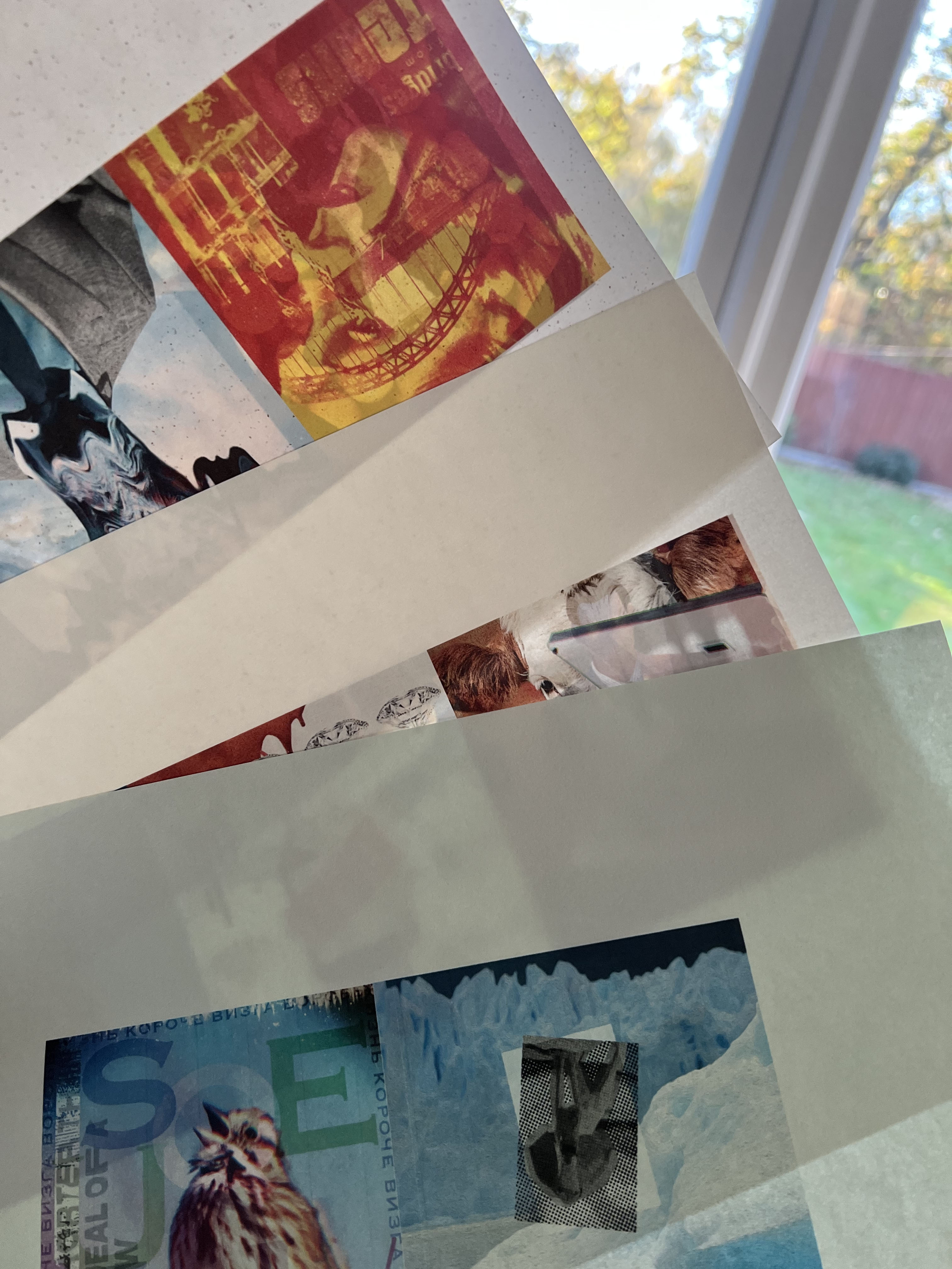
Having printed your images from the previous exercise, take the opportunity to view all of the pages, reflect on them and evaluate before moving on to the next step of collating and binding the pages together. Which pages are successful? Which pages have not turned out as well as you had hoped? Are there any visual surprises, or happy accidents? Given the experimental and open-ended nature of this exercise, the answers may be quite subjective, but it is important you reflect on these and other questions, to sharpen your self-critical awareness and assessment of your own progress.
Evaluating my work
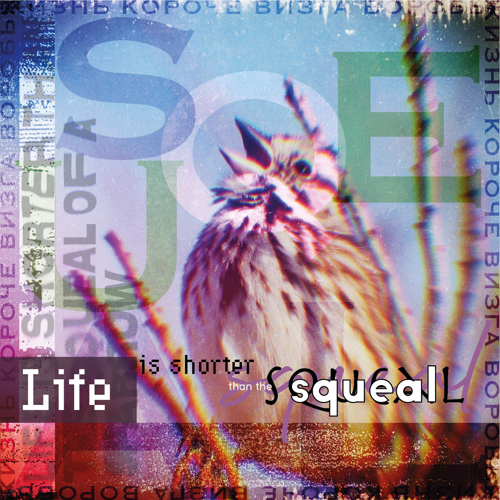
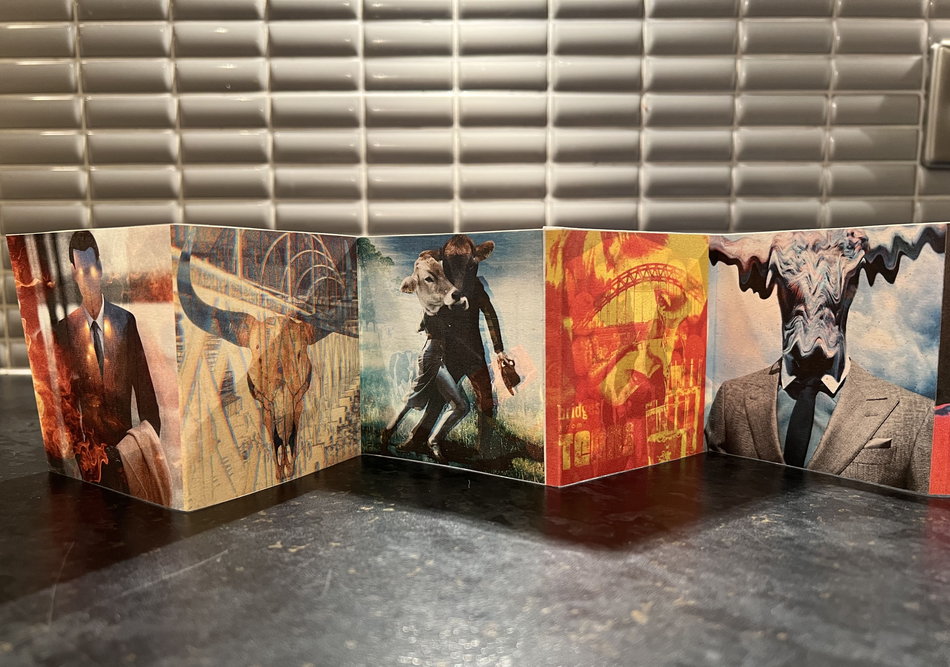
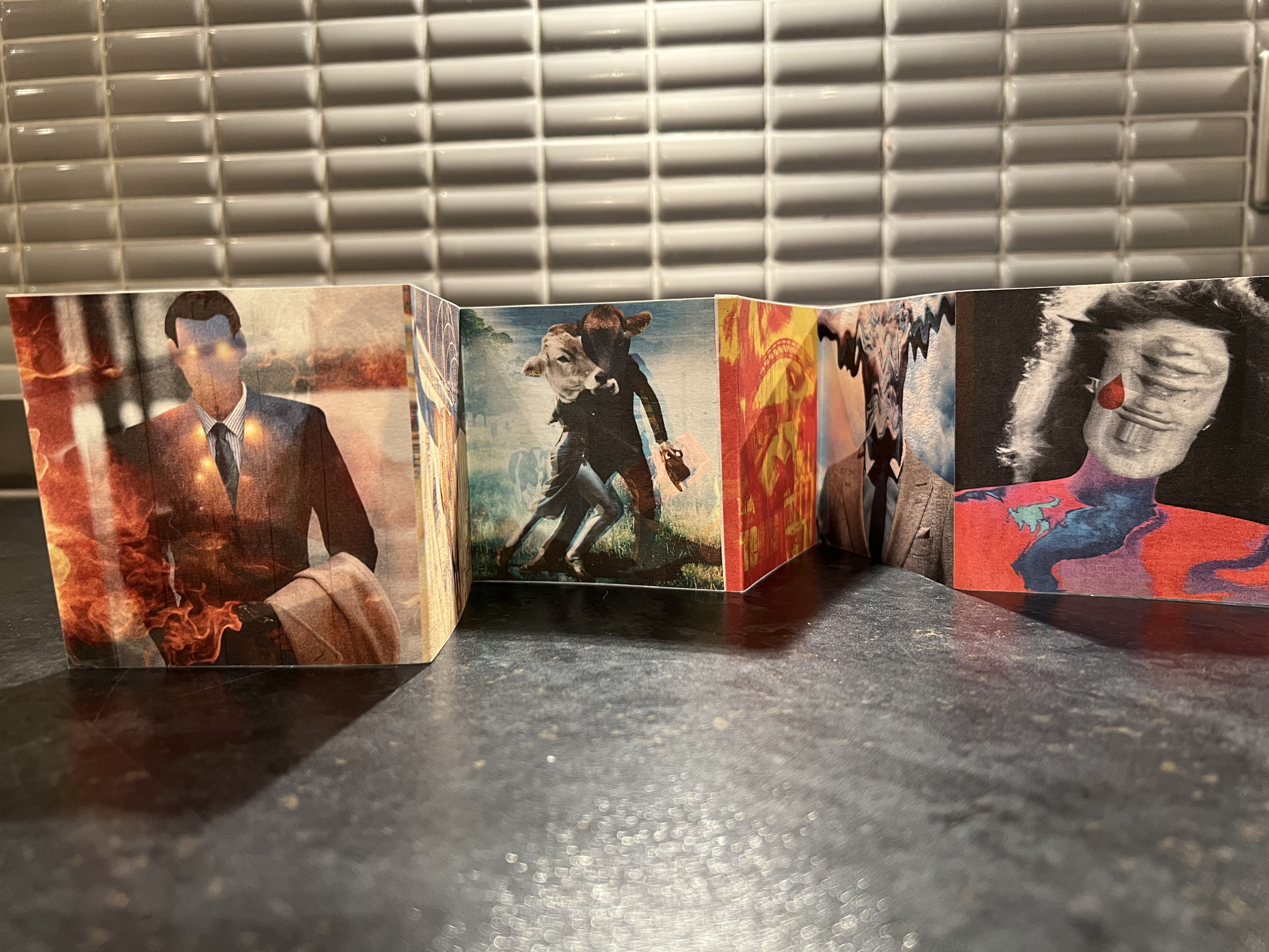
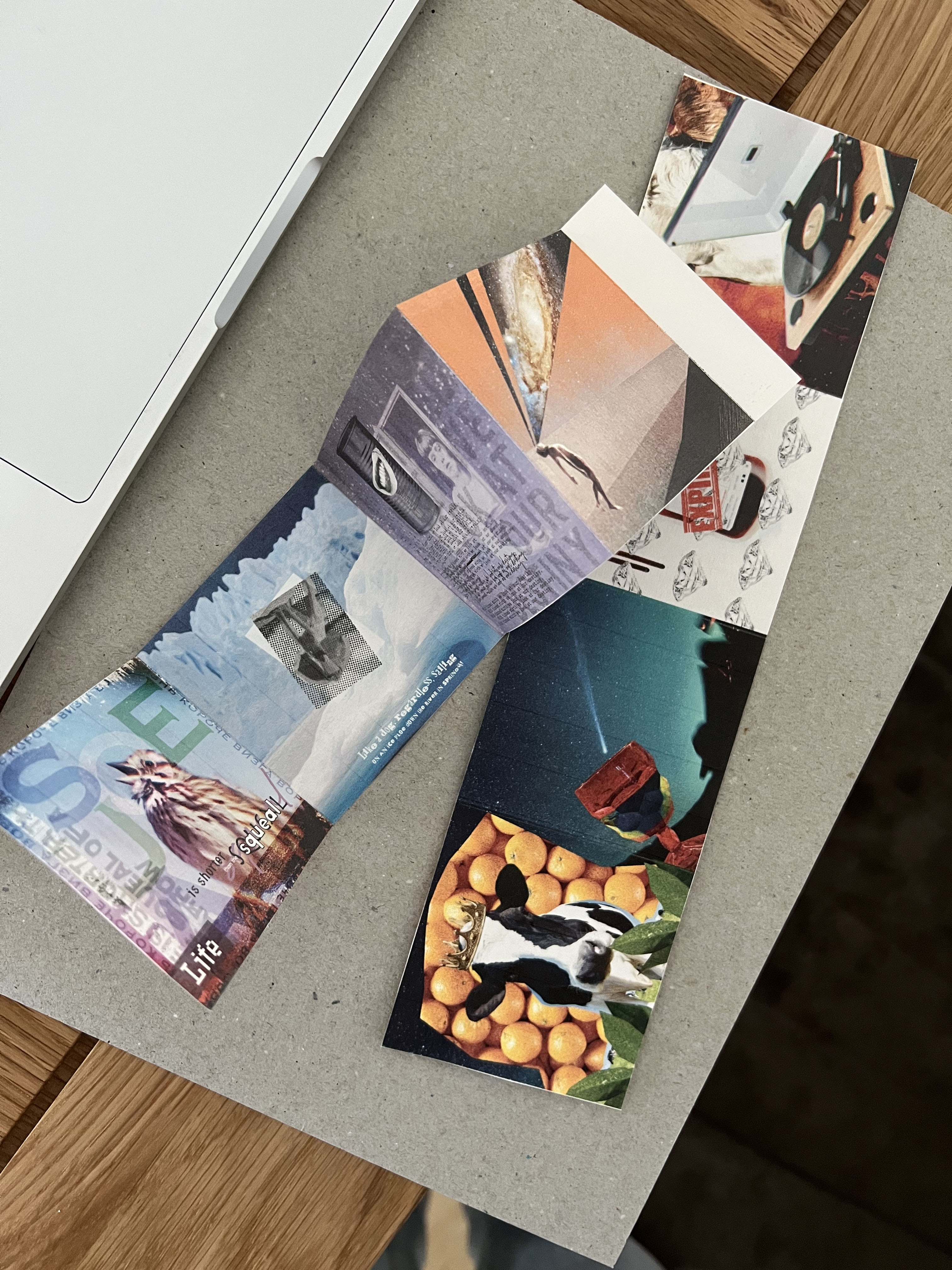
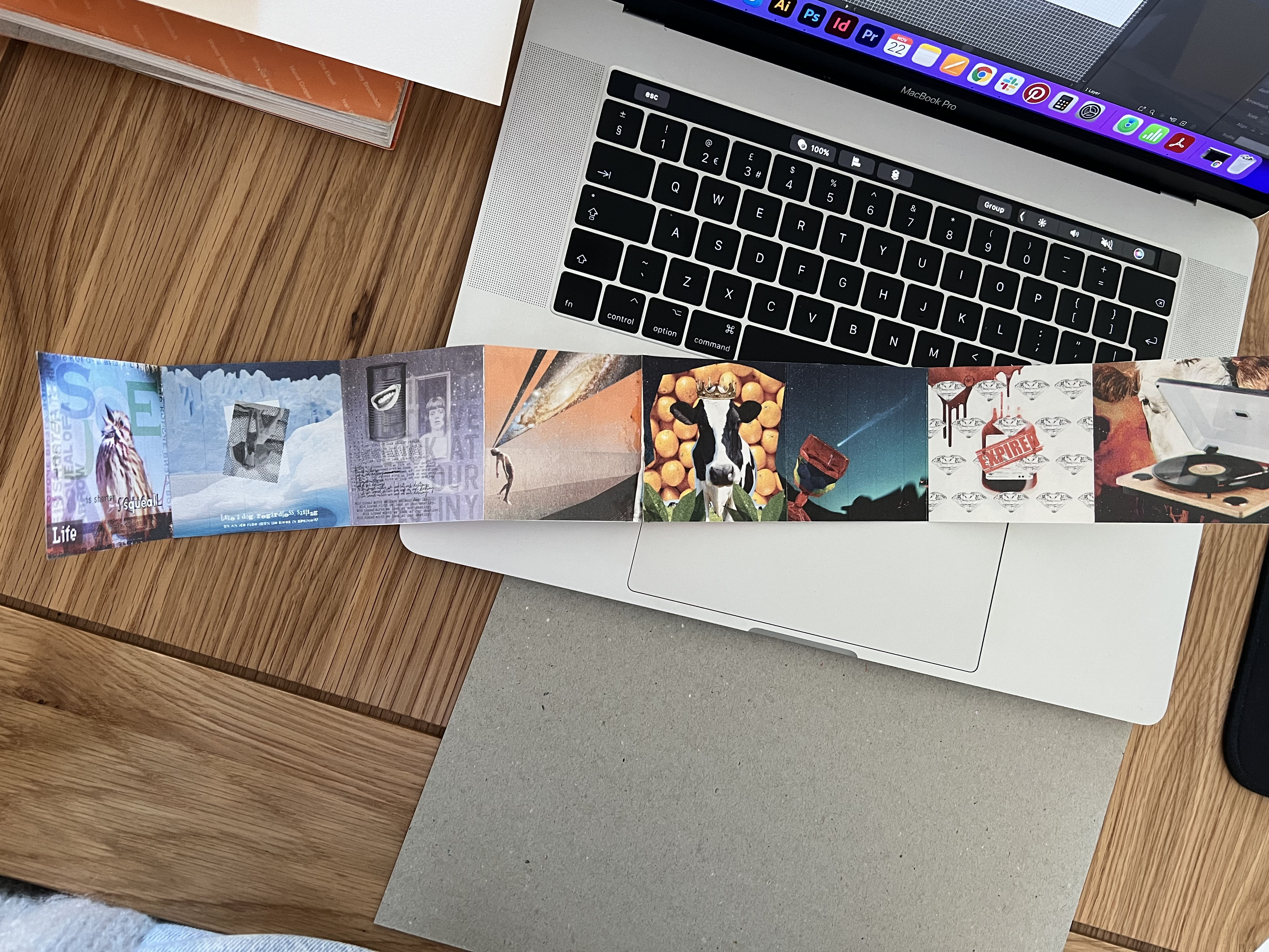
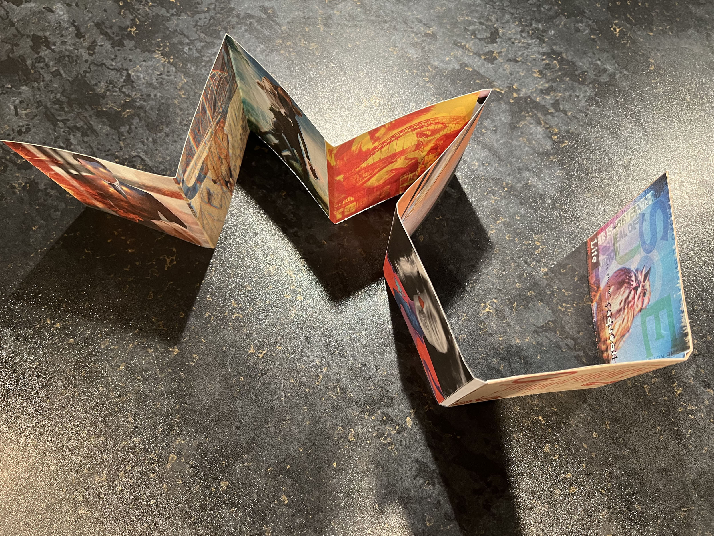
The first image was a starting point of the whole book. At this point I was still thinking on the concept, and that’s why the image is full of wording and text, as I was planning to make each page with the sentences from the poem, but later I excluded that idea and kept each montage free from overload. I kept the wording in this poster still, as it looked quite good together with the rest effects that I added around the picture. I like the colours in it, it helped me to set up the direction of the colour palette for the brochure, as I wanted it to be colourful but with a slightly transparent and grainy effect on them. And little cute sparrow represented well the action of the squeal.

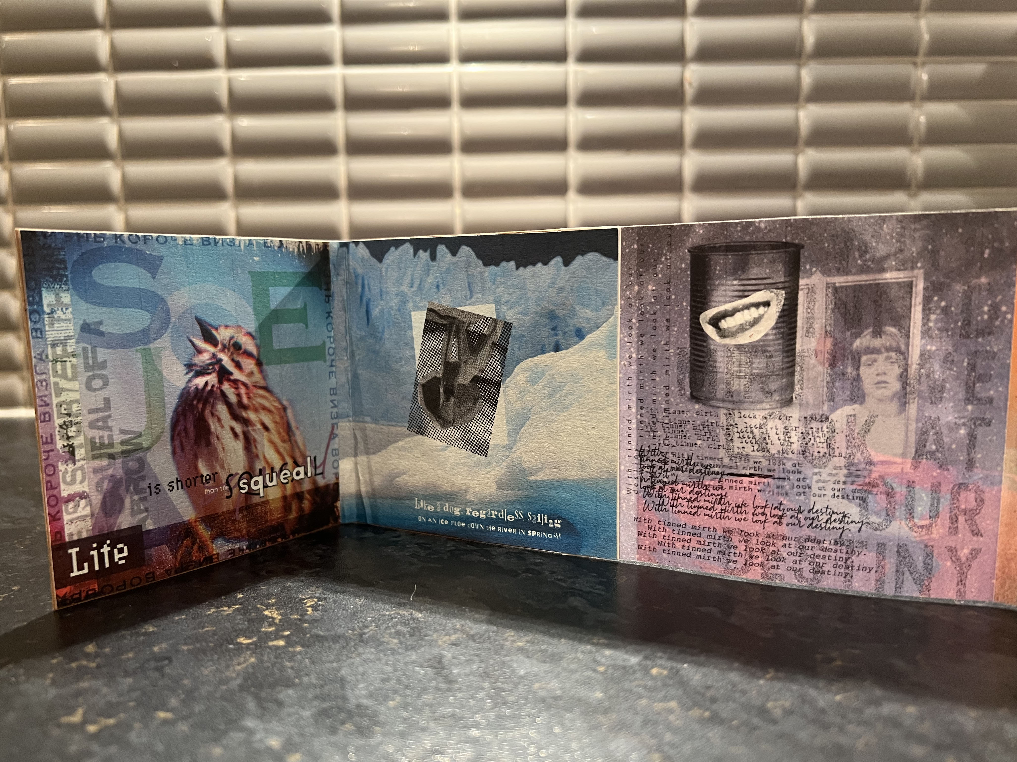
This is the image that I had to go back that to redesign slightly. I was not sure whether the big brown bulky fonts in combination with script font looks good with the rest of designs, as it was too dominating in the image, and I didn’t apply that principle anywhere elese. But the position of the dog upside down on the snowy background worked quite well. I loved that oil painting effect on the top of it, and the dog has quite an unusual dots effect, so the image can be still recognisable after careful exploring. I liked the colour combination in it, and it worked very well with the first page.
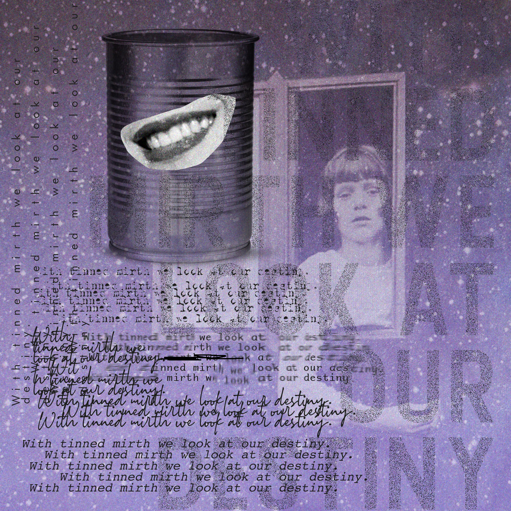
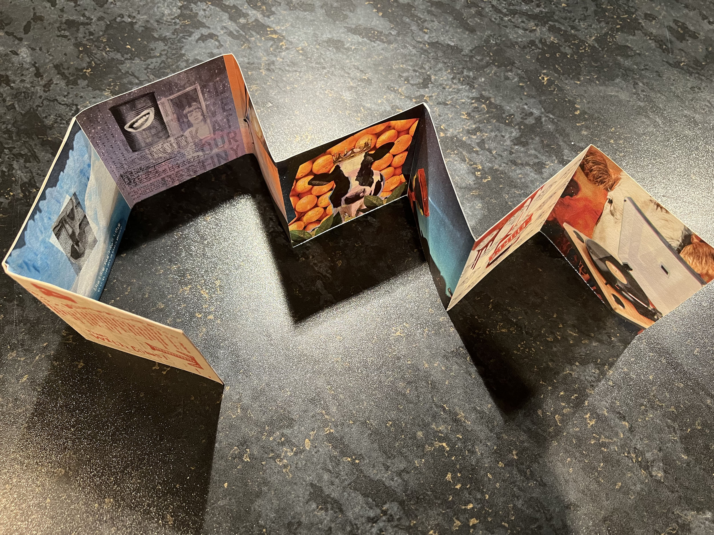
This is one of my favourite collage in this book. I put lots of hard work and efforts into that text positioning and fonts combinations to make it look harmonious. I liked how those first three images merged into a similar theme, and on top of that, this particular photomontage was generously filled with different layers of stars and grain effect. The smile on the tin can looks curious, and the girl like a ghost image looking far ahead gives an eerie mood, with some oddness. The hue in this image is cold violet, and it reminds of some kind of dreamy mood and night star sky. Even though other pages didn’t have as much wording, I think, due to its transparency it worked quite well and was not as heavy going that to keep up with the rest of the style.
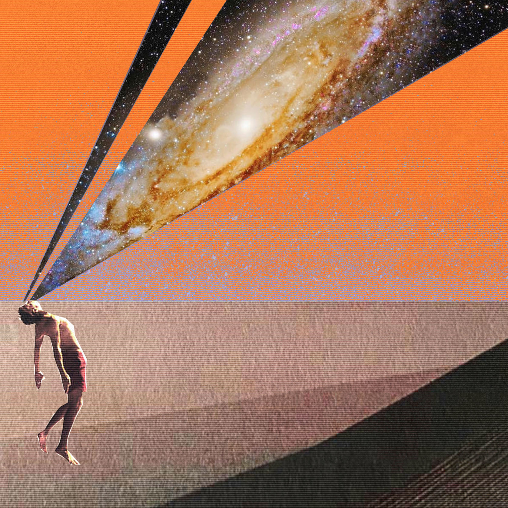
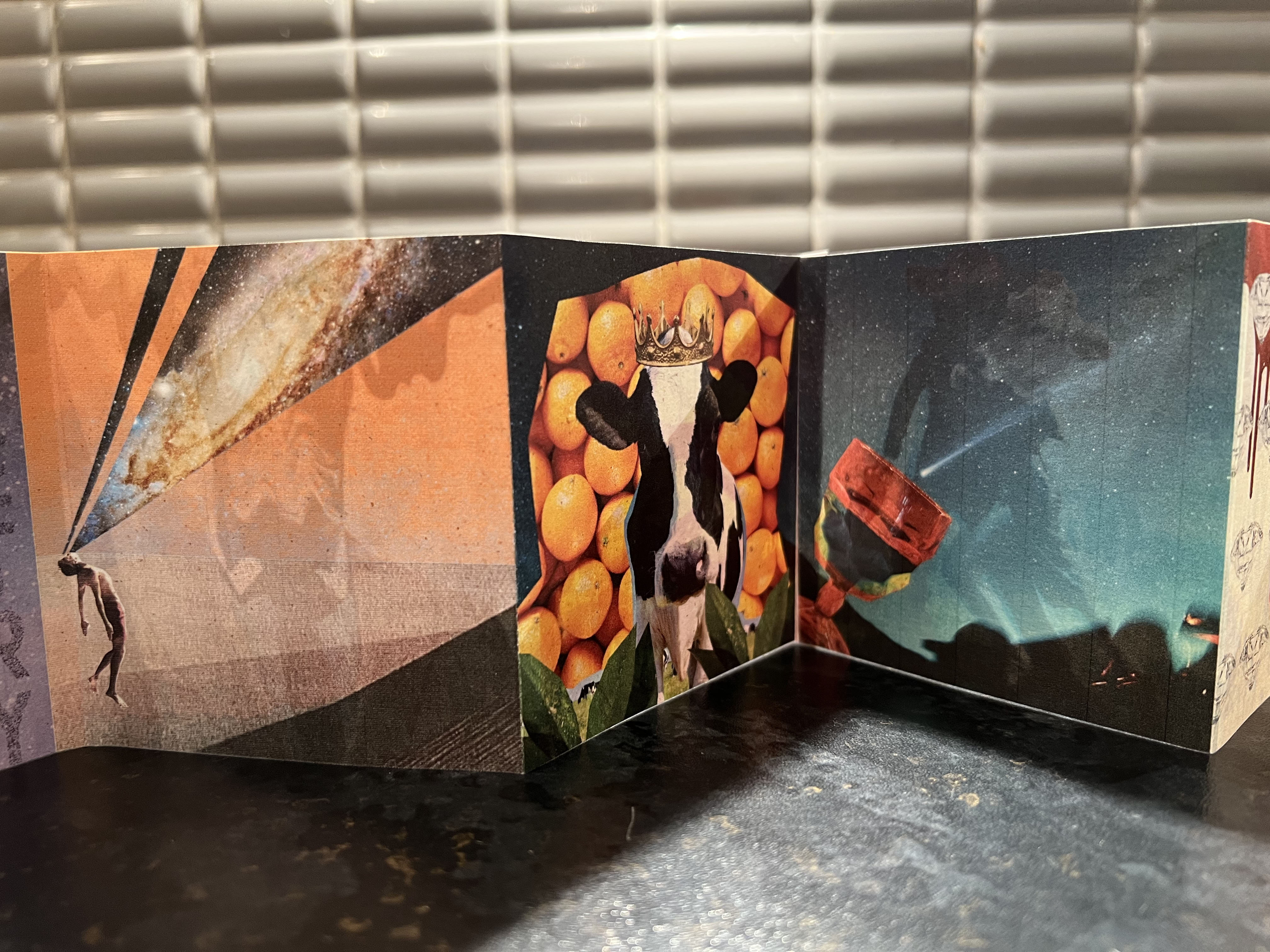
At this point, I started to walk away from the design style brochure. I chose geometric angles in it, and a very little image of the human in the corner,– conqueror of the air. I was returning to this image a few times, trying to adjust it according to the colour palette the best way I could, I changed the colours many times as well, however, I still managed to come up with something as coherent as possible with the difference of the composition top effects. The reason why I kept it, as it had that levitating spirit, it was light, filled with emotion of discovery the Universe.
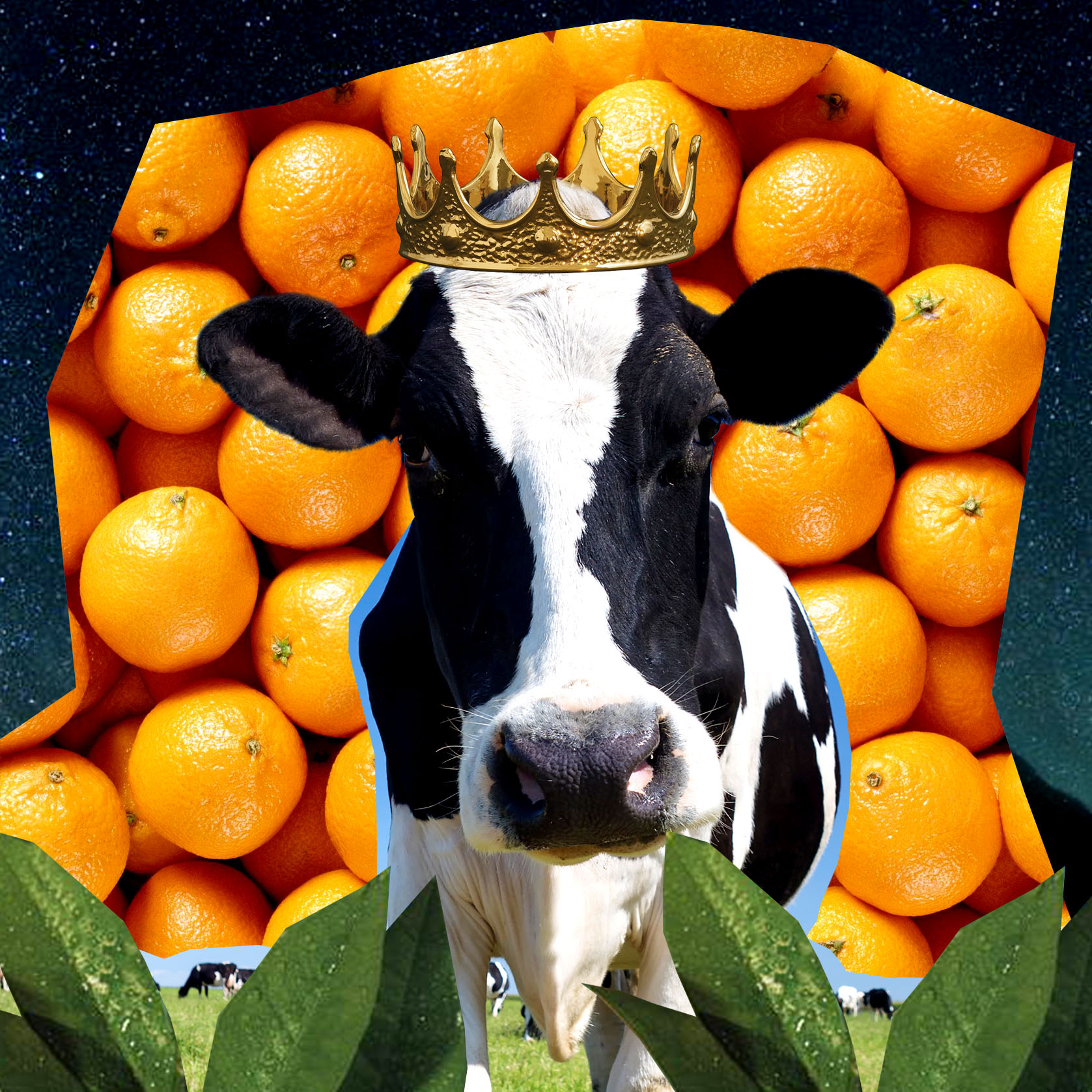
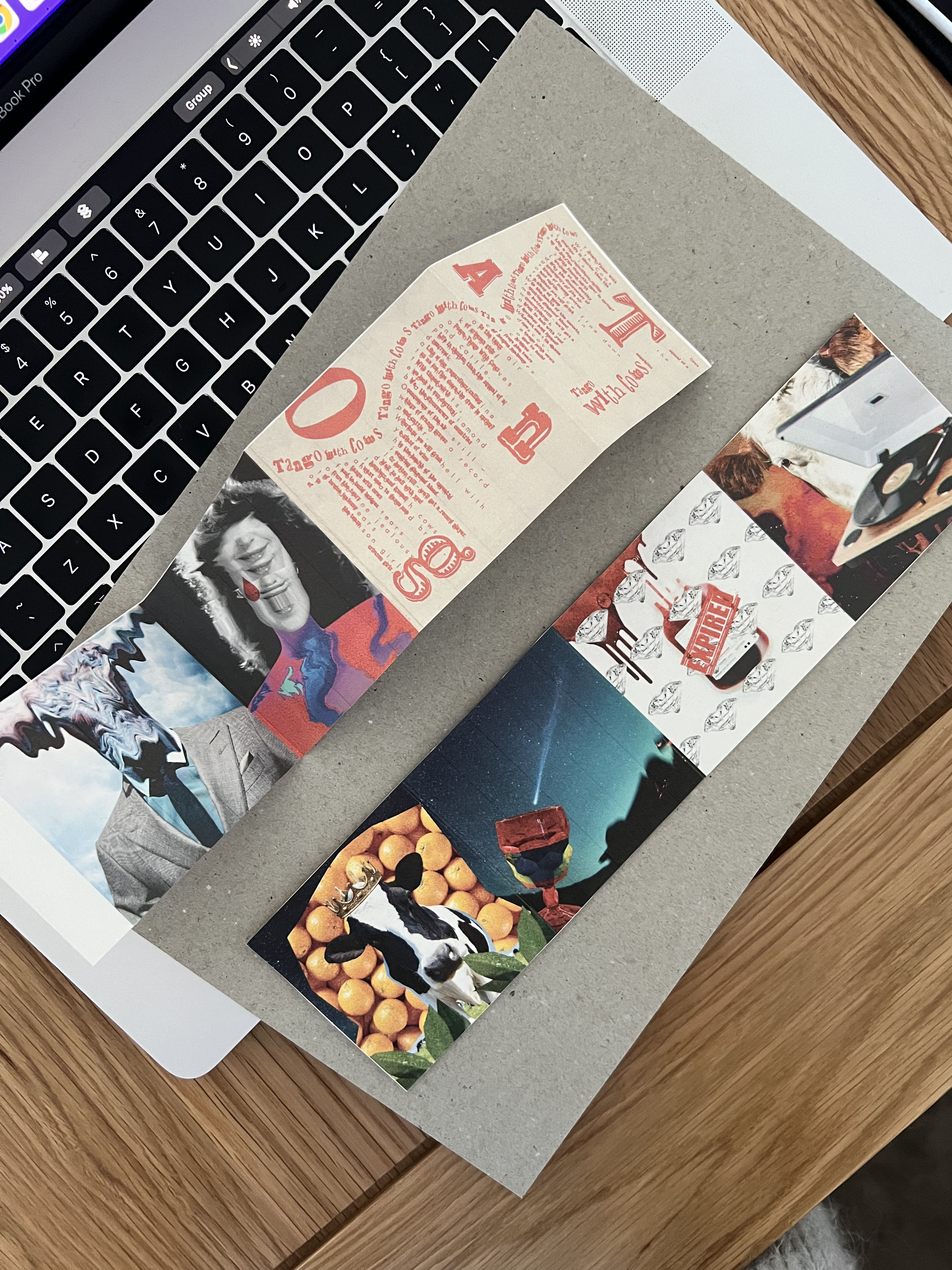
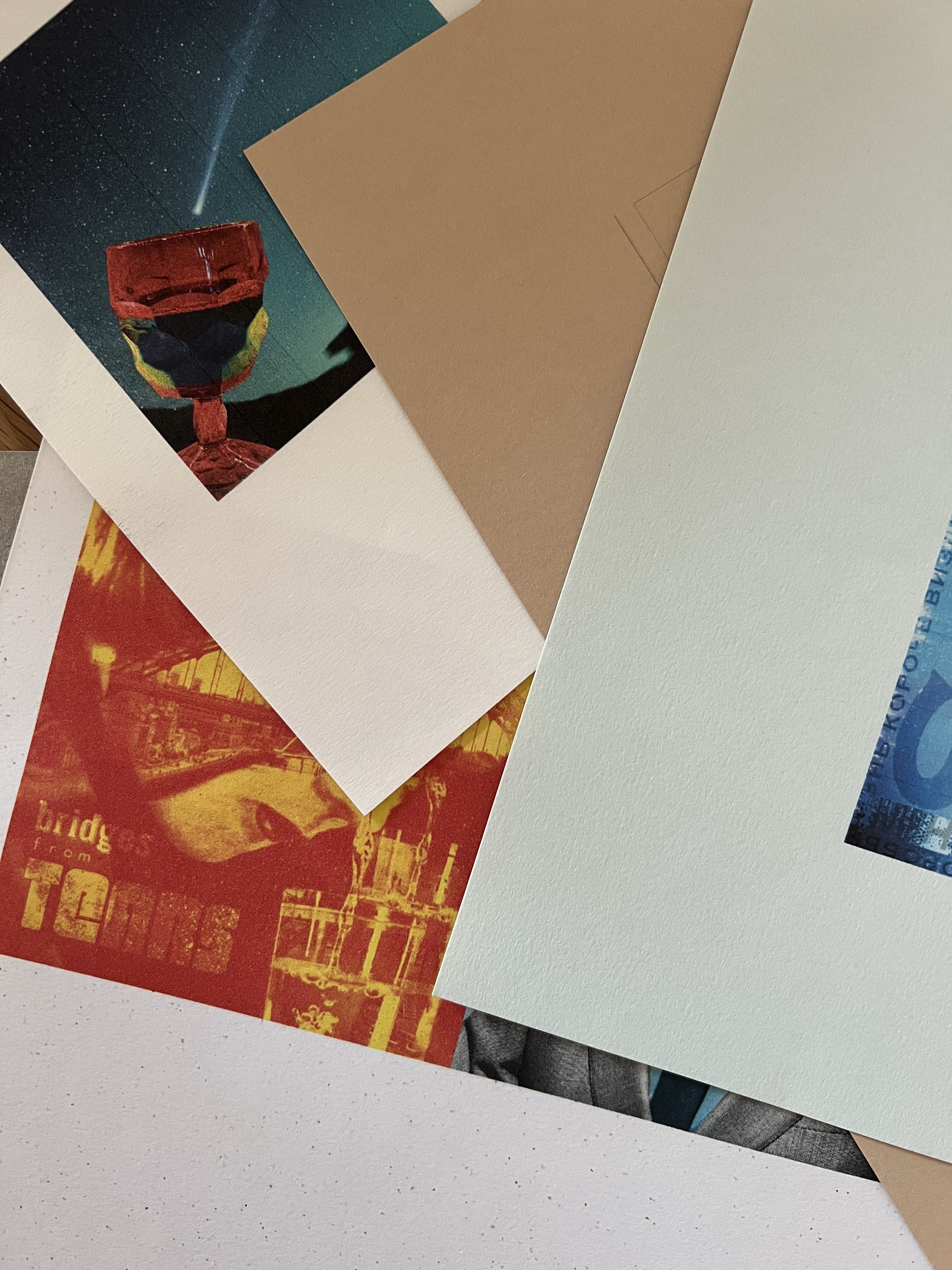
For the kings of orange groves and health of the comets I created same background theme, and I’m quite satisfied with this duo. I decided to create a joint image, where the sky is continuing from one picture to another. Originally I had different effects in it, with blue sky and lighter colours, but I didn’t feel it looked right, so after some consideration, I came up with this night sky solution. The cow with crown amongst the oranges looks out of place, but that is the purpose of the poem, to surprise the reader, and visually I recreated it in the same way. Fewer layers and effects in it, but still looks consistent with the booklet.
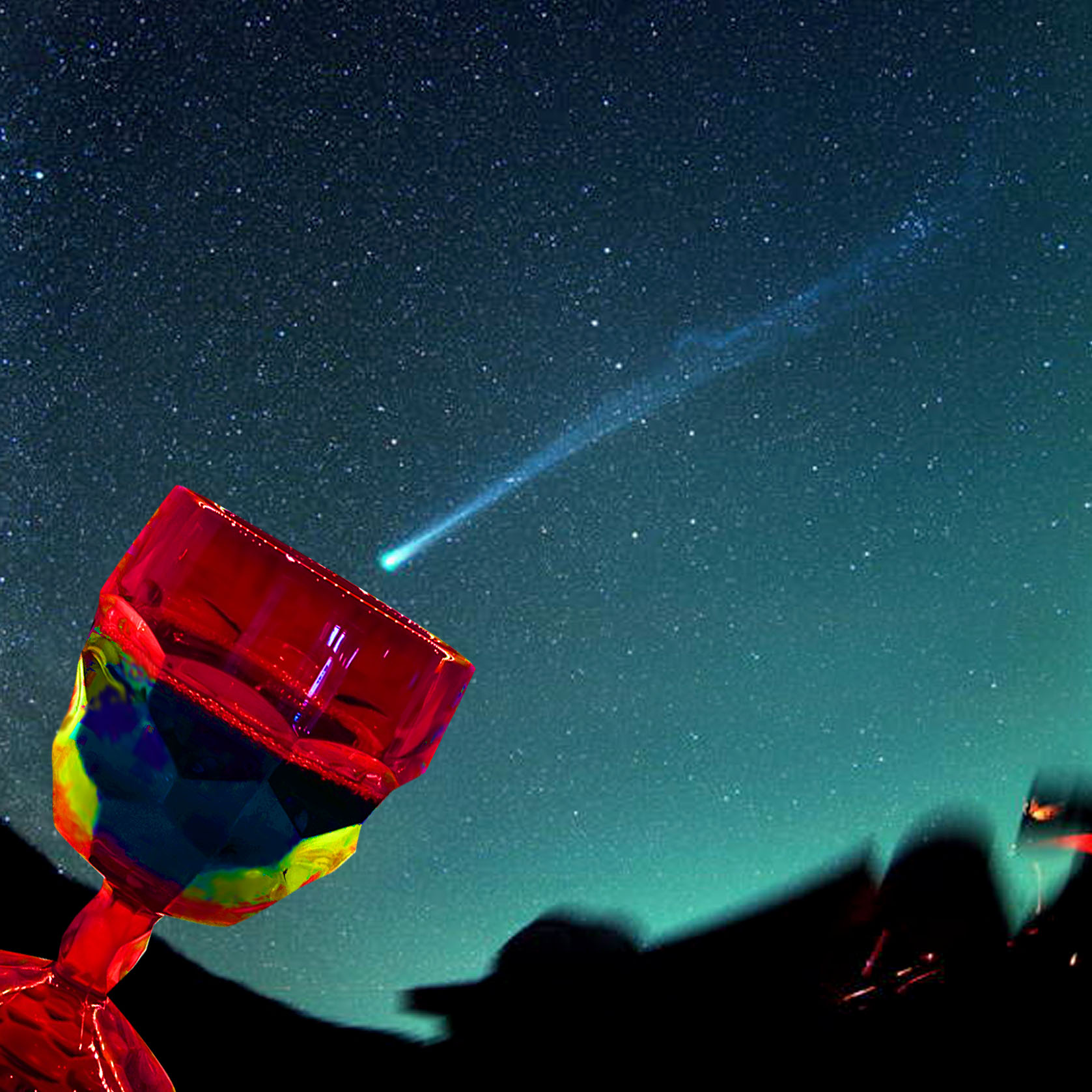
I like this page for its simplicity and matching the trend of the booklet. Here I discovered that minimum details can provide required effect. As I tried to use the part of the different planet with it, and a picture of the moon and with the comet, all together it created the overloading outcome, so I stripped it back and got what I was needed. It’s clean and clear and looks like the wine glass catching the falling star to make a wish, additional meaning to the health of the comets line.
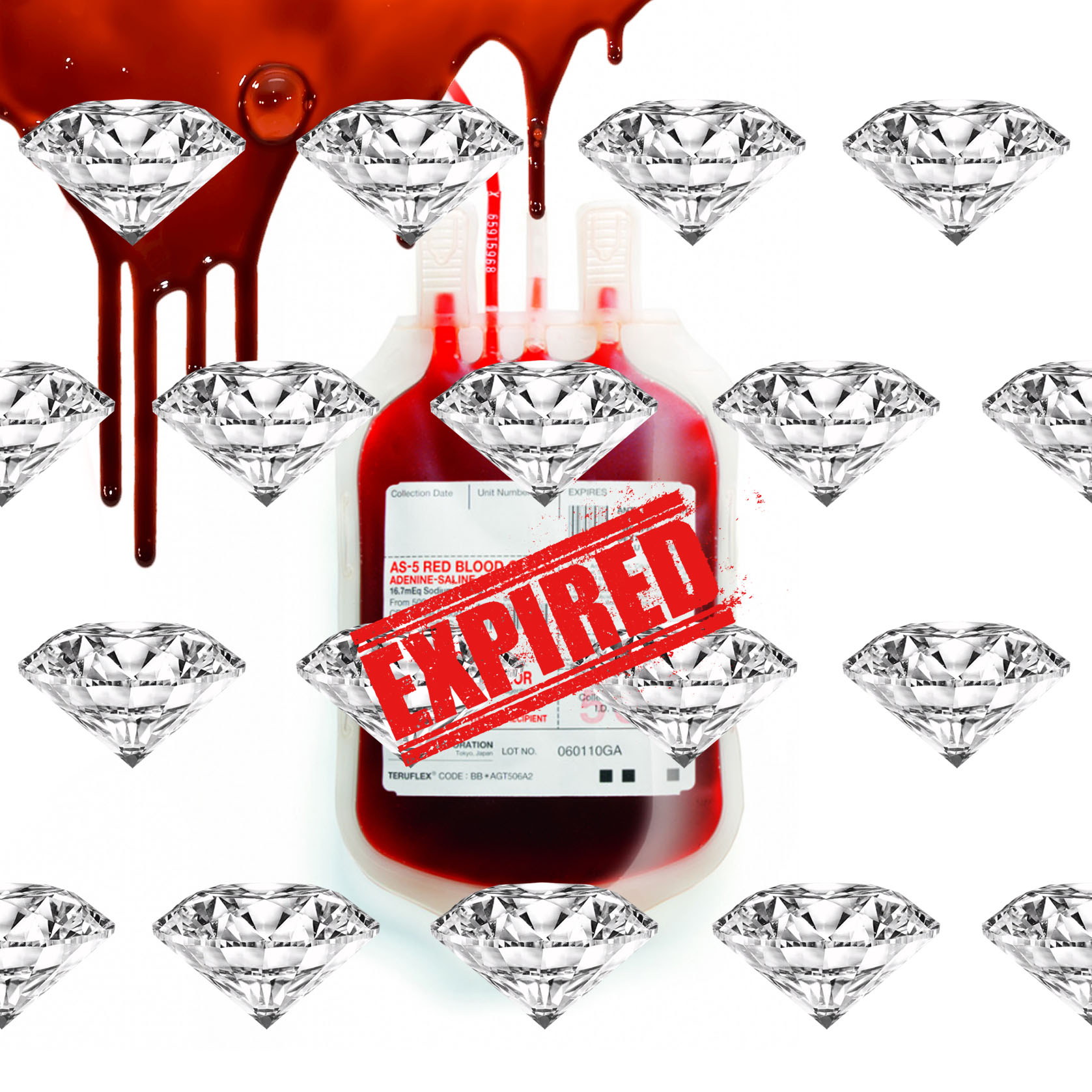
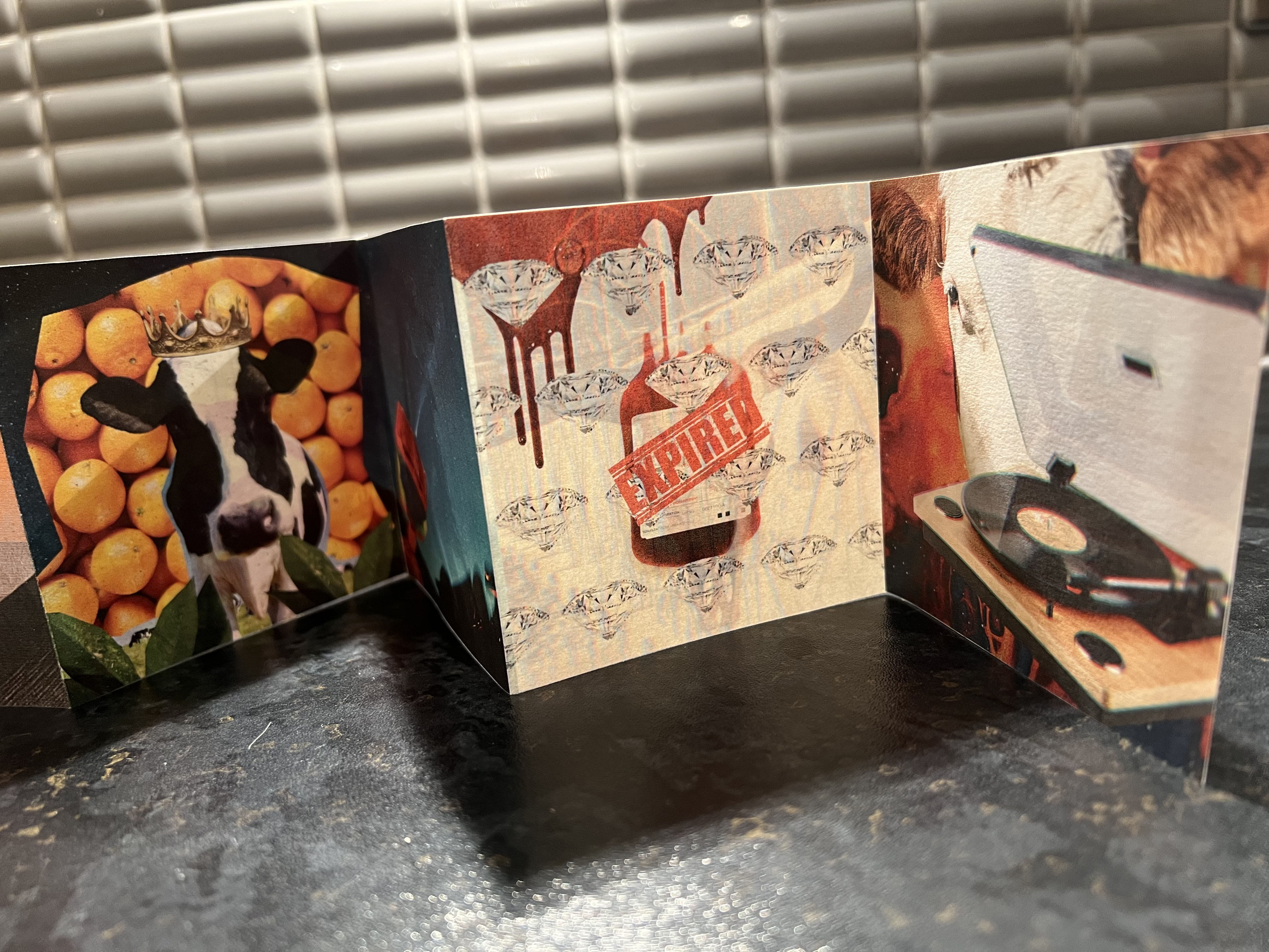
Here I have matching colours with the blood splatters and the red glass of red wine. I like when there is a colour circulation in composition and painting, as the reader can follow the pattern of joining images from one to another. Here the red glass and red blood created similar purpose. This is the only one page where I used a grid of objects in the line, and the realistic picture of the blood creating creepiness and oddnes as well. I didn’t use as many filtures here, and kep it clean, but on a print it did look great together with the rest of the images, despite to the white background and diamonds grid.
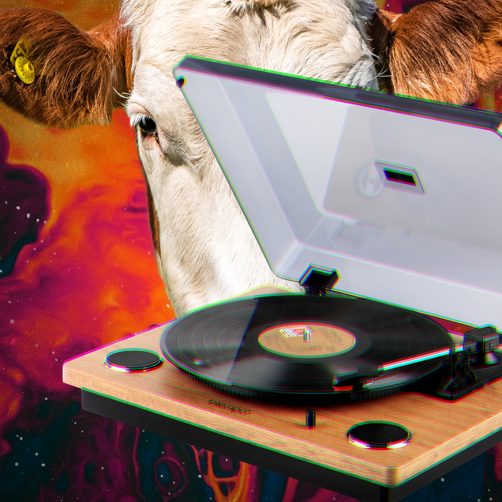
This photomontage is straight to the point too, record player with the abstract background. I used the head of the cow just to create juxtaposition. Back image consist from contrasting colours splatters, which are matching to the next image, I moved sightly to the warmer hues, red, orange and brown, as around this part I could see words assosated with red shades such as as blood, wine, hell.
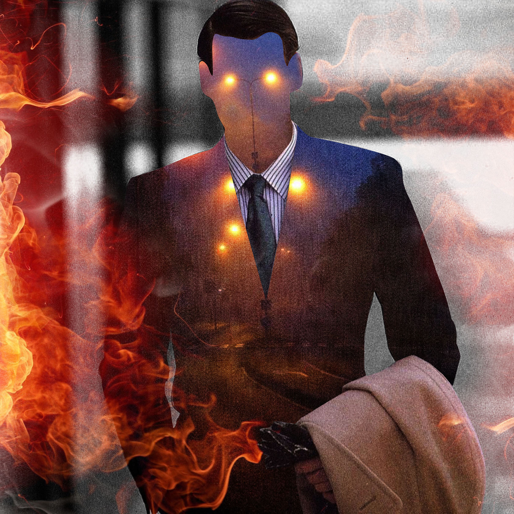
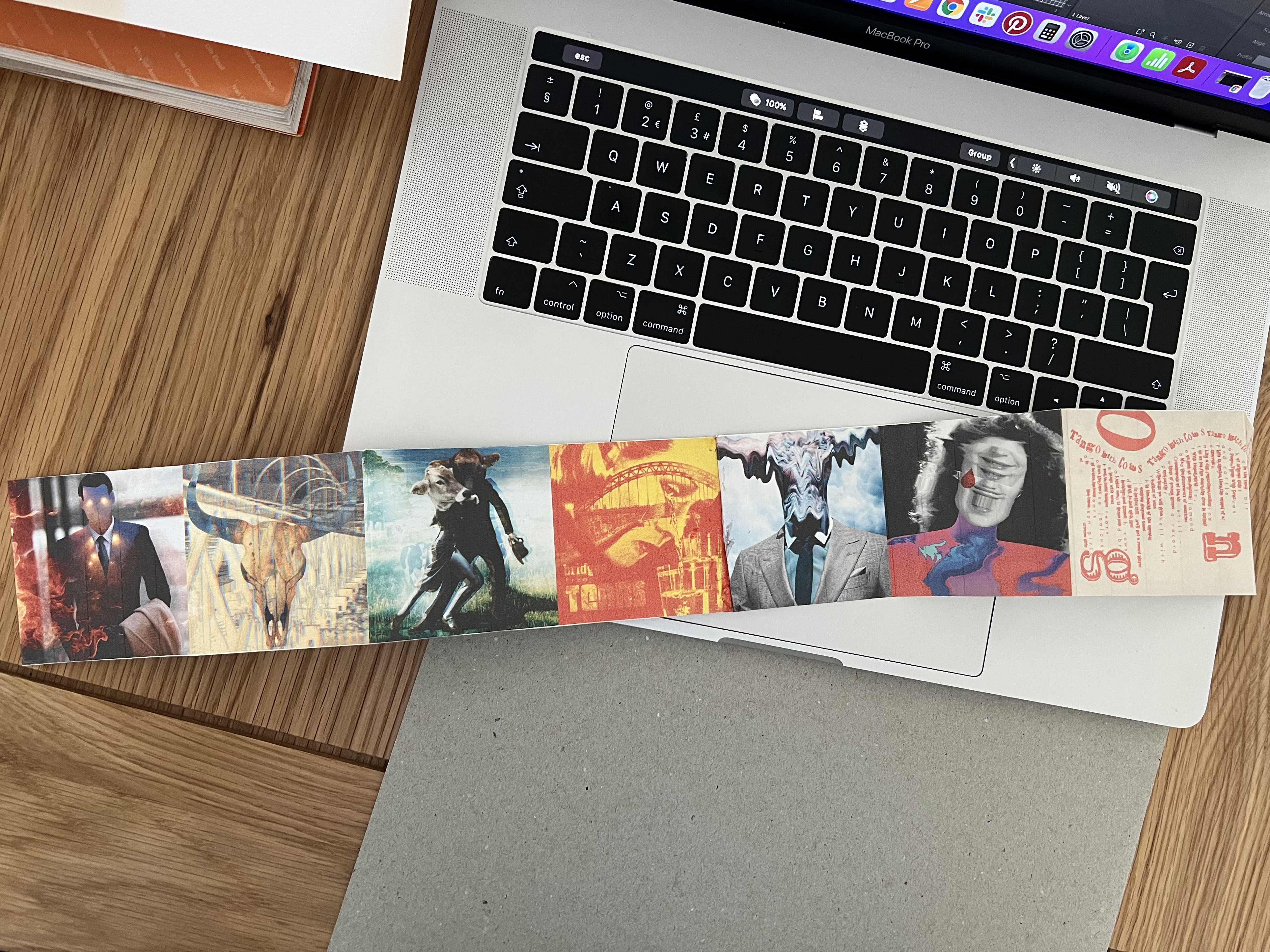
This photomontage was straightforward for me. I think my previous collages helped me to establish the feel and mannerism of the poem expression. The mood is dystopian, and that image is a good representation of the line. I like that kind of collages, when they are not overwhelmed and not too complicated, but have some mysterious atmosphere. So it was good and right to the point, and I’m pleased with the outcome.
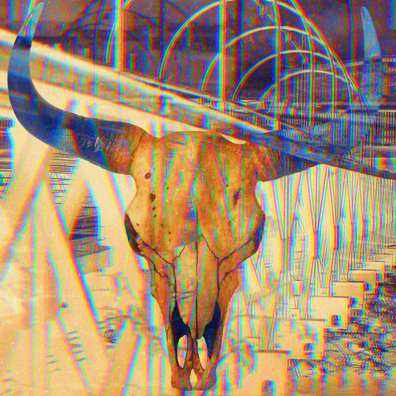
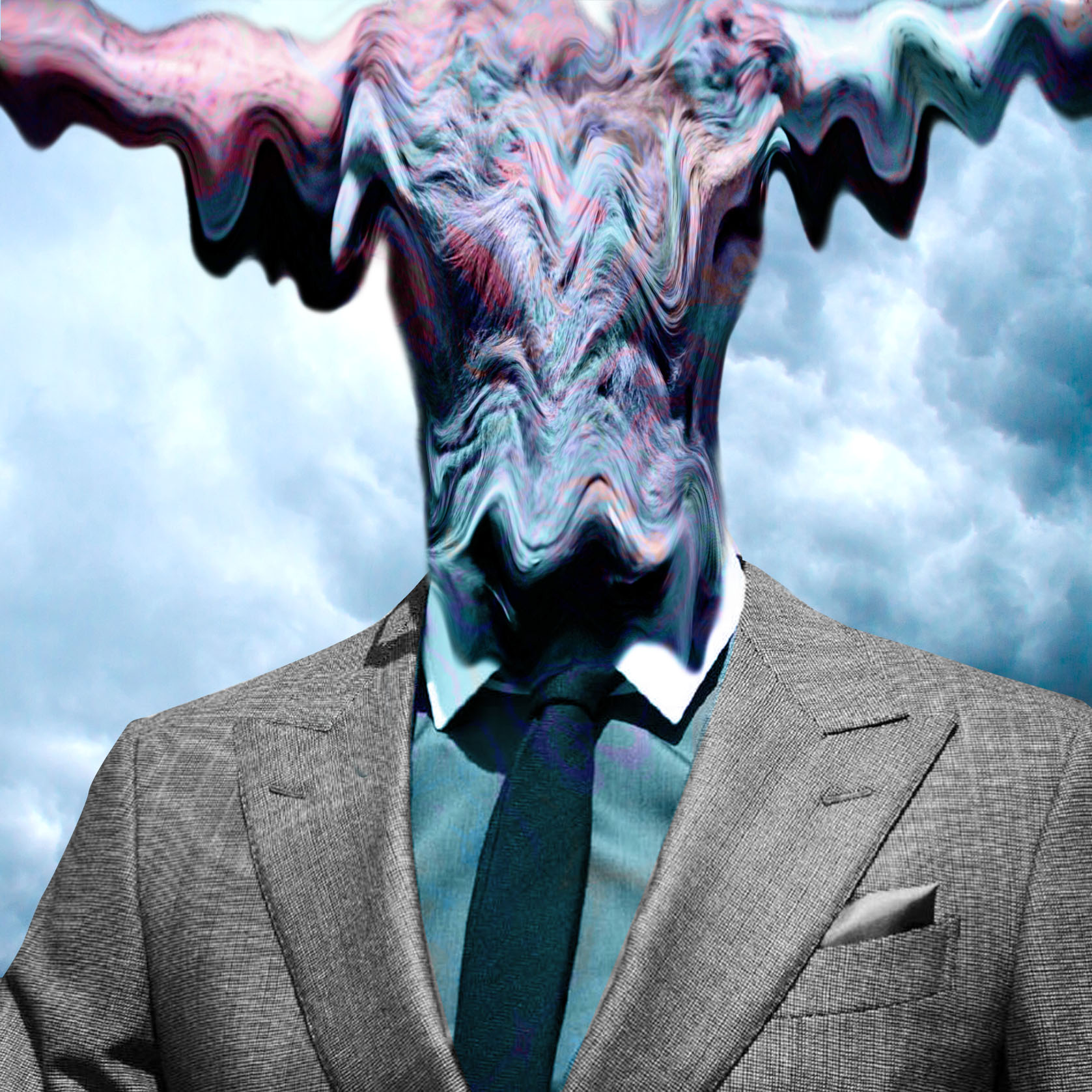
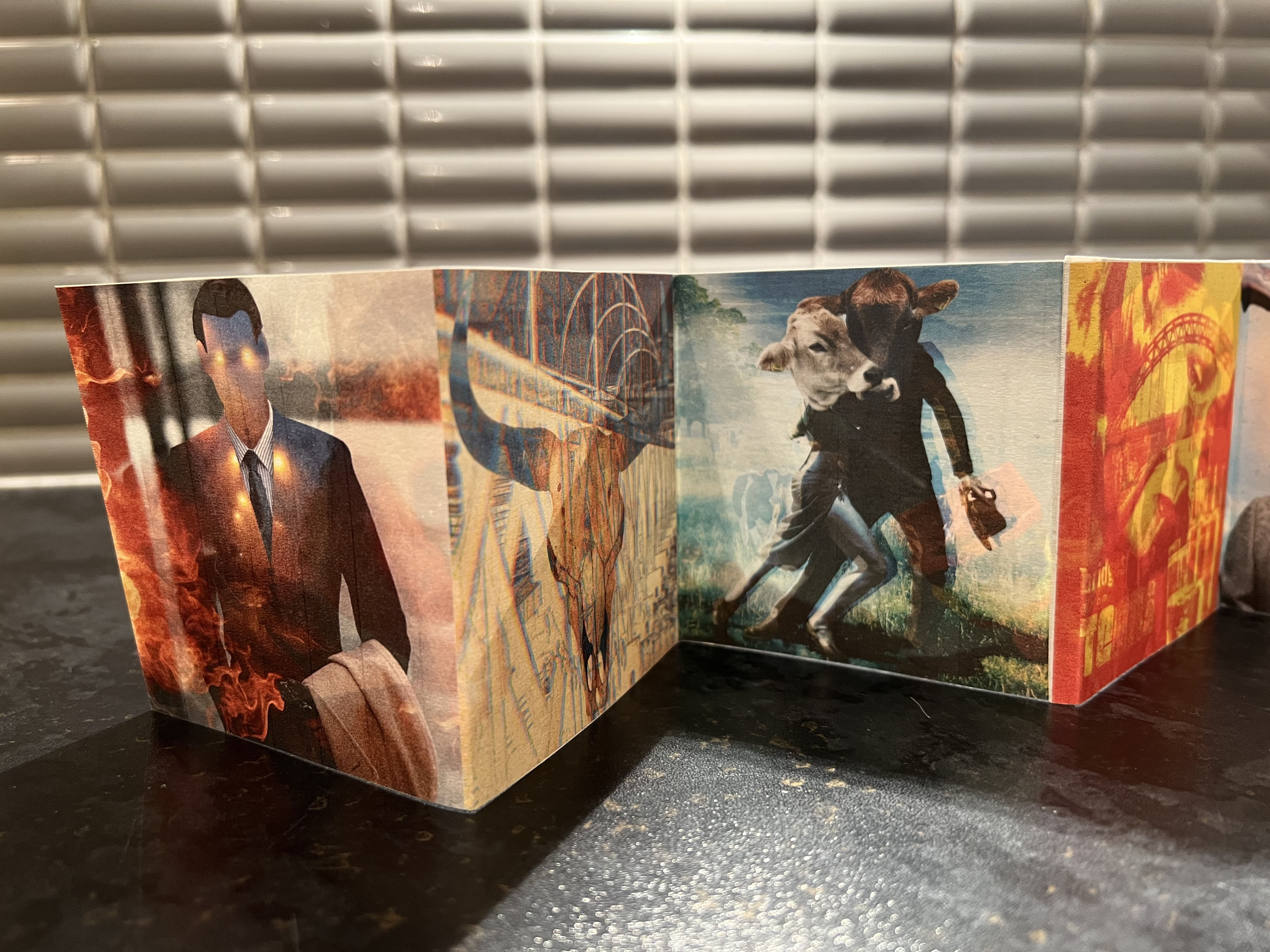
For this photomonrage I used the picture of the Sheffiel Bridge I had in my folders. With a bull skull with some opacity effects on the top, it created translucent filter with some fluorescental colours. That how it works sometime with Photoshop, just do some trials and see for the interesting results. The collage looked slightly different to the previous works, but here I had a brochure of experiments, as the idea was to make it look appealing and unusual. I like that collage, and it was good colourcombination with the image of the man.
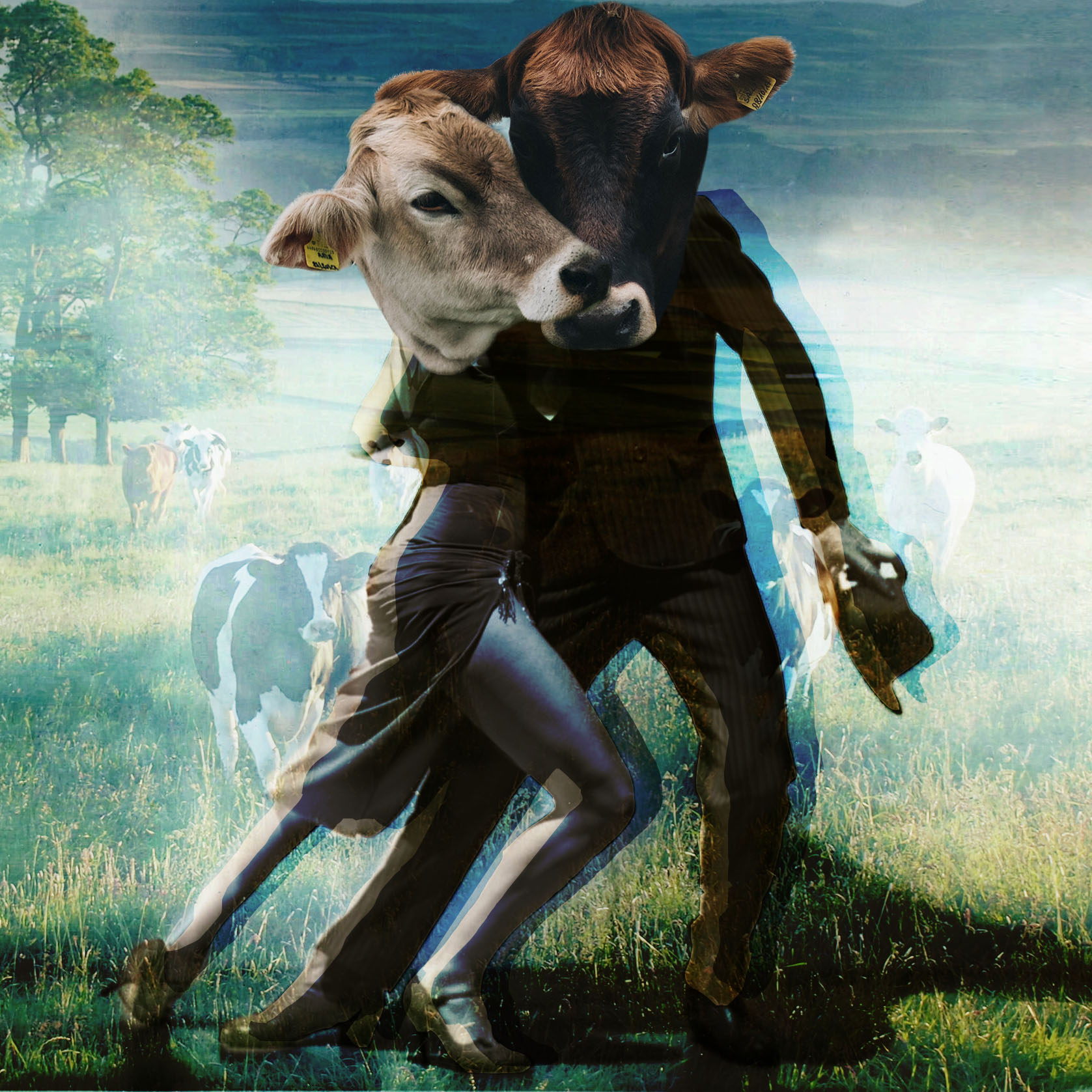
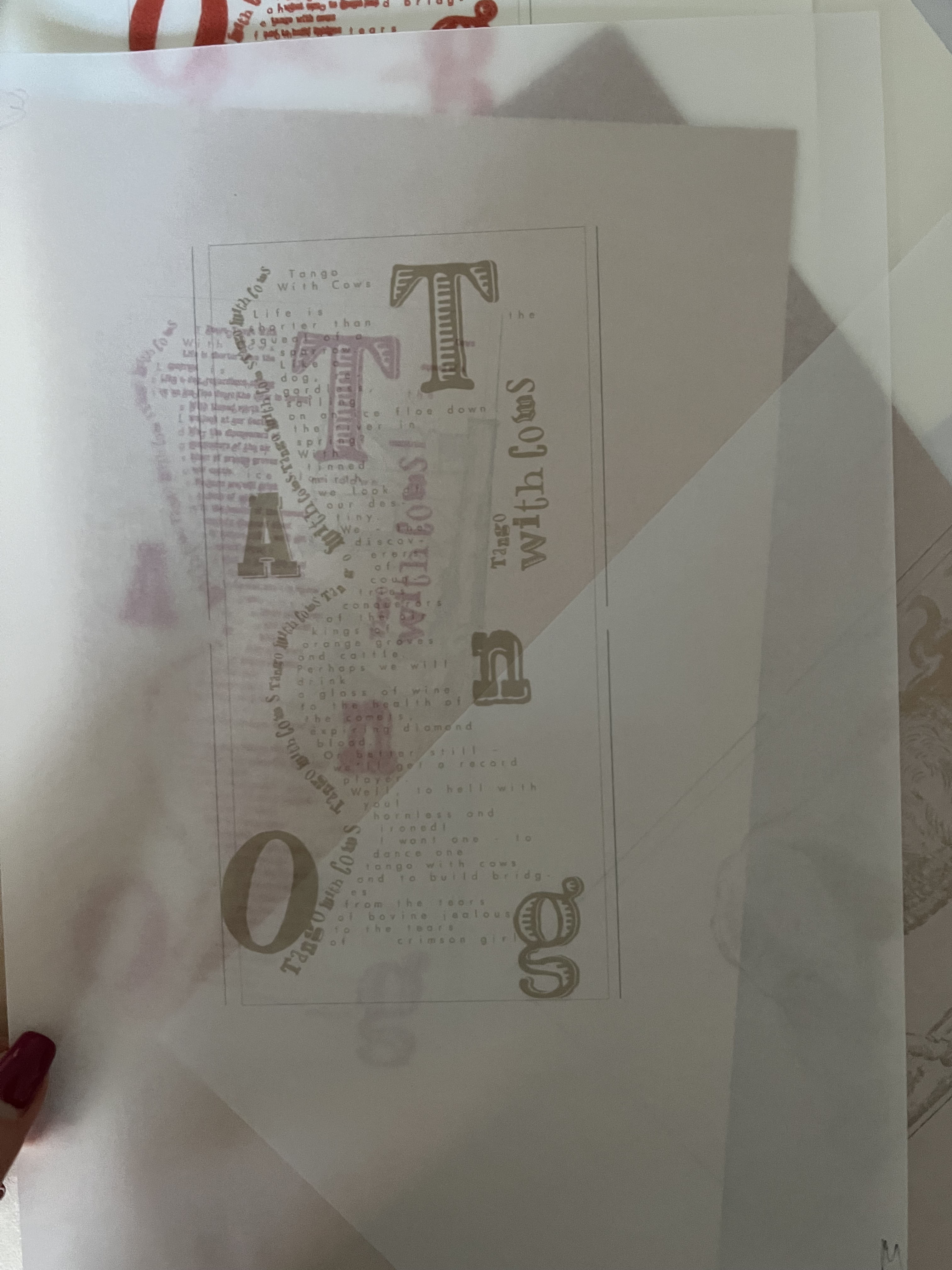
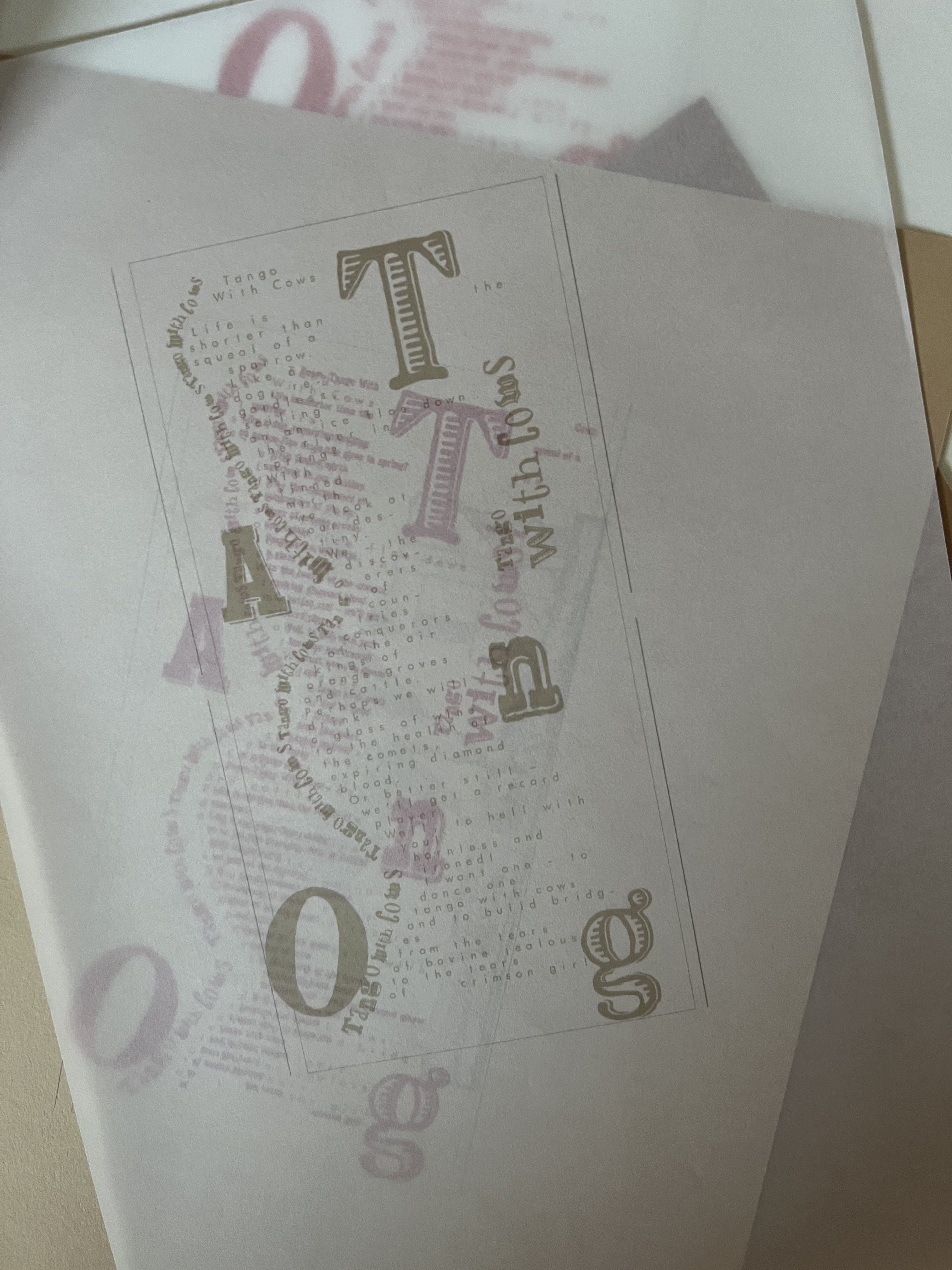
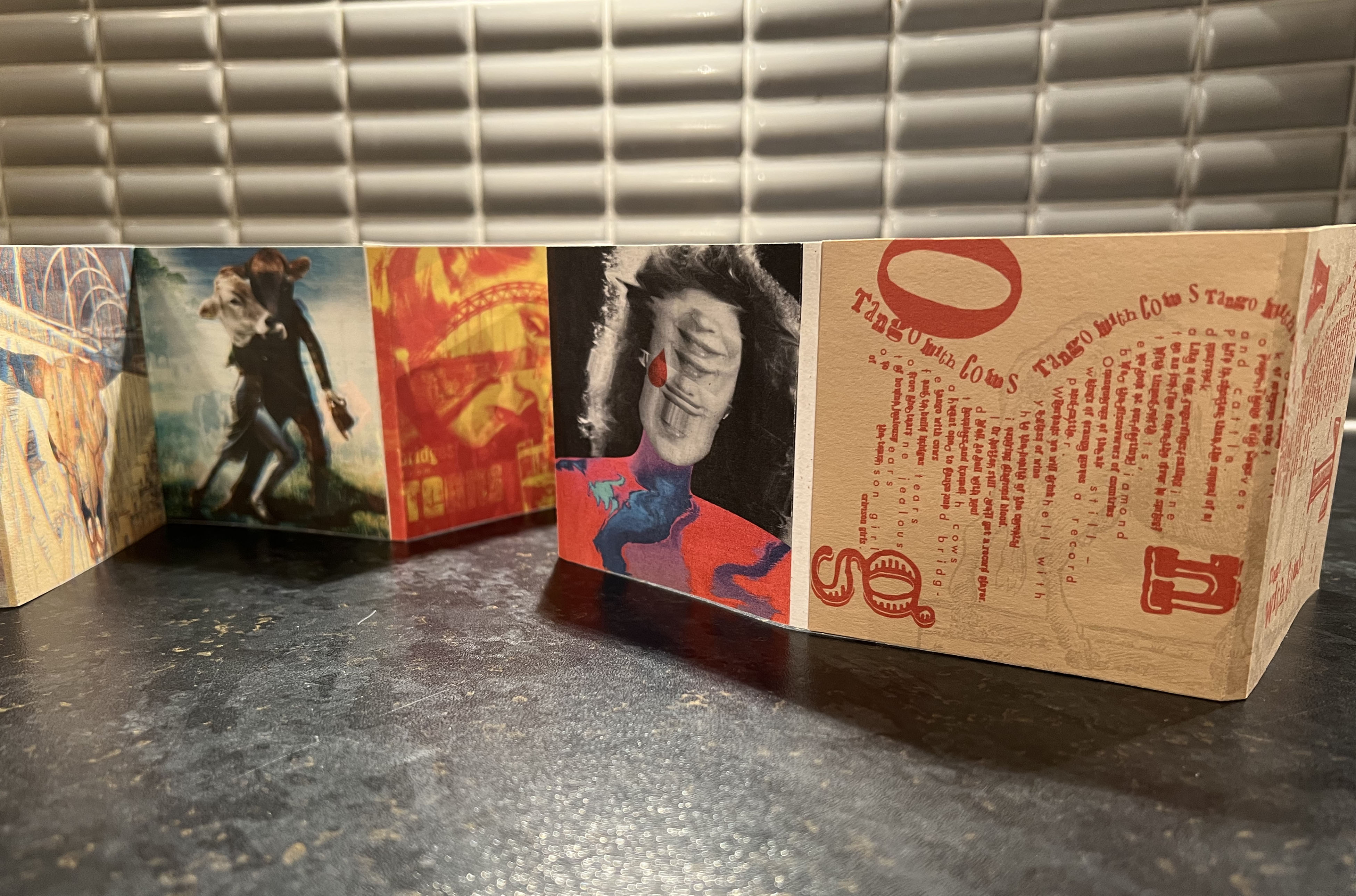
This is the central image of the poetry, as that is the name of the poem. I tried to be considerable with this image and be as much as responsive to the theme and mood I established through the brochure. Colourwise it reminds me of the old painting of traditional countryside with grazing cows. It took me a while to come up with this idea, but I’m glad I could push it enough that to see this result. The image has depth, interesting shadows, originality and eclectic vibe. I even left the numbers on the cows years, as a symbol being a cattle.
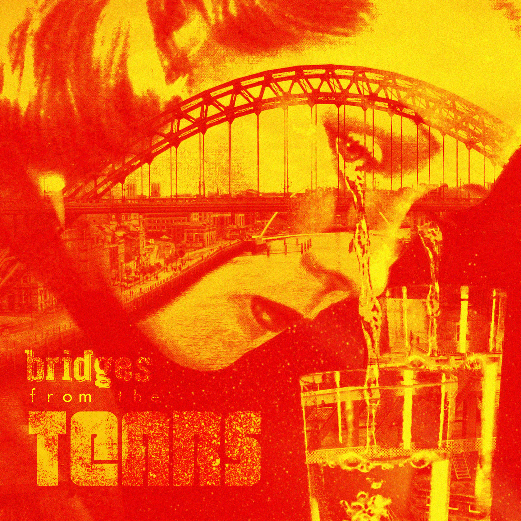
This one is probably the one of the collages that was the hardest for me to do, probably closer to the end of the book I just became exhausted from generating ideas. I found this picture of the woman with tears, and I thought would be great to implement a photo of the bridge in there, with some transparencies and merging together. I tried few colour variations, but in some reason that was the best colour solution. Probably one of the redest and brightest images in this sequence set, but I loved how it looked individually. It has a bit of funzine style, and vintage photomontage feel, which I always aimed to learn, so that’s why I kept it. Maybe an odd one but still looks great.
This image I created as a pair to the last picture of a crimson girl. I think they are working great together, and have similarities in approach and style. Liquify effect was handy for that cow’s head, it made it look serious and dominant. Perfect explanation of bovine jealousy.
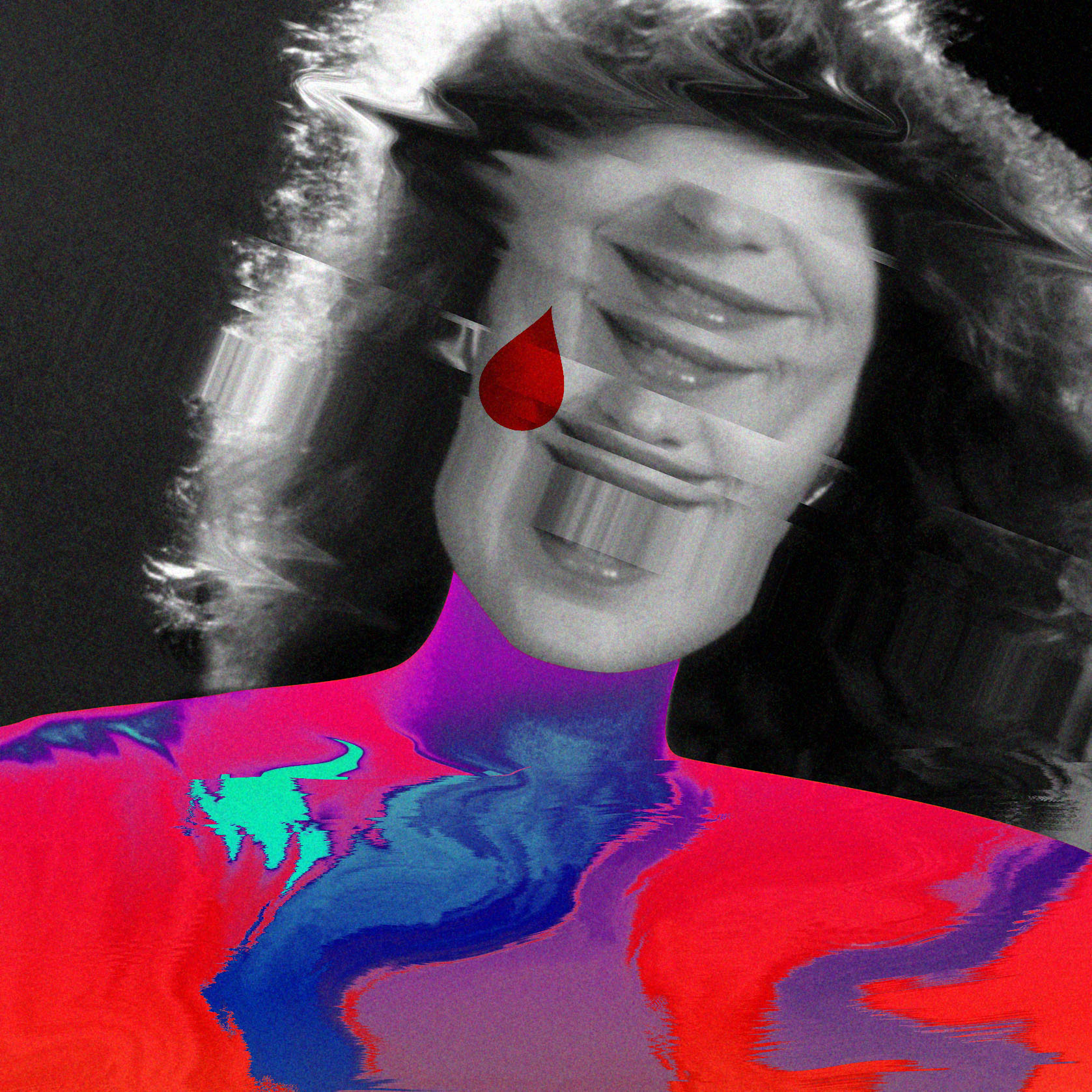
The last image is one of my favourites as well. It was inspired by the juxtaposition of modern artist Tyler Spangler and collage artist John Stezaker. I like experiments with distortion and replacing parts of the body, that creates an interesting effect that goes beyond the imagination. That woman has a smile and a big tear, which looks like the opposite meaning. The distortion effects worked quite well in this exercise, and I’m pleased that the approach can potentially represent a new generation of art.
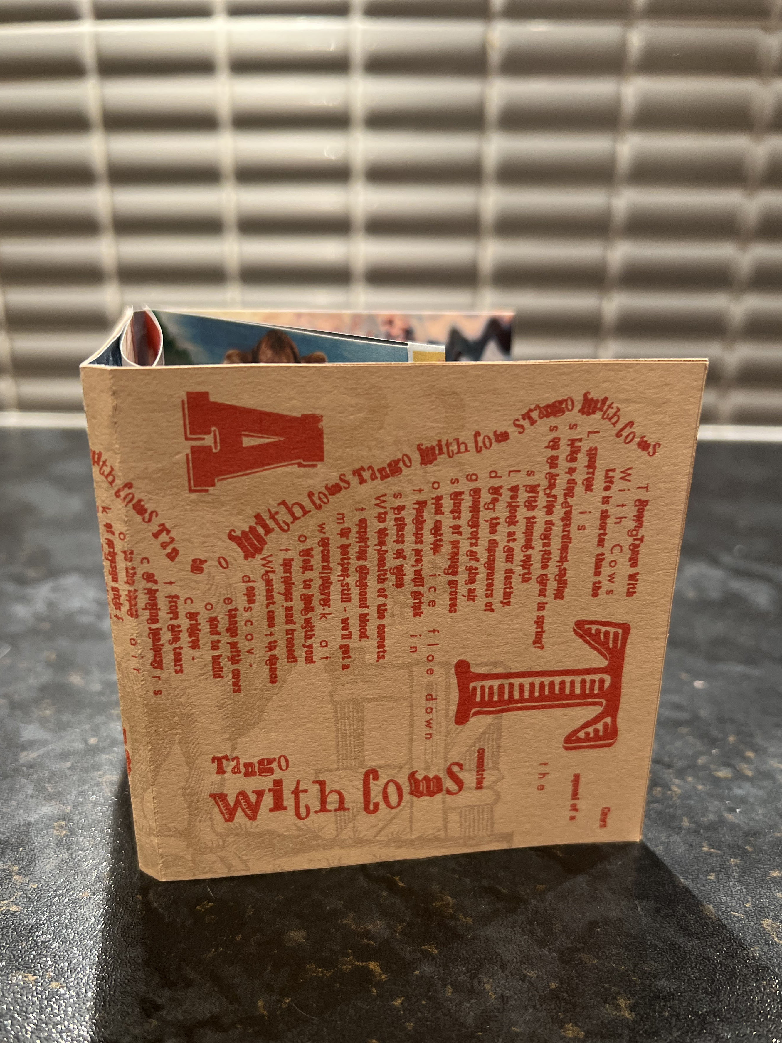
Printed version
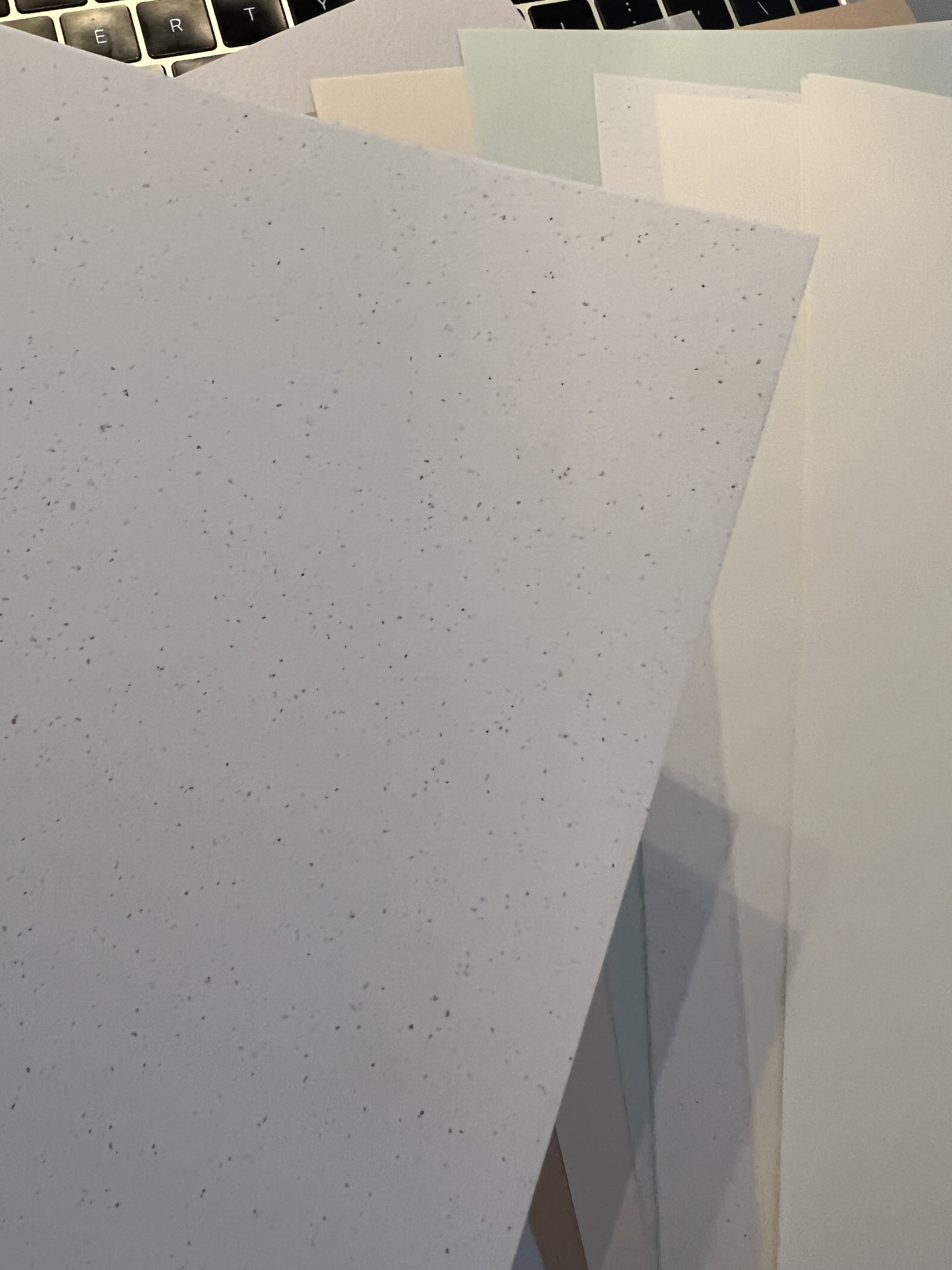
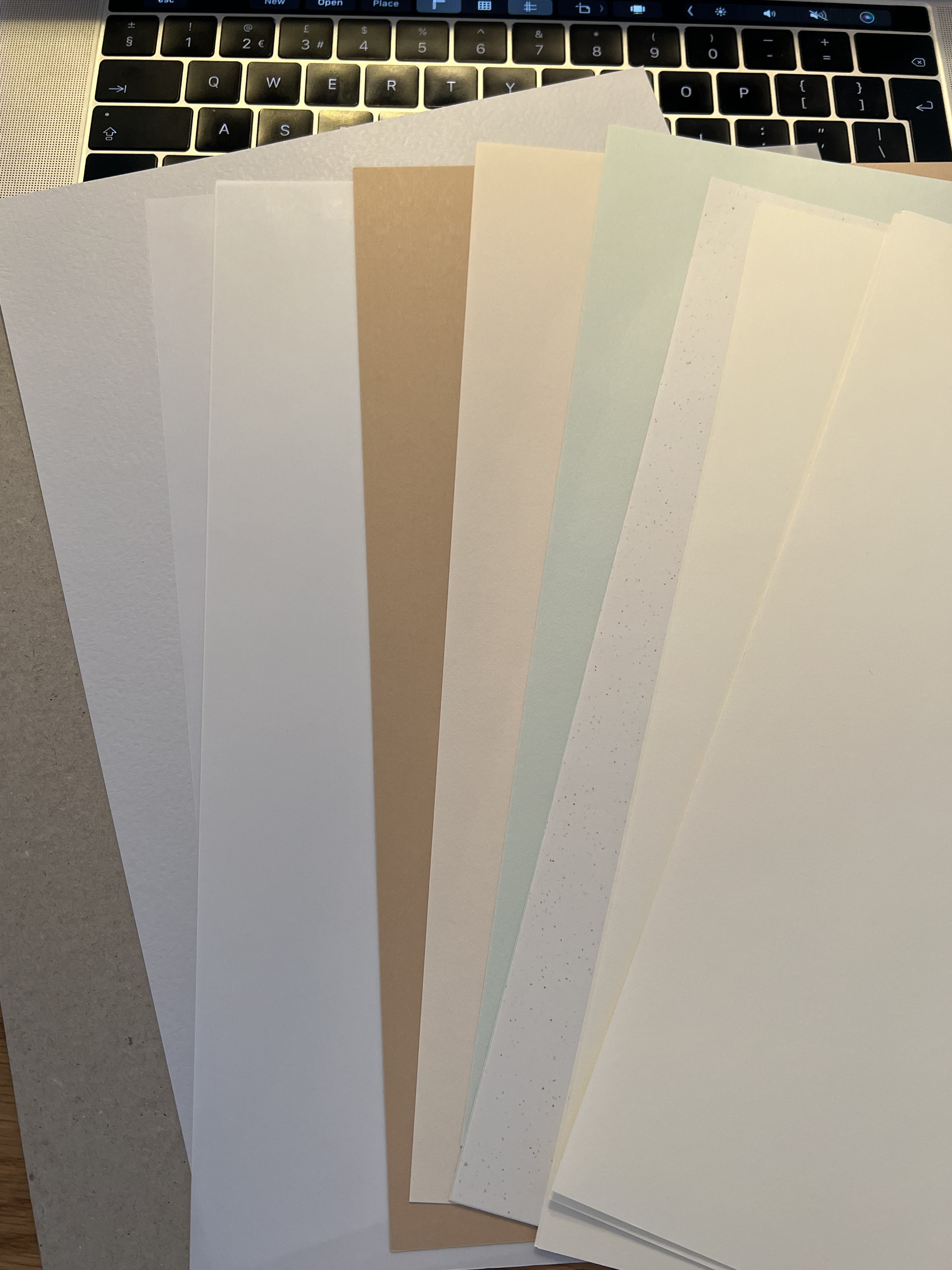
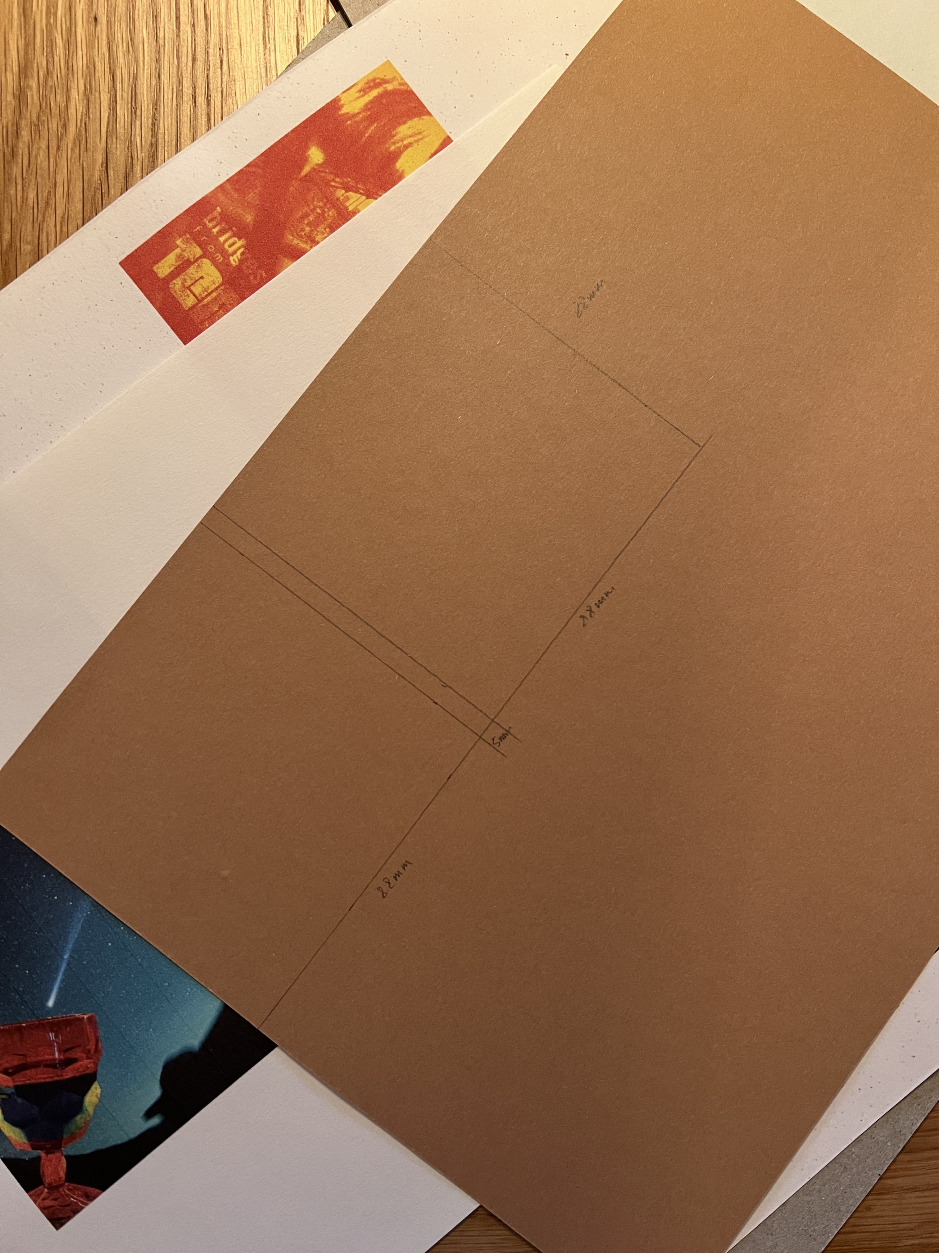
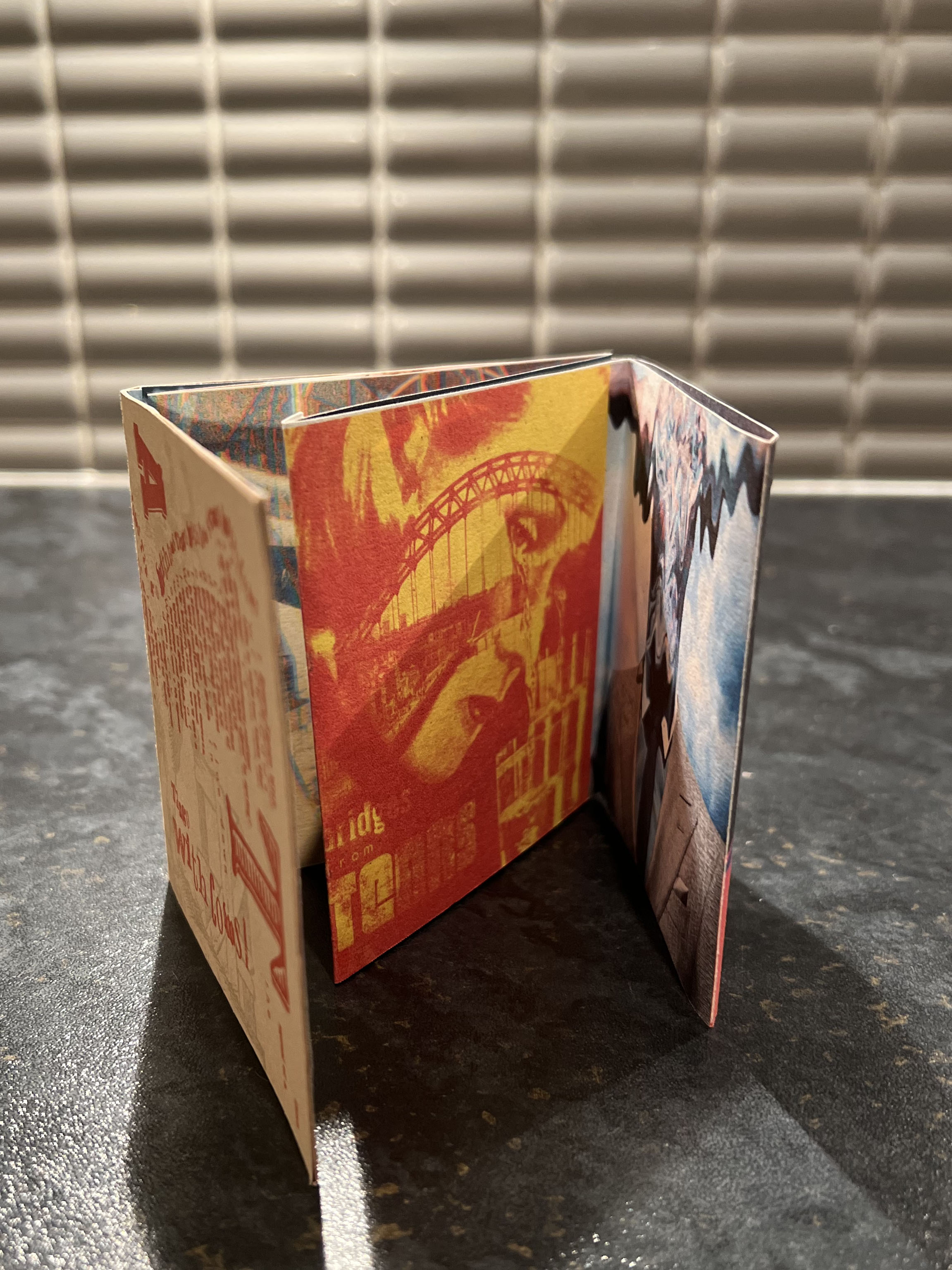
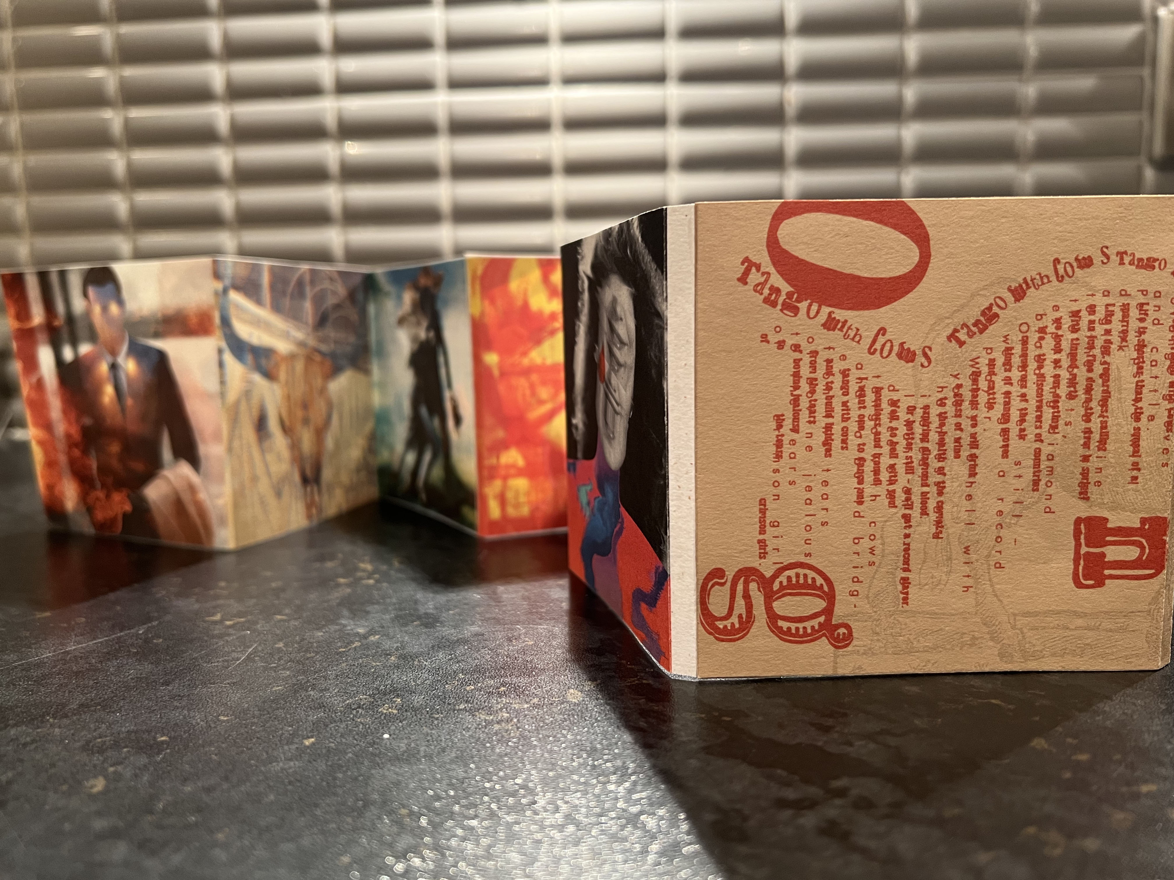
By the time when I finished the last pages, I received by post my pieces of paper from G. F. Smith. I ordered different textures and colours of A4 design papers, which I was going to use at home printing. Firstly, I did a test on the smaller size, as the sequence is quite long I couldn’t do it as big I wanted to, so I ended up instead of 142×142 mm with only an 88×88 mm size brochure. It was smaller than I planned, but the images were still readable, and it was easier for me to stick it around, but for professional printing I would go with the firstly planned size.
Here I selected beautifully textured papers, vellum white, powder green, weizen with some dots in it, mainly 135 gr, so I could print them indoor. When I did those prints I’ve noticed that the quality, hue and saturation of the print changed depending on the colour of the paper. That was a good experiment to learn, as different colours of paper reflect the printing colours in different ways. For the spine of the book, I created a thicker paper template, that to stick into it front and back cover and first few pages. It was a bit of hand-made work for me to print and glue pages together, as I was printing it on my own, I couldn’t create that factory look as I usually have when I use printing companies series, from the other hand this version of hand-made brochure its own charms.
For the final part, I needed to stick and fold the brochure together, which was a challenge as well. I didn’t expect it to be so thick, so even with my 5 mm spine I could barely fit all the pages inside, what I should have done, is to make cover pages from all sides 5 mm bigger too, but that’s for the future. If the print was made somewhere else, like at the printers, I would make sure that marks are ticked, and the brochure made to perfection.
I was so pleased with my little printed version, it turned out smaller than I wanted it to be, however, the resolution of the collage would allow me to make it as big as I want, ideally, I would say 142×142 mm, but this mini version could be good for the pocket and handy to give away. I think the offset paper I used for this brochure gave a nice texture feeling for the images.
Live version
Conclusion
This exercise was genuinely a great experience for me. I must admit it was quite a challenge, and I didn’t know what is the formula that to complete all the parts of the brief, how to make it right, what is the best solution for the style of the brochure. I still think that I could improve it, make the book itself neater, be more coherent in photomontages, do not overcomplicate it, think about varieties of the bookbinding because in theory I just come up with one printed version, where could be much more. Creative book design is quite broad, however, I’m proud of my little work, and I think that was a new learning experience for me. I enjoyed exploring each line of the poetry and thinking about possible designs I could come up with. I believe that particular part teaches us how to be brave in our creativity, be experimental and never give up, even if the task looks quite complex. And I hope that I could achieve a good result in it.
