Create a series of images which will build a narrative sequence over about 16 pages.
Use keywords from the poem as a starting point. Work with images you have created before, developing and changing their contents, or use fresh new ideas and imagery related to the poem. Remind yourself of the creative design process.
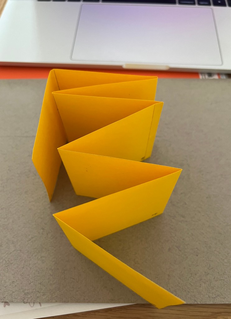
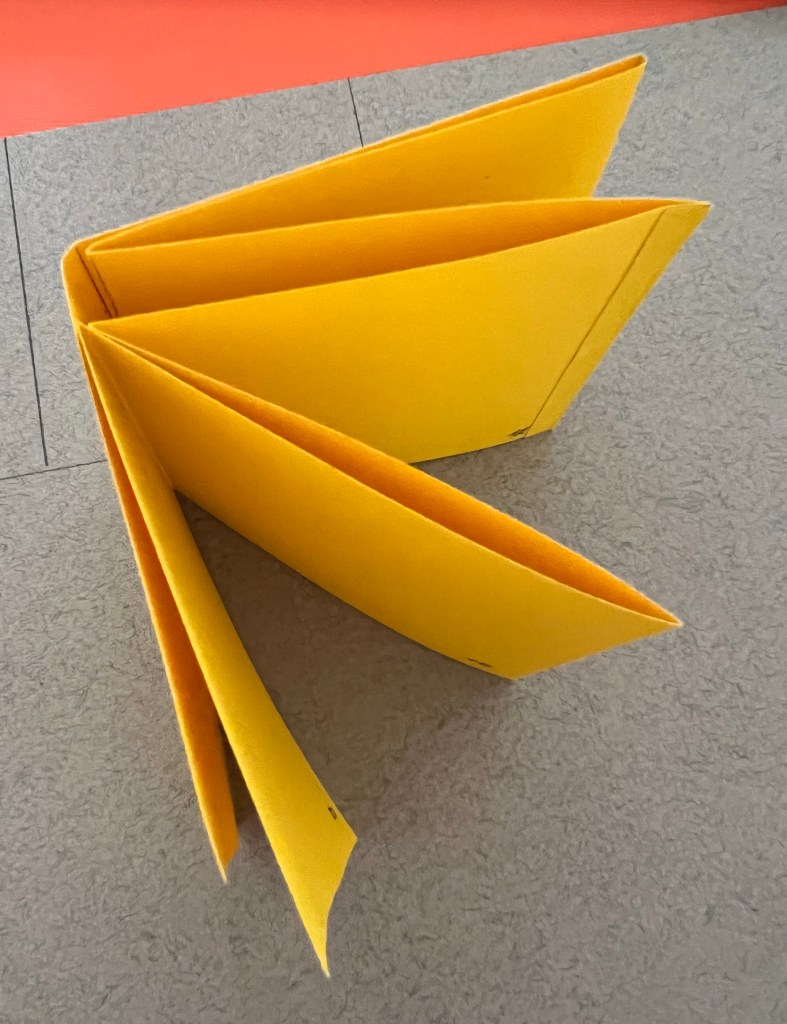
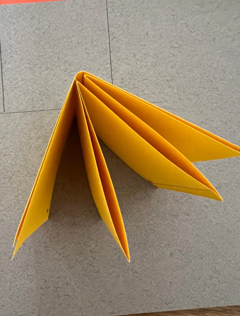
Explore the sequential narrative over the folds. Produce a folding document (2 sided) with the images you have created. Try one of the folding systems discussed in part two of the course, Form and Function: Paper folding.
Introduction
In this exercise, I must follow the Tango with Cows – Vasily Kamensky poem that to create a narrative by using keywords and sentences from it. The purpose of this brief is to interpret important for me images and extend their meaning. I think the whole sense of this fourth part, was to open the borders and explore new approaches in graphic design. I assume my detailed researches from the previous exercise of the meaning of the poem and explaining the story for myself should help me to produce some designs by using collages with cut and paste objects, or using Photoshop Software for juxtaposing. Also, I could potentially use my learning log for creating a sequence of images for the mind map. In this case, I assume, we are free to choose our own path for the final destination, which is the unique narrative visual of concrete poetry. Here I will try to be as experimental as possible, that to join all materials together, such as photography, paintings, drawings, film footage and many others more.
The visual narrative has always been the way of transferring the part of the story. The story may be told using still photography, illustration, or video, and can be enhanced with graphics, music, voice and other audio. There can be two ways of interpretations of the story, in chronological order, for example, how the personality has been transforming with the time, the beginning, middle part, and the end. Or, it could be a less predictable way, of performing abstract images, exploring the ways of printing and writing.
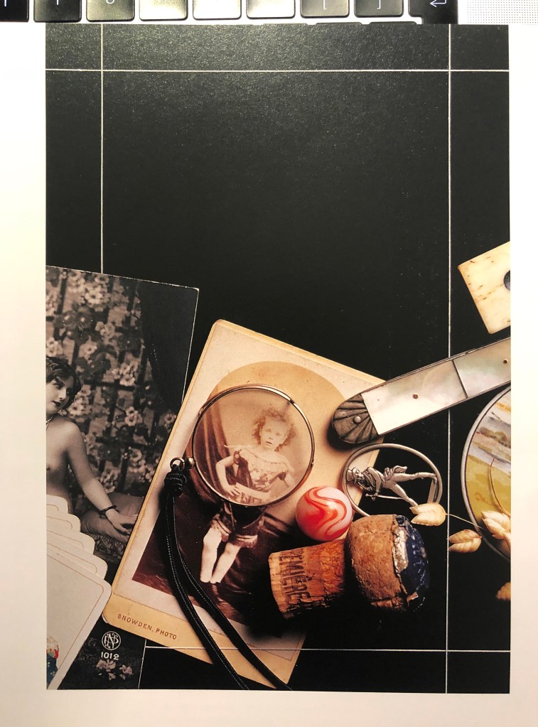
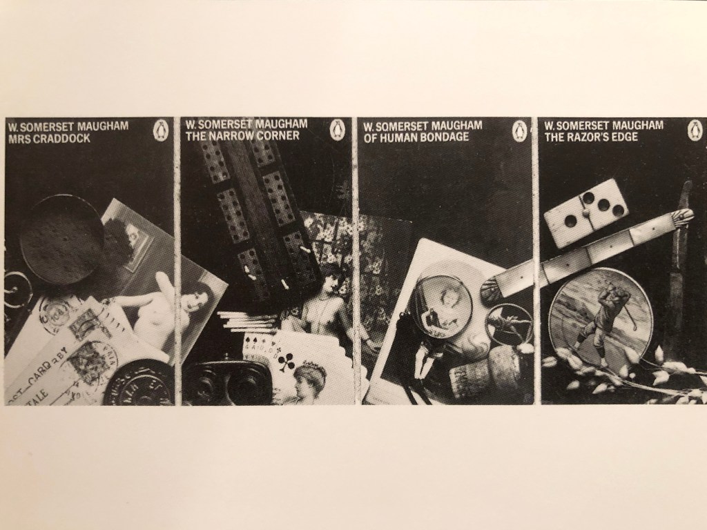
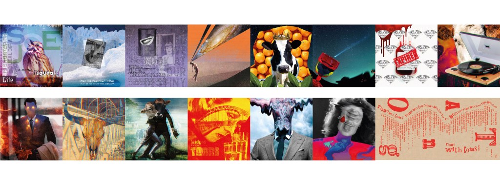
I collected some images from the Notes on Book Design by Derek Birdsall, there are photographs that represent a sequence of images, or in some way tell the narrative story in a logical or abstract way. For example, the first two images of Maugham books tell the narrative in sequence from the book covers. They were shown on the Penguin stand in a particular order as all those book covers have parted from the next book. I liked how those images joined together, they are mysterious and dramatic and tell the brief story of the book from the cover.
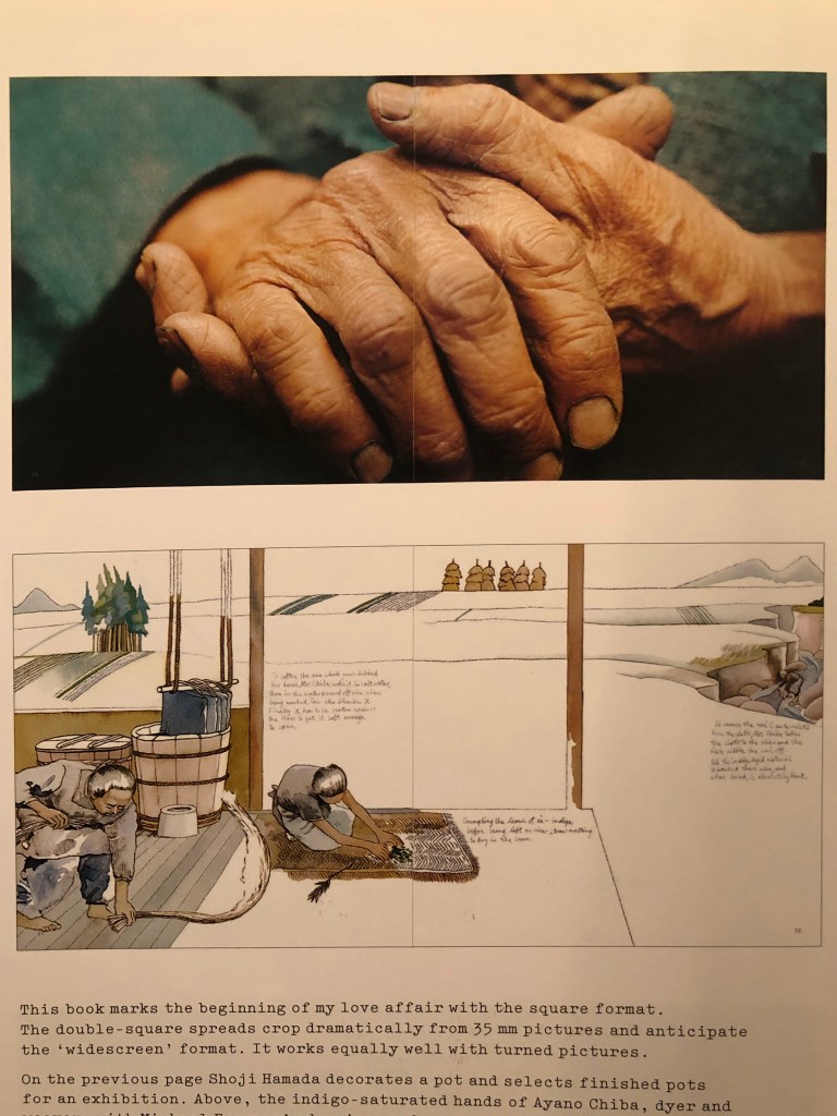
The Living Treasures of Japan, Wildwood House 19873 book shows a unique Japanese distinction for craftsmen and women, and the way how textured paper, photography and illustration are combined together is a prime example that the narrative story can be told visually, without words needed. Also, I attached Francis Bacon book of small portraits with triptychs spreads to have a visual example of experiments in art in sequences.
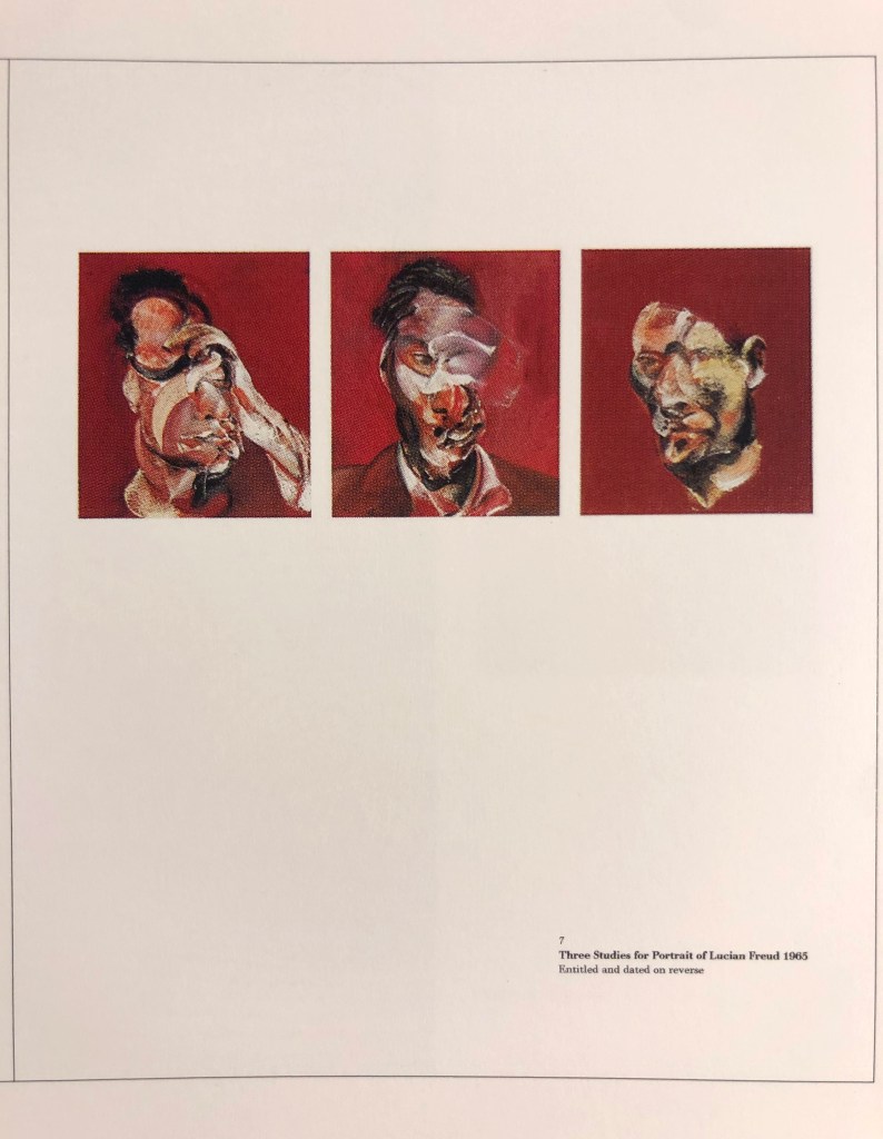
Small Portrait Studies
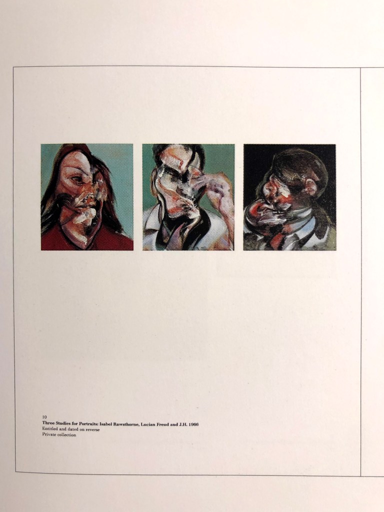
Small Portrait Studies
I paid attention to these gate-folds as they are useful when design deals with exceptionally wide pictures or in our case with the sequence of images. It’s quite unusual to see that extended pages in the big books unless the book is designed in multiple folds in purpose. These are the examples that the story could be told by paintings in triptych, where the reader follows the path from left to the right, and the number of pages can be bigger. That could be a useful idea for my design construction with 16 pages.
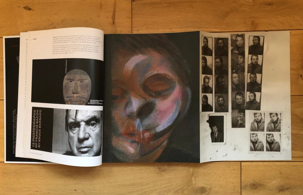
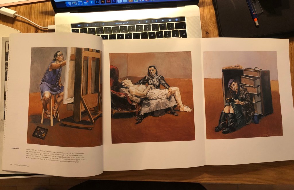
What is remarkable about those sequences collections presented by Derek Birdsall in Notes on Book Design, all books have the narrative in them, whether they are photography art, poster or history books. The story can be placed for the reader through so many sources, like in the case of art visually in the illustrations, designs and paintings.
Analysing the brief
Below I did some conclusive notes about the narrative and its variations. In the case of Tango and Cows, it sounds like a fictional narrative, as it describes an imaginary world, mainly just abstractive thoughts, filled with emotions and drama. I identified the keywords that should be presented in my sequence. I was going to highlight the keywords from the narrative and use them for designing idea around it, I wanted the design to evolve around each quote. Those sentences from the poetry sounded like a loud speech from an opinionated poetriest, and designs should be confident and inspirational. Also, I planned to use photos and collages but justify and arrange them in such a way, that the final image would be read through the philosophy, dark mood and mystery. I thought that my previous experiences working with fanzines, collages and juxtaposition will be a great starting point, and they will help me to reflect new meanings in these poetry lines.
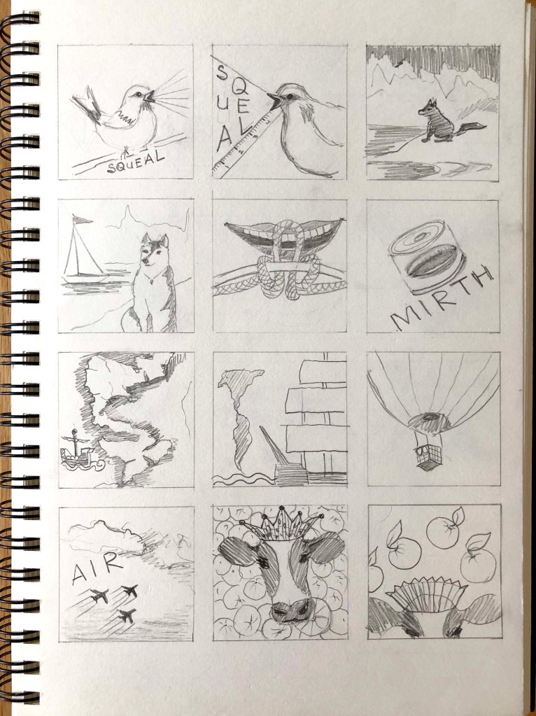
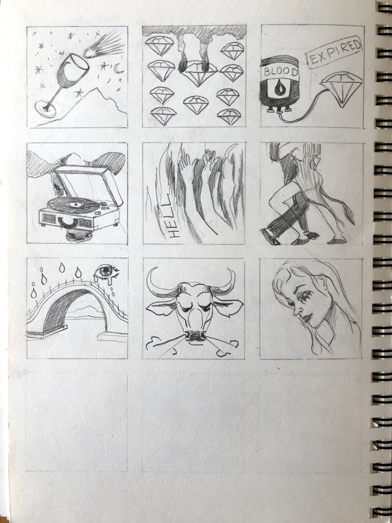
After I specified the leading points of the narrative, I proceeded to do sketches. For the front and back cover, or the first and last page of the booklet, I was going to use the adjusted design from the previous exercise of concrete poetry. As the design was going to be square, I need to amend the template slightly to match the size. The rest images I sketched straight away in the square format, which helped me to see approximate proportions and images arrangements in the sequence. Those sketches were a very helpful starting point for designs, as from the beginning I was overwhelmed with the amount of information I need to process and arrange fourteen visuals in one solid piece. For example, the first line is associated with the sparrow with an open mouth (alert, call of nature), the second image is a dog on the ice floe, someone lost and helpless. Tinned mirth from the original text had as well knot, but I was going to use a smile like a Cheshire cat but on the can. For the discoveries of new worlds, I was going to use the map or something like Columb first discovery of America. But later I changed that idea into discoveries of the Universe, as that is predominantly what are scientists concentrating on in XXI century). And so on, I think most of the sketches are self-explanatory. I split up the poem roughly into 14 lines and quotes and organised them according to the order. On the sketches, my images looked quite cartoony, but I knew what Photoshop tools I will be using to make them look artistic. I was going to apply some technics that to mark the design in a distinct manner.
For some inspiration in designs and laying out the images, I went through the book Pioneers of Modern Graphic Design: A Complete History by Jeremy Aynsley. I was keen on the experimental designs that emerged out from social questions and modern culture. The main feature was the simplicity and clearness of graphic design, but at the same time mysterious energy that dadaist and futurist artworks were filled with back in that time. As I mentioned before, my main points for designs were collages (cutting and pasting objects, work with different textures, filters), juxtaposition (merging some extraordinaire images together, merging the scenes, like space and cows) and fanzine style (brave and provocative).
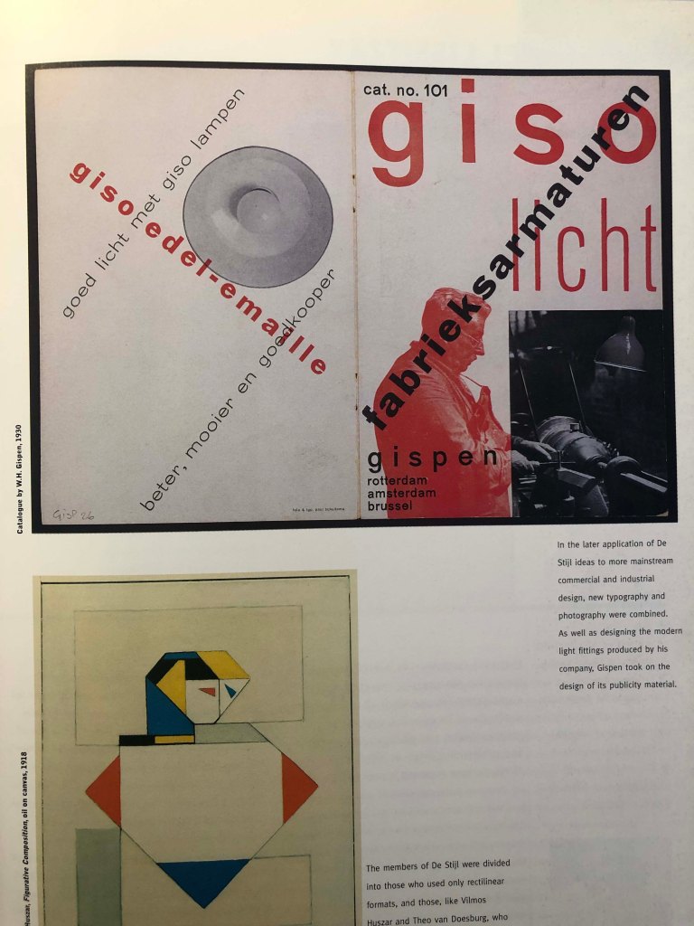
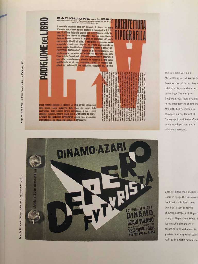
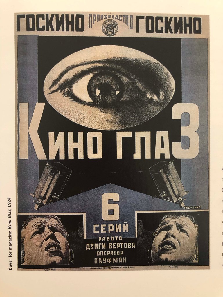
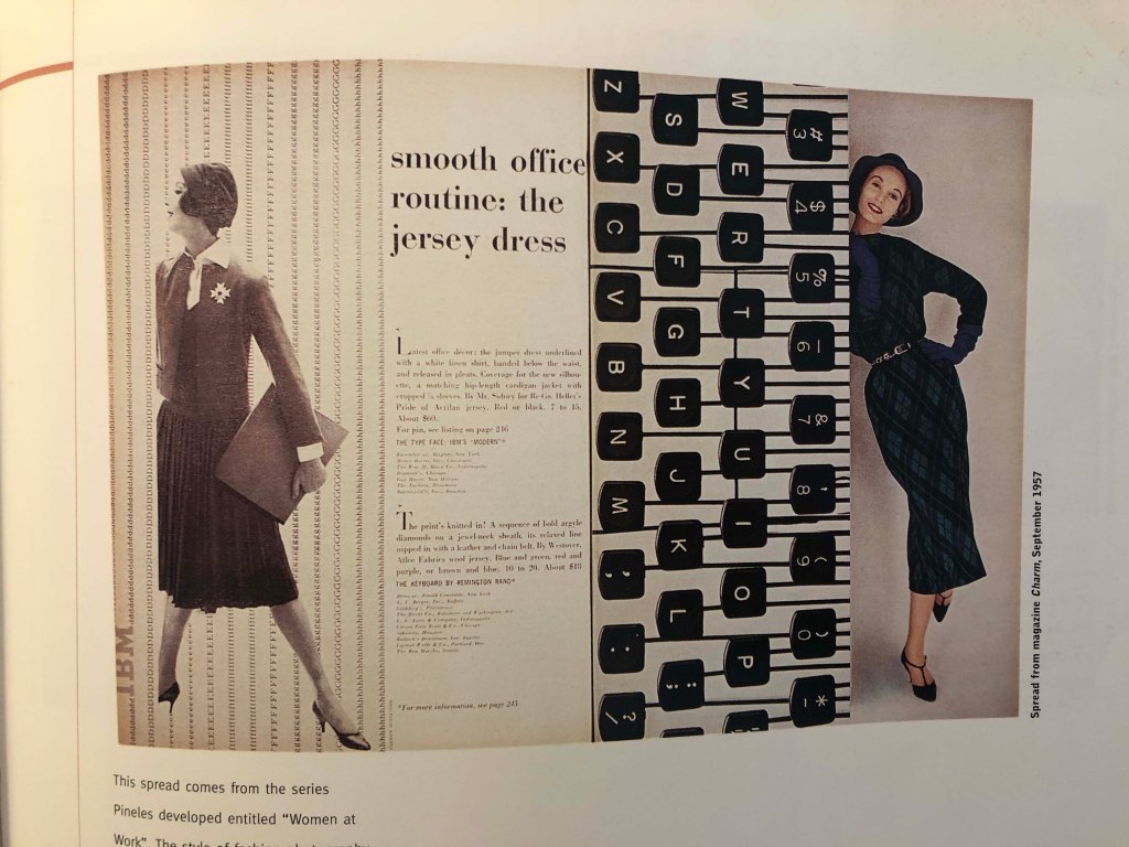
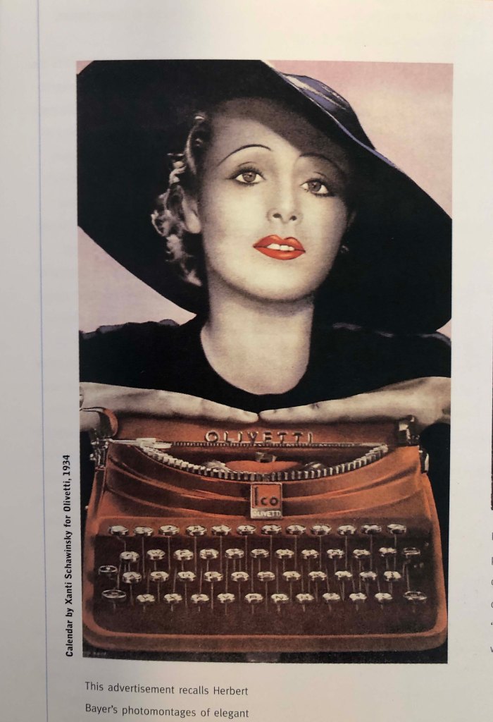
Below are collective examples of early movement from Italian Futurism, De Stijl, which was a Dutch avant-garde movement based around the same name magazine. The first few movements by looking at it were based on geometric patterns. Also, I was thinking I can borrow some ideas from Alexander Rodchenko’s works, which stands out for their vigour and dynamism. The rest collages are quite abstract. I loved the transparent filters on them, text that goes over the top, some liquify effects and colour variations on the layers. The fourth and fifth advertisement recalls photomontages of elegant women, designs are quite simplistic and clear, but with some grace in them. I’ve noticed that retro images give some mystery and oddness to the collages and create a special mood. Also, for my designs I was going to adapt free-style graphics, a combination of visual eclecticism and technical experiments, that was characteristical for pop, subversion and alternative culture.
Folding
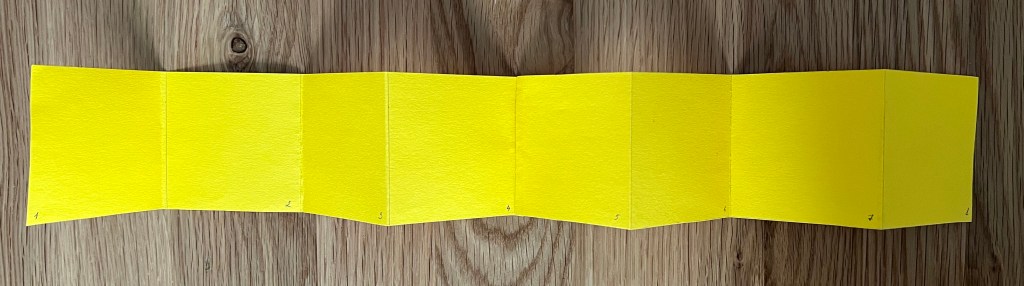
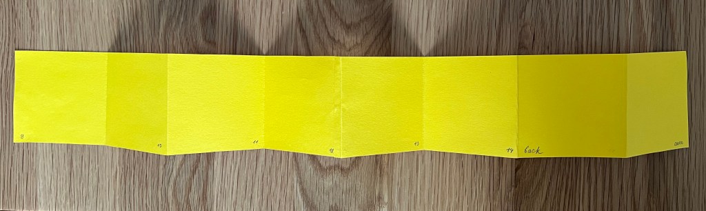
I was thinking about the brochure fold from the start. There is various type of fold available for the brochure which includes tri-fold, z-fold, half-fold, parallel fold & more. As that is a sequence that consists of 16 pages including the front and back cover, I was going for the accordion-type of folding, with the idea that all pages will fold inside of the two pieces of paper, so in the result, the design will have a front and back cover and all pages hidden inside. Mocking the template helped me to see pages organisation. I planned to try a few options for printing, as I have only an A4 format printer, I would have to stick some of the pages together, for the cover I was going to try a few options, use a cupboard, so the brochure will have a hardcover, and use just textured pieces of paper, I collected specially for this exercise.
Designs
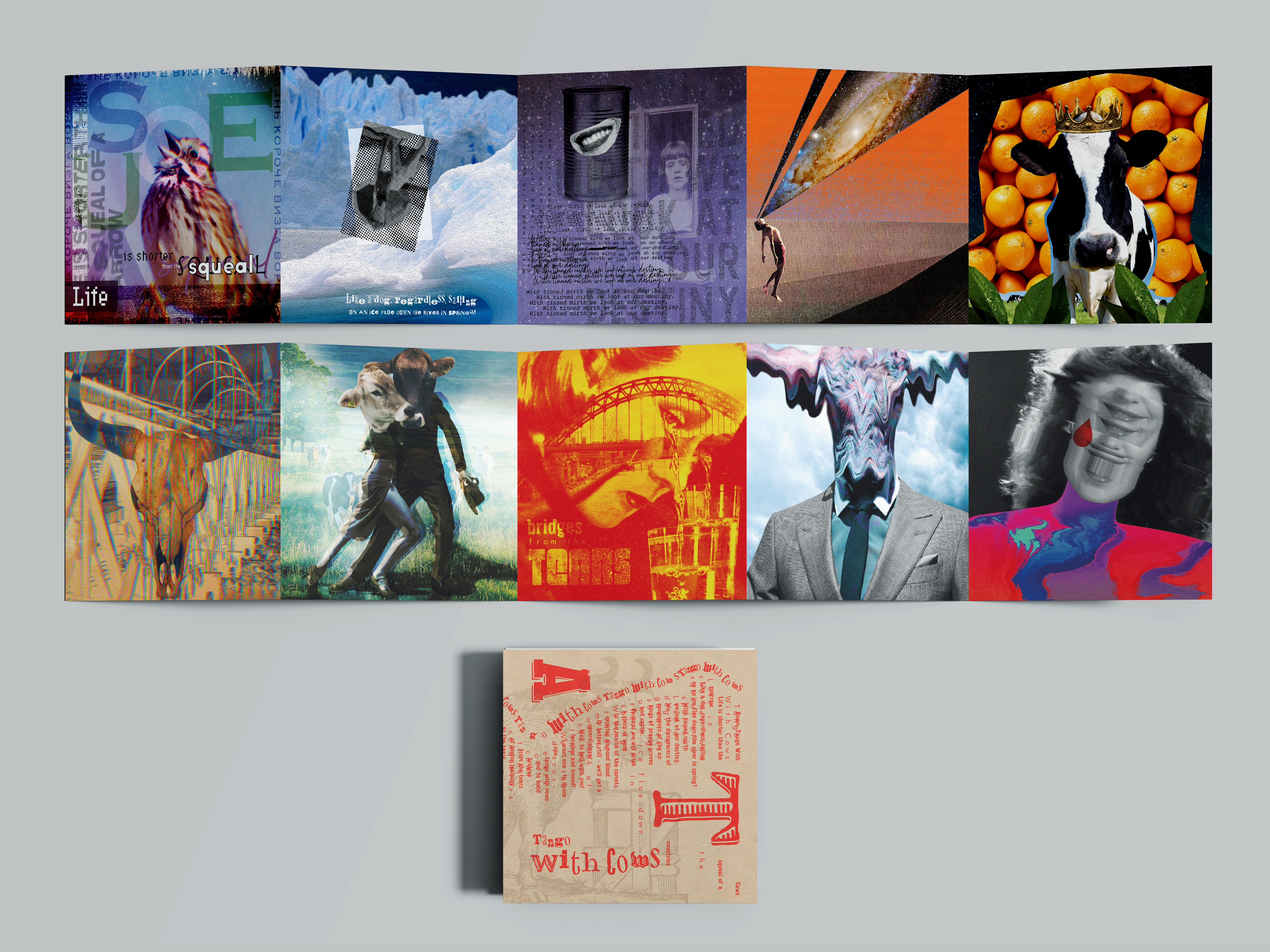
After the long process of searching and analysing major aspects of this exercise, I proceeded to the actual designs. I think my aim was not just to make designs, but create a concept from them, where I could combine all my experiences from the earlier exercises. Because the task was quite complex, it has concrete poetry, collage, fanzine, juztoposition, dadaist and modernsit culture influence, all of that created a great task, that I was going to complete. I made sure that I covered all points of the brief. I created a quick scheme in Adobe Illustrator that was based on 16 pages, and later I was going to fill it with images, following the narrative of the poem.
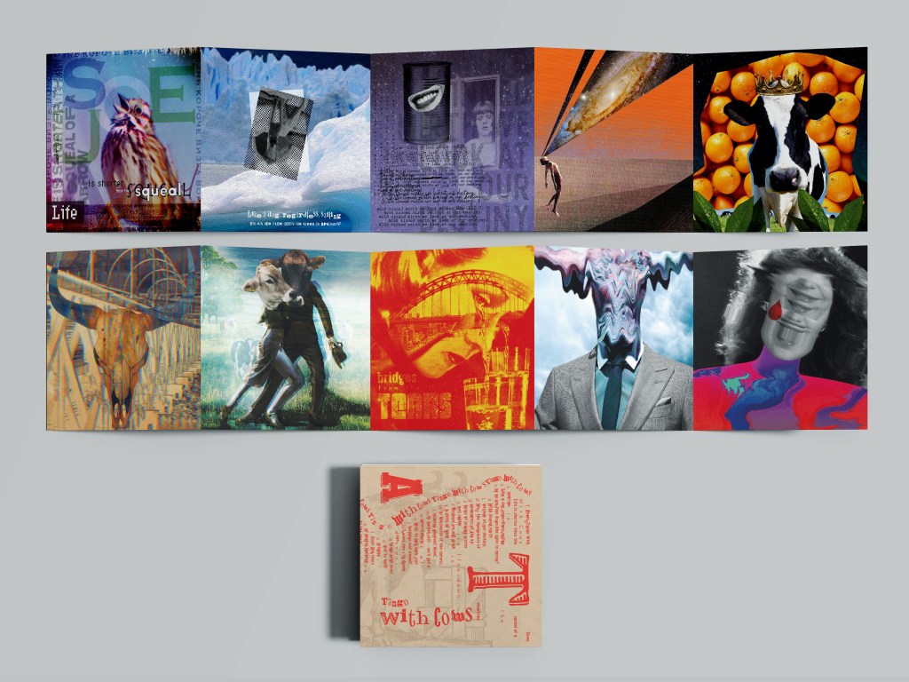
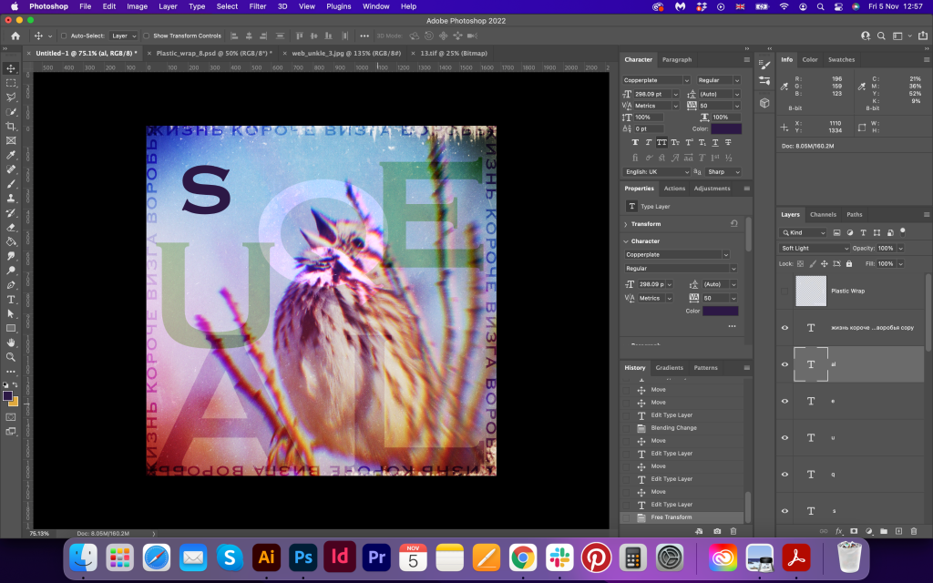
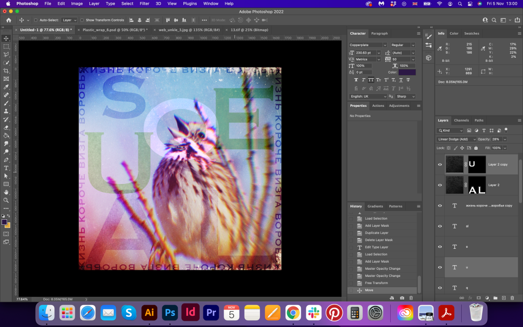
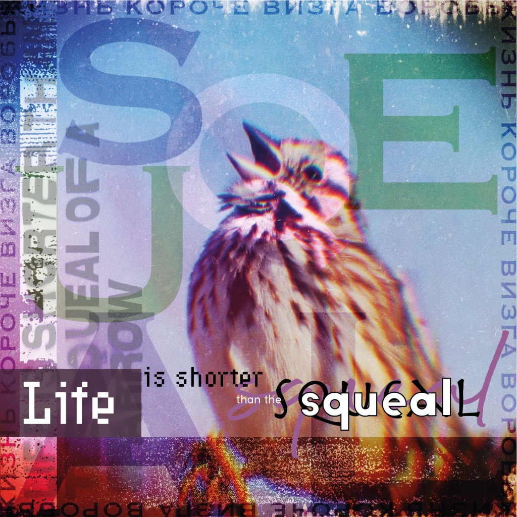
Life is shorter than the squeal of a sparrow.
For the first line, I went for the self-explanatory image of the sparrow with the open beak. That is really what is the first coming into the head when you think about it. I found an interesting filter in Adobe Photoshop, which creates an effect of an old lens with some distortion in it and bend the image from the centre. After that, I filled the layer with some grunge and sand-like effects on the top, and around organised text in Russian and used some fonts variation in it. My inspiration for this image was David Carlson; he used various layers and odd texts in his works. As the poem is very quirky and abstract, I tried my best for the first image to make it look less ordinary. That first image gave me a boost for the rest of the designs, I loved how colourful the image looked, I wanted to keep that trend, but at the same time, I needed more filters and distortion for my images. I kept it as a good starting point and proceeded to the rest.
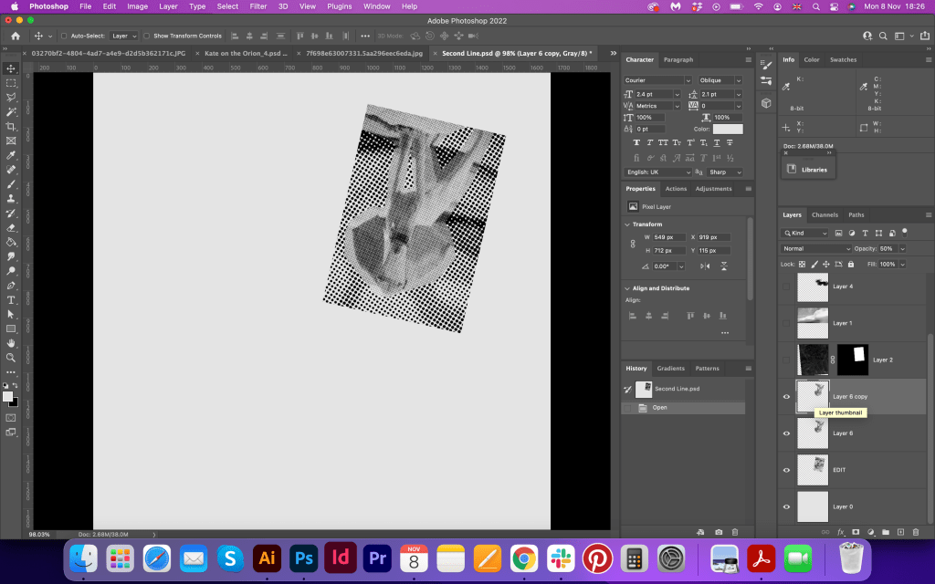
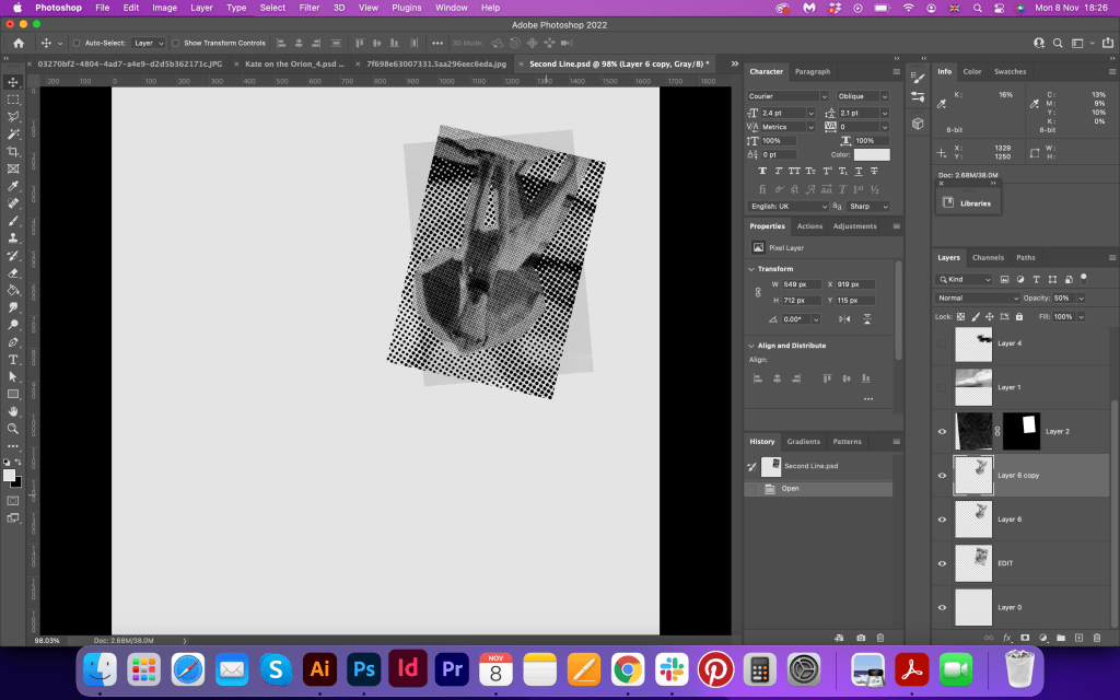
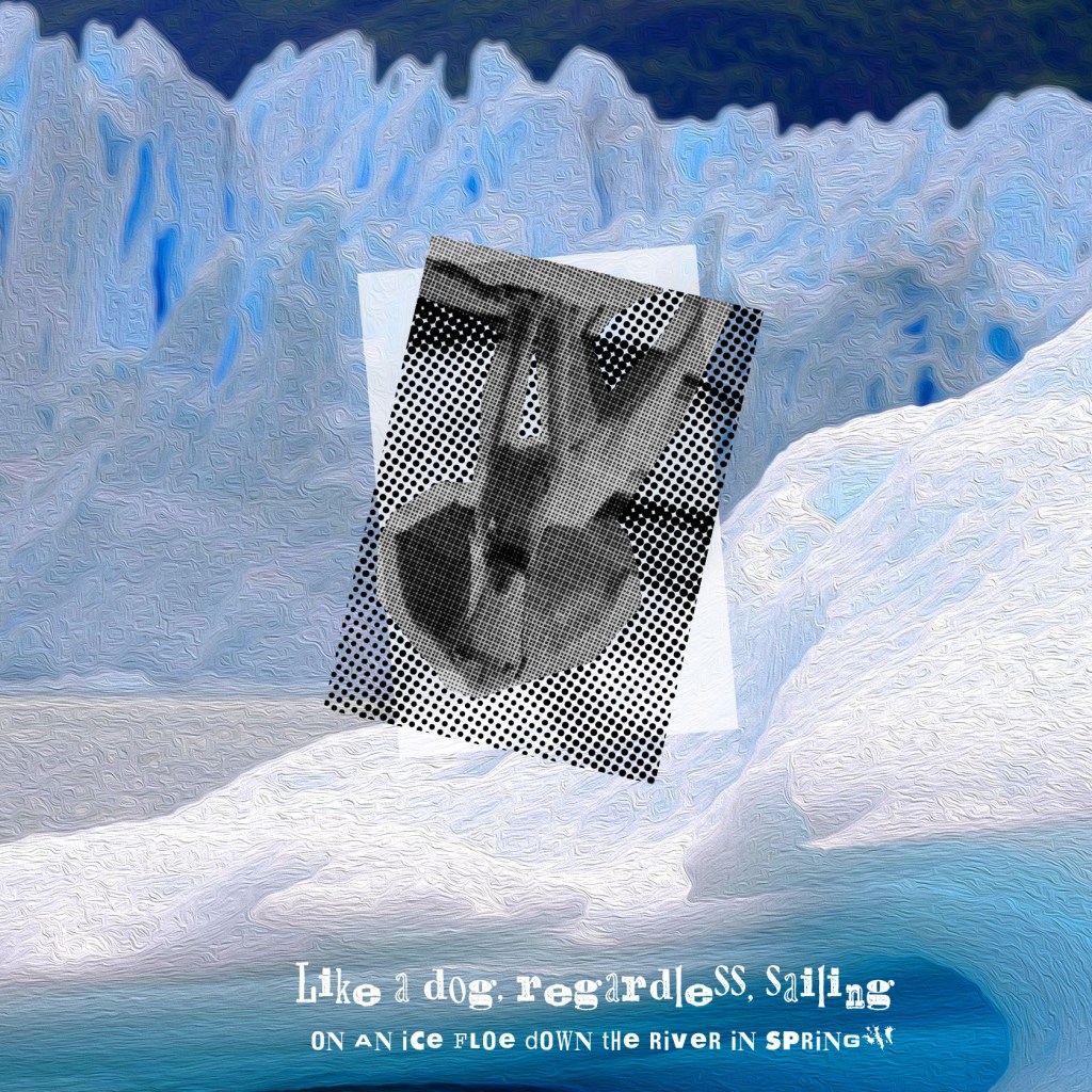
Like a dog, regardless, sailing
on an ice floe down the river in spring?
That was an interesting one, as I did two variations in it. I wanted to use more fonts and white background here, and have alternating sets in the brochure, like one image full coloured, another one on the white background, but later I lose that idea and had to go back to the design that to make a colourful image, as grey one with that bulky text didn’t work with the rest of the brochure. I kept the dog upside down, and used some dots filter on it, for the background I used an oil painting filter with the dynamic image of the ice and water. Also, colourwise the image was close to the sparrow one, and it had something artisticabout it, so I was fine with it. For the wording in the bottom I used AltaCalifornia type, which looked quite well in this page.

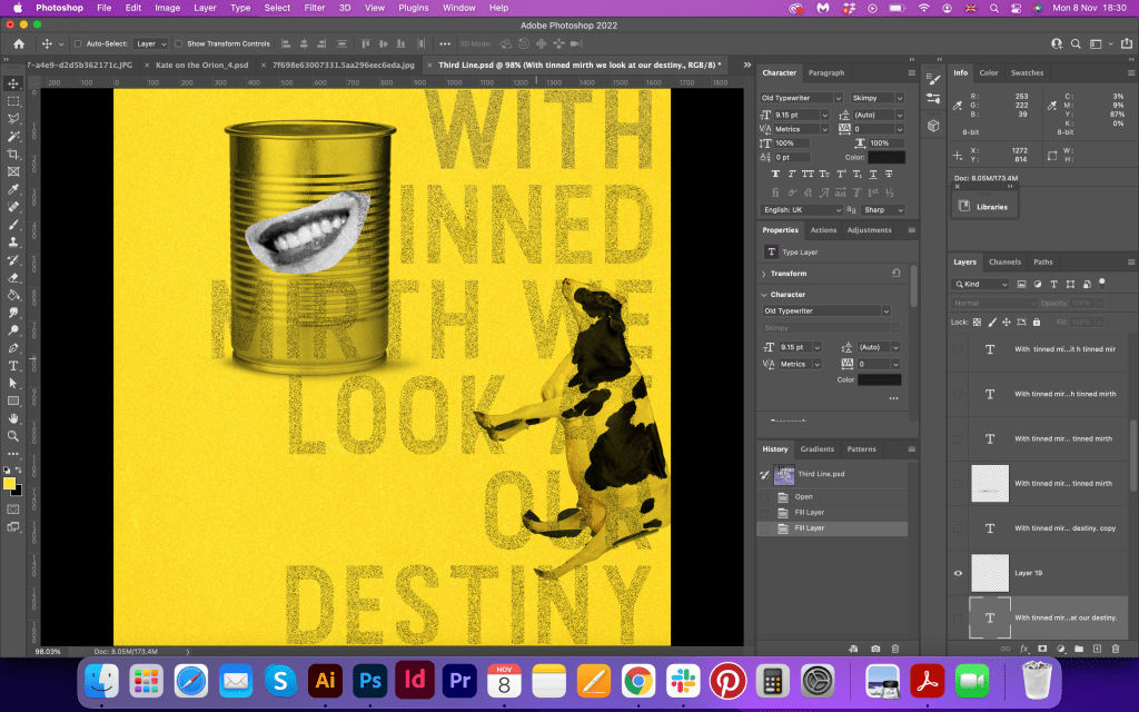
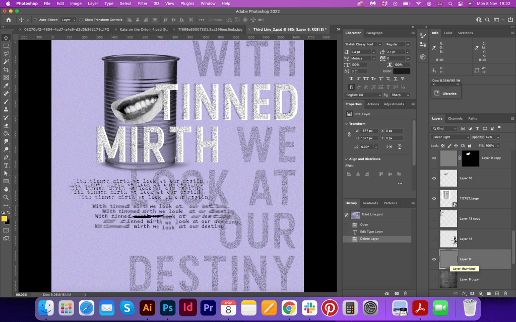
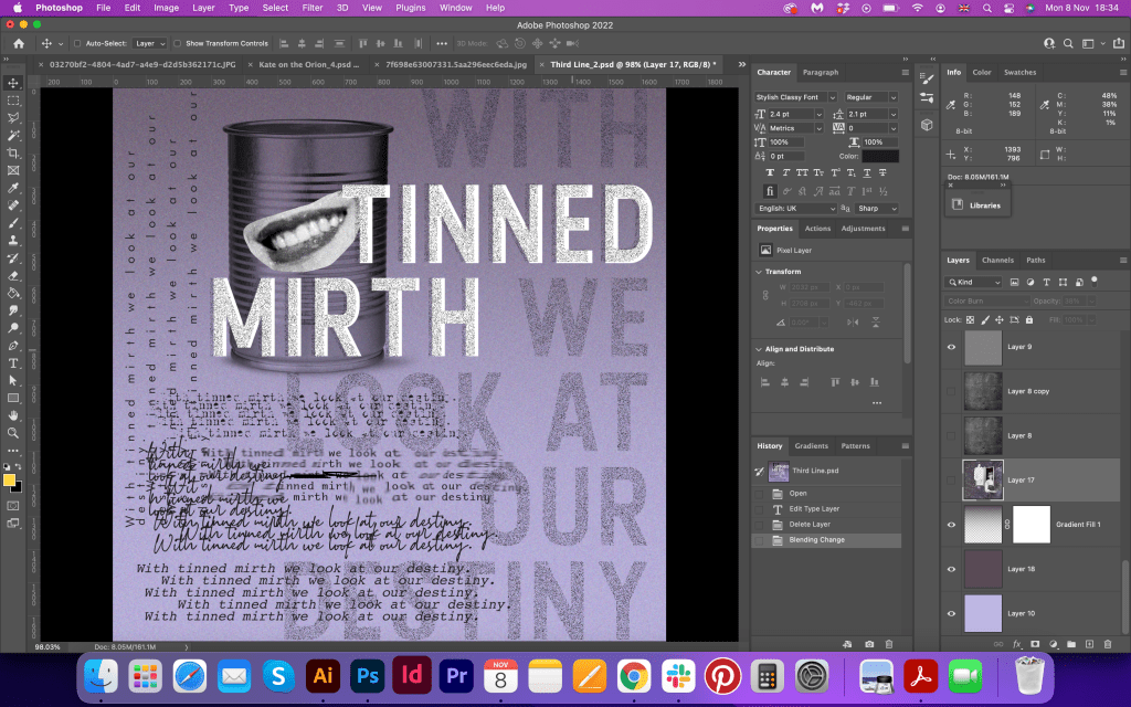
With tinned mirth
we look at our destiny.
Here I was going to experiment with the colour and make the page yellow, but later the concept of the Universe and star sky came into my head, so I started to implement it into the rest designs as well. Here was the first one that turned out quite well. I was coming from the later line about the health of the comets and I wanted it to appear through the theme of the brochure, and I think this extra layer into idea generation helped me to keep the dreamy mood and add a special signature into design. I added the woman’s smile from the retro picture, placed it on the top of the tin can, and next to it I placed the girl that looked like into the distance. Around I added lots of text in different typography, which is coming from the concrete poetry. I think that was my favourite so far, as it had hypnotised energy, the design had some depth and multiple layers, but the colours were still vibrant and appealing.

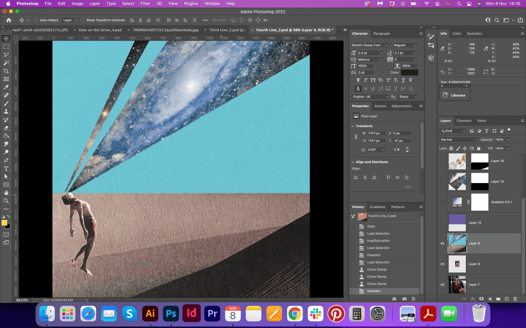
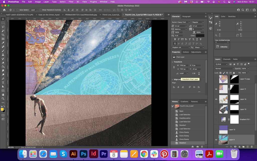
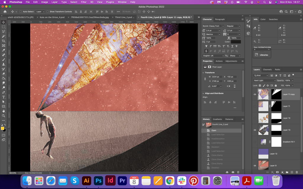
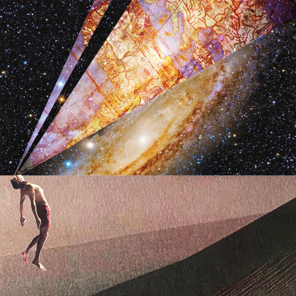
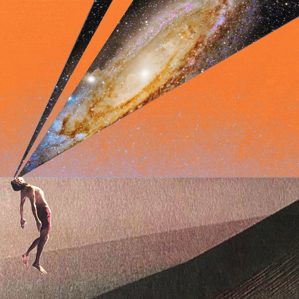
We – the discoverers of countries
conquerors of the air
In this design, I went a bit far from the original idea in my sketches. As I mentioned before, I was going to implement the sky theme here, so I thought why not try to show the man who discovers the Universe, which in my understanding helps to open a vision for the individuals too, we are conquerors of the space in some way. I tried different colour variations, but in the end left the image without text, as I thought the brochure could be overloaded with typography, so I went for the option less is better and left the image clean and with more free space around.


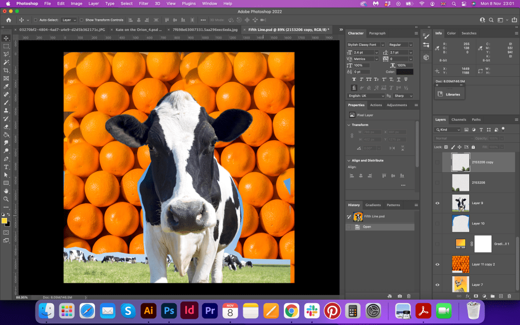
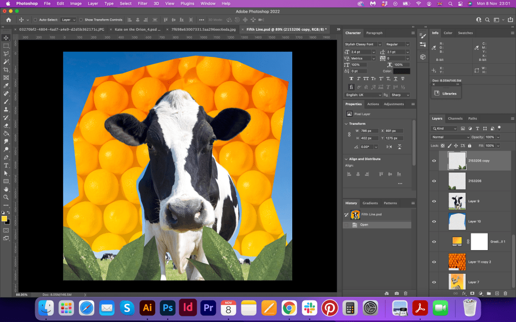
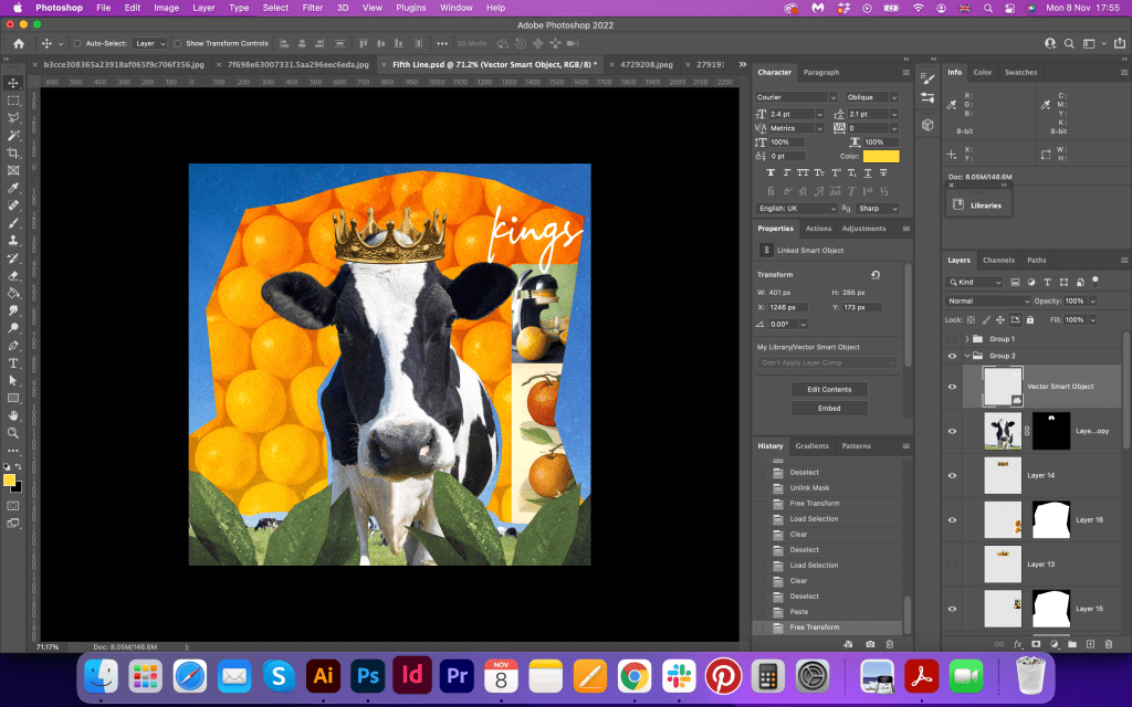
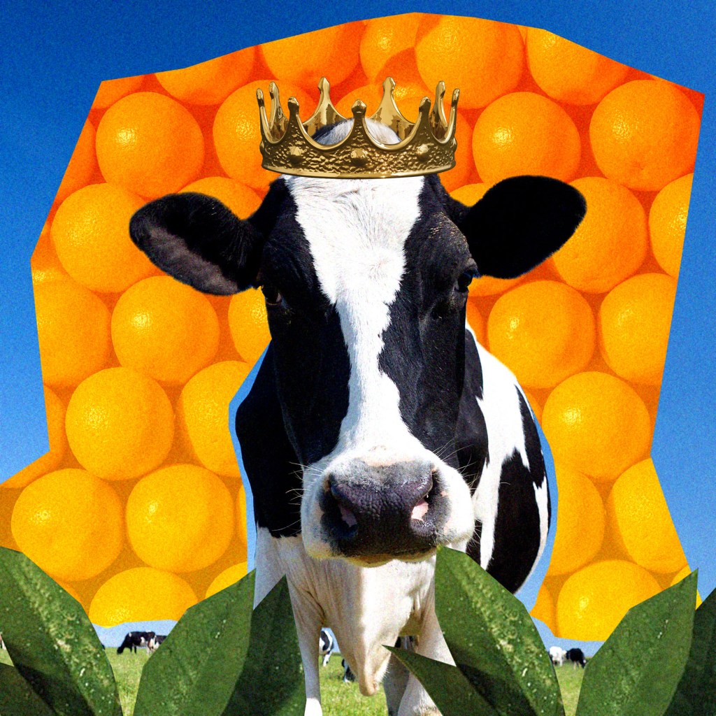
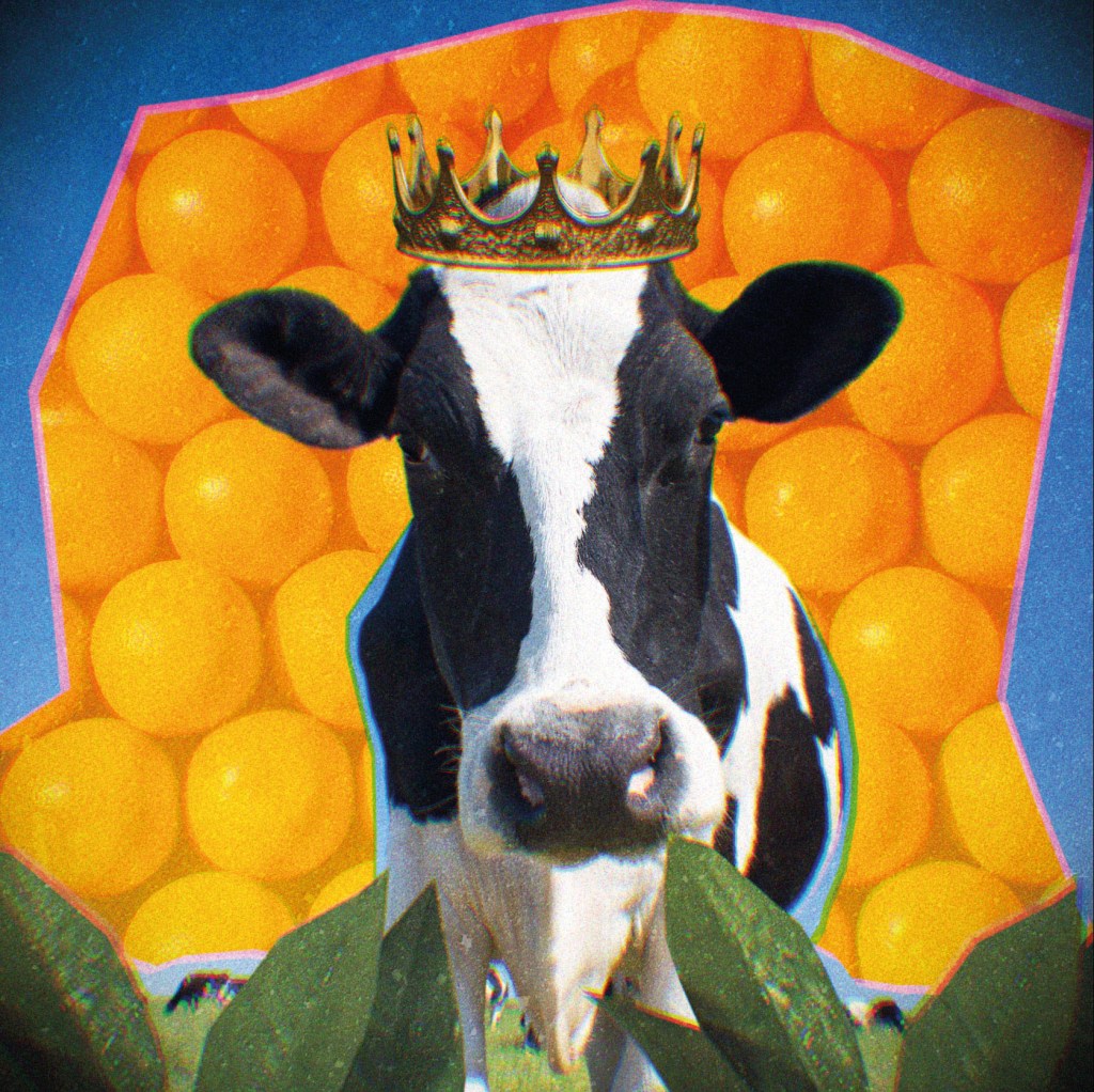
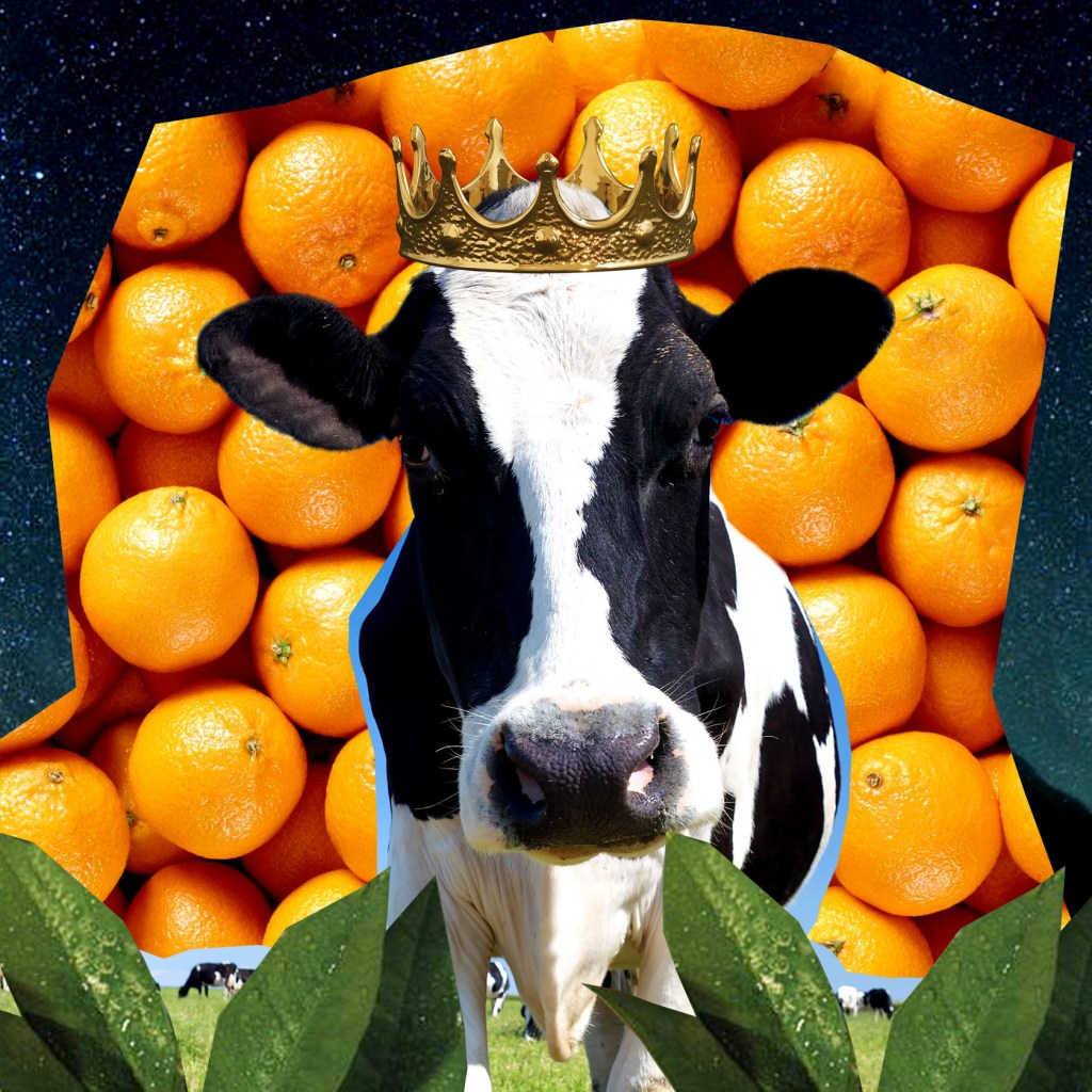
kings of orange groves
and cattle.
In this collage, I was going to use similar technics as in the first image, lense effect and colourful background but for some reason, it didn’t work in the way I planned. The blue colour and orange with filter were too bright and didn’t interact with the rest of the brochure I wanted it to. I added night sky in it, which helped to see the coherence with the rest of the images, changed oranges for the background with more natural ones. I thought that the visual of a cow in the crown is quite a comedian and funny, also being surrounded by oranges and citruses tree leaves is quite surreal in real life. Later the cow will appear more in my collages, as the key figure of the poem.
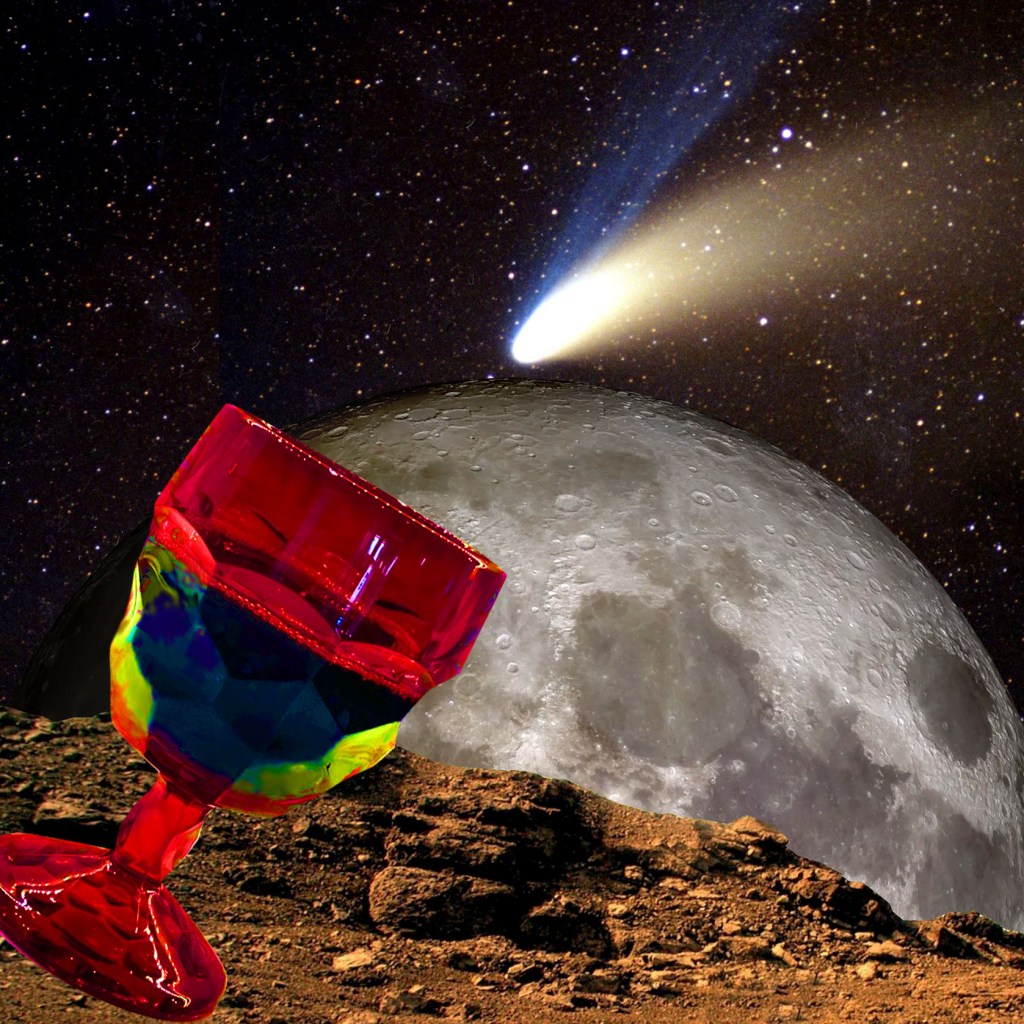
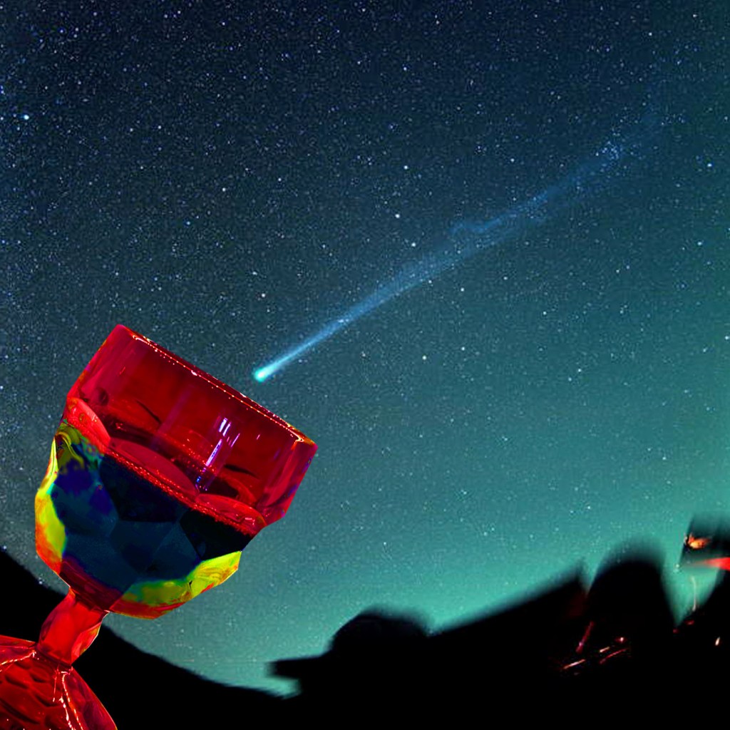
Perhaps we will drink
a glass of wine
to the health of the comets,
At this point, I realised that I have so many pages to work ahead, and I should not forget that all images should have coherence in them. It’s easy to get carried away and have different styles in one brochure when there are so many ideas and experiments that can be implemented into the design. I wanted to have one united piece of art with some variations in them, but at the same time be the whole. That was one of that cases when I had to go back to the image and redesign it, as the idea with the moon and piece of Mars planet was not too appealing compared to the rest of the images. So I decided to share the background with the sky image from the orange groves line. The picture of glass was from my mum’s sideboard, and that is the first visual that comes to mind when I think about rising the glass for the comets. That collage is probably one of the simplest I made here, but I was pleased with how well it worked with the previous image and similar colours palette with the rest designs.
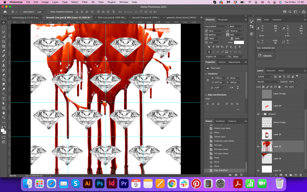
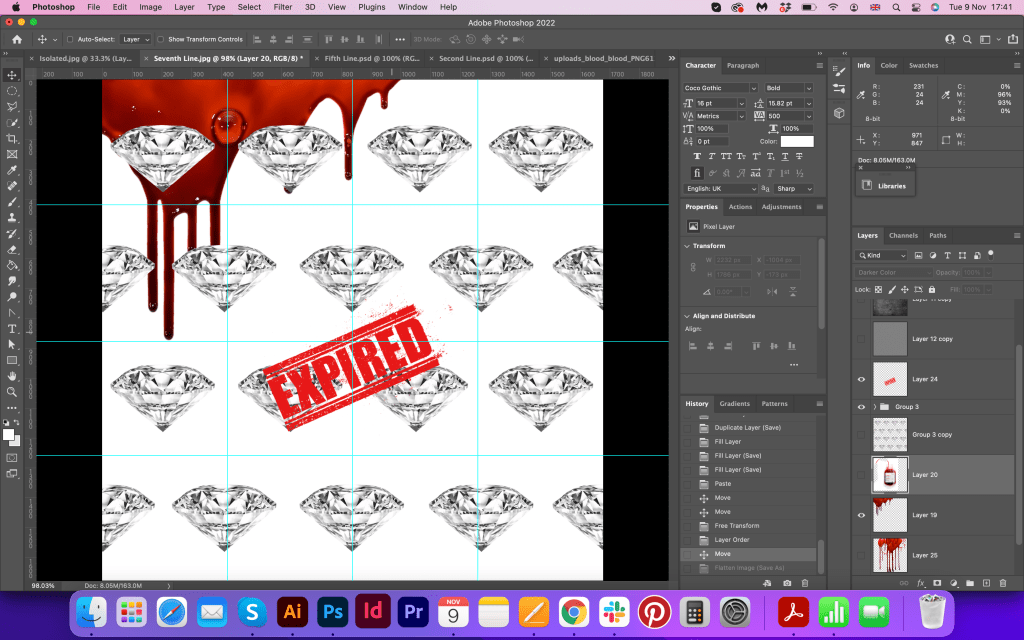
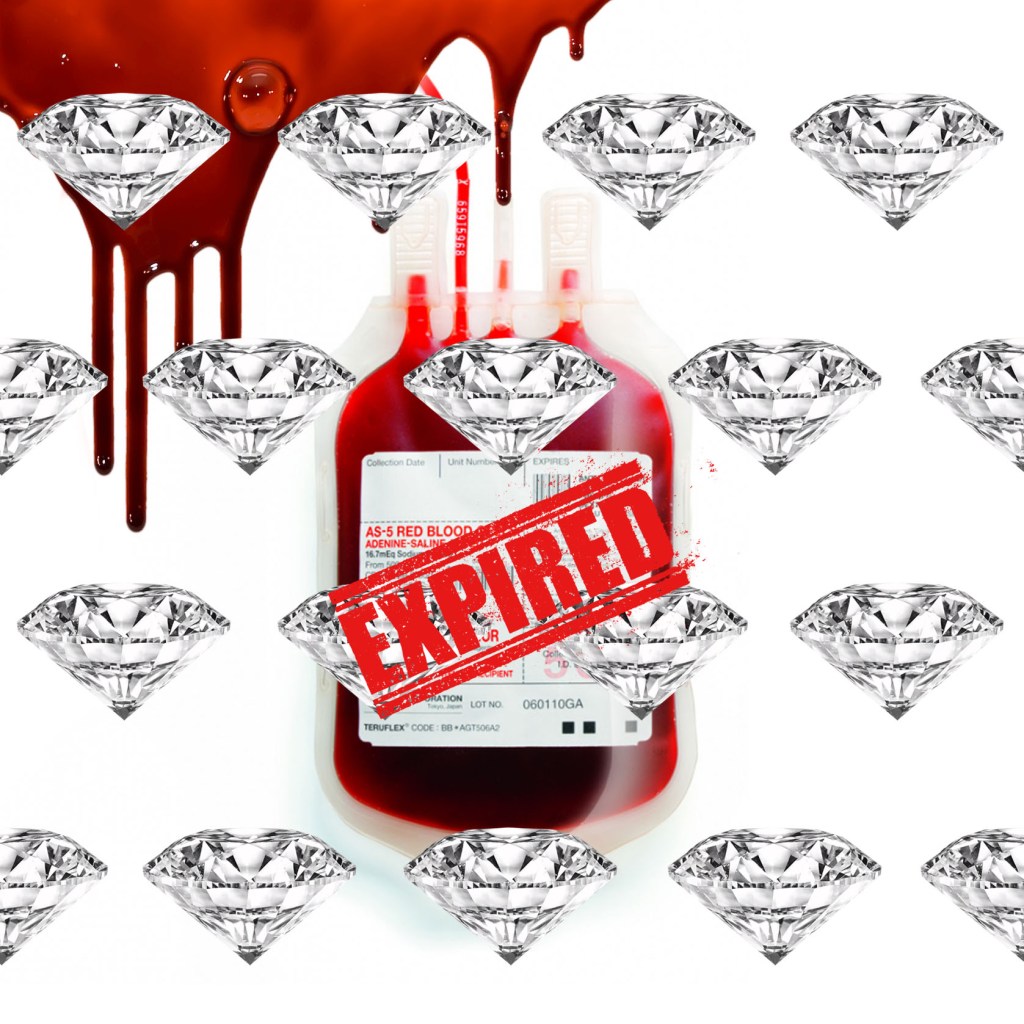
expiring diamond blood.
Actually, this one was quite straightforward. As I had that visualisation in my sketches, I’ve literally could transfer it into the Photoshop layout. I didn’t overload it with filters and transparencies, but the blood added some creepiness to the image, and crimson colours worked well with the red glass from the previous page.
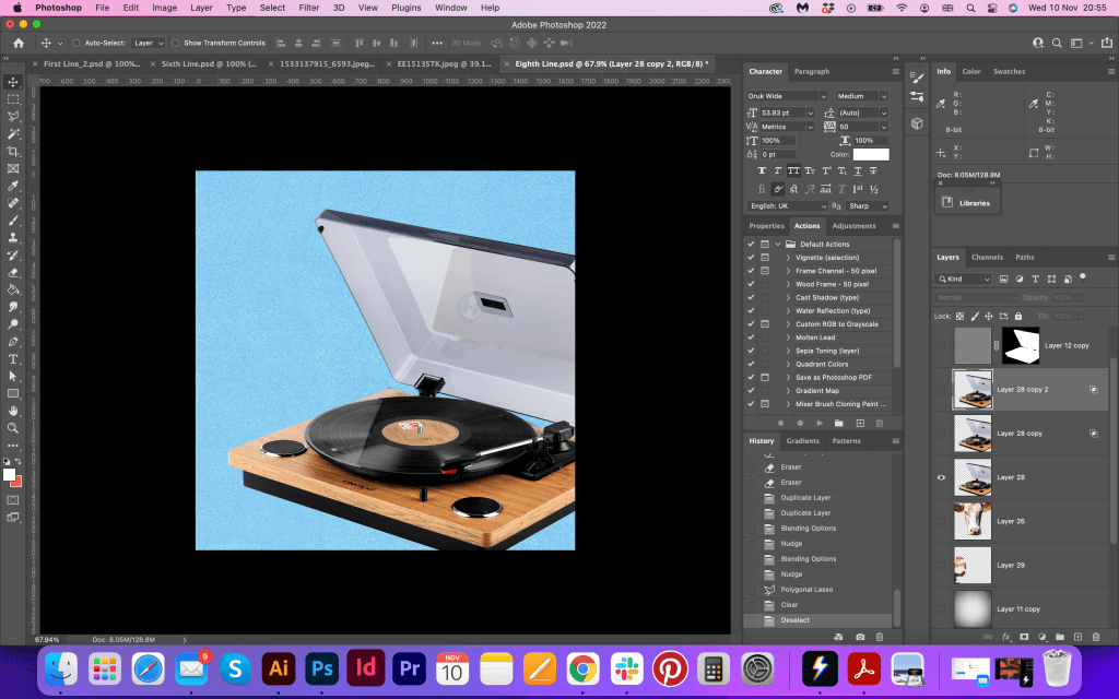
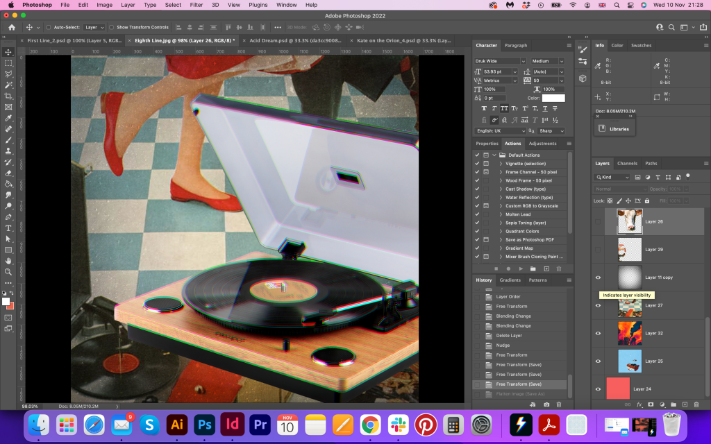
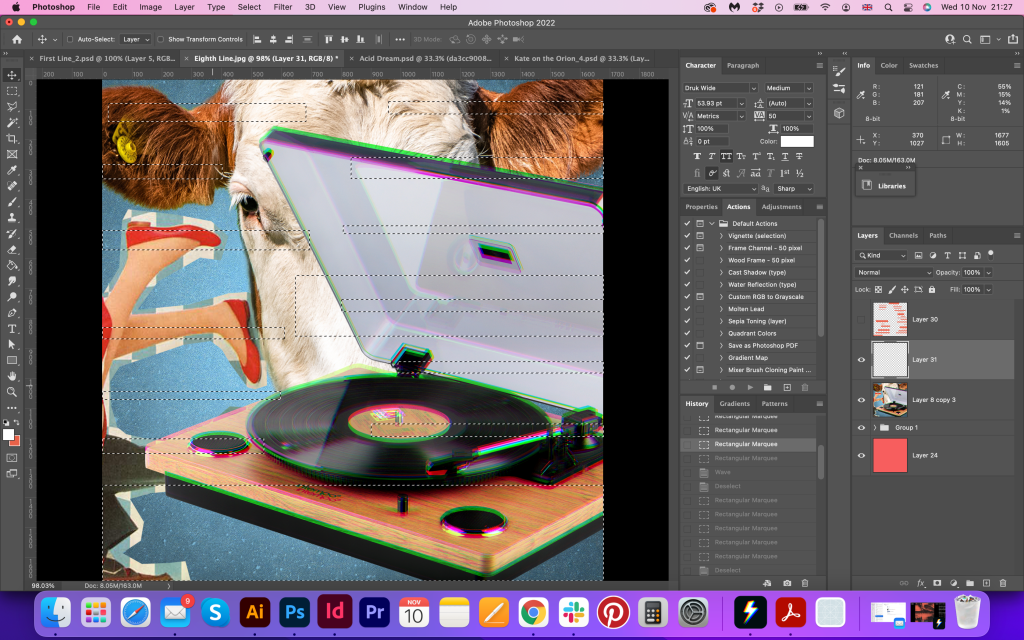
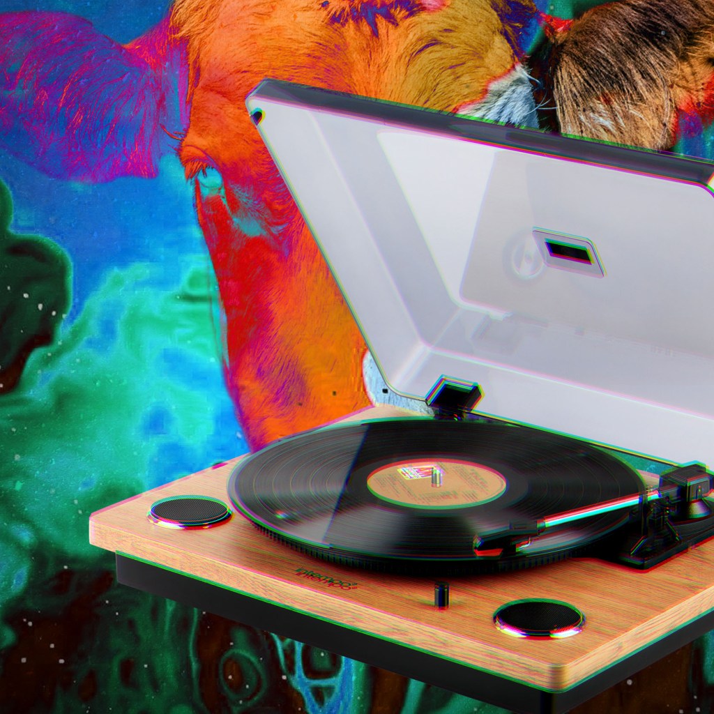
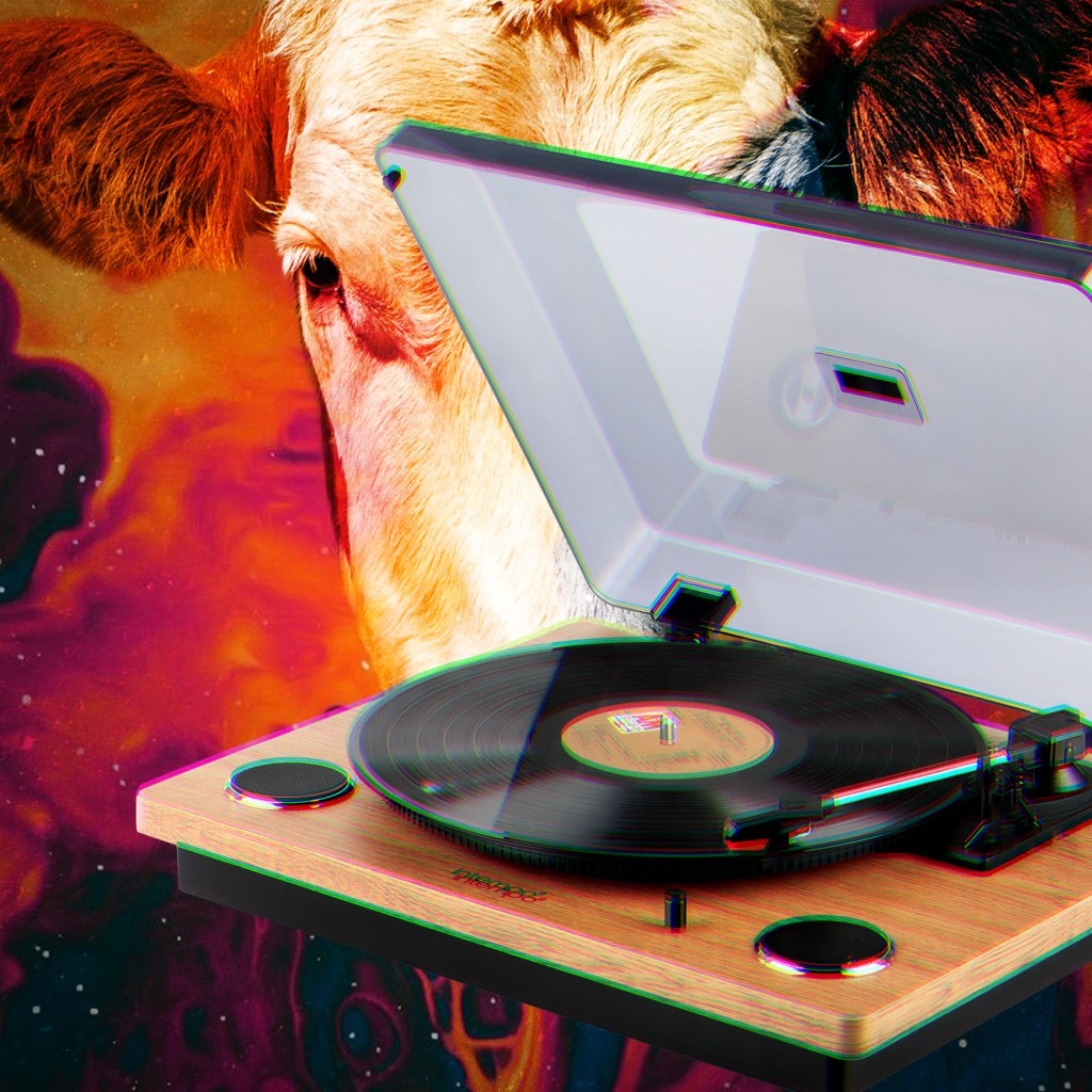
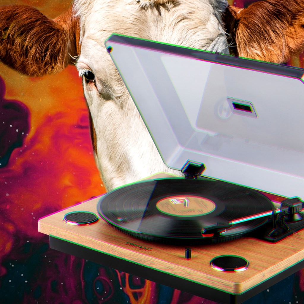
Or better still – we’ll get a record player.
For obvious reasons with this line, I went for the record player integrated within the collage. I tried some dancing couple on the back, but as to me that was missing some maturity, so I went for the abstract crimson background with some stars in it, and the head of the cow hidden behind. I didn’t overcomplicate this image, it doesn’t have as many layers as some of my previous pages, but the image combination still works well for the concept.
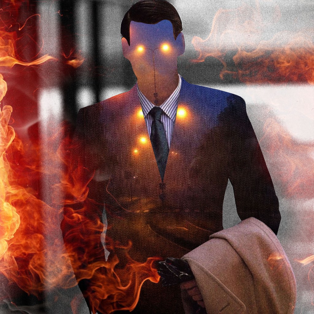
Well, to hell with you!
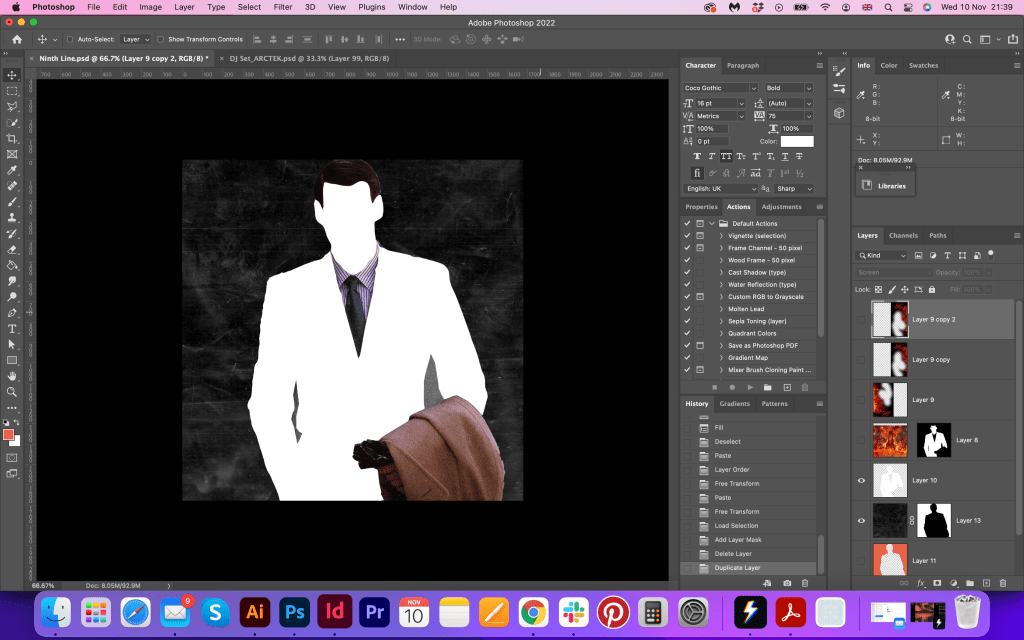
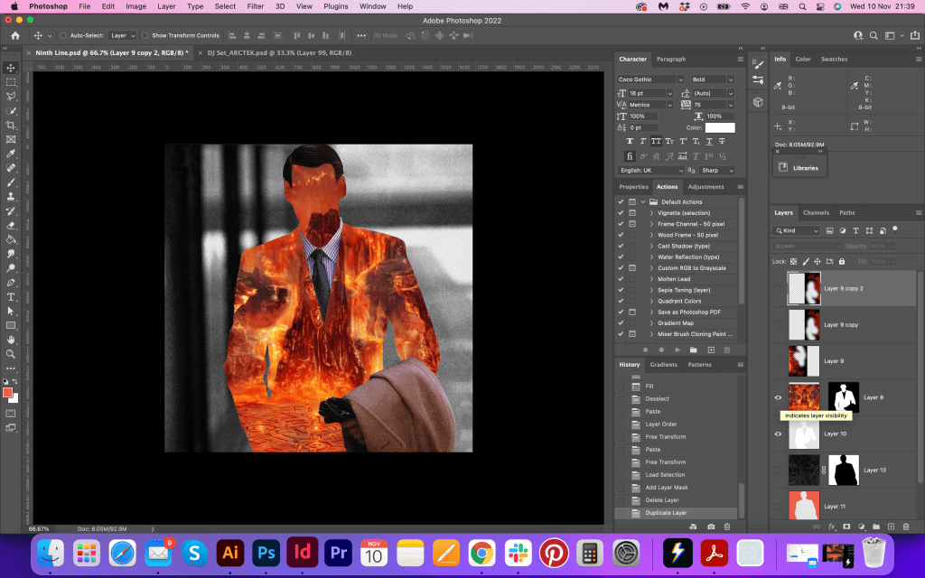
That is one of my favourite images, as it has all moods and emotions I wanted to show in this brochure. I discovered that juxtaposition collage approach over a year ago when abstract portraits became very popular amongst the music industry and creative art. I learnt different techniques through Photoshop tutorials, and I’m pleased that it helped me in this exercise, as I could use my skills in practice. That collage is quite easy to make, but it has so much depth and feelings into it, that I could call it one of the main characters in the brochure. Also, I changed the direction of the sequence slightly, and the rest of the images were evolving around this design.

hornless and ironed!
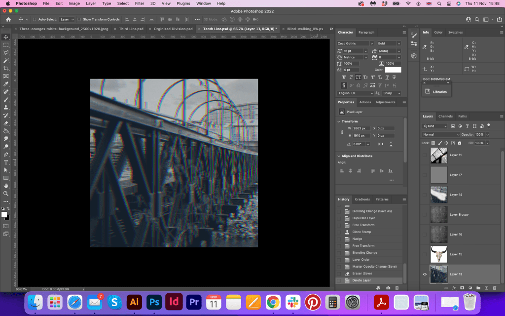
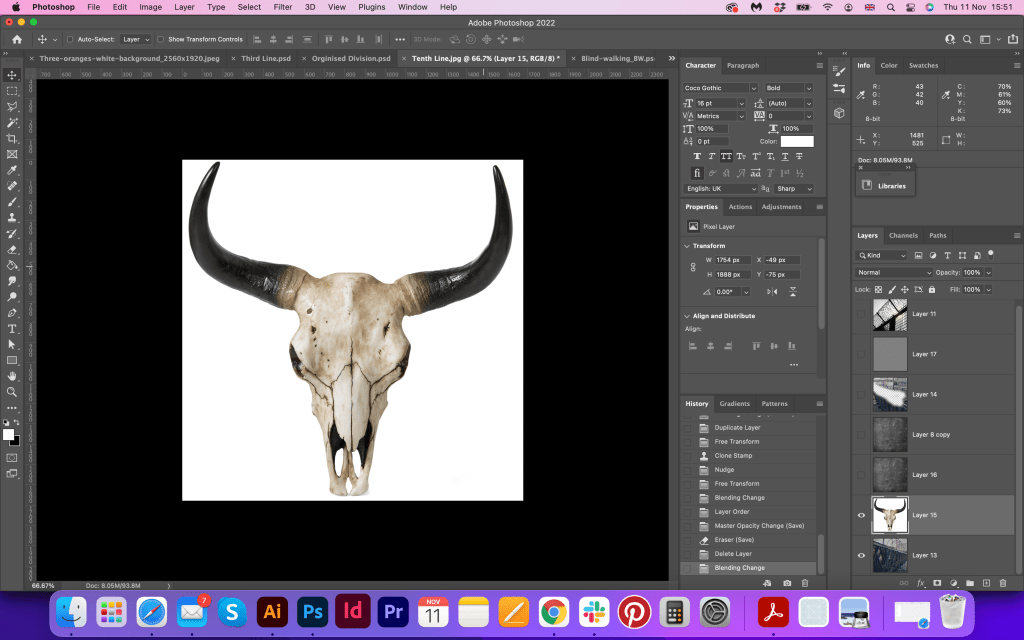
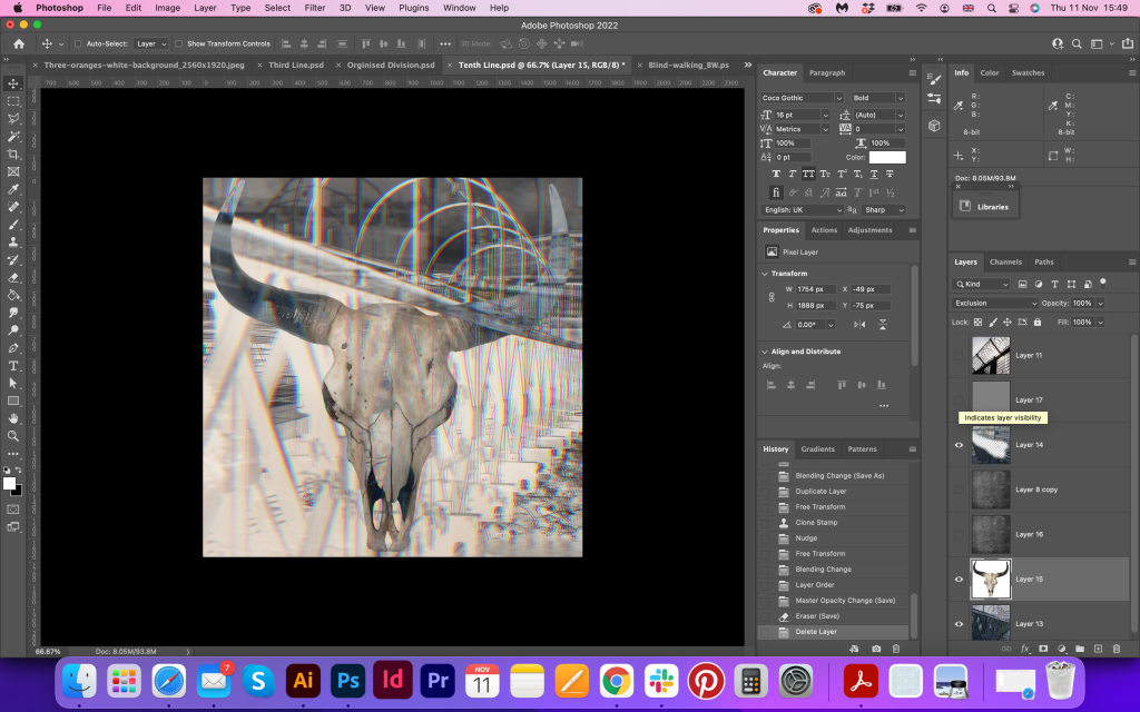
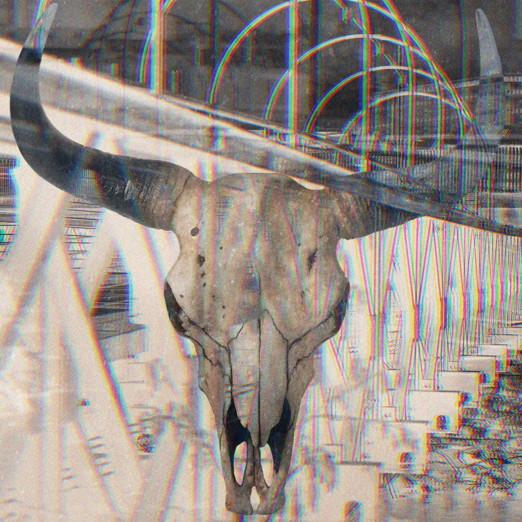
Here I was a bit stuck with the image choice. If I could do fewer pages I would probably have taken away this visual. But as I had to have fourteen collages at least, I had to push myself, that to invent some visuals for this line, which was quite tricky. I used the picture of my own from Sheffield bridge, and the image of the skull from the internet, added some filters in Photoshop, and here is the extra image, I was pleased that it worked well with the previous image, and kind of made sense for the poem.

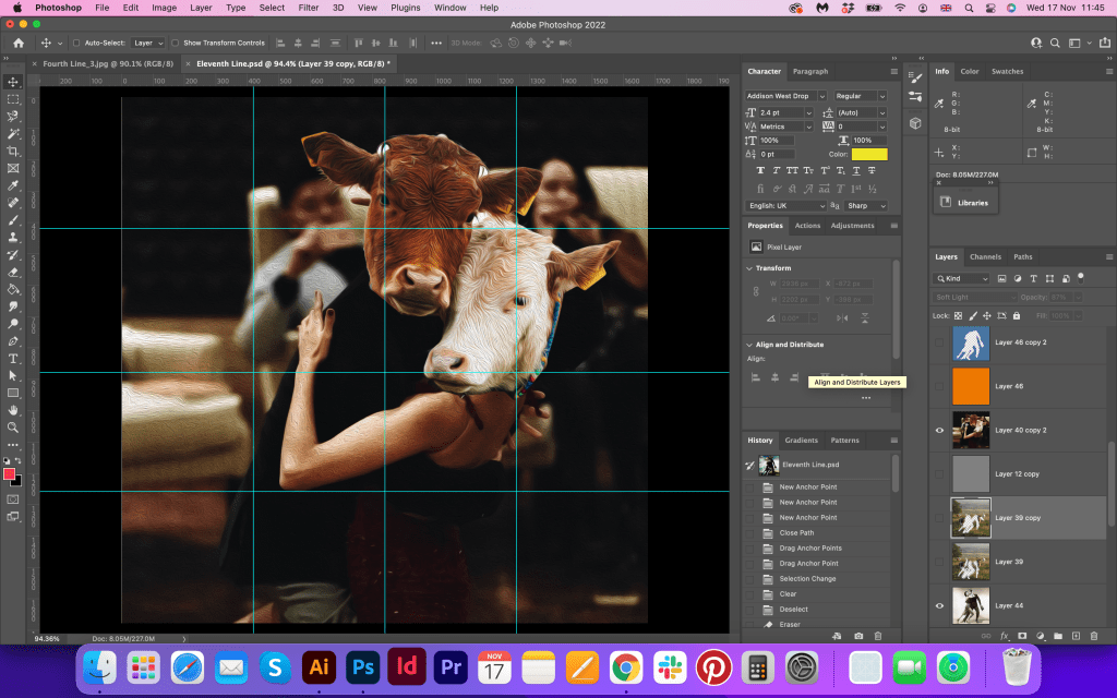
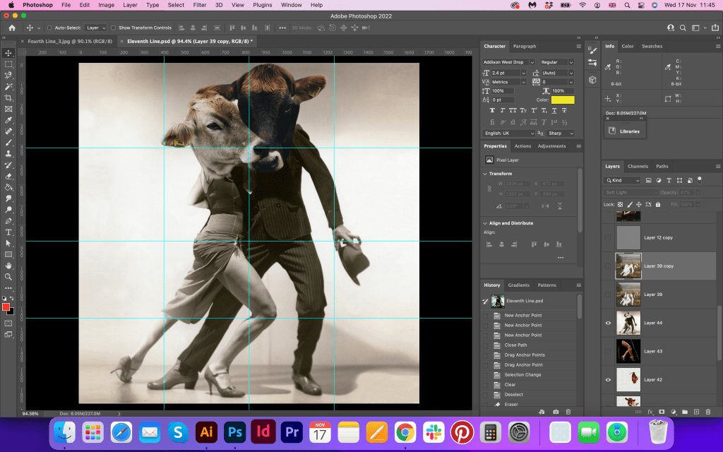
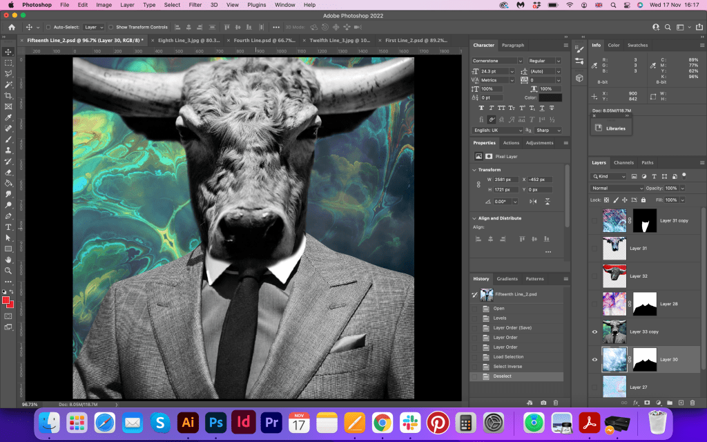
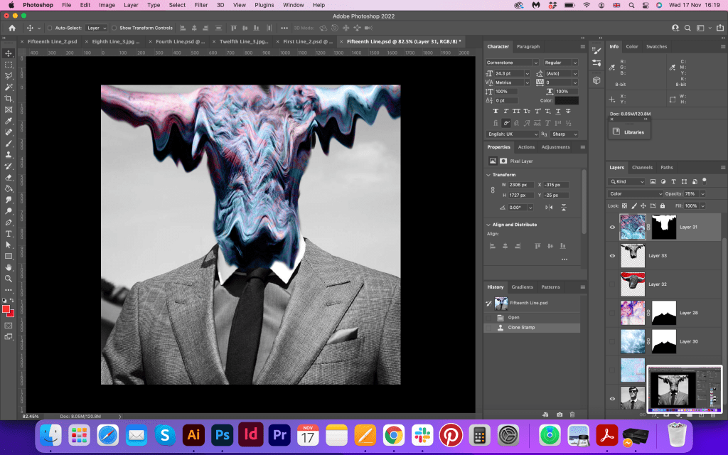
I want one – to dance one
tango with cows
To be fair, that was almost the last visual I designed, because it was such a crucial part of the poem, I wanted to make sure it will have the collective style from the whole brochure. It was not the easiest one for me, as I could not find the cow that wouldn’t look so sad, also, I was hesitating between using cow hooves or heads in the dance, what a dilemma…However, I came up with the solution I visualised from the start, a dancing couple with cow heads. I loved the mood and colours of that collage, I think it summed up the whole idea of the sequence and collage that I had in here and matches well to the mood of the poetry.
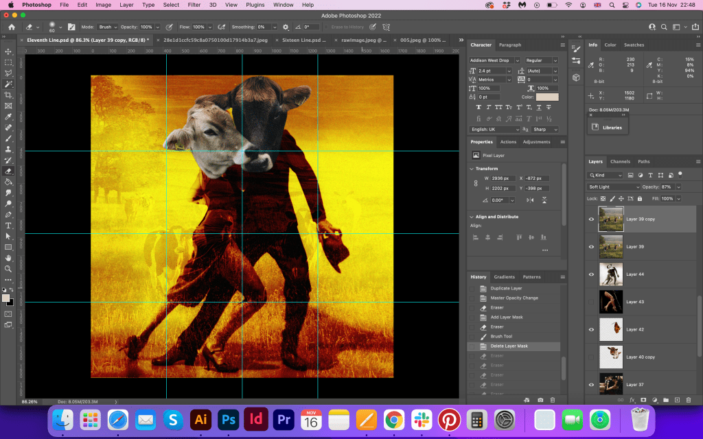

and to build bridges
from the tears
In this image, I was going to keep a similar colour palette as I had from the beginning, violet and blue shades, as there are tears and cold shades of the bridge, but I didn’t like how this particular visual looked in these colours, so I couldn’t do anything else but change the colour grade completely. I was fascinated by how vital the colour choice can be for the picture, as that juicy red and yellow colours changed the design completely, but at the same time, it stands out so much compared to the rest of the images. I knew it was different, but I was hoping it will work with some orange bits I had in the brochure, but the visual itself looked great, despite its oddness colourwise. In the corner, I added text in a few fonts, which made it looks like a poster.
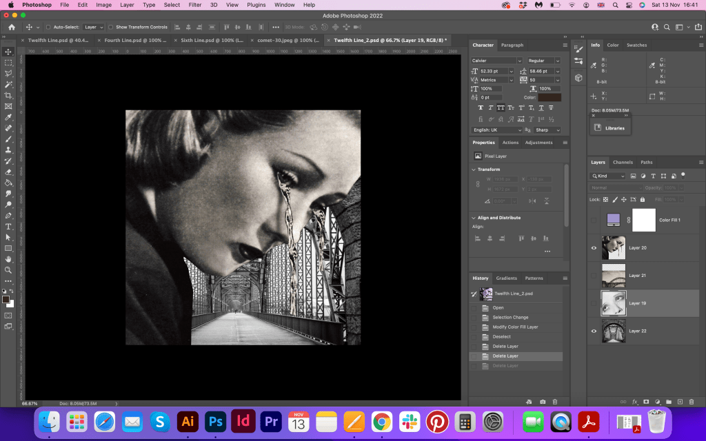
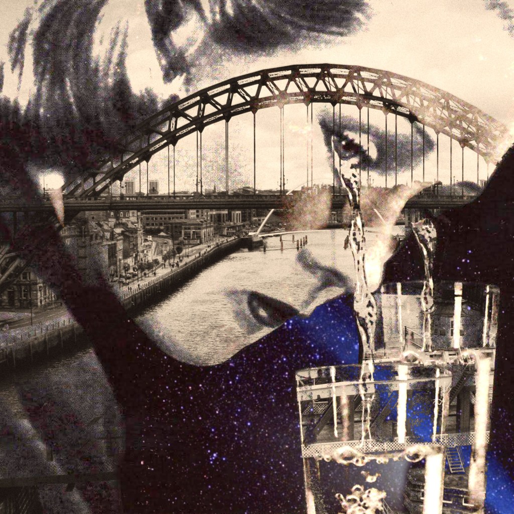

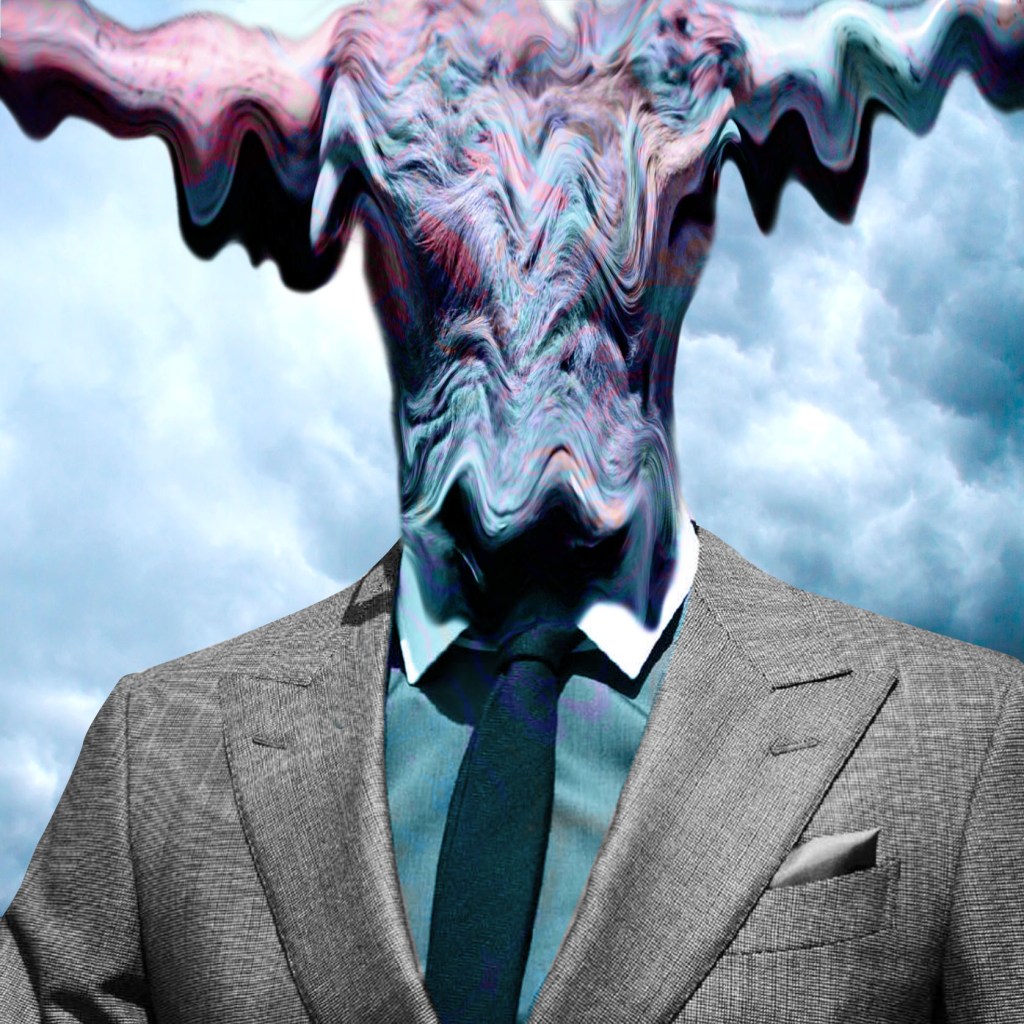
of bovine jealousy
This image I created to the pair of the last image from crimson girls. These four images of a man in a suit, crimson girls and dancing cows sort of share similarities in artistic style. These designs are based on vintage pictures by adding a visual psychedelic touch. When the two universes blend, they create a series of portraits covered by graphic and colourful elements, hypnotic and surreal compositions.

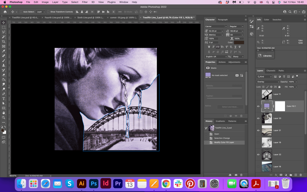
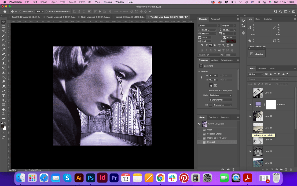
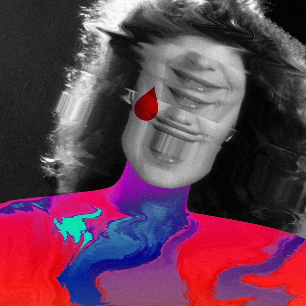
to the tears
of crimson girls.
For the last image I went for a creative vision of the girl who smiles; she doesn’t have eyes, as they disappeared in distortion, but there is still a tear on her right cheek. Here can be seen the formalist relationship between images as they are removed from their original context. The last two images work together as a tandem. They helped me to finalise the mood in the brochure and understand that how vital coherence and mood creation is in design.
All designs together
Reflection
This exercise was an amazing experience for me, I have never created multiple pages brochure with that amount of creative images in one collection before, and I’ve learnt that imagination and creativity can always go beyond the level. I found that how vital to follow a similar pattern and coherence for the brochure, also discovered that design can be represented through a set of sequences, not as a usual book, but closer to the artist book way. I love how an image can speak to the reader with no words and behind all, that abstract and imaginative collages represent the message of the author. At the same time, I met the challenge here of missing the pure similarity in style for the visuals, as I wanted to keep the reproduction of the collages on a high creative level, some images look less complicated and more straightforward compared to others. I still had to go back to some of them that to adjust the style and keep the manner in design as coherent as possible. I hope I met the brief, and that brochure could gain interest among the potential audience.
