Collect a wide variety of paper samples and other paper ephemera across a range of weights, textures and surface finishes. This builds on your previous paper sample exercise from Part Two.
This exercise is built on my previous researches from part two. In the first part I gathered together all possible examples I saved through my graphic design career, some of the examples are almost 15 years old, and it’s good to see that all this time subconsciously I was following the path of being the graphic design, archived paper examples in the library that to go back to them again.
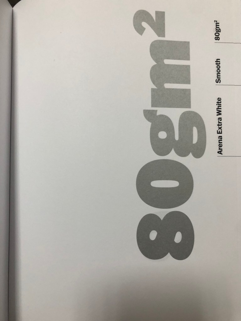
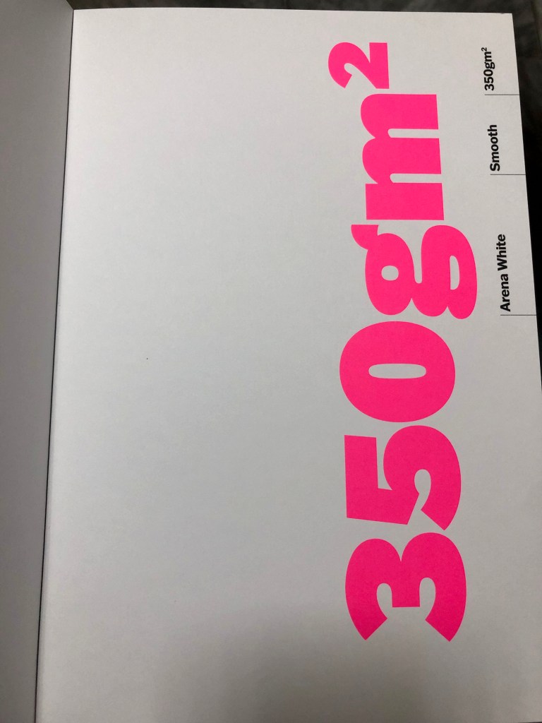
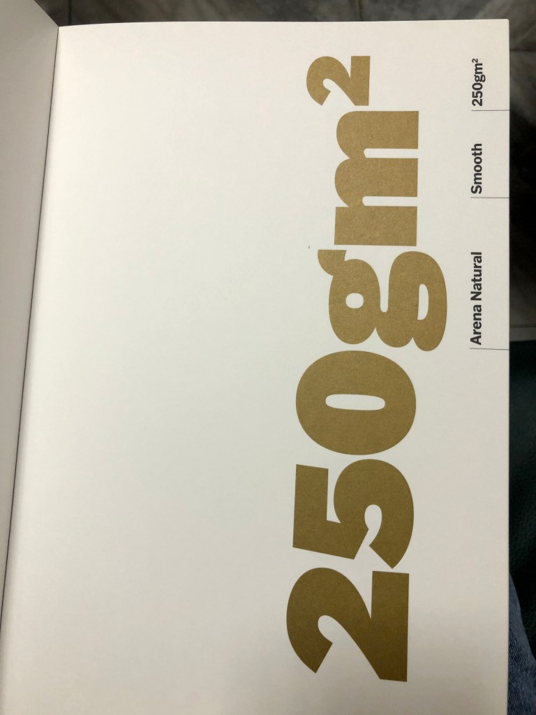
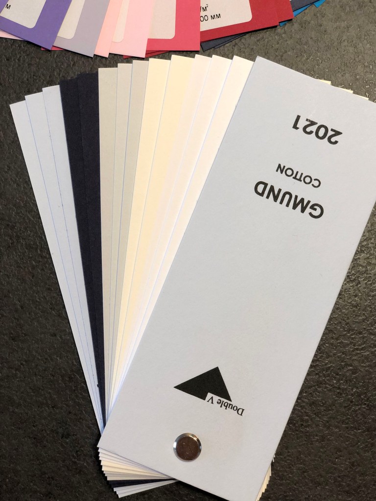
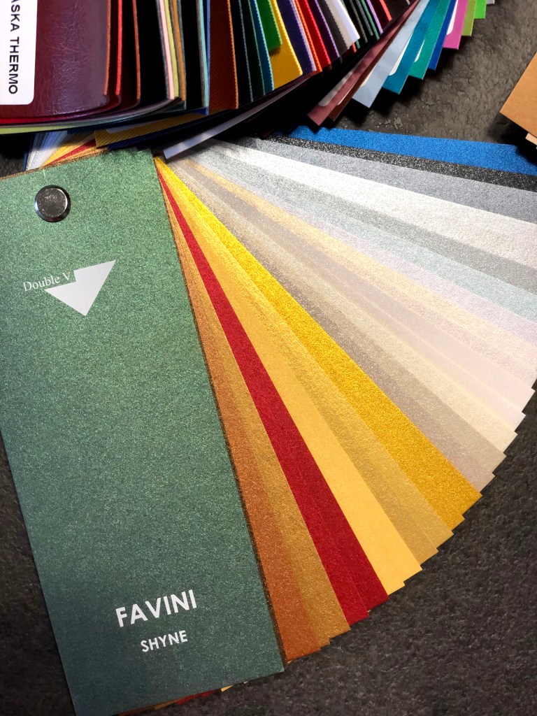
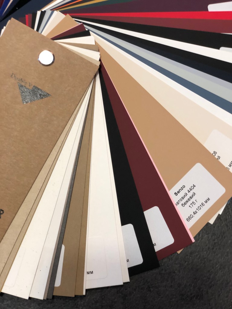
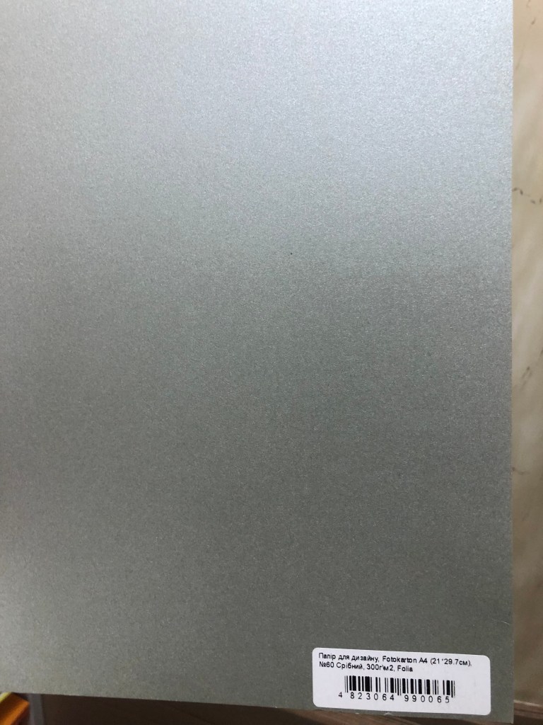
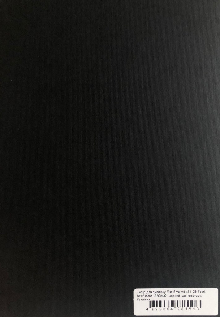
Another point is collecting actual paper examples coming from paper production companies. The biggest variety of paper examples coming from the August Trade company based in Ukraine. They have a significant variety of paper samples and colours that are available for printing, such as matt, gloss, shiny, textured paper, that would meet the requirements for all possible graphic design needs. All specimens are organised in matching colours, and depending on the price of the sheet, the cost of the design may vary. I analysed their colour and paper palette in the Research Task below.
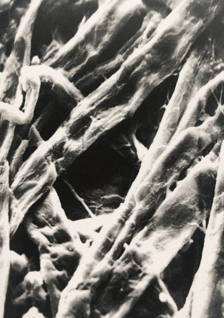
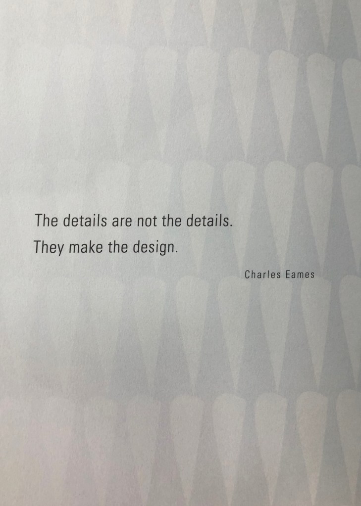
I wanted to go through some terminology to learn interesting facts about the paper. What is the paper? It’s a substance composed simply of the interlacing of fibres into a compact web. One of the finest and best-known scholars on paper of the 20th century, the American Dart Hunter, summed up paper as follows in his Papermaking, the History and Technique of an Ancient Craft.
To be classed as true paper, the thin sheets must be made from fibre that has been macerated until each individual filament is a separate unit; the fibres then intermixed with water, and, by the use of a sieve-like screen, are lifted from the water in the form of a thin stratum, the water draining through the small openings of the screen leaving a sheet of matted fibre upon the screen’s surface. This thin layer of fibre is paper.
Paper characteristics
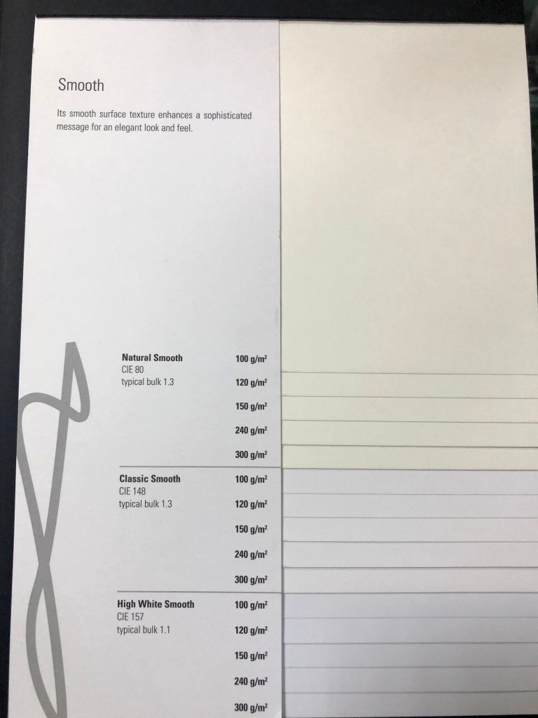
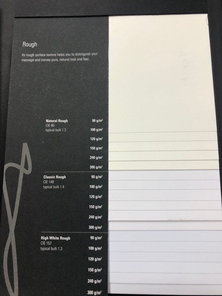
Lots of printing materials owe their form to the remarkable qualities of paper. It is very important that graphic designers take an interest in its physical properties and are aware of the many different types that are available. Paper has seven key characteristics: size, weight, bulk, grain, opacity, finish, and colour. All of this must be considered together with cost and availability when deciding on an appropriate paper for book printing and binding. Another feature that the designer may wish to consider, is its absorbency, its pH value, and percentage of recycled waste content.
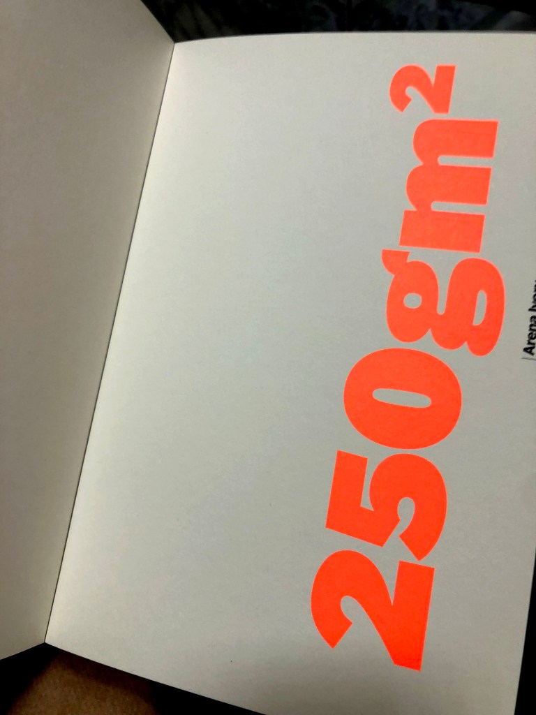
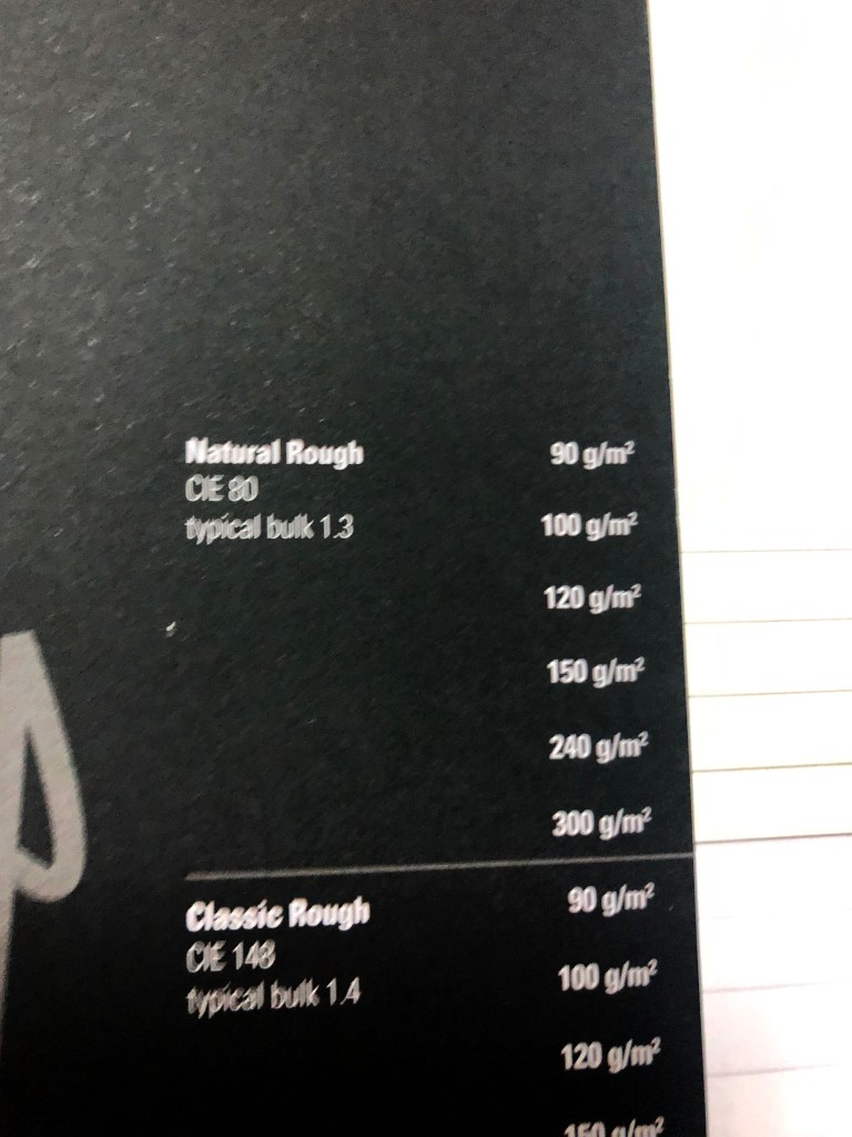
Paper weight is measured in two ways. Obviously, the thicker paper has more density and heavier than a light piece of paper. In North America, paper is measured and specified in pounds per ream (500 sheets), per sheet size. In the rest of the world, paper is measured in grams per square meter (gsm).
Paper weight and paper bulk are related, but it would be wrong to assume that heavy paper is by nature bulky, as paper density varies. Blotting paper is not very dense, having loosely bonded fibres, yet is relatively bulky, whereas some pressed millboards are very dense and heavy.
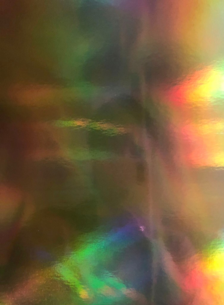
Opacity is a measure of how much light will pass through a sheet of paper. This is determined by the thickness of the paper, the density of the fibres, and the type of surface finish. No paper is completely opaque, allowing light to pass through. The surface finish of a sheet of paper determines its capacity to hold ink and its suitability for different types of printing. An interesting fact, that special surface finishes such as pitting, pebbling or pearl can be applied by running a textured roller over the paper during the calendering process.
Colour is generally added to a paper at the pulp stage. Some manufacturers produce consistently coloured paper, but others state that colour may vary between batches.
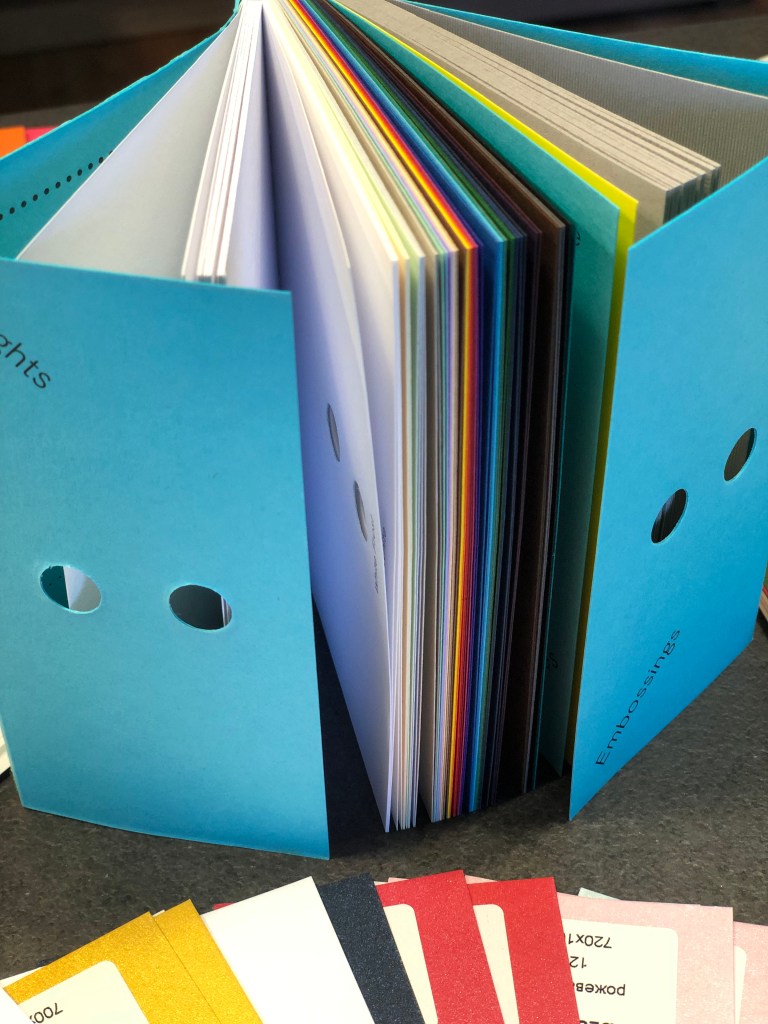
Collecting samples
Building up a collection of paper and board samples is very helpful when the designer has the opportunity to choose stock. It’s a useful feature reviewing the paper’s characteristics – size, weight, bulk, grain, opacity, colour in relation to the design feel, subject, content, etc.
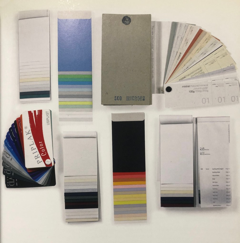
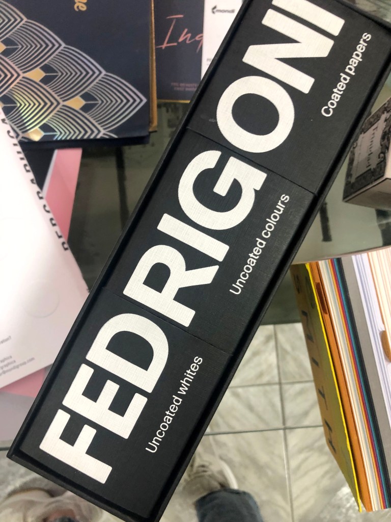
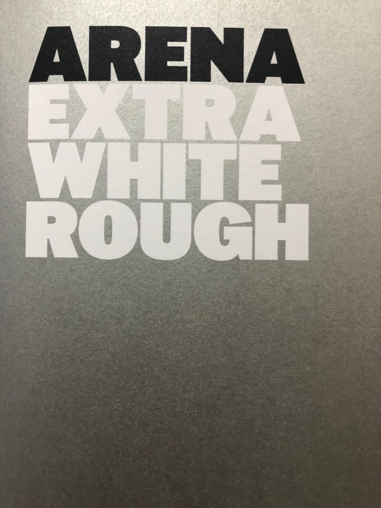
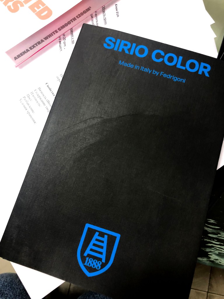
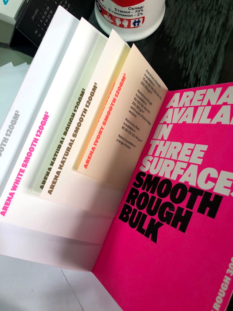
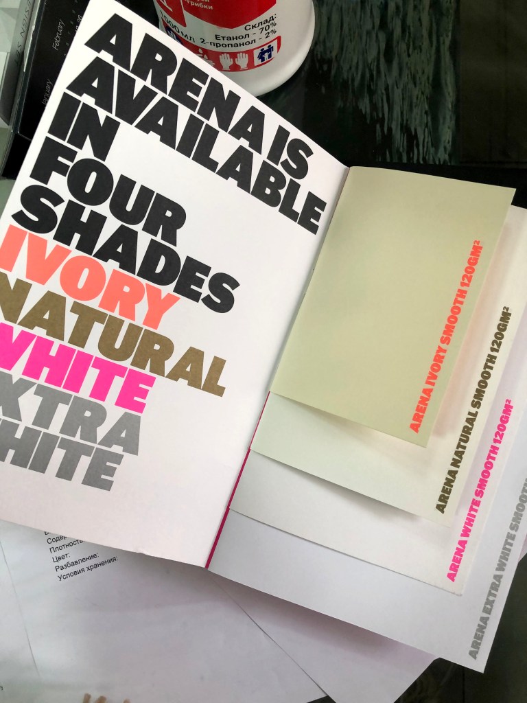
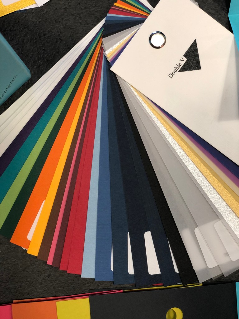
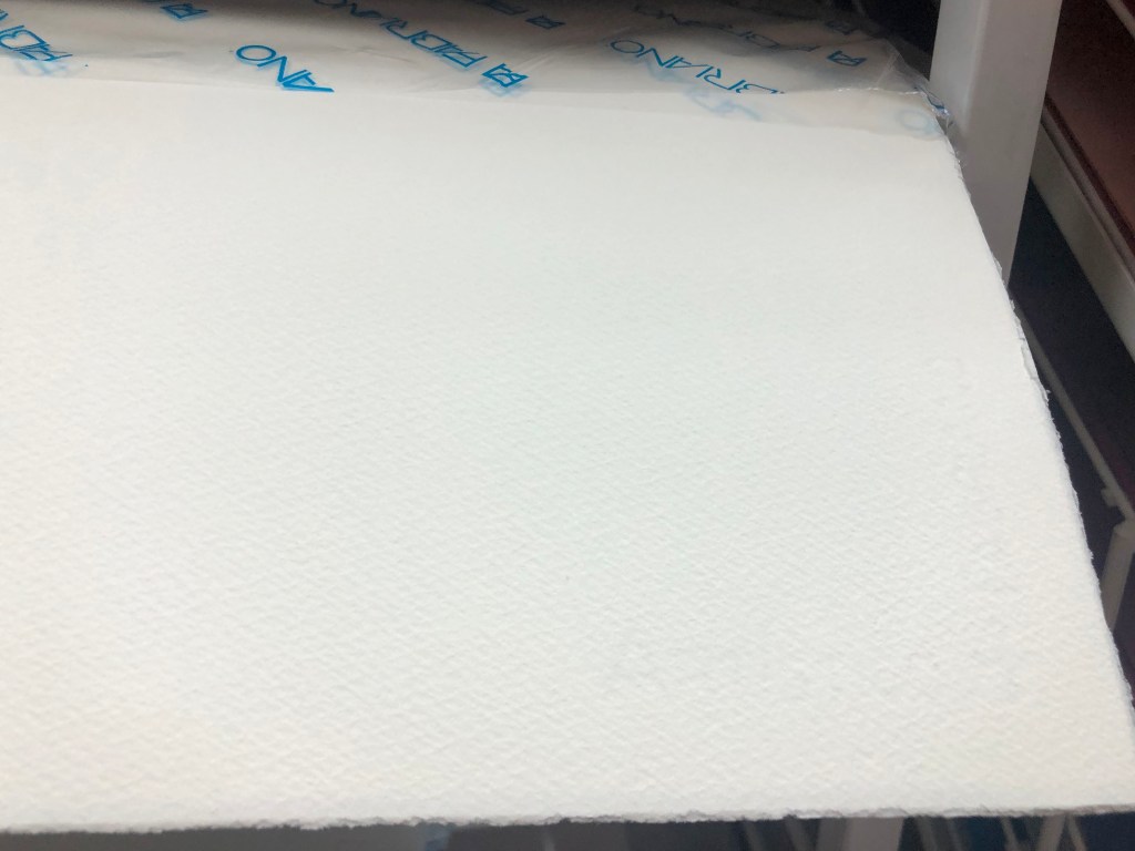
In addition, I wanted to extend my researches that to find some more companies that produce paper for design. It took me some time for searching, but after a while, I stumbled on to the distribution company Double V based in Kyiv, which has the biggest choice of paper examples I have ever seen. What’s so special about them, that they are collaborating with a lot of companies over Europe, and depending on your need they can order a paper for you. I thought would be great to have a trip over there, that to examine some of the paper samples. They have original sets from the production companies, such as Fedrigoni Italy, Arena, G. F Smyth UK, Mondi, Fabriano, Reflex, etc. These examples are very expensive, and they all can be delivered individually. Below are the websites I found from the paper production companies, I thought would be useful to keep them in one place and potentially use them in the future.
- https://www.mymondi.net/ufp/en/paper-finder
- https://www.fedrigonipapers.com/paperbox
- https://www.gfsmith.com/the-collection-2020
- https://reflex-paper.com/
- https://fabriano.com/en/273/cocktail
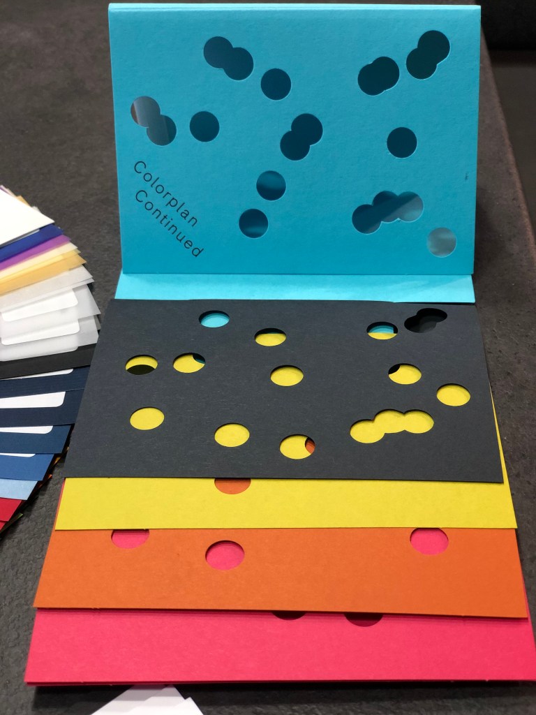
I took pictures of them, to show that some of the books were made in a special way, with creativity and original presentation.
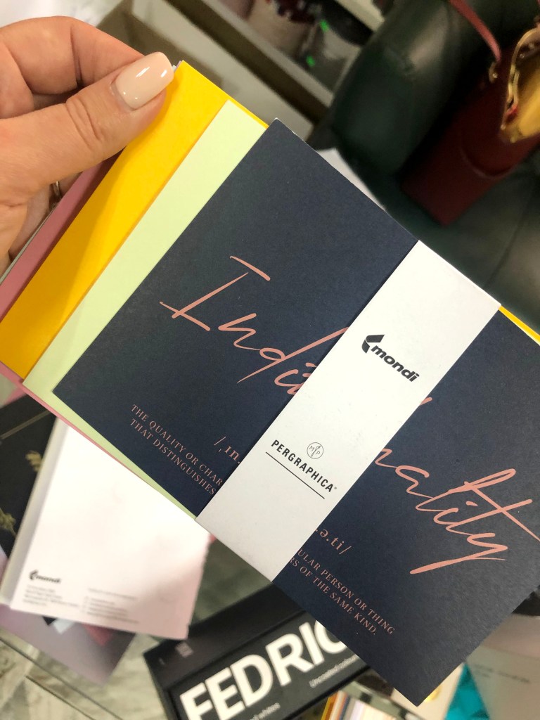
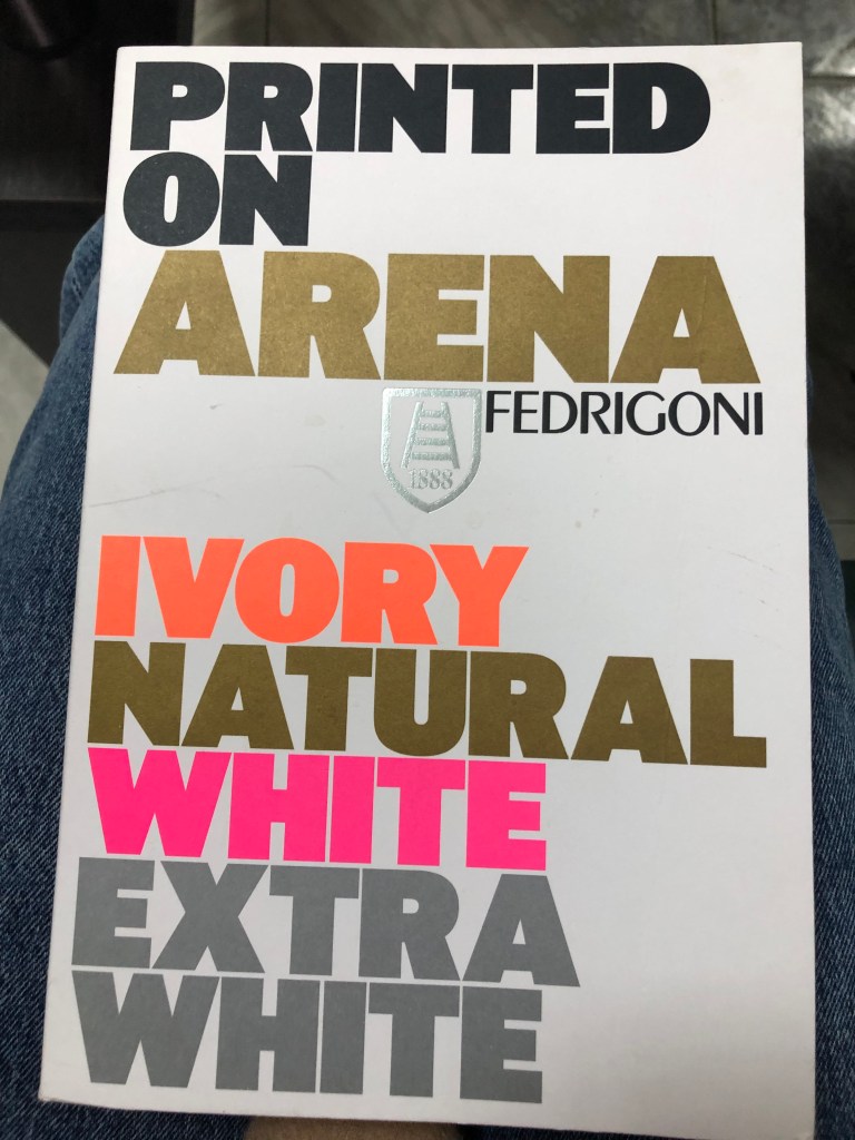
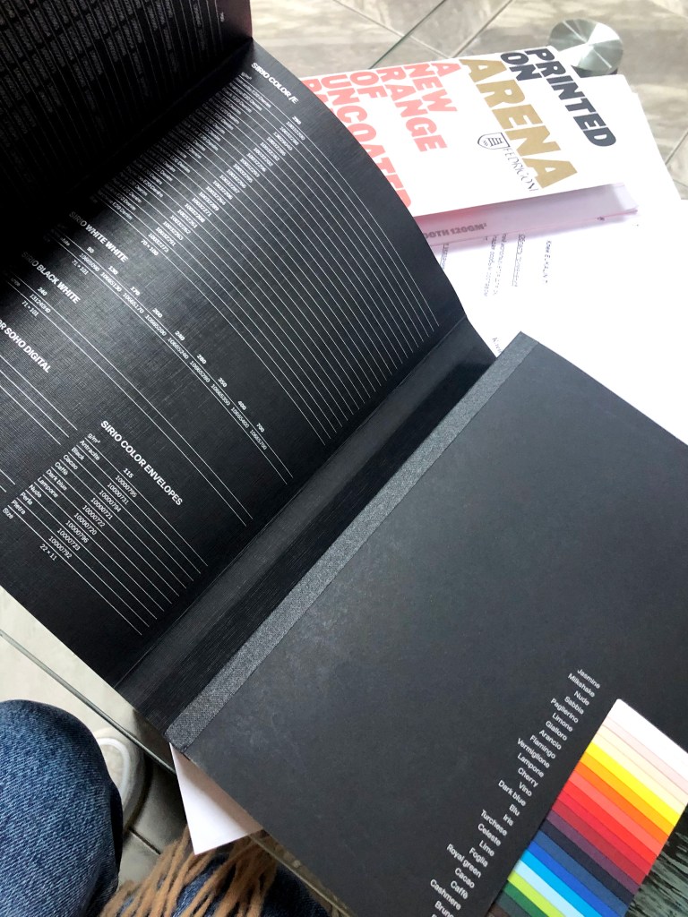
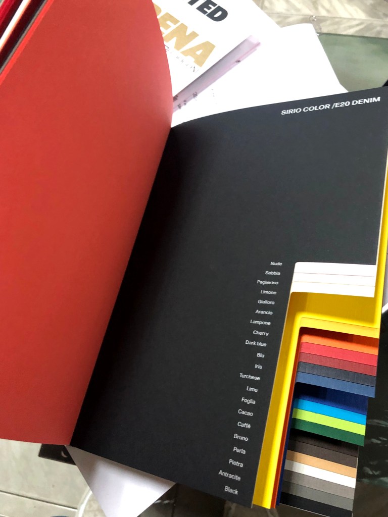
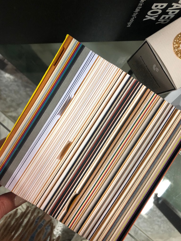
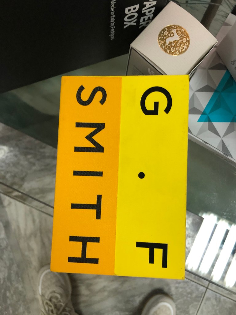
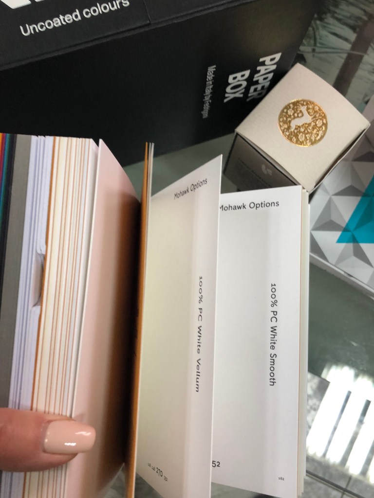
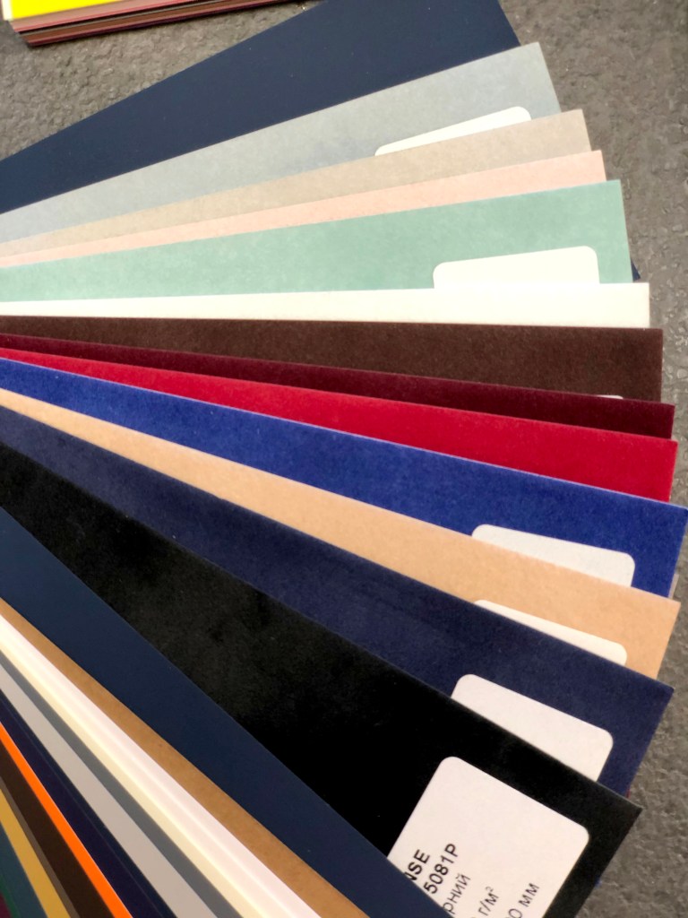
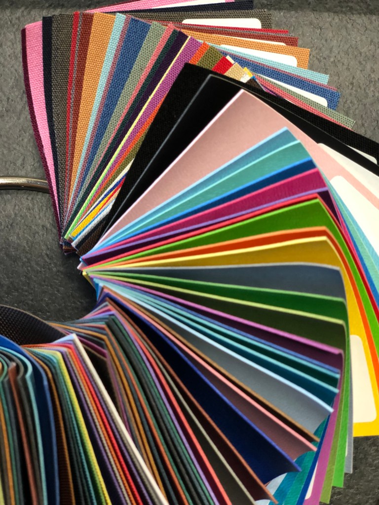
These are examples I bought for my collection. I think the distribution company collects them on site, so they are much cheaper compare to original sets. Also, I got some amazing sets from G. F Smyth, which do look like a creative book. The variety of paper is great. I have some textured paper, shine papers, all possible colours of tracing paper leather paper, velvet paper and so many more, that definitely should inspire me for some creations.
Now I have amazing spectral tracing paper, pure cellulose tinted tracing paper. Also, such made as Fabriano – uncoated environmentally-friendly wood-free papers and boards, with a special pearlescent effect on both sides.
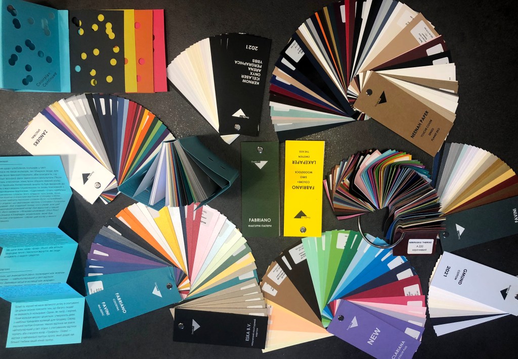
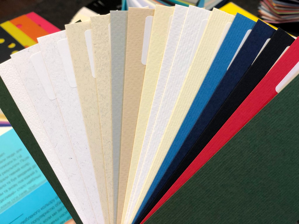
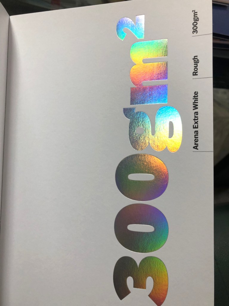
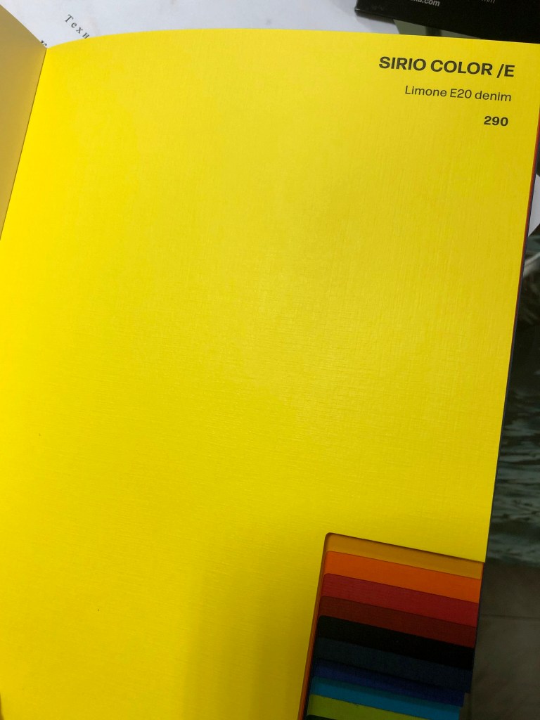
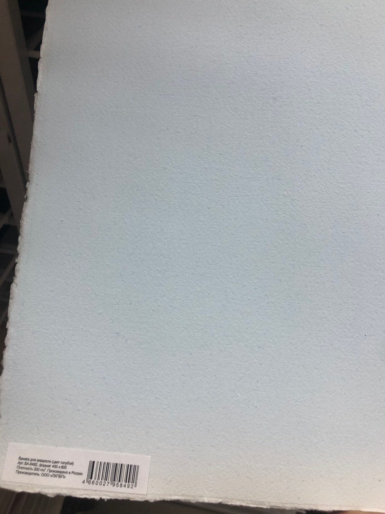
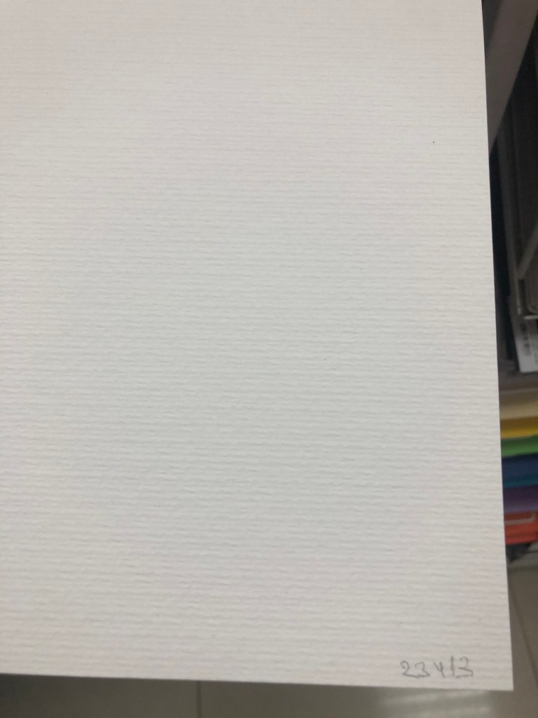
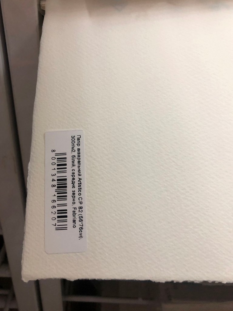
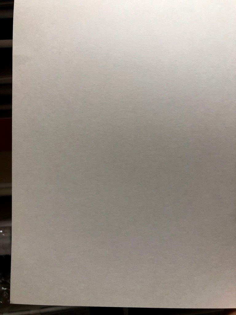
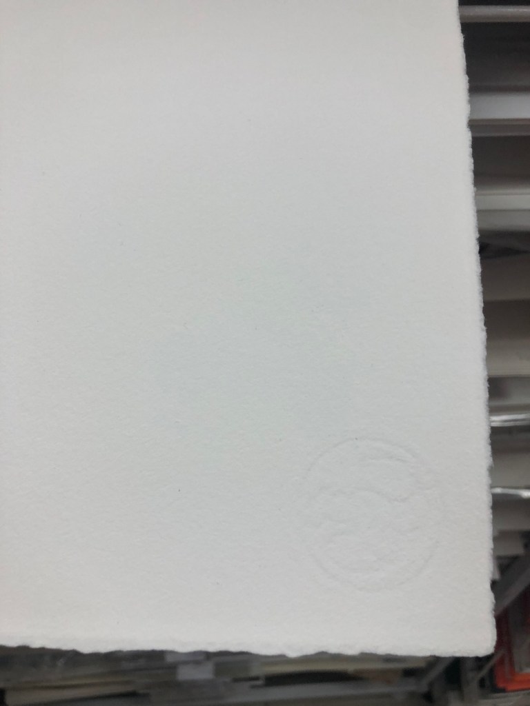
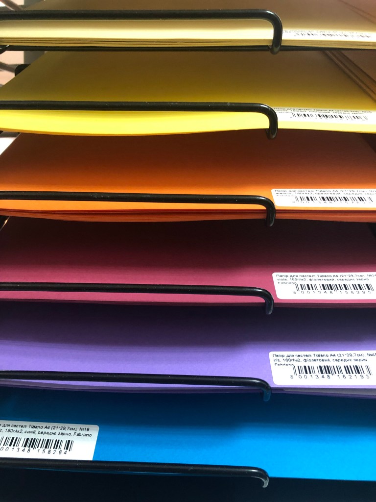
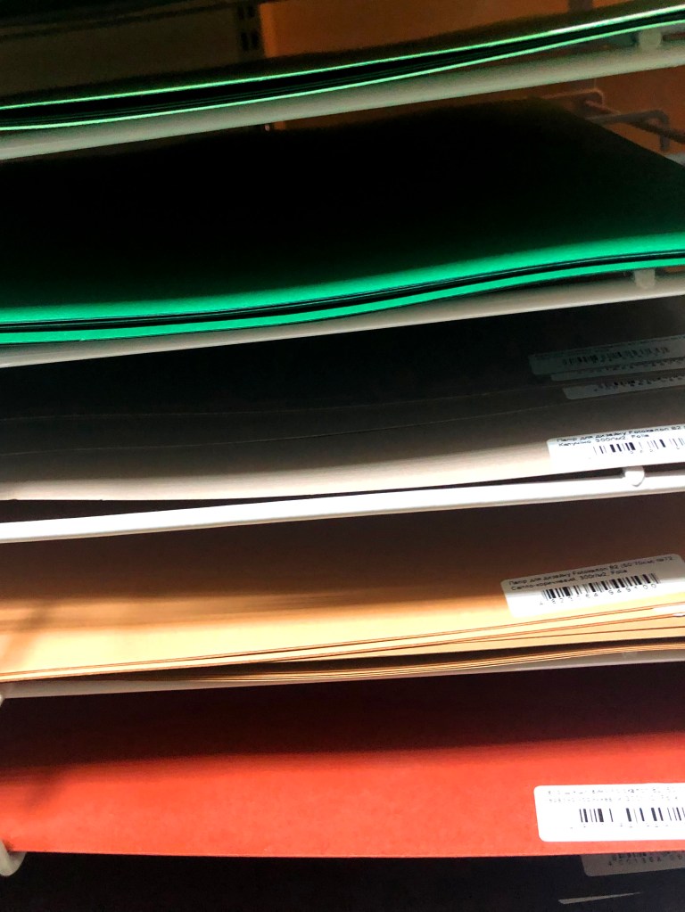
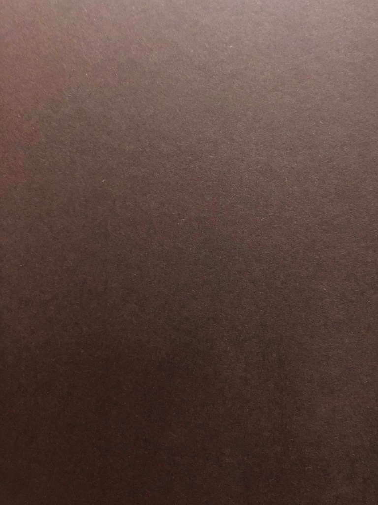
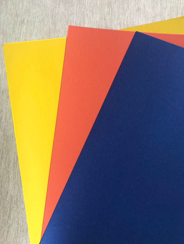
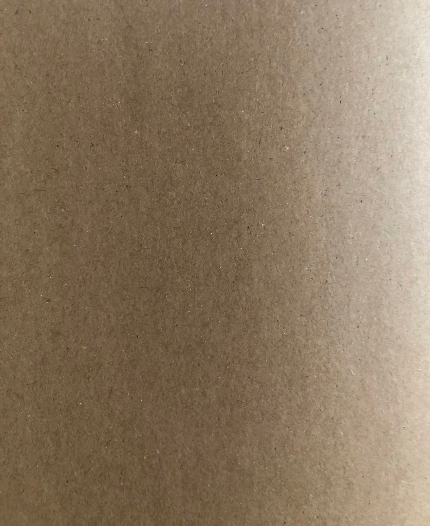
I always updating my catalogue of paper samples. One of my favourite thing to do is to go around shops with different paper materials, to examine them, and go through different paper colours and their purpose. I’m a big fan of watercolour paper examples, as they are thick, has some bulkiness into them, and have a nice texture to feel. They are not usable for printing books but could be useful in artists’ books I assume, when there is a wider field for creativity and play with the form. I took a picture of some paper samples. Textured ones are purely artistic to me, some examples that could be widely be used in art. I like the variety of patterns each of them has, which is important if a designer wants to create a special mood for their designs. That kind of watercolour paper could be used for cards, or design invitations as well. When there is a grey, gold, brown colour in paper design I see them perfectly be used for such things as marketing materials cards or business cards, posters. most of them are quite thick and have around 300 grams density. Colourful paper, like yellow, blue, green pallets they remind me of my scholar times when we had to do applications from them, as I don’t remember using such bright colours for any marketing or printing purposes recently. Most of the prints done are regular colour pallets, like sepia, white black.


Collecting samples
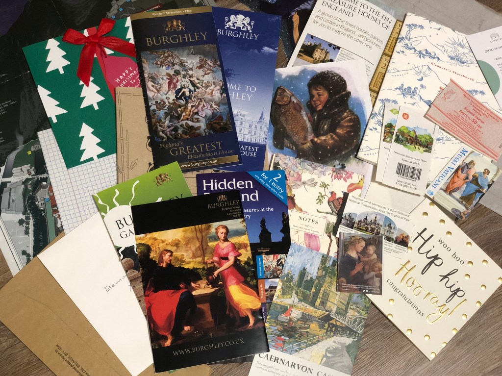
I’m the kind of person who collects different printed samples, tickets, leaflets, flyers and cards, but not only for design purposes but for sentimental reasons too. I think that could be the habit of most designers to keep printed ephemera, as they help establish the taste and vision for the printed materials. Each paper is different and has its feature, and instead of memorising them, those pieces could be saved somewhere safely for creative purposes.
Those little tickets to Vatican Museum, and some Kyiv heritage architecture, zoo tickets as well are printed on similar paper, glossy, not too thin, approximate 150 grams, which makes them easy for cutting, also those papers not opaque, that makes them reliable for printing as they contain as about 85% printed images and text.
The little white and red museum ticket was printed on very thin coated paper, not very white colour, up to 80 grams, looked very old-fashioned, in matching design, but that is what makes it special to me. Little ticket to the past, which works well for the historical places.
Also, I kept those examples of paper from my first assignment about fanzines. It’s a good example of think magazine paper, glossy, and very thin, but good enough for colourful print. I’ve noticed that most of the magazines use glossy paper, as I think they are better for printing and cheaper than coated paper.
I’m saving all gift cards, as they have different features in the paper quality, and it’s good to see how designers use paint or gold foil on them, as that is a good way of seeing the use of paper in life. Also, I’m keeping some of the magazines with different paper combinations in one issue. For example, some of the companies use thicker paper for their adverts, as it helps to pay attention to the information, the work on contrast helps to make the product stand out.
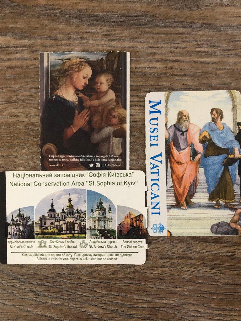
Vatican Museum, and some Kyiv heritage architecture 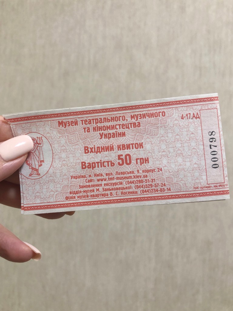
History of theatre and cinema art museum ticket 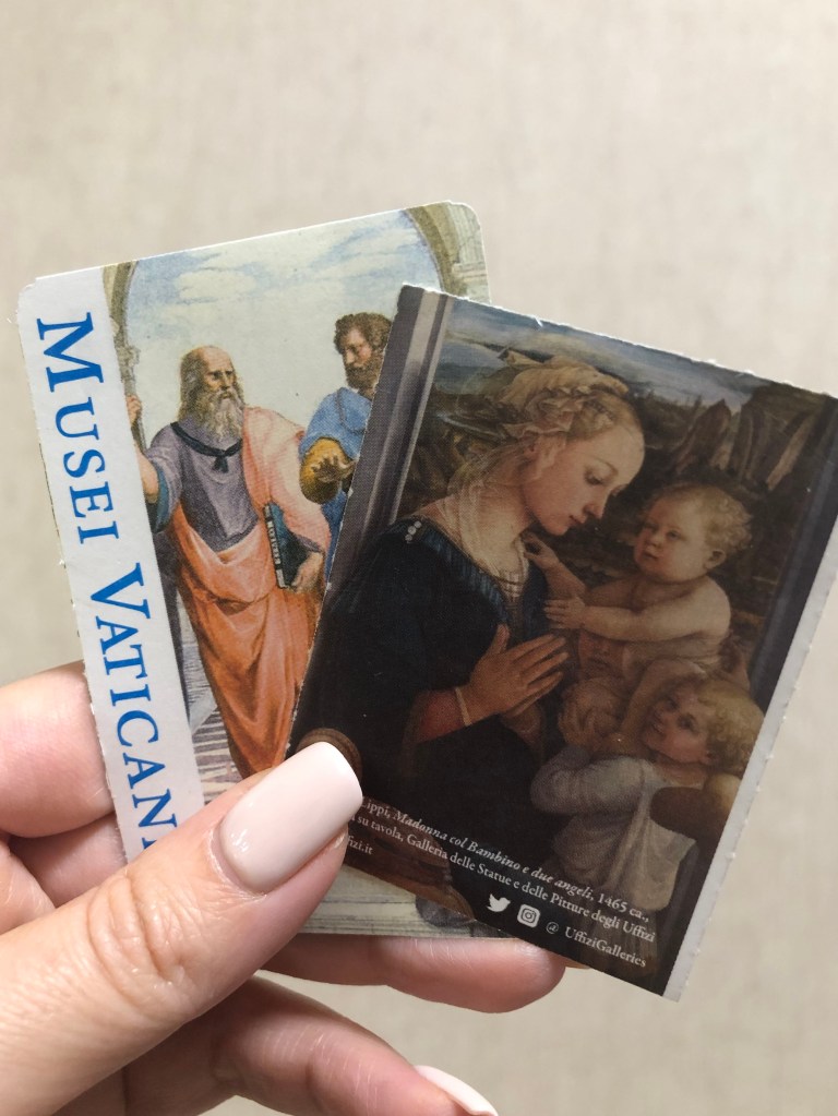
Vatican Museum tickets 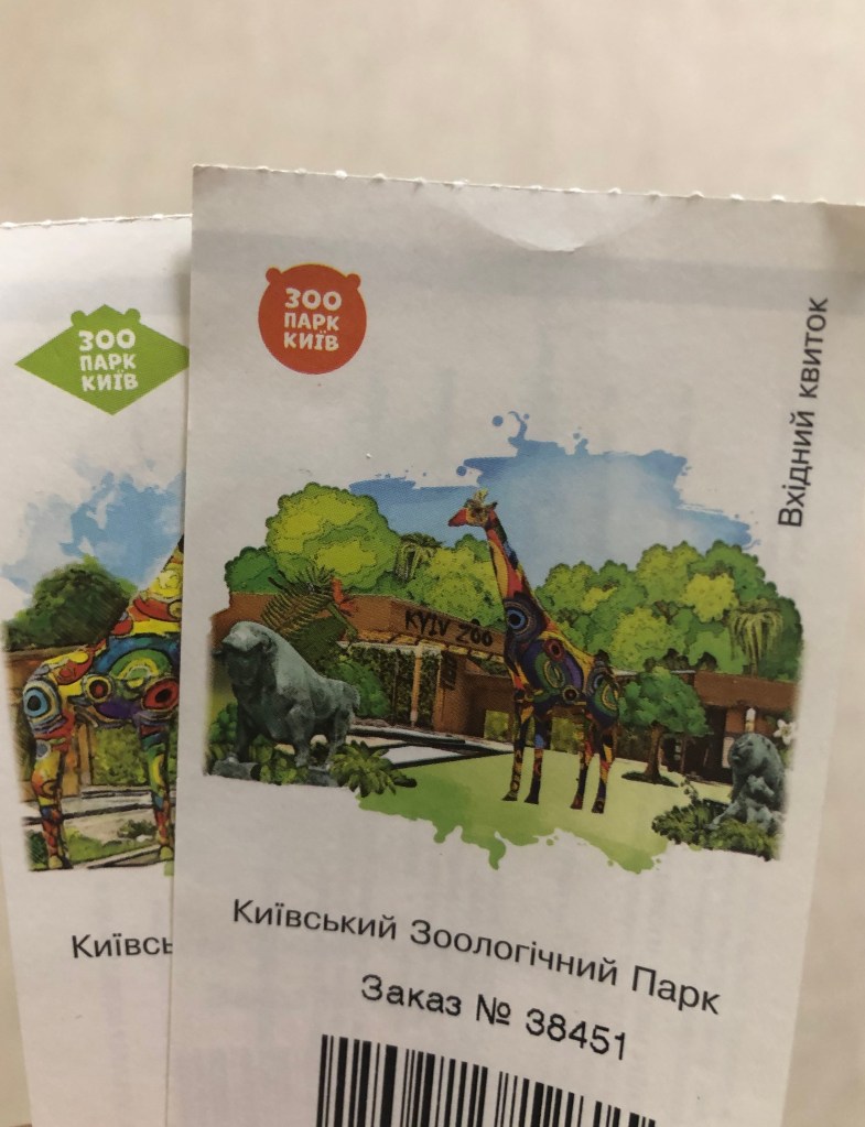
Zoo Tickets 
Magazine paper 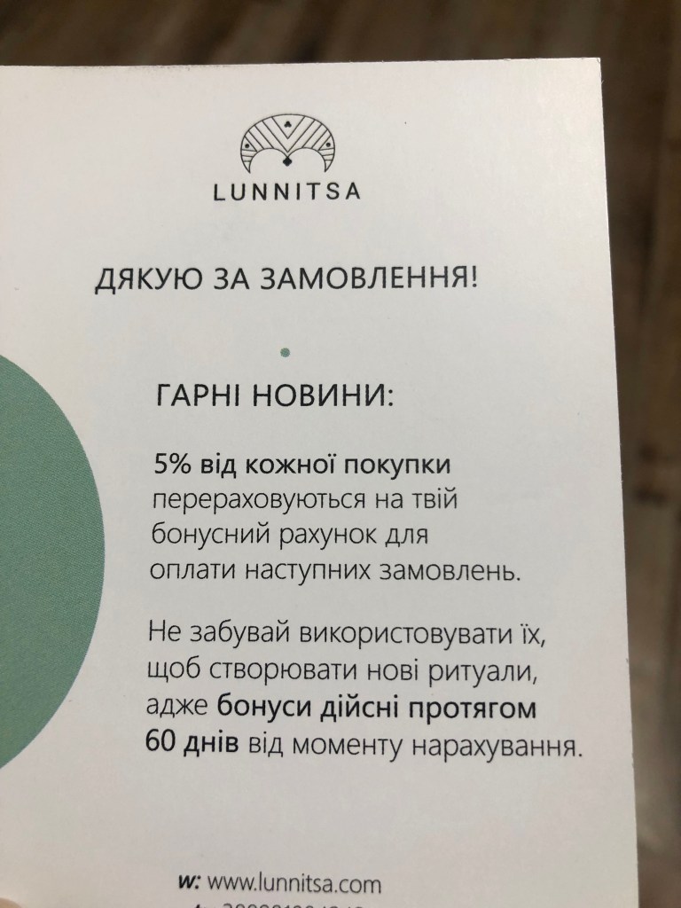
Thank you card 
Card 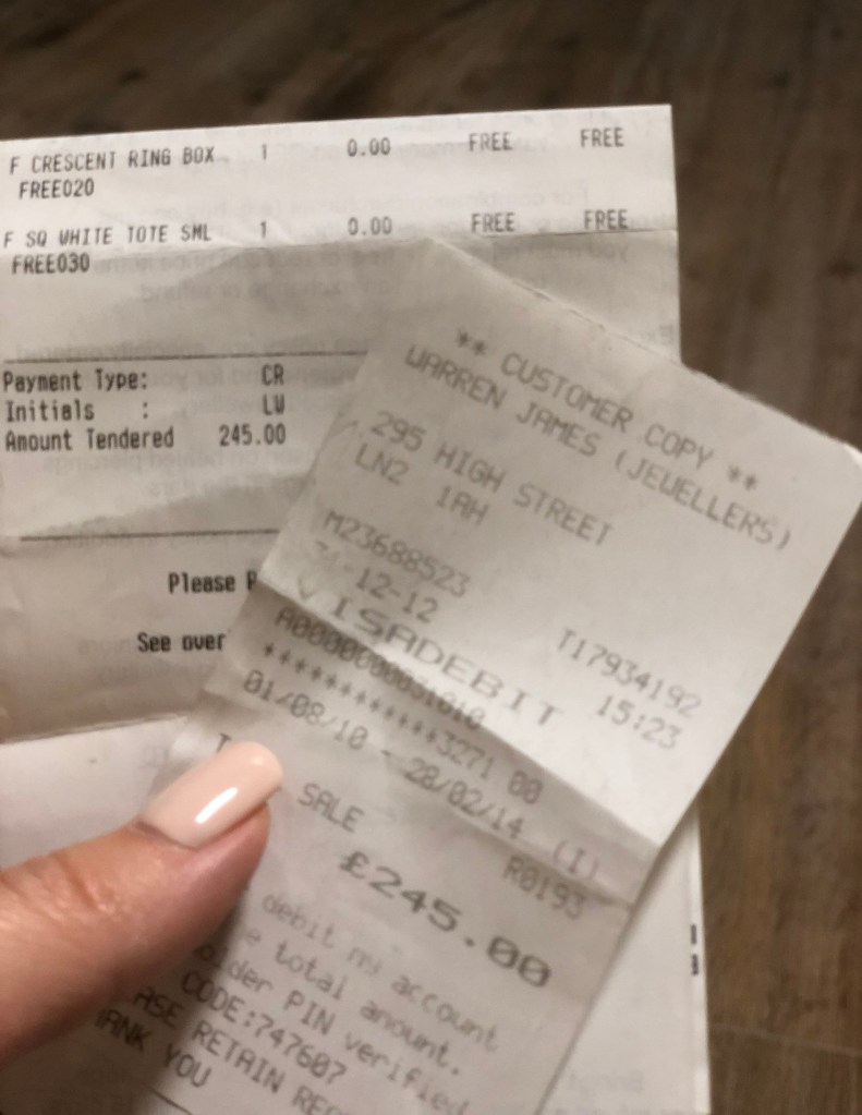
Receipt 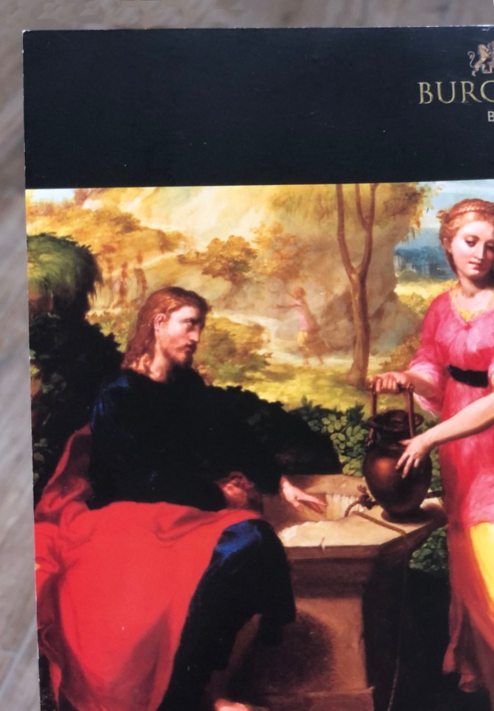
Burghley House Brochure 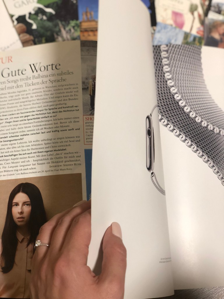
Combination of thin and thick paper in the magazine 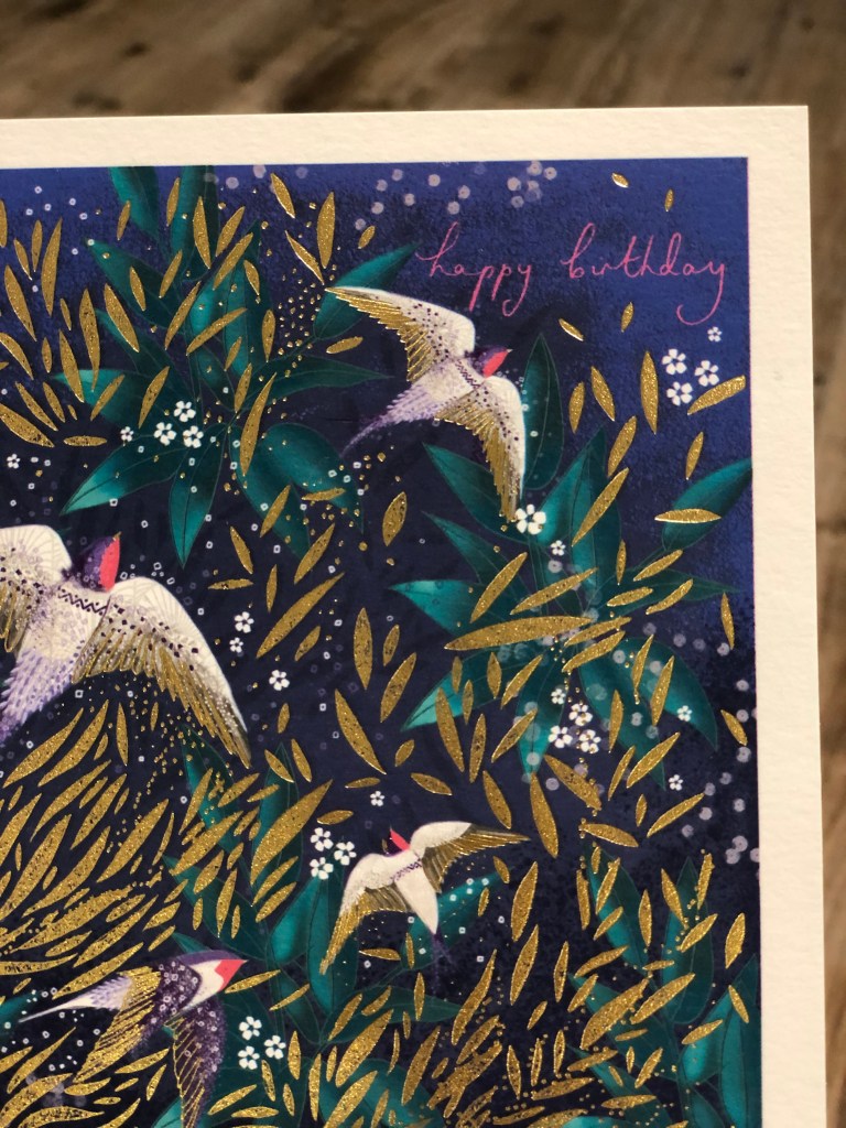
Card 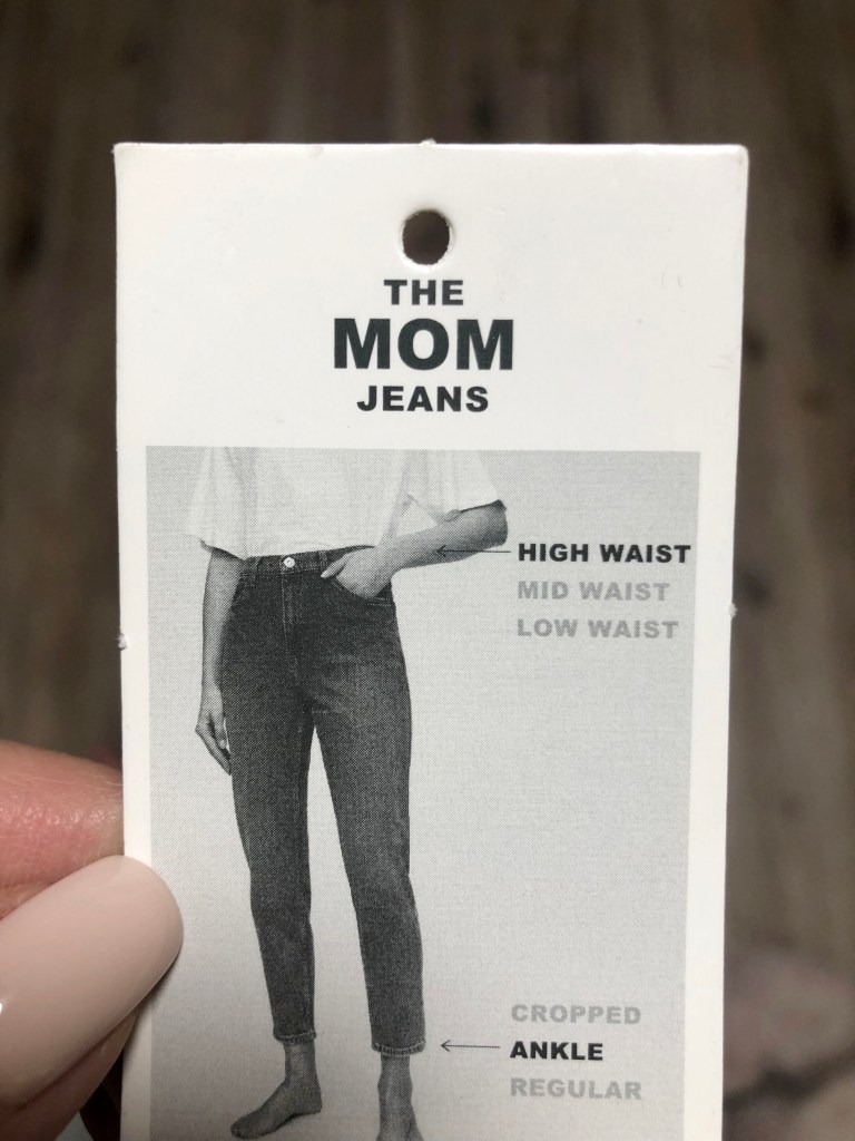
Jeans Tag
Overall, it was a great experience for me to expand the speciemens of papers for this exercise. Moreover, it gave me the push to do even wider researches, and discover some amazing paper samples, and top up y library with some great pieces of design papers.
