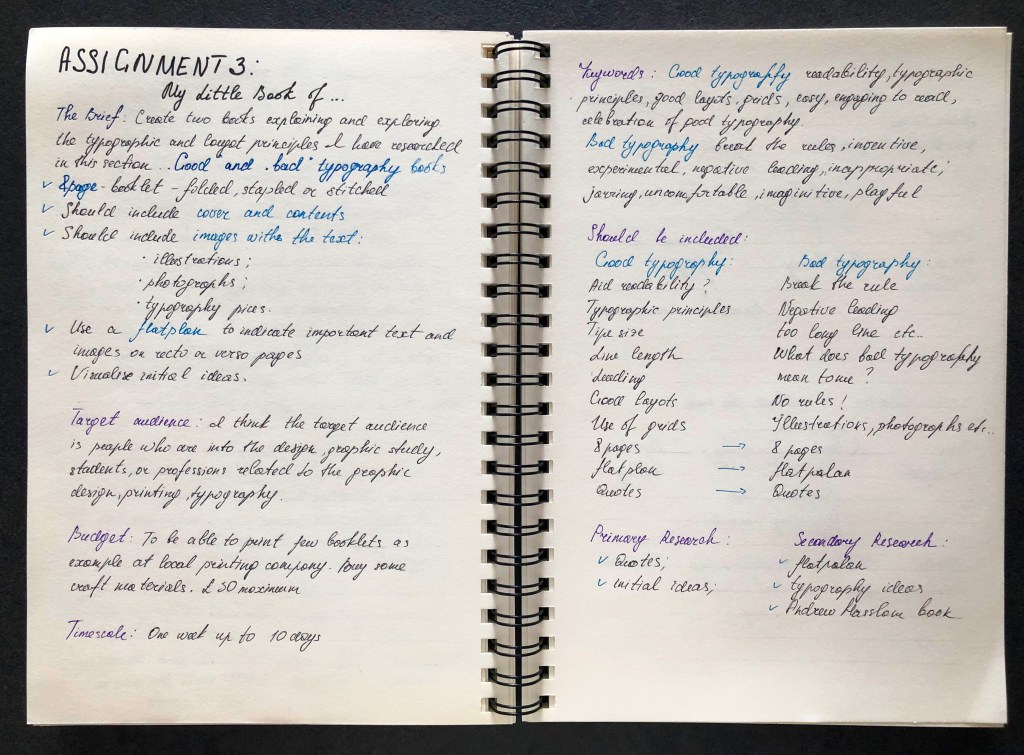
The brief: Create two books explaining and exploring the typographic and layout principles you have researched in this section.
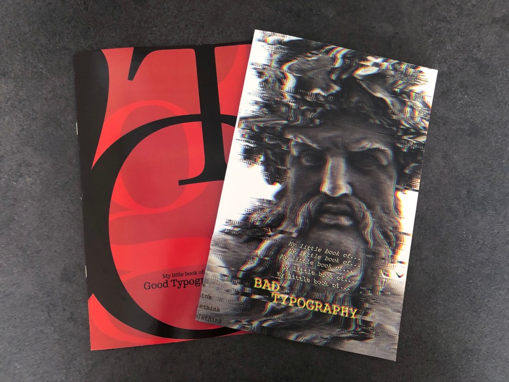
Book 1: My Little Book of…Good Typography
Using the reference material that you’ve gathered throughout the exercises and research tasks in Part Three, design a book which explores traditional ‘good practice’ in typography. What is readability and, as a designer, how can you aid it? Visually explain the typographic principles that we’ve touched on in Part Three, such as type size, leading and line length. For example, you could demonstrate kerning by creating a page which looks at letter combinations applying this principle. Equally, explore good layouts and use of grids to help support and frame your typography. This is an opportunity to develop carefully considered design layouts that feel easy and engaging to read, and look at. Be creative in how you do this, developing a range of options and possibilities. Show off your good typography skills as well as talking about what makes good typography in your text. To support this, find quotes and type rules by other typographers and designers – perhaps revisit your research into book designers from part two. Find examples of good typography within book design you can present and talk about. Your booklet should be a celebration of good typography, whatever you think that is.
Book 2: My Little Book of…Bad Typography
The rules surrounding what constitutes ‘good’ typography are entrenched in tradition and convention, as you demonstrated in Book 1. Having looked at ‘the rules’ surrounding readability and legibility, now is your opportunity to break them! Be inventive and experimental in how you explore what might constitute ‘bad’ typography. For example, negative leading, too-long line length and ‘inappropriate’ application of typographic principles may produce visually jarring and uncomfortable results. What does ‘bad typography’ mean to you and how might it manifest itself? Express your ideas in a visually imaginative way within your second book. This is an opportunity to be playful and push your design layouts, typography and ideas to the limits – celebrate bad typography through your designs and content. Again, find quotations you can work with or examples of bad typography to draw on.
Your books should each take the form of a simple eight-page booklet – folded, stapled or stitched. Design the cover and contents for each. When creating your content for both books, be aware of your audience, and how you might want them to engage with your content.
While both these books are about typography, make sure you also include images within the text. These could be your own illustrations, photographs, or stand alone typography pieces that accompany your text.
Use a flatplan to organise your content and indicate where important text and images occur, on a recto (right-hand) or verso (left-hand) page, or as a double-page spread. Suggest images by a crossed box, as in the example for ‘front cover’ in the diagram on the previous page. These crossed rectangles indicate image boxes in desktop publishing (DTP) software, and are used in drafts and sketches to signify image material. There is no need to go into detailed drawing regarding text or image material at this stage. Text can be indicated by a series of thick horizontal lines, with main headings sketched in. Use the flatplan to familiarise yourself with the structure of a booklet. Note the blank pages and how they are organised to complement the preceding or following page. Note the extent (number of pages) in the book and whether it has been printed in signatures, or sections.
As with previous assignments, see this as an opportunity to undertake a creative project that is more circular in nature than linear. Visualise initial ideas, assess them and return to your starting point to develop new starting points. Be experimental with your typography and take creative risks along the way. Focus on how you can visually document your creative journey as well as your reflections on what you are producing. Your notes should cover why you decided to portray what you did, what you included and what you omitted. Reflect on how do you feel about the two completed books. For example, are there comparisons you can make between them, has any interesting design issues emerged through the process of making them?
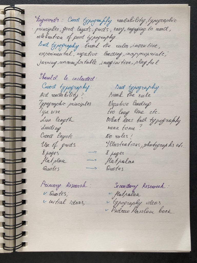
Primary research
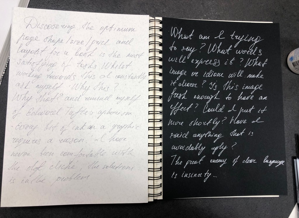
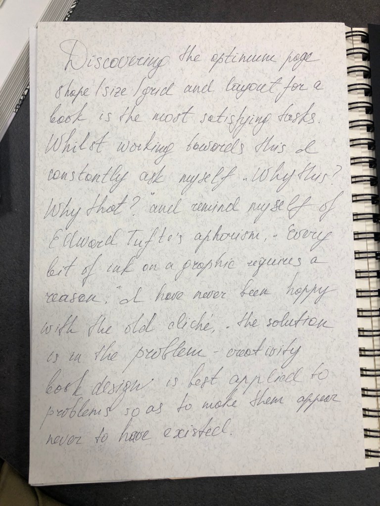
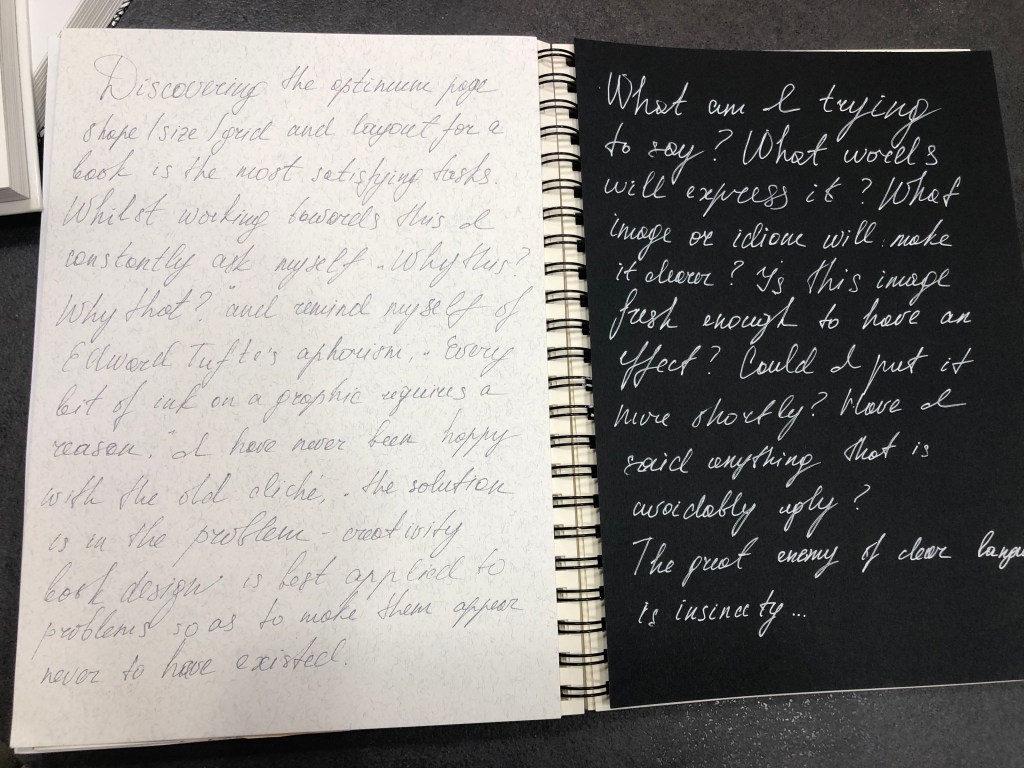
To start this assignment I decided to refer to Andrew Hasslam’s ‘Book Design‘, as it contains valuable information that will help me to set up basics for my books. The author says that the most important part of the book design is documentation. It is fundamental to typography, graphic design, cartography, charts, tables – all of them are components of the book. So, here I realised that very important to include my creative process in those books. I want to construct the combined design from digital and analog materials, by documenting some of the creative processes stages.
Another part, is to decide what approach I would like to apply to those designs, Expressive or Conceptual? Expressive are rarely have some rational explanations into them, it is often lyrical, and, not intended to bring meaning. The conceptual approach evolves around “big idea”, and it is based on communication. Often it is clever, witty and entertaining. I’m more inclined towards the idea of the Expressive approach in design for the Bad Typography, it can be full of experiments and non-standard solutions. At the same time for the Good Typography book, the Conceptual design could work quite well, as it can be neat, organised and follow the guide type of design.
I think, that the Bad Typography book will be filled with experiments and different solutions for the distorted font, glitches, sentences lines all over the place. But Good Typography will be an example of a marketing brochure, where is important to produce pristine and neat design, so it serves to purpose to bring aesthetic pleasure from the reading.

https://webb42.files.wordpress.com/2009/10/img045.jpg

Format
I was thinking about whether I would like to design a pocketbook, or should it be a large format? Is it portrait or landscape format? I think I will go with the format 162×246 mm, which is kind of smaller than A4 format but still will fit nicely into the standard continental sheet size of 700 x 1000 mm.
https://luminerydotcom.wordpress.com/2012/07/12/its-a-project-by-chicks-on-speed-2004/
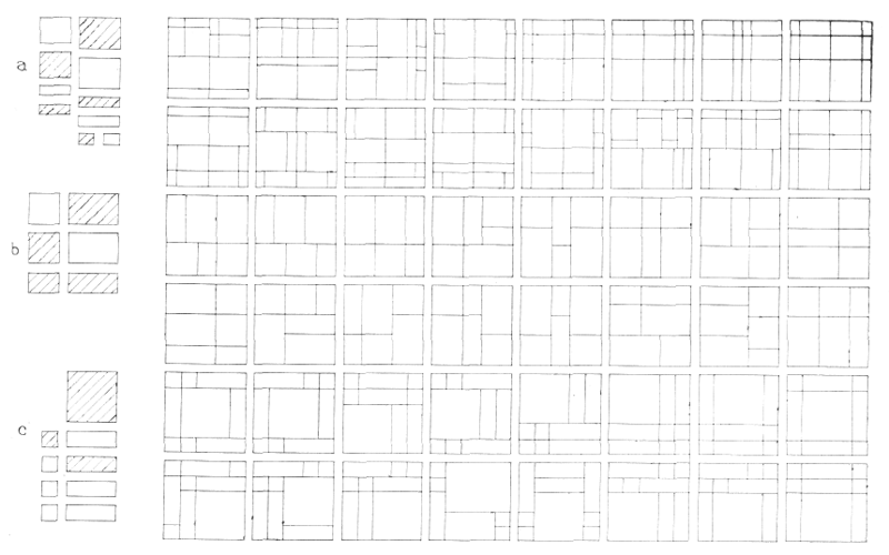
Golden section, the Fibonacci series, and its derivatives
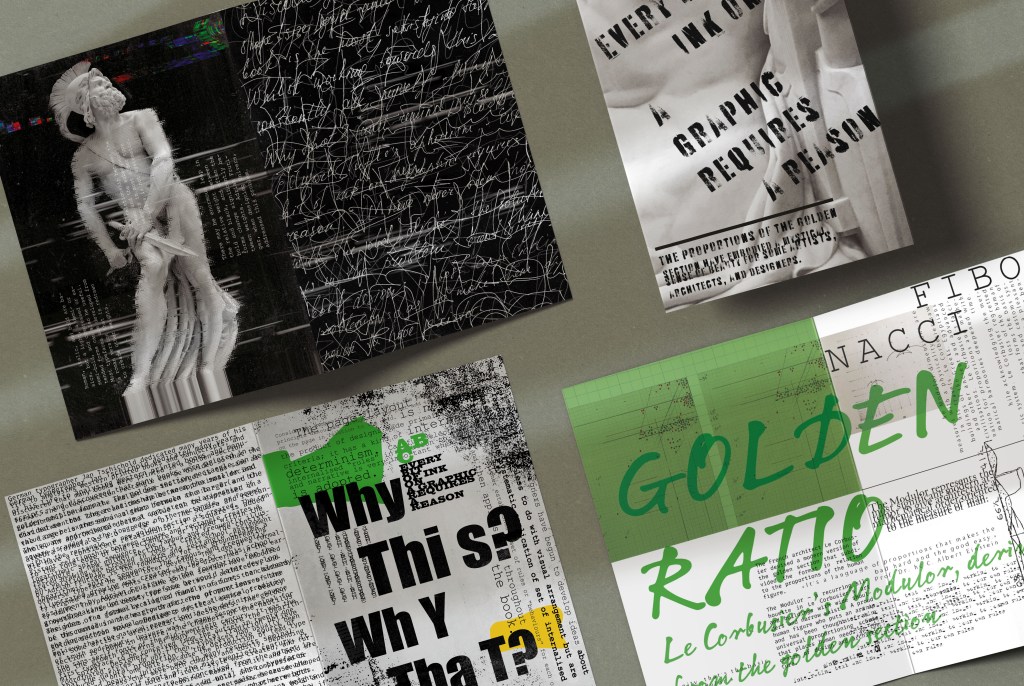
Those could be suitable components for the Good Typography books. I imagine well-balanced designs, with clean white space around, neat columns, all organised nicely and within the grid that was designed accordingly to the Fibonacci series table. In this third part Creative Book Design Unit, the whole research task was dedicated to the Golden Section, and I think this is the relevant direction for the Good Typography book. Nice proportions combined with readable accurate typography would create the right solution for the first book.

Modulor, 1950/52/60. Works based on the human proportions.
http://corbusier.totalarch.com/le_modulor_II
Design brief
Here I wanted to go through some essential parts from the brief, and to determine some priorities from the assignment and key points that I need to pay attention to.

Grids
This is quite a significant part to include in my books. Grids are essential components for most of the book design. The format of the book determines the external proportions of the page when the grid explains the internal division of the page. Grid usage gives a book consistency and the look of a coherent template. I would like to use grids for my Good Typography book, as I believe it will help to concentrate on the content of the book. But for the Bad Typography book, I would like to challenge the template and not use grids in it, as some designers think that grids can limit the layout, and restrict it from creativity.
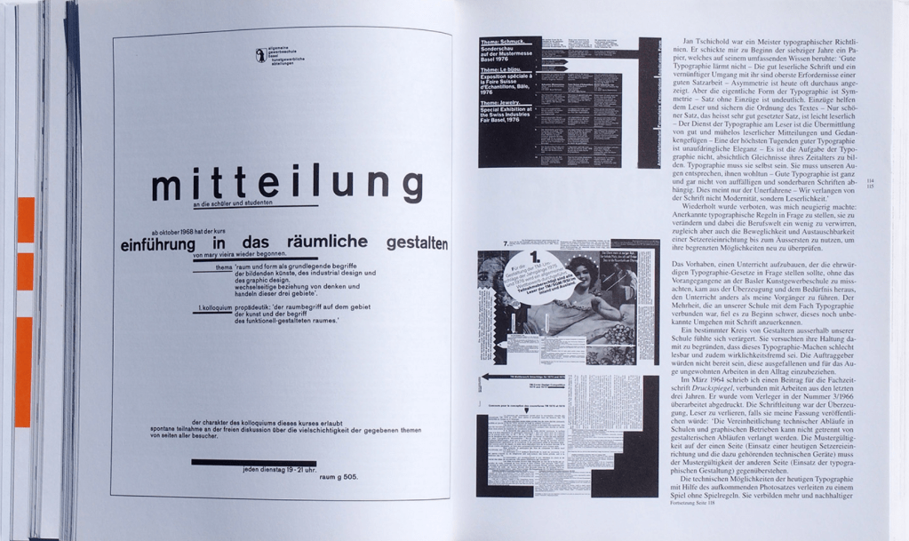
Another point is to consider is the text area where the information is going to be placed. The text area could be symmetrical and asymmetric. I think I could try both, and see what will work in the best way. Symmetrical text placements were mainly used in medieval manuscripts and considered to be traditional and based on natural proportions. Jan Tschichold was one of many artists from the beginning of the XX century who questioned those old types of grids, text placement, and layouts. The modernist thinking on book design was influenced by Bauhaus and Constructivism.
http://page-spread.com/wiengart-typography-my-way-to-typography/

https://bit.ly/2XPcRwN
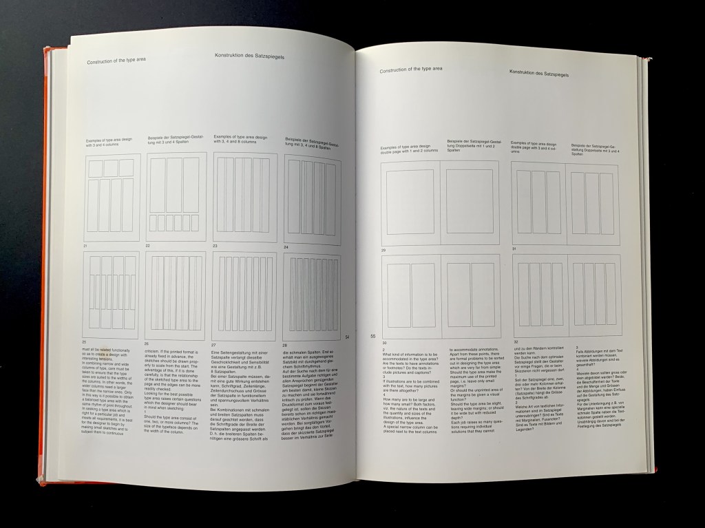
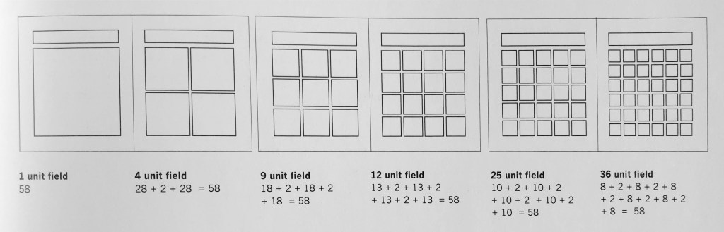
Using a modernist grid any number could create unites, but usually, columns of the grid are divided between two to eight. For example, if the page is four columns wide, a field with 24 units will be created, or 48 per spread. Once the grid is created, the next step is to think about folios, footnotes, labels, and annotations.
Multi-layered grids are something to consider as well. The system was developed by Swiss designer Karl Gerstner. The grid is quite flexible and can fit different-sized images depending on the number of images that need placing.
Avoiding Grids
Many great illustrated books don’t have a grid system in them. The book below is the example of composition only relating to the width of the spread. However, the layout has some magnetic feel to it, and the creativity of those illustrations can’t let the reader go by.
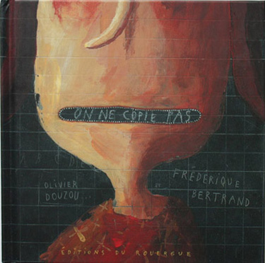

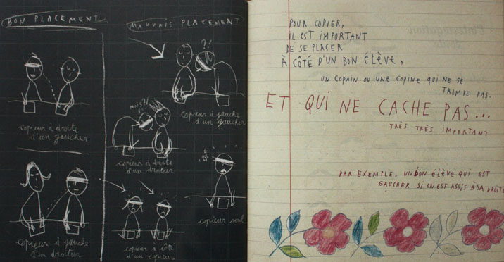
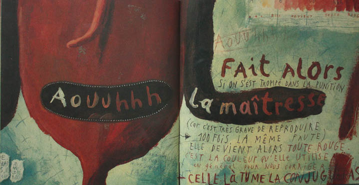
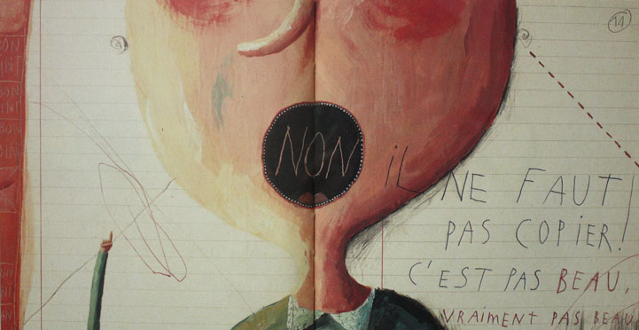

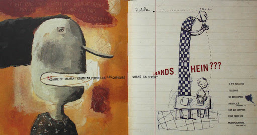


http://www.lesfreds.com/fb/index.php?/edition/on-ne-copie-pas/
Layout
When we browse for books, we pre-read them by flicking through the pages. The potential reader creates the judgment of the book from the quality of the book and overall appeal. If the layout is messy, the print is poor resolution then the book is instantly devalued. Very important to create a right first impression.
Many editors start their work with a rough flatplan. The flatplan is a diagram that shows all pages of the future book drawn as a spread. This is an example of the flatplan for the David Haslam Book Design with codes such as green corners for part opening, for black for folios, red for pages with photographs, and blue for diagrams. Quite a useful technic when book design including multiple pages.
Pinterest Mood board
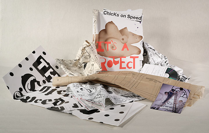
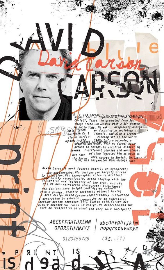
Here I collected some interesting ideas for my typography books. When I look at this collection of designs I can see that here I gathered different templates structures, most of them missing the grid system, and they are based on the creative, rebellion approach, they are bad typography examples. I think David Carson’s works are the prime example of Experimenting Typography, he brought the creativity of magazines to a new level, he purposefully didn’t use grids and avoided the rules. Also, I saved works of the book Chicks on Speed, fascinating format, and unusual combinations in textures and images.
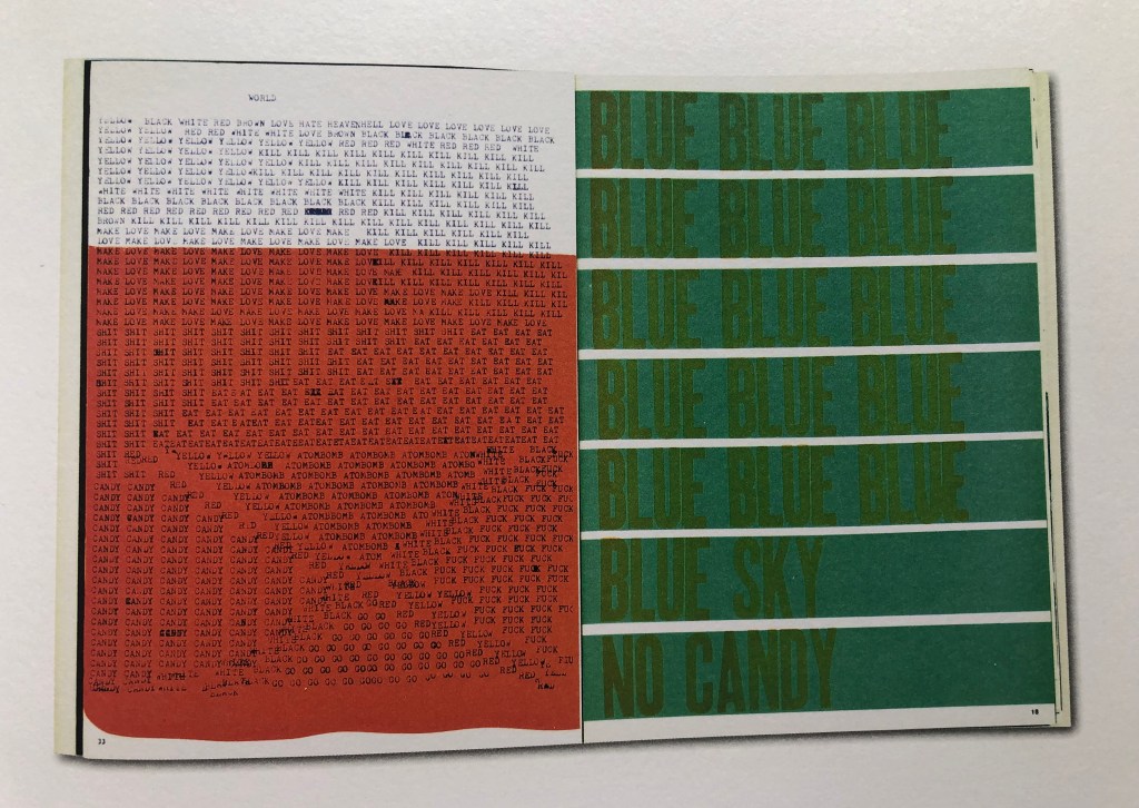
If I look back to my previous exercise with experimental typography I created some glitch effects in them. I think I could use this approach for my Bad Typography book. I’m keen on the electronic type of digits, with some distortion. This approach is quite often used for techno music posts, the scene where designs should look purposely distorted. The idea of techno allows the computer to do what it wants to do. The computer is alive, and do noises, such as bleeps, clicks, it is a living machine. I have the concept of combining sound and typography.
I’m fascinated by how simple HTML font looks like design, for example of minimal design, this is the typography without any special appreciation. I’m intrigued by this is design point of view. At the same time, this is the most used font design and is under-appreciated. I also see the connection between HTML code and computer and technology. Techno is the scene where the computer meets sound. There is a symbolism of code and the relations of code to the computer and how some music within a techno scene is encapsulated.
Experiments
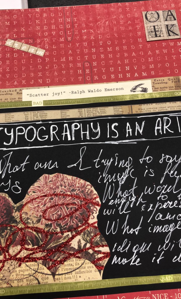
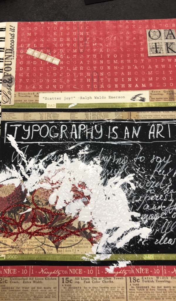
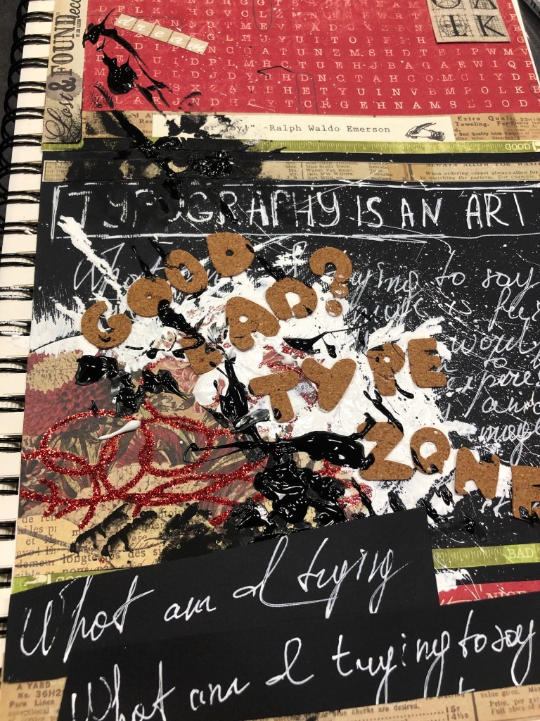
After some researches, I went to the next level of some experiments with typography around me. I had some examples of craft around, so I wanted to try some cut and paste approaches, similar to fanzines. These could be examples of experimental typography. In addition, I made my own writings with a white pen on the chalk board. At this point, I was not confident about what exactly I’m looking for but it was worth seeing whether those typography examples are going to work.
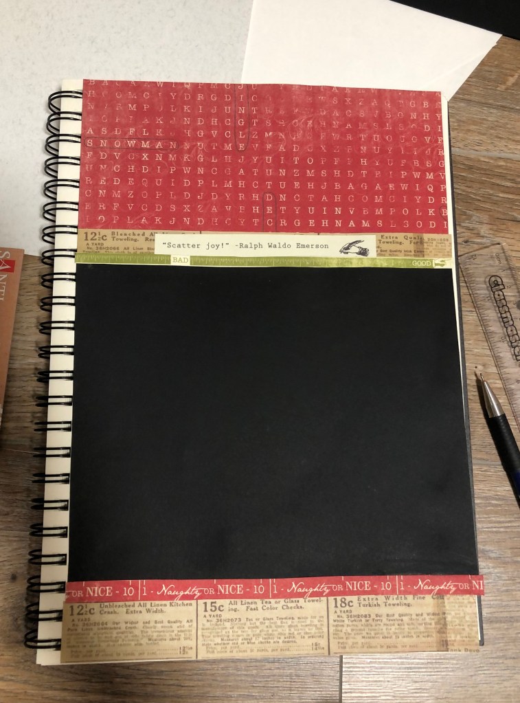
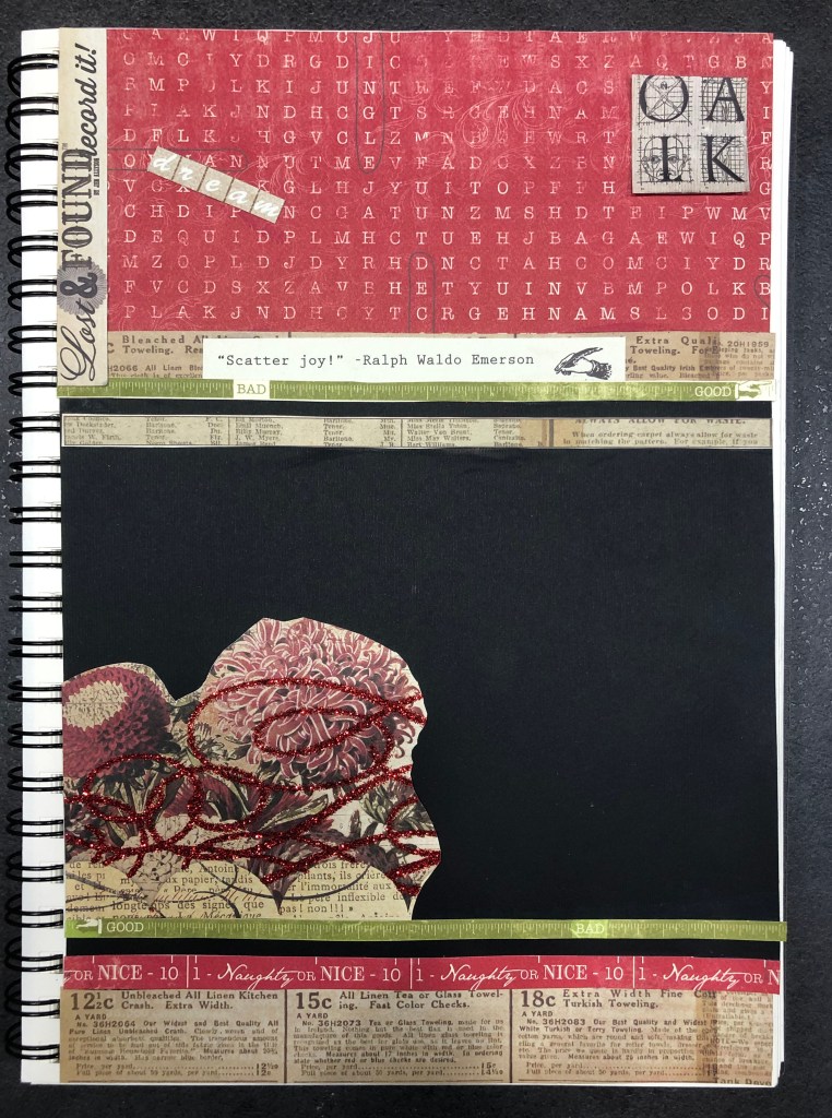

I had some fonts examples that were not my favourite, they mainly were used for posters, or signages, probably not for books or magazines. I wanted to stick them together in the similar way as I had from the Type Tells Tales book. These were examples of Lora Fosberg text Paintings. All her works hand-painted on small slips of paper adhered to panels. This is example of attraction to the what surrounds us: ‘old signage, vintage graphic design, pop culture’. I think I tried those examples mainly for experiments. I was not quite sure whether I’m going to include them, but it’s always useful to discover.


Another example that I could possible use, was my own handwriting. I always wanted to apply it for some designs, would be interesting to create some sort of juxtaposition with my own handwriting and some electronic fonts around. I thought it still needs editing in Adobe Photoshop, so I kept it just in case for later.
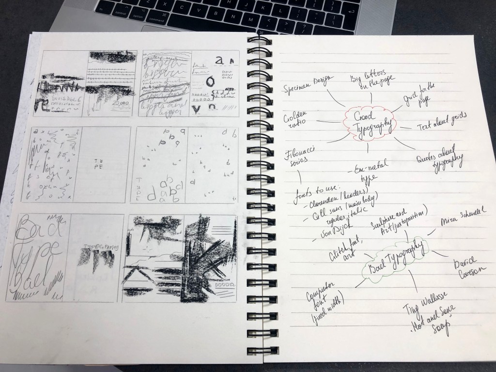
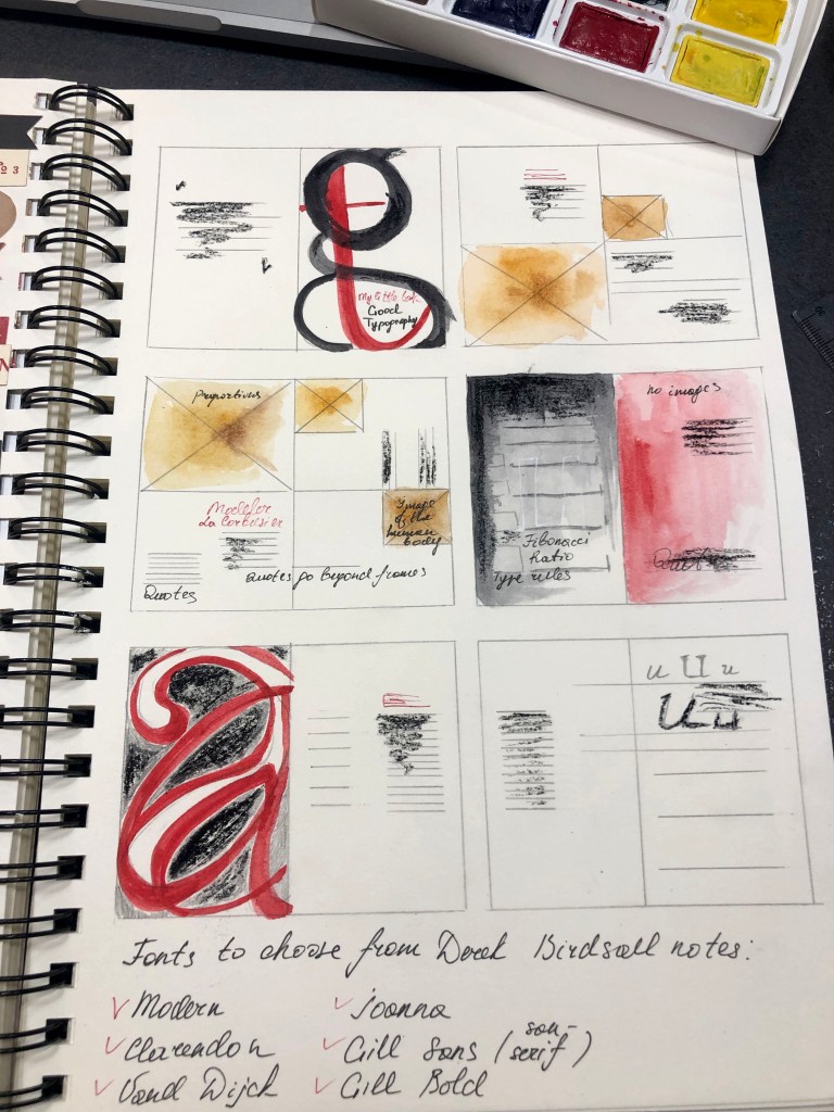
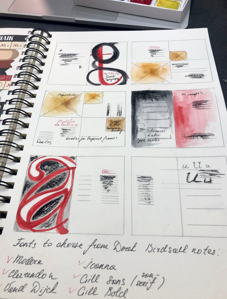
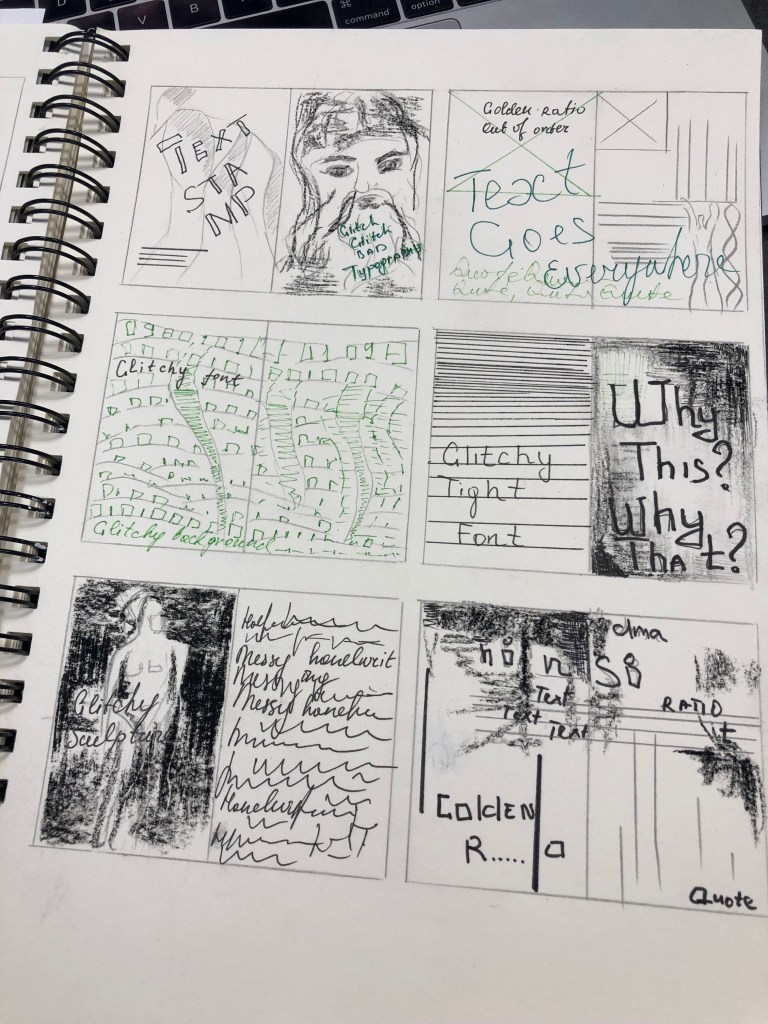
Mind map good and bad typography
I created a mind map of final parts that I was going to include into my booklet. Those were going to be for the Good Typography:
- Golden Ratio
- Fibonacci series
- Le Corbusier
- -em metal type
- Quotes about typography
- Fonts such as: Clarendon, Gill sans, Van Dijck.
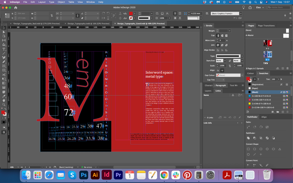
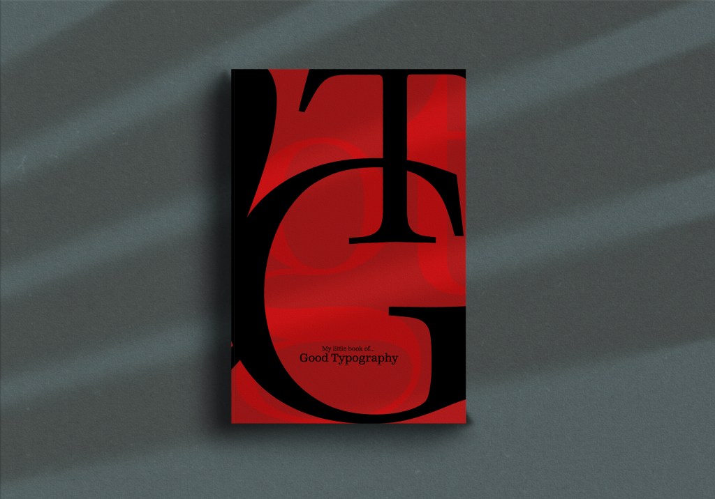
Design-wise I wanted the booklet to look like a specimen catalogue, which would celebrate great book typographies. For the colour palette, I decided to go for red, black and white. Instead of photographs I wanted to create big illustrations made from letters, they would look like decorative parts of the design.
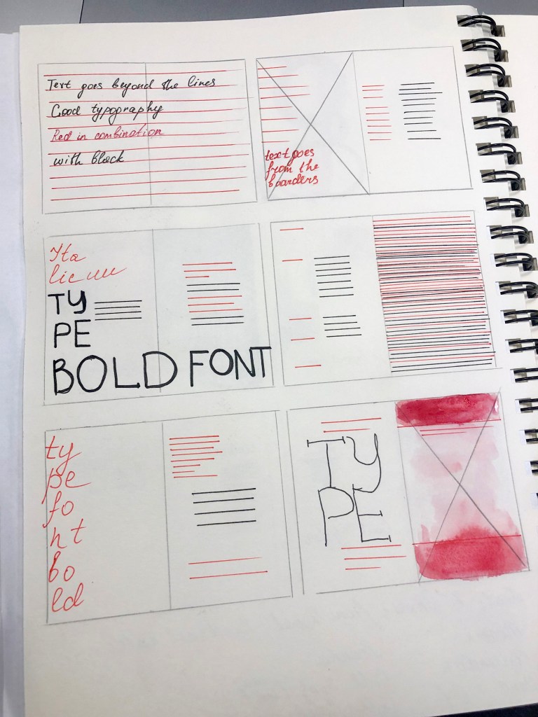
For the Bad Typography book, I was going to use a bright green colour pallet with some contrast dark backgrounds. Also, I wanted to combine art and glitchy fonts. Things to include:
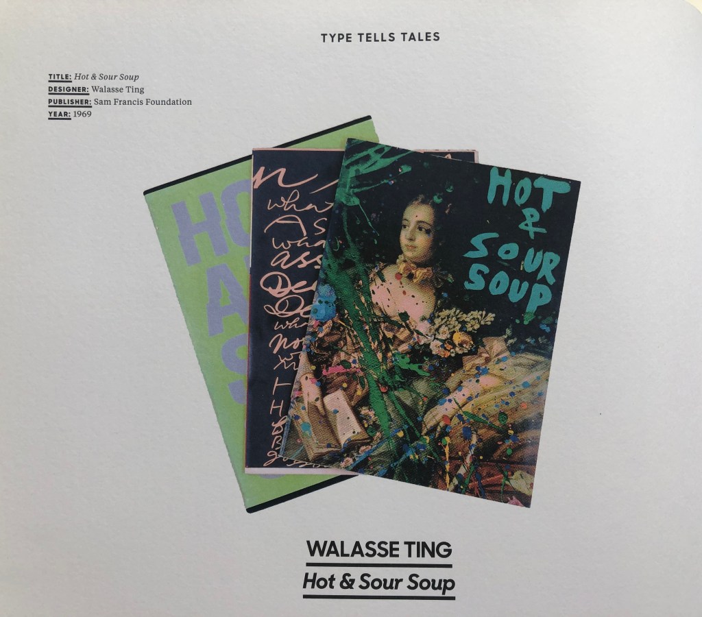
- Art or sculpture combined with hand written fonts (Ting Wallasse Hot and Sour Soup}
- Messy typography with different bas spacing (David Carson}
- Concrete typography (Paul Dutton Plastic Typewriter}
- Black background use with some paint brushes elements (Tomato, Mmm…skyscraper I love you}
- Flying bits of typography (Mira Schendel}
Book 1: My Little Book of…Good Typography
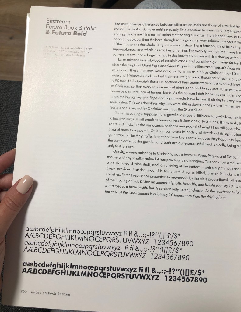
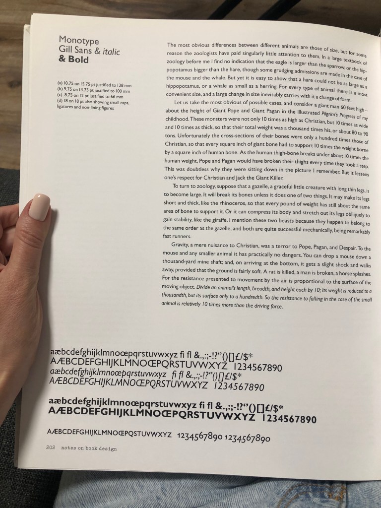
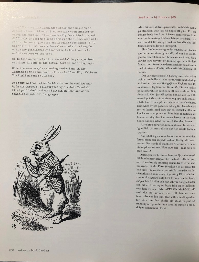
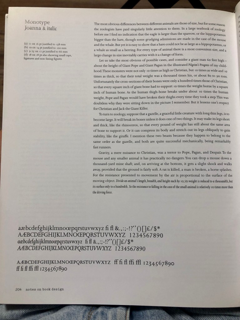
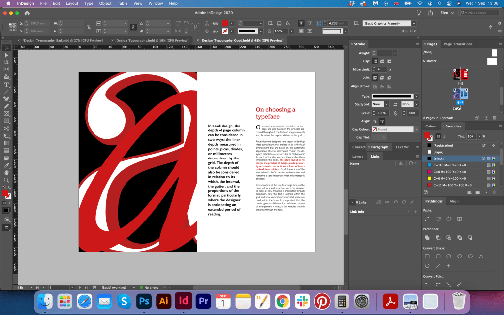
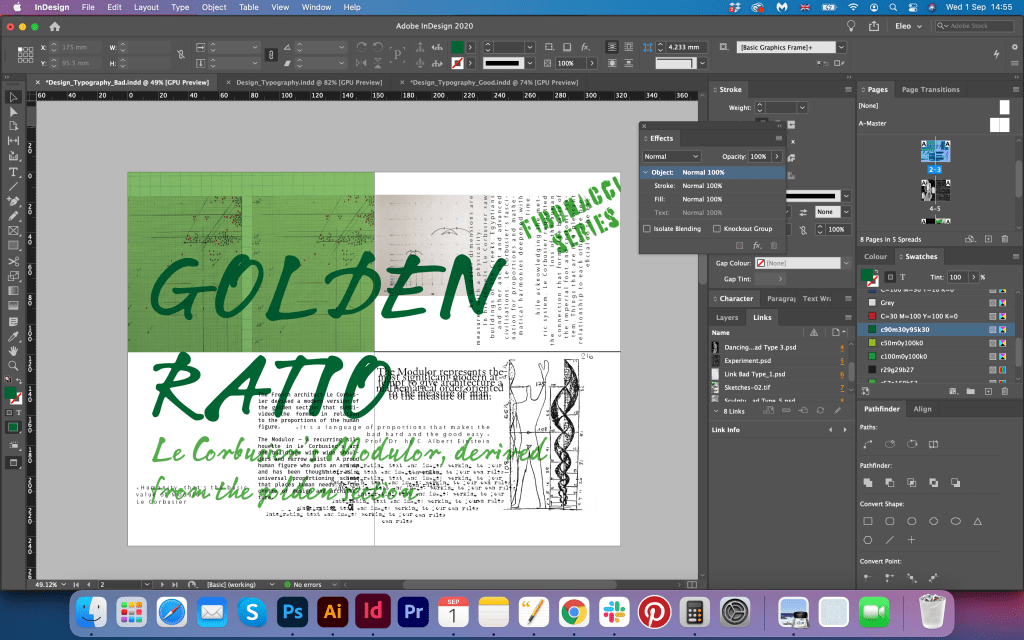
As I decided on the format of the booklet 162 x 246 mm, I did sketches in similar proportion pages. The idea was to create a clean and neat brochure, which would look like a catalogue of fonts. As the navigation to the font choice, I wanted to refer to the Notes on Book Design by Derek Birdsall. He gives some recommendations on what fonts should be used in book design, depending on the set of symbols that will be used in it, whether there are numbers, or formulas, or just magazine text. From the first point, it looks like those fonts don’t have anything in particular in them, but when I looked at the examples of actual text, I could see that those fonts are readable, works good in columns and quite well balanced on the page. I see this as a valuable example of good book typography, and I think would be great to celebrate those fonts.


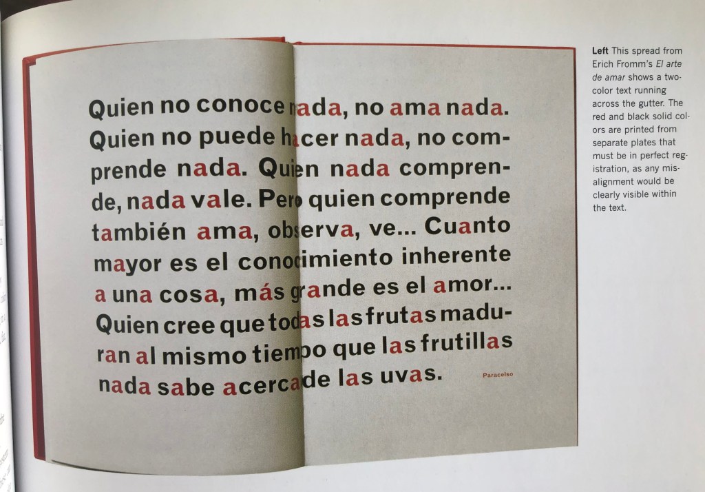
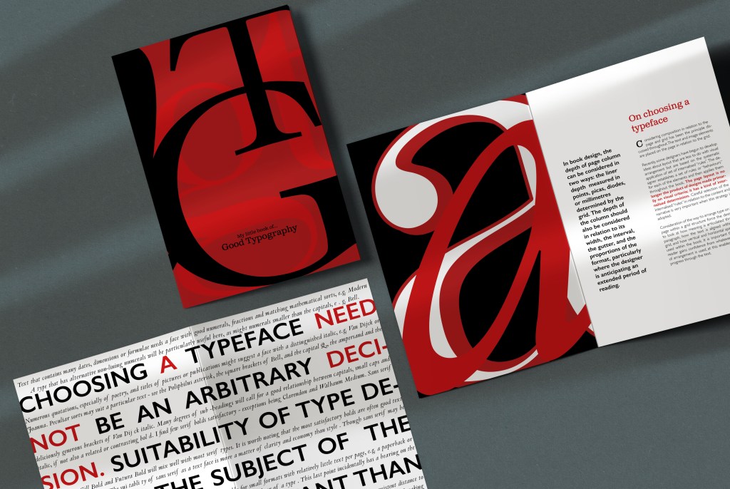
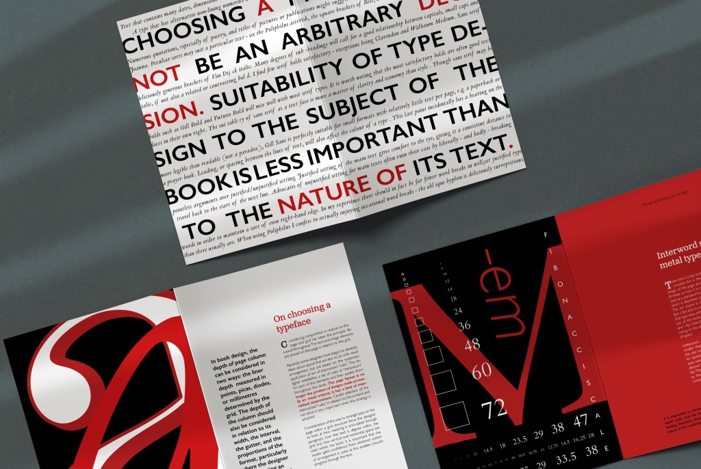
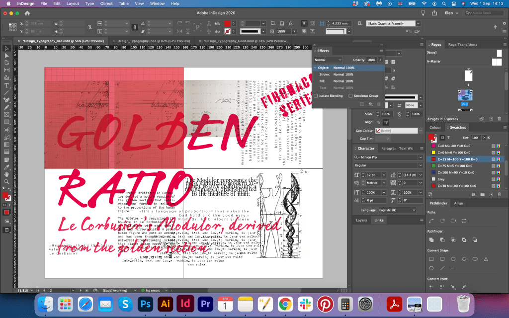
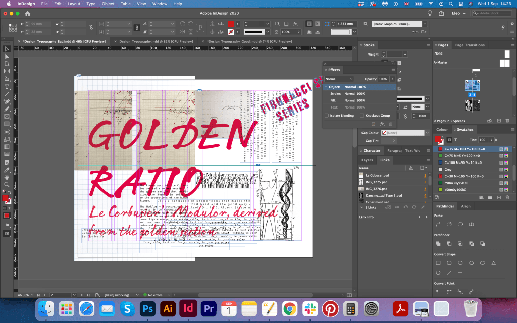
I did some sketches for the cover, that would reflect my initial thought about design. I was not quite sure about what pages should go, as I could have only eight pages, including the front and back cover. I didn’t want the brochure to look just like a magazine, I wanted it to look more like a bright catalogue and have the accent on the typography. I think the hierarchy should go on the decorative, and nicely designed letter, and then on the content. That second spread from Erich Fromm’s El arte de amar shows two-colour text running across the gutter gave me the idea that I can use a similar approach in my design too. The text goes out of frames, but despite that, it is big, readable, and play a decorative role on the page.


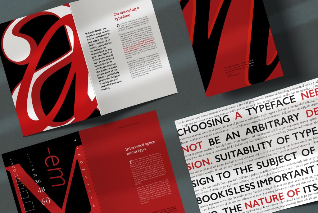
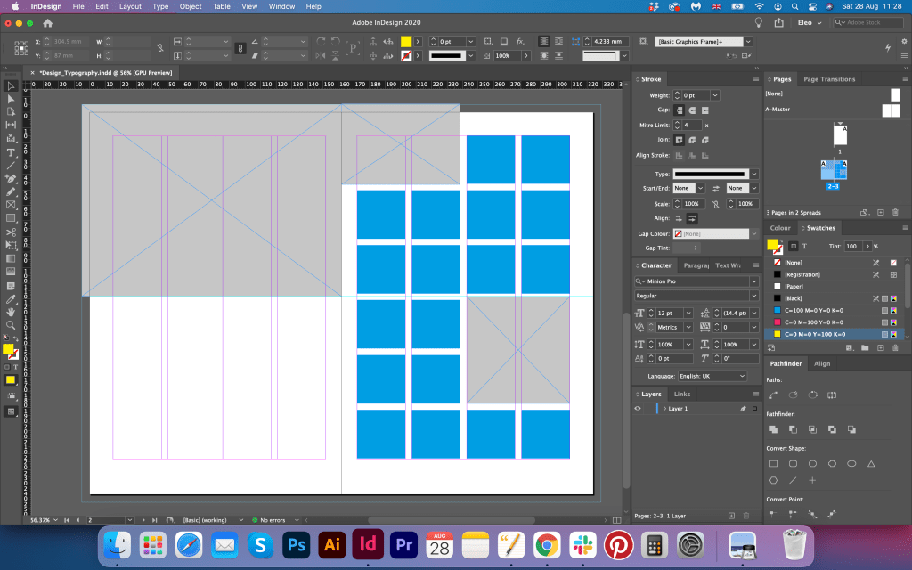
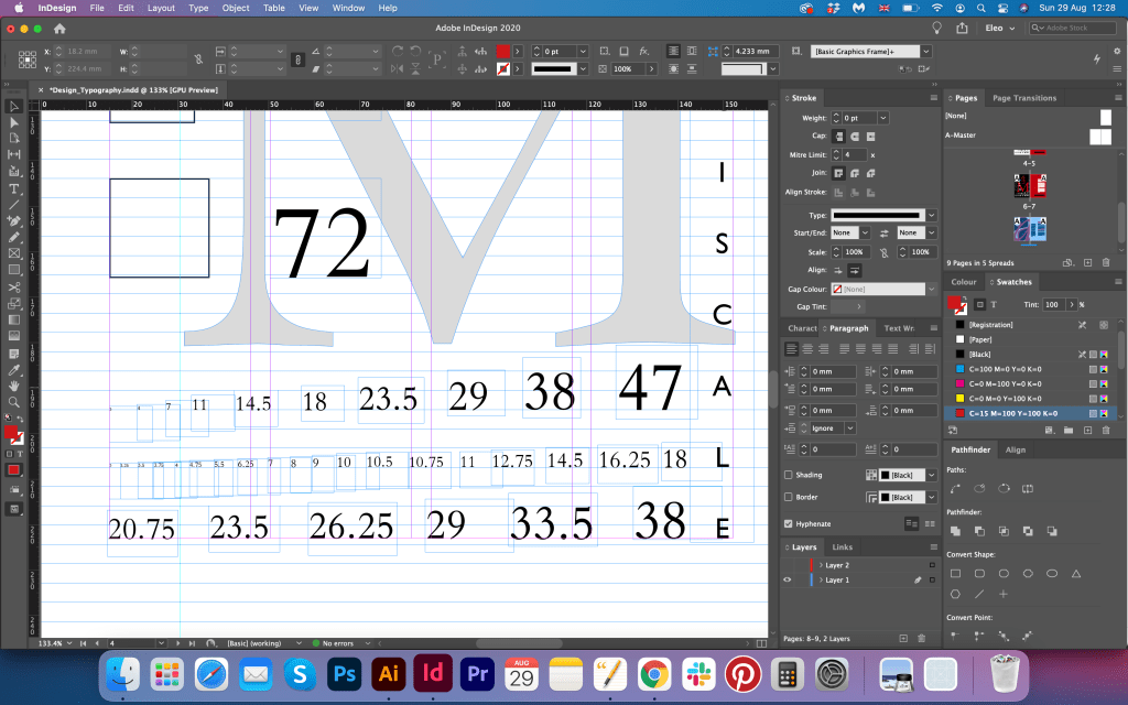
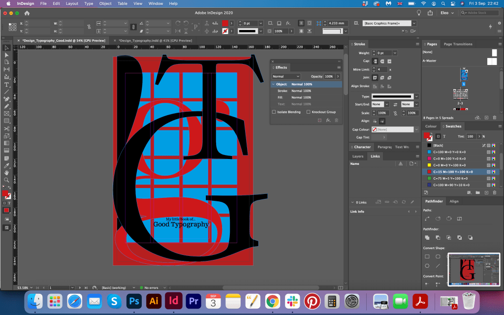
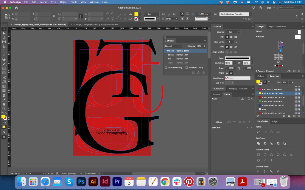
I created document in Adobe Indesign with pre-agreed portrait rotation of the page. On the page I made a grid that I was going to stick for the text columns. I started with Le Corbusier spread with some quotes and running texts from the side of the columns. I tried the experiment with rotation of the columns and some squashed fonts, it looked creative but I thought it was missing the celebration, so I decided to keep it on side, and concentrate on other pages where I was going to show the sizing of the letters according to proportions, I did page with the letter -a- in different variations on the top of each other, and combined fonts for the text columns. I used the principle of serif font for the header Clarendon Text Pro and san serif for the main body Gill Sans light and semibold, which is always works for the neat brochures.
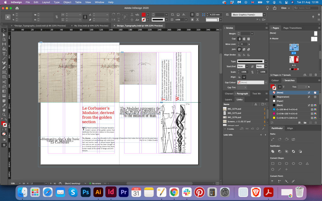
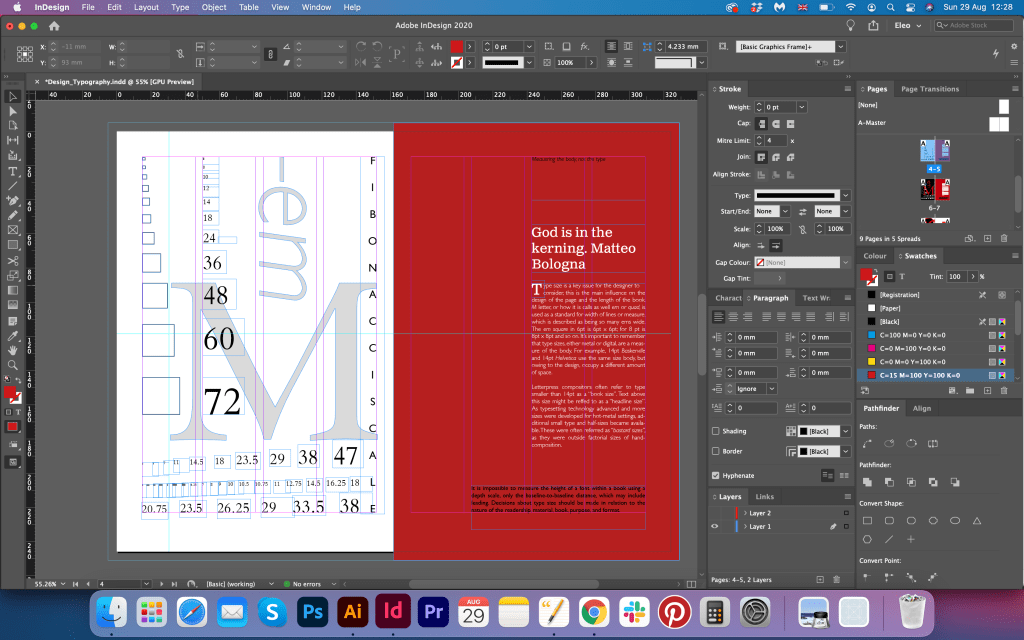
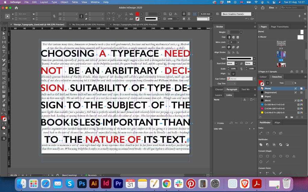
Later I tried the spread about the Univers font, that would match to the first Le Corbusier spread, but they were missing some main point from the brief, they were nicely organised on the page, but I thought they were too plain for the typography booklet, so I decided not to use them. Referring to the spread I discovered earlier, I decided to create that page with big capital letters in red and black colours and some running italic wording under it, which was good addition to this brochure.
Also, I was still considering the design of the cover, I was not sure that lowercase letters -g-t- looked right on the front cover, therefore I decided to experiment more, and try capital letters instead. Also, I changed the colour of the background to dark red, on the front I placed bright red lowercase letters and black capital letters on the front, so it created unusual 3-d feel, and finally the cover became more eye-catching and had some depth into it.
When I look at those pages placed together, it gives to me the feeling of the completed project, and I can see I accomplished some aims some targets that I had for my booklet. The reference material that I gathered and my researches helped me to create traditional ‘good practice’ typography booklet. I discovered that choosing the right font is one of the fundamental parts of a good typography booklet. The font should be readable, have the right kerning, be traditional and serve the purpose of being clear on the page. My pages with the size of the letters is a good demonstration of the golden ratio applied to the font size, which should be kept for the printing materials. Another part that I included in my brochure are grids, which helps to organise images and columns into the proportional frames on the page, depending on the format. In addition, the booklet has some creativity in it, as the use of big letters or text running through the page still can look well-balanced and proportional.

Book 2: My Little Book of…Bad Typography
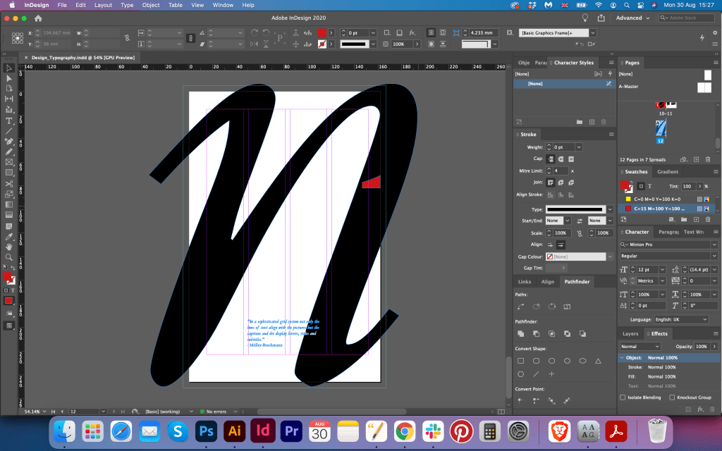
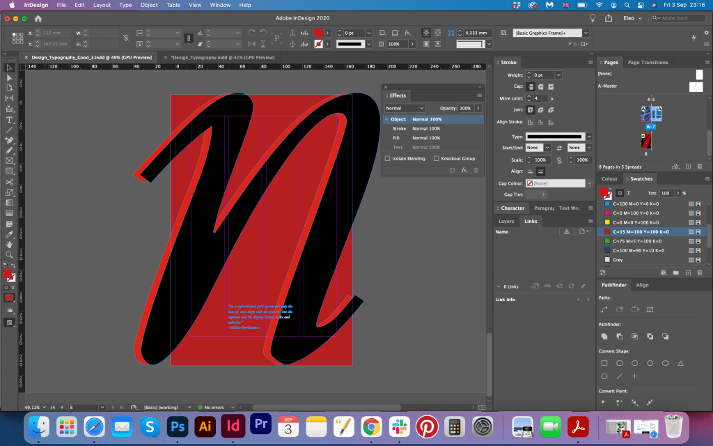
For the Bad Typography book, I was prepared in advance with all the ideas I collected earlier. I thought it is much easier to create bad typography, as the field is quit broad, but at the same time, I tried to think about the concept, as I wanted my booklet look cohesive. I just needed to recreate the ideas that I had in my head. To start with I wanted to go from the techno scene for the design, I wanted to go from the glitchy effect combined with art, have some sort of computerised typography, which would look like HTML code. Later I reorganised those thoughts in my head and decided slightly to lose the idea of HTML code font. Instead I could use fixed width font, which could be hard to read if it is not placed correct on the layout. In my book Type Tells Tales I found those amazing examples of typography designed by Walasse Ting Hot & Sour Soup. I loved how the author combined Renaissance art with handwritten typography, typewriter typography in the patterns, and the use of colourful and black backgrounds on the page. Also, my inspiration was David Carson, with his approach ‘out of the rules’. I wanted to play around not as much with ugly, messy fonts, didn’t want that look of obviously bad type, I wanted to see it as a creatively bad font, with some difficult to read, out of the space fonts, too busy, and staff like that. Which could be a challenge too.

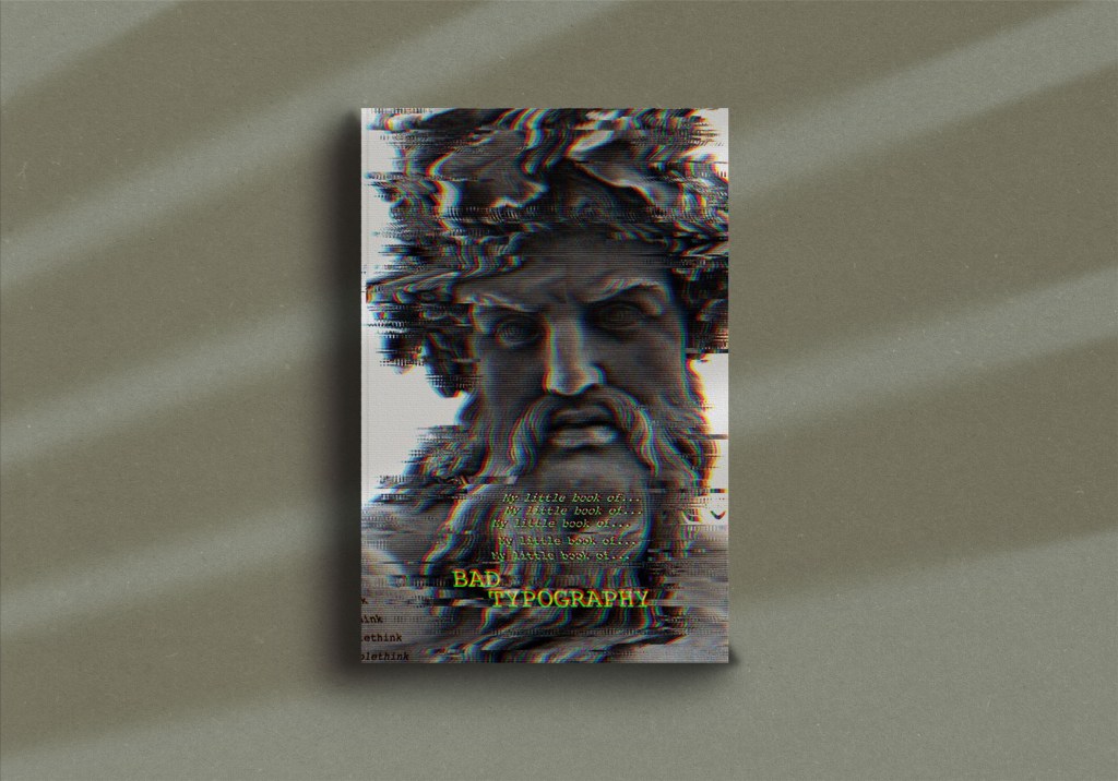
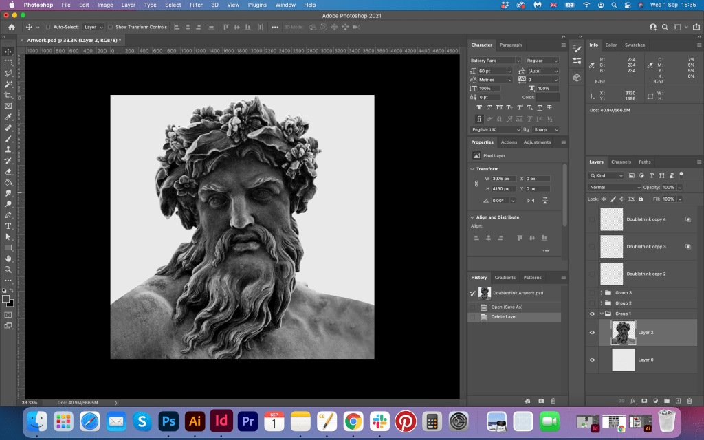
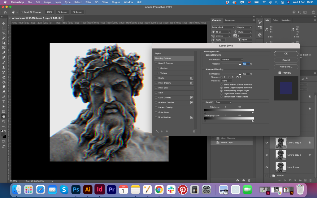
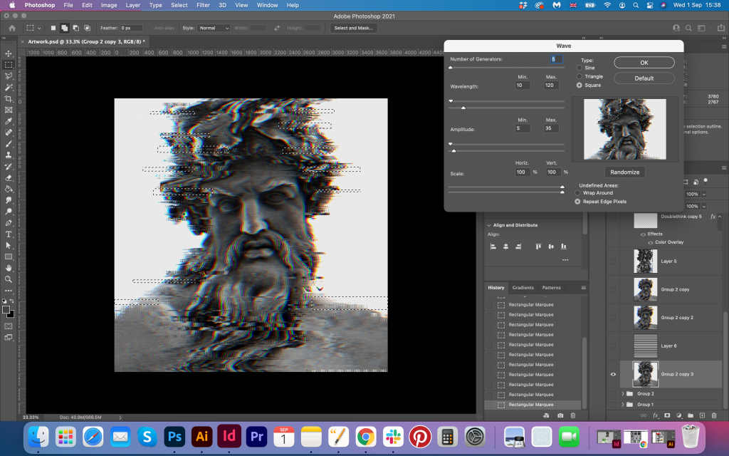
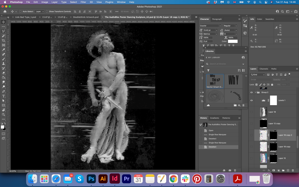
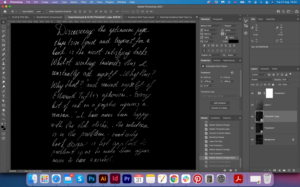
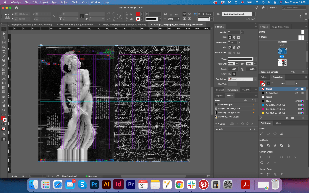
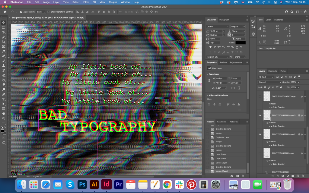
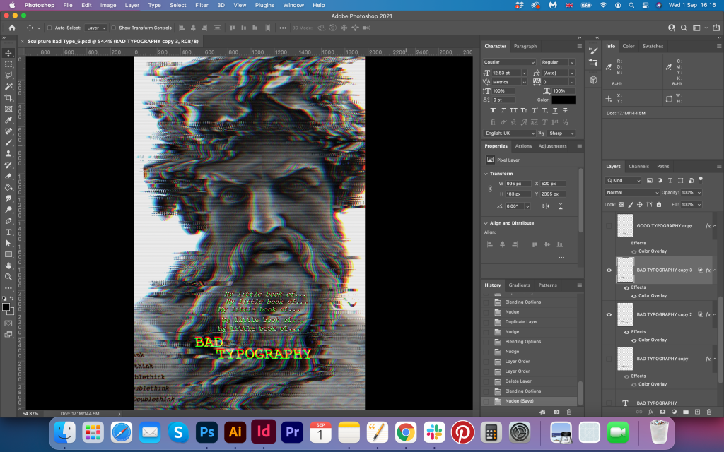
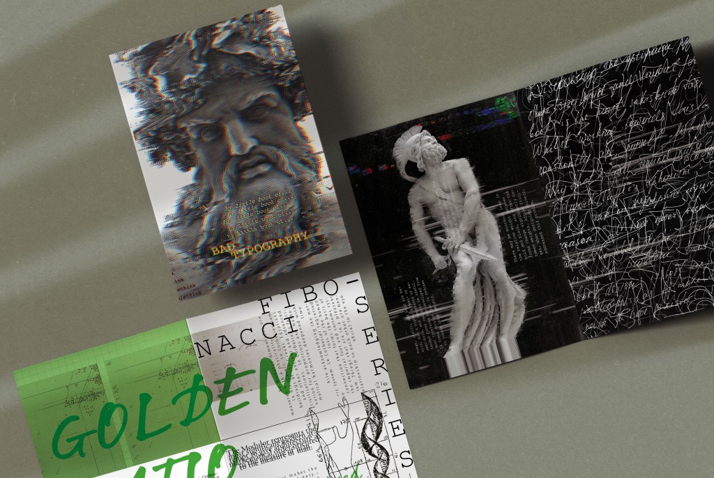
I started the book design with an inspiring image of the Statue of Zeus at Olympia. I wanted to bring some distortion on it, that to apply the glitchy font with it, that in summary would bring similar result as I had in Experimental Typography exercise. The placement of the type I left for later. I realised that the image of the sculpture dominating here, and that is a very powerful and popular piece of art, but I wanted to highlight it with the necessary brief, which is bad typography.
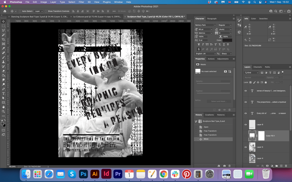
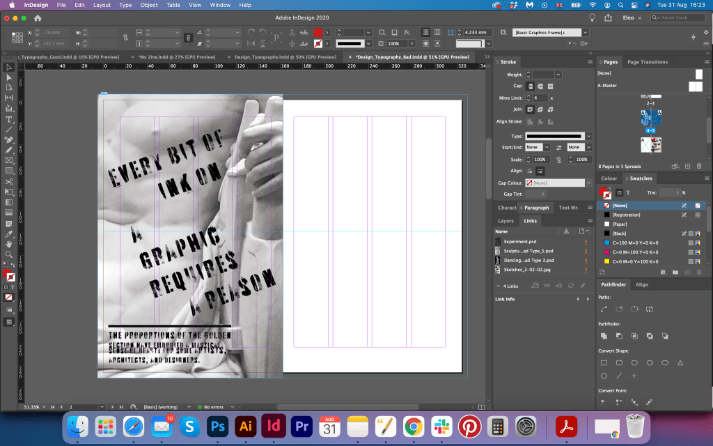
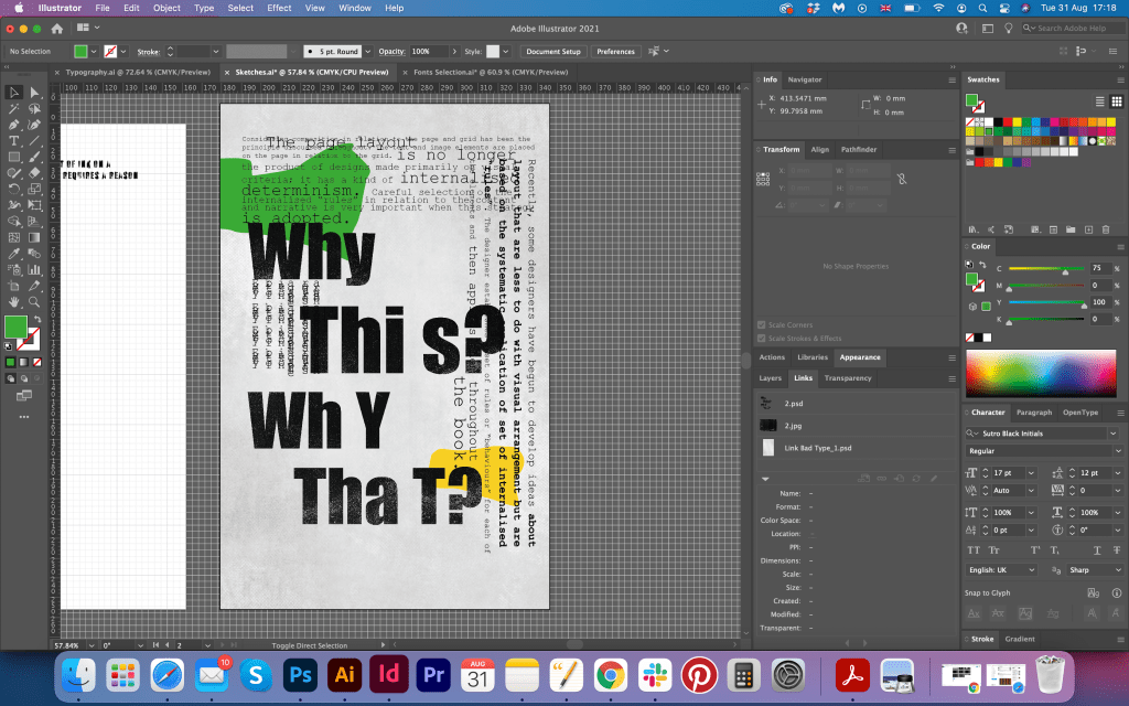
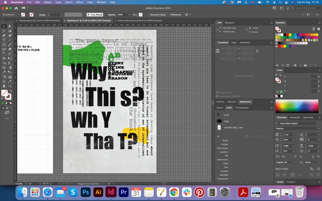
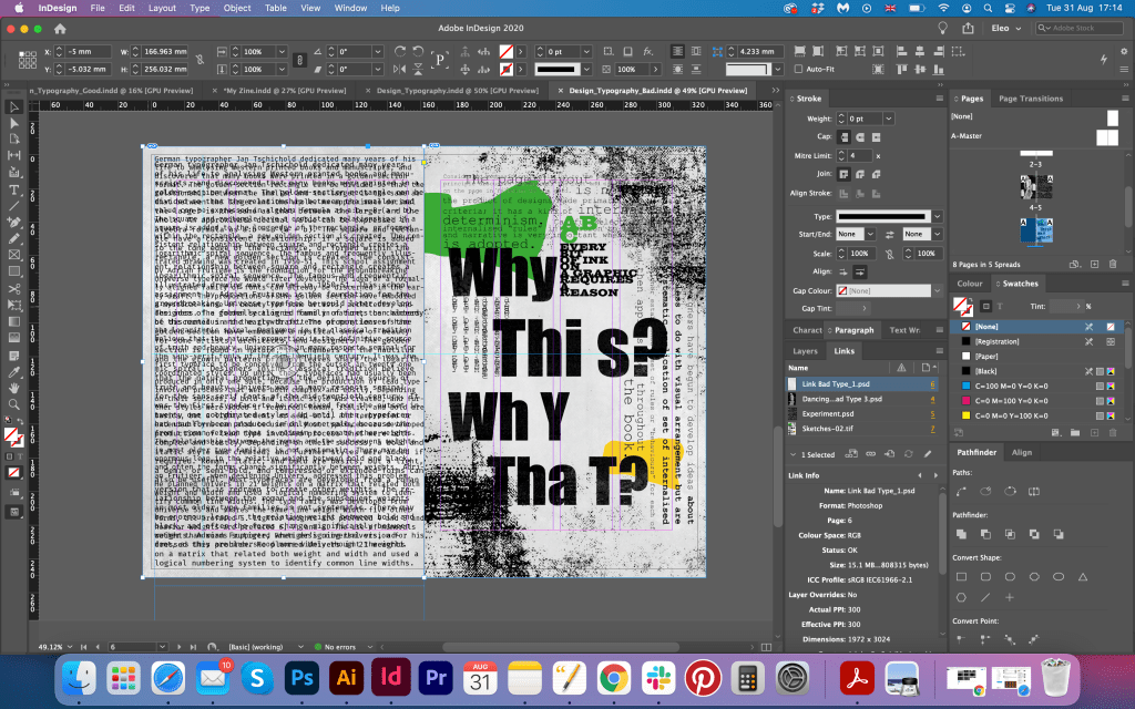
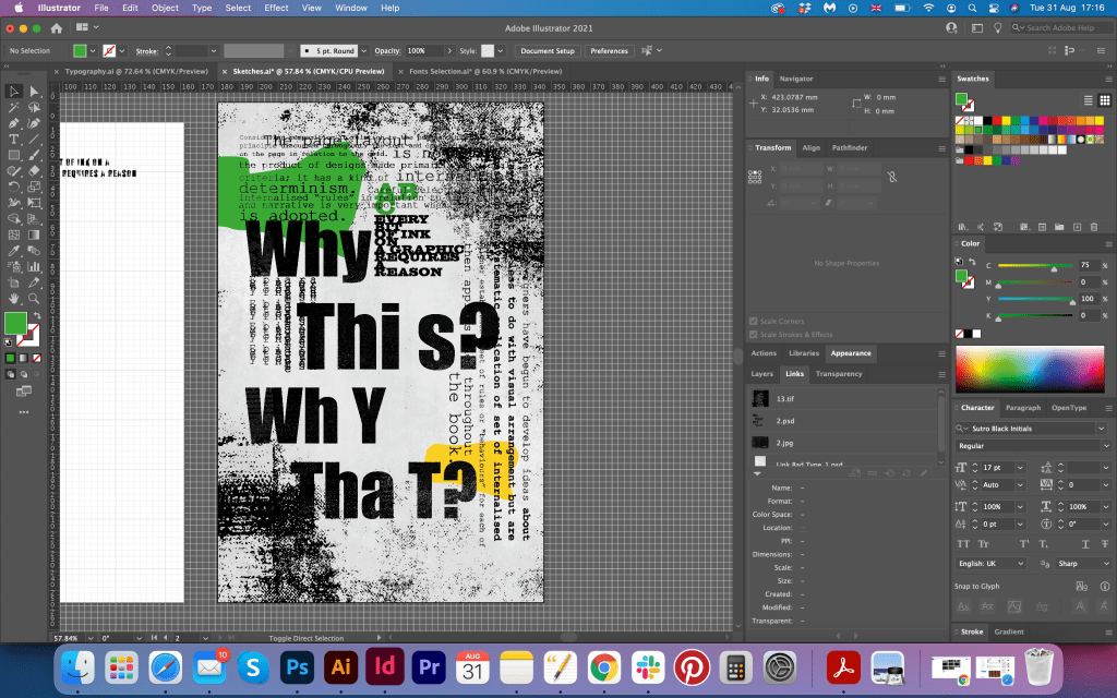
For the first spread I went for the help of good typography, the one that I decided to lose with the Le Corbusier spread, I thought that I can add it with some extreme running typography, make it look creative, and make some fonts look awkward, so it would fit the theme. For the header, I chose LTNotec, the font I made it run on the top of the text columns in green colour. For the main text, I chose fixed-width Fira Mono, also for phrases around I had hard to read quotes Old Typewriter, squashed text in VanDijck, Amaryllis font in angle, and Courier New font on the boarders. Altogether I had six different fonts for one spread, which is a sign of bad design, the idea was to overuse the number of fonts, also some of them practically impossible to read, but at the same time I have the wording about proportions and golden ration, which is the kind of juxtaposition in here. I’m quite pleased with this design, as it has the creativity and nicely responds to the brief, as the spread has some visual signs of bad typography.
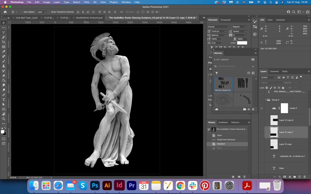
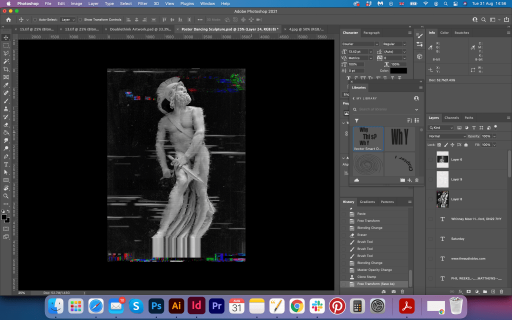
For the next spread, I chose another sculpture of Philopoemen, a skilled Greek general and statesman, I loved the way the sculpture is bend, I thought it would look great next to my handwriting, which I purposely made look like wrote in high speed, on the top of that I placed another layer of a pen stroke, together they created catchy 3-D look layers. Around the sculpture of I placed text in Courier New, but because of distortion around, it was hard to read it.
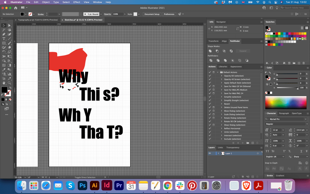
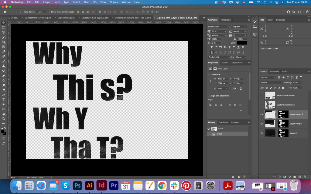
For the last spread I had inspiration from the David Carsons, Paul Dutton, Walasse Ting works. Here I have dominating big font Impact, with wrong spacing in it, saying Why this, Why that? with some text around it. I purposefully made some spacing wrong, the distance between the sentences. On the left side, I had the text looked like made by typewriter, all squashed as well, using font Fira Mono. I think those pages were good additions to each other and created good looking bad typography spread.
For the back cover, I used a zoomed-in picture from the sculpture as well, with some phrases about graphic design in stamp looking font Battery Park, again, bad looking distorted font, but works great with art as juxtaposition. Also, I did some text distortion for the front cover, applied an RGB filter in it, and made it look blurry and wavy on the page. That Courier New font is ideal solution for distorted images and looks like it was purposefully designed to be a bad looking font, which is great for electronic posters.

Conclusion
It was a great journey of creating two opposite brochures of Bad and Good Typography. I think, I was managed to create interesting looking and visually responsive to the brief booklets, that are completely different, but have some attraction to them. I realised that there is a thin line between bad and good typography, and only deep analysis helped me to determine some targets that I had to reach during this assignment. The first brochure with good typography was slightly easier for me to achieve than the second one. I think my Good Typography Book looks more cohesive, it has a running theme, colours are well-balanced and despite the different text structures, there is something in common between them. Keeping minimum fonts, and following golden rules was a massive help to me as well. Fo the Bad Typography Book I had more challenges, as I had lots of ideas in my head, however, I still needed the same running theme to throw the booklet. I think the Bad Typography Book reflecting Fanzine style, I enjoyed searching for the bad types and exploring them, but probably in some pages I was too careful with text, for example for the text with a sculpture of Philopoemen I could go wilder and create more glitches and distortions for the text, but the page with handwritten wording looks how I imagined it. I hope this assignment will bring some good results into my course.

Printed works
