“Typeface choices might be influenced by what is legible, what is available on a computer and by the nature of the text. Typefaces can also be chosen for historical reasons. While a novel set in Renaissance Italy or eighteenth-century Britain may benefit from the use of Bembo or Baskerville respectively, it is not a necessity. What matters is that the text is readable and attractive to its intended audience today.”
Phil Baines & Andrew Haslam, Type & Typography , 2005. London: Laurence King Publishing.
In Exercise 3, you have to choose a typeface for the text, but how do you choose a typeface? In Notes on Book Design, Derek Birdsall describes clearly how you can choose a typeface that is appropriate for your text. Read the section ‘ on choosing a typeface ’ in the book, Notes on Book Design , and use this as an approach in Exercise 3.

pp. 186-187
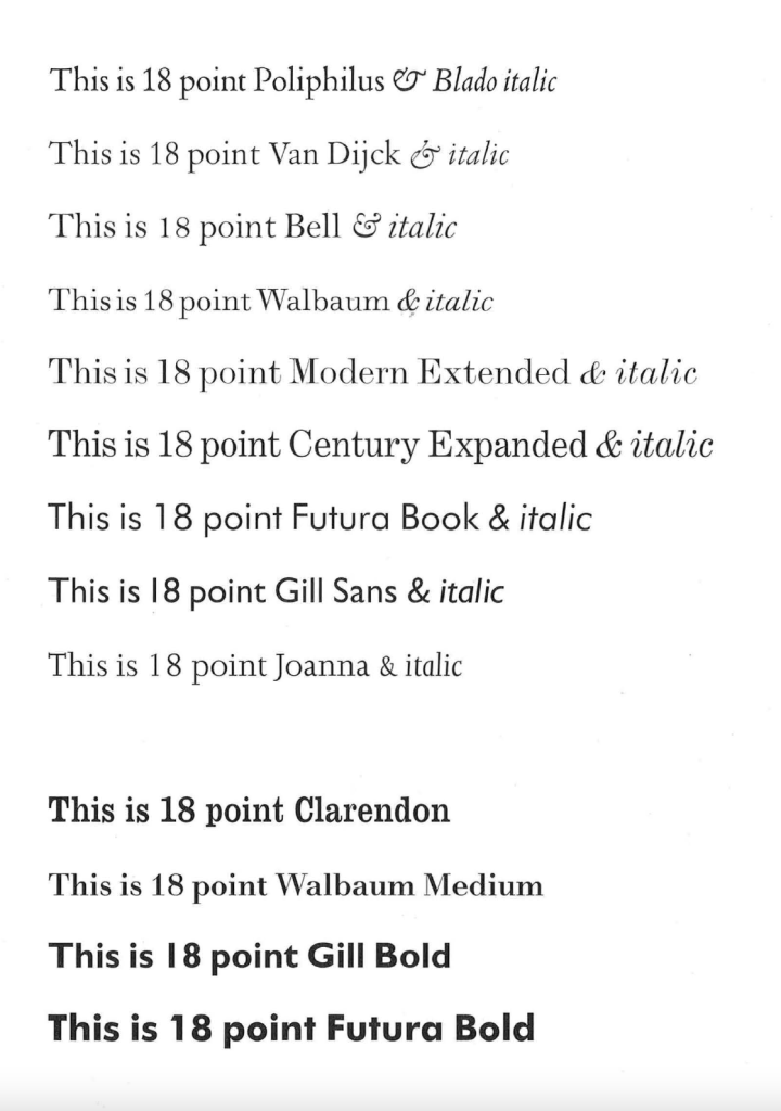
With the help of my students group I was managed to find this important piece of information on the choosing type from the Notes on Book Design by Derek Birdsall. The author explaining in details how he choses the font for his book designs, what is the main guidance in typeface, and how to chose the right font for different occasions. I thought that would be useful to create a spreadsheet with the list of fonts, and top up the library for the next exercise. I think for the Exercise 3 I could try to play around with all of them, serif and san-serif they all should work well. The author of the book suggested that Vand Dijck and Joanna ideal fonts for the poetry type of texts, which could be close to the subject I need for the 20,000 Leagues Under the Sea, Jules Verne. Not sure about Modern and Bell typography, as they are better to use for the text that contains many dates, dimensions or formula, as they have good numerals in them.
Visually on the example with 18 points can be seen that all fonts are slightly different in sizing, but Derek Birdsall recommends to use Poliphilus font as the benchmark for the settings.
