
Below is an extract from Jules Verne’s 20,000 Leagues Under the Sea. Using a single typeface of your choice, lay out the text in as inventive a way as possible. Experiment with the letters and words, using the typographic principles you researched in earlier exercises to significantly alter the arrangement of the text, its rhythm and readability.
Think about design group Tomato’s definition of typography – ‘Sound as form’ – and how this concept might apply to your own work. Use the content of the text to inspire visual ideas. How might you experiment with the type to communicate something of the essence of the descriptive content? Think about how the designers you researched in the previous section, e.g. David Carson and El Lissitsky, would approach the text – or artists like Marinetti and Schwitters.
It is important that you play with the text, with individual letters and words. How experimental can you be in making expressive typographic designs? Can you reveal something of the character and nature of the letterform by experimenting with scale and orientation, so a simple unassuming letter becomes a monumental, almost sculptural form?
Think about the sound of the words you are working with, how can your typographic decisions help to communicate these?
As a book designer, you might be more drawn to analog or digital ways of working. Whatever your preference, try to mix and match both approaches. Your work on paper might become a starting point for digital experimentation with this text, or print out your initial ideas, so that you can experiment with what happens when you start to cut, collage or physically alter your text in some way. This physical work can then be scanned to kick start a new digital stage.
Read the text through once before starting to manipulate the type. Make several designed versions of this passage, or parts of it, spanning several pages if need be. Feel free to focus on certain aspects of the text, or use the whole text within your designs. Use your learning log to reflect your creative decision making as well as sharing the various stages of your process.
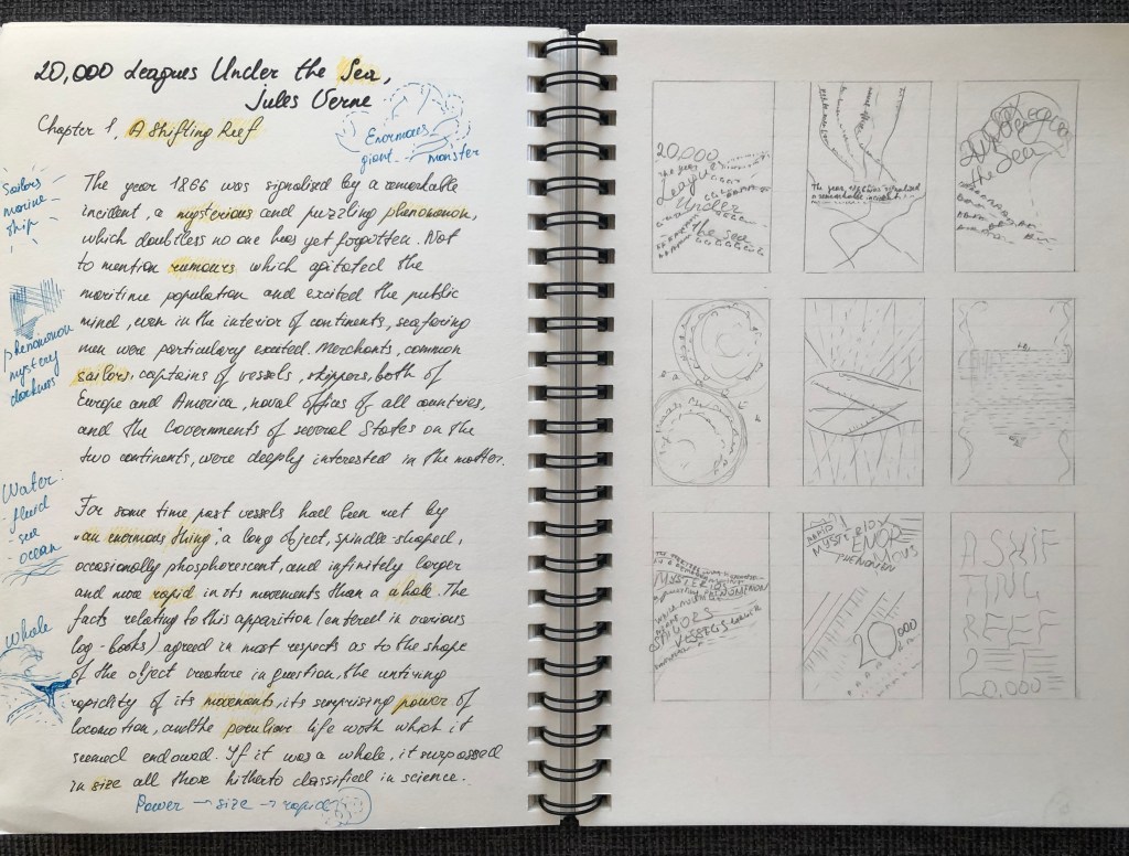
20,000 Leagues Under the Sea, Jules Verne
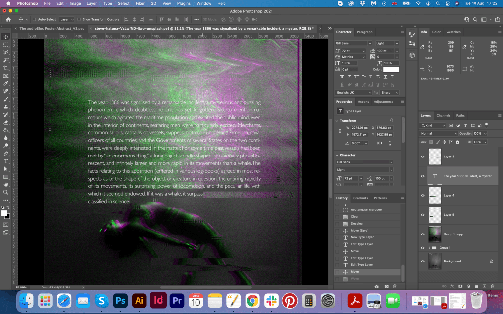
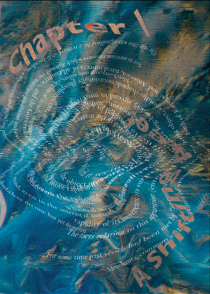
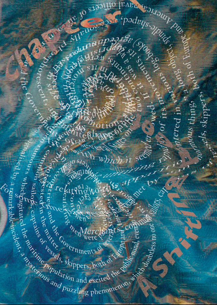
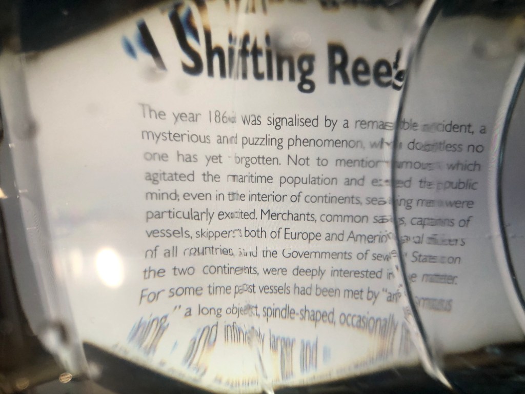
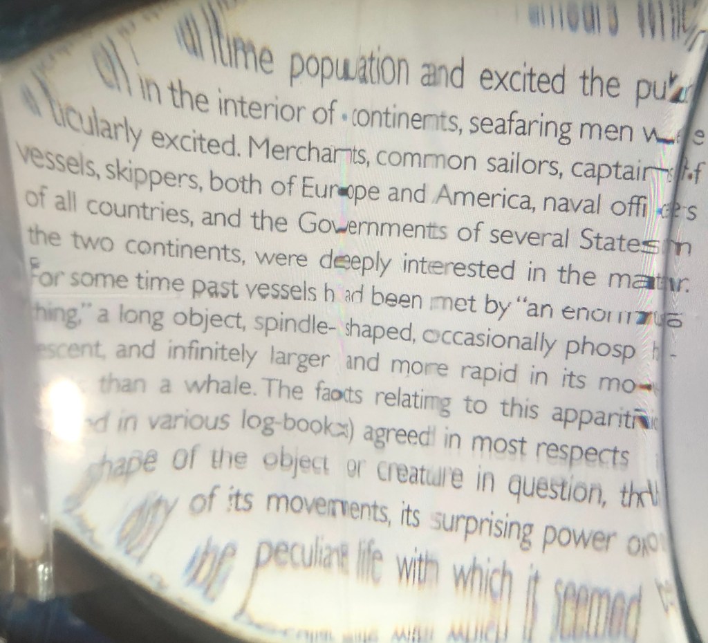
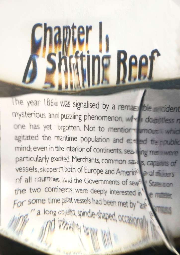
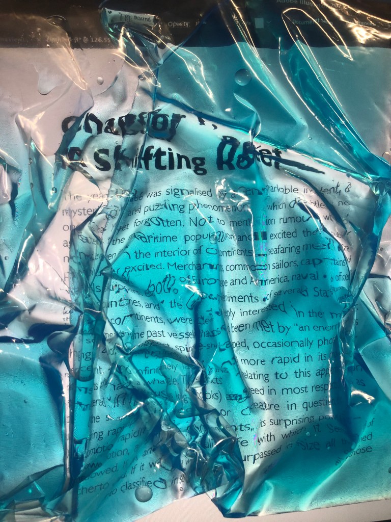
The year 1866 was signalised by a remarkable incident, a mysterious and puzzling phenomenon, which doubtless no one has yet forgotten. Not to mention rumours which agitated the maritime population and excited the public mind, even in the interior of continents, seafaring men were particularly excited. Merchants, common sailors, captains of vessels, skippers, both of Europe and America, naval officers of all countries, and the Governments of several States on the two continents, were deeply interested in the matter. For some time past vessels had been met by “an enormous thing,” a long object, spindle-shaped, occasionally phosphorescent, and infinitely larger and more rapid in its movements than a whale. The facts relating to this apparition (entered in various log-books) agreed in most respects as to the shape of the object or creature in question, the untiring rapidity of its movements, its surprising power of locomotion, and the peculiar life with which it seemed endowed. If it was a whale, it surpassed in size all those hitherto classified in science.
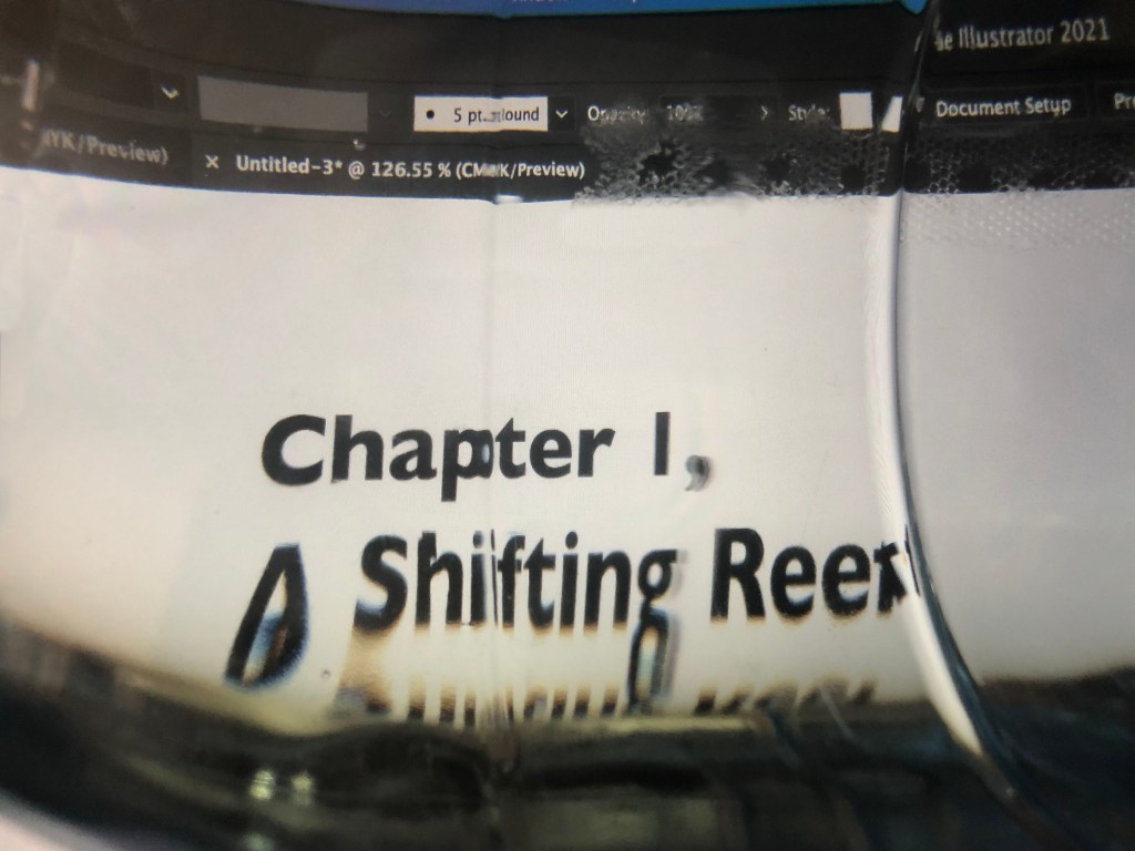
Chapter 1, A Shifting Reef
Research
The best way to start this exercise is by exploring others artists fonts, to learn their technics and approaches in typography, layouts and composition. I wanted to explore works from Tomato Design Group first, so I could learn from their experienced view.
Tomato Design Group
Tomato is a multi-discipline design and film collective, founded in London in 1991 by Steve Baker, Dirk van Dooren, Simon Taylor, John Warwicker and Graham Wood, plus musicians Karl Hyde and Rick Smith of the electronic group Underworld and Colin Vearncombe. The collective includes a worldwide group of directors, designers, artists, writers, producers and composers, who develop cross-platform projects that are commercial, artistic and research-based. Bellow is presented their work for dedicated for O. Tomato 25th Anniversary exhibition. These posters attracted my attention because of the variety of layouts that were being used in one magazine, their complication, and with all the diversity there is a common style alongside pages. The first few pages reflect the personalised font, which consists of lines, the font is constructive and bold, it has square corners and lines. I can see the 80’s disco vibe in it. On the page with a mean with the speaker, the font looks like it was handwritten in the angle. The rest pages are black and white, they have displayed the usage of transparent layouts, contrasting angles for the text placement, broken looking fonts and fidgeting lines and waves around them. I think they all speculate on the fanzine like style, full of free creativity vibes and odd typography.

http://www.tomato.co.uk/archive/o-tomato-anniversary-exhibition-book
(Accessed 26/07/2021)
David Carson
David Carson is a graphic designer, art director and surfer from the USA. His work for the magazines’ beaches culture and ray gun in the 1990s brought a new approach to type and page design breaking with traditional layout systems. David’s first education was in Sociology, he didn’t have professional experience in graphic design, and his works broke the stereotypes, as they never followed the rules, grids, or specific layouts. He is an experimental graphic designer, which I related earlier in my researches. David Carson continues to explore the possibilities of graphic design, particularly typography as a form of expression across print and video for both commercial and cultural clients. His approach in design is experimental, intuitive and personal. The similarity with the Tomato Group Exhibition book is a fanzine style. I think for this particular exercise I can use the experience of this artist from the layering fonts on the top of each other, the hierarchy of the typography, photomontage, cut and paste approach, using foreground and background for the text arrangements, and the freedom of wonky and handwritten type on for posters and designs. Clearly can be seen that designer approaches the text in the freeway, at the same time he doesn’t use waves or smooth lines, they are confident, direct and following the straight line texts, in some cases with angles.
El Lissitzky
El Lissitzky, an artist, designer, photographer, typographer, and architect, was a major exponent of Russian Constructivism, an art movement whose aim was mass communication connecting art to everyday life. He believed that books with bold geometric forms, clean layouts, and photographs could effectively connect to and transform the consciousness of the viewer. In my Core Concepts Part 4 Assignment I related to his works for my font development and magazine article. I was fascinated with direct lines, clearness, innovation the feel of the Soviet Union design approach, which was the discovery for those times. The author uses simple bold and bulky fonts and using them as objects to play around with the theme. For the colour pallet, it was mainly red and black on canvas. Also, I can see that designer gives the personality to the single letters, and make them dominant on the page. I think these works are slightly different to the brief in this exercise, but it is still useful to learn contrasting approaches in text formatting and typography design.
F. T. Marinetti
Les mots en liberté futuristes is a book illustrations designed by Filippo Tommaso Marinetti, the author of the famous manifesto for the Italian Futurist movement in 1909. This book is an ingenious typographic design example with a powerful technique for representing the noisy energy of 20th-century life. This book have different styles and sizes of its typefaces, which was all against traditional rules of structure and punctuation and created a revolution in modern visual communication. It was a pioneering example of what is known as visual or concrete poetry, in which avant-garde artists used typography and page layout for expressive purposes.
Kurt Schwitters
Kurt Schwitters was a German artist involved in both Dadaism and Constructivism. Schwitters is best known for his Merz and Merzbau works, which incorporated collage, found objects, typography, and sound poetry to construct unique compositions. In these works, the artist used magazine clippings, waste material, and other recycled items in an attempt to express the rapidly changing world. Schwitters influencer was El Lizztsky. He absorbed the experience from the source of inspiration and expressed it in Merz works and Ursonate poems. His posters mainly consist of the copy-paste approach, with sticking objects together in harmonious and sentimental arrangements. If I compare Schwitters with Marinetti exhibits both artists have a lack of order: in their artwork text are placed in unexpected areas. Schwitters challenged the organisational hierarchy of text and imagery, which was all against the rules in printing documents.
Typewriter Art
Whilst I was preparing to this exercise, I realised that I have a book that I bought last year, perfectly matching to the brief. The book was written by Barrie Tullet Typewriter Art. Modern Anthology. The reason why this book is stumbled into my head because it’s full of beautiful examples of typewriter artists, who used the keyboard as a ‘palette’ to create artworks. There are some imaginative examples of shapes and forms that can be used for concrete poetry. It’s a good fundament for creating an astonishing range of creative work. Some of them I would like to mention in my blog.
This work by Steve McCaffery termed as typestract (abstract typewriter art) was released by small Canadian presses to represent the direction of North American poetry. The materials of writing are explored in a relationship to how poetry can be crafted and perceived at the same time. The design shows the typographic complexity, moving from the simplicity of red and black masks of a typewriter ribbon to the rubberstamped letterforms, carbon-paper frottage and holograph. This artwork is full of smooth lines, shapes and fascinating spins around. Specially organised “o” letters creating a floating feel pattern. This is perfect example of experimental typography, that each designer who works with book design should be familiar with.
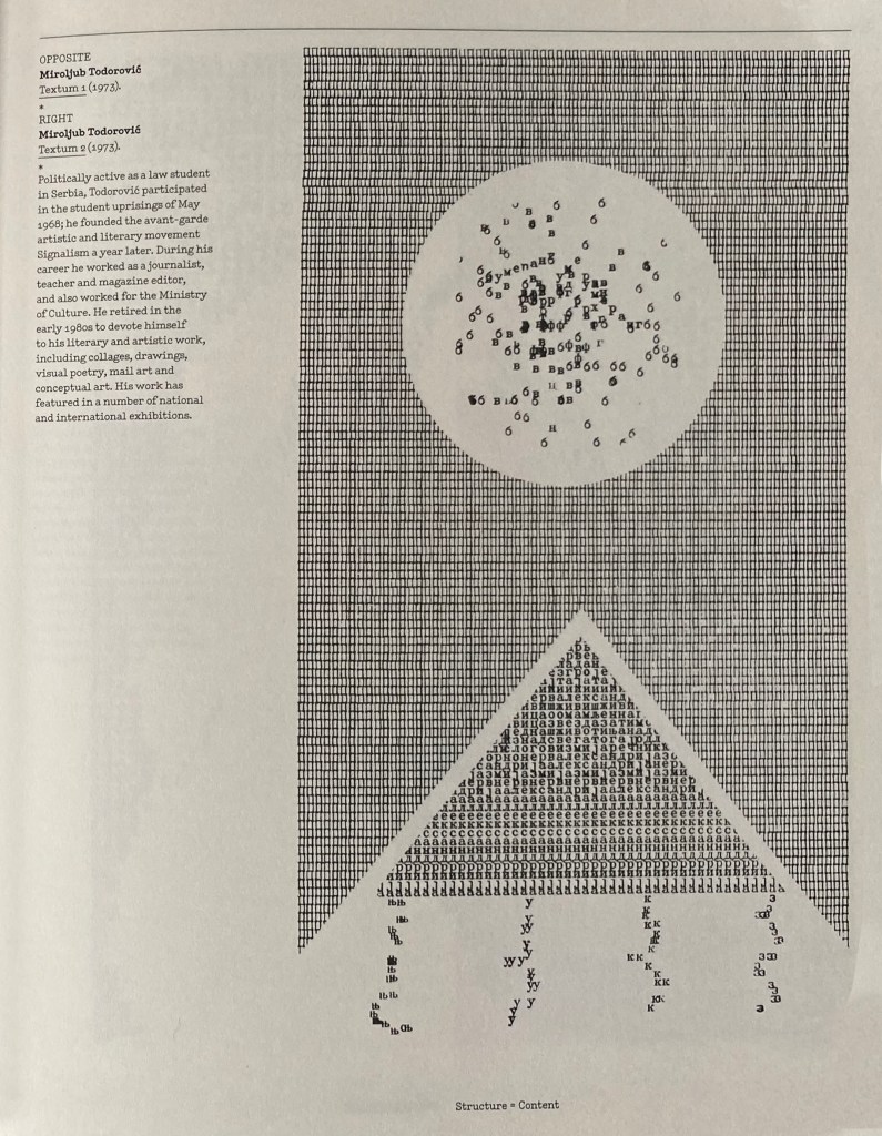
Miroljub Todorovic was founder of the avant-garde artistic movement Signalism. His artwork Textum 2 has more straight and direct lines, all goes according to proportions, but what I like about is some unexpected wavy text lines in the bottom of the mountain and inside of the moon.
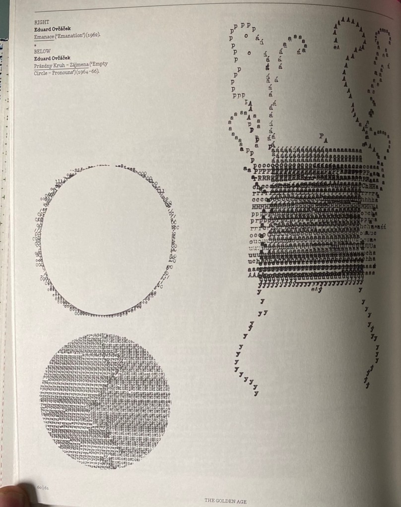
On the left side presented some works of Eduard Ovčáček Czech graphic artist, sculptor, lettrist, painter and professor at the University of Ostrava. In his work ‘Prazdniny Kruh’ (‘Empty Circle’) he experimented with the circle shape by arranging words to come outside. Also, the shape of words that inside of the circle giving to it a texture and the feel of 3-D object. The image which calls ‘Emanation’ with the text arranged in square with some line waves around it looks more like an experimental image, with artistic meaning in it.
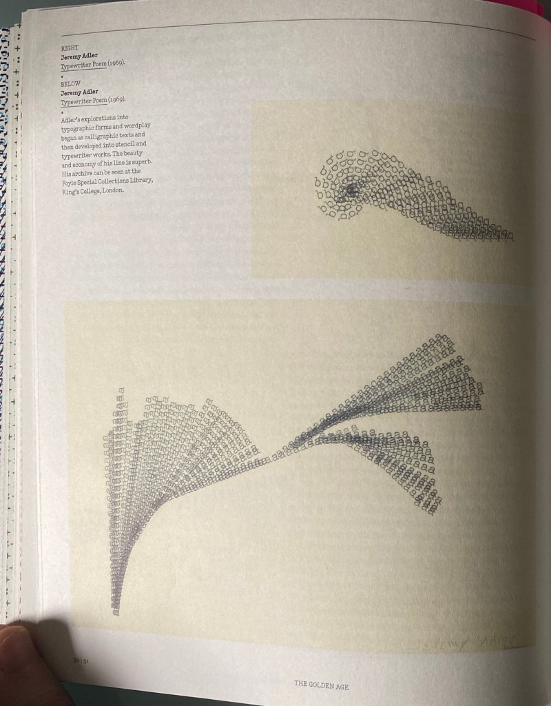
Jeremy’s Adler ‘Typewriter poem’ is another example of beautifully organised concrete poetry, with elegant and smooth lines coming from bottom left corner and heading up to the right corner. This drawing is a part of British Museum collection.
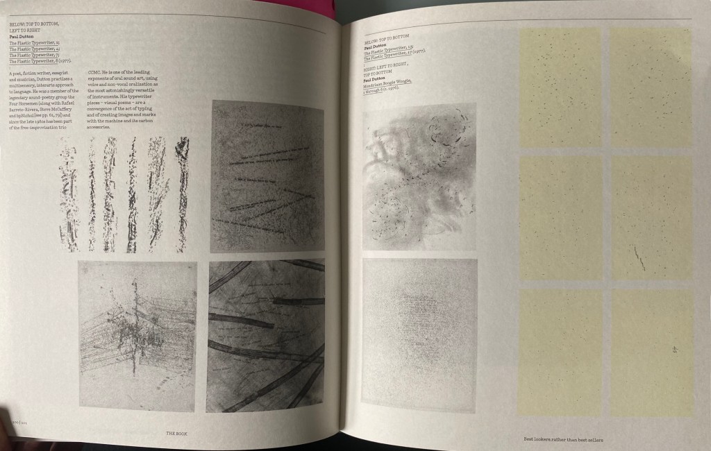
Another stunning examples of experiments with typography from Paul Dutton, the series of works ‘Plastic typewriter’. This collection of typewriter poems was made with a disassembled plastic typewriter, an intact typewriter, carbon ribbons, carbon paper, a metal file and white bond paper.
Some additional examples I found from internet, they are all about the same subject, how to make the text to work in different shapes. I’ve noticed that even if there are straight lines between sentences there are some original executions for the text experiments.


Source: https://www.behance.net/gallery/Helvetica-Experiments/498492
(Accessed: 26/07/2021)
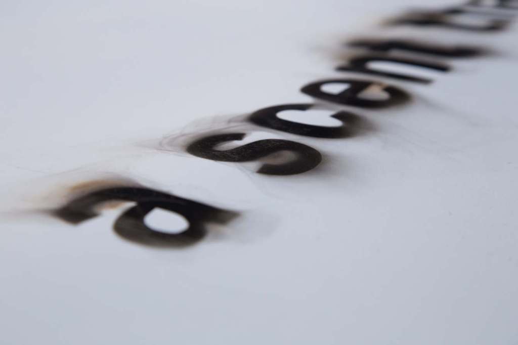
These typography experiments I liked because of their 3D feel, like they were made by burning the ages, or special ice-cubes to give this convex shape. What I have noticed, that natural elements like iron fonts, burned letters, or shapes through the glass or water gives to the font natural bends, and appealing stains with the unexceptional gradients on them. Also, I saved as example the typographical text organised into the sea wave, as another way of expressing concrete poetry.


Source: https://cabrinaalviar.com/ART-Experimental-Typography-2
(Accessed: 26/07/2021)
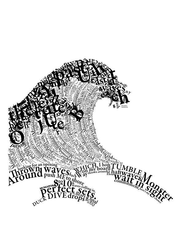
https://www.behance.net/gallery/3875125/TYPOGRAPHY-WAVE
(Accessed: 26/07/2021)

Designs
After detailed analyses of artists and their experimental typography works I went to the next stage of making sketches and looking for keywords. I wanted to understand all the details of that text fragment from the Jules Verne‘s novel. I wrote the text down, with some associations to it, it helped me to create some basic keywords to work with:
- sea, marine, water sailors (blue, turquoise colours)
- enormous thing, size, whale
- peculiar, mystery, darkens (black, dark, black)
Also, I made some sketches for my designs, so I could decide what shape of the text I could potentially go for. I wanted to be investigational with my designs and see where they can take me. I tried different figures, angles for the forms, I had so many ideas in my head, but wasn’t quite sure where to start design from. Whether it will be tactical work with objects, or work with graphic thumbnails. I wanted to try a bit of all approaches, because that was the way of discovering finest outcome.
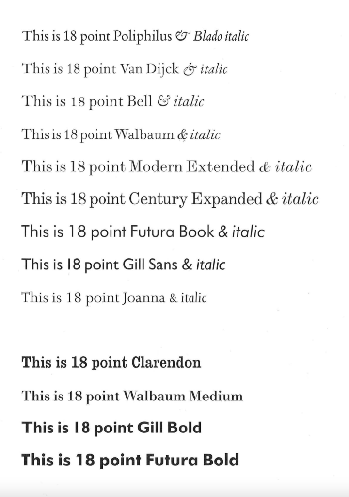
Notes on Book Design by Derek Birdsall. Some of those types I used before, but some of them were new to me, they are the classical font, and I liked how precise the author explains their use for the book design. Readability is a crucial part of the font, then the distance between the letters and their colour. Even such thing a bold font makes a difference, as some fonts don’t look right. I thought would be good to use something from this list of typography, but with some filters applied on top of them.

Experiments with the typography 1
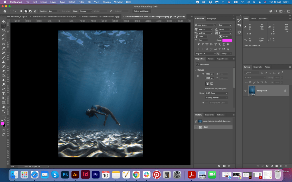
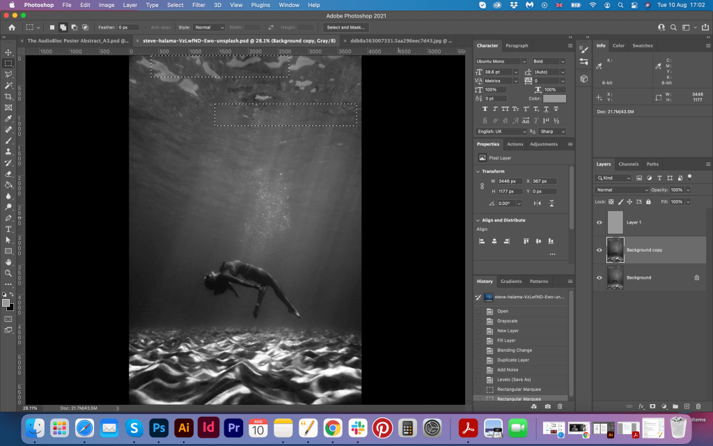
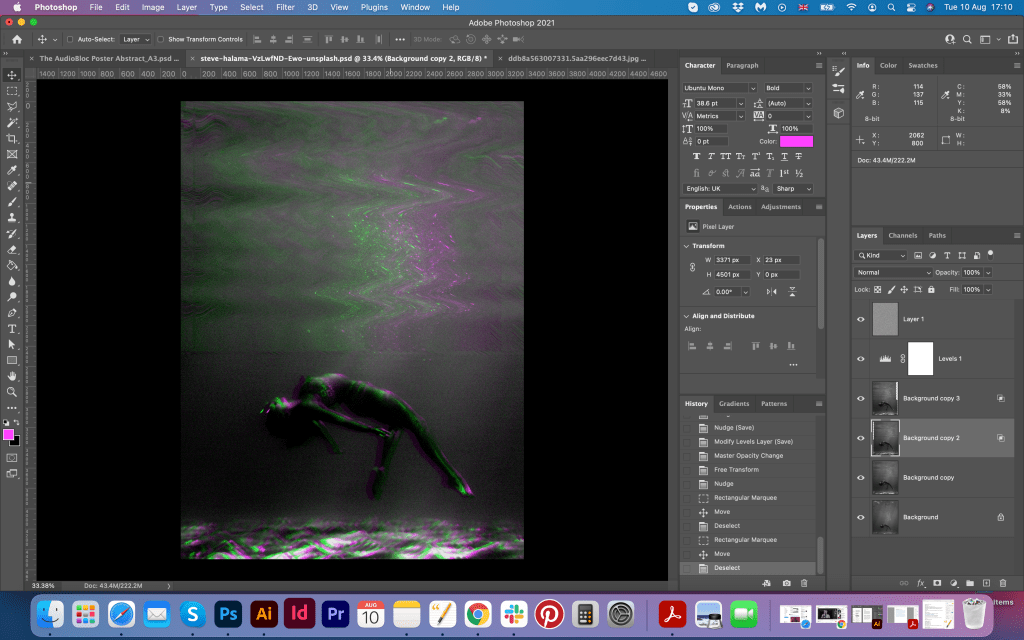
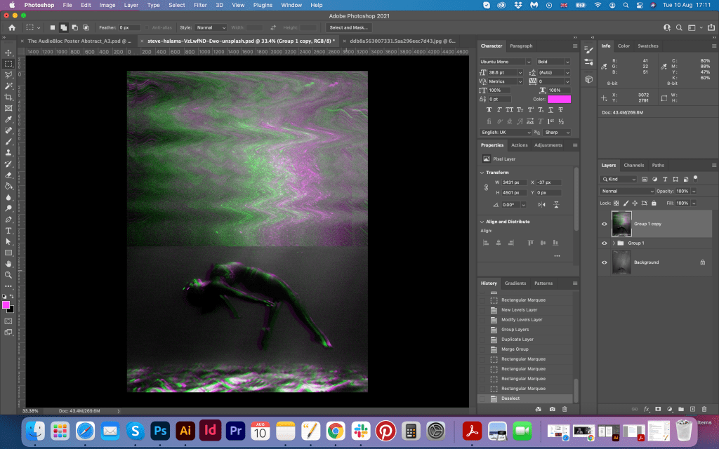
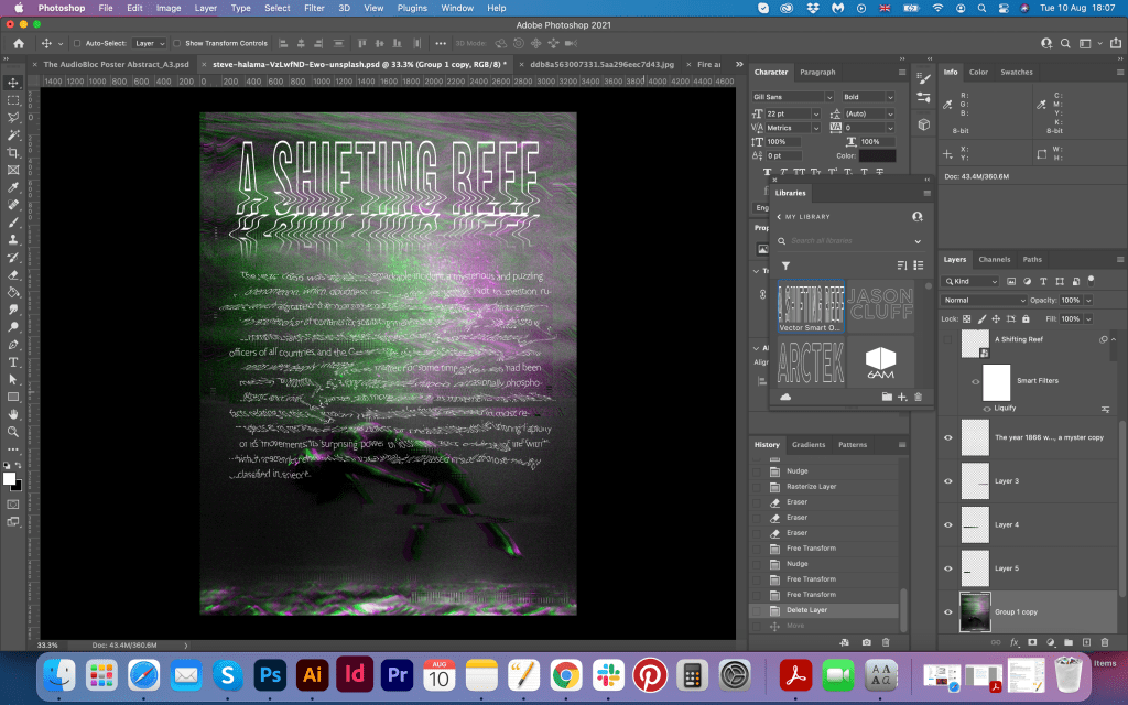
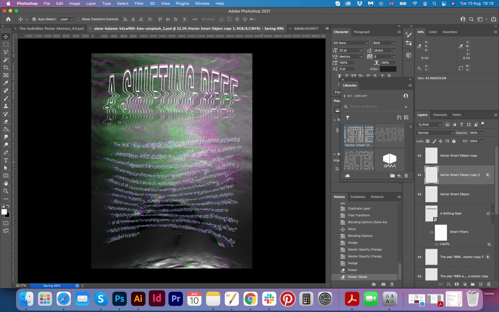
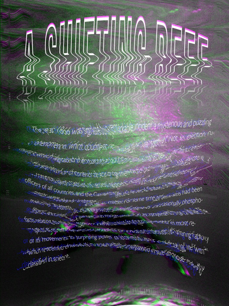
My first design idea was based at the glitchy image under the water with some text with the distortion on the top of it. I converted the image into the black and white object with some RGB effect on the top of it. I wanted to create delusional effect for the background, which would associate with words deep, underwater, sea, ocean, etc. I placed the whole paragraph in Gill Sans font, I made the text all wonky and glitchy, with some RGB filter as well. I chose Helvetica Neue Condensed Bold font for the header, as I wanted to have bold outlined narrow font with some wavy effect in it, I think it all worked quite well together. It was the very first experiment, so I wanted to explore some more. I liked how the text looked like it was really under the water, and how it worked together with the underwater picture. I wanted to see dark, mysterious image, with some spooky feel in it. It was not completely scientific type of design, mysterious yes, but not marine type. But still worth trying.


Experiments with the typography 2
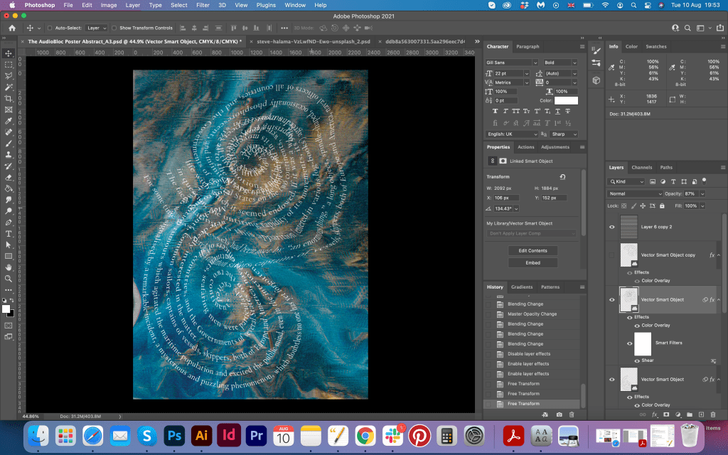
For the second experiment I used different approach. I wanted to try spiral effect, which reminded me golden ratio kind of design. I organised a text in the spiral with some extra manipulations in it, as it was tricky to fit all paragraph in one go. For the background I used an abstract picture which reminded me the picture of the Earth taken from space, I applied some glitchy effect on it as well. For the header I used slightly different font, Gill Sans bold and combined it with the serif font Van Dijck from that book recommendation I read. It was good and readable font combination, but I think that san-serif font worked better in terms of readability. I made the text and the header all wavy and dynamic, so it looked like the water is swings those letters and makes them move. Also I think I preferred clear blue and gold tones on that image, I think it gave more association with the water and mystery.
Experiments with the typography 3
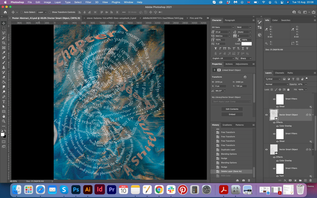
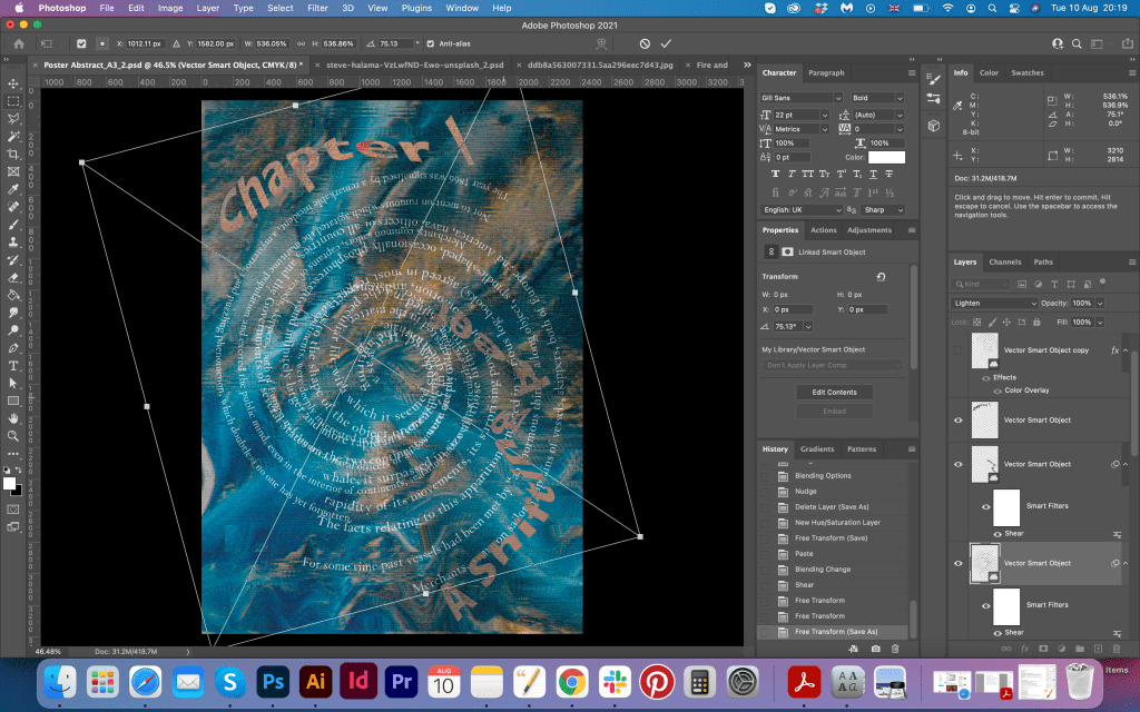
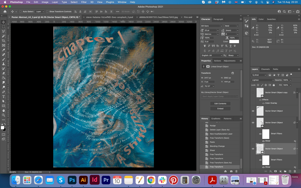
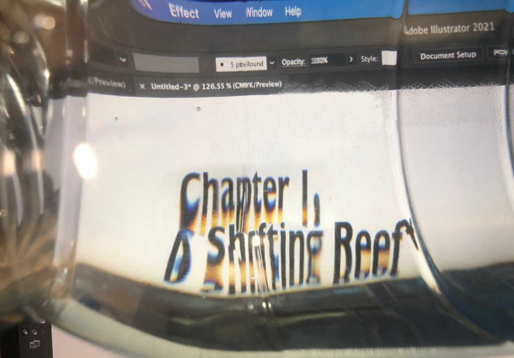
For this part I took a new route. I wanted to be experimental as this is the exercise for some new approaches with typography, so here are some results with it. I had a text paragraph on my laptop, all flat and on the white background, and on the top of it I put a bottle of spring water, and looked through it on those fonts. And surprisingly I saw something curious, as it was like looking on it through the lens, I had RGB colours around letters, they were distorted all way around, they had natural 3D feel. I took a camera and managed to take a pictures of them, moving the water bottle around. Later I composed those collages on the Photoshop and sticked them together. I quite like those type experiments, especially when I arranged them on the A4 format and make them look like one poster, typography looked like it was deep under the sea, but the header was still on the top, I had similar to floating effect. I think it came up nicely. I enjoyed it.

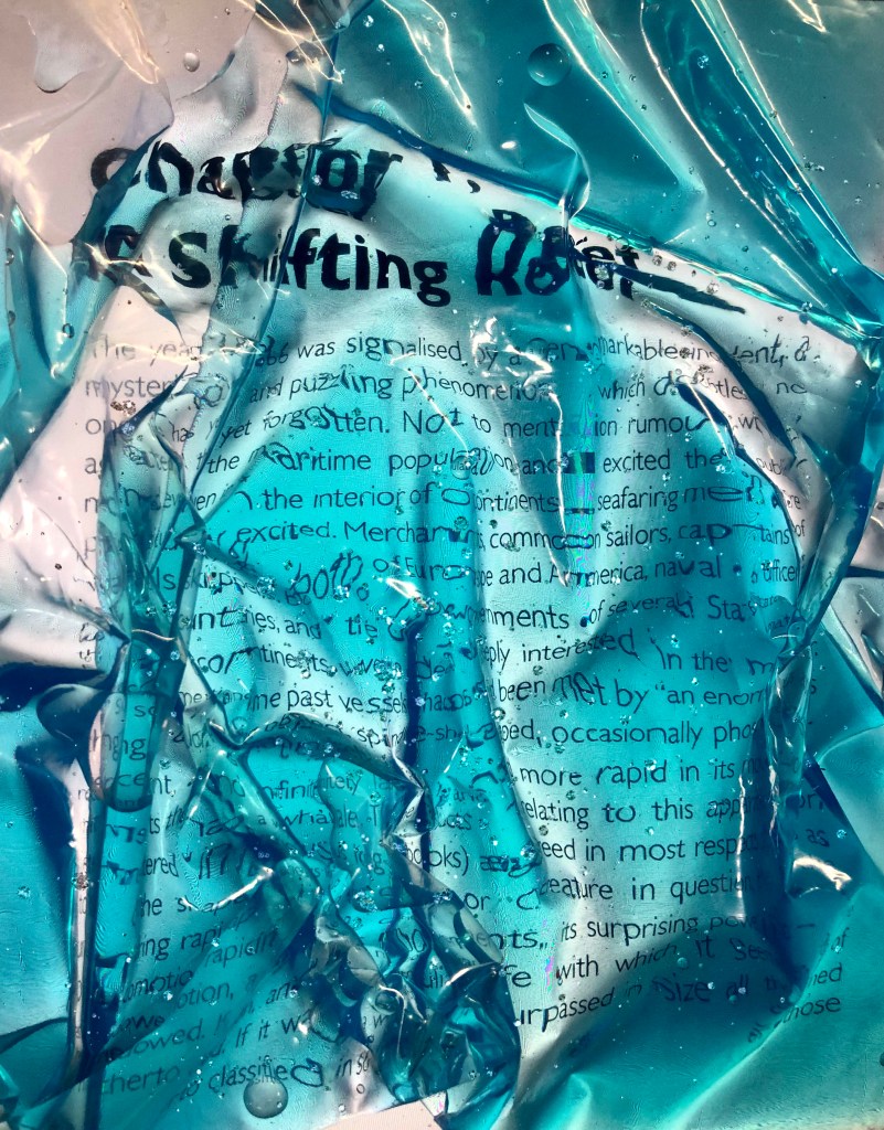
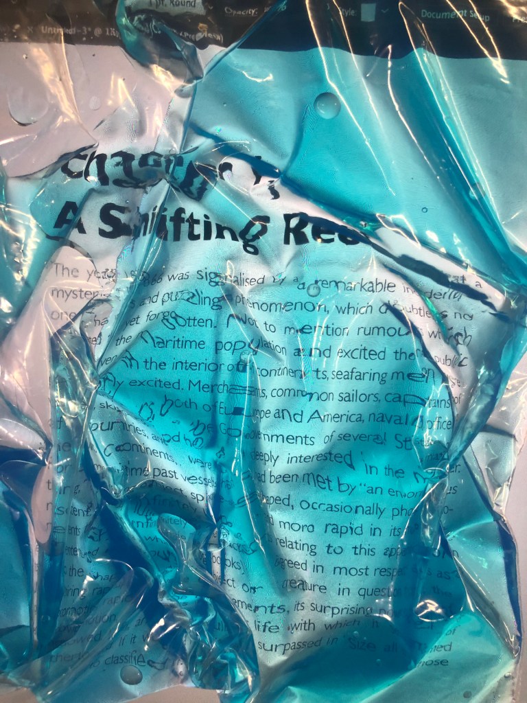
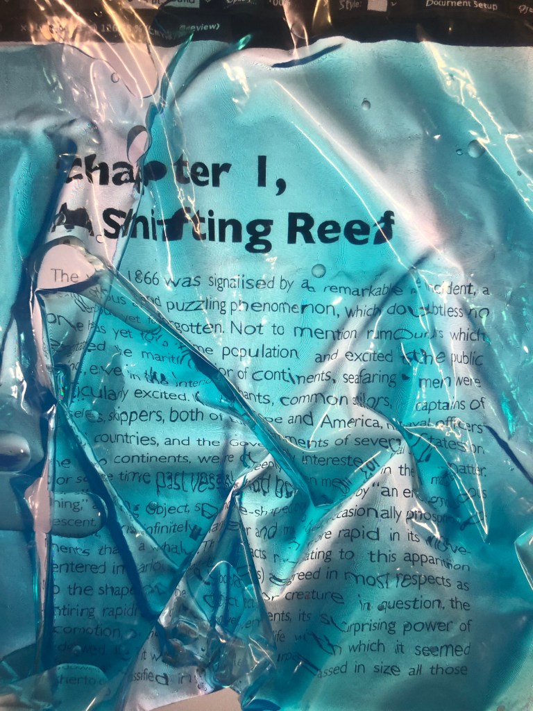
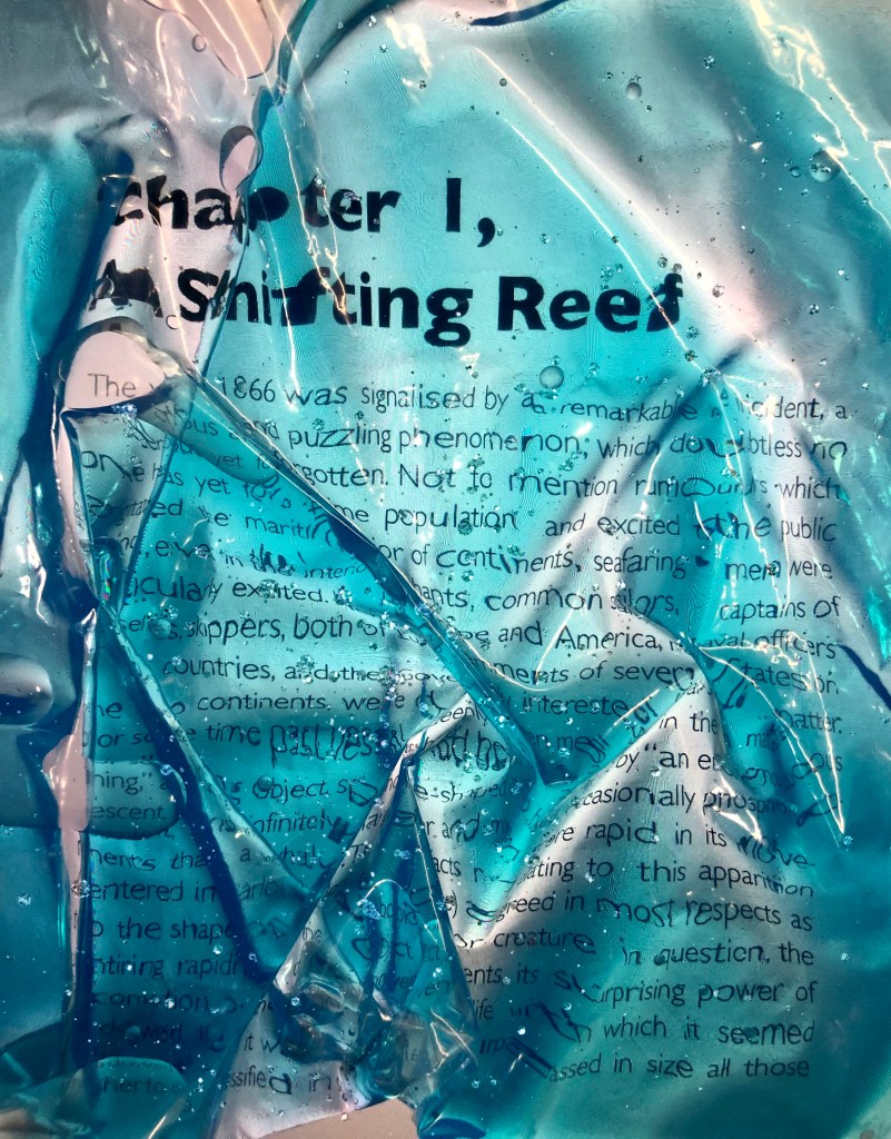
Experiments with the typography 4
The last experiment was just an addition, but as usually it happens it I had some extraordinary results with it. I was going to finalise my researches on the above three options, but I still had that idea in my head with the blue liquid inside of the sealed plastic bag. I wanted to create natural distortion effect with all curves and folds around the text. So, what I did, again, I had flat text on my computer screen, and on the top of it I put the plastic bag with the turquoise watercolored water. I flattened it, to avoid less air, but some little quite bubbles still were floating around. The experiment came out nicely, It had that juicy and fresh distortion, with direct association to the underwater, and natural text bends were amazing as well, much better than my trials in Photoshop. The conclusion is, work with tactical object can bring some surprises, and it’s alway great idea to explore. Last two options with the bottle of water and turquoise water are the best.
Conclusion
I think this was one of my favourite exercises to complete so far; it clearly can be seen from the wide range of researches and experiments that I put into this typographic task. The amount of analysis that I put into the artists work also made influence this task. I was inspired by numerous ideas that evolving around concrete poetry and texts. I know that I always felt comfortable with the software, also I’m aware of different tools that explore numerous distortions and glitches for my text, but the analogue route is a new zone for me, that requires some special preparations and processes for me. I enjoy comparing them, discover new solutions and bring some new vibes into my works. I’m intrigued to see how it’s going to help me with my third assignment.
