This two-part exercise aims to understand the relationship between typography, the grid, and the page in more depth by analysing existing layouts and creatively developing alternative ones. Both of these activities will feed into assignment three.
Understanding layouts
Research into book layouts that you find interesting. These could be art or design books, or others that have more complex layouts that balance images, typography and other content across multiple columns. Trace the grid structure of your chosen double-page spread using tracing paper and a sharp pencil. Measure the margins, column width and depth, plus spaces between the columns. Transcribe the tracing onto a clean sheet of paper, drawing on the measurements. Compare your drawings to other double-page
spreads within the same publication. Identify the similarities and differences – is there an underlying grid system and how does it adapt to deal with different content?
Now recreate the same double-page spread using DTP software. Use your traced drawing measurements as a guide.
There is no need to copy out all the text – you can use ‘dummy’ text or ‘blurb’ such as lorem ipsum. Lorem ipsum is Latin text which has a distribution of letters that make it look like readable English. You can download some from http://www.lipsum.com and incorporate it into your layout.
Similarly, there is no need to recreate the images – indicate images by a 10% shaded area, whether these are cut-out, full-bleed or within a box.
Try to match the typeface as closely as possible. It doesn’t need to be exactly the same, but try to retain something of the original – for example, make sure you use a sans-serif font if the original is sans-serif.
Experimental layouts
“These conditioned patterns of reading, from left to right or top to bottom for example, allow us to approach any form of printed material with some expectation of how we will navigate through it. This, then, is the starting point for the designer, who is able to build upon this familiarity within the layout and format of a project, often utilising the element of surprise or difference to confound the reader or user’s expectations.”
Russ Bestley & Ian Noble, Experimental Layout, 2001. Hove: Rotovision.
Extend the project by thinking about how you might radically change these layouts – what creative decisions around the grid would you make to improve these designs? Develop layout ideas that ignore the grid structure, challenge it, or offer radical alternatives to the existing layouts. Develop a range of ideas through thumbnail drawings and DTP layouts, in a similar way to the first part of the exercise. Use this as an opportunity to take creative risks, and find radically different ways to layout the existing content. This process might challenge any preconceived rules about how a layout should normally work. Reflect on the process in your learning log.
Researches
Here I wanted to examine some books layouts that I find interesting. This electric collection gives a voice to all possible forms of writing, from classic books to children fairytales.
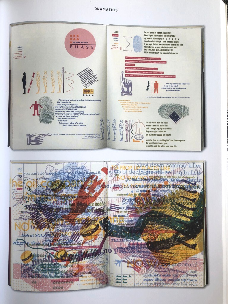
Warren Lehrer ‘French Fries’ book reflects American culture and character basing on the fast-food restaurant. Lehrer using typography to evoke voice; has personality in interaction; using different font combinations in one page, where each character has its individual typographic arrangements and colour. That book was the revolution in digital art. A good example of how experiments with shapes, numerous overlays and colour mix can show its technical achievements.
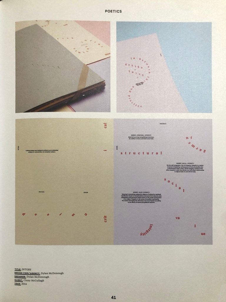
Dylan McDonough’s INTGR reflecting a story of fashion as social mechanism. Here can be seen the presence of layout hierarchy, minimalistic style, pages don’t have numbers, the lack of headings. The book uses language, objects and images of fashion and can be experienced as traditional ‘book’.
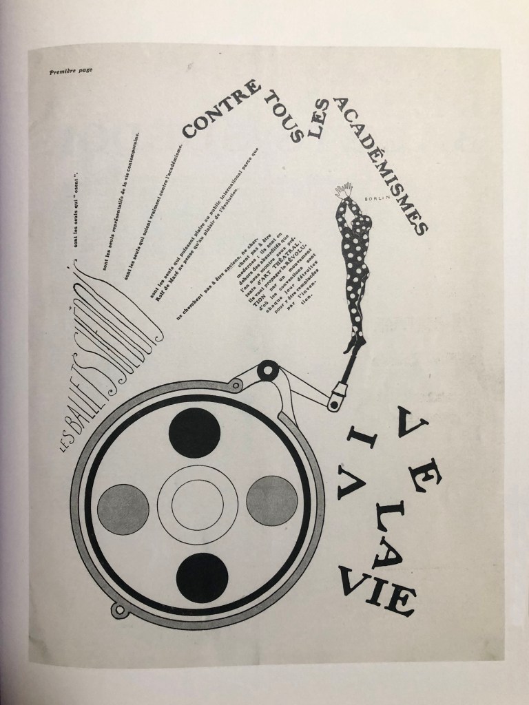
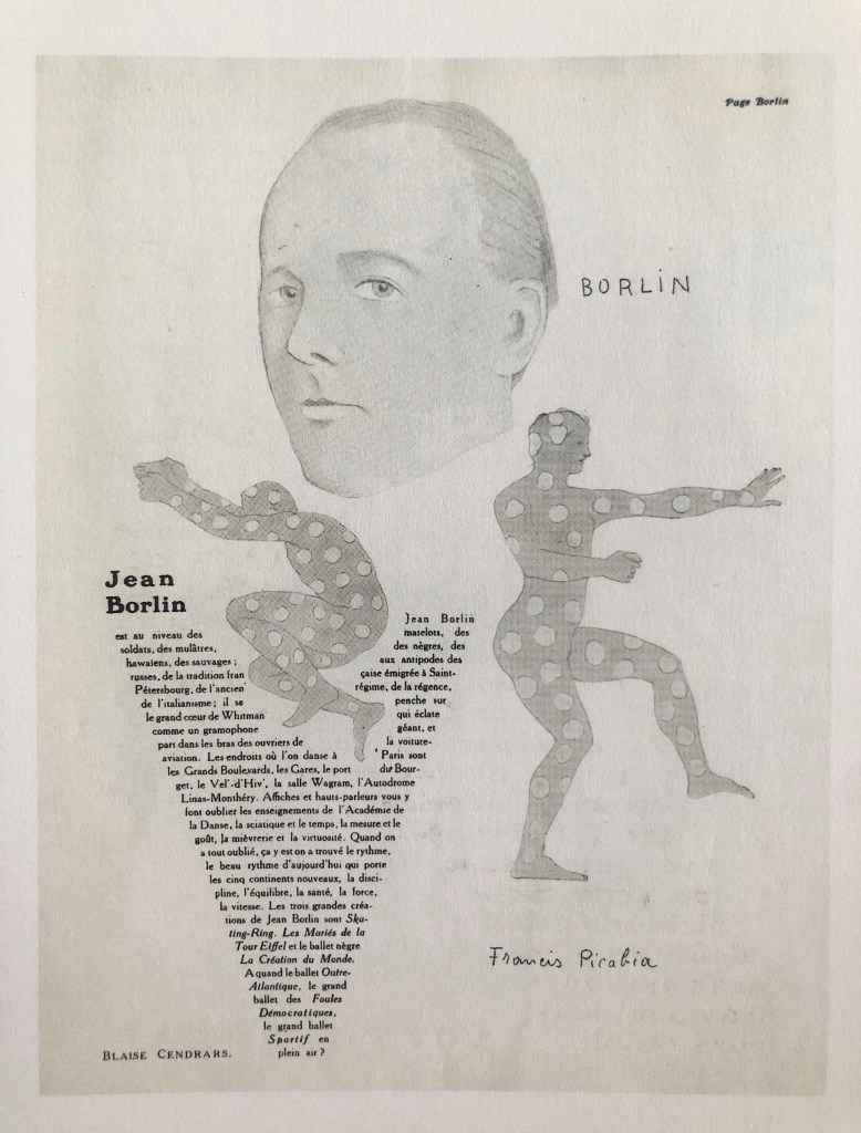
‘La Danse’ was a special issue for the Ballets performance from Paris, designed by Francis Picabia. Layouts included contoured text blocks, that wrapped around portraits, and leading caricatures of contributors. These templates are great examples of expressive typographical ideas.
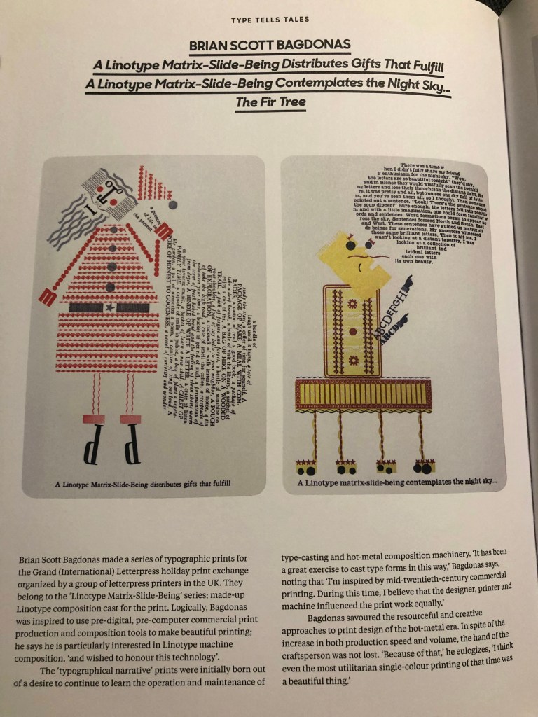
Through this book ‘Linotype Matrix-Side-Being’ the author Damián Sena wanted to show how the character translates typographically. He thought that here he creates the typographic universe, his identity, his beliefs and ideas. Also, Sena insists that typography speaks itself. I liked how words and sentences go above and beyond lines on the pages, and some words falling down vertically, as there are no rules.
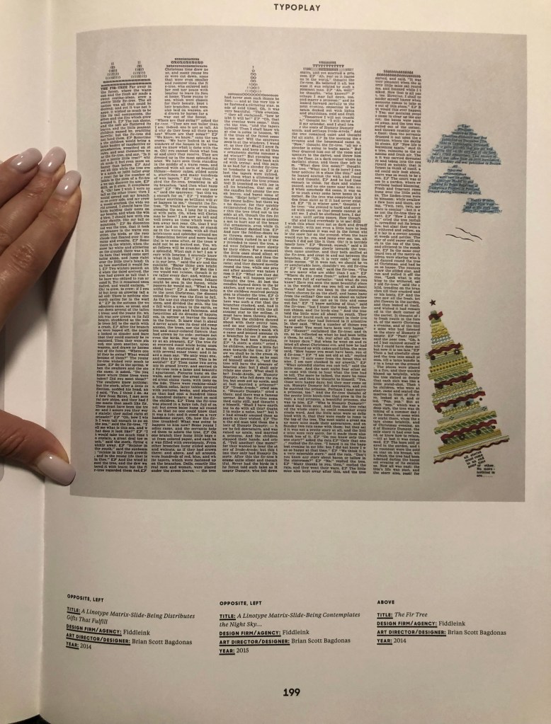
These designs caught my attention, because of the shapes typographer Brian Scott Bagdonas used for his Letterpress print. Designs remind me of concrete poetry when texts are organised into special forms, and some extra objects could be seen through the font. For example, if we look through Christmas Card Exchange with Santa, the red suit is made from border slide matrix, and his boots are made from foundry 60pt Corvinus cap “P”, and his face is made up of an 18pt Hand Tooled Goudy lowercase, etc. The author of that prints became popular because of his creative approach in print design for the hot-metal era.
https://www.fiddleink.com/
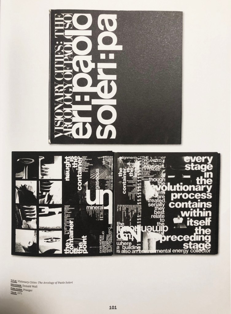
Visionary Cities: The Arcology of Paolo Soleri, 1971 was written and designed by architecture professor Donald Wall. The author manipulated words and images, smashed letters to a new level of density and illegibility. The book consists of a maze of typography, presenting phrases by visual architect Paolo Soleri. Wall used in this book design predominately black pages with high contrast images.
These book designs ideas helped me to open the vision in the graphic design approach. Also, I could see that brave and experimental designs can create a revolution and new direction for the book design layouts. For this exercise, I want to try to be experimentative and see how various templates can change the feeling of design.
The Genius of Design
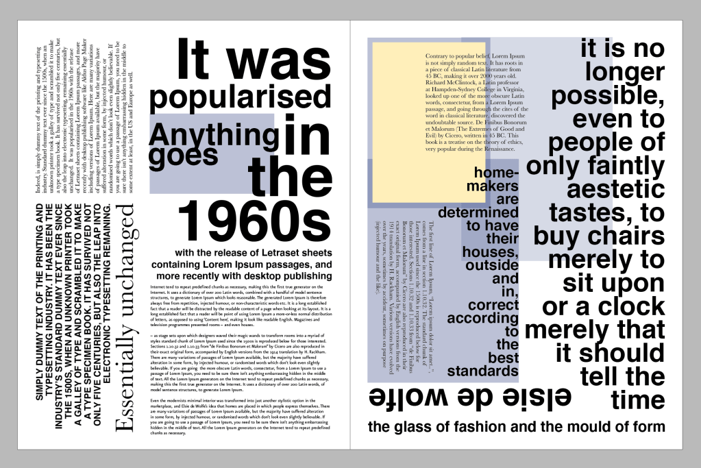
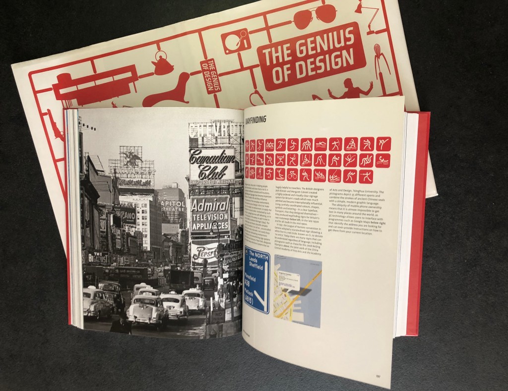
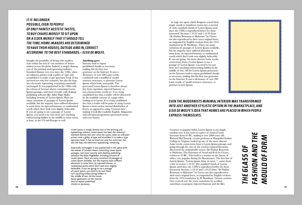
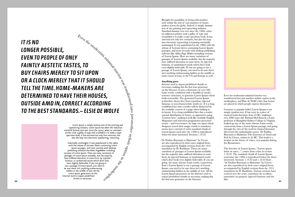
I found in my book library edition by Penny Sparke ‘The Genius of Design’. I think this is the first book about design I’ve had, and partly it helped me to establish my will to developing myself as a graphic designer. It doesn’t have a complicated grid system, but as a symbol that this is where my graphic design taste started from, I wanted to examine it closer. This book design is quite simple, with only two columns, a serif font for the main body and big caps letters in san-serif for the text of the quotes. But out of curiosity I thought would be great to learn this template. I took a picture of three different spreads, they all work at the similar principle, but for some spreads, the whole page was taken for images placement. I chose the spread with two columns on the left side and one column on the right, also with quotes on the right side.

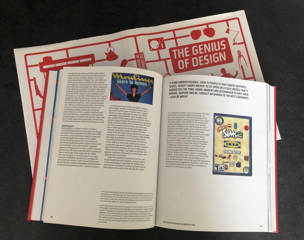
That to measure the template I took baking paper (which was a bit slippery on the pages), a sharp pencil and a ruler. Firstly, I determined the size of each column and their location and spacing between them, and after that, I measured them in mm that to recreate a copy of it. It was hard to see the spacing in the centre of the spread, but I think the measurements I placed were quite right.
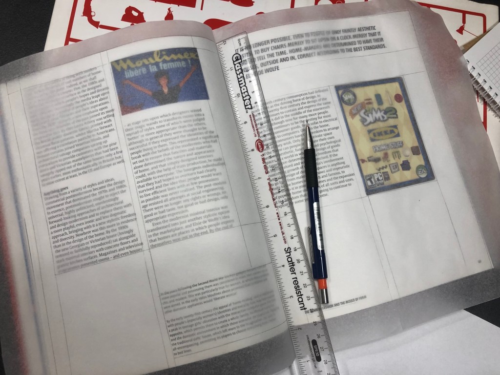
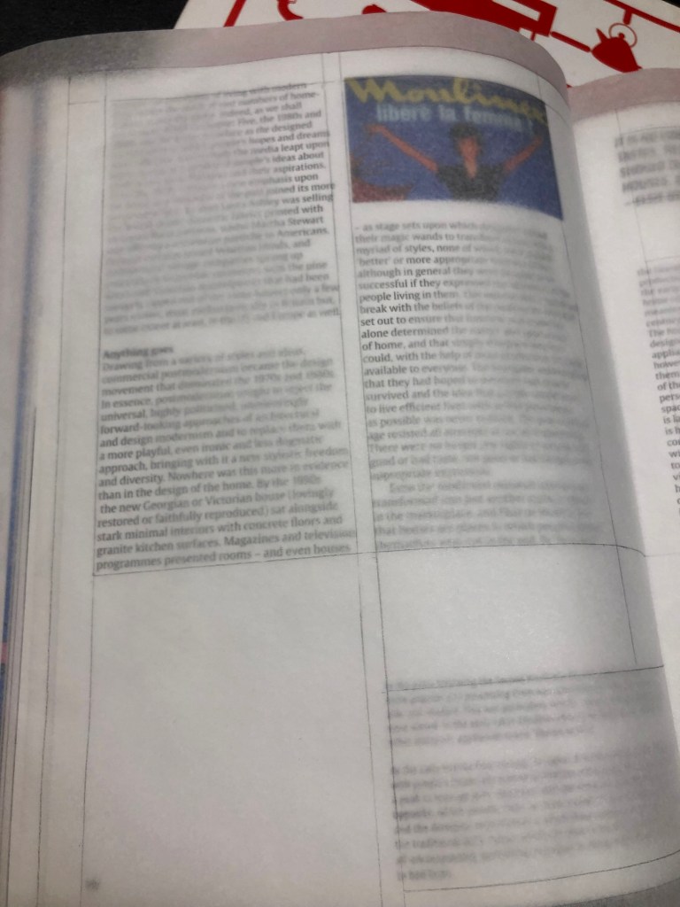
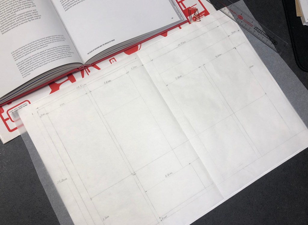
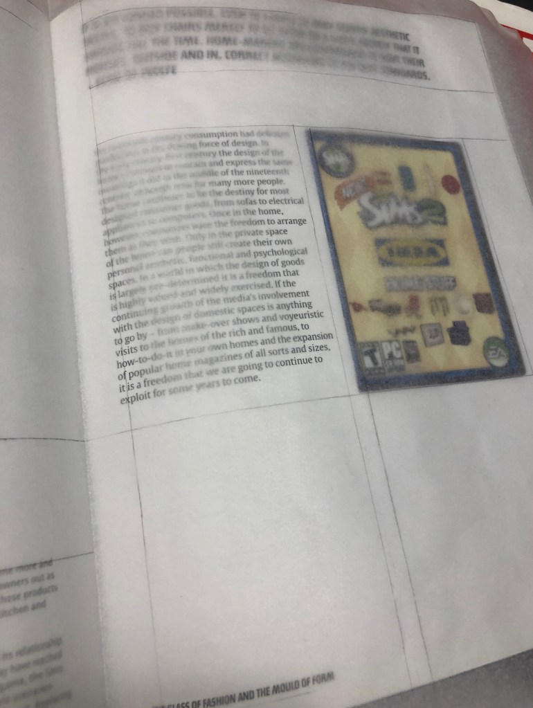
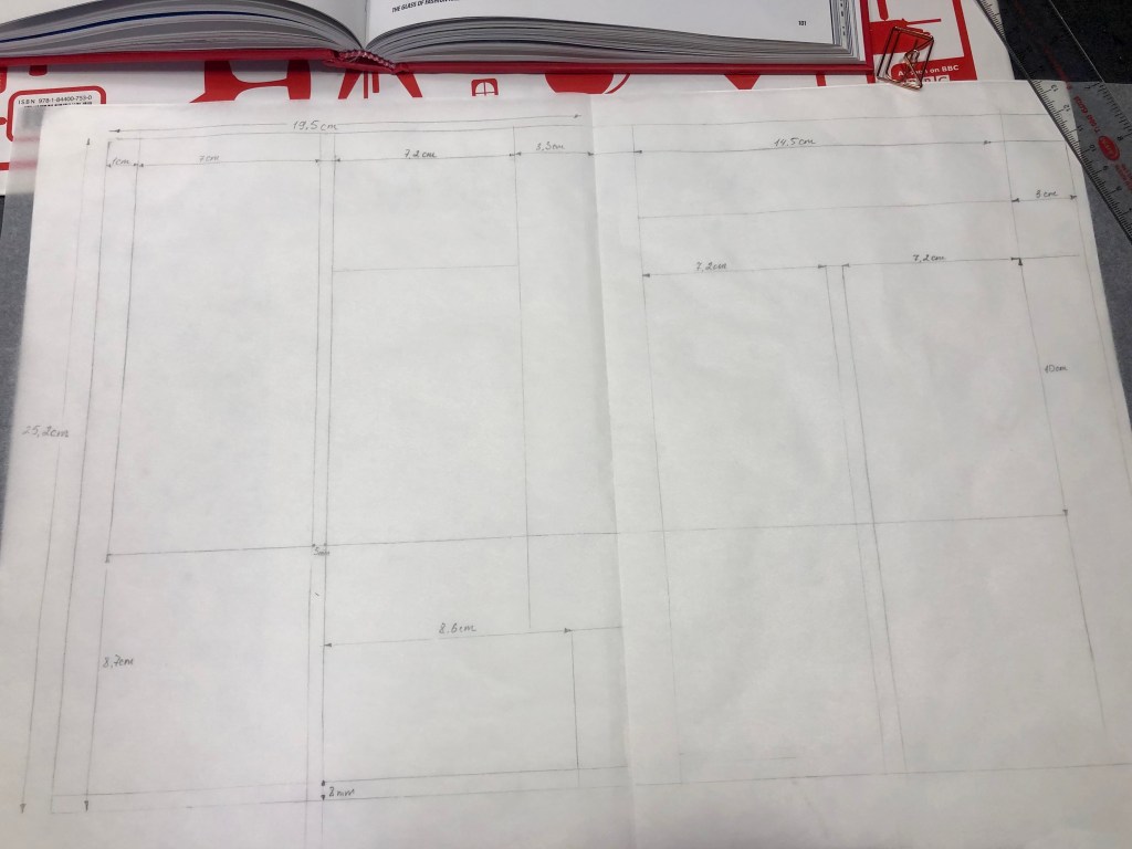
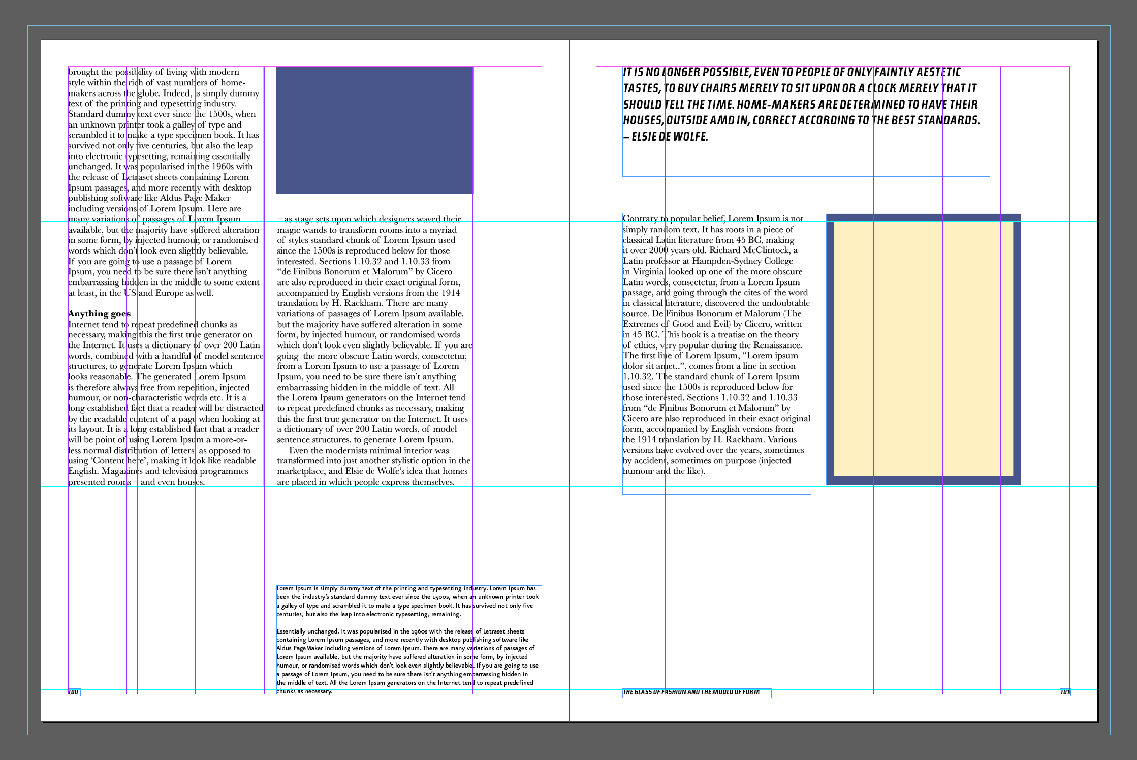
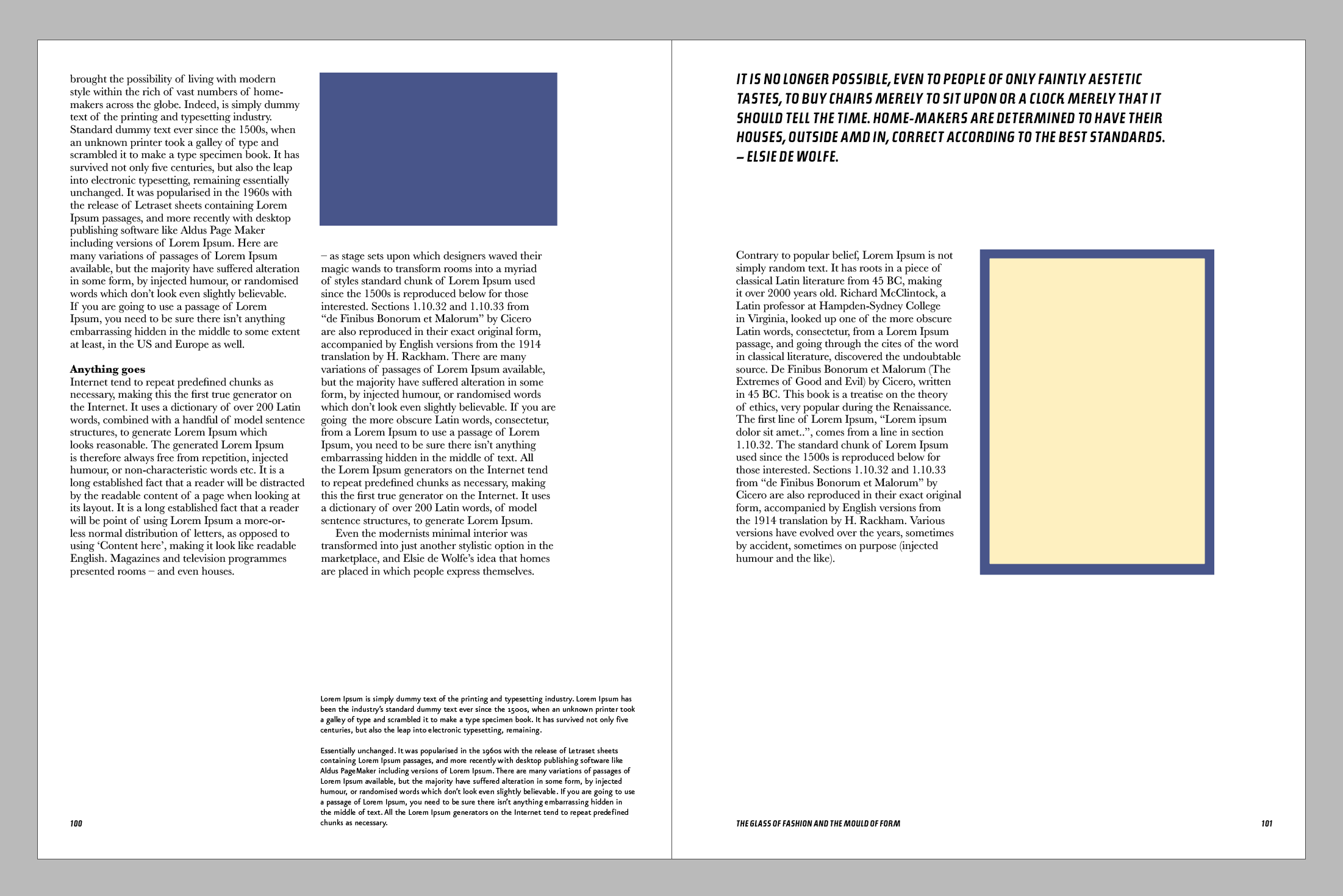
For the main body, I used the dummy wording, but in some locations, I placed original text. It helped me to see how the content looks compared to the original template. With the service ‘What the font?’ I found original fonts for the quotes, also I could see the same font was used for the cover of the book URWTopicW01-BoldItalic. For the main text, Baskerville serif font was used, and for the image caption in the button corner of the left page, I used Eureka Sans san-serif font. I’ve noticed that in this book not much attention was paid to the header, as it looks like mainly just columns of text one after another one, so I think it was purposely made to make the headline less visible. I followed the same path, that to examine the grid of the layout, I could see in this design was used grid of 7 columns, and with the space around the edges for 10 mm on each side. The spacing between the columns was 5 mm. I think what brought some originality to the layout is the extra-wide text for the image caption, spacious layout with lots of free space around, and big italic font for the quotes, which stands out compare to the rest of the text.
Alternative Layouts
For the alternative layout, I was going to use the golden ratio principle. Out of curiosity, I wanted to see how the template will look like if I arrange it into the golden ration circle. I tried a few approaches in the text arrangement, played with fonts, and moved the columns around, but I still kept the same font combinations for the body copy, pull quote and image caption.
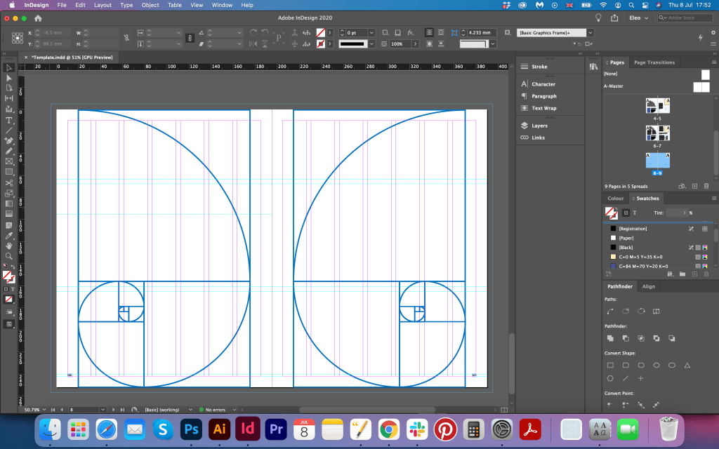
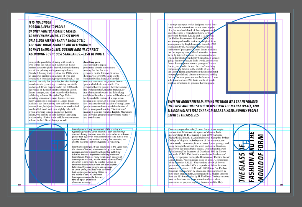
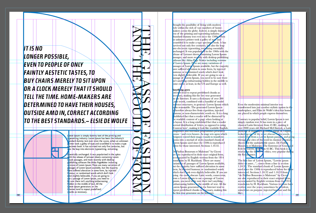
Columns that spins around the golden ratio grid looked quite interesting, I have never seen the same principle used before, so that idea was just a new vision for me, to see the difference of the layouts. In addition, I wanted to play around with the large quotes on the side of the page, which I made in serif cap font, but I was not sure if it worked. It looked a bit out of space and didn’t have harmony with the rest of the composition. In that case, I decided to try another option, with the phrase going at the same shape as a golden ratio twirl.I changed the bottom block into the right side alignment, so it repeated the shape of the circle I had.I thought it looked quite refreshing, and attention catchy.

For the last option, I wanted to go beyond and be investigational with the typography chose and text placement. I wanted to try overlapping texts, and see how the difference in the size of the font will look at one spread. I implemented additional font, bold Helvetica, which gave a feeling of bulky, confident design, with lots of activities going around. For some columns, I used a colour underneath with opacity, which helped to place accents. The inspiration template was designed by Paolo Soleri. Visionary Cities: The Arcology of Paolo Soleri, 1971. I like to see the results of experiments, estimate them, and analyse them from a construction point of view. Sometimes I’m too cautious with my design preferences, but it is useful to be brave and try different and extraordinary designs, as they are helping to open the vision.
The purpose of the book ‘The Genius of Design’ was to inform the reader about the history of design material, their use and how the design evolves into different objects. I think, the reason why the layout of the book was quite straightforward to read, is because the main point was concentrated on the object of design. But my alternative design could boost the creativity of the layout even more. In some pages with bright images, it could be too heavy, but with small images in the corners, it could work in tandem.
Conclusion
In conclusion, I would like to say that this exercise was quite engaging to complete. I love that kind of experiment when using the existing template to see what possibilities it has and how far you can go with it. At the same time, I had the possibility to learn deeper about that unusual templates, see what the author wanted to achieve with them, and why those unique ideas were used for specific purposes. I hope this exercise will give me some basics for my third assignment.
