“Though largely forgotten today, methods and rules upon which it is impossible to improve have been developed over centuries. To produce perfect books these rules have to be brought back to life and applied.”
Jan Tschichold, The New Typography, 1928
The Golden Section, or Golden Mean, has been applied by artists and designers over the centuries to create harmonious formats for their work. In his extensive research, Tschichold discovered that many book designs were based on theGolden Section. Based on a mathematical formula, and directly linked to the Fibonacci series, the Golden Section provides a method of creating and dividing space that is a useful working framework for the book designer.
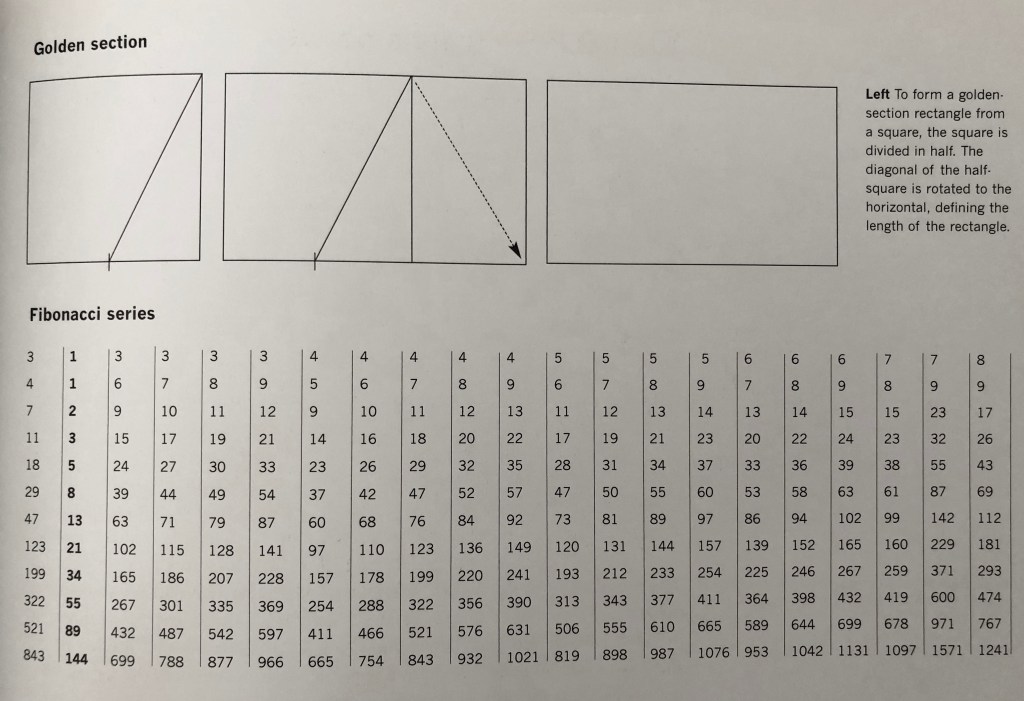
“To form a golden section rectangle from a square, the square is divided in half. The diagonal of the half square is rotated to the horizontal, defining the length of the rectangle.”
Andrew Haslam, Book Design, 2006
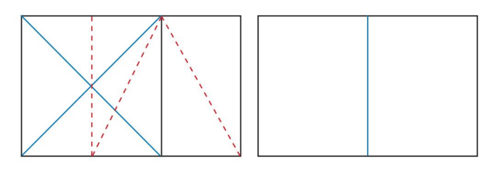
The red dotted lines show how a rectangle has been created from a square using the Golden Section principle. It is then divided to form 2 facing pages.
Look into the golden section more generally, by exploring how artists and designers have used these principles, and more specifically in book design, by looking at J. A. van de Graaf’s Canons of Page Design, Jan Tschichold’s grid designs, or other grid systems for organising the page:
https://en.wikipedia.org/wiki/Canons_of_page_construction
Golden section, the Fibonacci series
Earlier in my first assignment for Creative Book Design unit I did some researches about the Golden Ratio, following the publication of Andrew Haslam Book Design. I’m going to use this book as a guide this time again, but with some extra information about proportions, and their rules.
The golden ratio principle was discovered by Jan Tschichold in the beginning of XX century. The typographer noticed after some analysis, that many Western books and manuscripts were designed according to the golden-section format. We all know that the natural proportion was embedded in some of the greatest artworks created by artists, architectures, designers, painters. Designers believe that the natural proportion is source of the beauty of the nature.
Most of the books and magazines were designed with the use of golden ratio, which are the special proportions to make them pleasant to read. The golden ratio is based on the proportion 1:1.61803, which can be expressed in the formula as a:b = B (a+b).
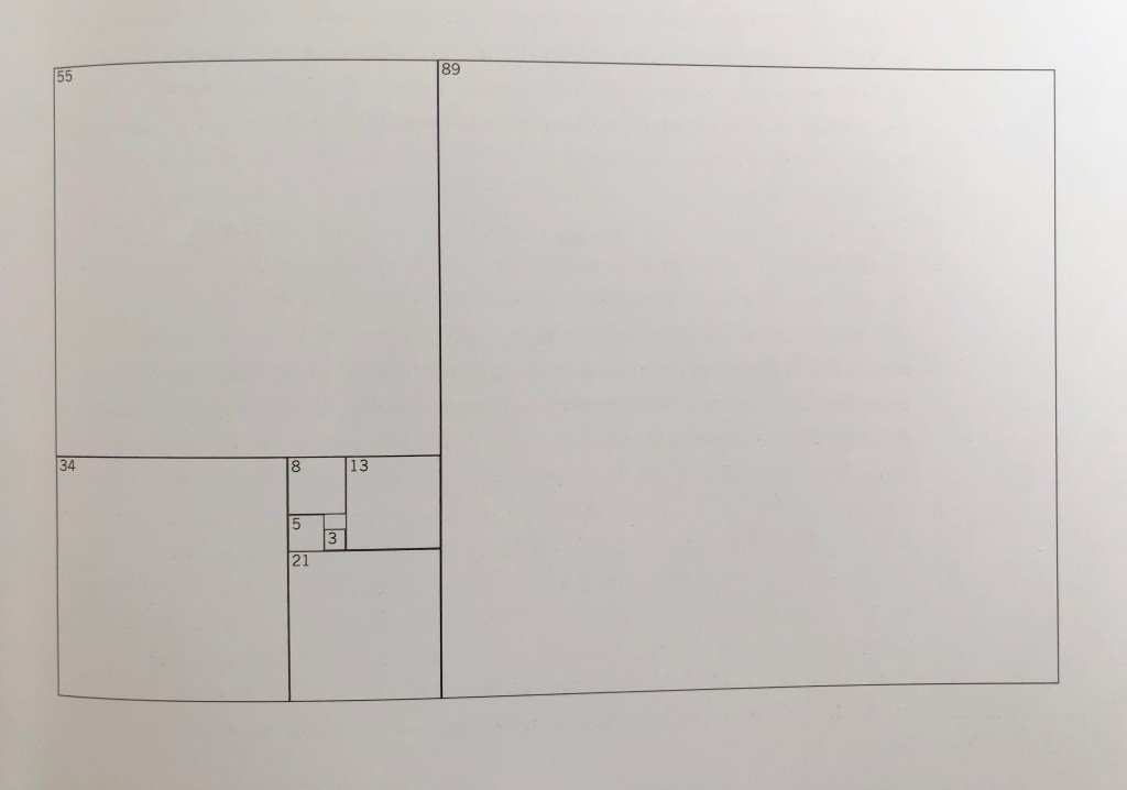
Pic. 2 Fibonacci sequences, where each number is the sum of the two preceding numbers
An Italian mathematician from the late 11th century, Fibonacci brought Arabic numerical system to Europe and invented a combination of numbers that graduated from the sum of its previous two numbers (for example 1, 1, 2, 3, 5, 8, 13, 21, 34, 55, 89 etc). Clever and easy combination of numbers to remember.
Villard de Honnecourt’s diagram
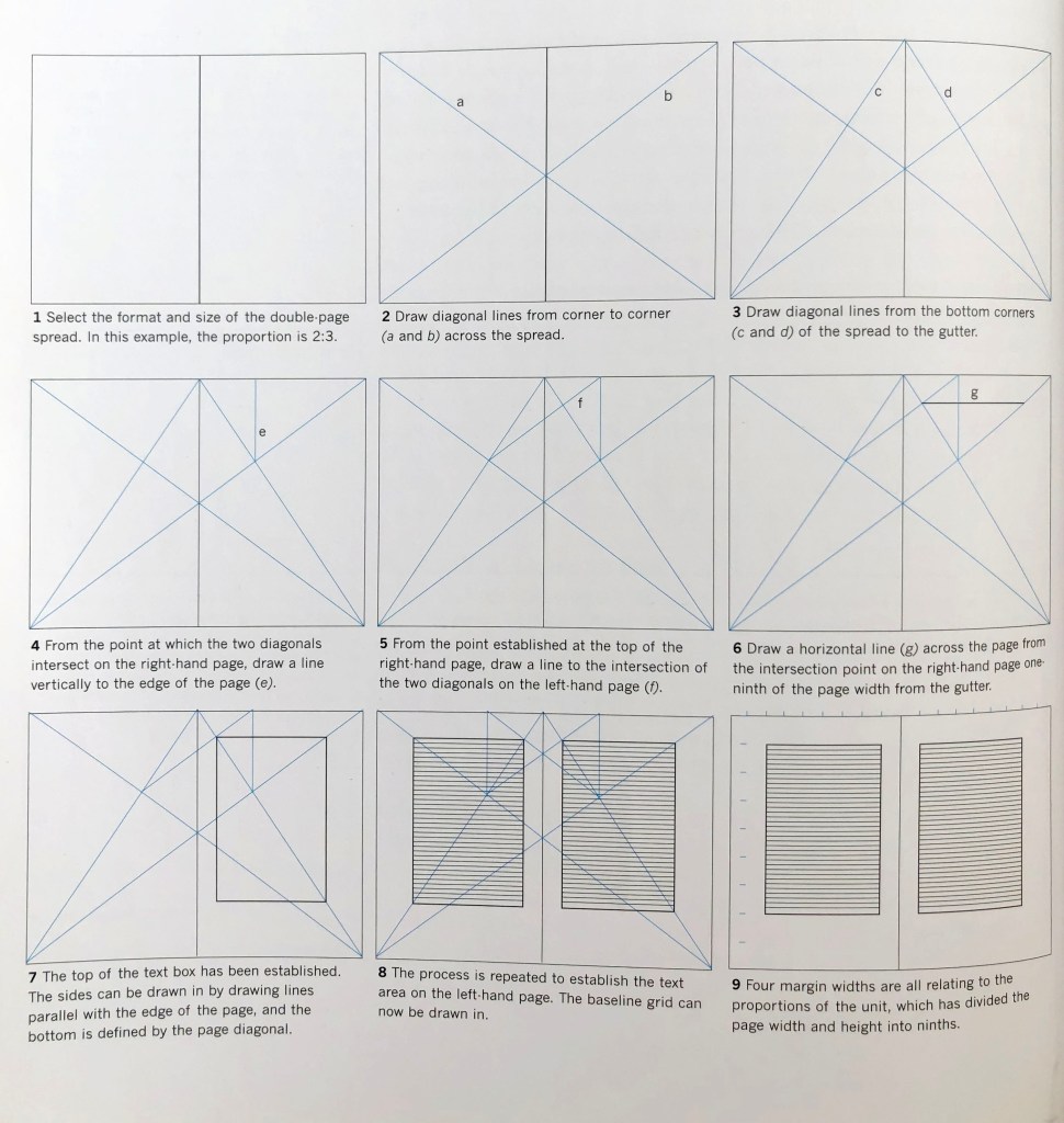
The architect Villard de Honnecourt took Fibonacci scale even further, by inventing a method of dividing a space in hight and width by nine, creating 81 units. Each unit has same proportion as both format and the text box. This is practical grid that can be used for designing magazines and books spreads. The structure is based The Van de Graaf canon, but with useful grid in it. I thought would be quite convenient to have this detailed scheme placed into my blog, as a practical layout.
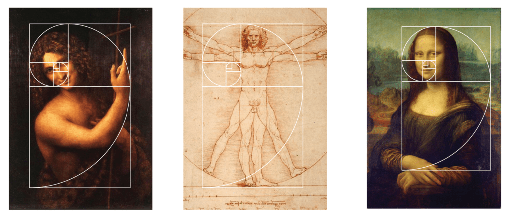
Art forms and Golden Ratio
The World of art has been influenced by Golden Ratio for years. There always been a strong connection between the nature and art. During the Renaissance times such artists as Leonardo Da Vinci, Sandro Botticelli, Michaelalgelo, and many others applied Golden Ratio technique into their works.
The uniqueness of Fibonacci sequence and the golden ratio, that many artists will utilise the aesthetic benefits intentionally when others through coincidence, so much so as that it could be seen in war photography or famous news coverage.
The well known shell-like shape was spread in many famous artistic pieces, one of the example is the Mona Lisa.

https://www.compulsivecontents.com/detail-event/the-golden-ratio-and-fibonacci-sequence-in-art/
(Accessed 05/07/2021)
During the modernism decade, artists drifted away from the strict rules of the Golden Ratio. Strict lines and bold colours started to appear in paintings and graphics, creating a flow in Constructivism, Suprematism, and De Stijl.

Source: https://www.ucsart.com/learn/blog/learn-the-golden-ratio-for-your-artworks-on-canvas
(Accessed 05/07/2021)
Conclusion
Golden Ratio has always been that unique ingredient in the designs, that we know that it exists, but it is not been used often. I can see that most of the time golden ratio is used for publications or art paintings, but in simple promotion materials, it is usually neglected. I can imagine using the grids for designs, they still help to put a balance into the composition, but I think would be great to apply the golden ratio in my upcoming projects.
