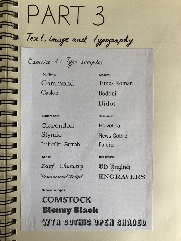
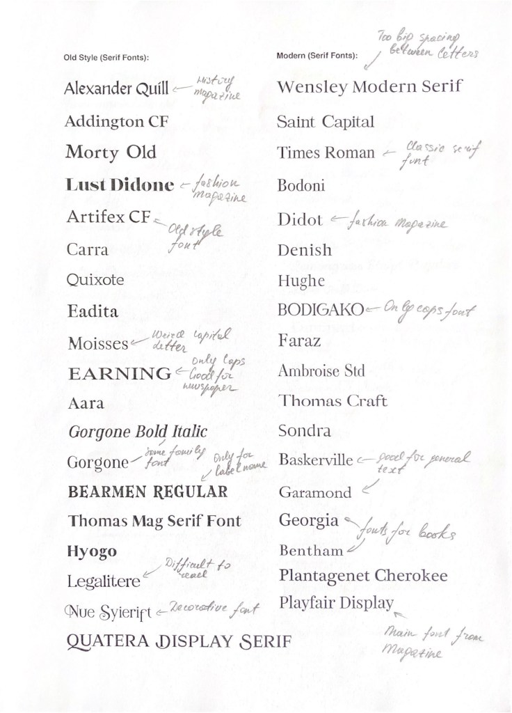
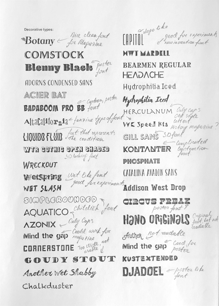
Find as many examples of type as you can from a range of sources, including newspapers, magazines, flyers, leaflets, online, and printed ephemera. Broadly classify them into serif and sans-serif groups. Explore your computer to see whether you have any of the typefaces mentioned on the previous page. Find other examples on your computer that relate to these classifications. Print these off and begin to create a collection of type samples.
Identify
Choose five different typefaces from your classification collection and now look for examples of how they can be used for reading in different contexts. For example, which typeface would be appropriate for a magazine, a science book or newspaper? Have you collected a typeface that might be suitable for all these subjects? As a way of testing out which typefaces might be appropriate for a particular job, also consider them as inappropriately as you can – find contexts in which they don’t work, look ugly or feel ‘wrong’ in some way. Do this by experimenting visually with your typeface choices.
Reflect
Consider and reflect on the nature of the type you are collecting. Examine and annotate printouts with your own impressions of the letterforms. Use descriptive words that express something of the form and character of the typeface. Follow the same process for your ‘wrong’ typefaces as well.
Develop
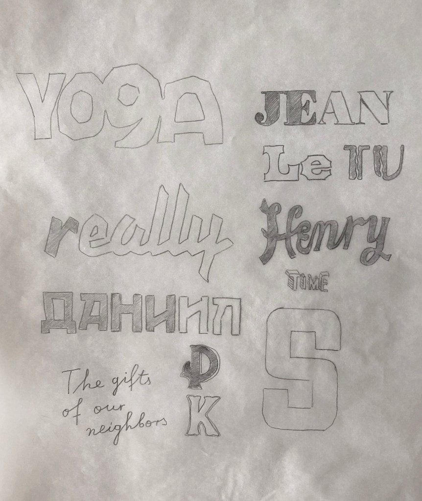
Trace some interesting, unusual and everyday letterforms onto clean paper. This will help you to understand the distribution of weight of line within a particular letterform. Draw over the tracing to enhance the line and fill in the letterform with an even dark grey tone – HB pencil is fine – to recreate the impression of print.
Document and present
The work you produce for this exercise will feed directly into your assignment, so collate your notes, printouts, traced letterforms and samples of type you have gathered. Consider how these could be inventively and visually integrated, and how your ideas could be creatively developed further for your assignment.
Researches
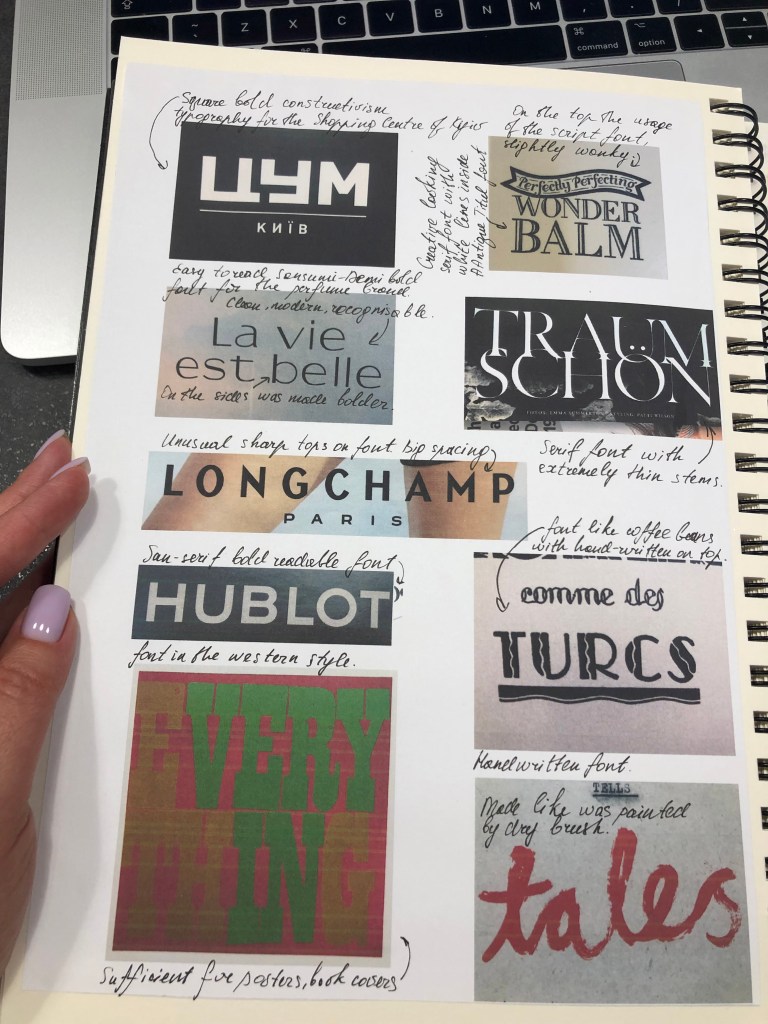
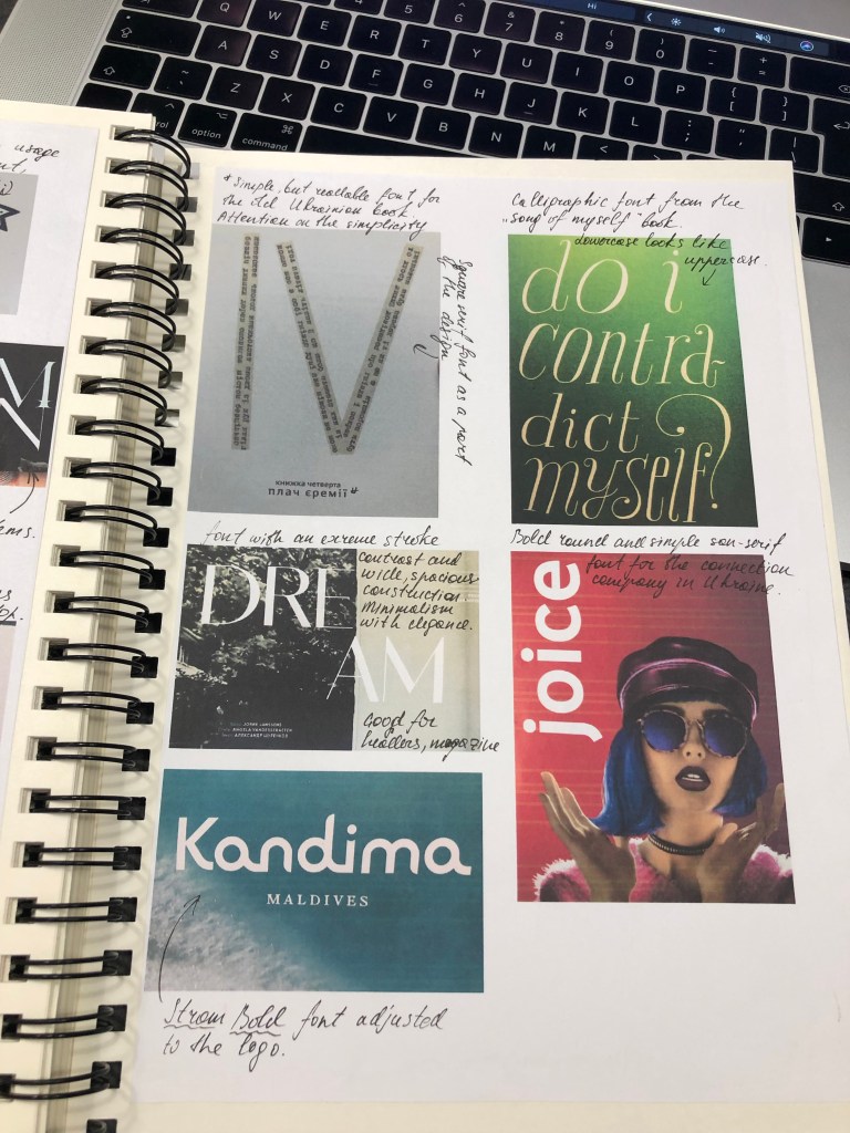
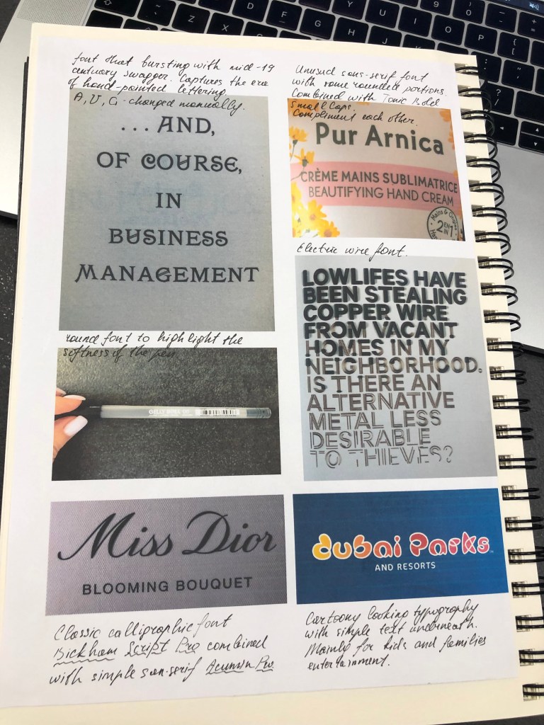
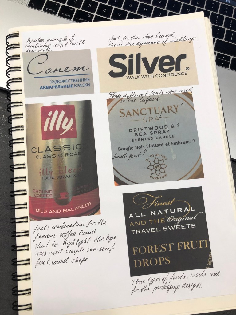
For this first exercise, I have been asked to collect some examples of type from different sources. Every day we are surrounded by different printed materials, and we are accustomed to seeing all types as the method of reading the information, however, as a graphic designer, I’m learning to analyse the information from the design point of view. Attention to the details teaches me how to identify unusual typography, the usage of fonts for different purposes, to see the misusage of the font and learn how to improve my typography skills. Below are presented some of the examples I examined around me.
I collected typographic materials from different sources, such as brand identity, logos, magazines, books, packaging for food and cosmetic products, etc. The variety of fonts is great, but that to summarise my point of view on the typography intake, I’ve noticed that for the magazines, and newspapers mainly serif and san-serif typography were used, thin and elegant, but for such promotional materials as logos, or brand advertisement companies goes for more experiments, here could be seen some big, bold fonts, or more decorative and hand-written.
Typography Analysis
I found the process of analysing typography quite detailed, I went a bit further with my researches, and tried to identify what fonts companies are using in their brands. Through the source WhatTheFont! I added some more typographies to my library. Some of them I could probably use for my designs and articles later. It’s useful to see what principles and technics established companies are using, and follow those rules that to developing my approach.
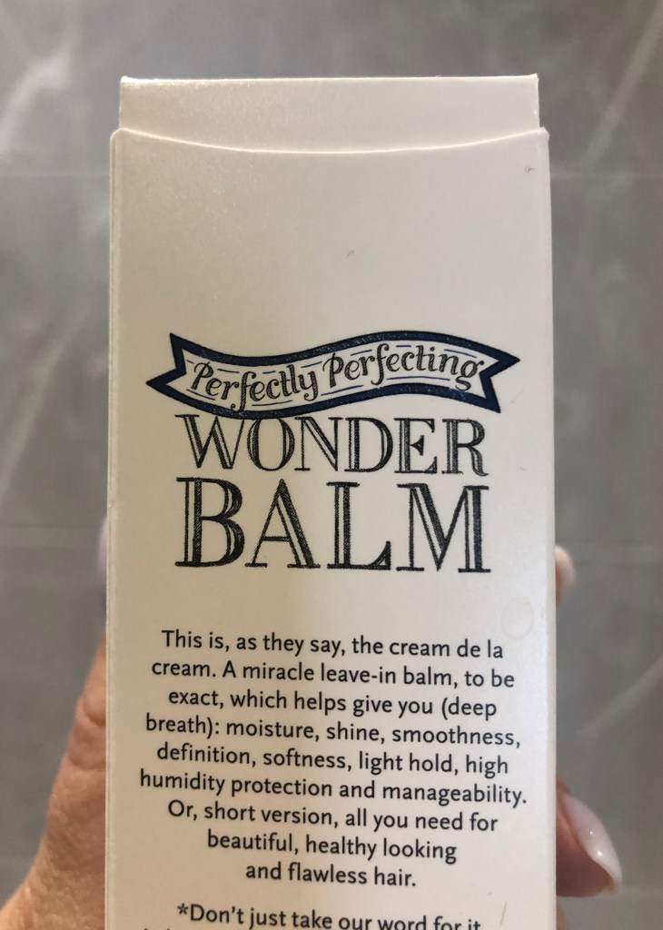
Uppercase letters in the logo with Script font 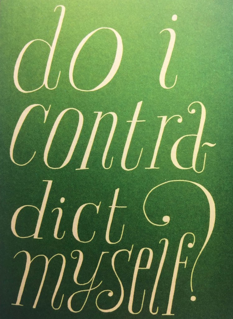
PARAMARIBO Light Condensed Italic
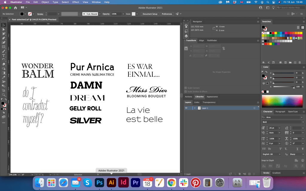
Wonder Balm font is classy and elegant, I think it’s a good play around the serif font, which has a bold design, all capital letters, and in addition the white line inside adding some uniqueness into it. The font has something quirky and girly, and also works well with handwritten text with the ribbon on the top of the logo. In addition, they are using simple and easy to read san-serif font with central alignment.
PARAMARIBO Light Condensed Italic is quite extraordinary handwritten font, each letter stands separately from each other, even though it is kind of hand-written font. Letters sits like uppercase would do, but they are written in the lowercase. This type good for posters, books design, using independently as a part of the design.
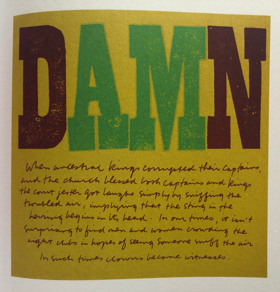
Arvo 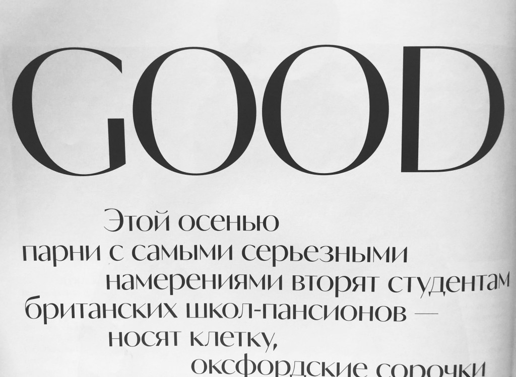
Olivette CF
Arvo type if big and bulky, square serif font, very eye-catching and works perfectly for posters and big distance read promotional materials. Here is the example of contrasts for the typography, as it combined with difficult to read handwritten font, which looks like was written in the rush. I thought that is a good example how two opposite fonts can work in the team together.
Olivette CF for the Elle magazine headers. What’s so special about that font, that it looks like the hybrid between serif and san-serif font, it has a feel of serif font with combination thinner and thicker stems, but the serifs are missing. Useful font to have in the library for the magazine designs and headers. Modern, classy, elegant typography.

MartinGot
Tonic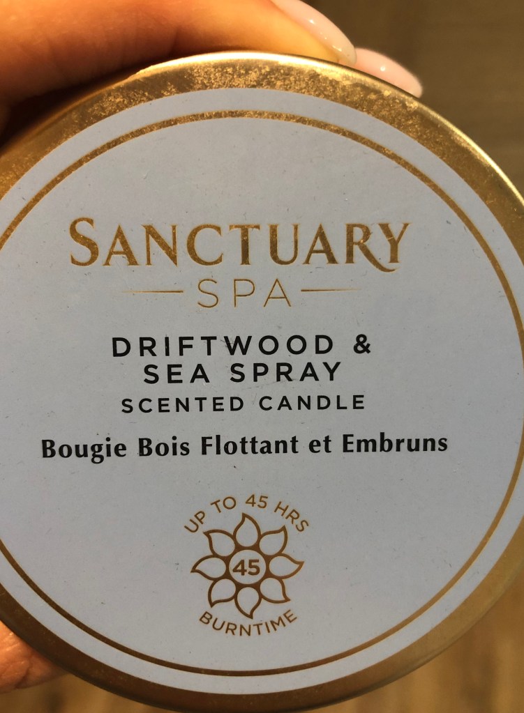
The last set of fonts I analysing here is from cosmetic products around me. I have noticed that some companies are experimenting with the font, they still keep them elegant and classic, but the shape is quite unusual. For example, how I can see with the hand creme from Yves Rocher, those typography selections of san-serif font, they look like fonts for the logo. Again, I could detect MartinGotURWTMed type combined with Tonic Bold. They are readable and not common for publishing materials, mainly those fonts that could be used for brands. The Sanctuary Spa candle had a combination of san-serif typography, there are all different, I can see around five different fonts in the little space, but they do look in harmony together.
Fonts Library
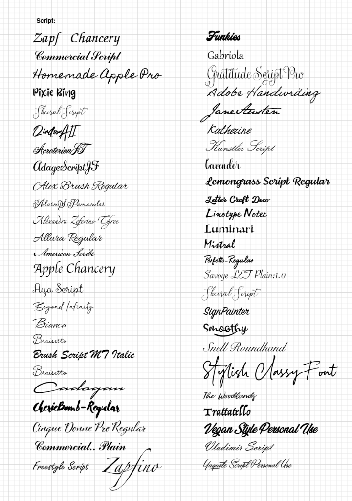
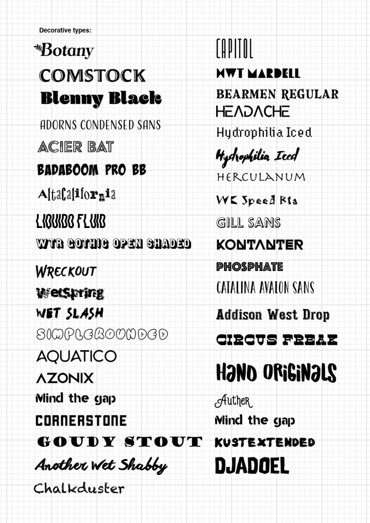
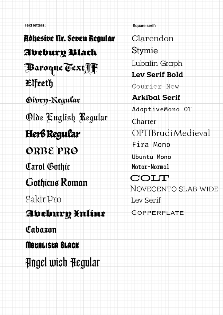
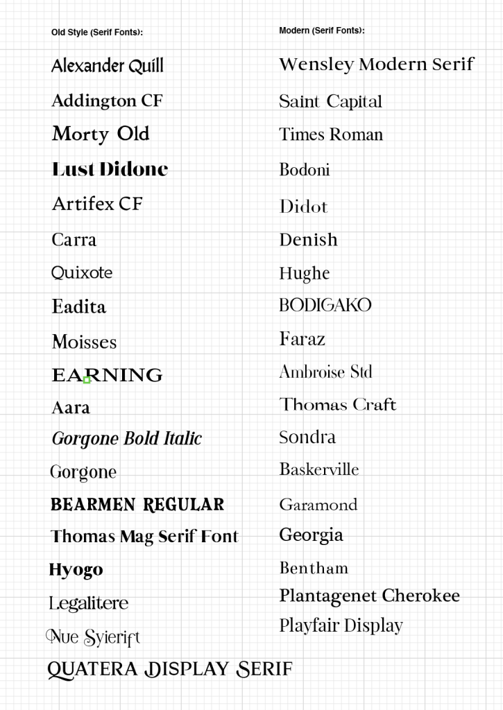
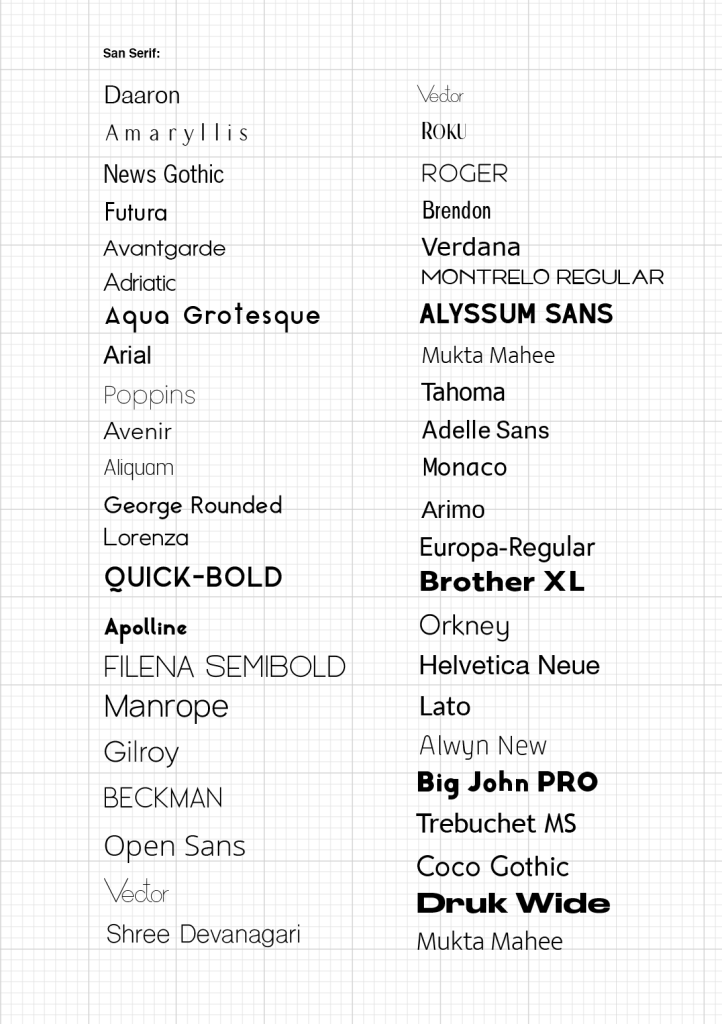
On my computer I have a big selection of fonts, I’m trying to add new fonts into the library for each purpose, whether I’m doing a new poster or online social media post, it’s useful to have the library updated, read some articles about trends in typography, and what new fonts have been released. But at the same time, I have a habit of using the most readable and tasteful fonts for the different promotional materials over again and again. I thought that is a great idea of creating visual examples of fonts, for some future projects I could relate to them, and it will help me to widen my fonts usage.
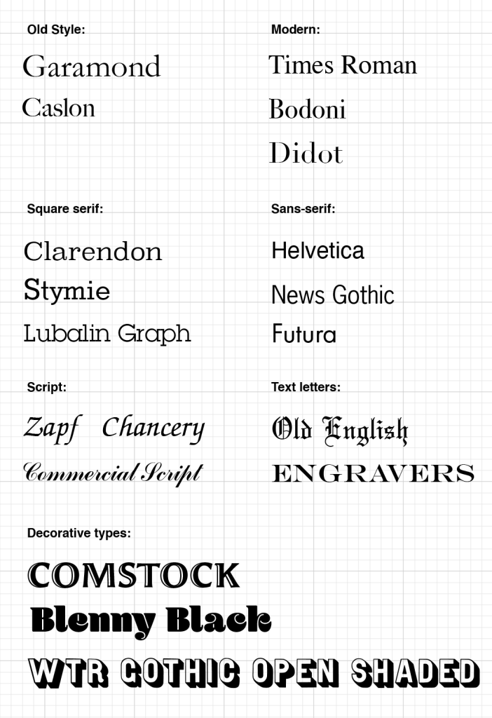
I printed the set of typography and placed them in the order. I tried to classified them into the groups, but also analysed what area could be appropriate for some of them.
Fonts for Fashion Magazine
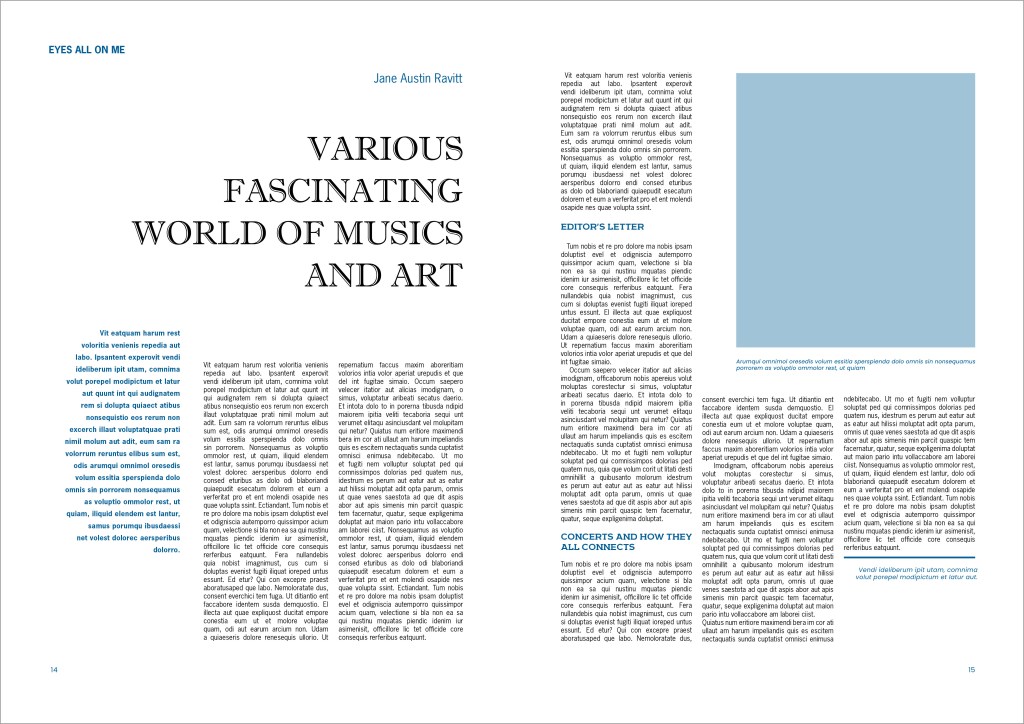
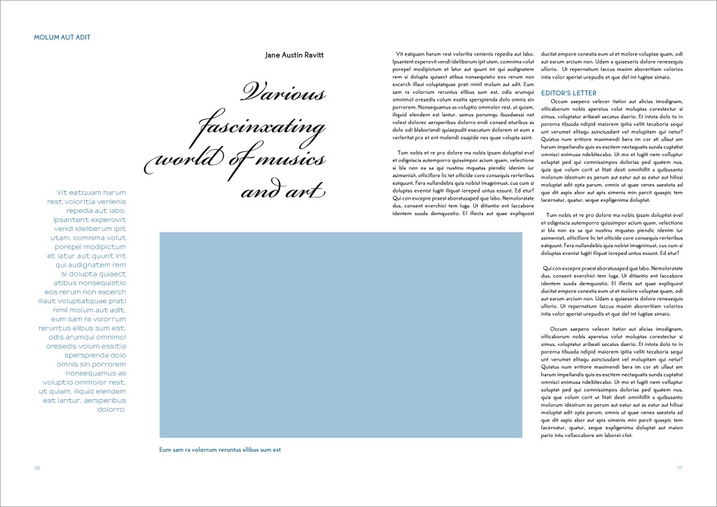
For the magazine layouts I collected five different fonts combinations, to see how they will work together. To say ahead, I was surprised with the results, as fonts that I thought would be less readable, or appropriate for the context, had better impression than I expected. Bellow I mentioned the list of fonts I was going to use, mainly they were from the selected fonts that I picked through WhatTheFont?
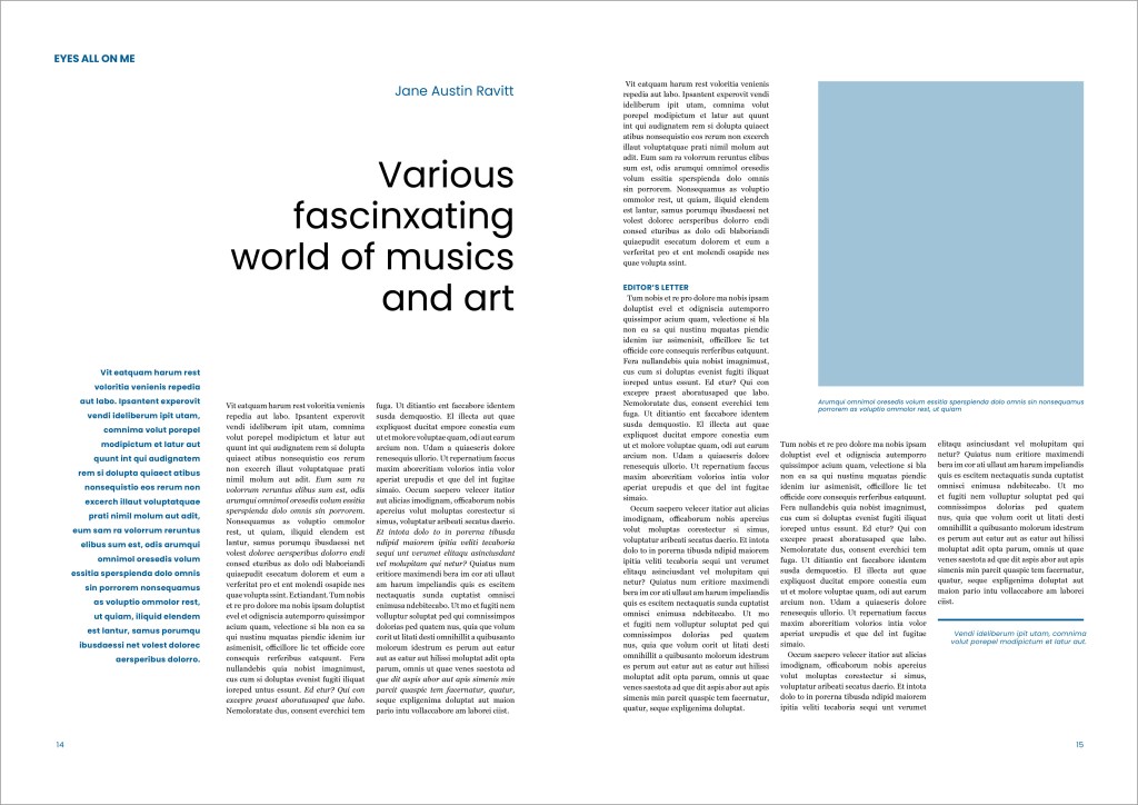
- Poppins for the header (san-serif), Georgia for the main text (serif)
- Olivette CF for the header (san-serif, bold, wide), Orkney for the main text (san-serif)
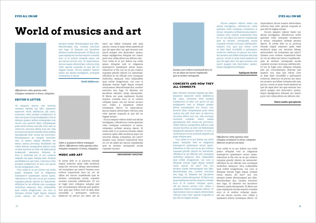
- Arvo for the header (square serif, bold), Lev Serif for the main text (square serif)
- Antique Titul DcFr (serif, decorative font), News Gothic Std for the main text(san-serif)
- Bickham Script Pro (handwritten, script font), Tonic bold (san-serif)
Poppins san-serif type gives a light feel for the header, it works well for the art and history kind of magazine, in combination with George serif font the magazine spread looks classic and elegant. For the main text I used tracking 8pt, with the spacing 11 pt, otherwise, the sentences were too dense. The disadvantage of this font combination, that it is too straightforward, and doesn’t have a creative or extraordinary feel. Also, that font combination doesn’t give the challenge to grab attention. But it is a great pair for the clean, easy to read layout. Intro word I made in Poppins font as well, but in bold and doubled spaces between the sentences.
Olivette CF font has more personality, it is eye-catching, wide and noticeable. For the body I used san-serif Orkney light font. ThrohandRegular serif font for the intro. In my designs I tried to experiment with different types combinations, so I could see which works better. Visually the main text font is slightly wide and round, it is readable, but I had to increase the font size to the 9pt, as the font was too small. Also, it was noticeable gaps between the words, I think that is something to do with the shape of the font. Altogether the article have the modern feel, and I think will be suitable for the contemporary magazine edition.
Arvo type has a strong, bold and straightforward impression, and it bold and noticeable font, which gives the article a strict feel. For the header, I used the wording about the music and art as for the previous templates, but in this case, this structure and font of the article will work also for the books review, newspaper, or publication about the technologies. For the body text, I decided to use Lev Serif square serif font, without much hope that the font will work for it, but surprisedly it was the most readable and coherent type I tried to use so far. I realised how important try different options because only in comparison the real results can be seen. Also, another Big John PRO for the subheads with bold and round writing was a good addition to this magazine template.
Antique Titul DcFr header with decorative look serif fonts doesn’t work for the publications as it has too much personality, which is more suitable for logos, or marketing materials. Also, the white lines in the middle of the letters gaining too much attention. News Gothic Std medium serif font for the main body is too narrow and not easy to read. Arkibal Serif for the subheads works fine, but not in this template and fonts combinations.
For the last version I tried completely different fonts combination. I used script Bickham Script Pro for the header. The header font looked fine, it didn’t look tike the type I would see every day for the magazines, but it could be acceptable font for the classic music publication. Sansumi-DemiBold serif font for intro, Tonic Bold main body, MartinGotURWTMed subhead, not something I would use, as the shape of the fonts conflicting and don’t work together. I can see that types mismatch in this template, so it’s still good to be considerable, when choosing appropriate typography for a magazine, a science book or newspaper.
Letterform tracing
For the last part, I tried to trace different typographies around me. The font selection is quite unusual. I was curious to see that for the type from the word ‘Really’ that look like the script, mainly consist of straight and parallel lines. Or the font that looks round, the word ‘Yoga’ has some angles in it.
Conclusion
This exercise helped me to make analysis of typography, see how fonts communicate with the reader and learn that there is a connection between types in publication. I believe this part will help me to establish first steps for my next assignment.
