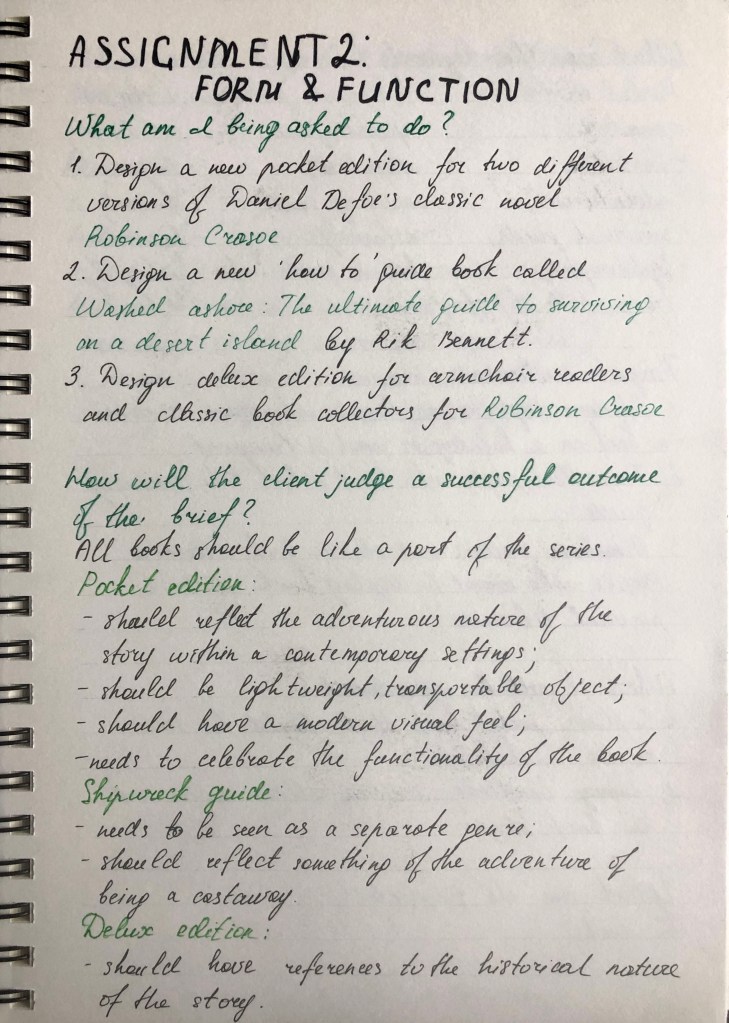
Assignment two provides a creative opportunity to put into practice what you have learnt so far, by exploring the physicality of the book in relation to its function and working through the design process in relation to a set brief.
Your brief
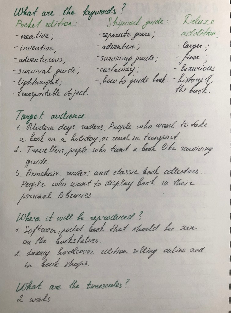
Design the book format and cover artwork for two different versions of Daniel Defoe’s classic 1719 novel Robinson Crusoe. The publishers, Viking Press, have decided to re-release this title as a new pocket edition for readers on the move that reflects the adventurous nature of the story within a contemporary setting. This paperback version should have a modern visual feel that can compete with new titles in the bookshop. They also want a deluxe edition for armchair readers and classic book collectors that references the historical nature of the story and its associations. Produce book design ideas and cover artwork to reflect the content of the story across both formats and contexts. Be creative and inventive with both the look and format of these books.
As a side project to accompany the re-release of Robinson Crusoe, Viking Press has also asked you to design a new book called Washed ashore: The ultimate guide to surviving on a desert island by Rik Bennett. This is a ‘how to’ guide that should reflect not only the practical advice it offers, but something of the adventure of being a castaway.
The scale, stock and binding of these publications are up to you. The pocket edition needs to celebrate the functionality of the book as a lightweight, transportable object, and to connect to the story’s travel or survival themes in a contemporary way. The deluxe edition can present the content in a larger, finer, more luxurious, considered or expanded way, that perhaps makes reference to the history of the book itself. Your designs need to be seen as part of a series across both versions, so think about how you adapt your designs to fit each format. The shipwreck guide needs to be seen as a separate genre, piggy-backing on the success of Robinson Crusoe. Develop visual ideas that can distinguish the survival guide from your Robinson Crusoe designs, while at the same time making some thematic connection between them.
Your design should include the front, back, spine and flaps of your covers – if you opt for a traditional book binding. You can also come up with alternative ways of binding, and therefore designing your books if you want to. Generate your own illustrations, photography or artwork for the covers, source copyright free images, or treat the covers purely typographically. This is an opportunity to be creative with both your design thinking and outcomes, so experiment, and test out a range of visual and physical options.
You may want to extend your project by also designing a number of sample pages from the inside of the book. When creating sample pages, try to make a link between the cover design and the design of the inside pages.
Present your ideas by mocking up each of the books and their covers, and by presenting the overall spec of your designs (what paper stock you are using, etc.).
Work through the design process, documenting it in your learning log as you go. Use rough drawings, notes, diagrams, mock-ups of your books, photographs of what you’re working on, and by saving different stages of any digital work to show your process. Talk about your creative process through notes and reflections.
Research and ideas
Read the brief, identifying keywords, and do the same for Defoe’s text. You don’t have to read the whole book, but make yourself broadly familiar with the story and identify key themes, motifs and images. The full text of the novel is available here: http://www.gutenberg.org/ebooks/521
Identify the research you need to undertake. This could include researching existing versions of this cover, others of the same genre, or seeking inspiration elsewhere. The same goes for your survival guide. This brief requires some lateral thinking, so develop ideas that are unexpected, as well as the obvious.
Generate thumbnail sketches to document and explore your creative thinking process. Aim to come up with a range of different ideas from which you can select and test different outcomes.
Present visual outcomes
Develop your initial ideas through making, drawing, collage, photography or whatever other mediums you choose. Be playful and let new ideas emerge through your making process. See this as a project, rather than a linear journey, so you may want to return to earlier stages of the process to develop new lines of visual enquiry or to take creative risks and try new things out.
For the deluxe edition of the book, you may want to access the Bridgeman Library to source copyright free illustrations from previous editions of the book.
Think about how your choice of scale, paper selection, and binding can help support your ideas in visual and tactile ways. If you are unable to source particular materials, then find other ways of visualising or describing your choices.
Lay out the jacket using DTP software and incorporating text and image(s). Design a range of versions of the jacket to choose from. Print the jacket designs and make a mock-up of the jacket onto either an existing book, or find other ways of mocking up the scale of the books. Photograph both versions of the book jackets as your final outcome to the project brief.
Reflection
Reflect on your outcomes but more so on your creative process – what worked for you, and how might you adapt these approaches for future projects? Just a reminder to think about how well you have done against the assessment criteria and make notes in your learning log.
Analysing the brief
First edition
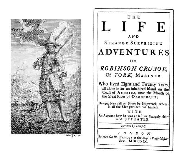
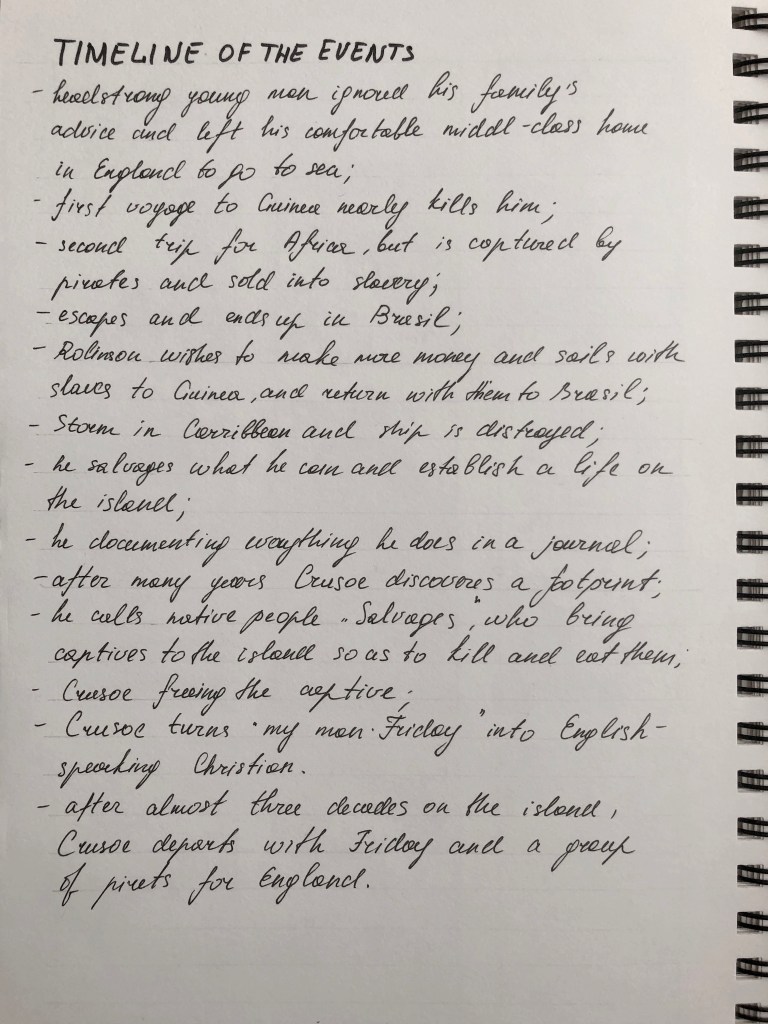
Robinson Crusoe is a novel written by Daniel Defoe over 300 years ago. It was published on 25 April 1719. The first edition didn’t mention Defoe as an author of the novel, the full first name of the book was “The Life and Strange Surprising Adventures of Robinson Crusoe, of York, Mariner: who lived eight and twenty years, all alone in an un-inhabited island on the coast of America … Written by himself”. Because of that everyone believed Robinson Crusoe was a real person and the book is a travelogue of true incidents.
The story has been thought to be based on the life of Alexander Selkirk, a Scottish castaway who lived for four years on a Pacific island called “Más a Tierra”, now part of Chile, which was renamed Robinson Crusoe Island in 1966.
The book blends many different genres. It is the escapist adventure of a young man who spends 28 years on a remote tropical desert island near the coasts of Venezuela and Trinidad; and braves shipwrecks, pirates and cannibals. But it also prompts us to ask ourselves how we would cope – alone ‒ in Crusoe’s place?
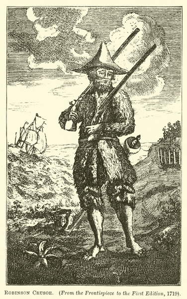
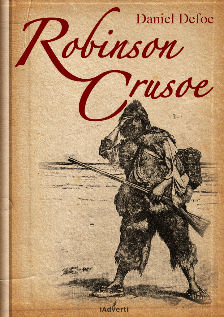
This is the first edition of the famous castaway tale. The iconic frontispiece shows Crusoe in his goatskin jacket and cap, with guns slung over his shoulders. The original image of Robinson has been used for numerous book covers in the future. I think that is the main visual to show the spirit of the book, and it’s vital to learn the history of this book design, as it can help to invent something new based on the original images.

Research
The first time I read this book was at the age of 10. I read it according to the school’s World Literature programme. I was fascinated by the story, as it brought a spirit of adventure into my mind, but at the same time, I was not old enough to see this story as a psychological drama, as Robinson was the individual who was lost in the middle of the ocean, but who despite all still kept social aspects in him, and implemented modern cultures around him, like making friends, and adapt his life with a new friend Friday, and battling enemies as wild culture. The story is very old, and it sounds very authentic compared to modern life, where we learn how to collaborate with different cultures, but at the same time, I think this book was like the start of the cultural development in different societies. Also, there are social values that were risen in that book. When I was little I saw the story only from the point of an adventure, I thought that the person who appeared on the wild island would start to battle for life naturally, adapting to the surroundings. But the main point here was motivation, the will to survive and having a clear mind despite challenges. I think, the modern-day it will be practically impossible to appear on the undiscovered island, as all lands and territories have been civilised by now, or owned by someone, but back 300 years ago, the story sounded like truth, as people wouldn’t leave their natural habitat as often as we do nowadays.
Earlier, in the first part of Book Cover Design Unit, Exercise 1: Influential books, I mentioned that book, as one of my favourite books, probably the story shaped my mind to dream about faraway islands to visit, that to feel myself like a Robinson, who discovers a world. https://eleonoras.art.blog/2020/11/23/exercise-1-influential-books/ That design can be classed as a pocketbook. Its size of it is 124×200 mm, which is similar to the 5×8 inches, but slightly smaller. The spine is only 1,5 cm. The book is light to take in the handbag. The spirit of the book cover is quite optimistic and easy-going, it’s a picture of a man wandering around a beautiful island, even though on the back cover they showed a shipwreck.
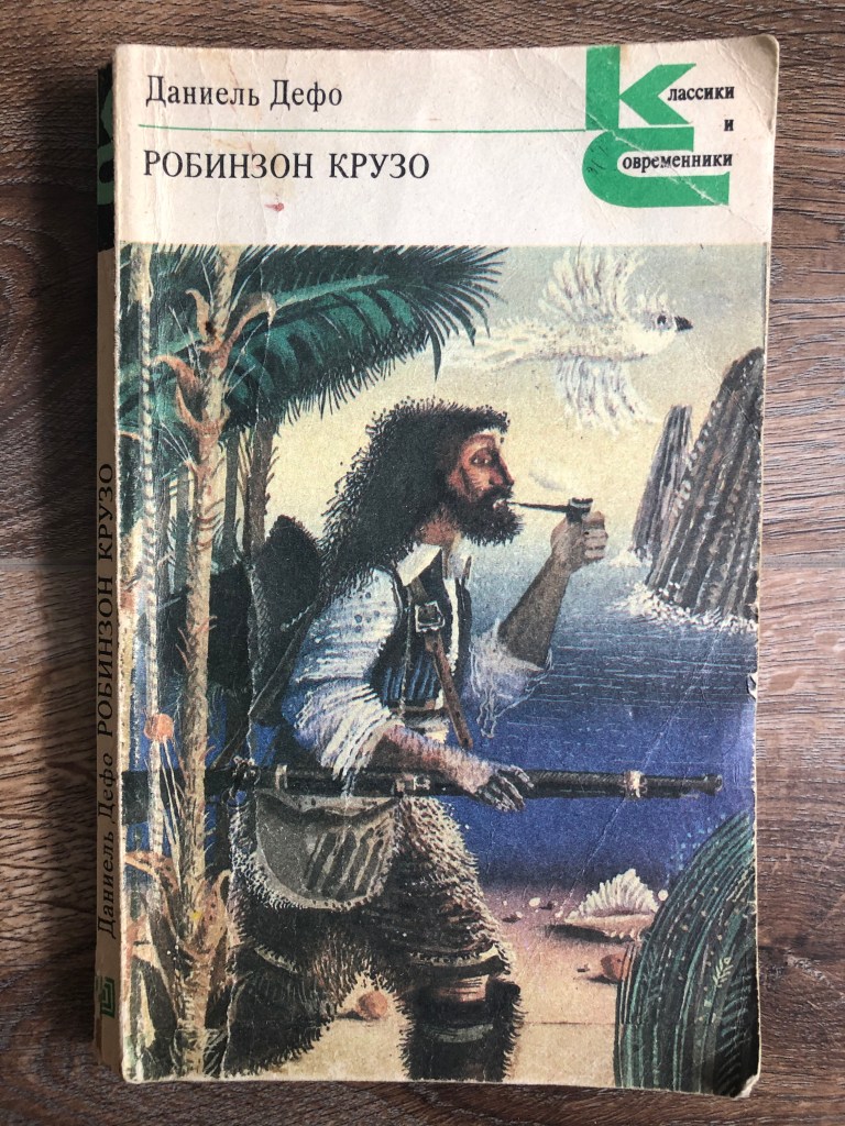
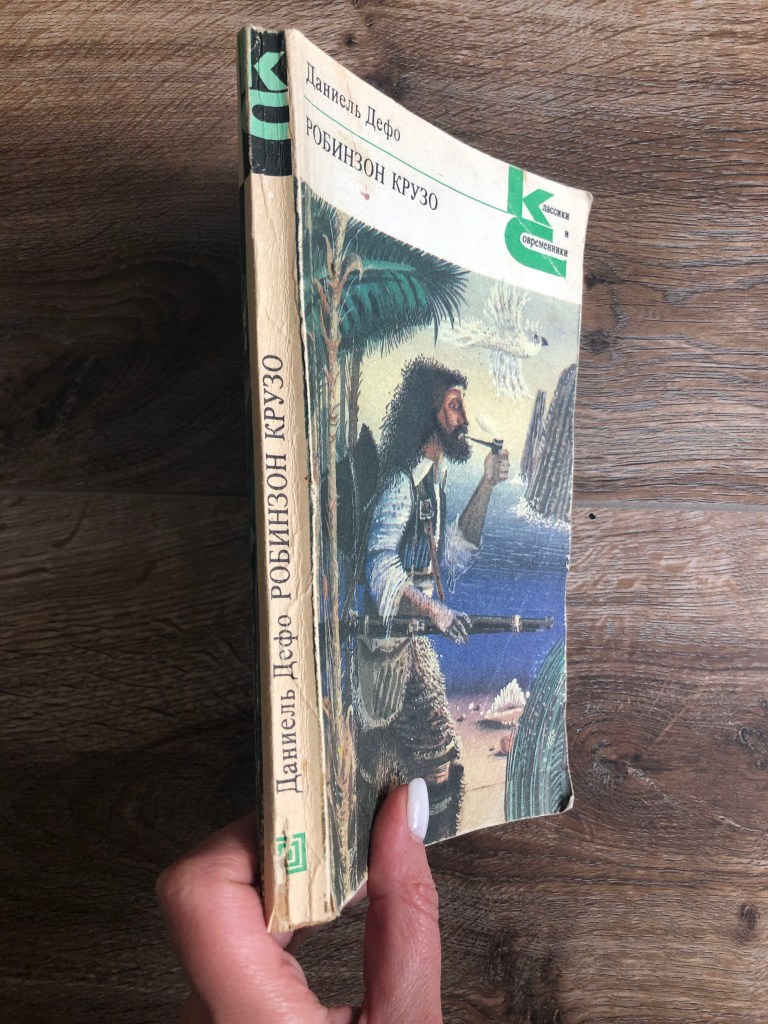
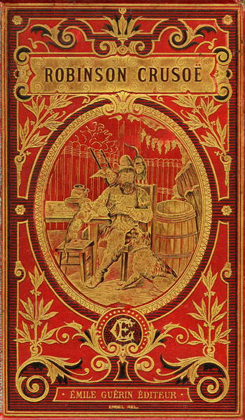
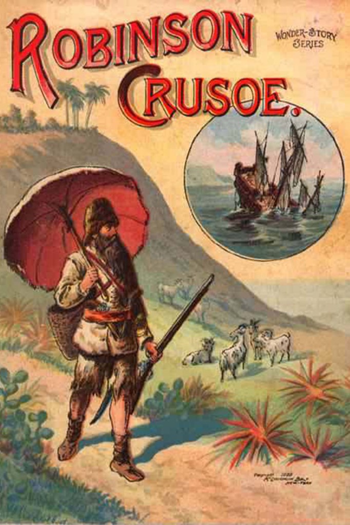
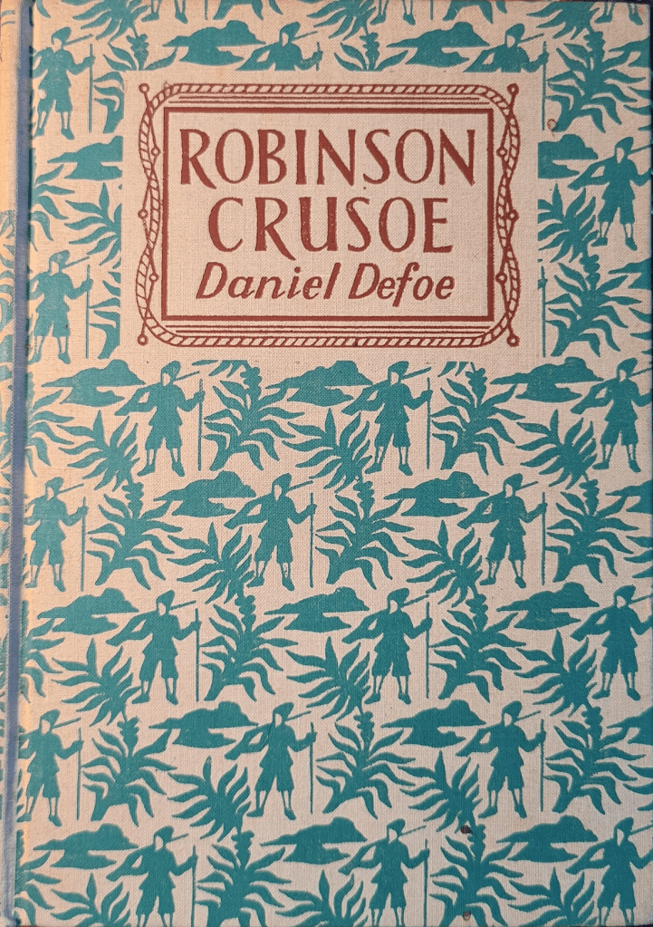
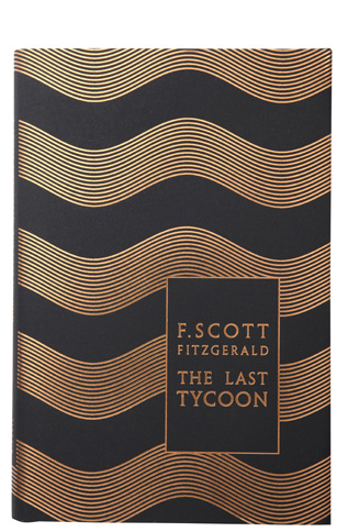
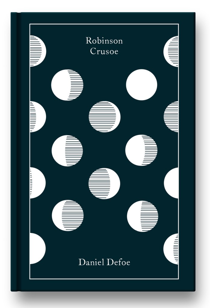
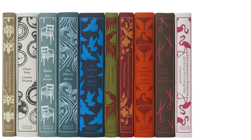
That cover was dated 1981 and has a similar theme to the covers I found from the Bridgeman photography source, illustrative style to visualise the protagonist and the full background around it, such as see, island, and landscapes. What’s so fascinating, the book cover was designed so many times, throughout all these years, so it has thousands of different illustrations, that are kept in people’s libraries. Most of the designs I would call a pocket edition, they all have an expressive approach, which illustrates the protagonist and the abandoned island. The painting of Robinson Crusoe is usually a beardy man, with heavy clothes, accompanied by a dog, parrot or Friday. On some covers, Robinson appears like a lonely person, surrounded by thousands of kilometres of water. All illustrations are colourful, with loads of details, painted in watercolour and gouache type of paintings. Later designs became minimalistic, I could see the presence of flat colours and outlined painted objects, like a palm leaf, or moons. I quite like the design with green leaves, which look like a jungle design by Pinguin. It could confuse Jungle Book design, but because it is so different to others Robinson Crusoe books, I think it stands out quite well.
I found all illustrations below from different sources, including Bridgeman photography bank. Also, I added some modern covers, that to compare the evolution of the book covers. Most of the covers look like a pocketbook, and only a few designs have a look of luxury additions. I thought it will be quite interesting to work on that design style, which was not used for this book often too, but at the same time have it in keeping with the pocket edition.


https://www.amazon.com/Robinson-Crusoe-Bob-Blaisdell/dp/0486288161
https://www.hollywoodreporter.com/thr-esq/artist-wins-4-million-ruling-668068
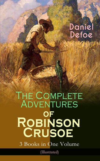
https://www.kobo.com/fr/fr/ebook/the-complete-adventures-of-robinson-crusoe-3-books-in-one-volume-illustrated
https://www.penguin.com.au/books/robinson-crusoe-popular-penguins-9780141195100
https://en.wikipedia.org/wiki/File:Op%C3%A9ra-Comique-Robinson-Cruso%C3%A9-1867.jpg
http://www.kenilgunas.com/2014/12/the-best-books-syllabus.html
https://shop.reloveoxley.com/collections/gimme-vintage-books/products/danieldefoerobinsoncrusoehardcoverbook?variant=31644612427841
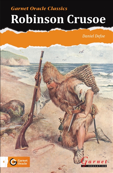
https://www.bebc.co.uk/garnet-graded-oracle-classic-reader-4-robinson-crusoe-book
https://wordery.com/oxford-reading-tree-treetops-classics-level-17-robinson-crusoe-daniel-defoe-9780198448839
https://almabooks.com/product/robinson-crusoe/
https://br.pinterest.com/pin/484207397406012386/
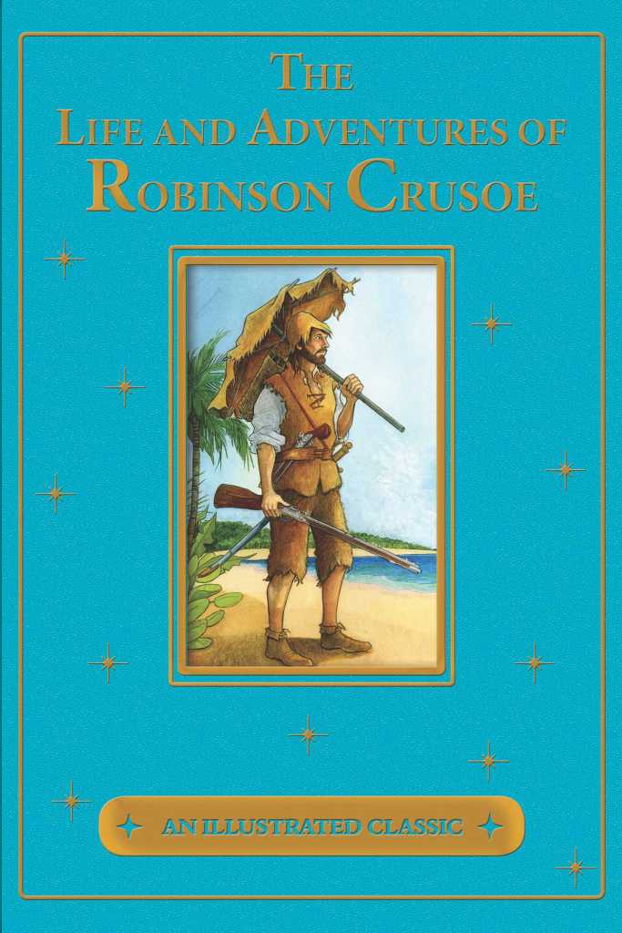
https://www.simonandschuster.com/books/The-Life-and-Adventures-of-Robinson-Crusoe/Daniel-Defoe/An-Illustrated-Classic/9781684127931
(Accessed 13/04/2021)
Bookshop
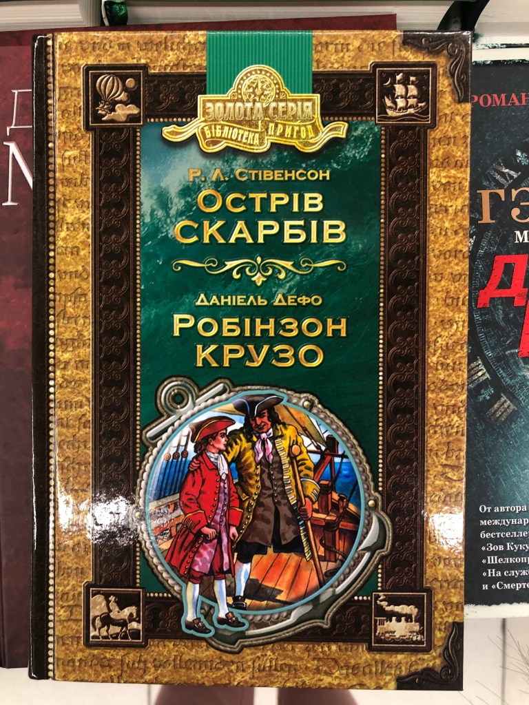
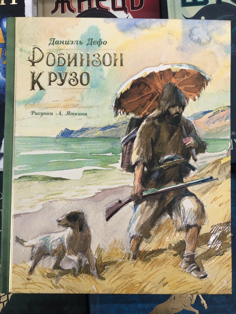
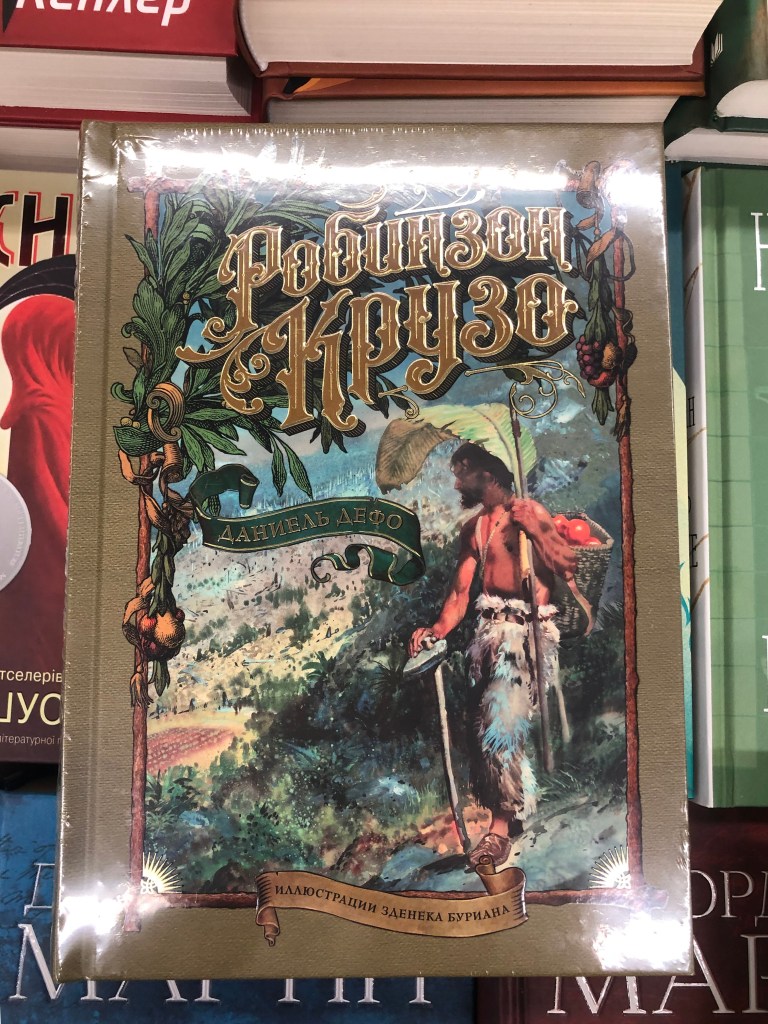
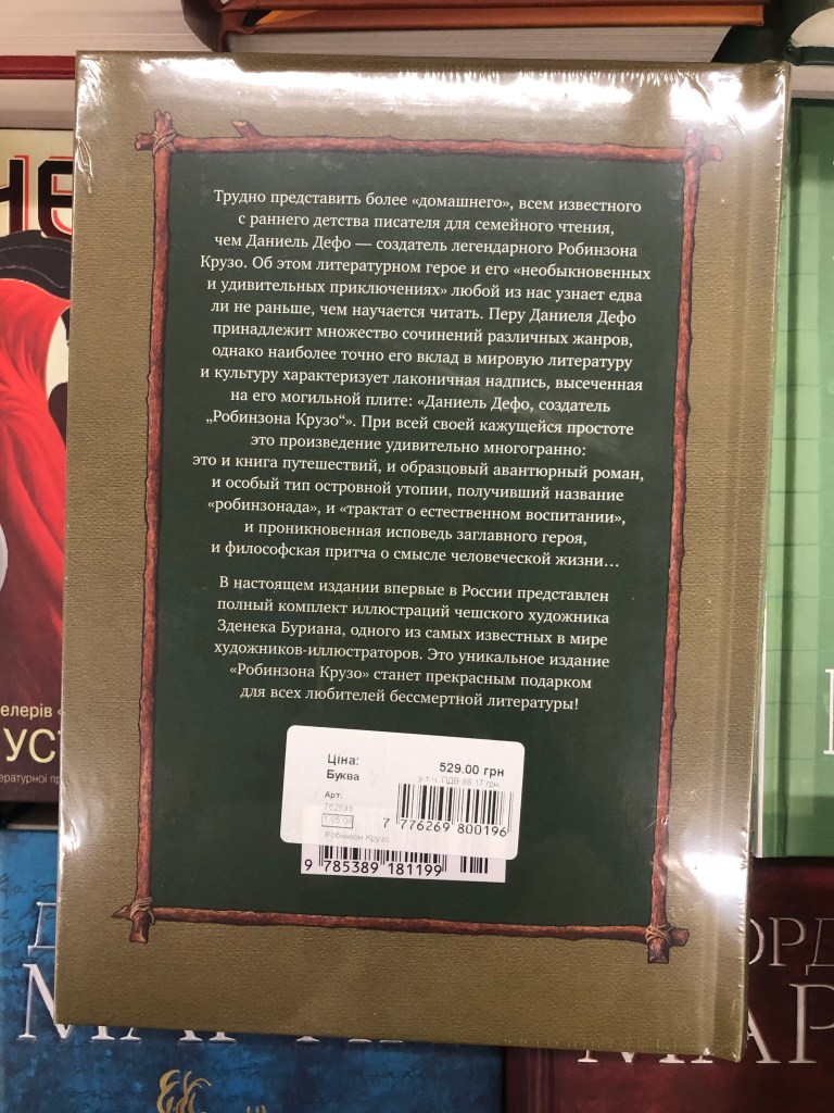
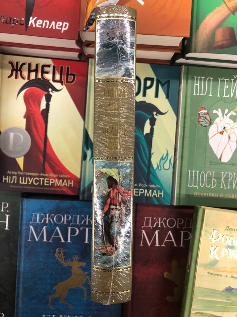
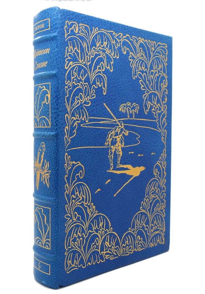
In the local bookshop, I found some interesting additions for Robinson Crusoe books as well. There were three different versions. The first book was on bookshelves for kids, the book had hardcover, and it was combined with Treasure Island adventure novel by Scottish author Robert Louis Stevenson. The book had illustrations inside, made in pencil technic. The second book was the one that I bought. It was located on the classical books shelves, and that was my favourite. It contained loads of watercolours in it, and the cover was designed by famous Russian illustrator Anatoly Itkin. One of the books was classed as a luxurious edition as it had a hardcover, lacquer on the top of some painted elements, and gold stamping for the font. The third book had a prime design, and it was twice more expensive as compared to the rest, and it was located on the gift section bookshelves. I couldn’t look inside of it, as it had a wrap around it, but on the main cover, it was said it has watercolour paintings inside made by Zdeněk Burian, who was a Moravian (region of the Czech Republic) painter, book illustrator and paleoartist whose work played a central role in the development of palaeontological reconstruction. The book itself had a golden stamping for the font, also the foredge of the book had a golden colour.
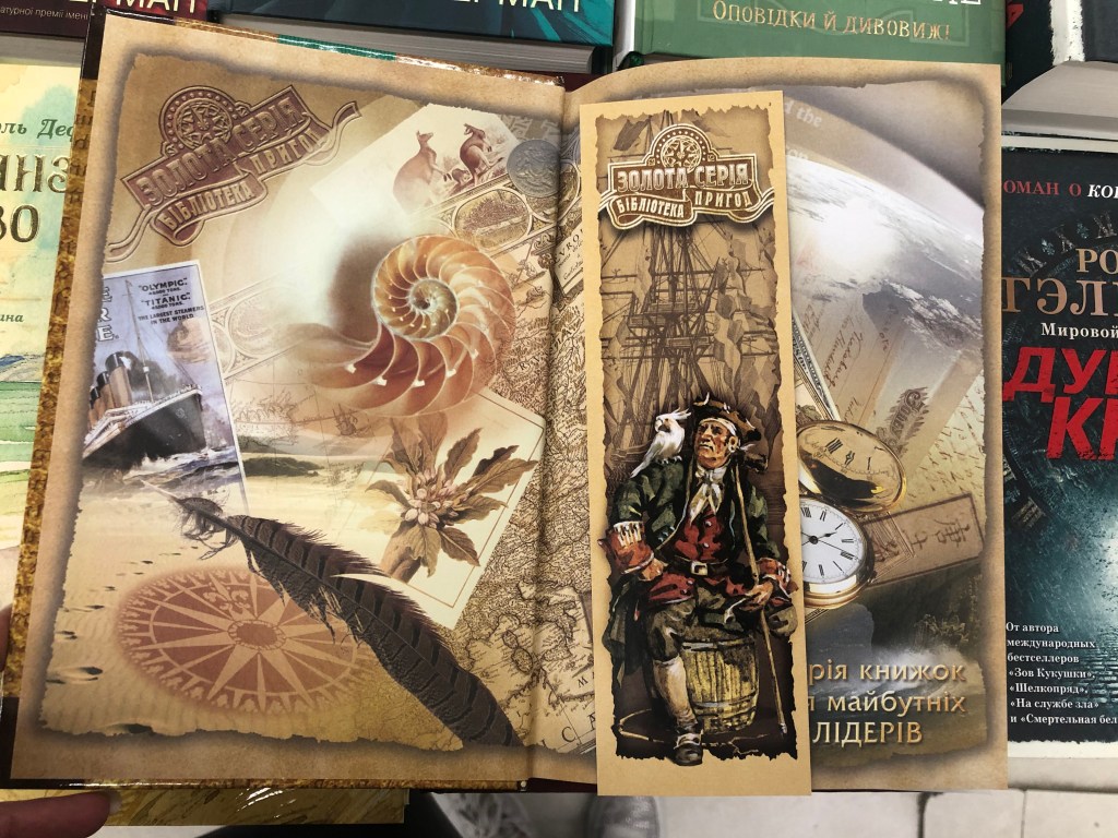
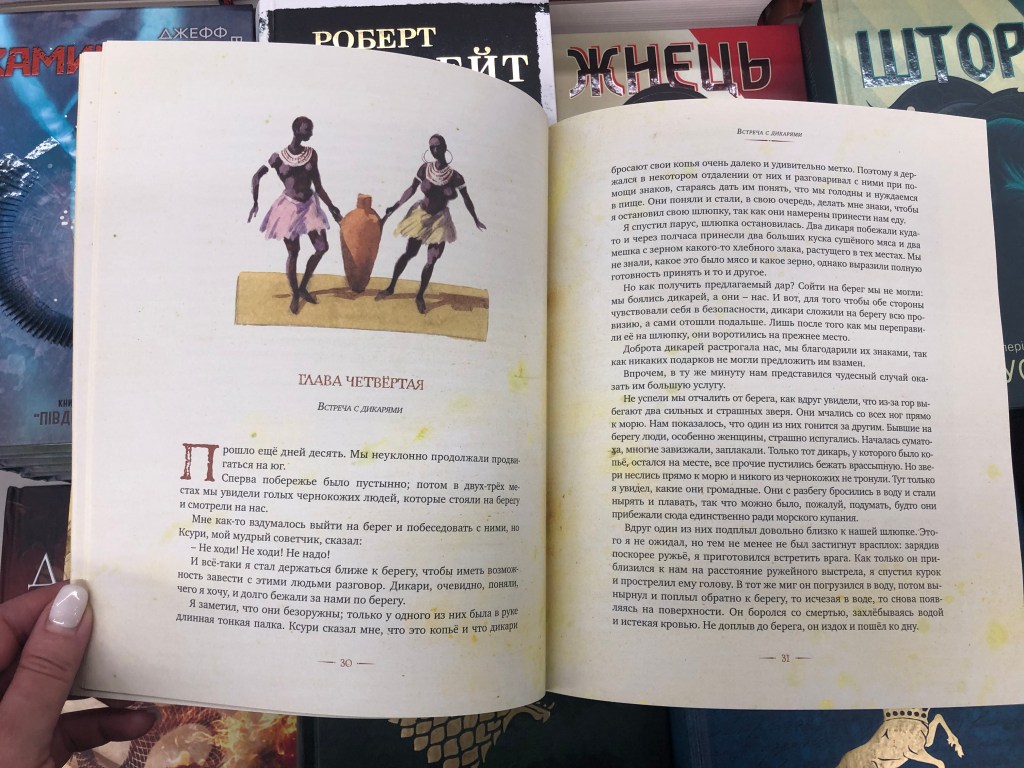
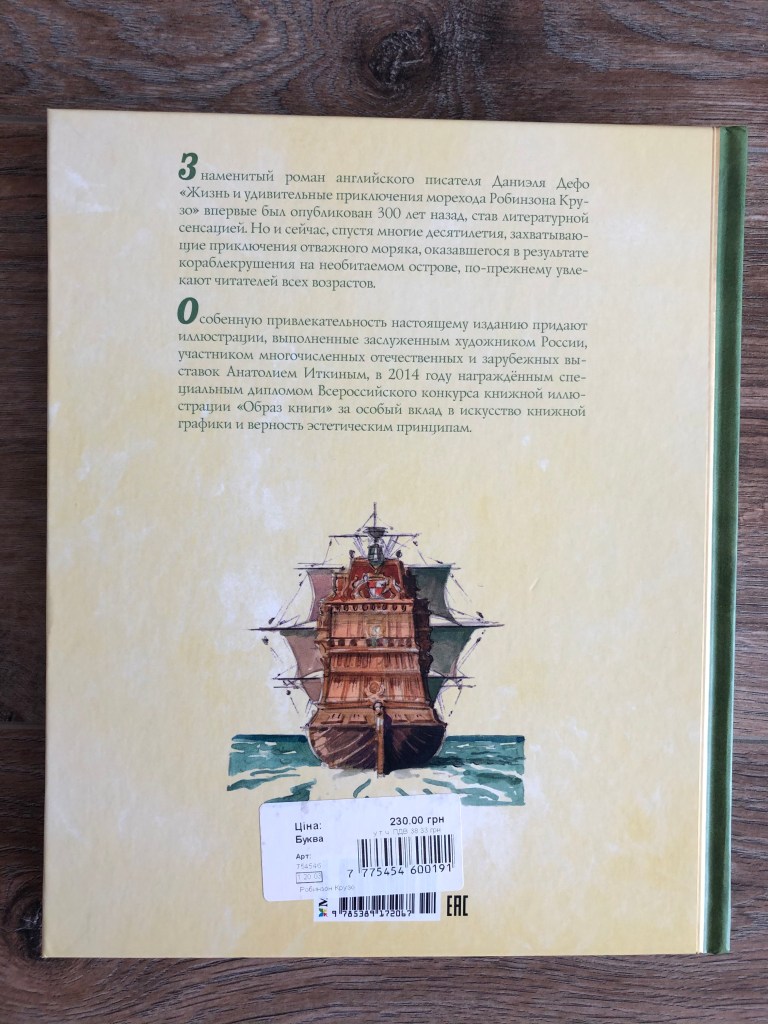

Here I found the inside world of the deluxe book design.
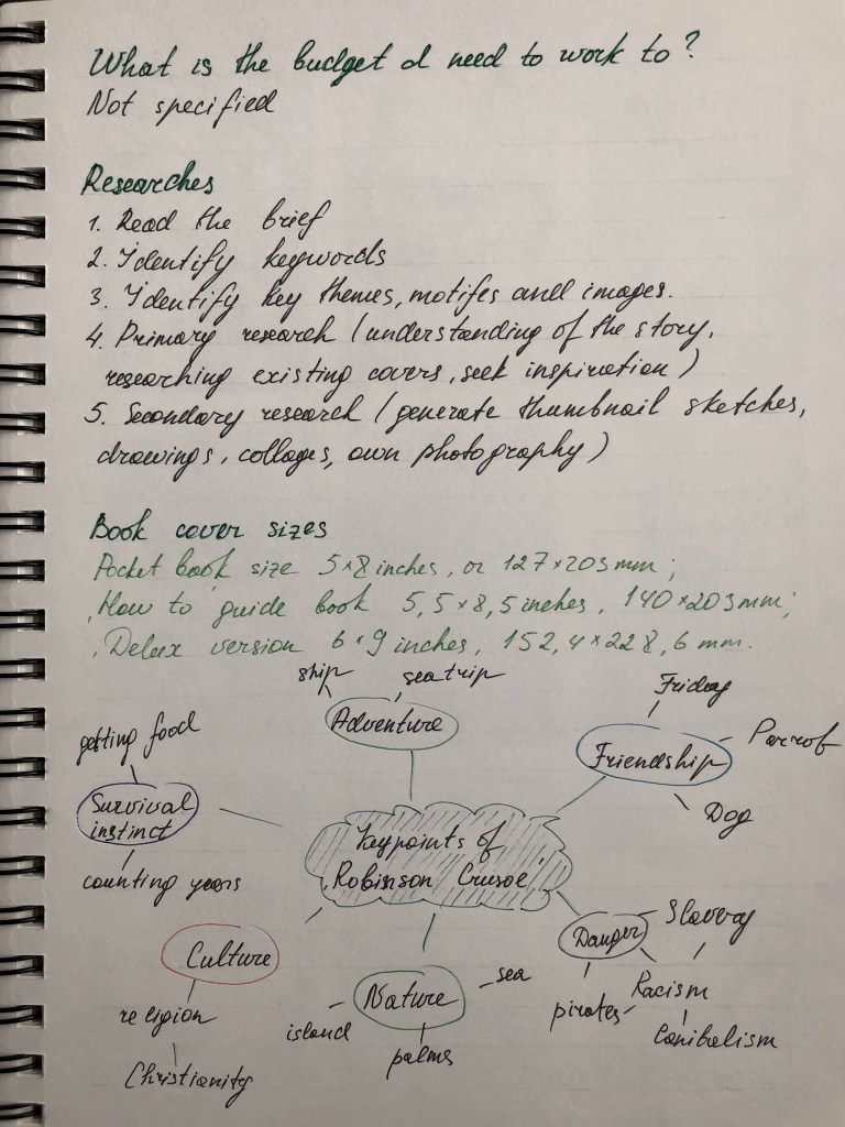
Mind Map
To organise the mind map I decided to go through the main points of the story again, trying to highlight the object that I could use in my book cover. I had the key points to work with, and they were: adventure, society, the look of the protagonist, nature as land and the sea, and borrowing some elements from the originals of the book in 1719.

Pinterest Mood Board
Some additional options for the book cover I selected in the Pinterest mood board. It helped me to visualise different compositions for my future book covers. Here I placed various genres of design, some colour combinations I could go for, the font selections, and a comparison of a modern approach to Robinson’s cover and classic ways of painting.
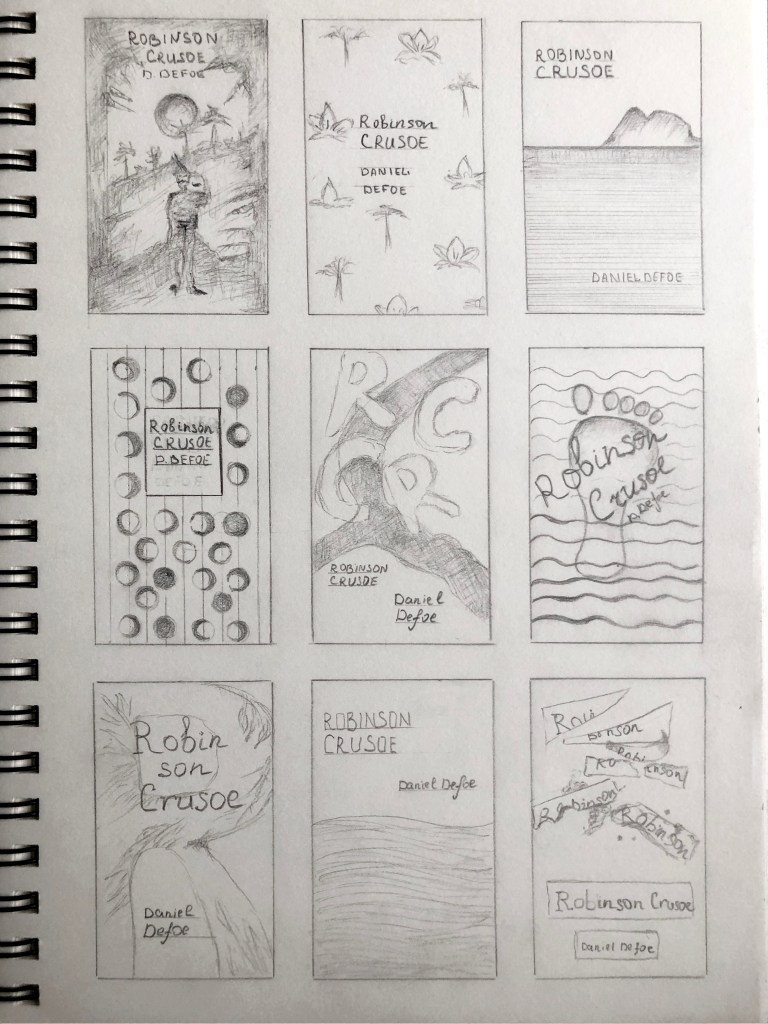
Sketches
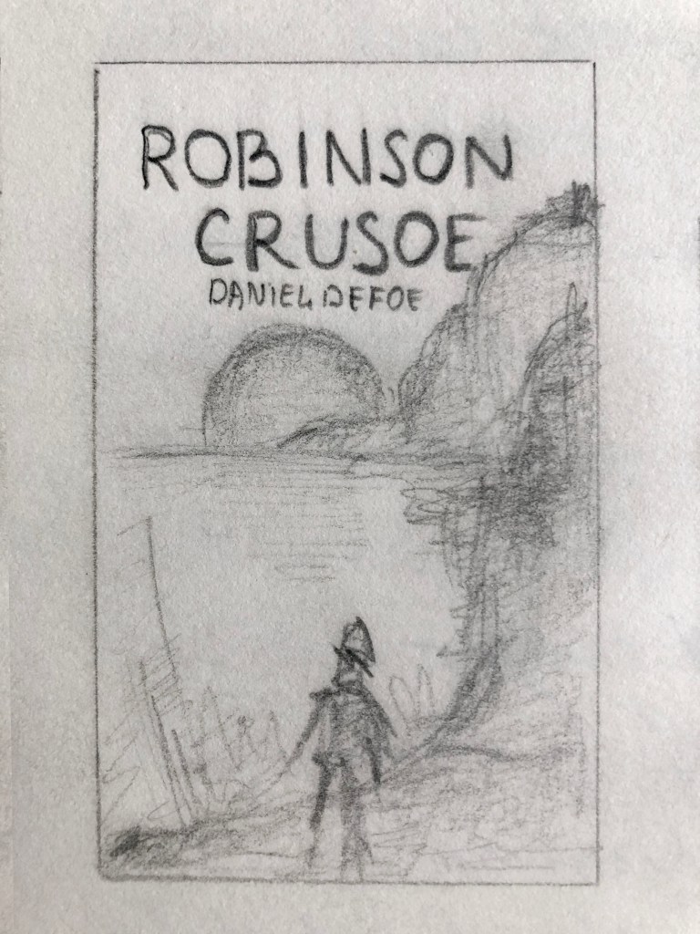
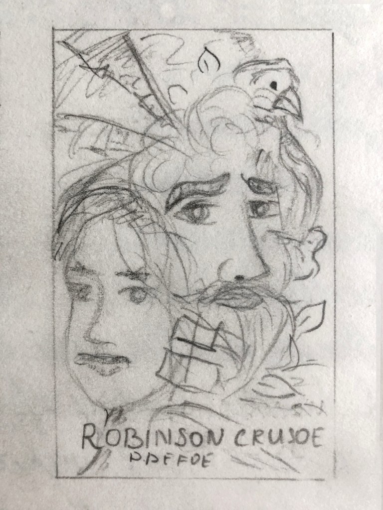
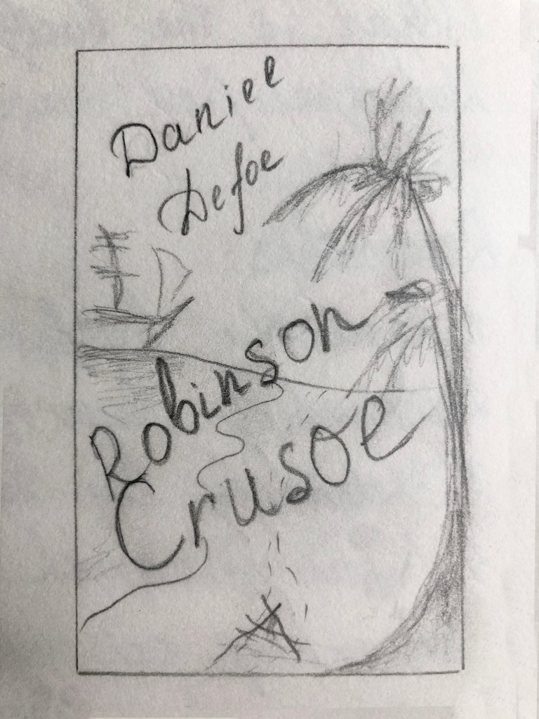
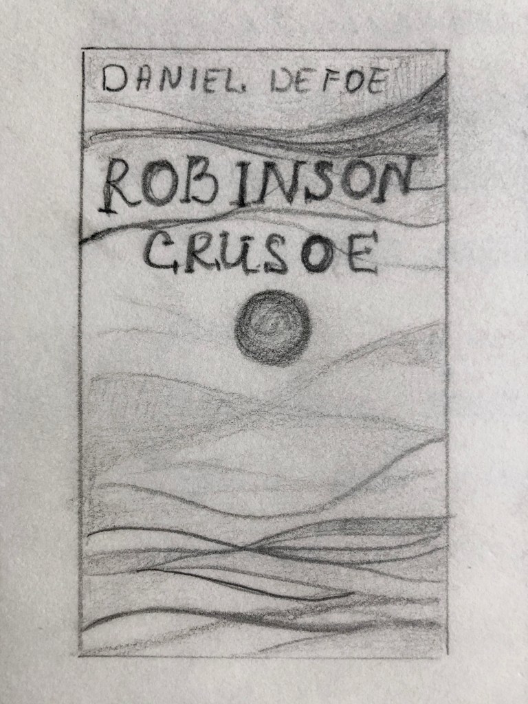
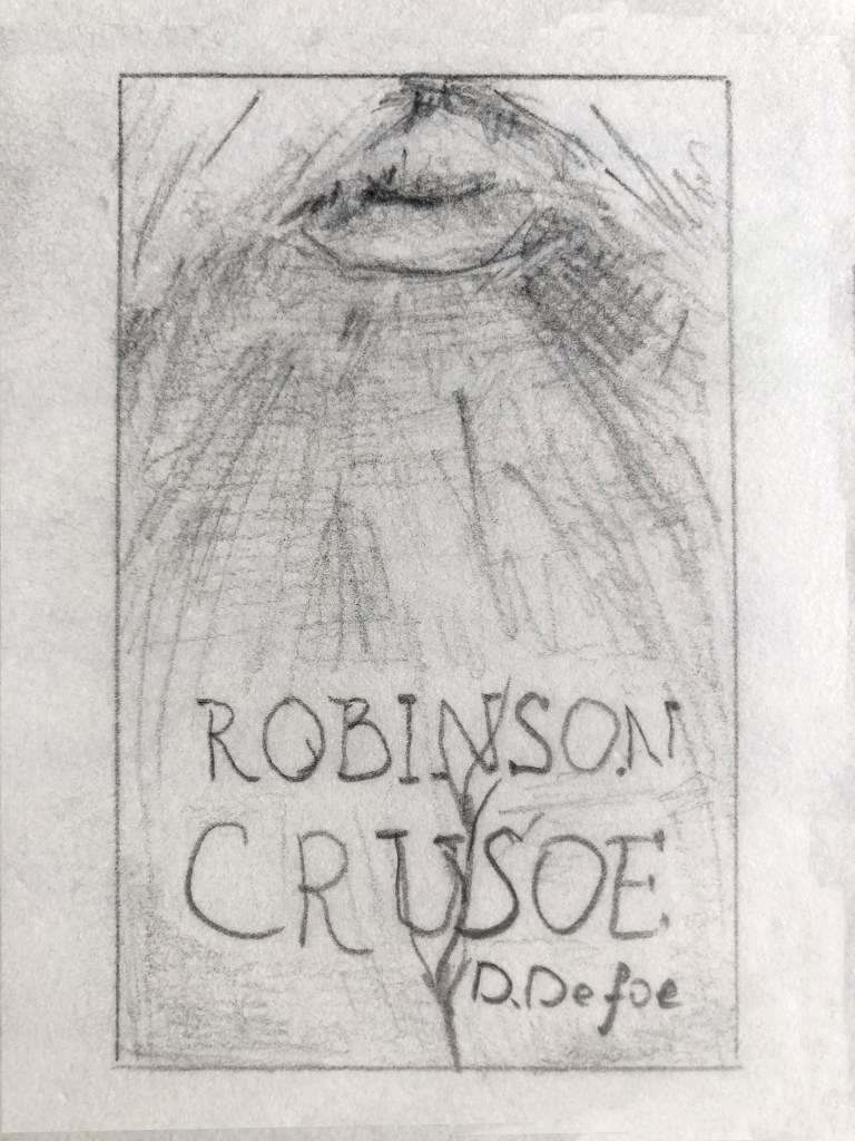
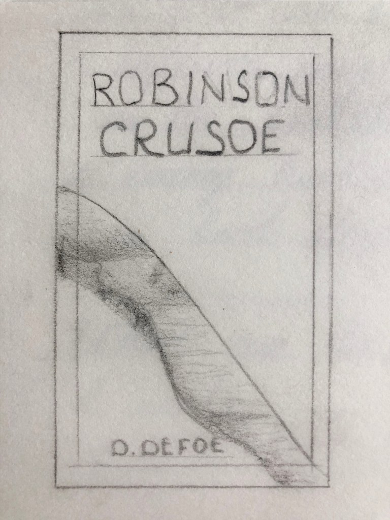
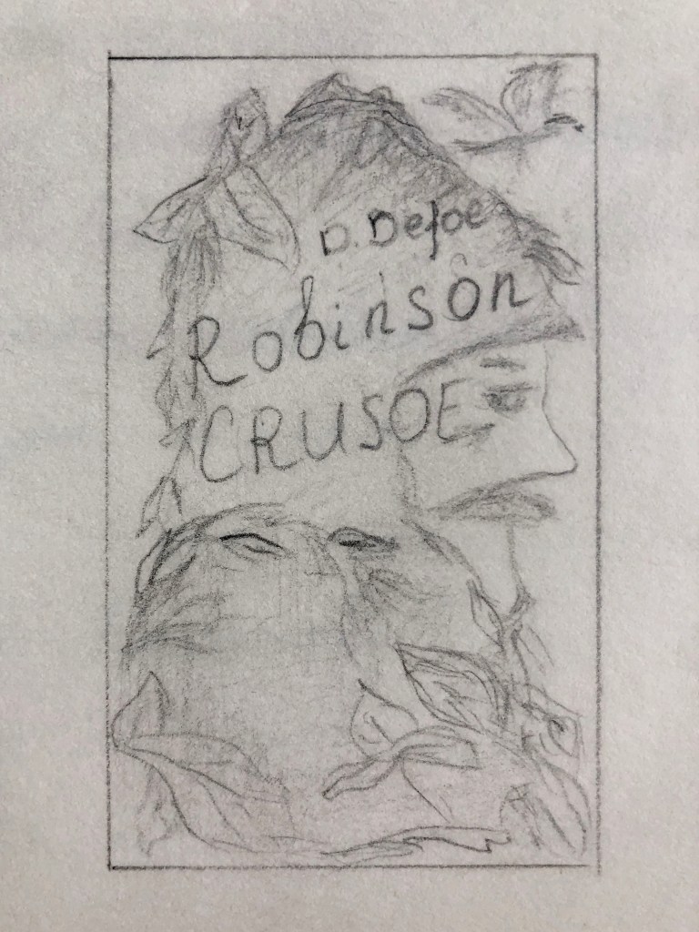
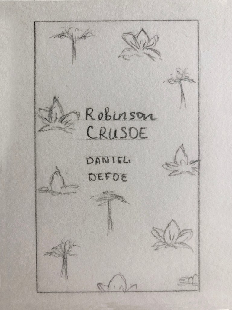
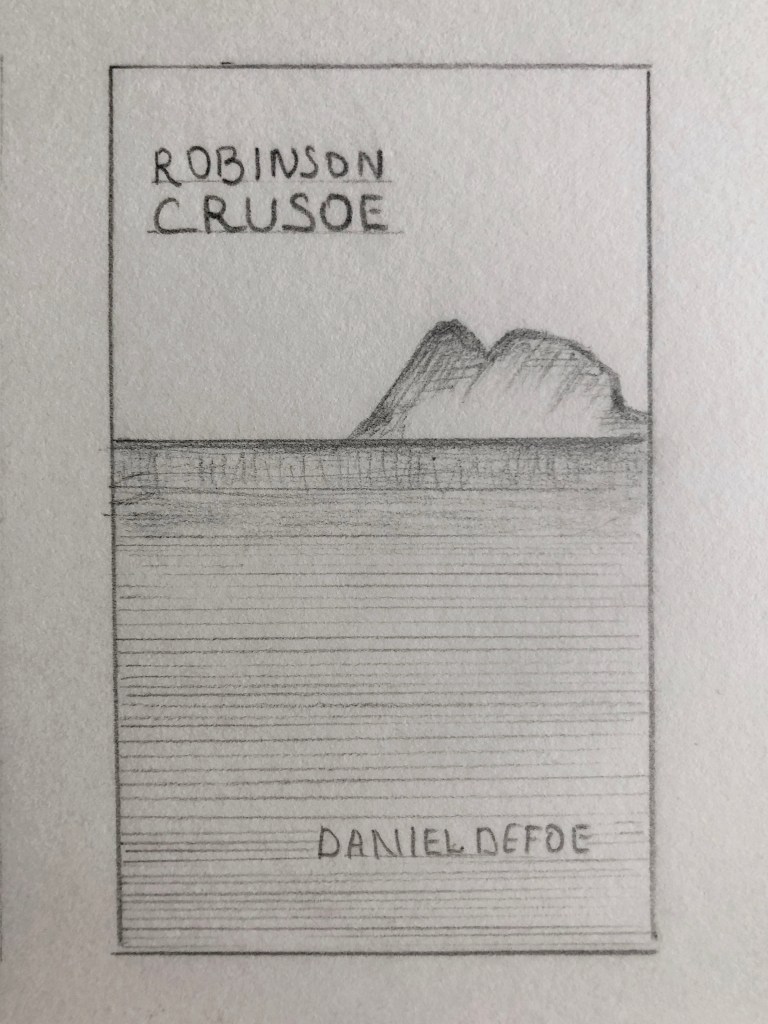
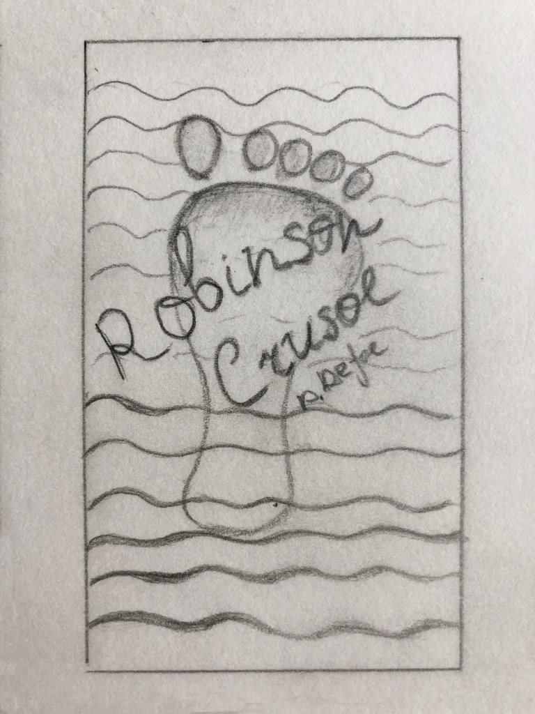
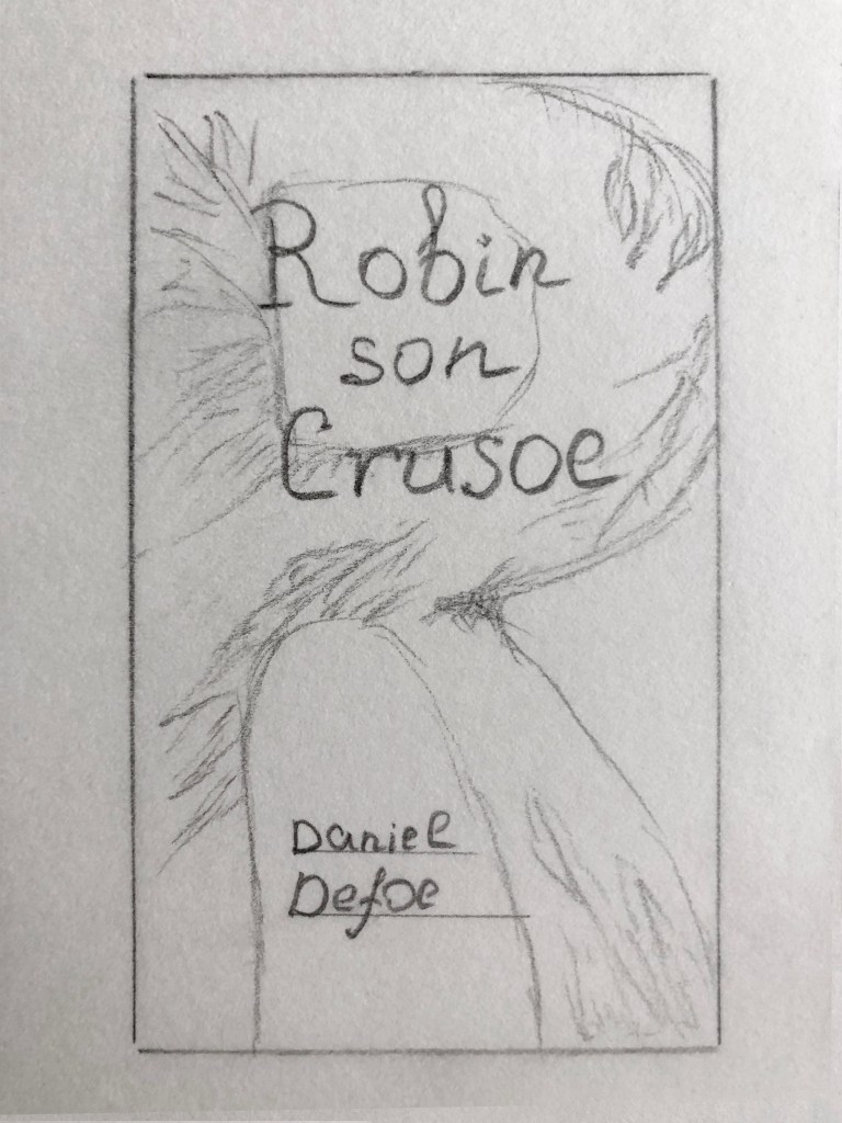
The next stage was to make some sketches, I identified visuals I could use in my designs, and tried to recreate them in these little drawings. I painted many possible objects for pocketbook covers, starting from the different positions of nature, I created different scale portraits and abstract images. They helped me to shape the book cover I was going to design. I was thinking about visualising a lonely man on the edge of the island or creating a close-up portrait of Robinson and his ‘team’. Some of the options had just abstract lines for it, to visualise some gradient to go from sand to the water and then into the sea, like three main parts of nature. Also, I was thinking to design just a simple leaf on the book cover, to visualise the jungle theme in it or just a few leaves on the side of the book. In addition, I had some ideas about abstract design, like using symbols of Robinson Crusoe’s name, and some jungle elements inside it. For some modern versions, I wanted to experiment with a grid, and place the order of some elements from the book, flowers, leaves, and palms, and create a pattern from it. Sketches helped to understand the direction of my future design.


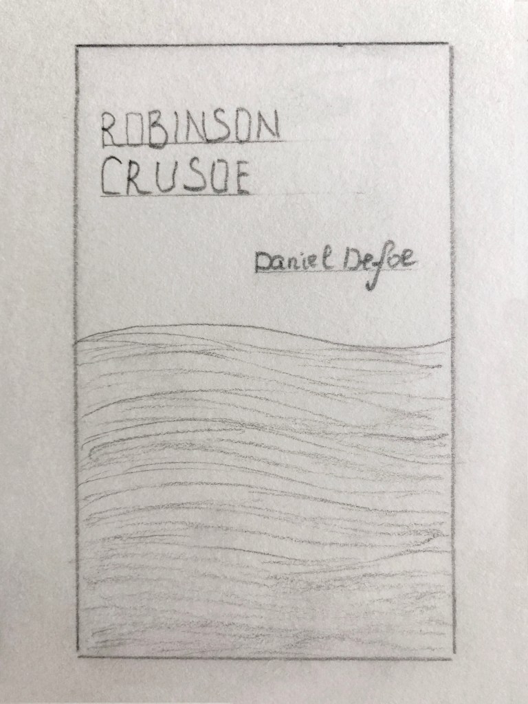
Book format
In this part I wanted to go through some book cover sizes, some points the designer should consider before designing a book, and what standard sizes for different types of books.
Standard book sizes can vary depending on the genre. If the publisher is planning to produce physical copies of the book, the size of the book is quite an important part. The choice of book size will not only affect how the designer typesetting the manuscript but the audience’s reading experience and potential profit margin.
The final size of the book calls the trim size, which relates to these dimensions, in Width x Height format. The importance of the trim size potentially can affect reading experience, marketability, and cost.
What are the industry’s terms for trim sizes?
Mass-market paperbacks: Compact and inexpensively produced, these books (also called pocketbooks) are around 4.25” x 6.87”. Can be found on the racks of grocery stores and supermarkets.
Trade paperbacks: Trade paperback sizes will range anywhere from 5.5” x 8.5” (a size that’s called digest) to 6” x 9” (also known as US trade). In today’s market, this is the go-to paperback size range for many novels, memoirs, and non-fiction books.
Hardcover: These are premium formats. Book sizes tend to range from 6” x 9” to 8.5” x 11”.

What are the standard book sizes in publishing?
- Fiction: 4.25 x 6.87, 5 x 8, 5.25 x 8, 5.5 x 8.5, 6 x 9
- Novella: 5 x 8
- Children’s: 7.5 x 7.5, 7 x 10, 10 x 8
- Textbooks: 6 x 9, 7 x 10, 8.5 x 11
- Non-fiction: 5.5 x 8.5, 6 x 9, 7 x 10″
- Memoir: 5.25 x 8, 5.5 x 8.5
- Photography: Whatever you see fit!
Finally, I could identify book cover sizes for my designs.
- Pocket book size 5 x 8 inches size, which is equivalent to 127 x 203 mm;
- ‘How to’ guide book 5.5 x 8.5 inches, 140 x 203 mm;
- Deluxe version 6 x 9 inches, 152.4 x 228.6 mm.
Book cover design
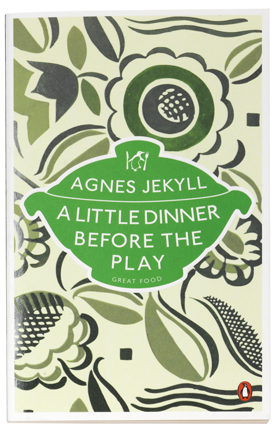
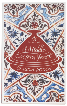
In this section, I would like to go through some inspirations for my book cover design. I think I can identify my design style close to the doodling, or sketching. I like how painted covers look from the visual point of view, and experiment with them myself. Here for the inspiration, I went to look for Suzanne Dean’s book covers. I love all the details she is using for the covers, how she keeps the minimal colour pallet, and the contrast lines dominating the black colour. That gave me an idea of what I can develop for my book cover.


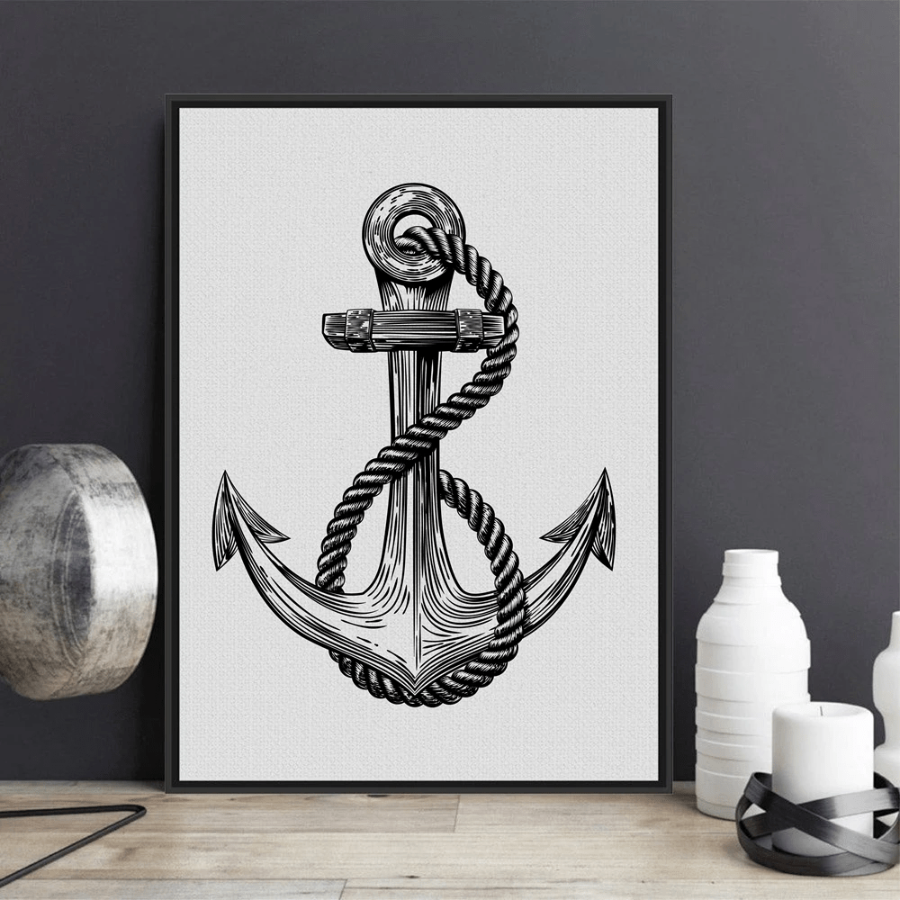
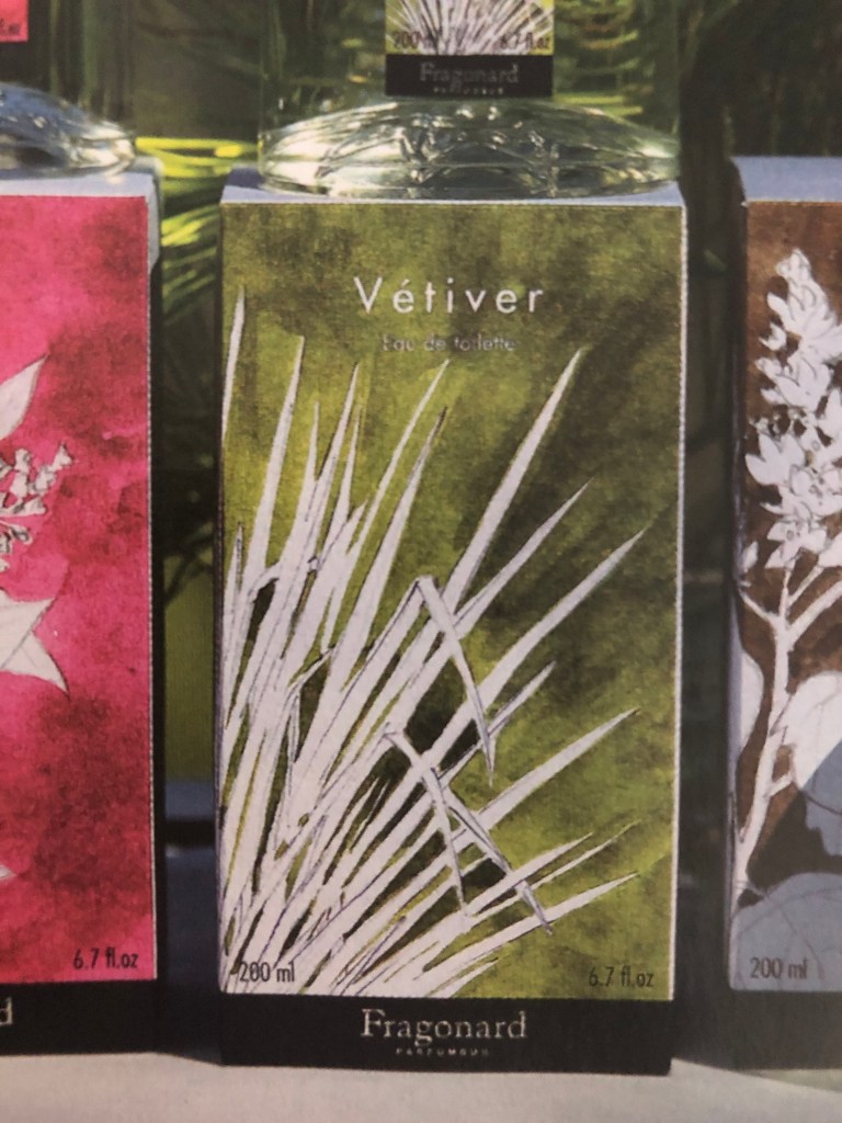
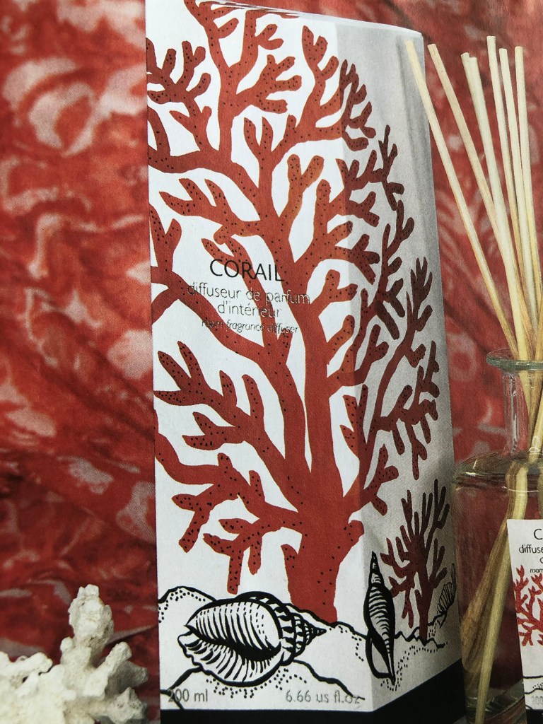
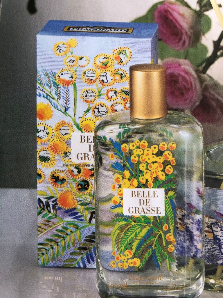
Also, I got inspiration from Fragonard brand perfumes, I loved how they are combining white objects with black outlines on the colourful background. I had an idea of using flat background colour, then on the top to go some patterns in white colour and black outline, and then on the top colourful object, like Robinson’s portrait. Similar to the design birds were used like three layers for design. In addition in my mood board, I attached water-coloured background with just white plants, or, usage of white background and some doodles on the top. For painted elements, I wanted to use nautical style, like the anchor design, with confident sketched lines.


In addition, I explored designs inspired by Coralie Bickford-Smith. She used the central part of the cover to place the name of the book, and around she filled it with different patterns, flowers, and ornaments, to bring the cultural feel of the book.

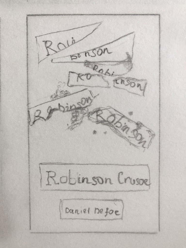
Sketches
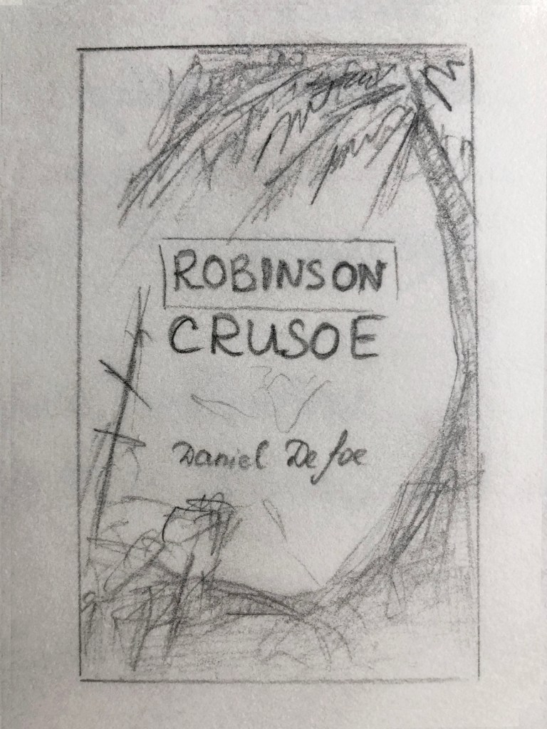
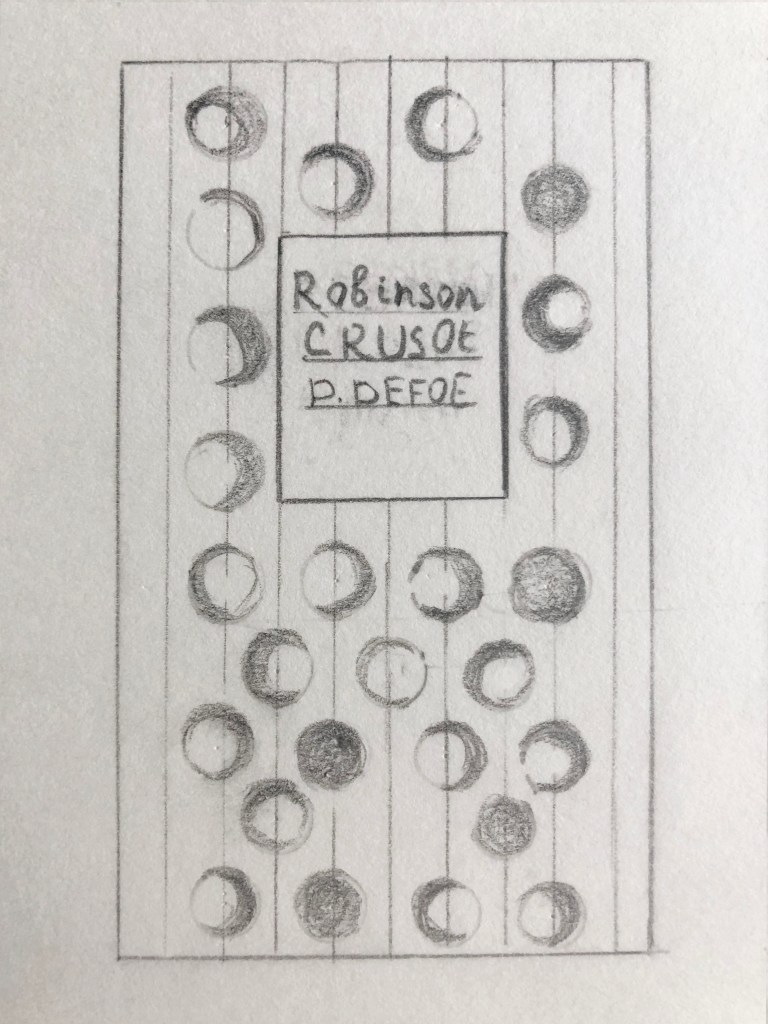
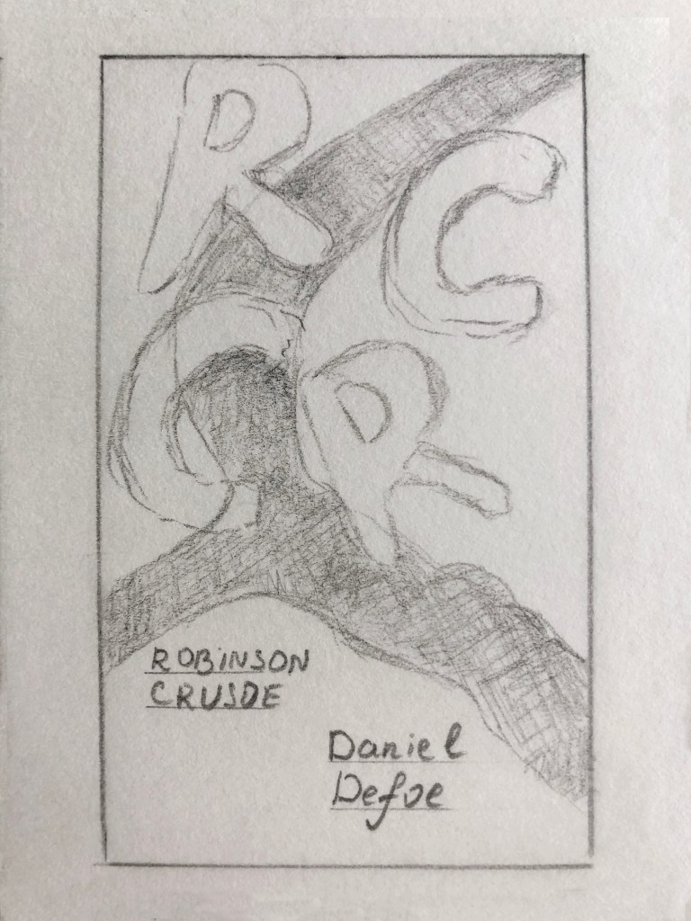
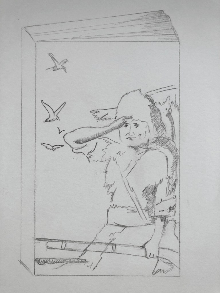
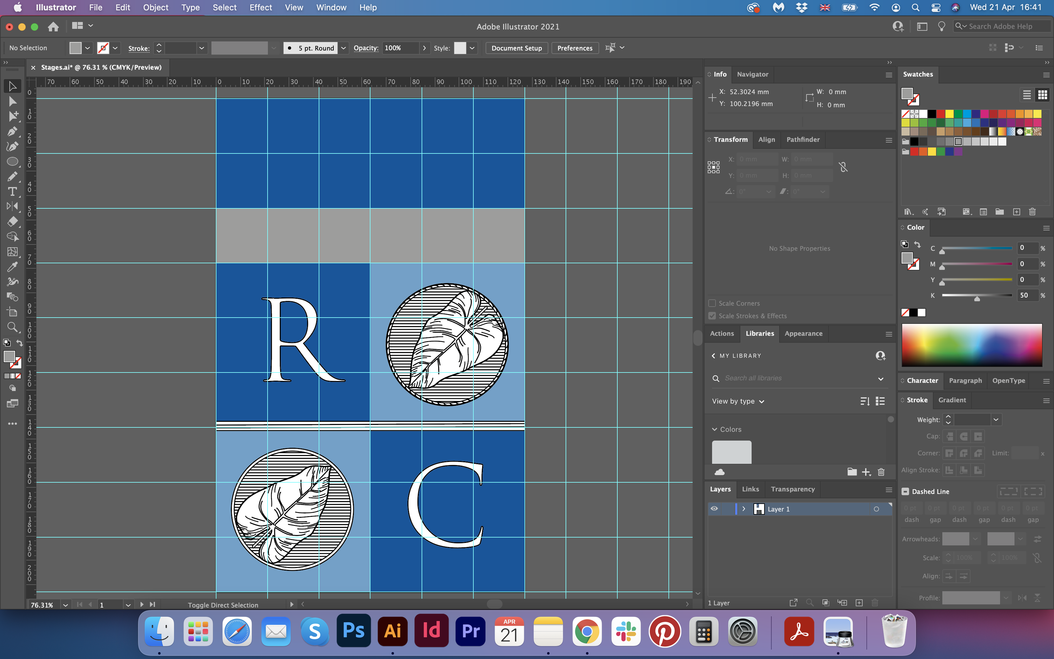
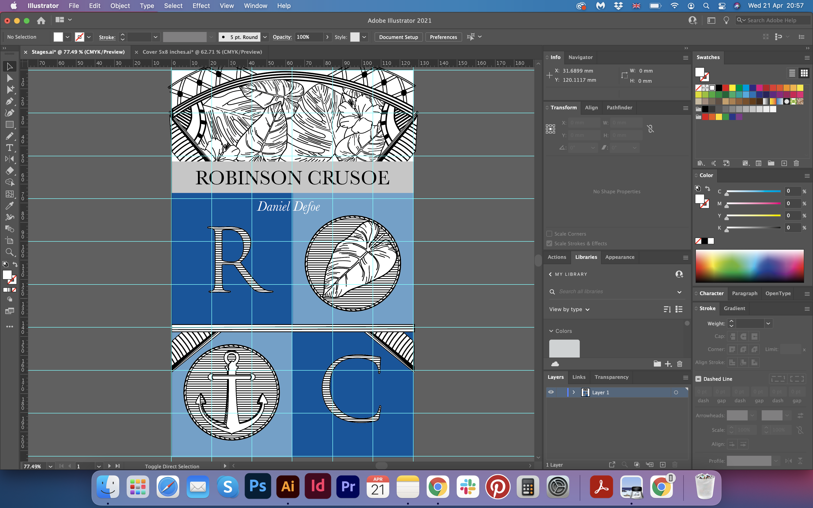
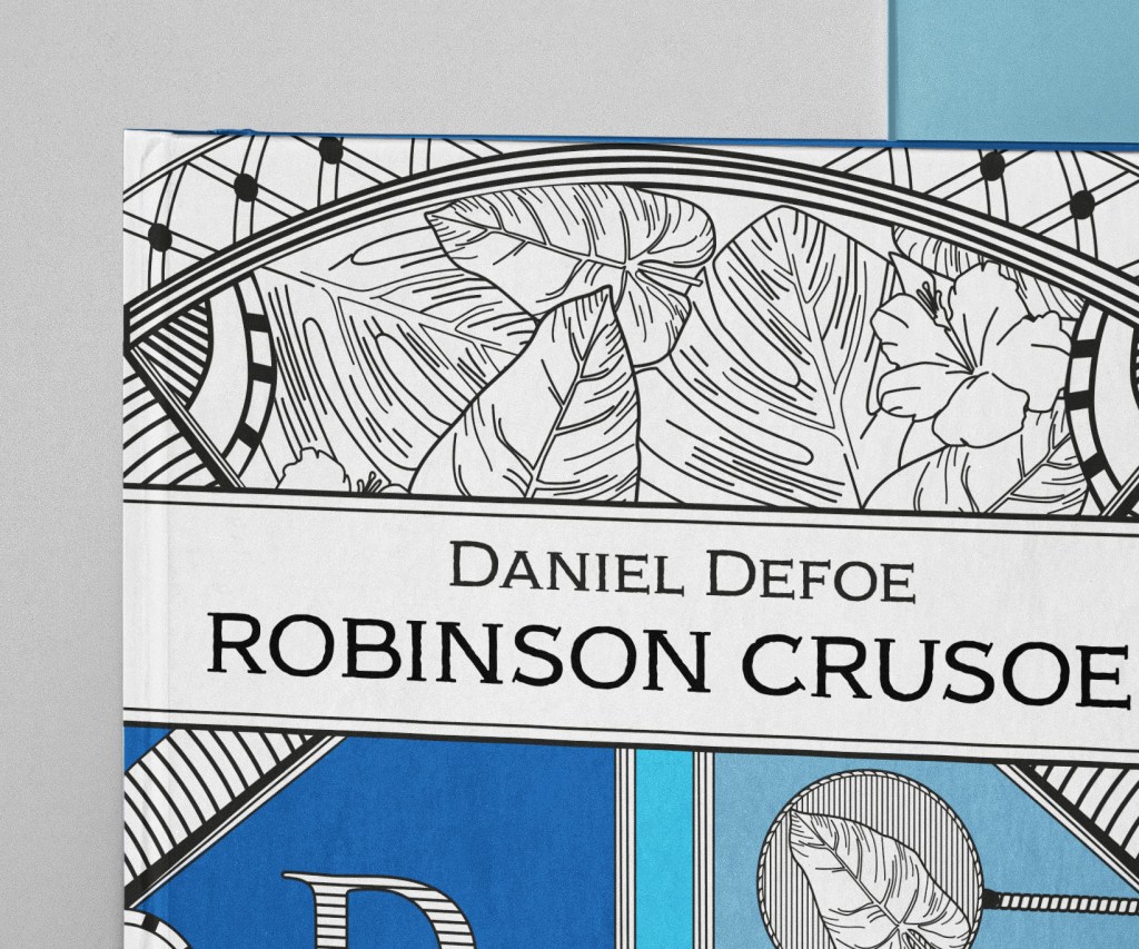
Before the actual design, I decided to make the final sketch for my book cover. The idea was to divide the space into a grid and use each segment for the purpose. The top part I wanted to use for the floral, jungle elements, like palm leaves, hibiscus flowers and some pattern outlines. Below I wanted to place the name of the book and the author’s name, and 3/4 of the book to use for the initials of Robinson Crusoe with letters “RC”, placed in the big squares, and fill the space with geometric lines, anchors and palm leaves. I sketched some main elements I was going to use for the design, that I could trace in Adobe Illustrator.
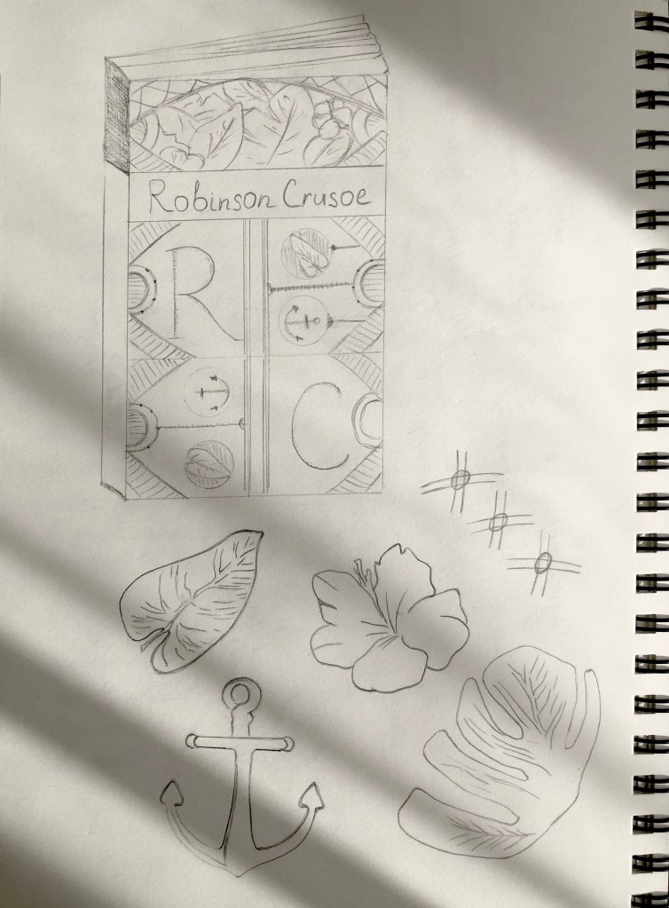
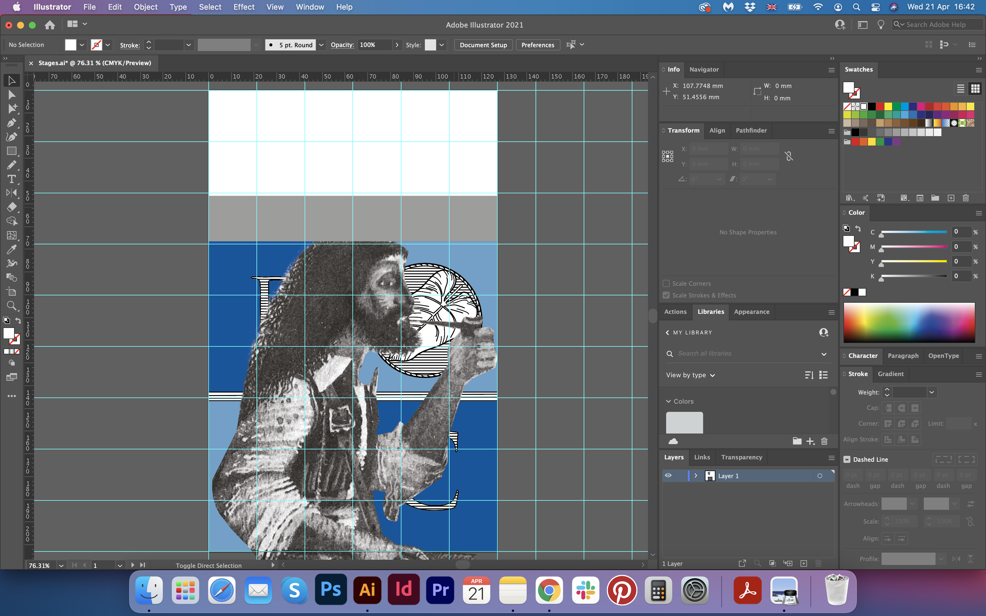
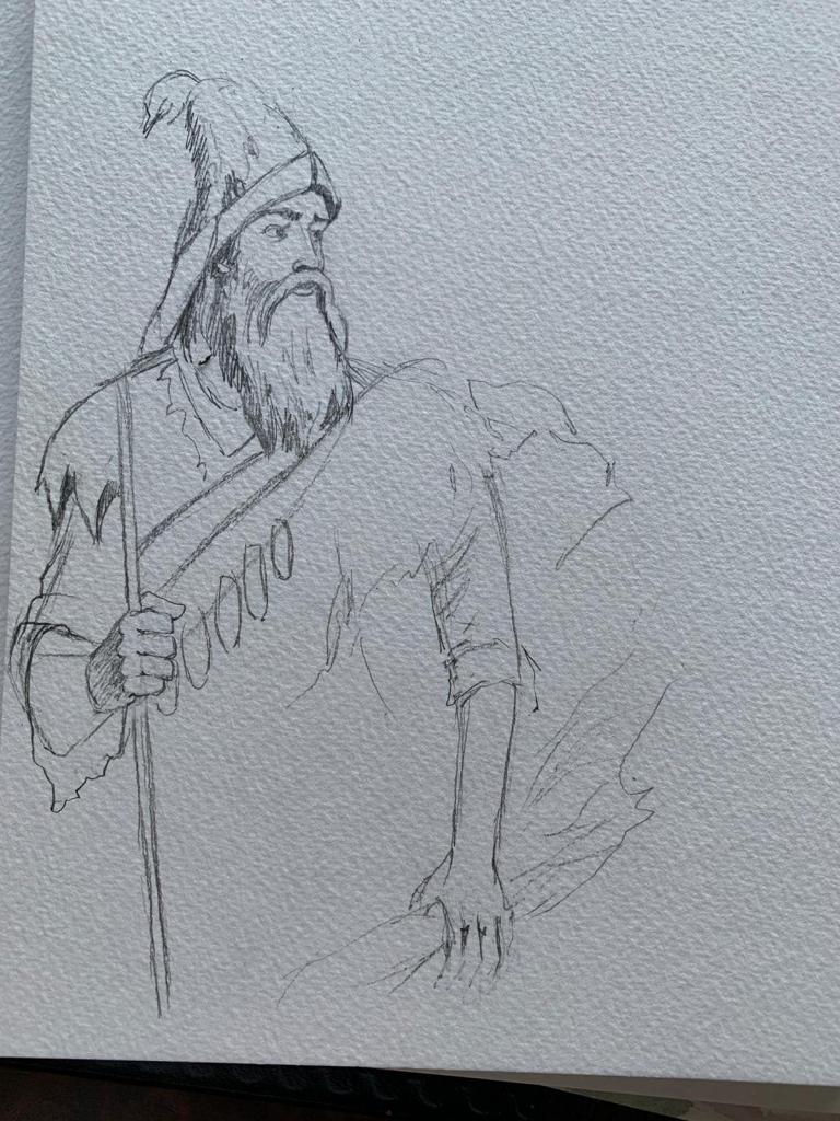
Also, I sketched Robinson Crusoe’s portrait in his traditional clothes, his hunting tools and some birds around. That design I was planning to use for the modernise book cover, with some very bright and contrast colours. The round shape frame I was going to use for the deluxe edition. I was thinking to design it in just simple black colour on the colourful background or apply like a foil effect on it. In the middle of that shape I was going to place the portrait of Robinson, but that part I’m going to explain later.
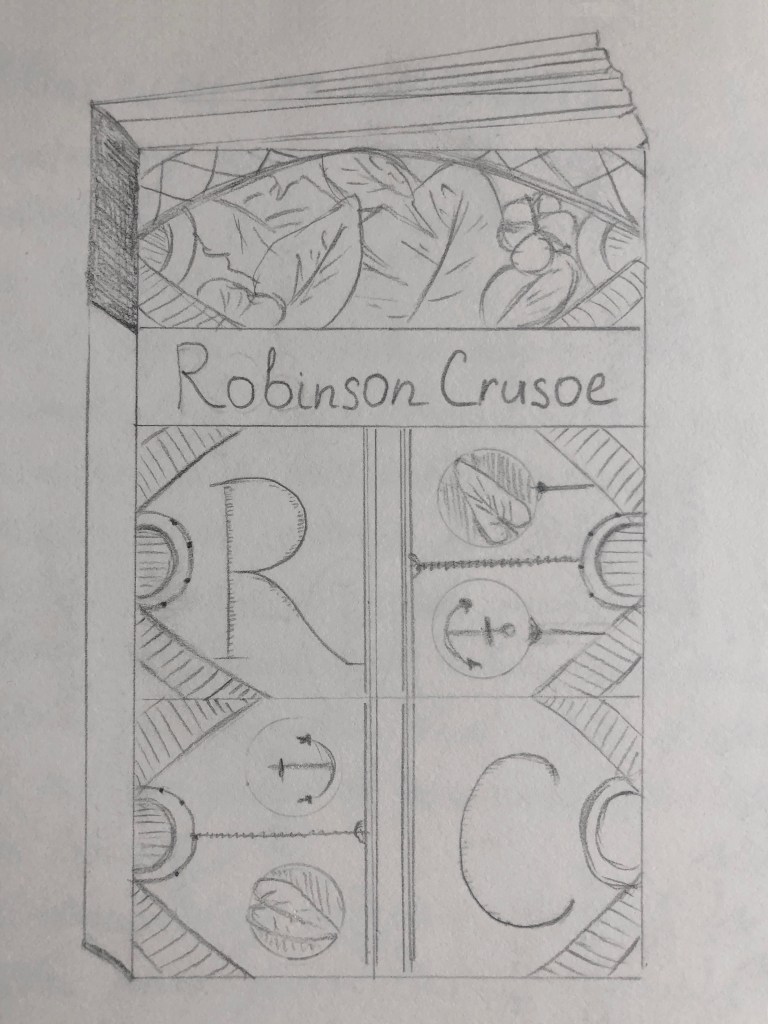
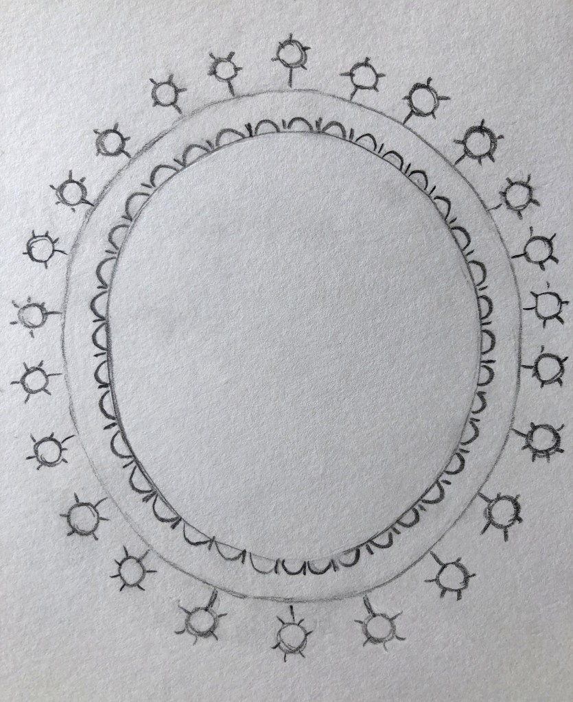
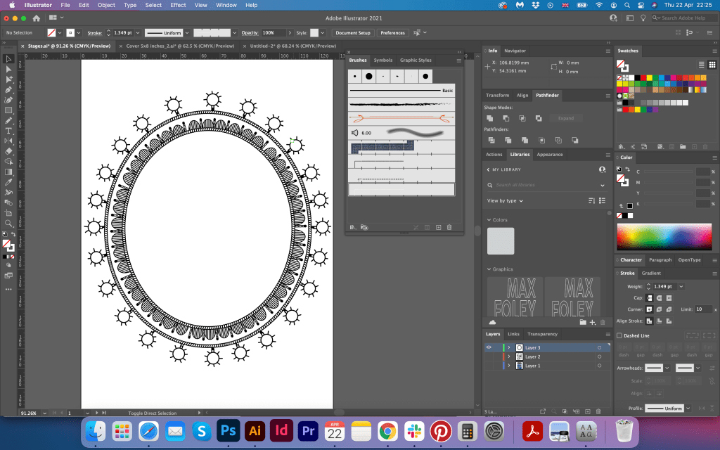
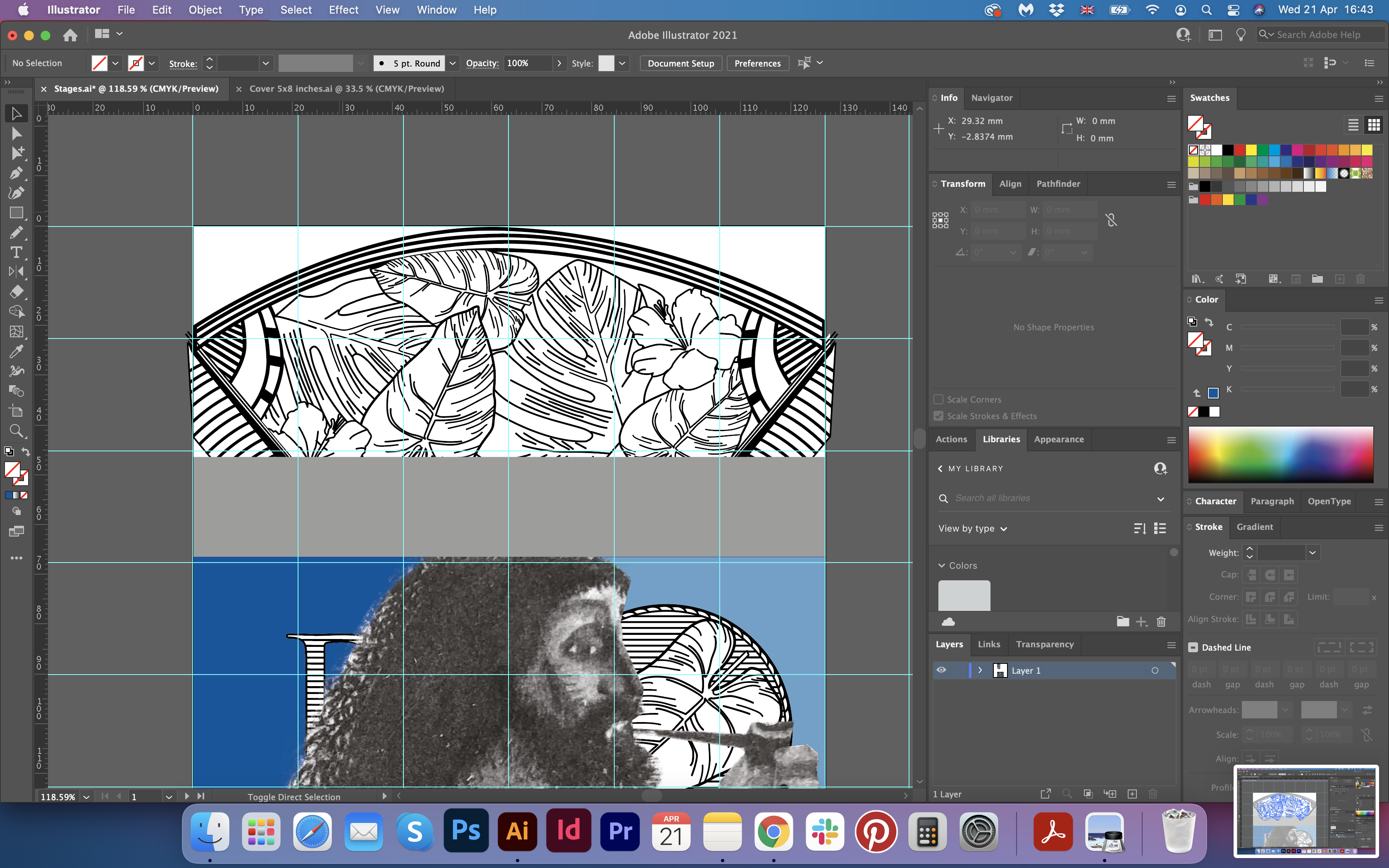
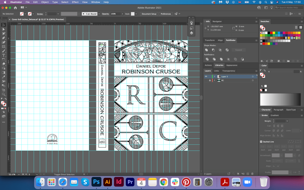
Some objects I traced in Adobe Illustrator are presented below. They all were designed with simple Pen Tool, and Arrows to navigate them. The round frame was a bit tricky, and I had to watch a quick tutorial, that to remind myself how to make a pattern out of the outline, that to organise them into the round shape.
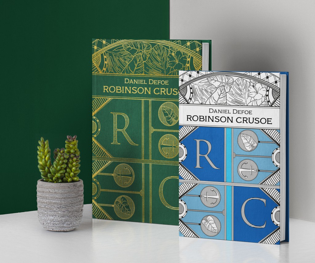
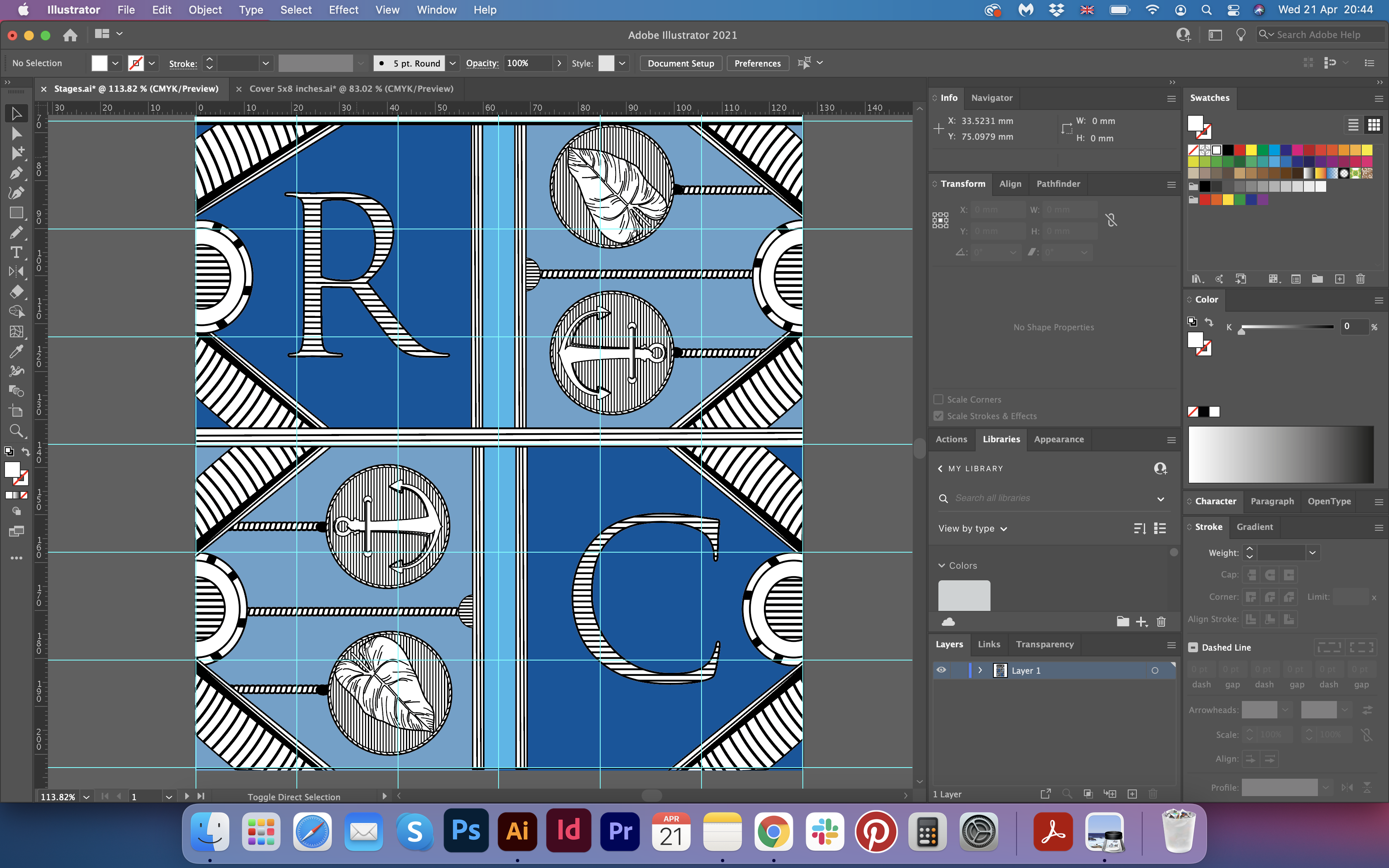
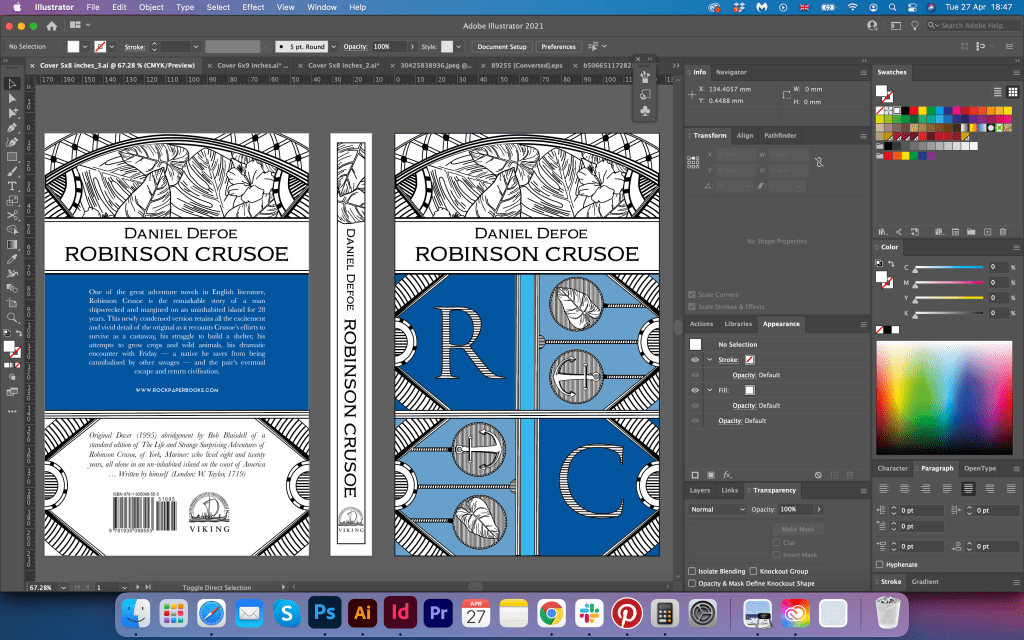
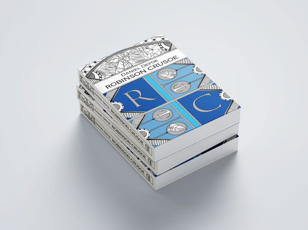
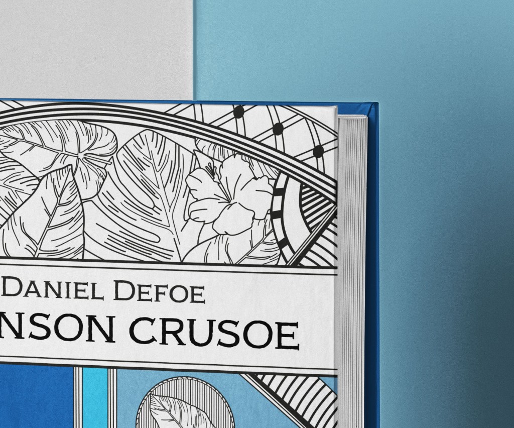
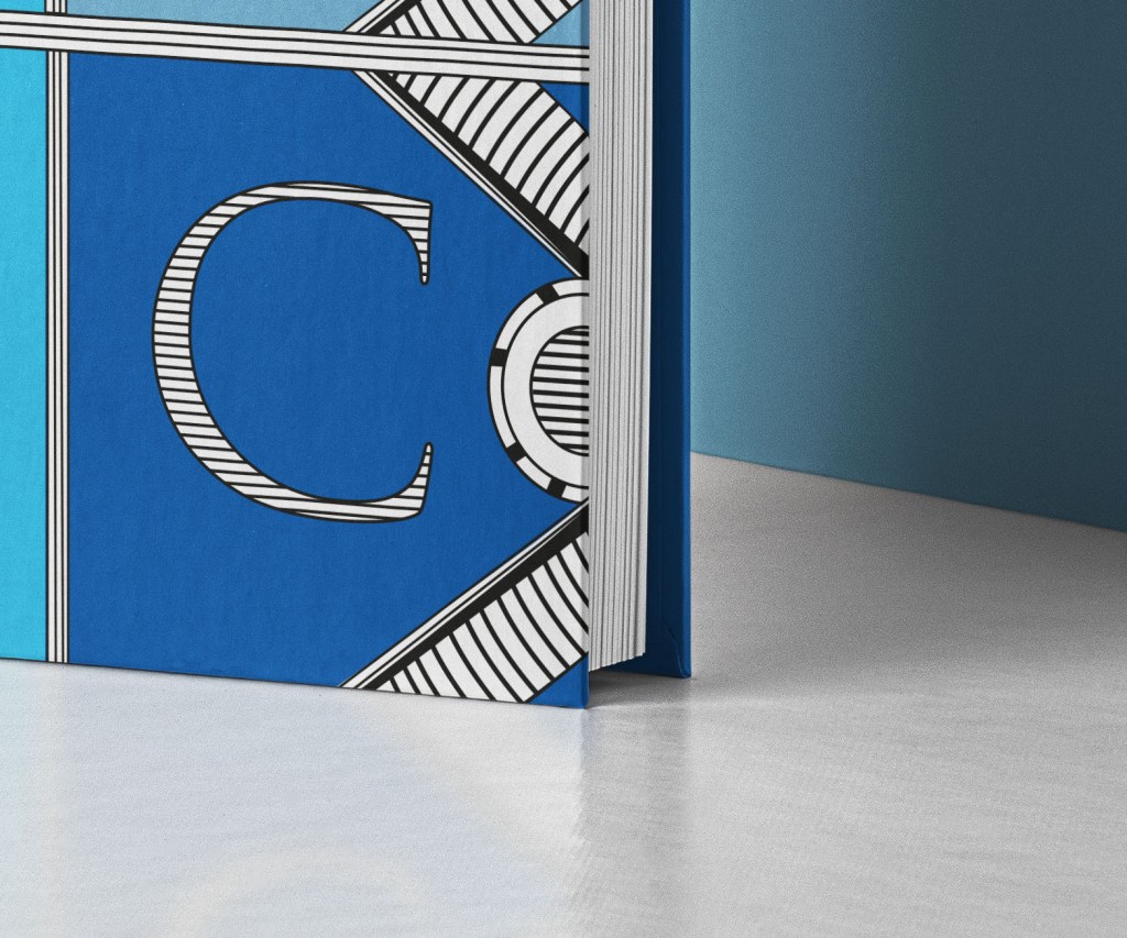
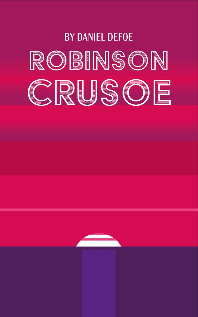
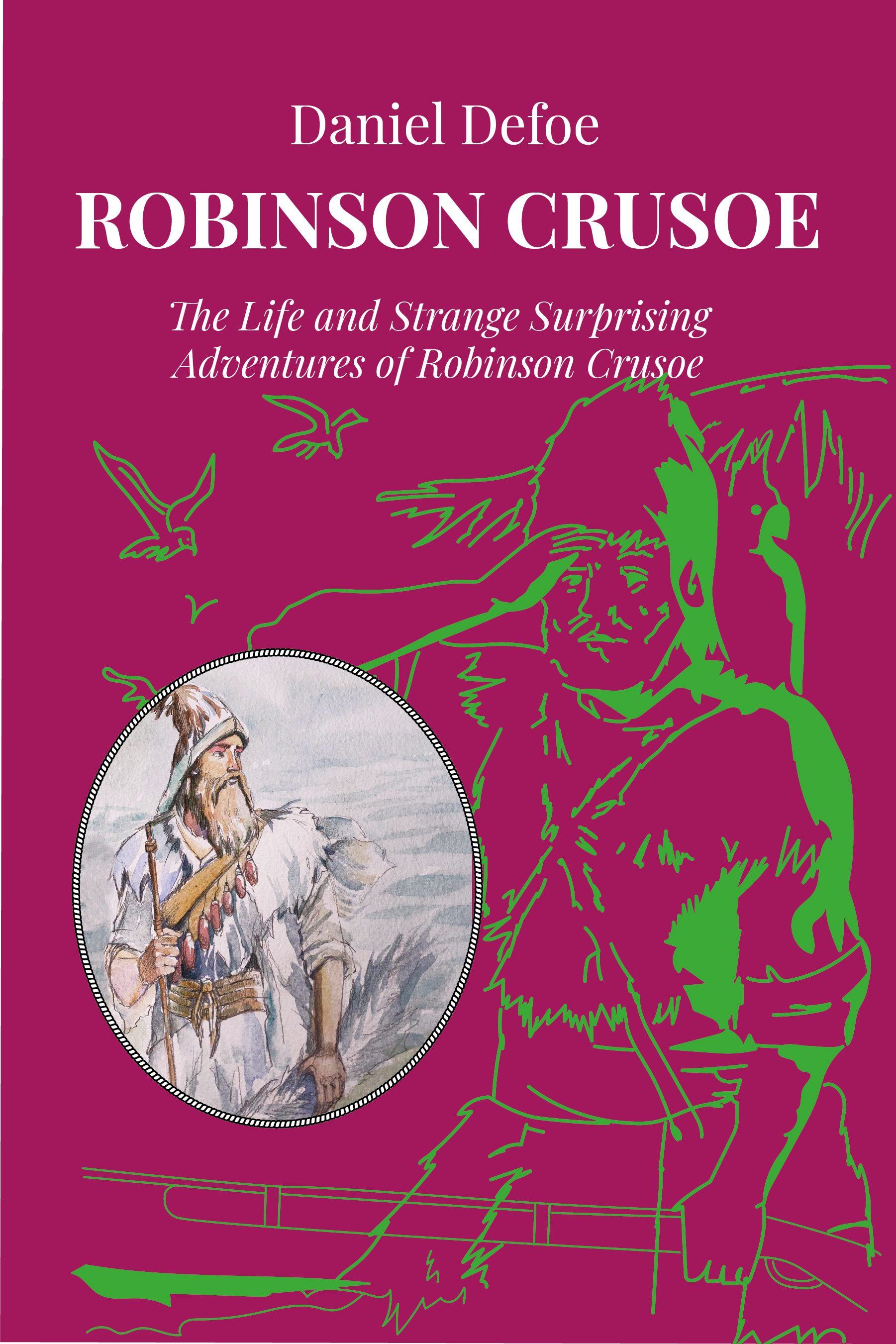
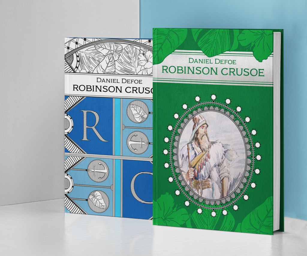
Here can be seen the process of designing the first book cover. The original size of the pocketbook cover was 127×203 mm. I divided the space into equal squares for the grid, 6×9 pieces, but later I made twice more, 12×18, so I could have a more precise grid inside the cover. The colour pallet was natural blue, as a symbol of the water and sky, also I was thinking of a green book cover, but I thought I might keep it for the Deluxe version. As a result, I had three shades of blue, white and black colour within the design.
I was thinking of placing the portrait of Robinson in the middle, that to create a third layer on the top, but then I thought that the design could be too busy and loaded with staff. So in the result, I had only two layers, the background of flat colour and doodled elements on the top. For the initials “RC” I used serif font, Trajan Pro 3, with some black and white stripes on the top of it. Elemnts like leaves, flowers, anchore I doodled in Adobe Illustrator, apart from the rope, that I had to take from the Freepik vector elements. (Source: https://www.freepik.com/free-vector/vintage-sailor-naval-set_9586144.htm#page=1&query=vintage-sailor-naval-set&position=0)
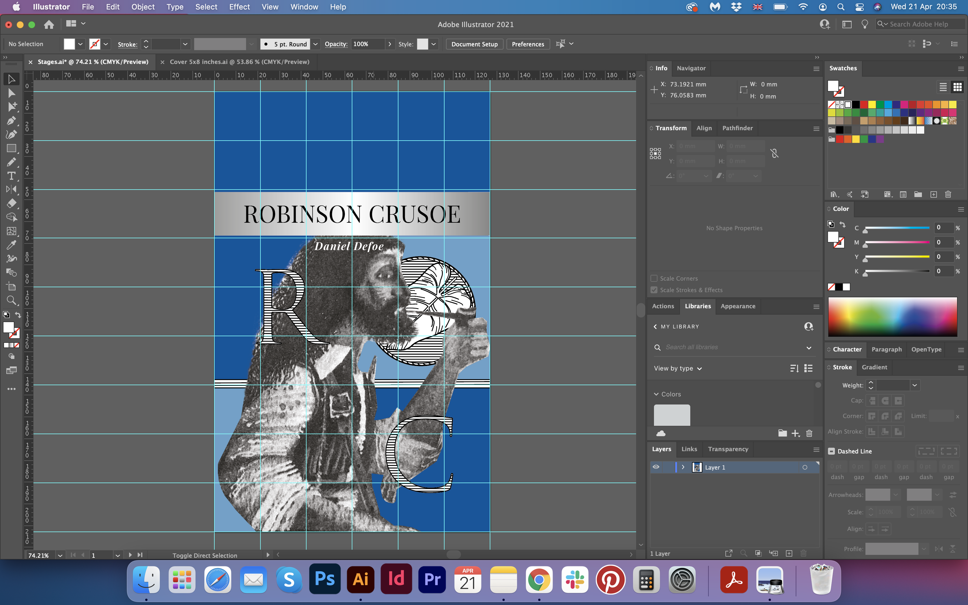


After some experiments, this is the book cover I came across. I used classic Playfair Display font for the name but was not quite sure about the placement of the author’s name, I thought it completely disappeared in that little corner. Also, I had some doubts about the back and the spine, looked like it needed some work, and some final touches to see the completed book cover design version.
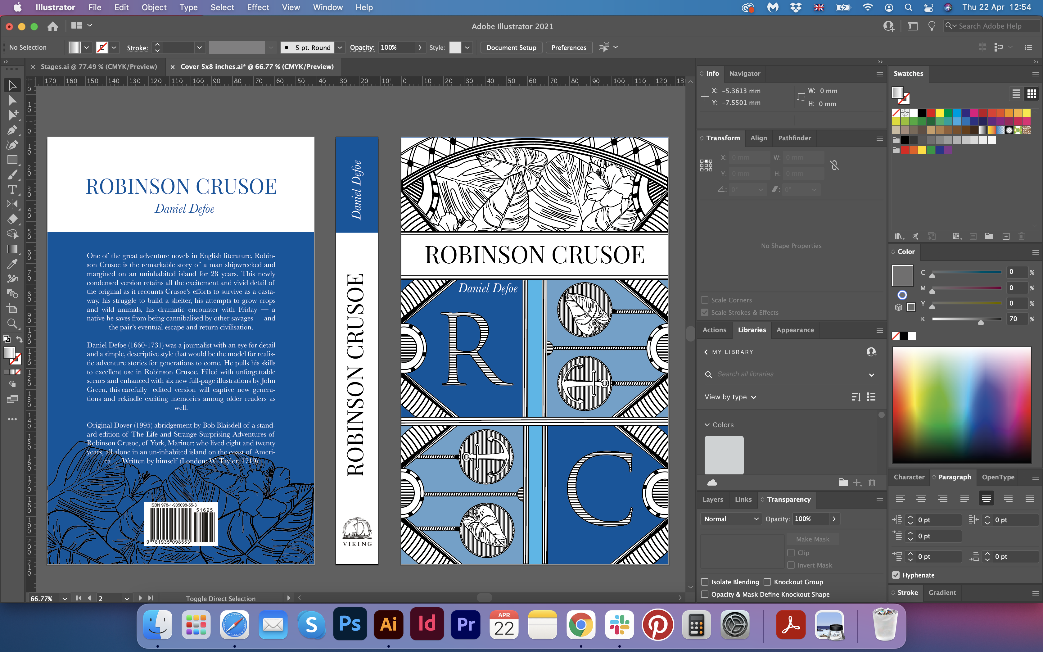
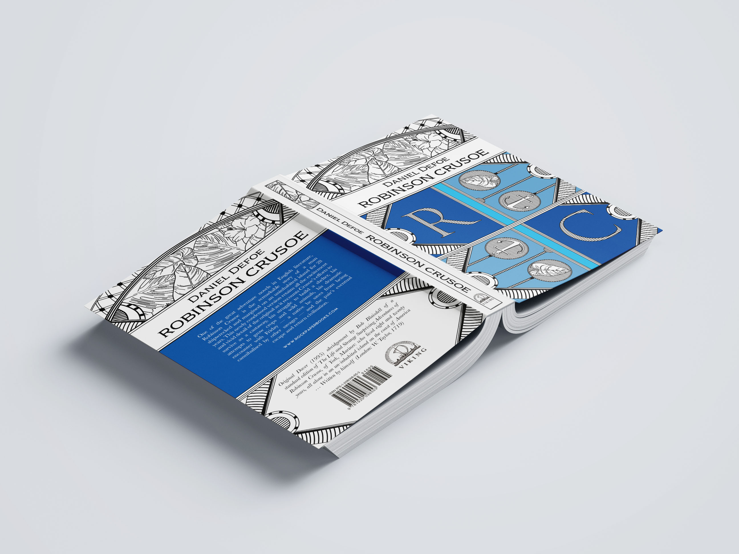
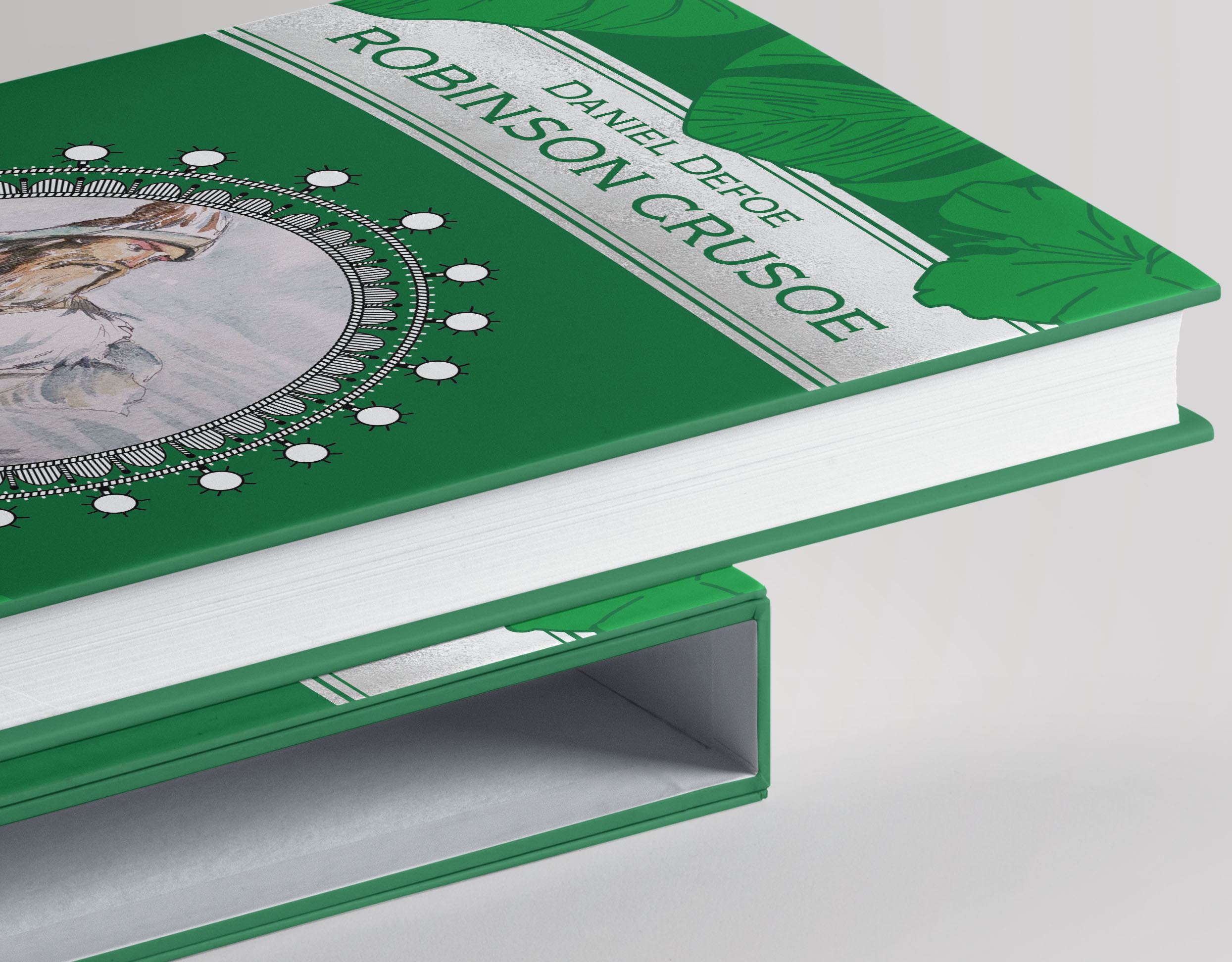
As some work needed to be done with the font, and Daniel Defoe‘s name placement, I found good solutions. I have to admit, it didn’t come up to me straight away, to be fair, I noticed that the back of the book cover and the font on the front cover isn’t exciting at all only after designing the deluxe cover. However, the improved version I was going to keep as it is. I made the stripe for the name higher, and it gave me enough space for the two lines and arrange the composition in a more balanced way. Also, I found this nice decorative font Adorn Copperplate, which created a nice tandem with the general feel of the book cover design. In addition, I changed the back of the book cover. I thought that would be great if the open book would create a mirrored design, and each side would go smoothly from one like to another. I created a grid on the back of the book as well and placed objects in a similar way as in the front, and I thought that finally, I could see some Feng Shui in this design. The spine of the book had some changes as well. I outlined it, and I duplicated floral elements in it as well.
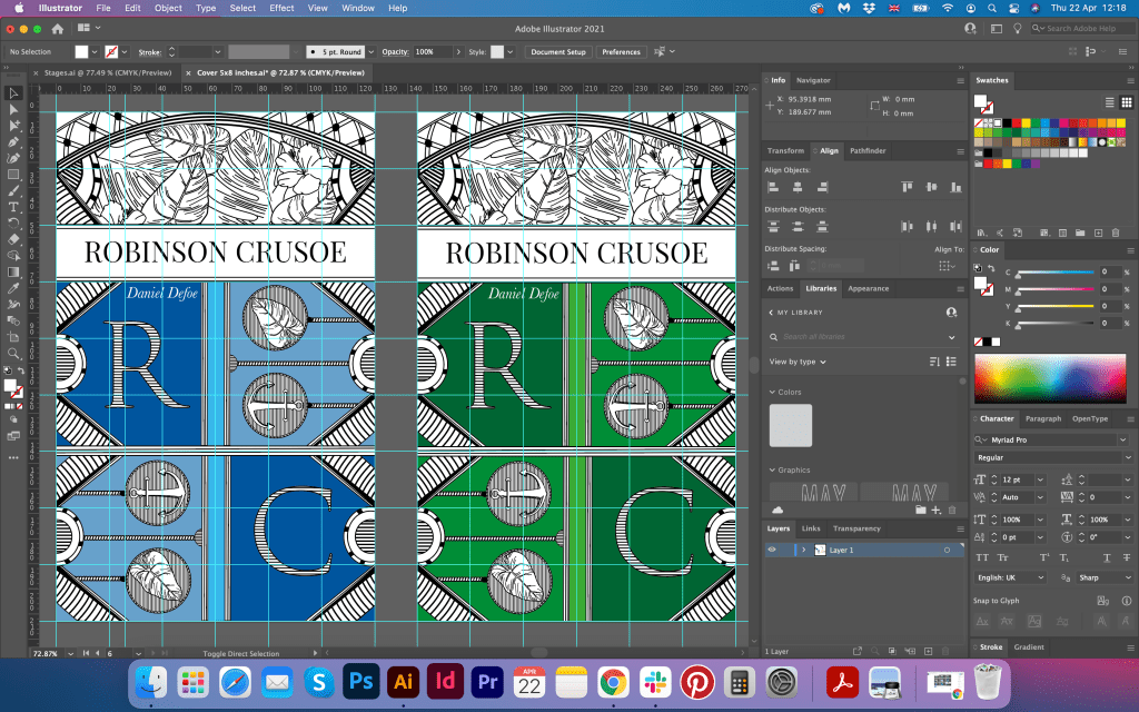
The design fits well for a paperback book. It creates the impression of a modern and elegant design. Mockups for the paperback book cover are presented below.

Option 2
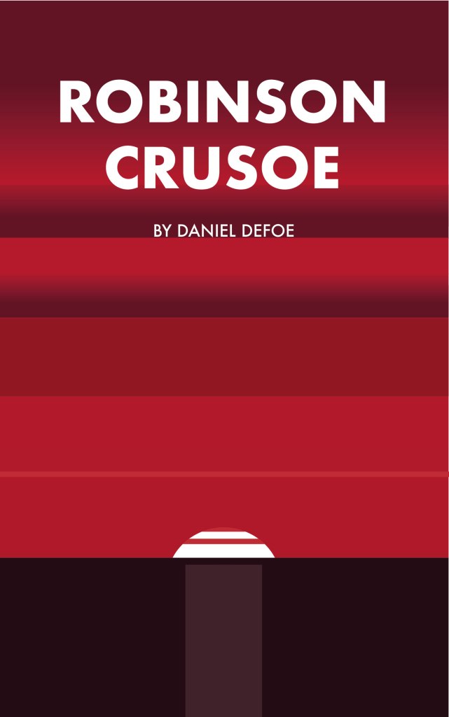
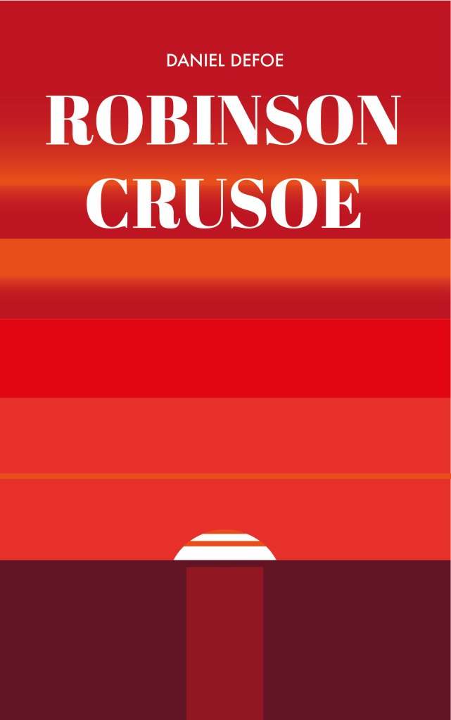
As I still was going to experiment with some design ideas, I wanted to see what the minimalistic design would look like for this cover. Just a simple sunset, in natural crimson, red, blue, and magenta colours. I thought that the design will not be successful enough to grab the attention of the reader. Generally, it looked fine, but not exciting enough to examine all the nice details. I’m going to leave them here, that to show the progress and different approaches in my work.

Painting of Robinson Crusoe
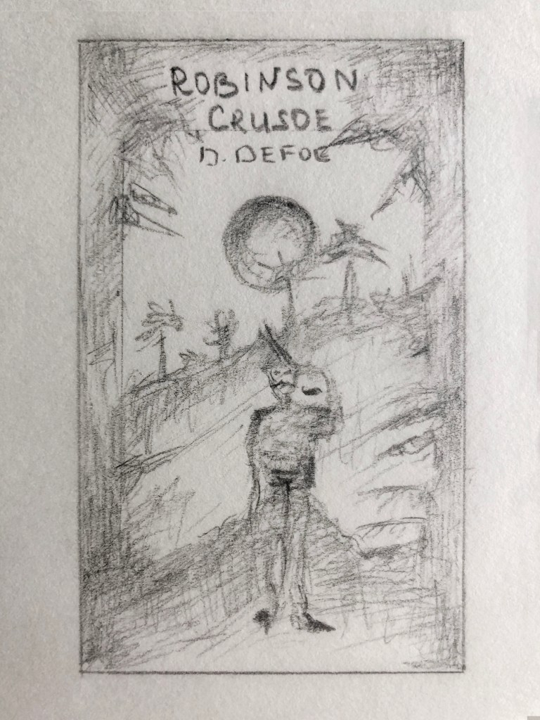
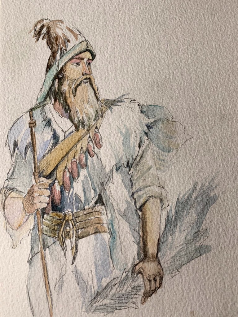
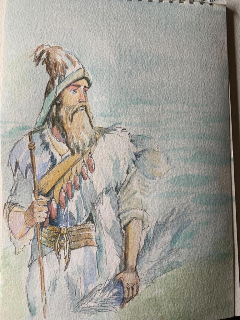
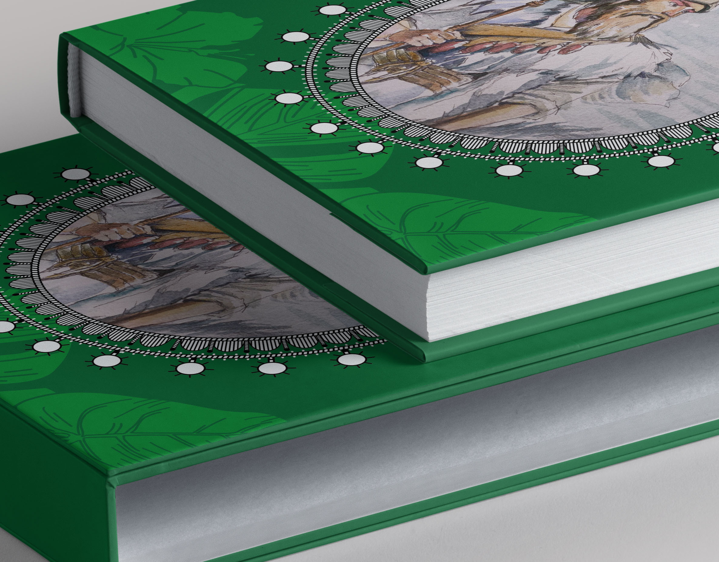
The next stage for me was to design a cover with a painting of Robinson Crusoe. I had an idea to picturise the image of the protagonist, with a self-proud. I found some different portraits of Robinson, some of them showed the tired man, all wrapped in clothes, looking tired and lonely, and some of the images showed a happy man, who looked like he loved his life on the island, but this image showed just proud man, quite calm. He looked a bit like the owner of the space and the land, maybe a bit too unrealistic, but I loved the spirit that that painting could bring. I started with a sketch, adding some colours to it. For the background of that portrait, I added just slight transparent colours with blue (water) and green (land). I was going to use it for the deluxe book cover, and for the pocketbook as well.


Option 3
This is another alternative to my design. Here I was going to use the watercoloured painting of Robinson on the colourful background. For inspiration, I looked for some works by Linda Huang. I loved her bright vector book covers, with some nice coloured contrasts on them. Also, she was experimental with the font chosen, and I thought I could try this approach for my book covers. Her designed looks perfect for the pocketbook, as the are bright and eye catching. I wanted to try this path as well, and it’s the king of designs I understand and like to work with. I loved the fact she uses this handwritten font, however my design was probably too organised for the pocket version.


For the background, I used the sketch of Robinson I showed earlier in my blog. It was outlined design, of the protagonist looking far ahead, with some hunting tool in his hand. On the central left side, I placed the watercoloured image in the circle, with a little robe frame around it. I experimented with the font and contrast shades, and I think red and violet colours with handwritten font looked quite nice, it was something unusual about this design. I tried different fonts variations, starting from Playfair Display serif font, then Beckman font for sans-serif version, Homemade Apple Pro font for handwritten text option, and Linotype Notec for the red book cover.
The only problem with this design was, I didn’t know how to join this image with the deluxe cover, as it just looked like a contemporary visual for the modern pocketbook. I thought I can keep this option as one of the ideas.
Deluxe version
Here are my researches on deluxe design cover. Associations that I had with that design, mainly about beautiful gold patterns, getting to design the clothbound. This is the book to keep in the library as an important part of the collection. I can say, that approach to the luxury book covers has not changed much since the very first book covers. They still have similar objects, frames, and fonts as many years ago, maybe books aren’t that huge, so if for example, the story is big, there would rather be a few volumes as a part of one set. Some of the modern book covers are presented below.
That book cover, with circles designed by Coralie Bickford-Smith spent lots of hours in the Reading University library, and she wrote a dissertation about the printed editions of Robinson Crusoe. I would happily have an access to those hundreds of book covers as well, designed through all those years. The fact that by the end of the 19th century, no other book in the history of Western literature had more editions, spin-offs and translations meant that it was a great way to study how the process of printing and illustrating books changed with the changing tide of printing processes.


https://www.bridgemaneducation.com/en/search?filter_text=Robinson+Crusoe+book+cover
https://bit.ly/2RlGNNM (Accessed 26/04/2021)
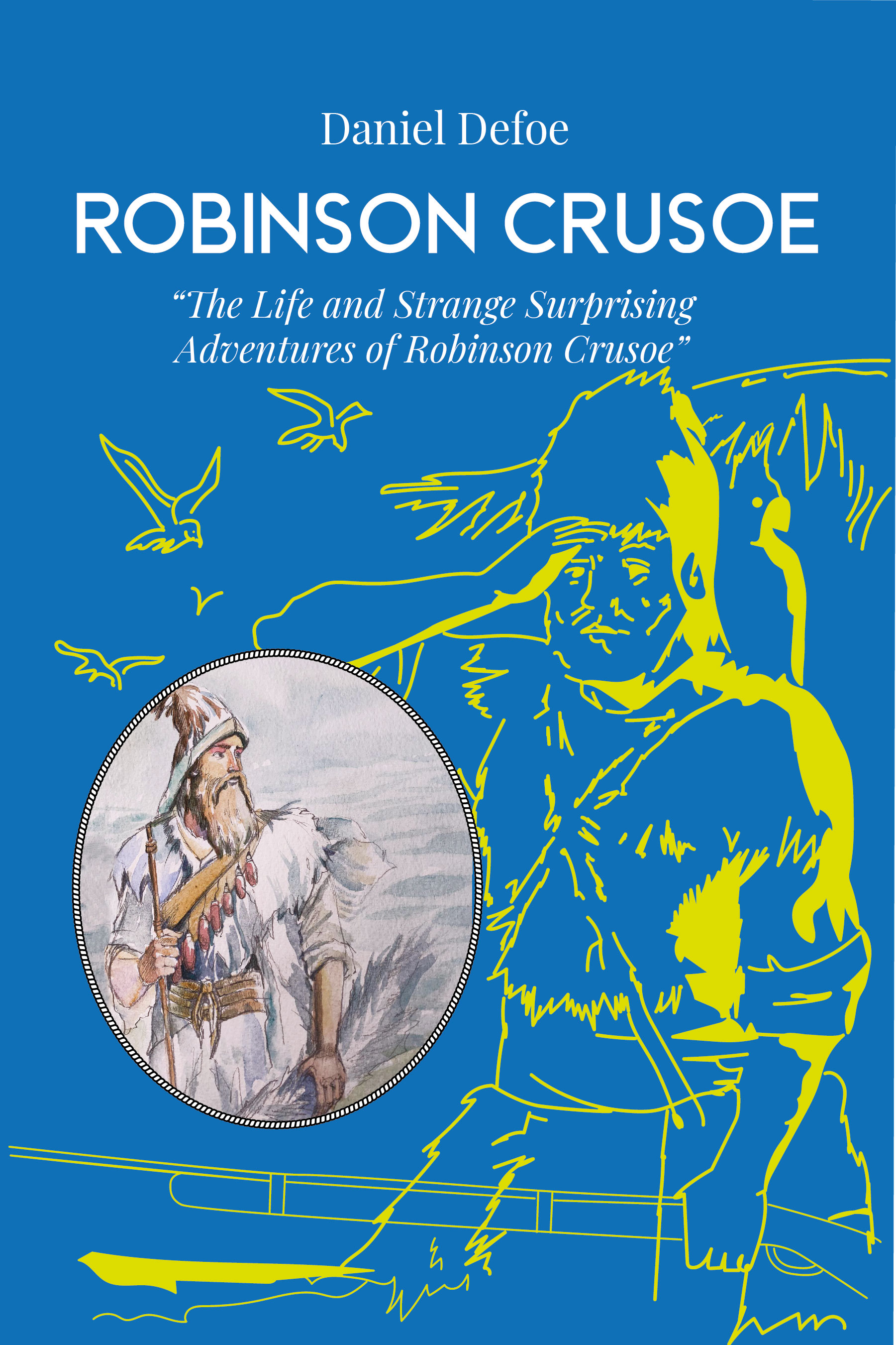
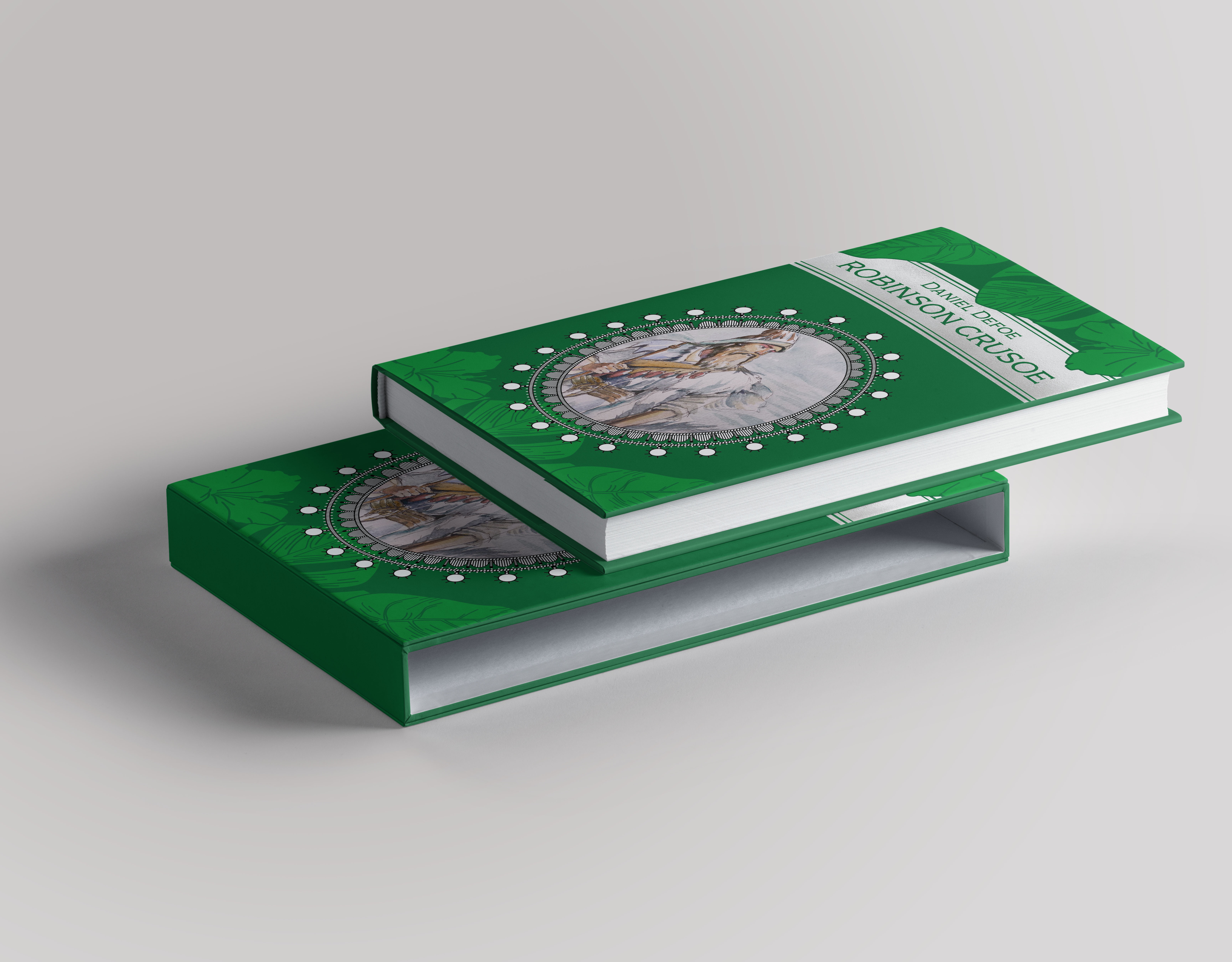
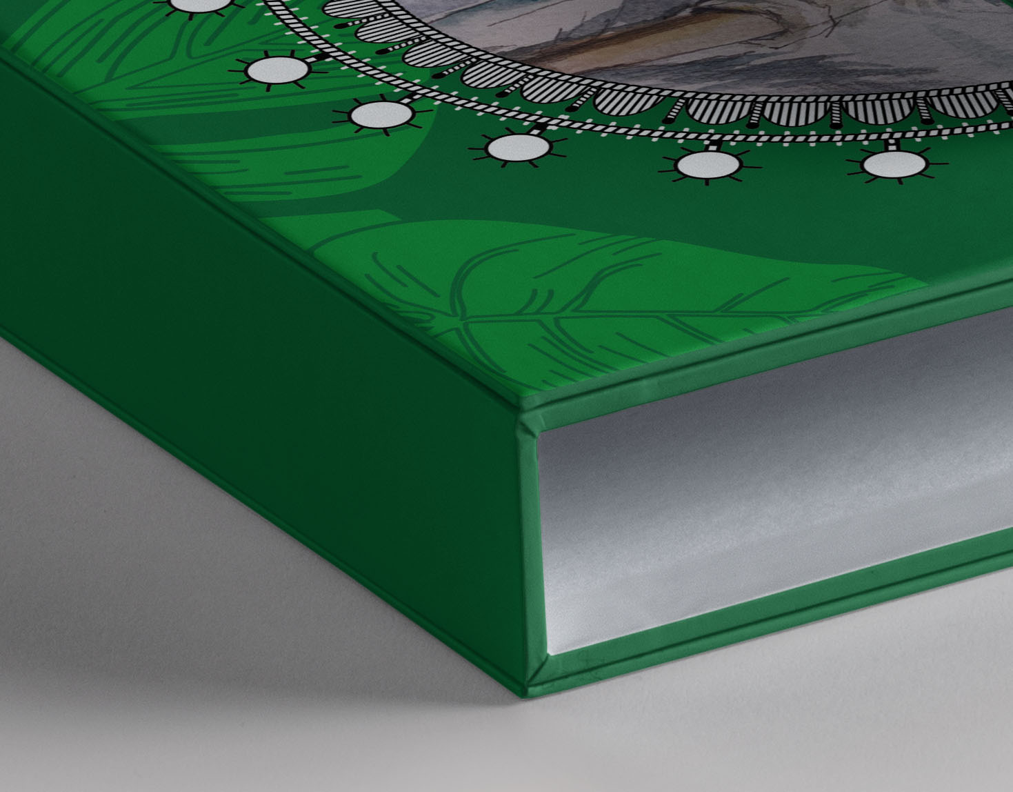
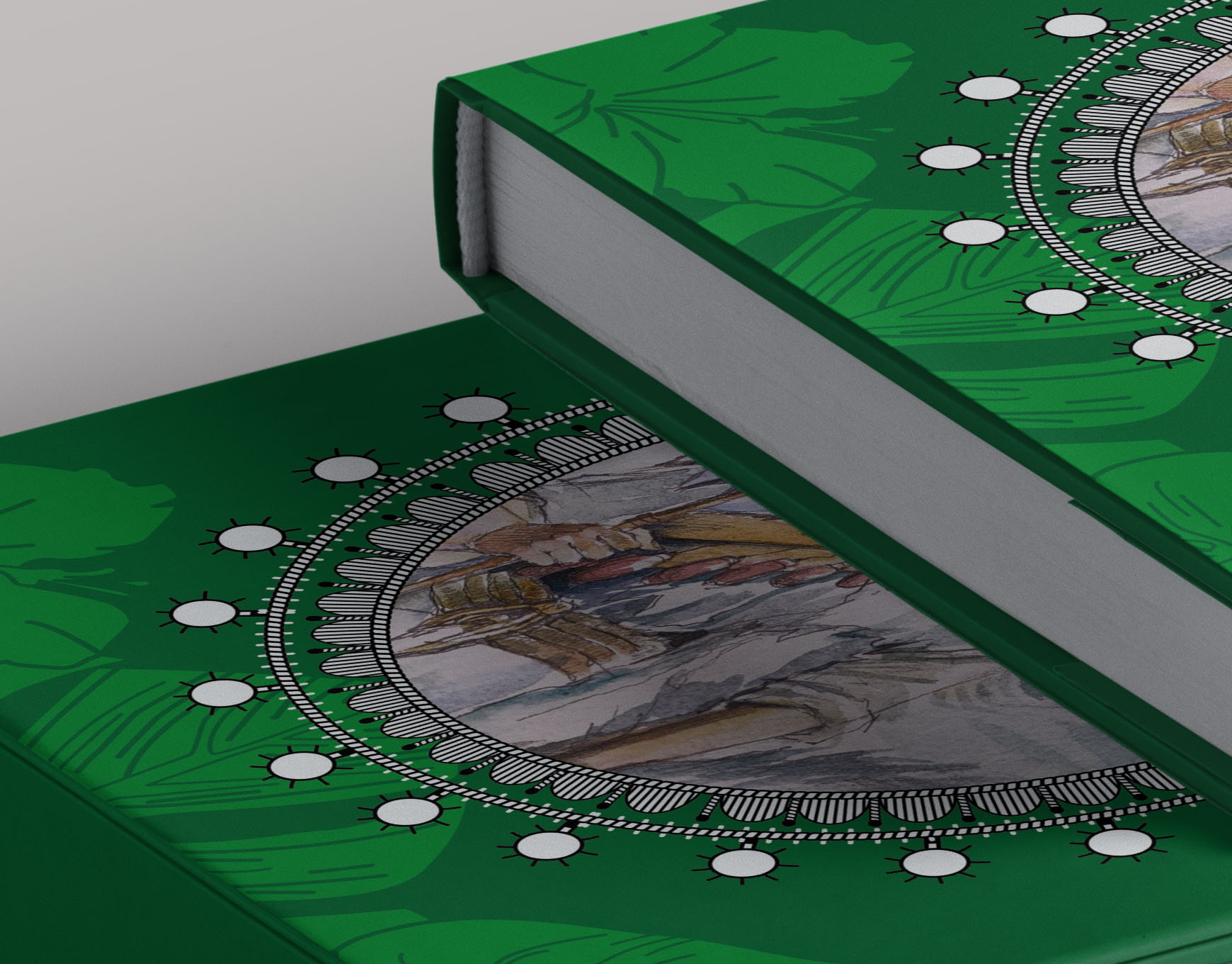
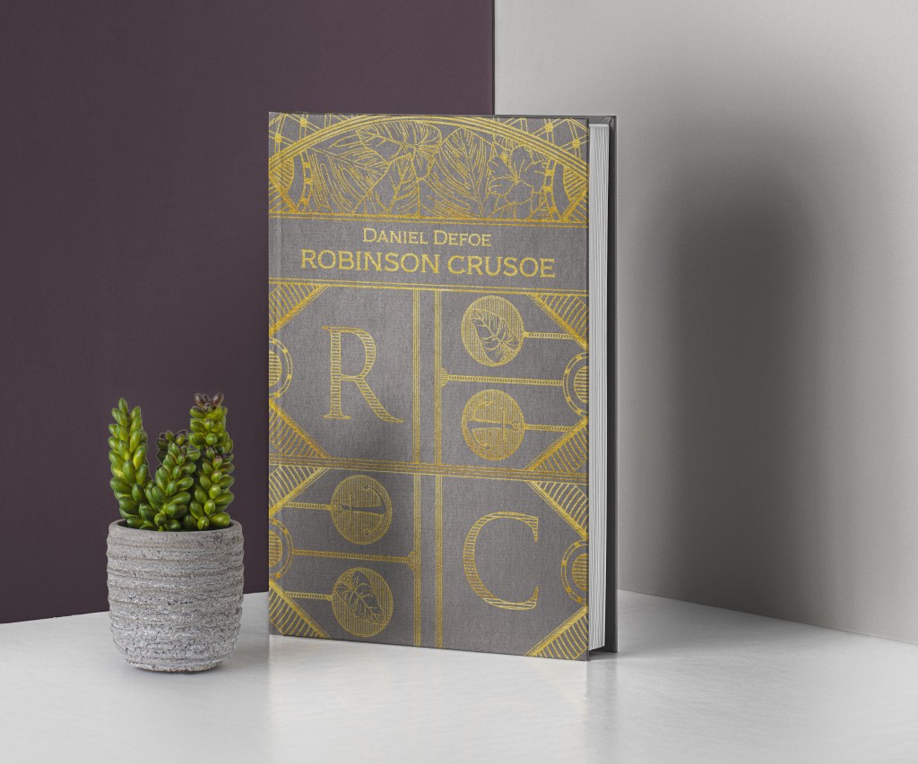
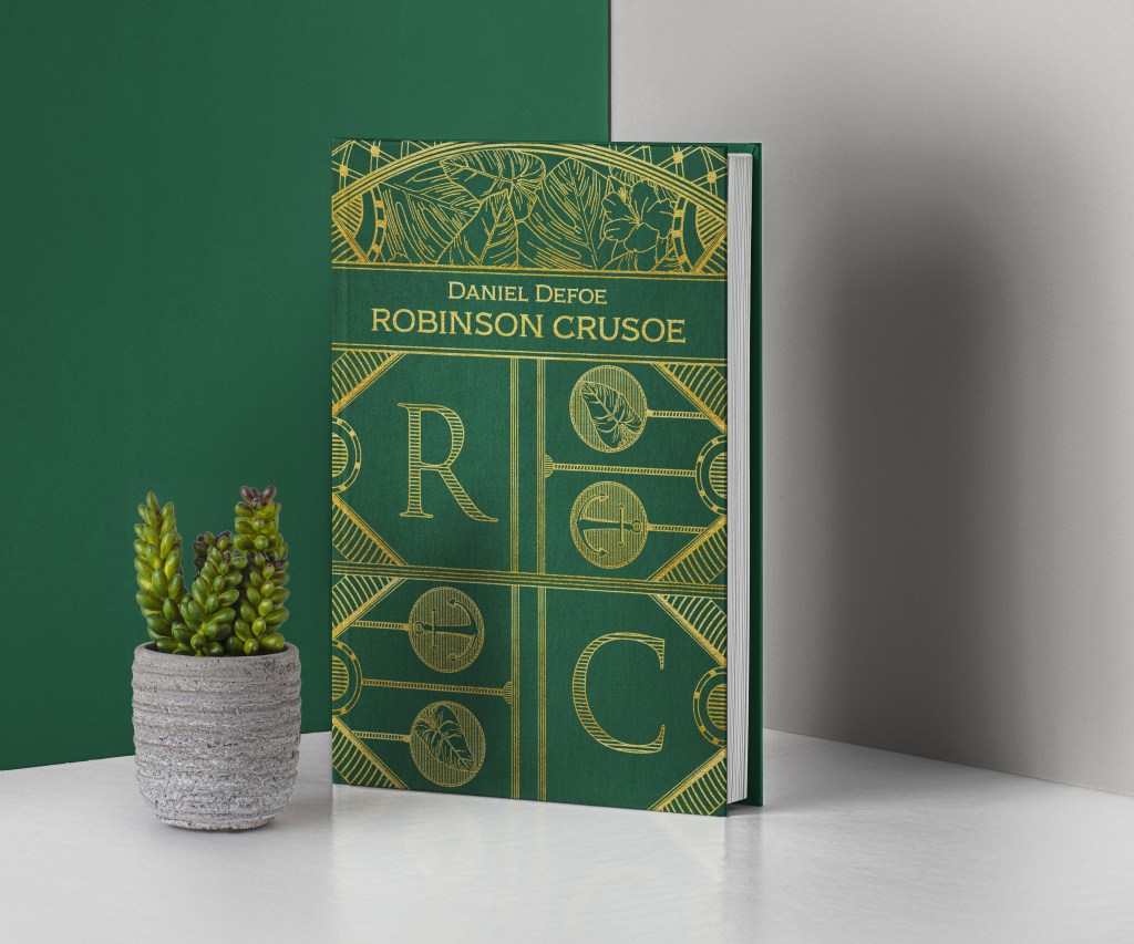
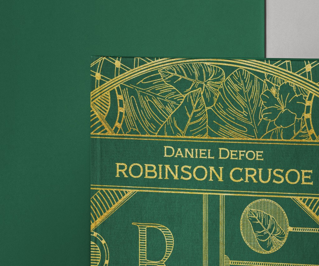
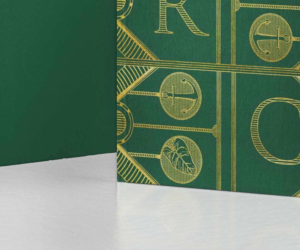
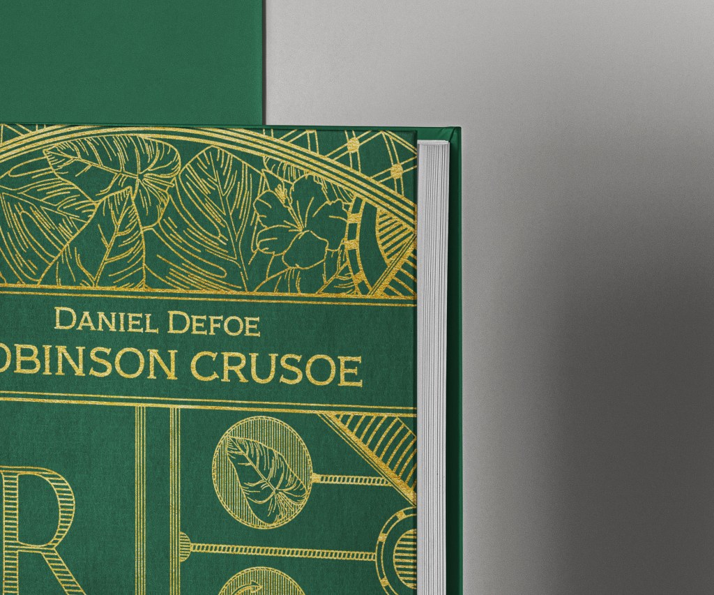
As I had this nice watercoloured painting of Robinson Crusoe I wanted to try to apply it for the deluxe cover. I realised that I won’t be able to use it for on the clothbound, as it presupposes using only one colour, like gold or silver, or Pantone colours. I thought that I can try to adapt the design for the book with the box. My first option had a similar design to the pocketbook, but instead, I used a dark green with coloured leaves. That frame that I sketched earlier I used for the round frame, and in the centre, I placed the watercoloured image. Also, I experimented with colour, I was thinking of designing like an ochre book cover, with golden elements, but the cover looked pale, so I thought I should concentrate on the green, and it would much better than the blue pocketbook.

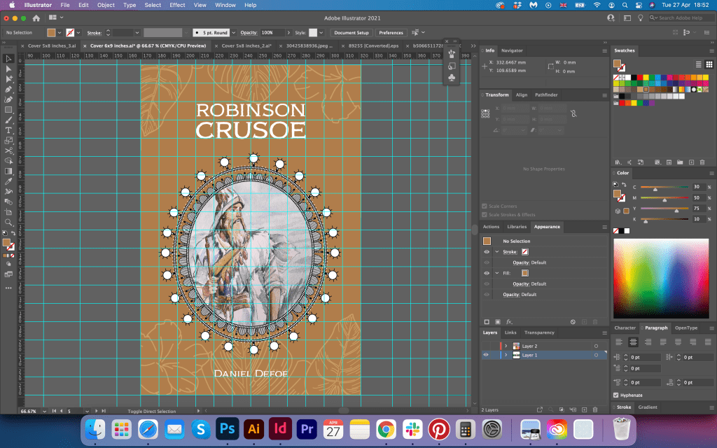
Here can be seen the grid for the book cover. The size for the deluxe version I chose was 153×229 mm, with a grid of 12×18 squares. It helped me to choose the right proportions for all objects. For the top part near the name of the book, I placed a silver ribbon. Also, I changed the font to Adorn Copperplate, matching the pocketbook version.
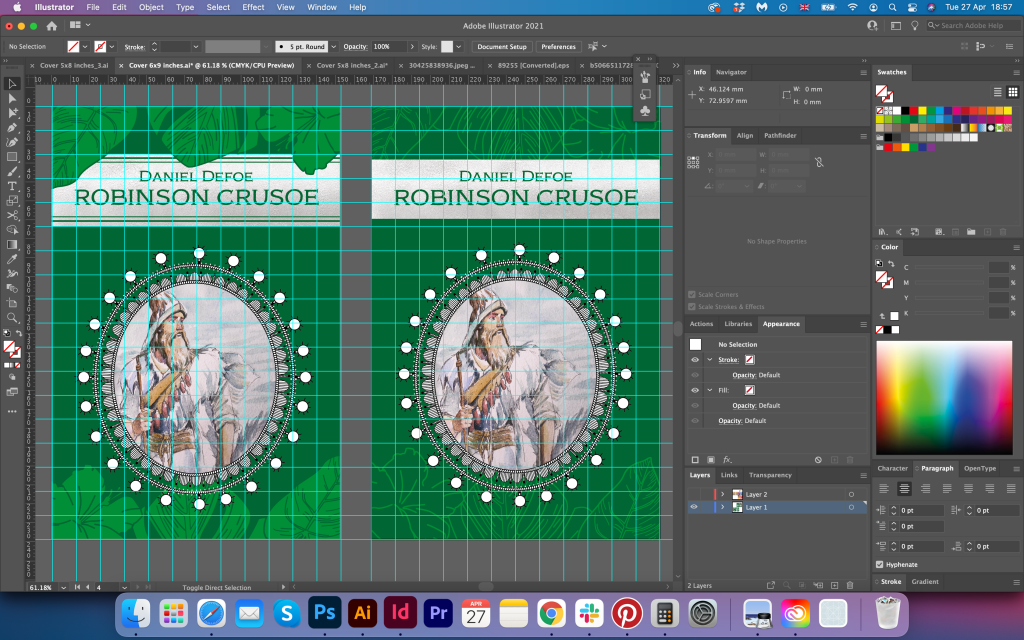
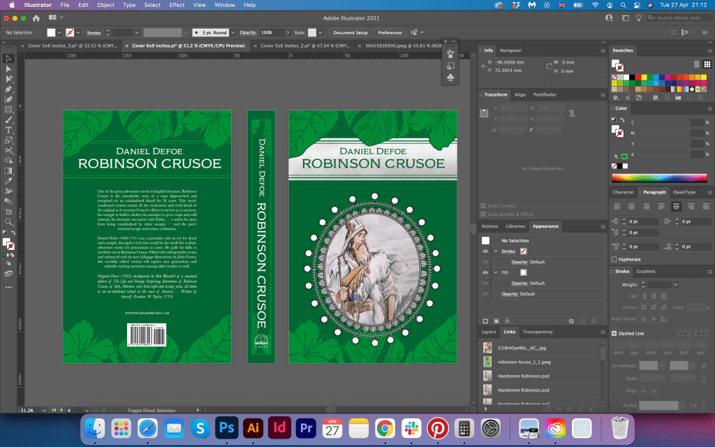
I placed all designs into the mockups with the box. It looked quite pleasing a modern deluxe version. Also, both books matched each other. The only disadvantage I could see was that it was not the distinguished difference between pocketbook and deluxe book covers. They look equally the same, and I felt like I needed some criticism to understand where I could improve. The green book cover looked quite confident next to the blue cover design, but I still thought of adjusting it.
Additional Deluxe Option in Gold
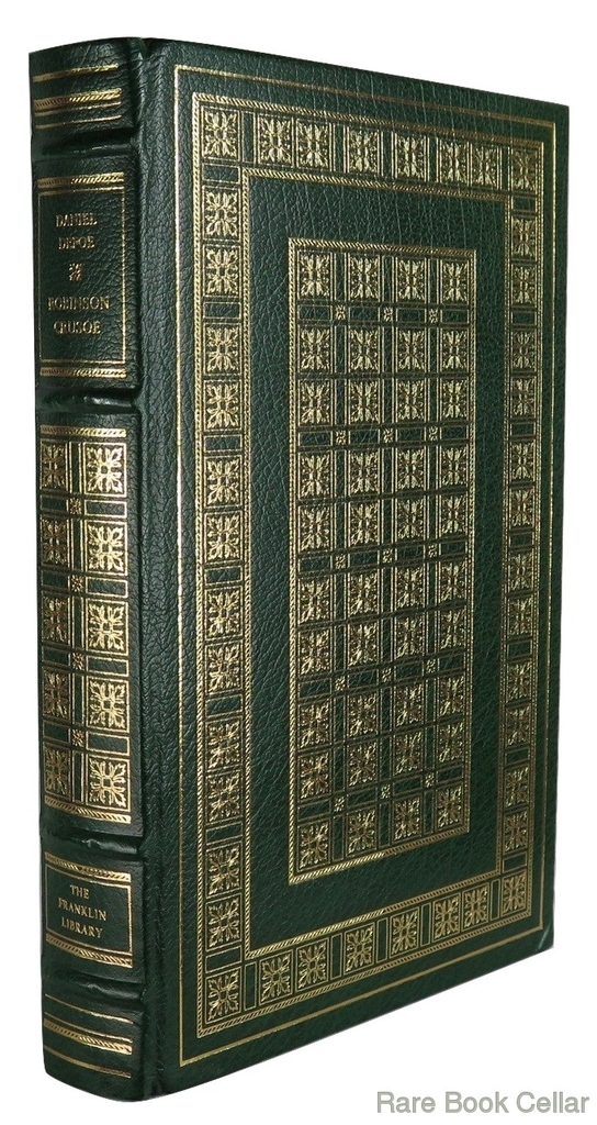
Whilst I was making my research, I found a unique website with some rare books for Robinson Crusoe, starting from $5 and up to the thousands. The most expensive, original version of the book, priced $15k, printed in two volumes, dated back from 1719, London. That book covers were something I could achieve in my design as well.
This website gave me some inspiration on how I could adapt the existing design from my pocketbook version for the deluxe cover. Mainly for the cover was used clothbound in one spot colour, like deep blue, green, or brown. And on the top, the gold foil was applied, and some Pantone colours print. I thought I could do something similar.

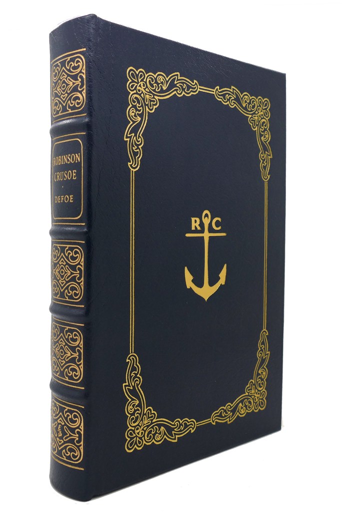
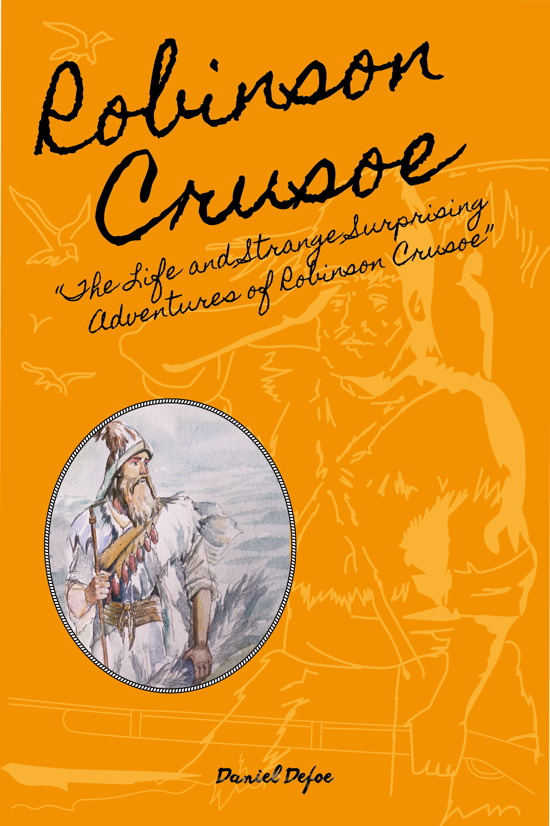
Why not take my first design, with nice details I made and convert it into one solid colour, for the foil effect? It will go nicely for any colour and will be in tandem with the pocketbook cover. It took me a while, whilst I was trying to create a clever outline for each element, considering that design for potential printing, as printing houses don’t like thin outlines. I still had some thinner lines, but before the actual printing, I can always adjust it according to the requirements of the publisher.
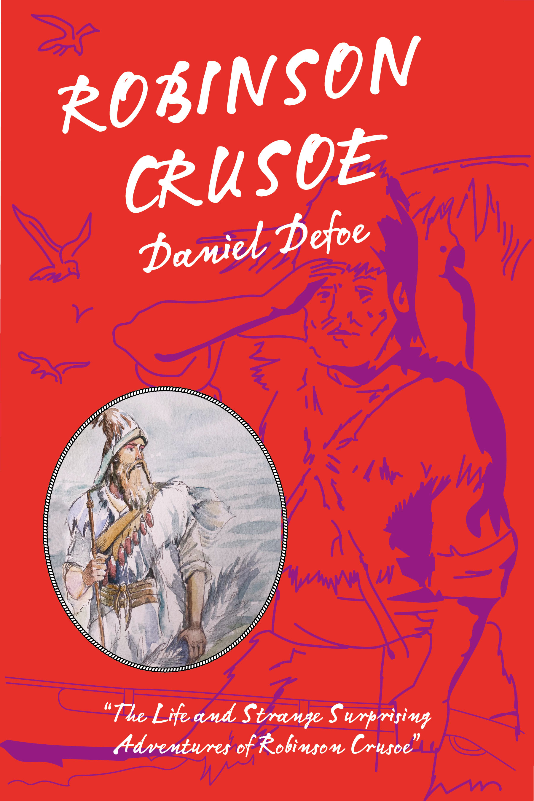
The first test on the clothbound went quite well. I showed it to my designer colleagues, and I got better feedback on this book cover to compare to the green design with the watercolour. This book had a classic feel in it, like traditional books to print, but at the same time was modern. I was not quite sure how this light brown colour matched the blue pocketbook, and some of the golden elements became too faded. But the direction for the design worked quite well, therefore for the next option I was going to try a dark green book cover.
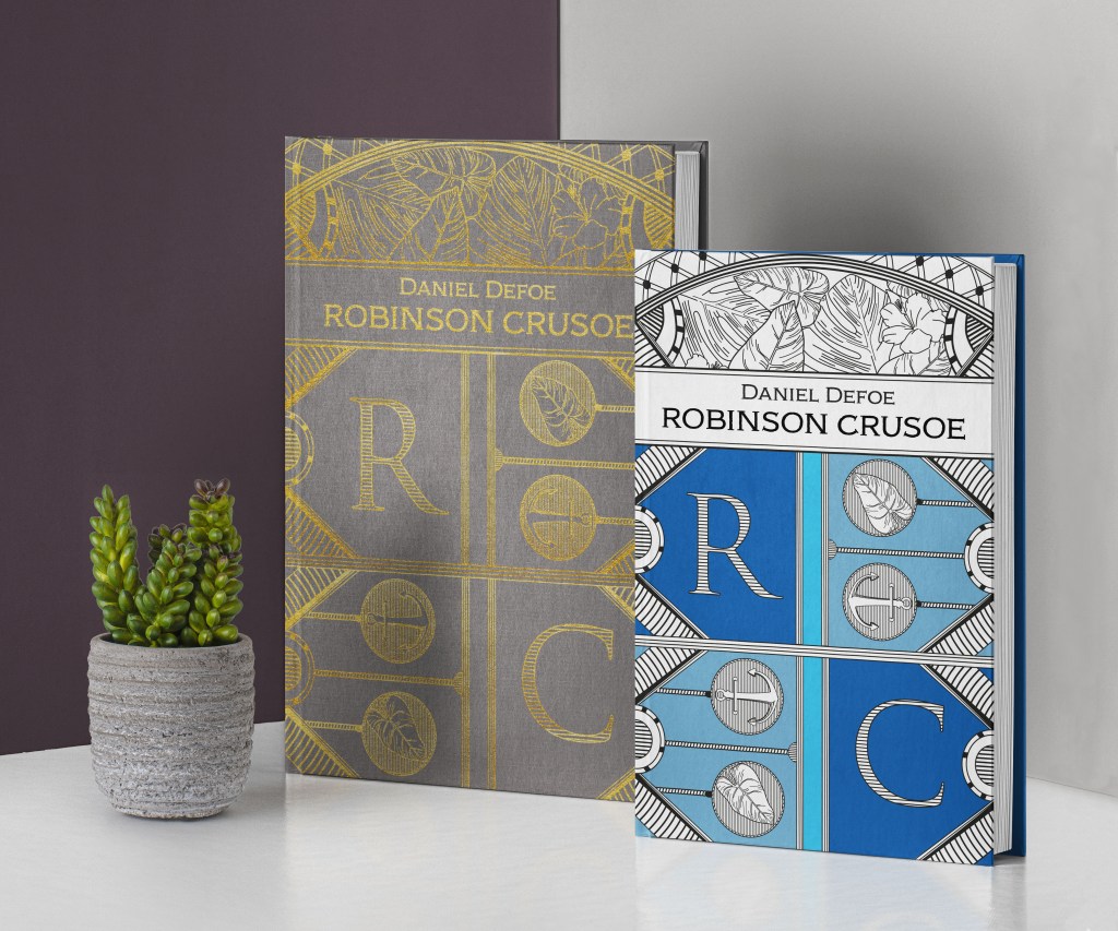
This is an alternative cover with a nice green book cover, similar to one of those luxury book cover designs I’ve examined before. I loved that deep green cover, and how nicely it worked with a blue pocketbook. I showed all the fine details in the close-up mockups, and I was happy with the design outcome.

‘How to’ guide research
Finally, the time came up for the third additional book for Washed Ashore Survival Guide. Here I went down the usual path of collecting some ideas for the how-to survive guide. Designs mainly looked quite a standard way, with some warning signs, or useful tools on them. The colour palette was quite simple as well, green, red, yellow, or some shades of cream colour. I’ve noticed that it’s common the usage of sketched vectors and illustrations for that kind of survival guides.


Sketches
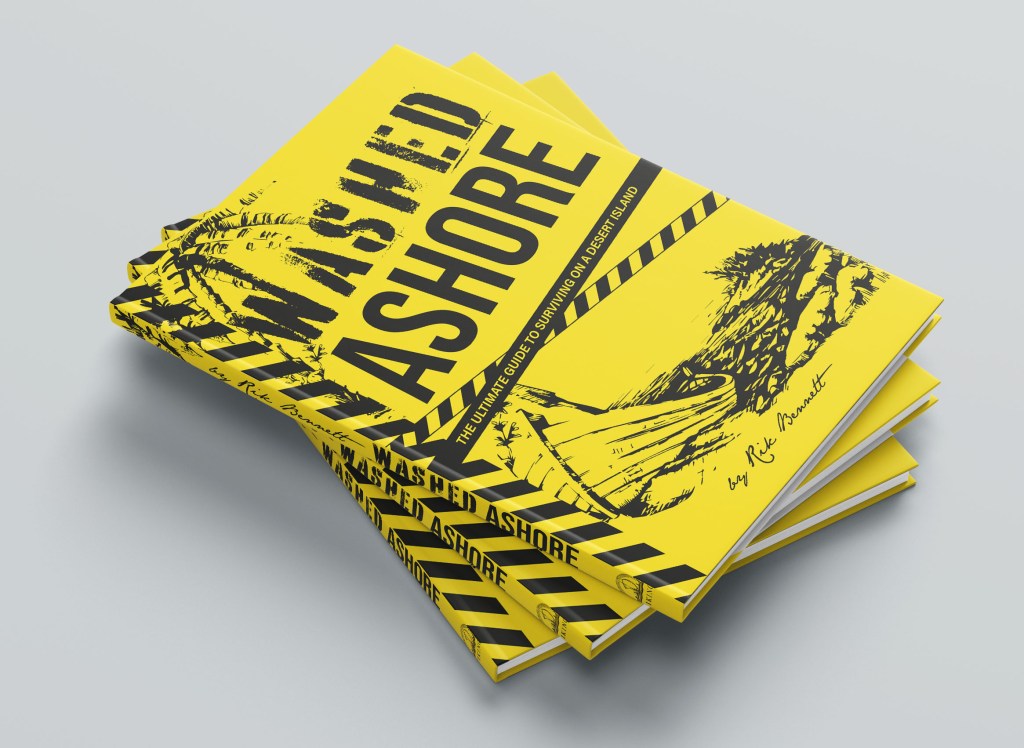
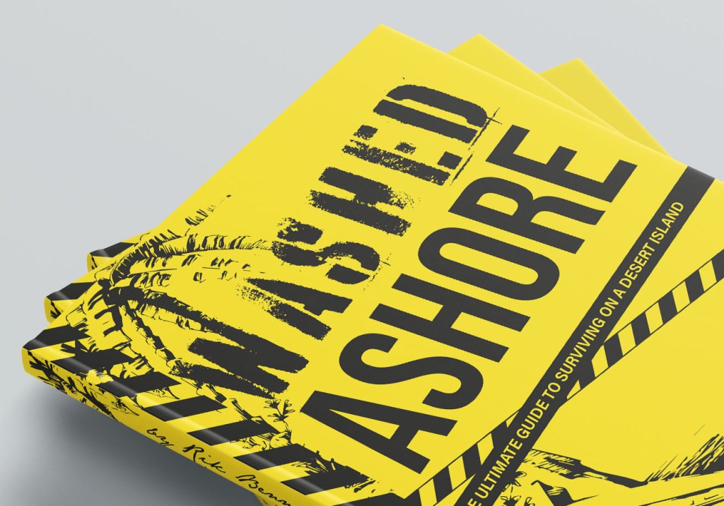
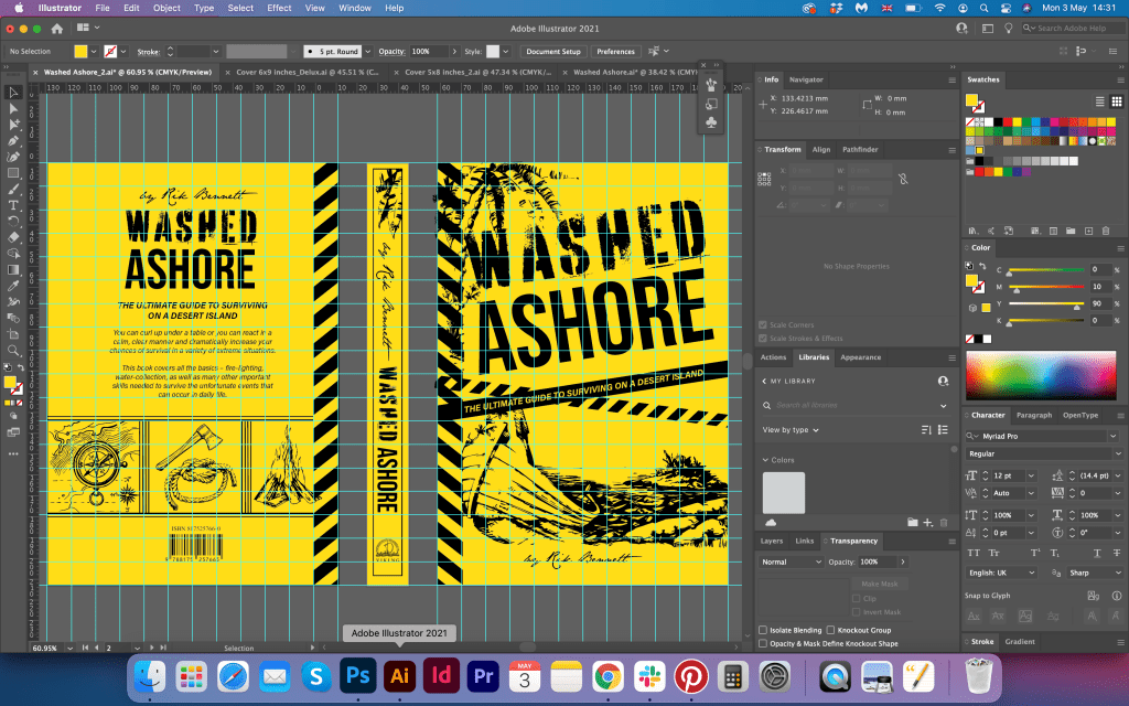
For the Washed Ashore book cover, I was going to divide the space into three sections, similar to the Robinson Crusoe design. Here I had the challenge how to combine my classic and elegant designs, with such style for a survival guide. This design needed to be bright, and catching, but have some similar elements. I was going to use some survival tools in it, like an axe, compass, how to make fire, and other tools, also, I could bring the jungle theme into this design. I planned to experiment with the font as well, I thought would be great to use the big bulky or decorative font, so I was going to make the name of the book the main point of attraction.
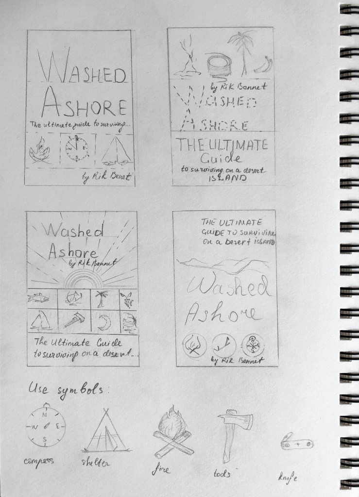
Design
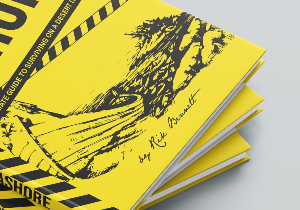
For the word WASHED I used interesting font, which looked like washed font Battery Park (I discovered it from the Unit 1 exercise about fonts and their purpose) For the word ASHORE I used Bebas Neue tall sans-serif font, which looks similar to Battery Park font but just without washed effect on it. I wanted to show a big alert name on that journal, so the buyer will spot it straight away. Also, a nice addition to this cover was Jane Austen handwritten font, which I used for the author’s name. Here I decided to apply juicy yellow colour, which explained the genre of the book, and it was the contrast colour for my blue and green set. I thought that maybe something more natural would be more logical for this cover, and I would have a similar colour palette for the book set, but for the design style I choose, and the dynamic around it, the yellow colour worked in the best way.
I was thinking about how I can join all designs between each other. And apart from palm elements, a boat on the island, similar stripes, and have a similar spine, I could not think of anything else.
Blue cover to compare designs.

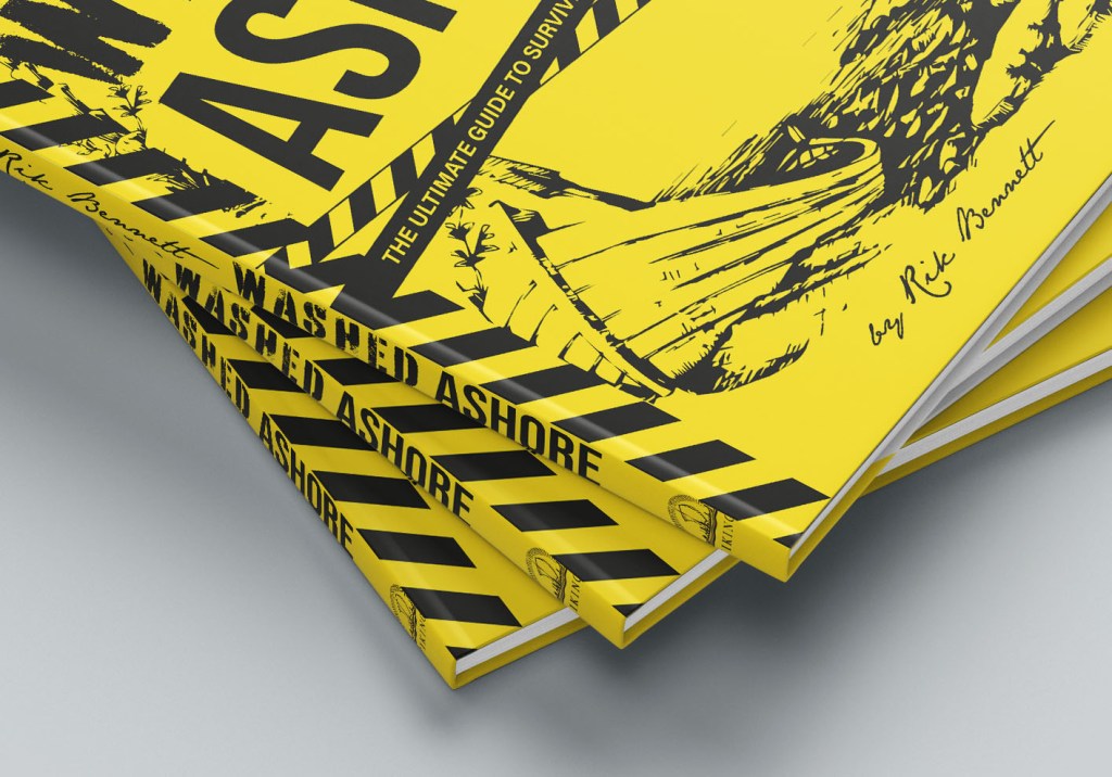
Final mockups.

Reflection
In conclusion, I would like to say, that this assignment was quite enjoyable for me to go through. I appreciated the research and analyses I made on that book, but from the final design pieces point of view I could see it need a bit more work. Would be great of course if I could go to some libraries to examine more book covers in person, but due to the lockdown, I had access only to the digital materials from online libraries.
I think my designs went more down the elegant and classical way, and they are not too contemporary or modern, but there is my style in those book cover designs I produced. Another criticism about my book covers is that the additional cover for the Washed Ashore is different from the Robinson Crusoe designs, as I could not implement a completely similar style into it. The last cover looks more modern because of the fonts choice and illustrations around it. I tried to play around with colours, that to use a similar colour palette as the first book cover, but for the final design I chose yellow, as I loved how the contrast worked with this design set.
Also, I like the experiment with the few book covers, where I used watercolour illustrations, and just one colour golden foil for design, it helped me to compare both works, and find the most suitable design for the set. I hope this assignment helped me to widen my creative horizons and helped me to keep close to the brief.
Upgraded version of conclusion
What’s noticeable in my book cover design approach, is the similarities in the style of the course. My first book covers were designed for the H.G.Wells, the exercise https://eleonoras.art.blog/2018/12/24/exercise-book-cover-design/ and I used similar vector elements and flat, bright colours. In this assignment, I definitely could see some improvements, but I still feel that I was missing a bit of the conceptual part. I think I was struggling to go beyond the boundaries and create something different. Maybe more handwritten text for the book name, or one footprint or one tropic leaf would be more in keeping with the brief. My designs were too careful, and too much within the grid, they are neat, well balanced, but probably don’t represent the feel of the free spirit of the book story as much as I wanted it to. I think, for the pocketbook version I got slightly stuck, however, the Delux version was quite successful, as in this case, my attention to the details and fine lines worked well.
I’m editing this conclusion after I submitted the work, and I feel like those book covers have so much more work and potential. I could do more playful and free design for the pocket version, bring into it more experiments, but as I look at it from the perspective of completing the one year unit, I’m glad that this book covers can be judged from the selfcritisim.
