This exercise hopes to broaden your understanding of other book designers’ work by looking at their cover designs. Start to identify the kinds of book covers you are drawn to, and critically assess why you think these designs are successful.
1. Undertake a combination of library and internet research into the following designers, identifying a number of book cover designs for each. Reflect on their conceptual and/or expressive approaches to design. Write a very brief description of your selected cover designs and a brief overview of the designer – try to focus on keywords rather than long descriptions. Do this in note form, using the designer and the chosen example design to visually inform how the information appears in your learning log.
- Phil Baines
- Coralie Bickford-Smith
- Derek Birdsall
- Kelly Blair
- Irma Boom
- Suzanne Dean
- Julia Hastings
- Linda Huang
- Jost Huchuli
- Ellen Lupton
- Peter Mendelsund
- Paul Rand
- Paula Scher
- Jan Tschichold
- Wolfgang Weingart
2. Compare and contrast some of the cover designs. For example, how does the cover of Peter Mendelsund’s Kafka series compare with Coralie Bickford-Smith’s gothic horror series for Penguin? Are these expressive or conceptual in nature? Are they both conforming to genre expectations, or are they challenging them in some way? Do Jan Tschichold and Ellen Lupton’s cover designs have anything in common? Make a drawing, sketch or tracing of the covers you’re comparing to help give you a better understanding of the imagery, typography and arrangement within the design. Use your learning log to reflect on your comparisons, identifying which covers you think are the strongest and why.
3. Now, select three or more designers from the list that you are particularly drawn to, either because you like their work or because you don’t understand their approach, and research their design careers in more depth. Think about how they’ve responded to very different design challenges, whether they have an underlying conceptual and/or expressive approach, and how their work has evolved over time. Continue to use your learning log to record their work visually, explore these covers through drawing, and your responses in note format. See this as a quick-fire activity rather than a long essay.
4. Finally, identify at least three different book designers you find visually engaging. To do this you might want to visit a library, or bookshop, or browse online. Identify who designed these covers and find out more about them. Try to work out why you are drawn to them. Is it to do with genre or their approach to design? What is it about the design that captures you? What sort of imagery, if any, is used on the cover? How does the text relate to the image? What atmosphere or style does the cover evoke? Summarise your thinking in your learning log – focusing on the kinds of book covers you are drawn to and why – and continue to document what these covers look like.
Part 1
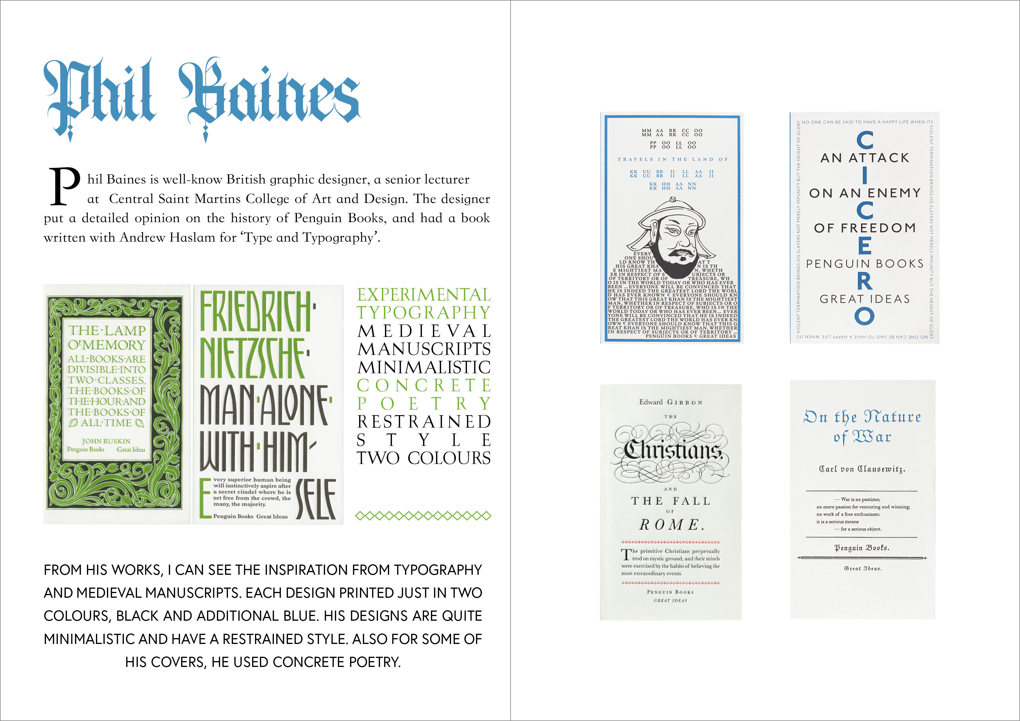
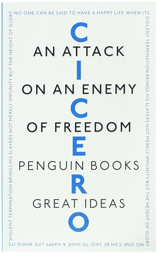
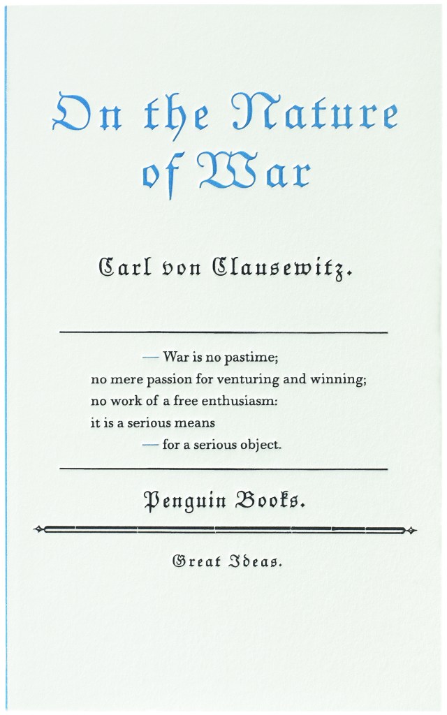
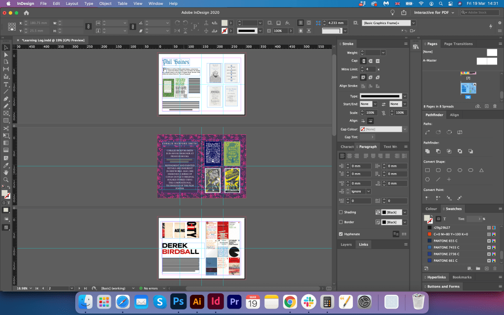
Phil Baines
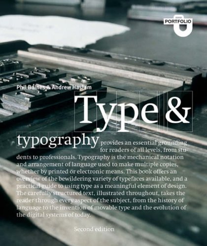
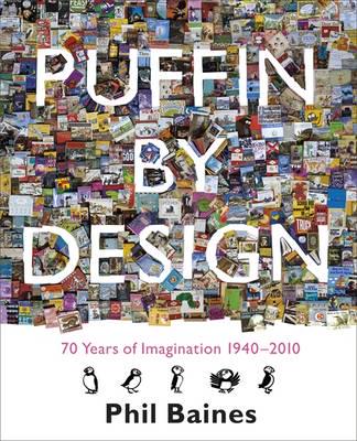
Phil Baines is a well-known British graphic designer and a senior lecturer at Central Saint Martins College of Art and Design. The designer put a detailed opinion on the history of Penguin Books, and had a book written with Andrew Haslam for ‘Type and Typography’. From his works, I can see the inspiration from typography and medieval manuscripts. Each design is printed just in two colours, black and additional blue. His designs are quite minimalistic and have a restrained style. Also for some of his covers, he used concrete poetry. This book covers based on the conceptual approach.

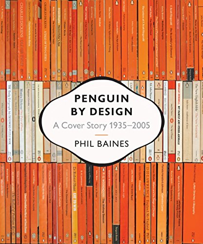
Sources: https://ualresearchonline.arts.ac.uk/id/eprint/1059/ (Accessed 05/03/2021)
Puffin by Design. Phil Baines. At: https://blackwells.co.uk/bookshop/product/Puffin-by-Design-by-Phil-Baines-author/9780141326146 (Accessed 05/03/2021)
Type and Typography. Phil Baines and Andrew Haslam. At: https://www.goodreads.com/book/show/119147.Type_and_Typography (Accessed 05/03/2021).
Penguin by Design. Phil Baines. At: https://www.worldofbooks.com/en-gb/books/phil-baines/penguin-by-design/9780713998399 (Accessed 05/03/2021).

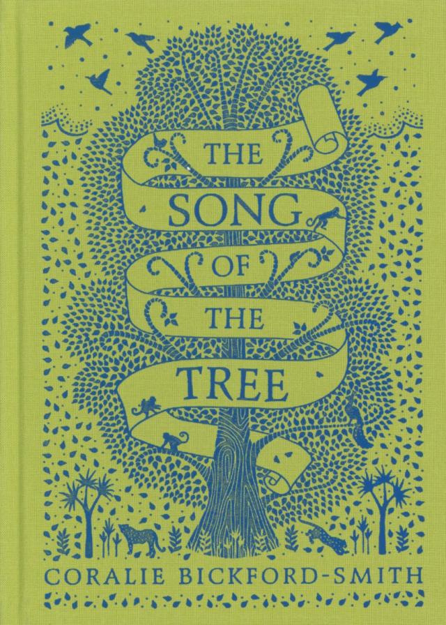
Coralie Bickford-Smith
Coralie Bickford-Smith is an in-house designer at Penguin Books. Her designs won awards among famous publications and magazines. Refinement and painted details are inherent in her works. Also, she designed a series of Conan Doyle’s original Holmes stories using the compositional techniques of the film poster. She uses a lot of illustrations on her book cover, pictured in only a few colours. These designs have an expressive approach.


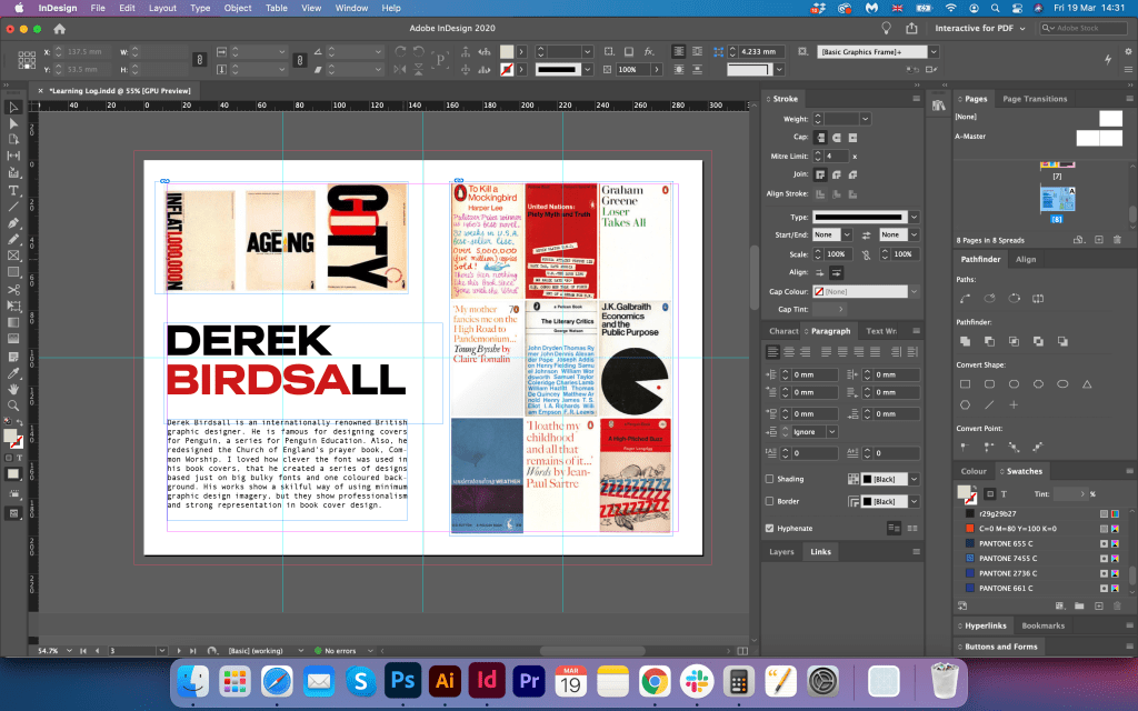
Derek Birdsall
Derek Birdsall is an internationally renowned British graphic designer. He is famous for designing covers for Penguin, a series for Penguin Education. Also, he redesigned the Church of England’s prayer book, Common Worship. The designer applied a conceptual approach to the Penguin Education covers. The breadth of the series content was held by two elements: the use of a single typeface (Railroad Gothic), and a cover arrangement that reflected the content of individual volumes. I loved how clever the font was used in his book covers, that he created a series of designs based just on big bulky fonts and one coloured background. His works show a skilful way of using minimum graphic design imagery, but at the same time, they are professional and have a strong representation in book cover design.


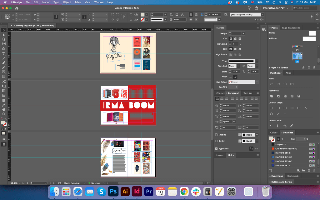
Kelly Blair
Kelly Blair is the art director of Pantheon Books and a freelance illustrator from New York. Her designs have a strong feel of covers from the XXI century. She has her techniques, as mainly designs are clean, with the dominant colour in it, and one particular object being highlighted. There is a very clever approach to the font hierarchy in her covers. These designs have an expressive approach.


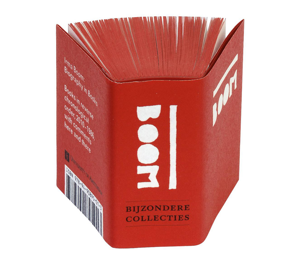
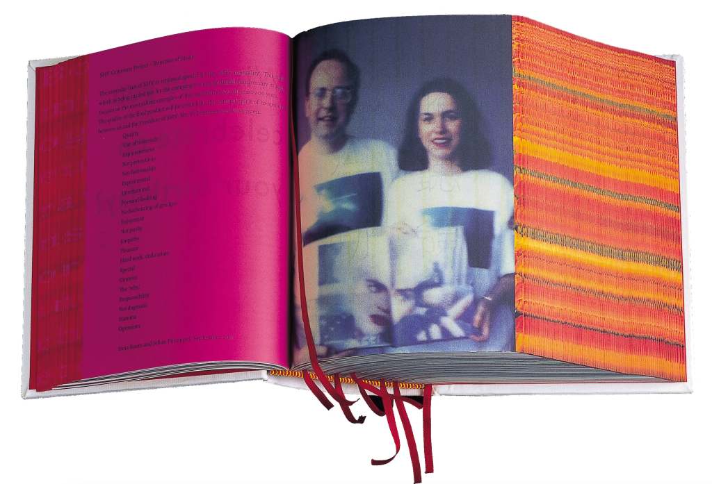
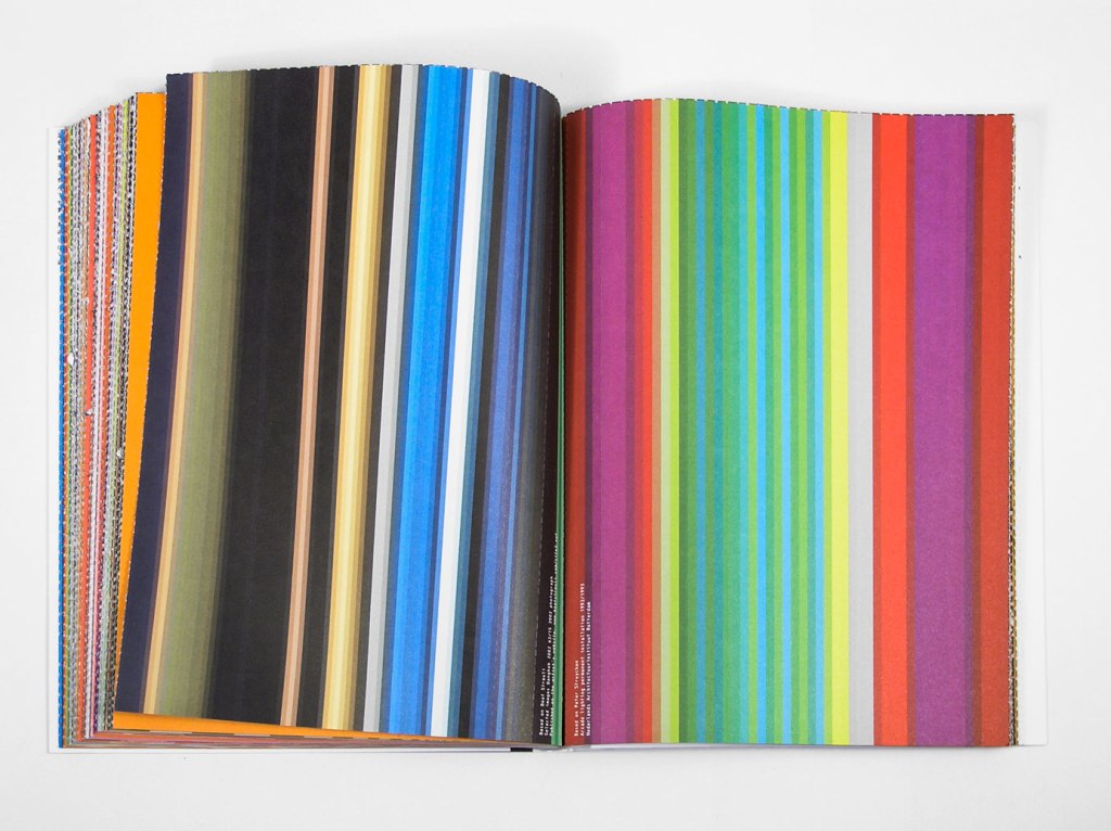
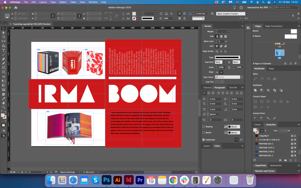
Irma Boom
This is a designer that everyone related to graphic design should be aware of. Irma Boom is an Amsterdam-based graphic designer widely recognised as being one of the world’s most inventive, creative and experimental book designers. She is an inspiring, clever artist with one of the most valuable works. She started her creative path as a painter but found herself in book cover design. Some of her works are like an encyclopedia for a graphic designer, she has innovative ideas, and she thinks out of the box.

(Accessed 13/03/2021)
I was impressed with the company history book she did for SHV Holdings, which took her 5 years to complete. At the foredge of the book, she illustrated the colours of the tulip’s field. Also, she designed a book with the word inside and outside on the foredge of the book. One of her creations has a book only with colours in it, and it has torn edges. From Van Gogh, Dürer and Rembrandt to Warhol and Fontana, the paintings are translated into colour diagrams which are in turn translated into vertical stripes. She has lots of ideas that I have never discovered before.


http://www.minddesign.info/kleur.html
https://www.pinterest.ru/pin/505740233135877540/ (Accessed 14/03/2021)
This is the interview of Irma Boom I stumbled on earlier through the Discord student group. Was nice to see where the artists’ inspirations are coming from, and listen to the author’s ideas about design development.

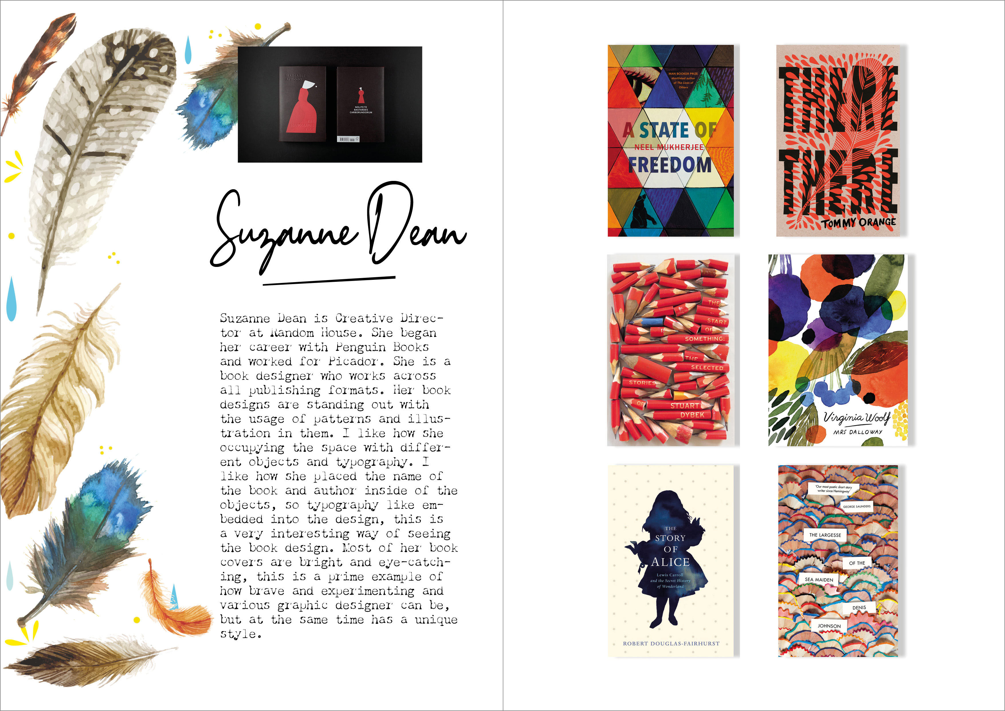
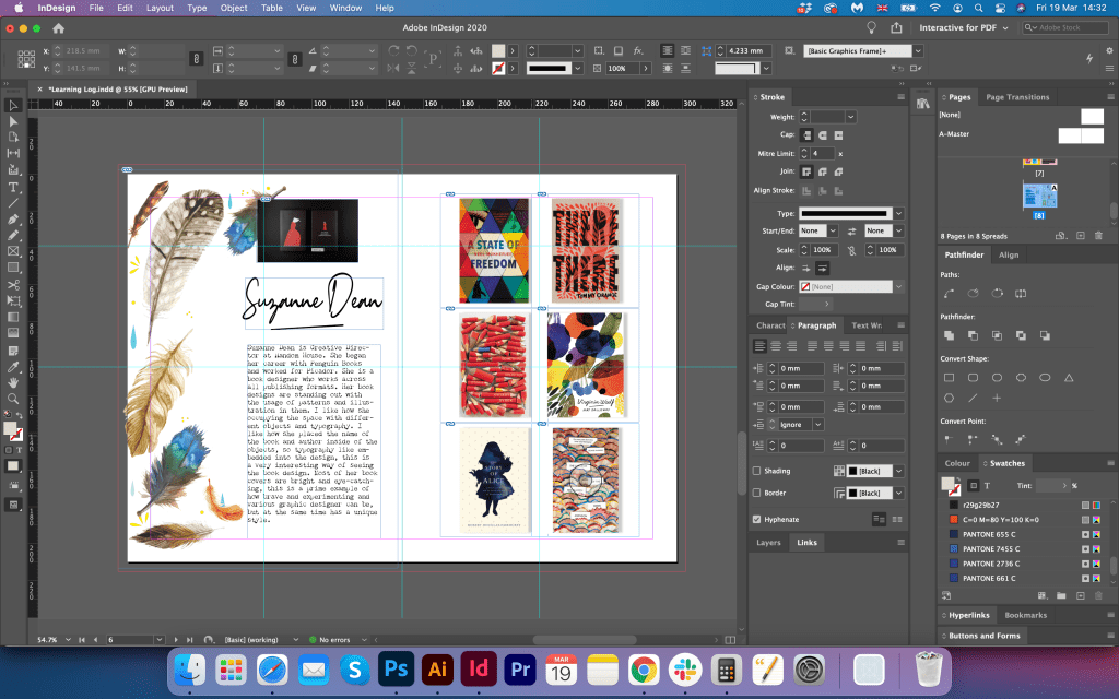
Suzanne Dean
Suzanne Dean is Creative Director at Random House. She began her career with Penguin Books and worked for Picador. She is a book designer who works across all publishing formats. Her book designs are standing out with the usage of patterns and illustrations in them. I like how she occupies the space with different objects and typography. I like how she placed the book’s name and author inside of the objects, so typography like embedded into the design, this is an exciting way of seeing the book design. Most of her book covers are bright and eye-catching, this is a prime example of how brave and experimenting various graphic designers can be, but at the same time has a unique style. These designs are representing an expressive approach as well.


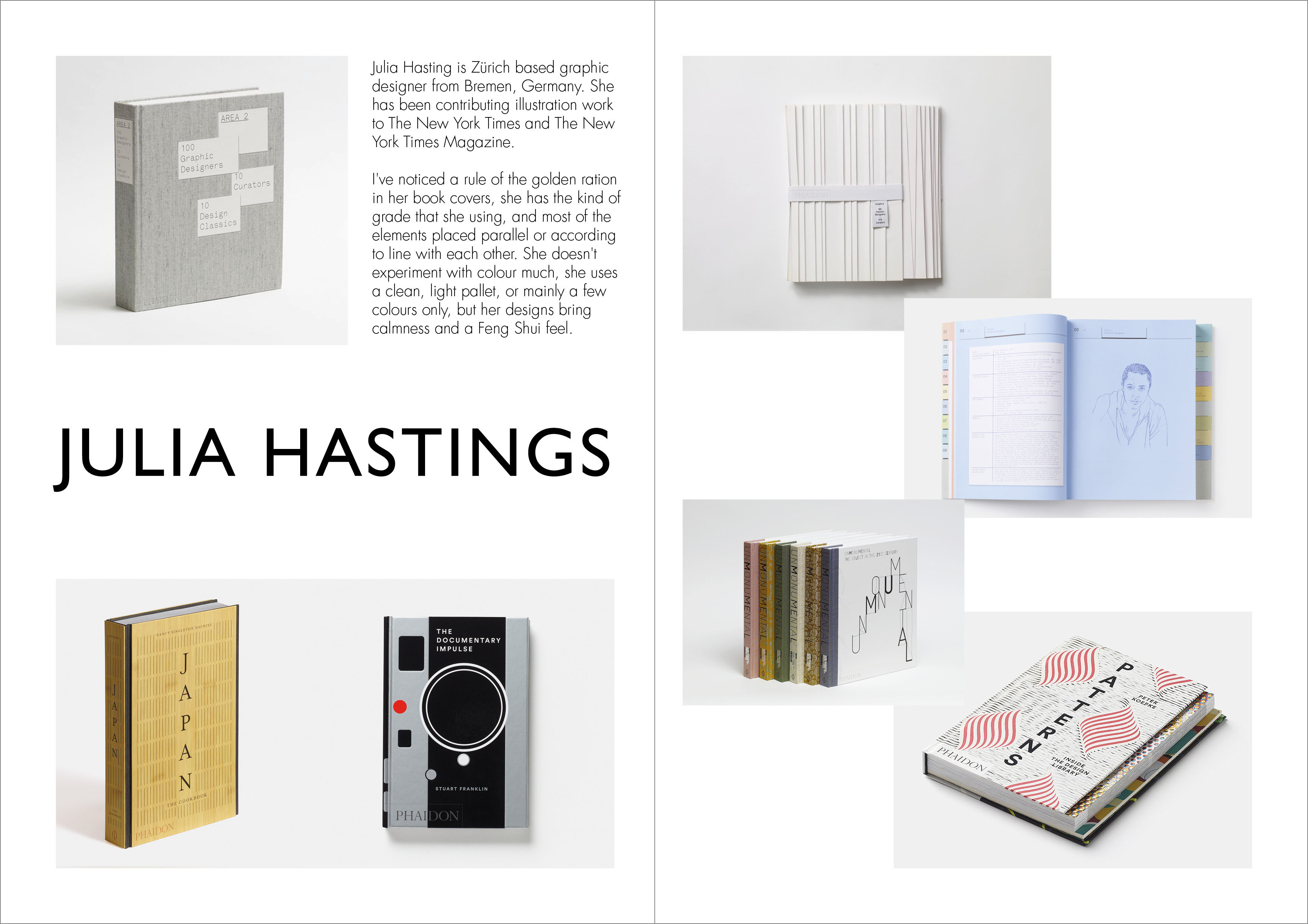
Julia Hastings
Julia Hasting is Zürich based graphic designer from Bremen, Germany. She has been contributing illustration work to The New York Times and The New York Times Magazine. I’ve noticed a rule of the golden ratio in her book covers, she has some kind of grade that she using, and most of the elements are placed parallel or according to line with each other. She doesn’t experiment with colour much, she uses a clean, light pallet, or mainly a few colours only, but her designs bring calmness and a Feng Shui feel. Her covers are based on conceptual thinking.


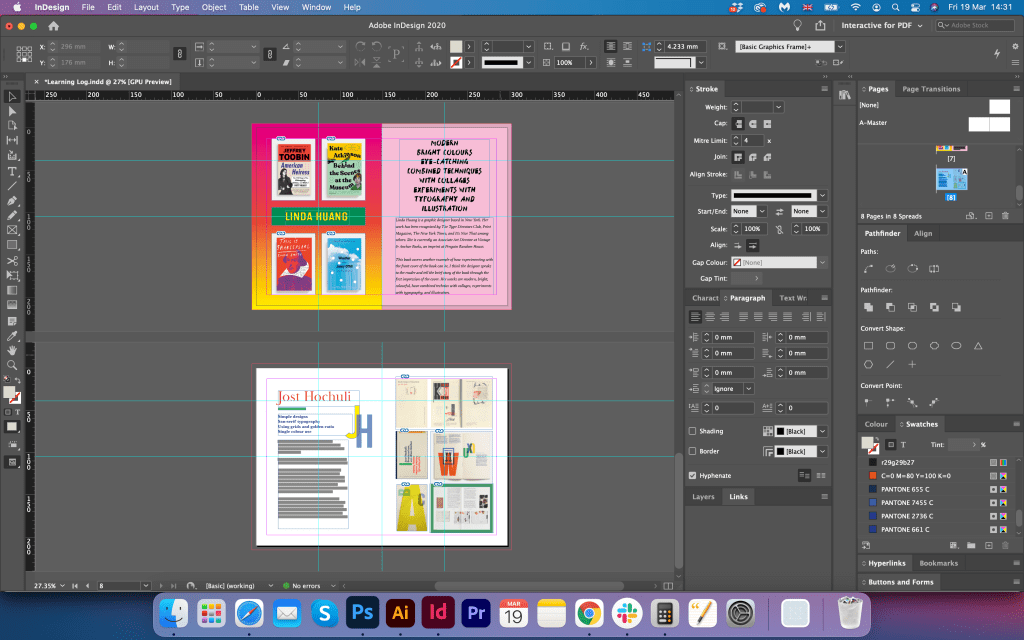
Linda Huang
Linda Huang is a graphic designer based in New York. Her works have been recognised by The Type Directors Club, Print Magazine, The New York Times, and It’s Nice That among others. She is currently an Associate Art Director at Vintage & Anchor Books, an imprint at Penguin Random House. This book covers another example of how experimenting with the front cover of the book can be, I think the designer speaks to the reader and tell the brief story of the book through the first impression of the cover. Her works are modern, bright, and colourful, and have combined techniques with collages, experiments with typography, and illustration.


In this little article https://spinemagazine.co/articles/linda-huang she explains where the idea for the design with an egg in the book cover came from, and I found this path explained very useful, as that is the prime example of critical thinking.

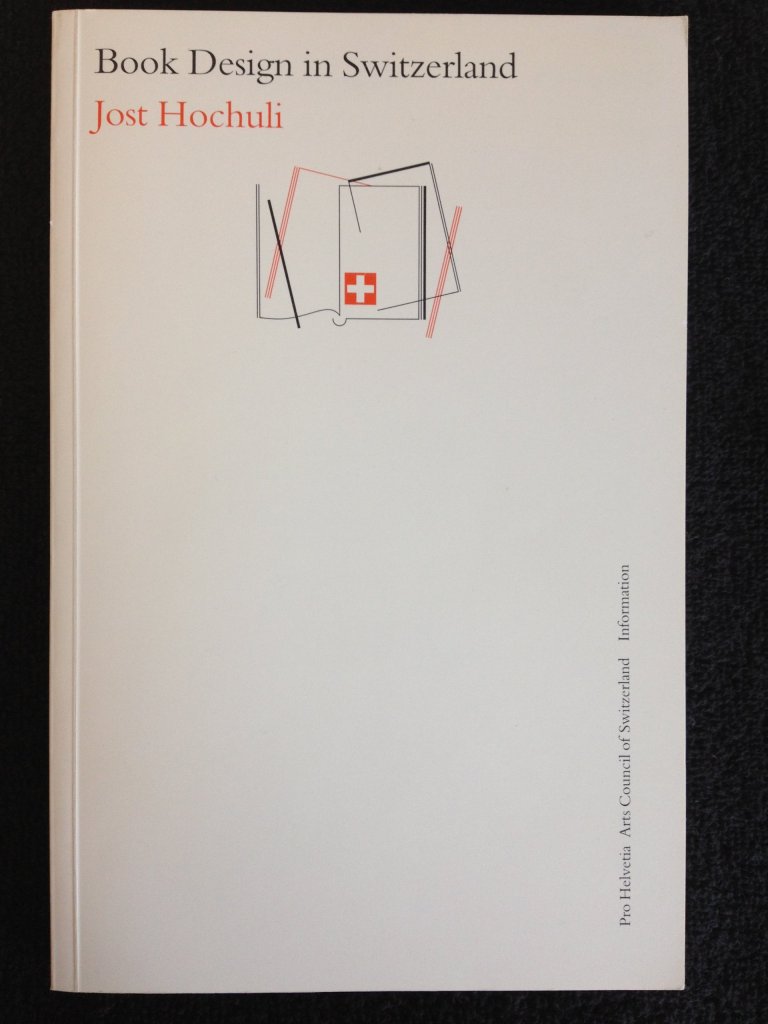
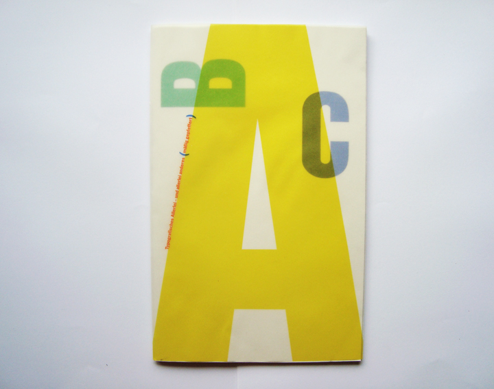
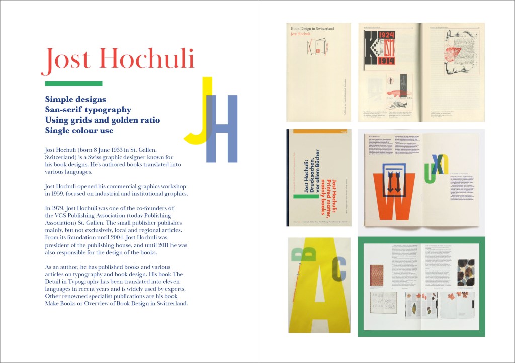
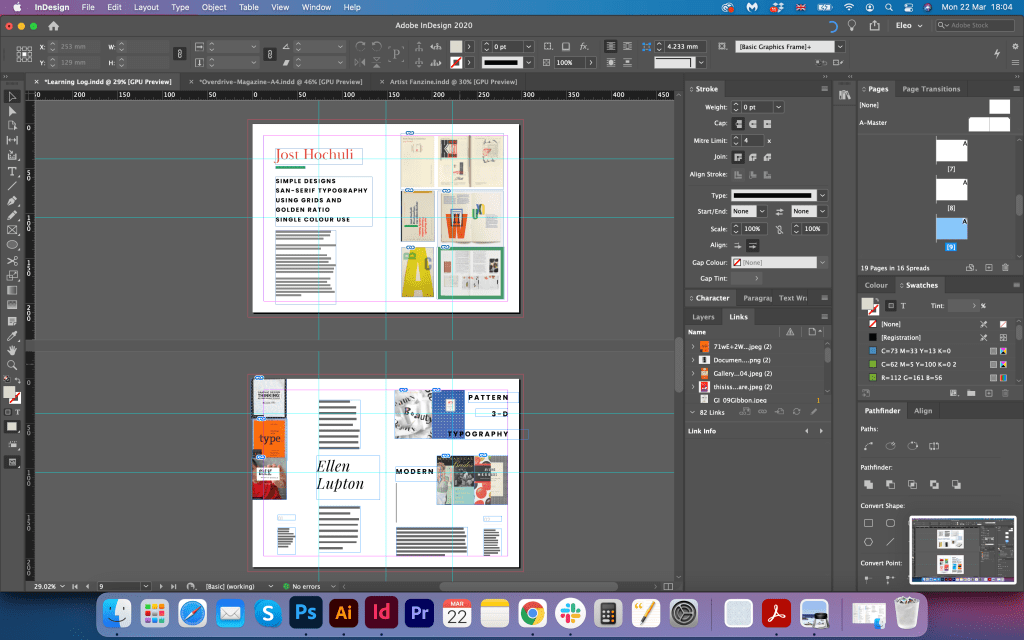
Jost Hochuli
Jost Hochuli is a Swiss graphic designer known for his book designs and typography. He is a person who explains how books should be designed, and he is an author of Designing books and Detail in typography. Below represent a fine example of his design style and Aesthetic. Jost Hochuli applied a conceptual approach to the book covers.

https://www.goodreads.com/book/show/2686719-jost-hochuli
https://modular4kc.com/tag/jost-hochuli/ (Accessed 15/03/2021)
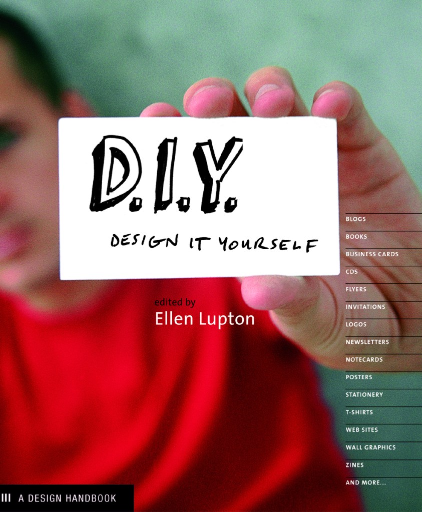
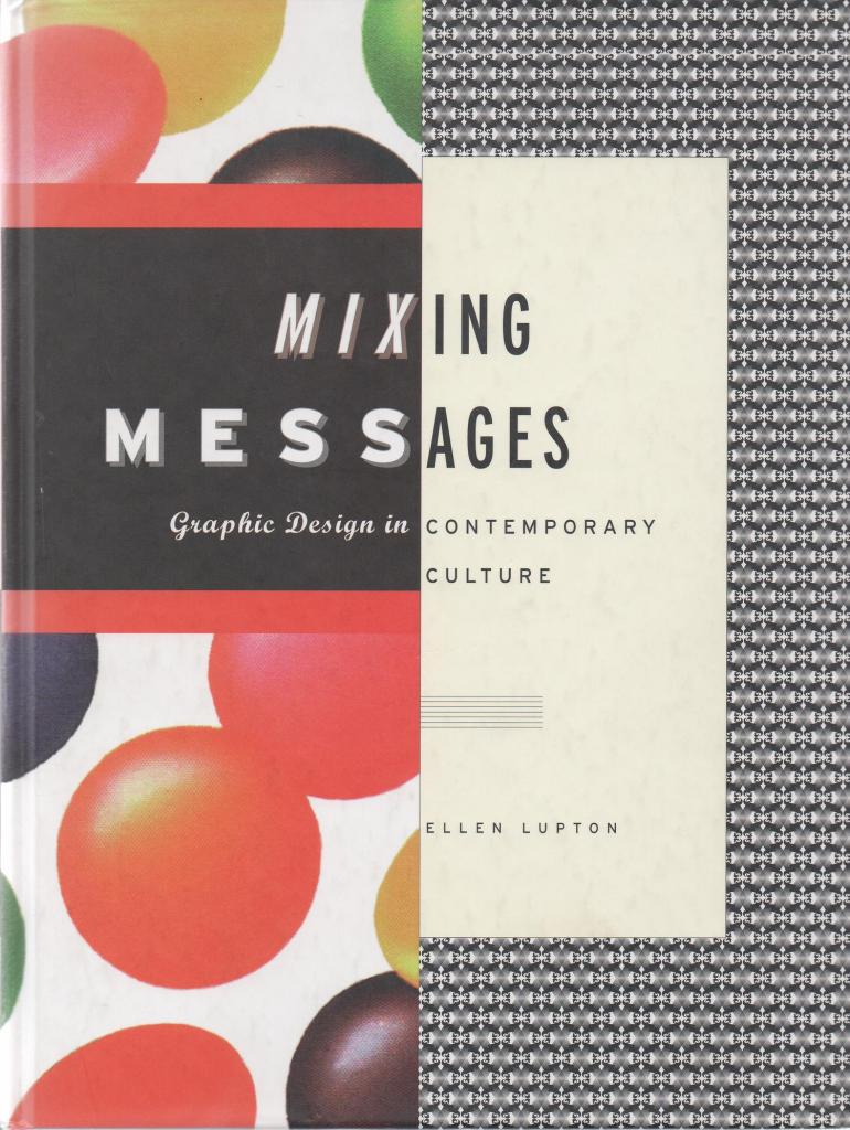
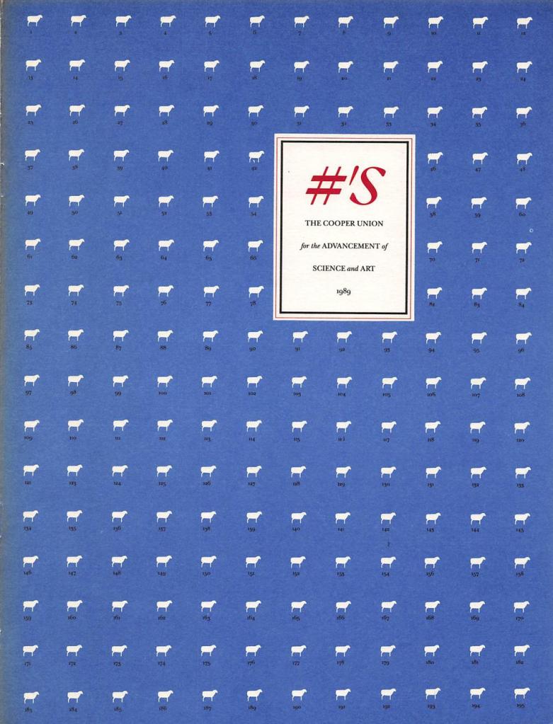
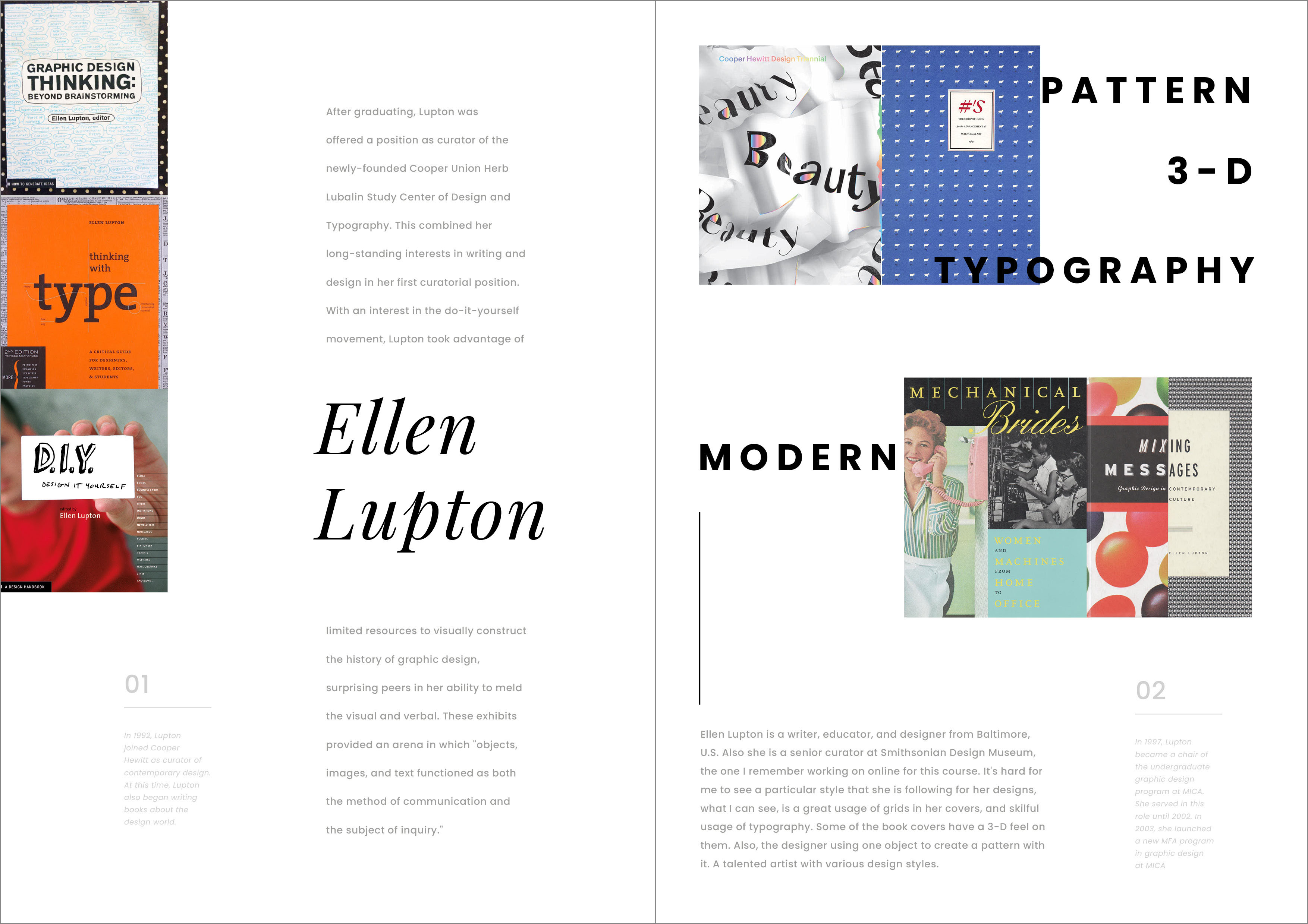
Ellen Lupton
Ellen Lupton is a writer, educator, and designer from Baltimore, U.S. Also she is a senior curator at Smithsonian Design Museum, the one I remember working on online for this course. It’s hard for me to see a particular style that she is following for her designs, what I can see, is a great usage of grids in her covers, and skilful usage of typography, collages and illustrations. Some of the book covers have a 3-D feel to them. Also, the designer uses one object to create a pattern with it. A talented artist with an expressive approach to cover design.


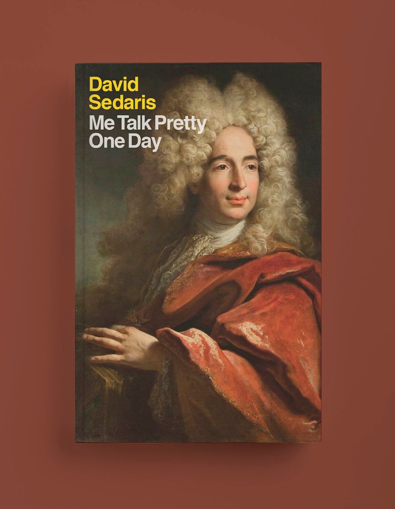
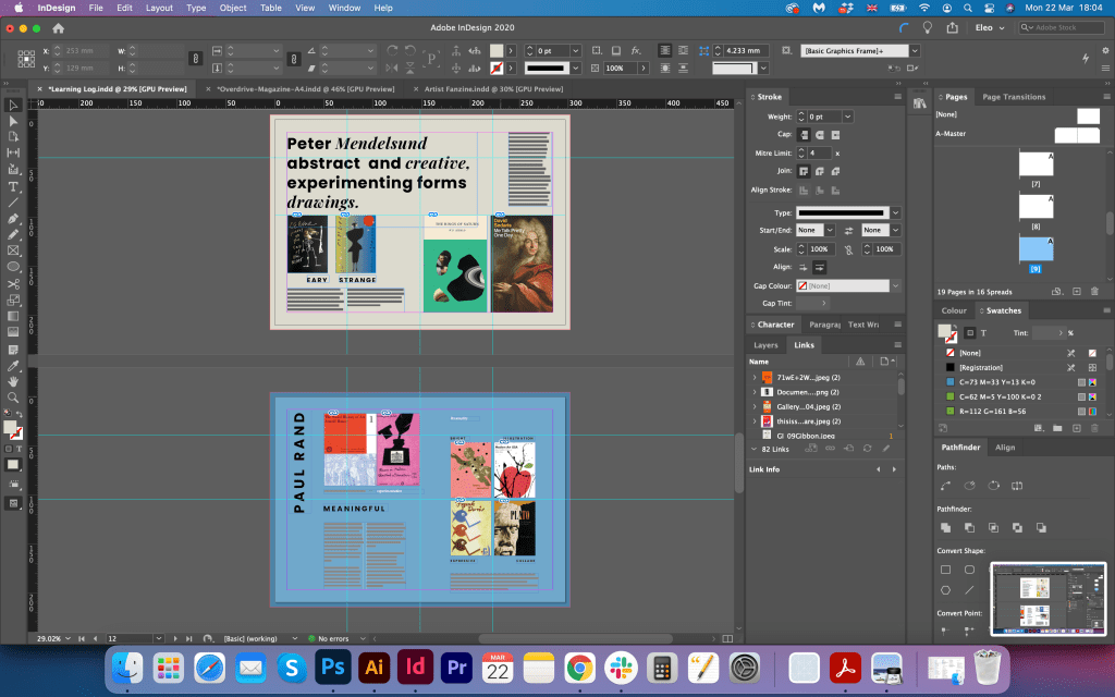
Peter Mendelsund
Peter Mendelsund is the creative director of The Atlantic, but he is the person who made his career from the very basic jobs, up to a professional designer. His works are easy, strange, abstract and creative. Peter has his vision for the objects and experiments with different shapes and forms for the covers, and he is not scared to be provocative. He has a big variety of fonts on his book covers, but at the same time, he uses classical motifs for his design. Also, I think his designs are eye-catching and have fresh ideas in them, a prime example of expressive book covers.


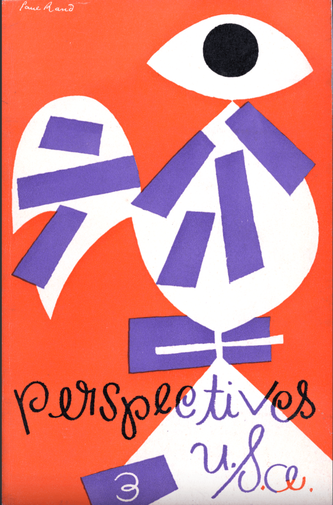
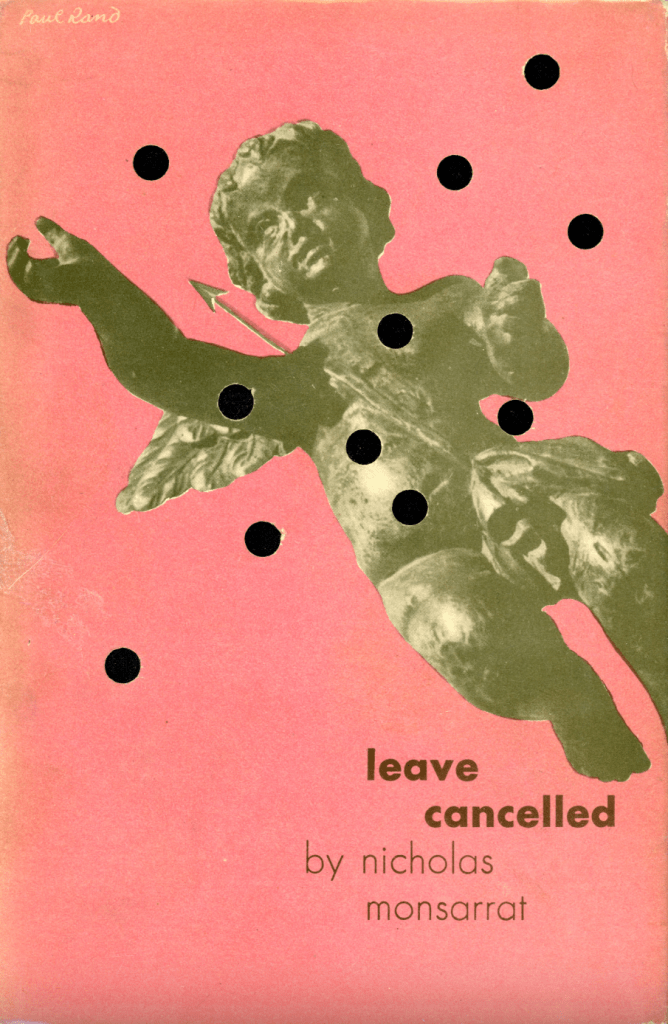
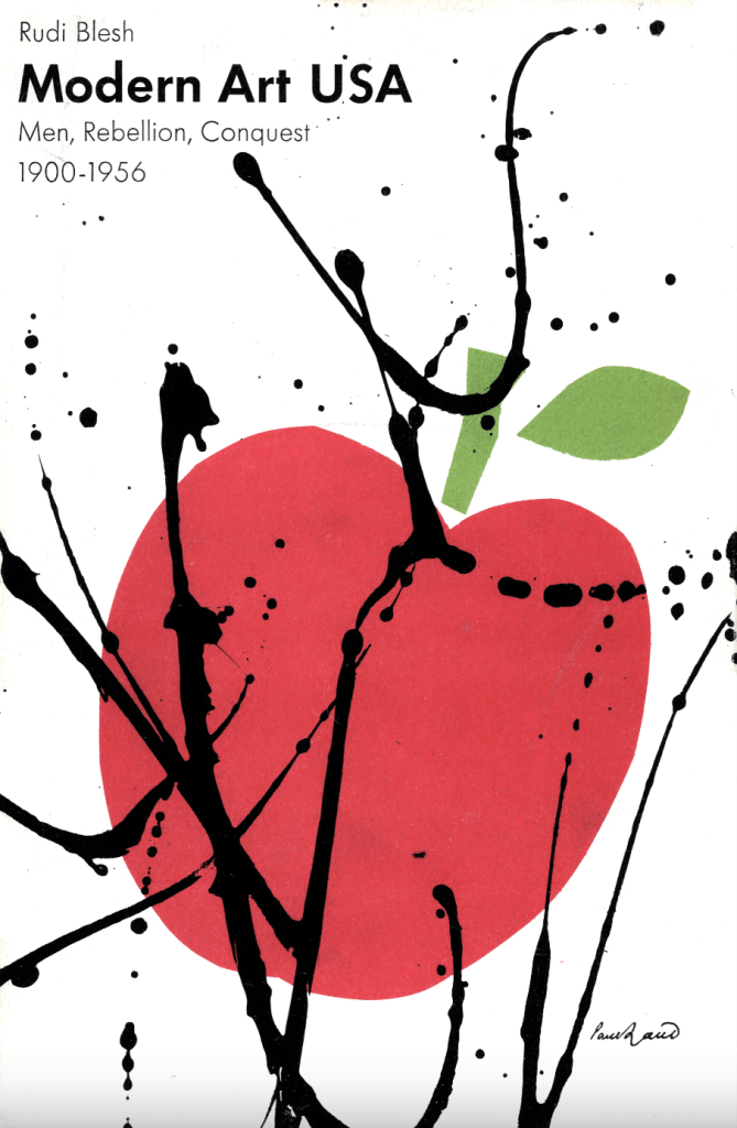
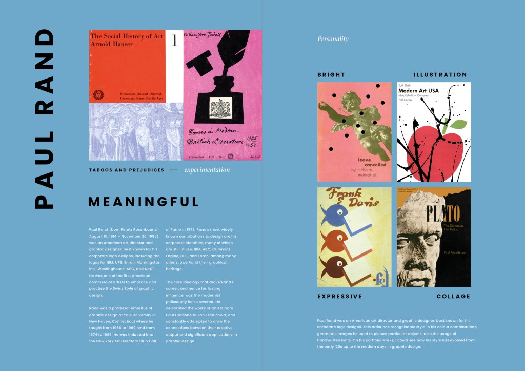
Paul Rand
Paul Rand was an American art director and graphic designer, best known for his corporate logo designs. This artist has a recognisable style in his colour combinations, geometric images he used to picture particular objects, also the usage of handwritten fonts. In his portfolio works, I could see how his style has evolved from the early ’20s up to the modern days in graphic design. I think these designs have a mixture of conceptual and expressive approaches.

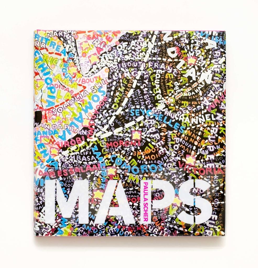
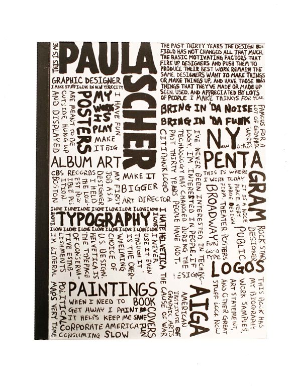
Paula Scher
Paula Scher is one of the most influential graphic designers in the world. She is famous for her conceptual ideas, creative designs and collaborations with such companies as Microsoft, Bausch + Lomb, Coca-Cola, the Museum of Modern Art, and many others. She has developed her recognisable voice in graphic design, and for book covers, she uses complicated schemes developed from fonts. Her colour schemes for book covers are simple coloured, but her solutions are very powerful and strong.

https://www.pinterest.co.uk/pin/207517495299985429/
https://www.uniteditions.com/products/paula-scher-works-concise-edition (Accessed 16/03/2021)

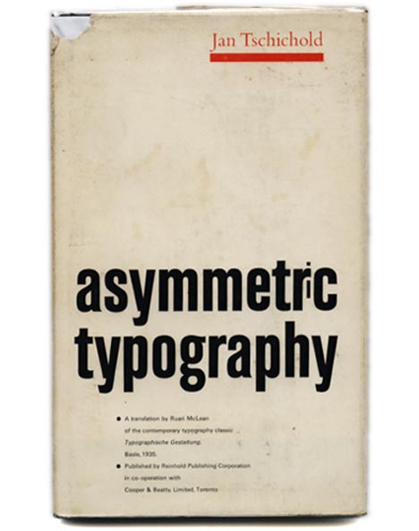
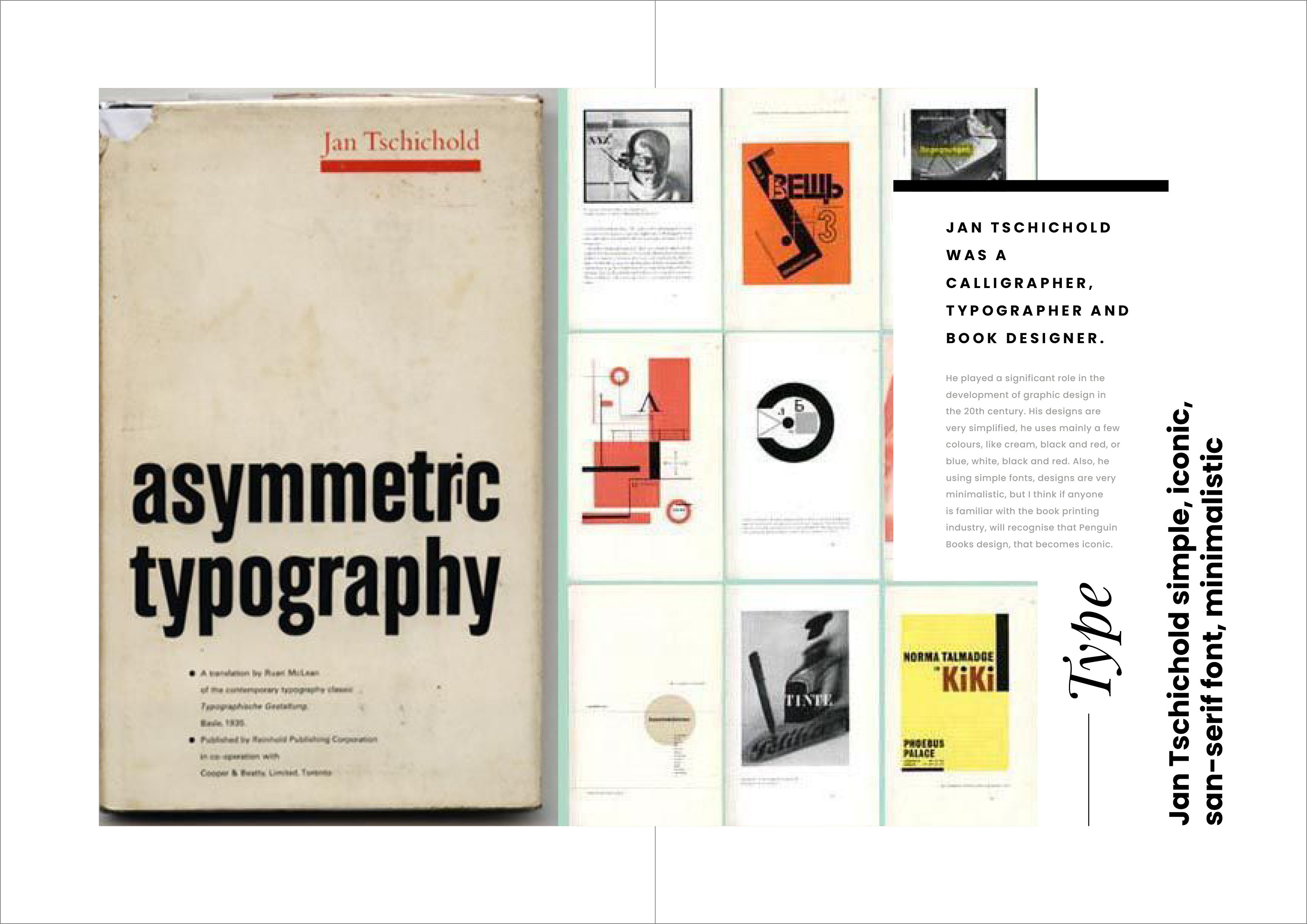
Jan Tschichold
Jan Tschichold was a calligrapher, typographer and book designer. He played a significant role in the development of graphic design in the 20th century. His designs are very simplified and conceptual. He uses mainly a few colours, like cream, black and red, or blue, white, black and red. Also, he uses simple fonts, and his designs are very minimalistic, but I think anyone familiar with the book printing industry, will recognise Penguin Books’ design, which becomes iconic.

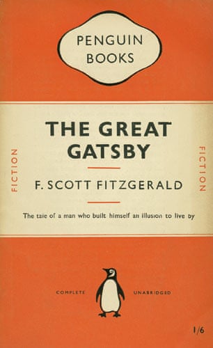
https://www.theguardian.com/culture/gallery/2008/dec/05/design (Accessed 16/03/2021)
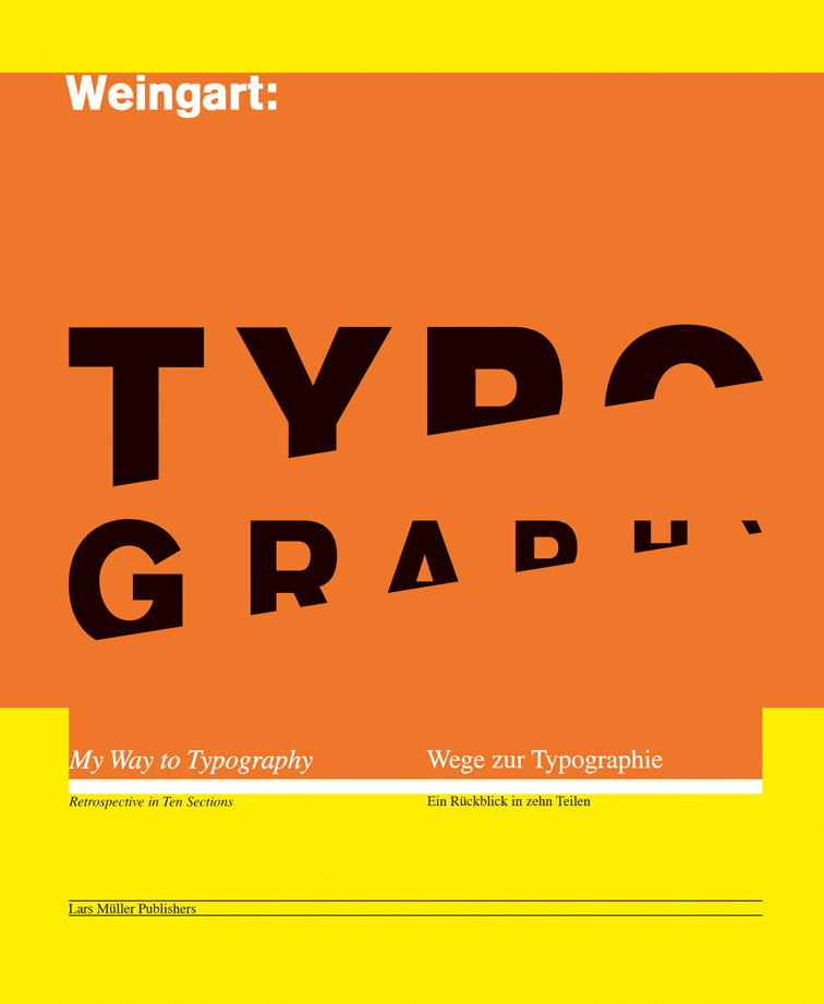
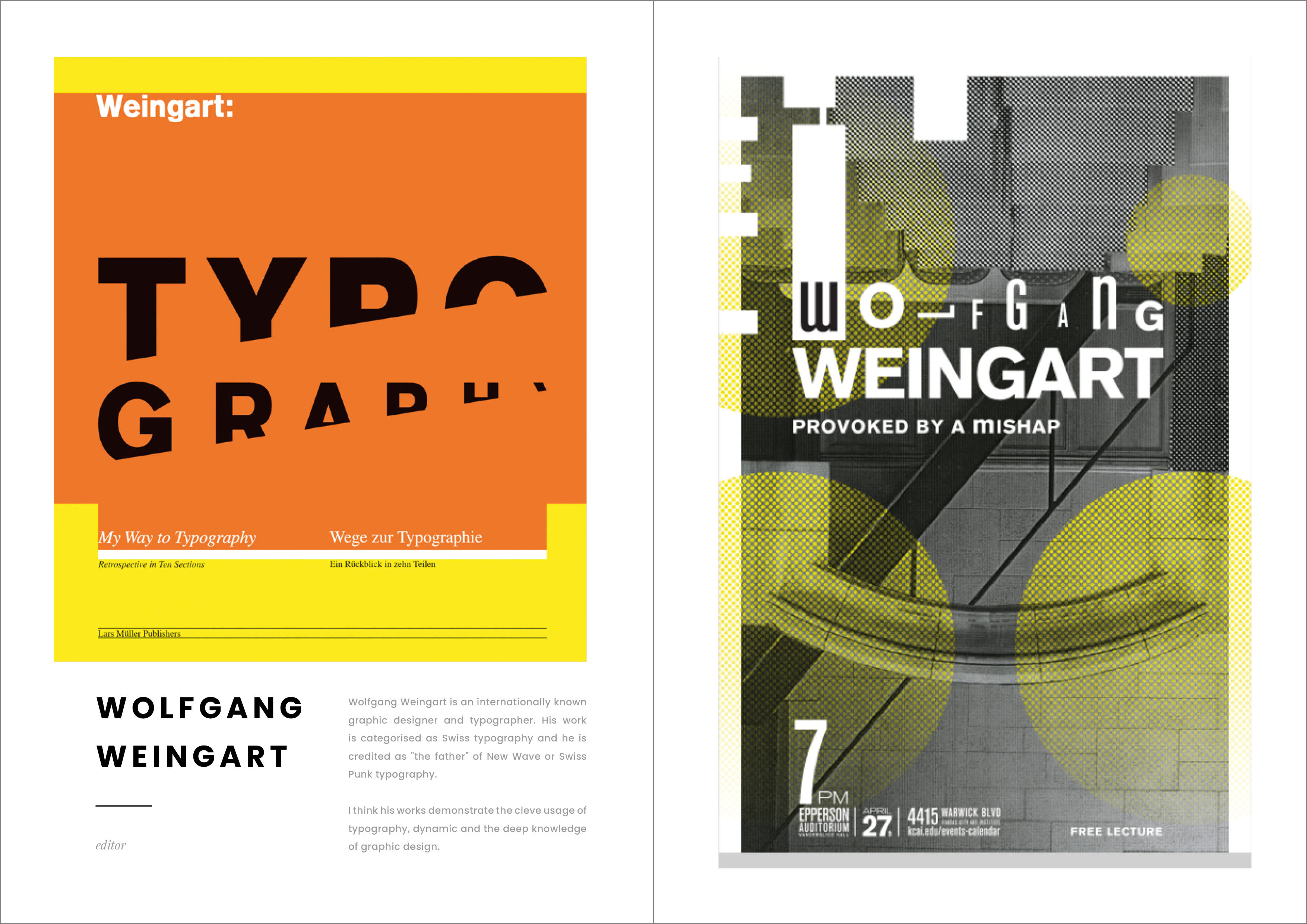
Wolfgang Weingart
Wolfgang Weingart is an internationally known graphic designer and typographer. His work is categorised as Swiss typography and he is credited as “the father” of New Wave or Swiss Punk typography. I think his conceptual covers demonstrate the clever usage of typography, dynamics and deep knowledge of graphic design.


Documenting book designers works in fanzine design
All book covers artists I documented in my learning log and created each template in InDesign. For convenience, I made a flip HTML brochure, with all pages gathered together in a pdf file. The link to it is below. Open in the new tab, please.
https://online.fliphtml5.com/temu/fujb/#p=1

Part 2
In the beginning, I wanted to clarify the difference between conceptual and expressive covers as a term. Conceptual covers that are based on conceptual thinking attempt to represent a book’s content through visual allegory, paradox, or cliché in an amusing fusion of image and title. Also, conceptual book covers have the name “a smile in the mind”, so the potential buyer will think, “oh, this book has a witty cover”. But an expressive approach to cover design is often used in novels and short stories, the aim is to communicate visually and conceptually. Drawing, mark-making, and symbolism are often used in expressive covers.
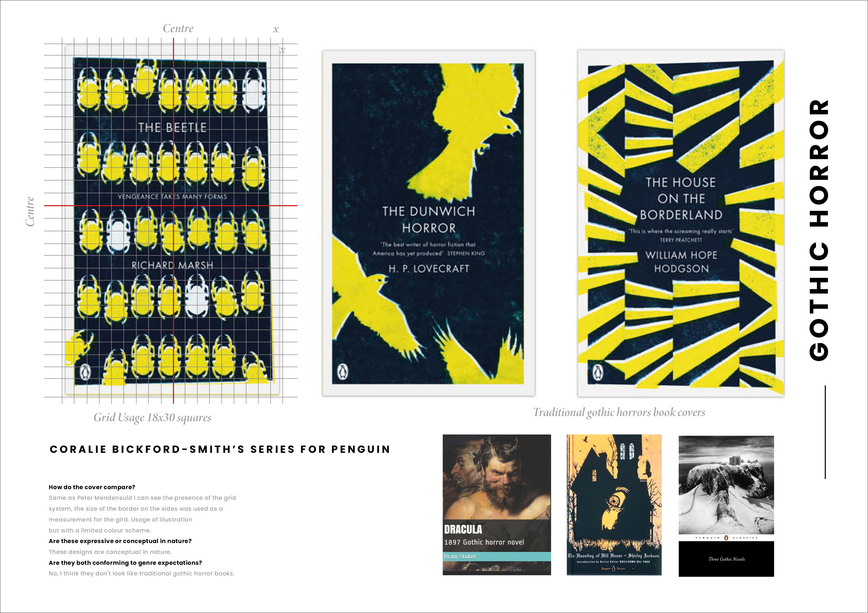
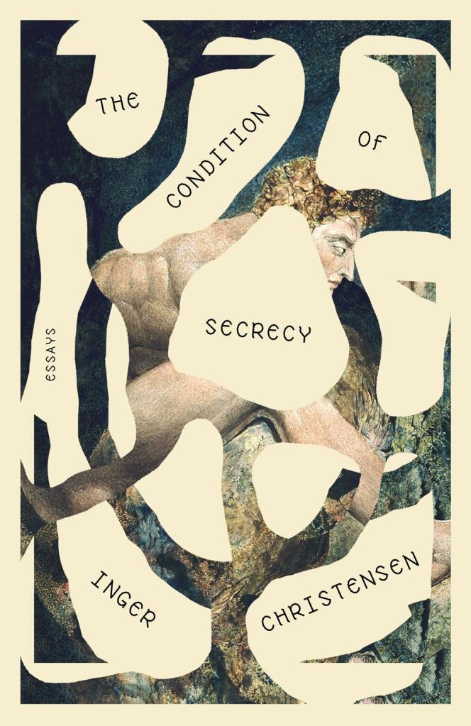
Below I compared Peter Mendelsund’s Kafka series and Coralie Bickford-Smith’s gothic horror series for Penguin. From this book’s covers, I could see similarities in the conceptual approach. Both book covers had illustrations in them, and both of them used a grid. But if to look deeper designs were different as well, for first covers was used hand-written font, for Penguin covers was used san-serif font aligned to the centre.

I made a grid for both designers’ examples, and I could see that their illustrations and book names fit into that grid frames. I think because of that it gives an aesthetical feel as well.
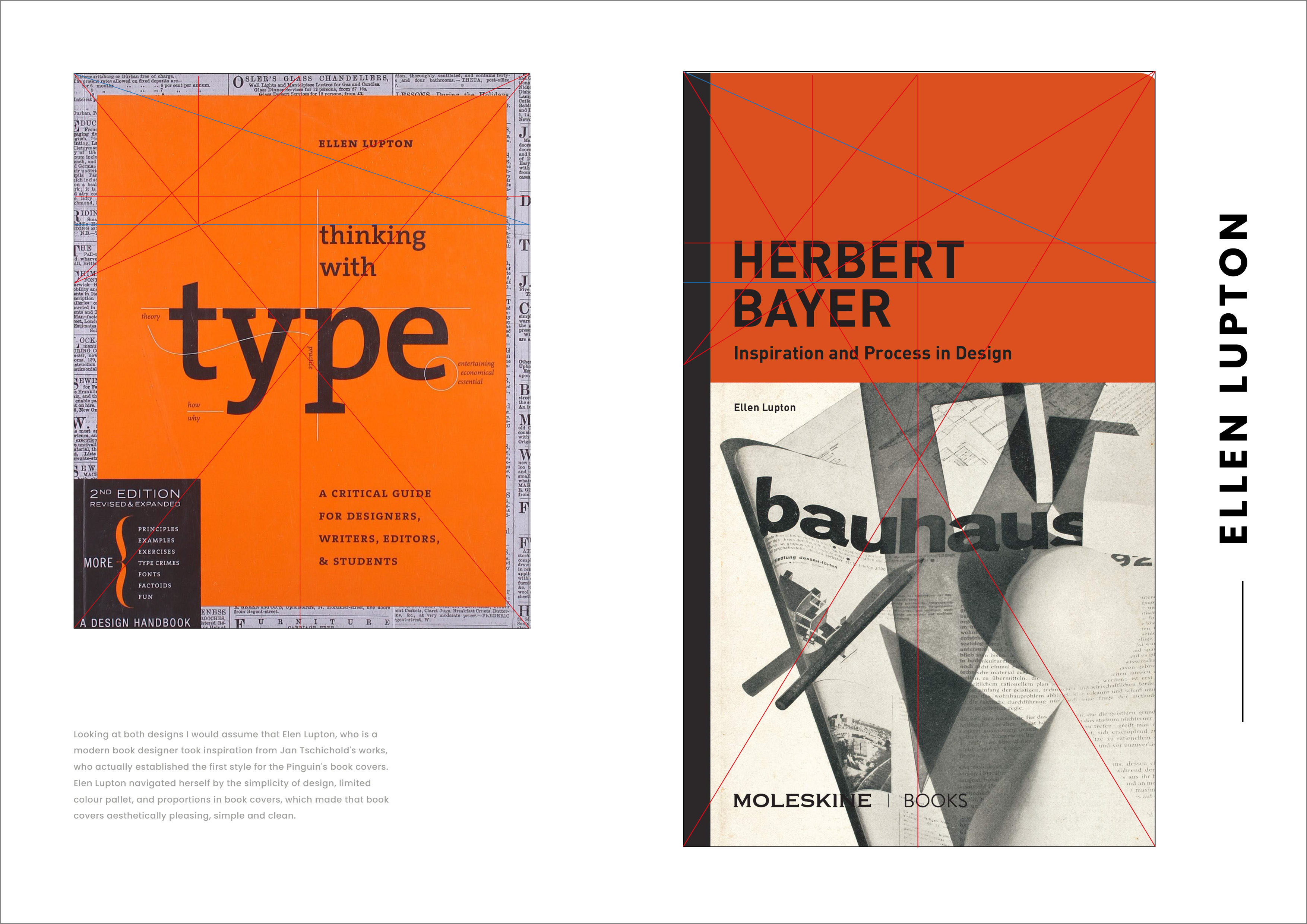
Here I’m comparing book covers of Jan Tschichold and Elen Lupton.
In this case, I went down the line of looking at designs through Villard de Honnecourt’s diagram and devised a method of geometrically dividing space. I think both designers used this method for their designs. But not only do proportionally those books look similar, but also they have similarities in the colour pallet and the feel of the design. For example, both use typography for the book covers, minimal colour scheme, orange and cream, orange and grey.

Looking at both designs I would assume that Elen Lupton, who is a modern book designer took inspiration from Jan Tschichold’s works, who established the first style for the Pinguin’s book covers. Ellen Lupton navigated herself by the simplicity of design, limited colour pallet, and proportions in book covers, which made the book covers aesthetically pleasing, simple and clean.
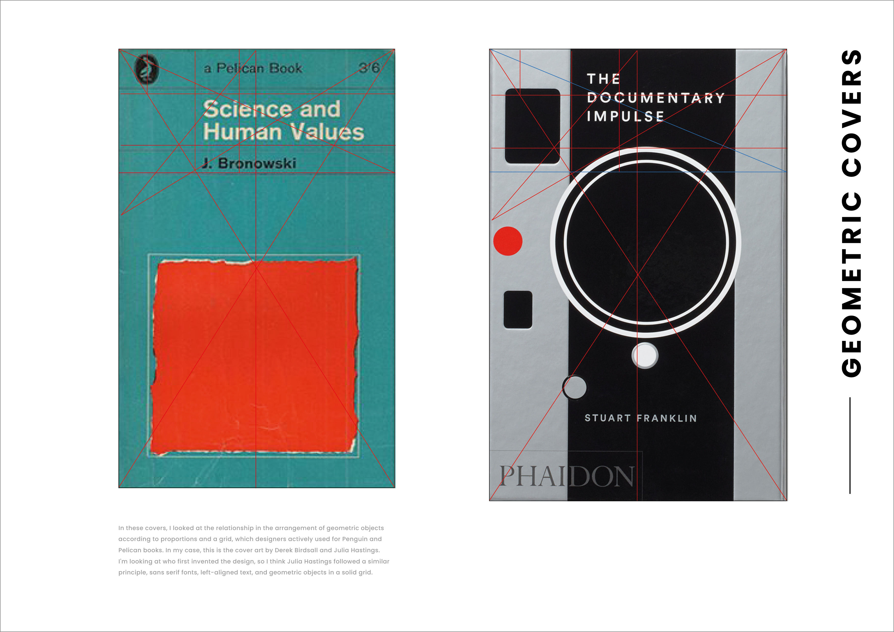
In these covers, I looked at the relationship in the arrangement of geometric objects according to proportions and a grid, which designers actively used for Penguin and Pelican books. In my case, this is the cover art by Derek Birdsall and Julia Hastings. I’m looking at who first invented the design, so I think Julia Hastings followed a similar principle, sans serif fonts, left-aligned text, and geometric objects in a solid grid.
In these designs, I saw similarities in performance. Both book covers have used the sketch to show an important figure, and the main background is a bright colour. The name of the book used calligraphic handwritten font, written in the freestyle. Both book covers didn’t keep the grid or golden section for design, they are more artistic and done in a creative, expressive way.

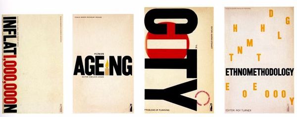
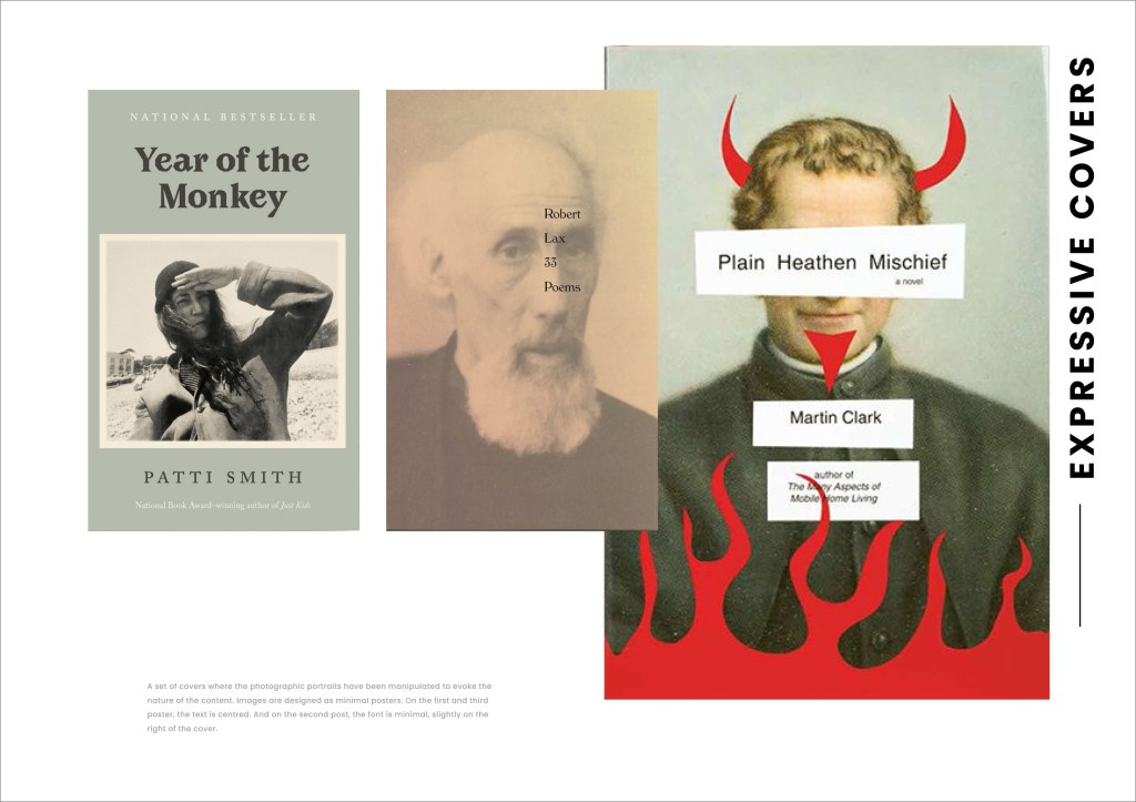
A set of covers where the photographic portraits have been manipulated to evoke the nature of the content. Images are designed as minimal posters. On the first and third posters, the text is centred. And on the second post, the font is minimal, slightly on the right of the cover.
This page shows three covers that make use of patterns. The first cover used a grid for the little animals in them, all aligned and strictly parallel to each other. The second cover has pencil shavings in chaotical orders and text hidden in it. And for the third cover little lines were used, the simple pattern colour makes it look special, as it has bright blocks for the text on the top of it.

This part has been quite complicated for me to go around. From the beginning, it looked like all covers were too different to compare them, and even when I saw similarities, it was not easy to explain in which way. That part of the exercise gave me an understanding of book covers, I learnt how to see them deeper and see each part of the book cover design as a vital role in the general feeling of the final design.
Part 3
For this part of the exercise I wanted to go through some artists that I found quite interesting, but at the same time, I tried to learn their approach to the design.
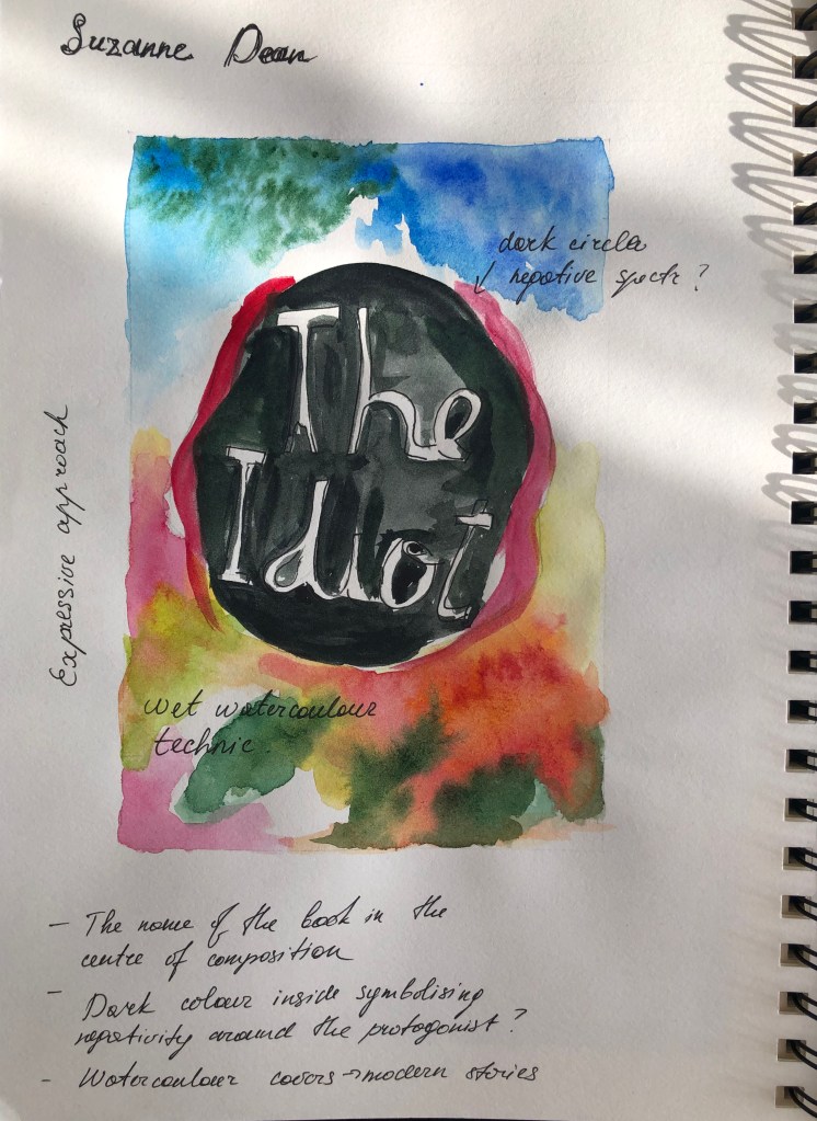
Susanne Dean
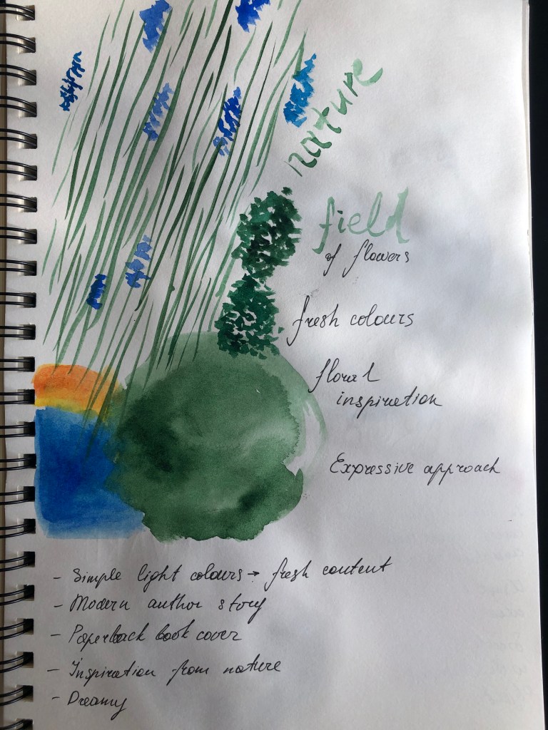
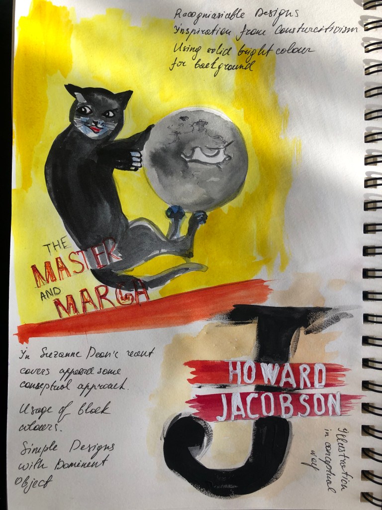
For example, the first artist Susanne Dean is the closest to my understanding of book cover design. She uses floral, watercolour and painting techniques in her book covers. She transports the mood of the book into the cover, so the potential reader could feel the book from first sight. I found her works quite inspiring and artistic. I tried to replicate some of her designs in my learning log, using watercolour and colourful pens. I made some notes in my sketches. I’ve found out that Susanne Dean was the author of the book for Yuval Noah Harari. Sapiens. A History of Humankind, where she used similar design techniques as Howard Jacobson’s book cover, with free space around the name, where she places a little fingerprint in the centre, and big font for the name of the book. Also, she designed the series of books for Michail Bulgakov, the cover with a cat on the bright yellow background has a feel from the ’60 book cover, but in modern performance. Her later covers were influenced by modern approaches, she became rather a conceptual book cover designer than an expressive.
Julia Hastings. Peter Mendelsund
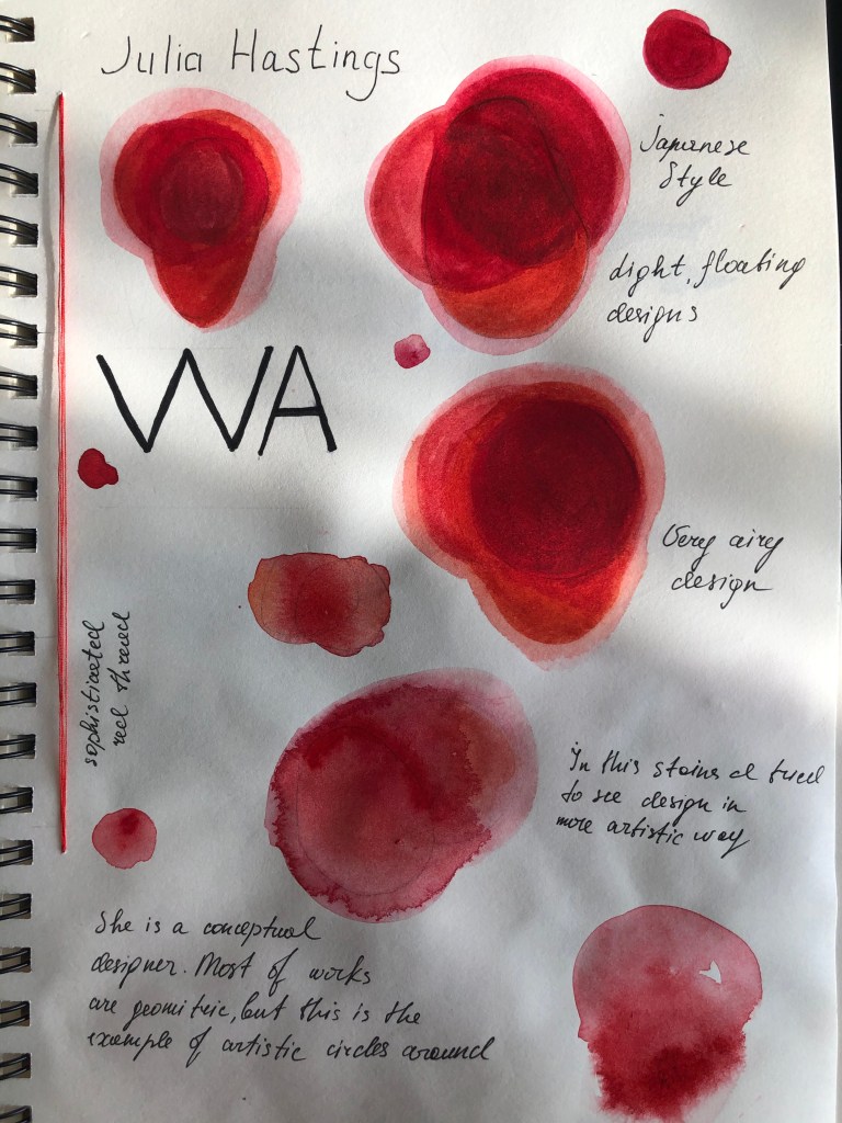
I found Julia Hastings designs very professional, simple and complicated at the same time. And the reason for that is, that she uses very minimal elements of design, but her works are very deep and pleasing for the eyes. She has loads of free, light space around, she uses grids, and she experiments with shapes, but she is mainly the conceptual designer. I found it is quite a complicated form of design, to create something minimalistic but powerful. In my sketches I wanted to try to play around with red round shapes for the book cover, that to have a feel for that book cover design, and experiment with the transparency of the red. I painted those beautiful red stains, they remind blood, flowers, and something floating. I can see that Julia Hastings has inspiration from Japanese style in her book design, and I think that is the culture you need to learn, that to understand that way of thinking.
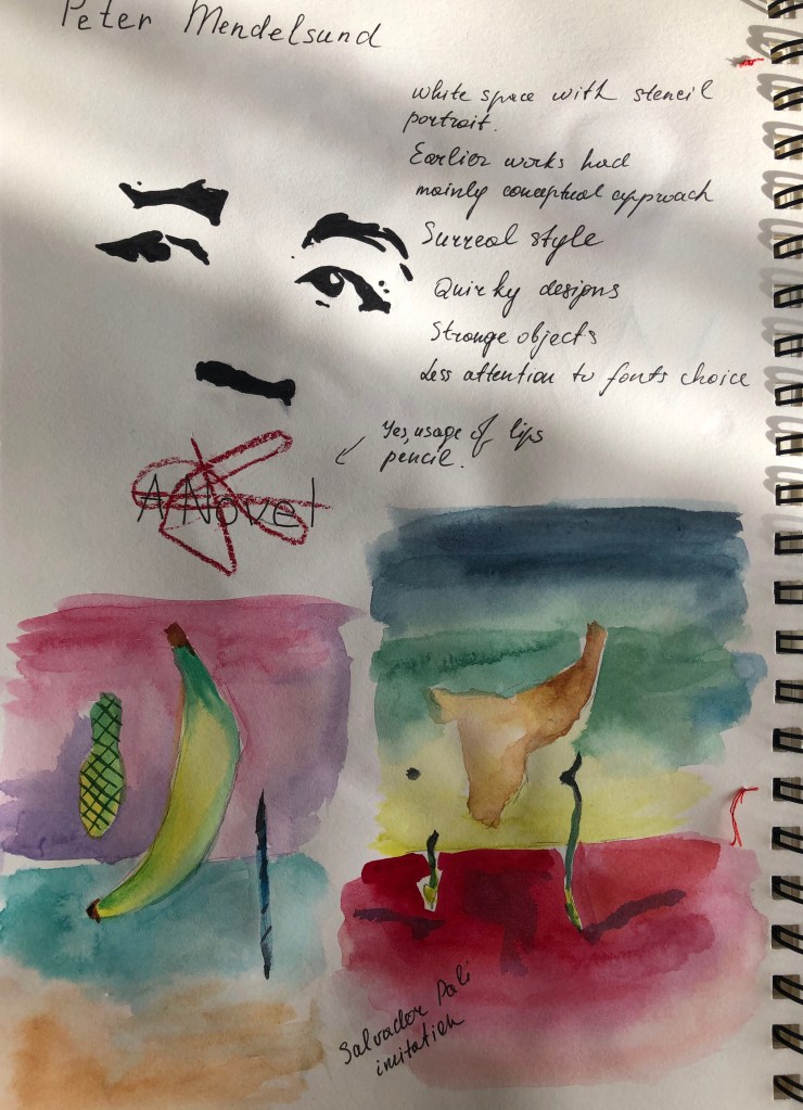
Also, I admire Peter Mendelsund’s works, as his designs out of my understanding of the book cover design approach. He has this unique style, of abstract images, his works like from the different reality, animals, people and objects look surrealistic. He uses watercolour, photography, arts, collages, sketches and drawings in his works. In those examples below I tried to perform some of his book covers that I found interesting. That is the stencil portrait of the man, with a pencil sketch around the mouth. Interesting portrait. Also, I used watercolour to replicate Peter Mendelsund’s experiment with shapes and forms like Salvador Dali’s art. No one did it before for the book cover, and it looks quite innovative.
Part 4
In the final part, I need to identify different book designers you find visually engaging. To do this, I visited my Pinterest board, and went through some articles for the best book covers, that to learn for myself what book covers I found the most interesting and why. It is quite an exciting process to bring the appreciation of the book covers to a new level now, as I’ve learnt so much about book cover artists, the components of the book, different techniques and styles in book covers, that I see them into the completely new way. Below I presented book covers that I found the most exciting and interesting from my point of view.
Jamie Keenan
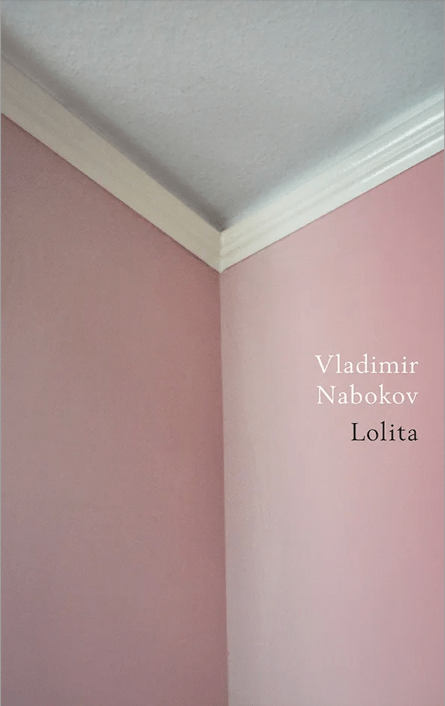
Jamie Keenan London-based designer, started his career at the BBC weather channel, leading into graphic design, branding, and identity, but eventually lend his skills to book cover design. Jamie’s designed beautiful covers for works of fiction and non-fiction, including the reinvention of the cover for Lolita – a novel that has sent numerous designers into panic spirals, this is the book cover that no one has ever seen before. These book covers are a combination of collages, experiments with fonts, and objects, but mainly they are expressive.
Jamie treats book cover design as great fun because. He doesn’t see it as only a book cover, but as a piece of packaging, a mini-poster, corporate identity, something to use illustration on, or photography, the designer can be purely typographical, figurative or conceptual with just the right amount of type to play around with, have complete ownership. That is what I like about this book’s covers presented below, they have freedom and personality at the same time.


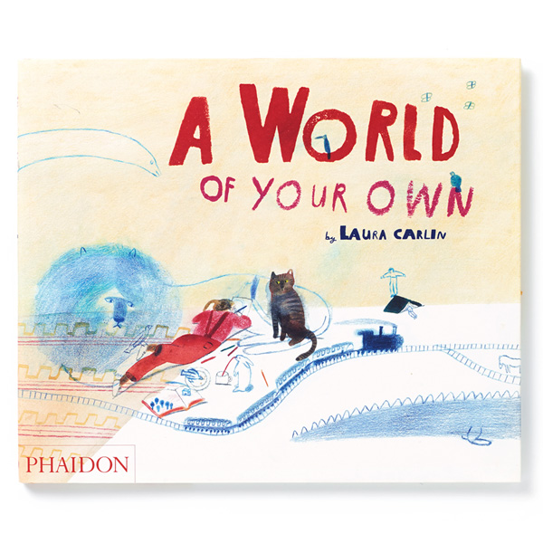
Laura Carlin
Laura Carlin’s book covers what I remember from the Core Concepts course. Laura Carlin is an award-winning London based ceramicist and illustrator, whose eye-catching designs and quirky sculptures have developed a cult following in the UK and abroad. She is famous for her imaginative illustrations. She designed not only book covers, but she is the author of the book that I’ve bought recently “A world of your own”.
Laura Carlin’s vessels and decorative pieces are full of surprises. Laura applies her playful aesthetic to paper, ceramic and even household items turning the mundane into the whimsical. That is quite complicated for me, I think to do that kind of design the artist should have a great imagination and have the vision coming from inside. That’s why I admire her works.


https://www.pinterest.co.uk/pin/AUQWXq-kQgWyuVEABhvdKCDG2x_fhp5-zD7RtnwQWikOa91Ma8gZ0Ag/
https://www.pinterest.cl/pin/508203139178098059/
http://www.lauracarlin.com/books
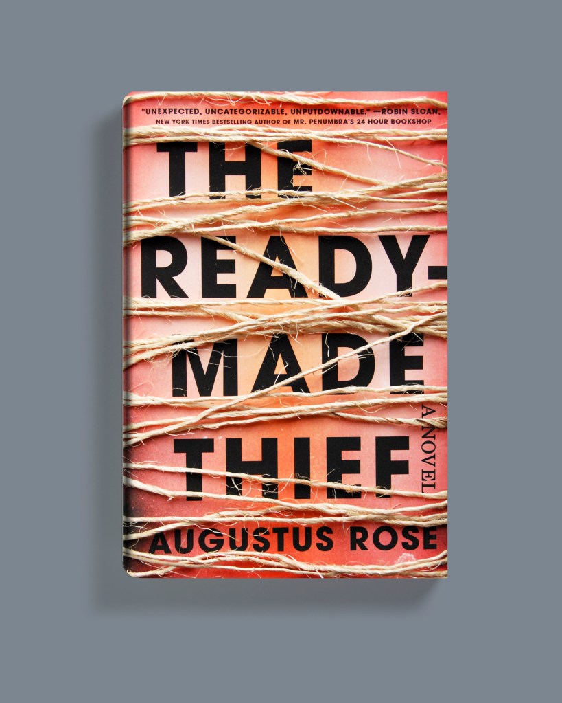
Jaya Miceli
Jaya Miceli is a book cover designer, illustrator, and the art director for Scribner, an imprint of Simon and Schuster. I found her works interesting as she use a book cover as a canvas, and created her designs like a picture in oil. She is working with her hands, using a paintbrush and starts her design from the painting first. Also, she uses stitches for her books, or wrapping them with rope and then taking a picture of them for the book cover.


Jaya Miceli‘s brief interview about her inspiration for book cover design is below.
Joan Wong
The last designer I wanted to describe in the exercise is Joan Wong. She worked at Penguin Random House where she designed covers for Chimamanda Ngozi Adichie, H.G. Wells, Samantha Irby, and Jonathan Lethem. She’s also a frequent collaborator with the New York Times, the New Yorker, and The Atlantic, helping to illustrate current events and think pieces about the world as it is today.
I’ve noticed about my preferred book covers that there is something that joins them together, whether it’s similarities in style, imagination and colours, or whether that is an expressive approach that I’m attracted to. Also, I’ve noticed that most of the book covers that I see as beautiful examples of the creative part, they have collage style, eye-catching performance and unusual font choices.


Conclusion
I think this exercise has been the hardest for the Creative Book Design part. I’ve challenged myself to make deeper research as possible, and I’ve leant how to see details in the covers, that I’ve never noticed before. I’ve learnt that behind famous book covers stand famous designers, it was a vital part that understanding the book cover as an important component of the whole design system itself. I found the process of learning them in such detail very effective and vital for the upcoming Assignment.
