The kind of stock you choose will be informed by the nature of the job you’re doing. If you were working commercially, then checking paper quality – the weight and finish of the paper – is something you would do with your client, as paper choices can add both quality and cost to a design job. The advent of high quality digital printing in almost every high street has made high finished standards much more achievable and affordable – although you might be amazed at what can be achieved with a photocopier and coloured 80gsm paper!
Knowing what papers are available and their qualities is an important part of what you might offer as a commercial book designer. One way to do this is by requesting sample books from commercial paper merchants, or talking to your local printers, who can give you a swatch of the papers they recommend for you to share with your client and keep for future reference. Another way of doing this is by looking at as many different kinds of books as you can and critically start to gauge the weight, grain and finish of the papers. Do all books keep the same paper choices throughout? What’s the relationship between the covers and the paper inside? Which books do you like the feel of, and why?
Analyse the binding style of the books you’ve collected. How does the book block adhere to the cover? How does it adhere to the spine? Is it stitched or glued? You’ll notice that in case-bound or hardback books, the sections, or signatures, are sewn together and glued to the spine. Paperback books, on the other hand, are more likely to be ’perfect-bound’, where the pages are glued together and then directly onto the covering.
Research
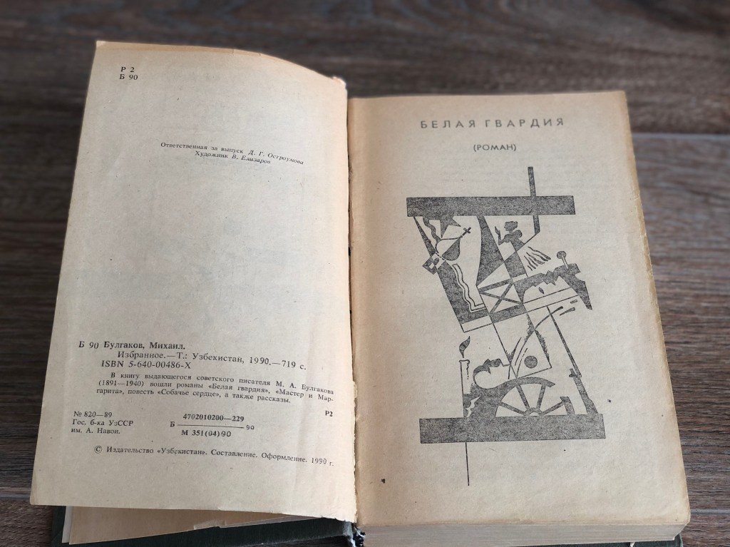
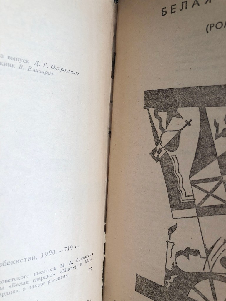
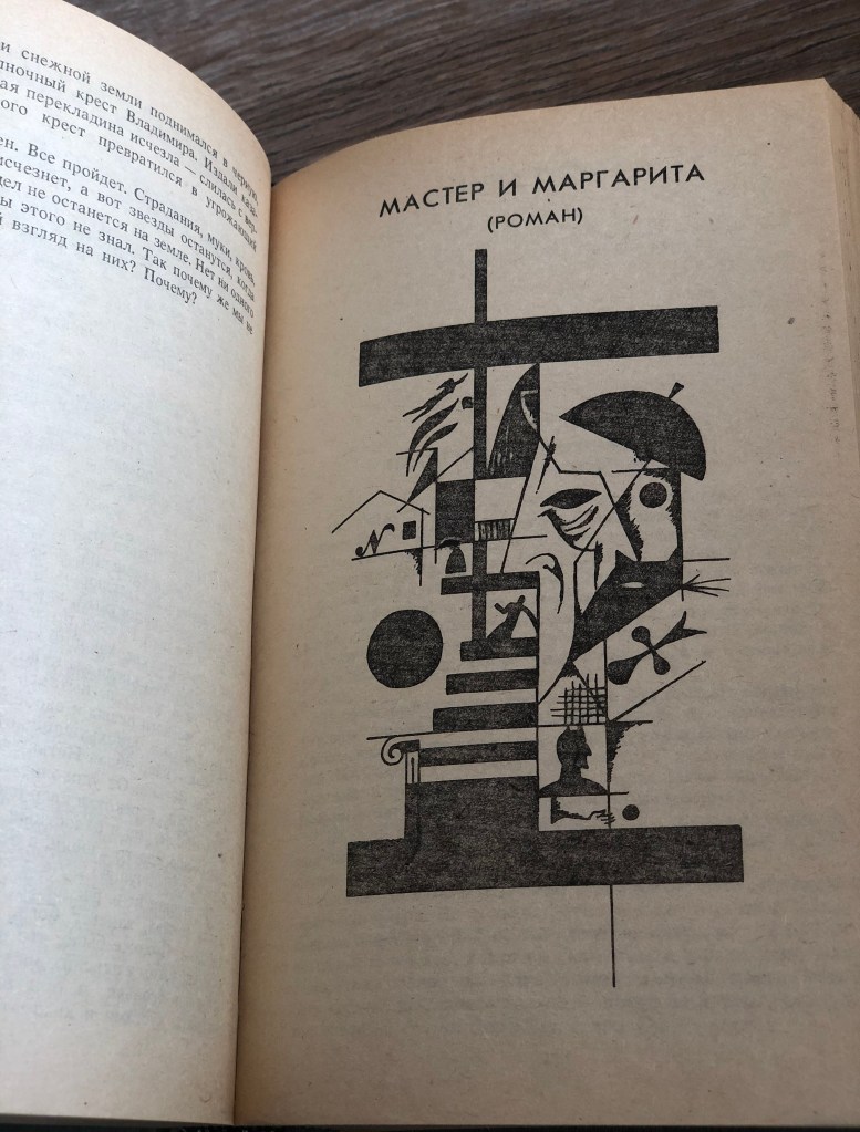
Here I would like again to analyse a quite old book that I have in my home library. I’ve read this novel by Mikhail Bulgakov ‘Master and Margarita’ two times, and it’s quite good, one of my favourites. What is special about those older books that I have, that I can examine them in more details, and with time book became less immaculate, compare to a modern or new book. Inside parts of the book can be seen in more details, which is better for exploration.
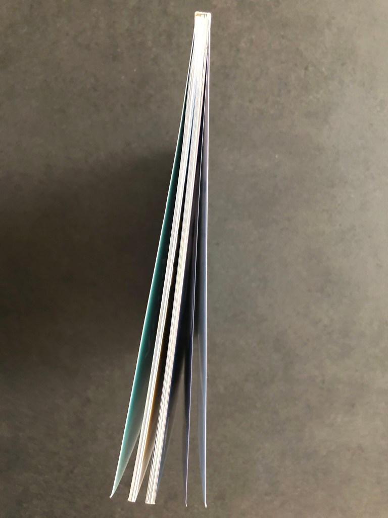
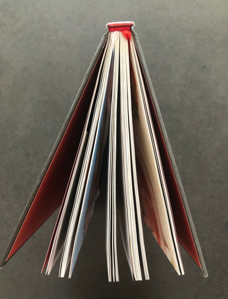
I’ve decided to start examining the book from the top, to look at the headband, which is black and white. All leaves glued to the type of canvas that goes inside if the book. Then that block is glued to the spine. Book has 23 sets of signature (bundles of papers), each of them has 7 leaves of paper, that were bent in the centre, so it creates 14 leaves together, and later they were stitched between each other in 4 places.
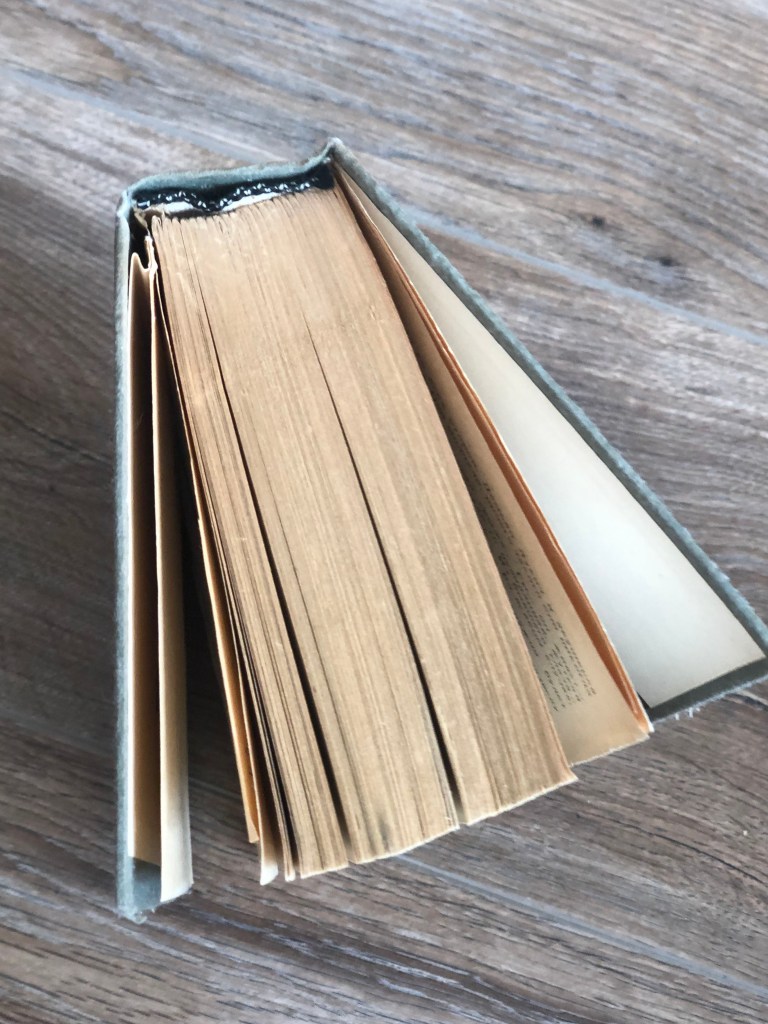
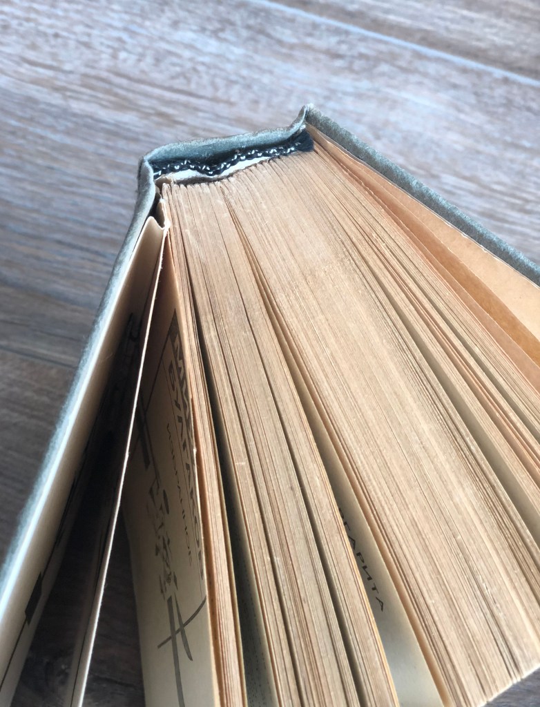
It doesn’t create a perfect bind, as with time heavy pages could pull the whole block away from the spine of the book, and as a result, fell apart. I can see from the example of soft book covers, even though they are still quite old, glueing directly to the spine of the book, creates more secure binding. In some places book is still held together, but in some parts could be seen problematic zones. The pressure of the opened book can pull leaves away from the base.

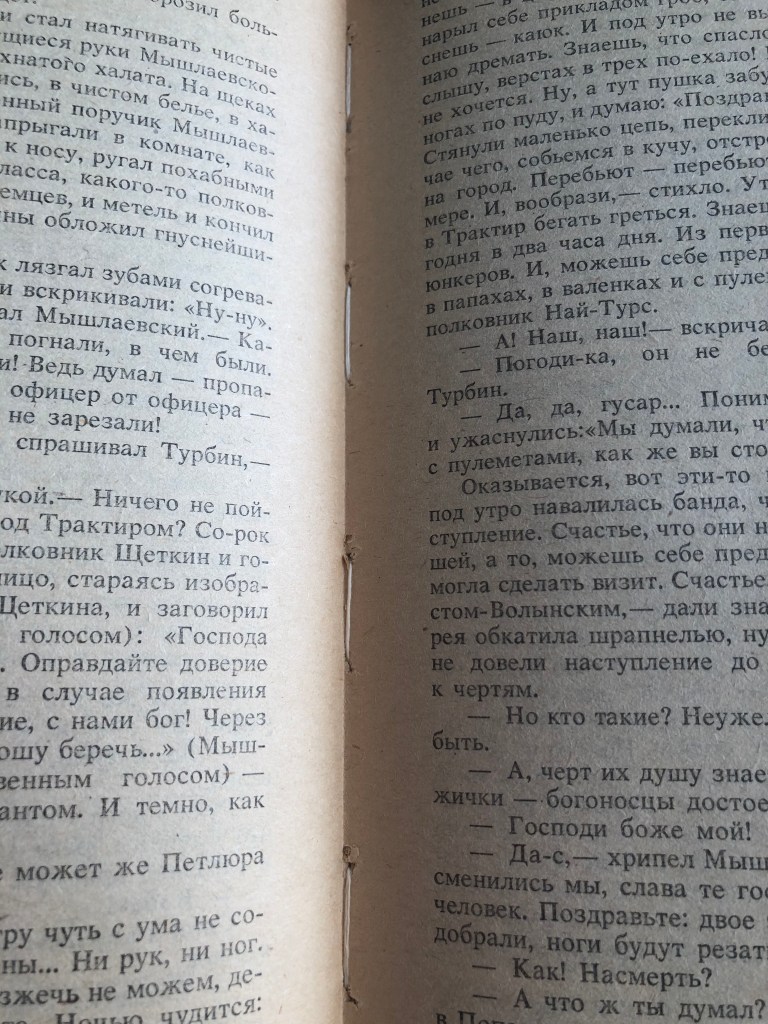
For many books in the past was used that cheaper type of paper. What I like about it, is the smell and feel of the texture, it’s a practically vintage type of pages with offset touch. Feels like there were made from a recycled type of paper, with a slightly yellow tint. Modern books publishers use white glossy papers, which is more resilient to time, but it doesn’t give that feel of an ancient book.
Flyleaf was glued so tight to the next page, so it pulls the next page ones I opened that endpaper.
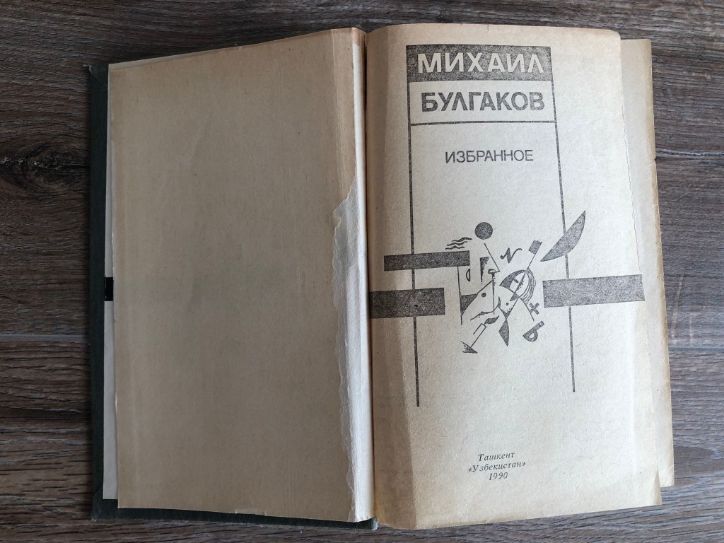
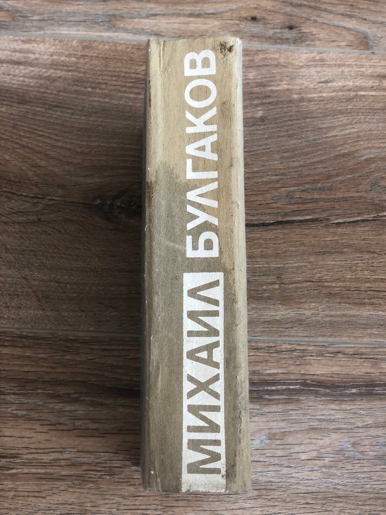
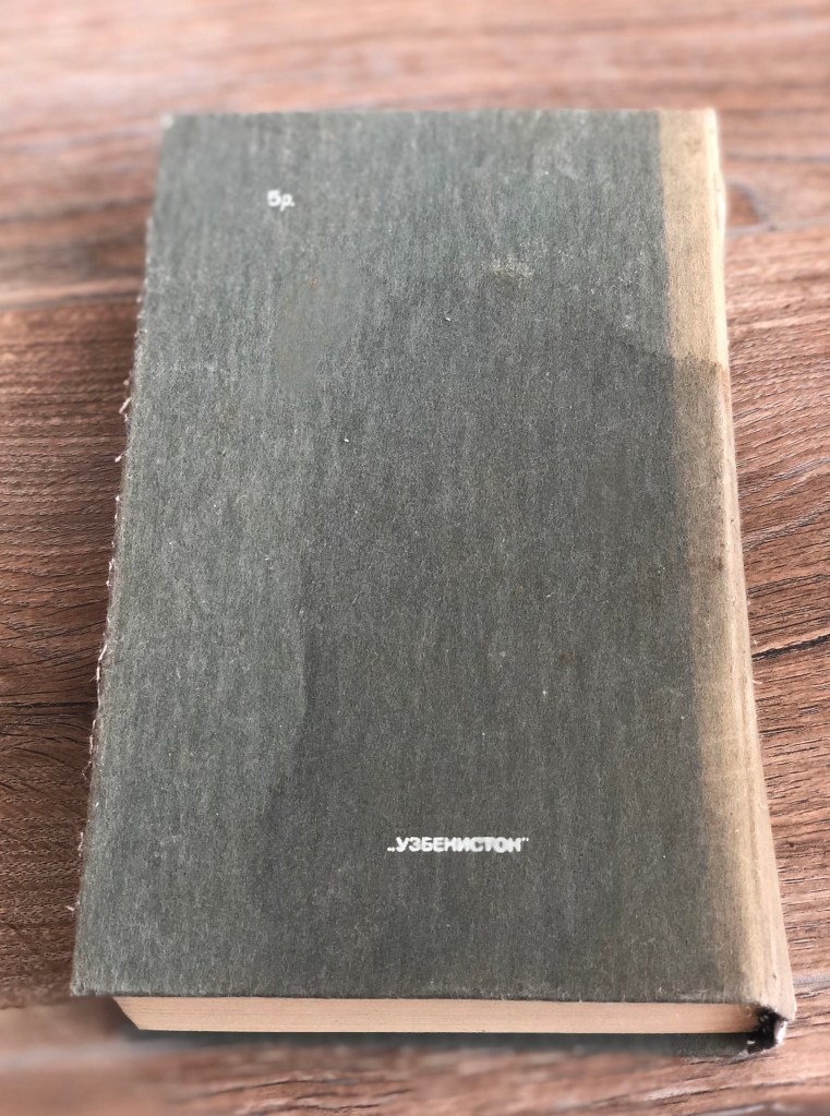
The cover has that interesting fabric feel like it was made from the wool type of material. That is probably the kind of design paper for book covers. As a result, not much design could be used for it, so the designer could offer only one colour white print on the top, which looks like gouache type of paint on the top. Book doesn’t have bios, blurb’s, critiques quotes or any others additional information. Just the name of the author, book name, publisher name and the price.
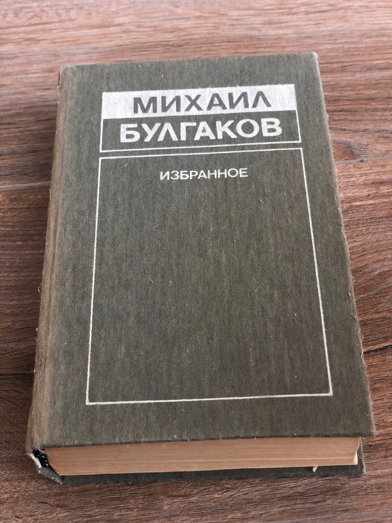
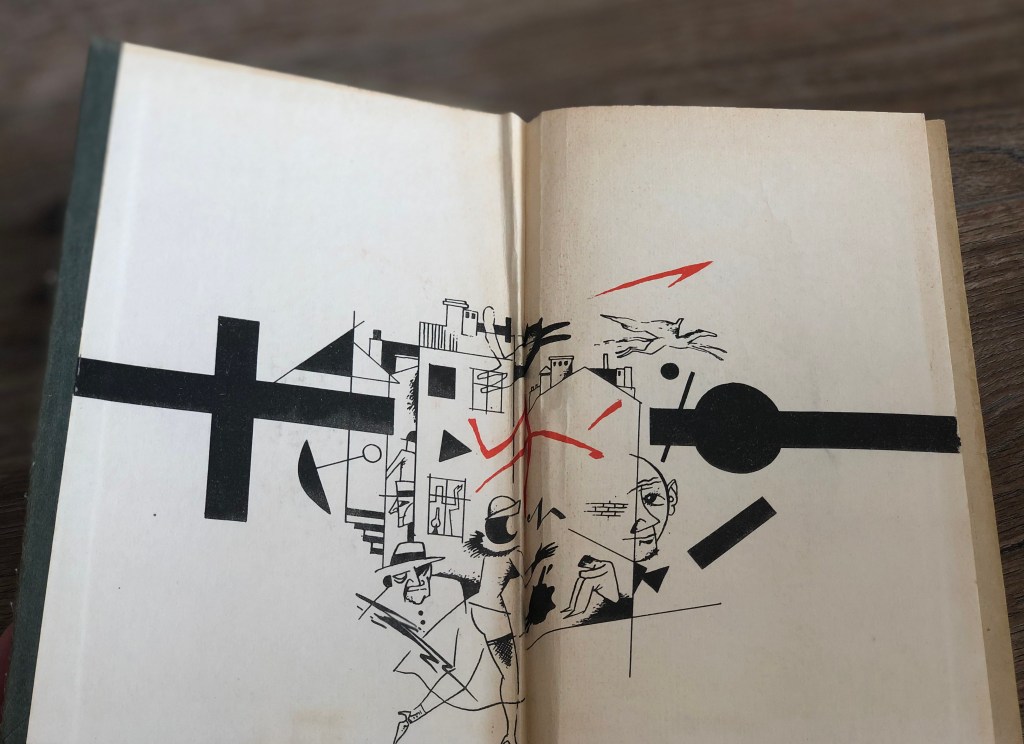
The cover design is minimalistic, have only straight lines and angles in it, therefore designs inside of the book has a complimentary design style to the cover. I can see similarities with Rodchenko and Kandinsky style, geometric designs, with colours such as black, white and red for the endpaper.
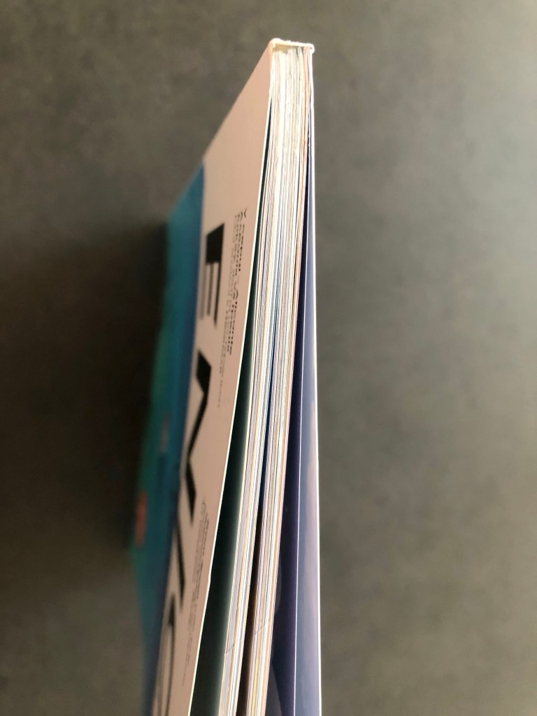
Enjoy Magazine
This is a completely different example to the previous book, as the magazine is modern printed, it has a thin spine, only 6 mm, and all pages glued directly to the spine. When I opened the spread, I could not find staples and stitch with threads in this magazine, so I’m guessing for magazines usually used the principle of glueing pages between each other.
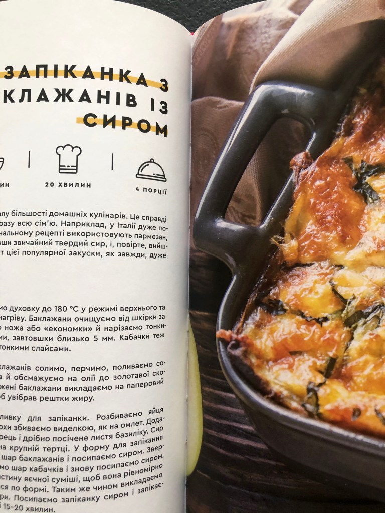
Culinary Book
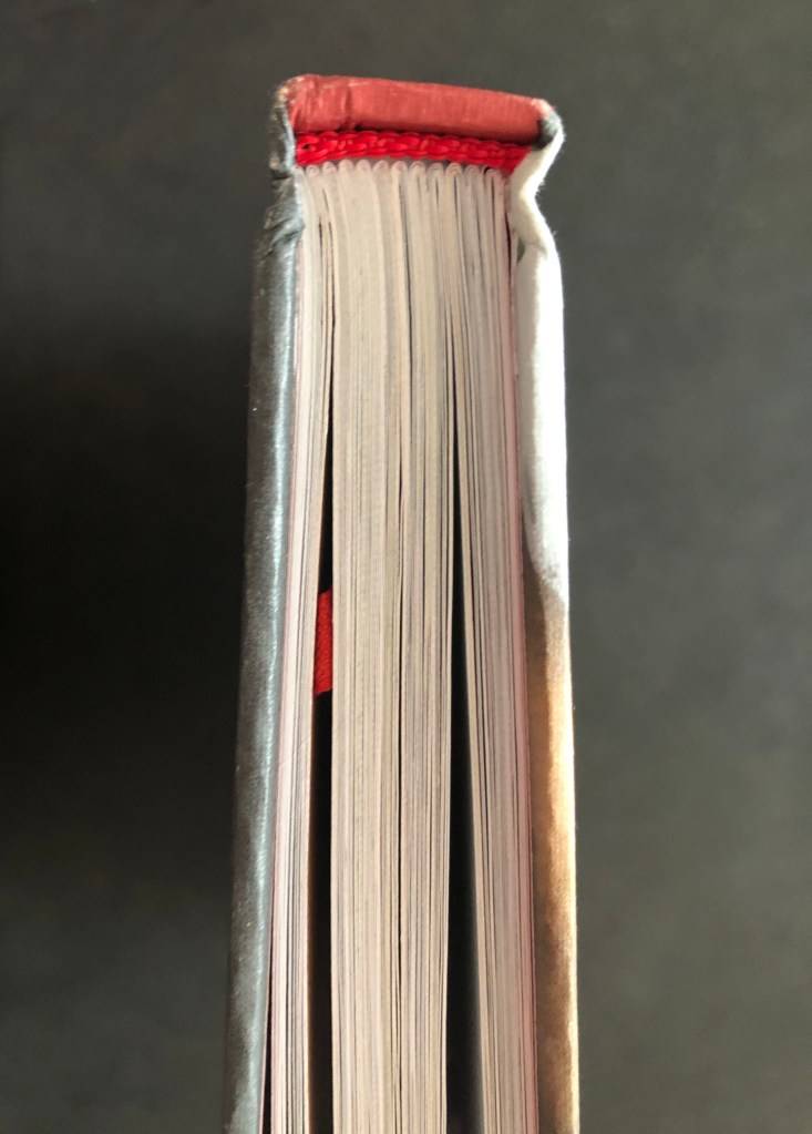
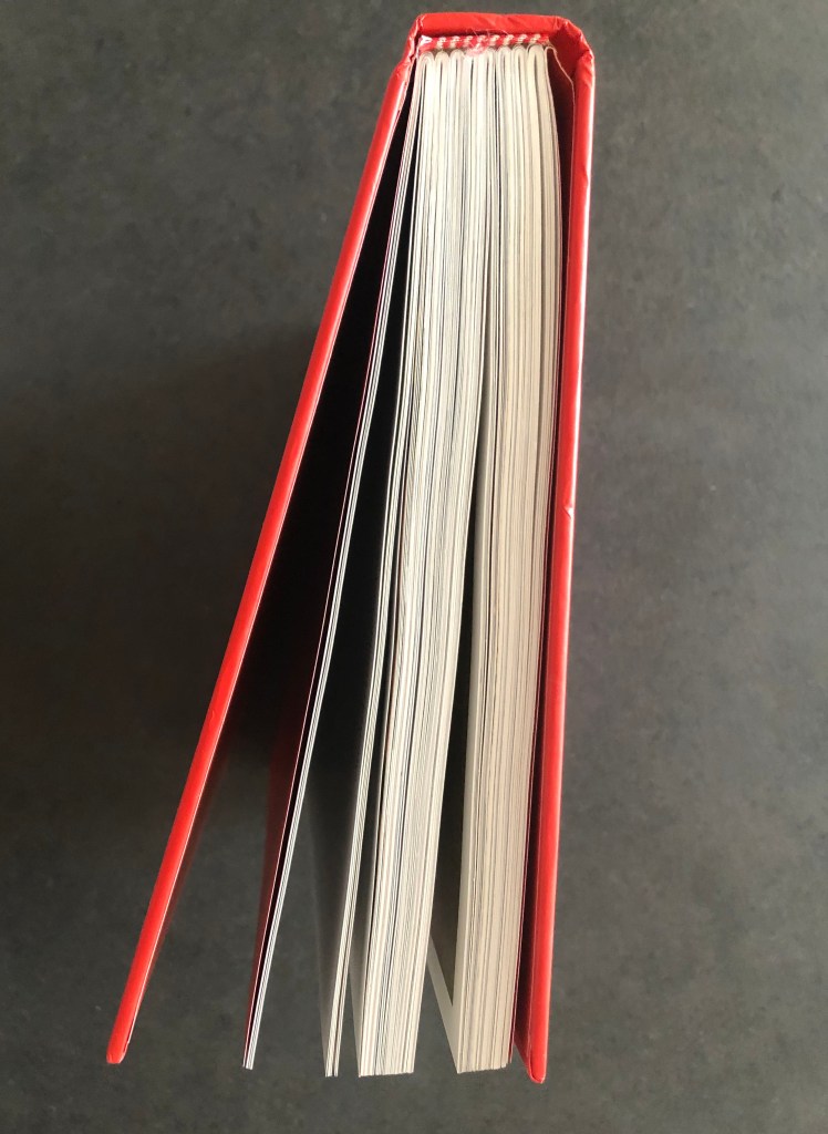
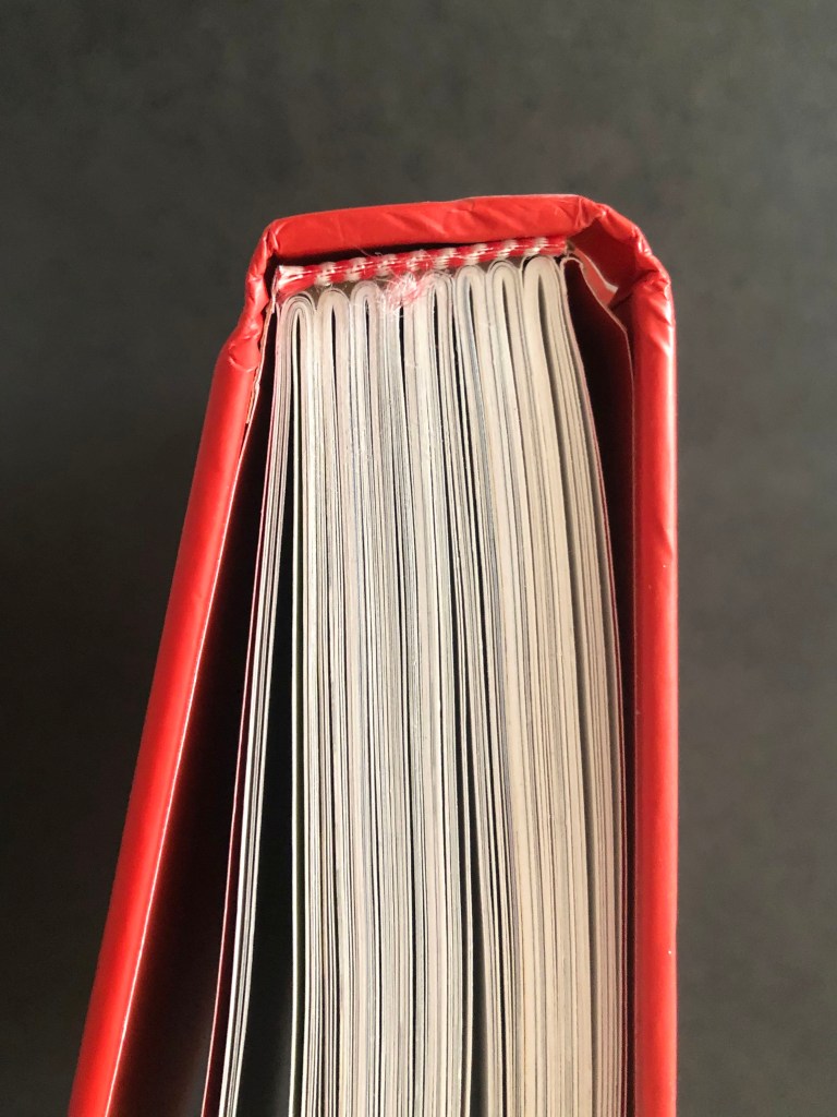
This book has a similar principle as the first book I explained at the beginning of this exercise. The hinge is red and glued to the spine of the book, and no gap can be seen between them, the construction of the book seems to be very firm. There are 12 sets of signature, that confidently glued between each other, but in the centre of the book, I discovered that leaves are stitched between each other 6 times.
The Genius of Design. Penny Sparke
This book has quite a wide spine, around 3 cm, but only 8 sets of signature blocks, which consists of 14 leaves each. As a standard page sets 6 times stitched between each other. I’ve noticed that the hinge is glued to the spine as well, but a little gap is there, I think it happened of the time, as it is not completely seen through. I liked how the colour of the hinge is matching to the book cover design, it has red and white shades in it.
Conclusion
This was another valuable exercise that was important to complete. I have never examined books in such details before, and I find it quite fascinating how I could hold that amount of information in my hand before, but never pay attention to the internal world of the book. I believe my new knowledge will help me to establish a new approach to books and their design.
