Identify a range of books that have fundamentally different functions in terms of how these books are engaged with – how they’re held, where they’re read, by whom, and for what purpose. Try to look at least six books, but you can extend this if you want to. The differences between these books might be determined by their genres. For example, you might look at a cookery book, a biography of a sports personality, a travel guide, a work of historical fiction, a teenage film tie-in like Twilight, this course guide – the choice is yours.
Think about how each book’s form reflects its function. The front cover is an obvious starting point (and the focus on your upcoming assignment) but try to look more broadly than this. Think about things like page extent, paper quality, typeface, the weight of the book, imagery and more. Is the book illustrated with photographs, reproduced images or drawings? Are these concentrated in one or two places or distributed throughout the book?
What about front matter and end matter? Historical novels like Hilary Mantel’s Wolf Hall may have family trees and/or a list of characters as part of the front matter. A scholarly biography will usually have many pages of end-notes and references.
Reflect on this in your learning log, with examples of some of the books you’ve selected. Identify how each book designer has reflected the genre and function of your chosen books in their final design.
The Age of Collage 2. Dennis Busch & Gestalten

The function of the book. A comprehensive collection of examples ranging from subversive to museum-worthy masterpieces. This book audience is people involved in art, graphic design, or photography. They could be students of art colleges or professional art experts to see the variety of juxtaposition and learn how this part of art developed, and who are the major influences in this field. When I saw this book in the art-gallery shop table with other art and design-related publications, it stands out for me, because of its size, a big heavy book full of images, and the paper is white and quite thick, so the images from another side of the page can’t be seen. I would say probably 70% of that book are pictures of collages. Book size slightly bigger than A4 24 × 30 cm, full-colour print, hardcover, 320 pages.
The front cover. Hardcover with a slight texture on the top of it, so the feel of the cover is more similar to the matt surface. In terms of the naming, there is only a small name of the book on the side, all capital letters, san-serif font, even the name of the author of the book is absent, only the publisher name. The main point in this book is the collage art of the lady, which should attract a potential book buyer eye.
Page extent. 320 pages.
Front matter. Front pastedown and front flyleaf have joined a colourful image, made in red and white colours, just like a bright collage. The next spread has just white paper, on the right page the name of the book and the publisher name. The next three pages are introductory to the book, no such information as publisher details, logos or copyrights were not placed for the front matter.
End matter. The same image as from the front matter, but with slightly rotated images. Flyleaf is quite thick, and I’ve noticed that pastedown pages like glued to the cover. I’m guessing it works like that for all hardcover books. The next spread has information only on the left page, it has the name of the book, editor names, type editor, the name of cover and book designers, and copyrights, with some certifications logos. The next spread has two pages of contents organised in alphabetical order with the name of the artists.
Paper quality. High-quality paper, not transparent, so all images can’t be see-through on another side.
Typeface. The typeface used inside of the book has distinguished difference from the standard books. It is a fixed-width typeface similar to Courier New font. The text columns are justified and have hyphens, also the space between lines is slightly bigger than automatic, which gives a free feel for the reading of the text, so it’s not a super strict traditional style book.
The weight of the book. The book is quite heavy, so I have never could take it with me causally somewhere out of the house. It meant to be in the book library, or attached to the office. I think that caused by the card cover, the size of the book and the thick paper print.
Imagery. The book is illustrated with photographs of collages and portraits. Images are distributed throughout the book, so each page has an image. The wording is not as important in this book, mainly it has a brief biography of each artist, but the main point here the artist’s works.
Type Tells Tales. Steven Heller, Gail Anderson

The function of the book. Type Tells Tales book that focuses on typography and the story that it’s expressing. This book orientated on graphic designers, publishers, and books related specialists for widening their knowledge in the design and purpose of the fonts used in art. Could be read at home, in student libraries for studying purposes, and for increasing the knowledge about the font as an independent object.
The front cover. Softcover, paperback with flaps. On the cover page, only fonts were used for the name of the book, shown in different styles of typography, combined with the name of the publisher in the left bottom corner, and the authors’ name in the top central position. All design goes in the centre of the book, showing that font is dominant here. The size of the book 34 x 24 cm.
Page extent. 224 pages.
Front matter. This book have flaps on the front and back cover, so the designer placed book description text on that flap, which is quite wide, it has the prehistory of the book, and the number of illustrations (332). On the right side, there is a white page with only the name of the book in the black san-serif font. As the cover is soft paper, no such things as pastedown or flyleaf were used. The next spread is colourful, has the name of the book again, placed at the same position as the previous page, but also names of the authors and publisher name Thames and Hudson. The next spread is the page of contents, placed on the bright yellow spread.
End matter. On the backside of the cover, the is a flap as well, and there was placed a description of the role for each author, and the list of books from the same writers, and the location that the book was printed in China. The next pages have such information as acknowledgements, copyrights, and website. For this kind of books, there are usually two types of contents pages, based on the chronology, and based on the name of artists in alphabetical order. Also, as this is a complicated design book, and had a page for the list of designers.
Paper quality. Good quality clean white paper, more glossy on touch, not thin, all images can’t be seen through on another side.
Typeface. Serif font for this book was chosen for this book. For each artist, there are descriptions in two columns, text block aligned to the left side with an indent on each new paragraph. No hyphens were used in the text blocks.
The weight of the book. The book doesn’t feel too heavy, easy to take somewhere on the journeys, to have a casual read through. Probably that’s because of soft cover, and the number of pages. From my point of view, everything below 200 pages is fine to carry around.
Imagery. This book as the previous one illustrated with printed examples of typography, mainly illustrations and drawings. As well as images taking most of the space in this book, on some spreads were used drawings and colours only. The purpose of the book to show the reader as many images as possible, with fewer descriptions, and that what I like about that kind of books, it is like self-analysis, and having a visual understanding of the subject.
Anna Karenina. Leo Tolstoy
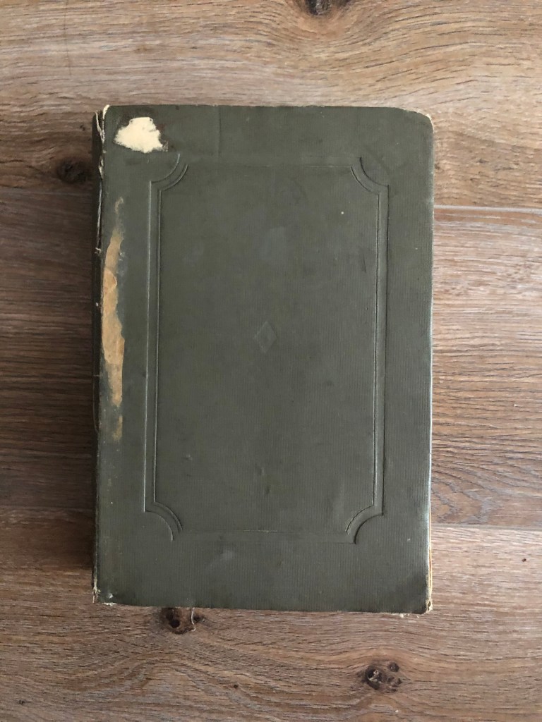
The function of the book. This one of my favourite book I have in my possession. Anna Karenina book published at 1936 with old-fashioned design and paper style. I think this book could be read by classical Russian novels admires, students at universities and colleges, mainly at library or for home read to learn the culture and history of Russia in the end of XIX century.
The front cover. The cover of that book has the first association with older times publications. As this example is almost 100 years old, back in that times book was considered more like an object to read, but not to have a kind of marketing sales tool. Hardcover medium grey colour with some canvas texture on the top of it. No names of the book or name of the writer on it. That information was placed on the spine of the book, I think that is because that book was meant to be in the library, and didn’t have intentions to be eye-catchy, just a pure piece of literature for someone who loves reading.
Page extent. 698 pages, plus 2 leaves in the end matter and 5 leavesfor the front matter.
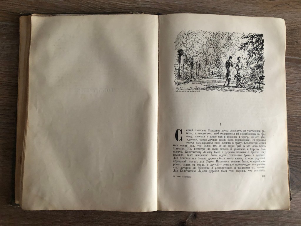
Front matter. The front pastedown page and front flyleaf paper are thicker but just blank. Next page on the right side the name of the publisher and logo, then again empty spread. The next spread has the name of the author, and the name of the book, years when the book was written, and the text editor name apart from the name of the publisher, and next spread is empty again, just with the name of the painter on the dust jacket. The next page is the pencil image by Mickael Vrubel of Anna Karenina and her son was placed on the left side and the number of the chapter. This book has the most pages for the front matter.
End matter. Back pastedown and the back flyleaf are the thickest paper as well, blank white page, and next spread white too. But the next page I found quite interesting, as I have never seen it, it has the list of errors that the book have, with the name of the page, and line number for each paragraph. Also, on the left side of the spread, there is additional information with editor names, price, typography number, and other technical specifications. Also the page of content, with the name of the artist for the frontispiece.
Paper quality. Can’t say for sure what kind of paper was used when it was first printed, but the colour of the paper turned into yellow colour, more like a vintage kind of shades. Some of the pages are falling, as they were glued to the spine of the book, but what’s positive about that, that book gives a feel of older times, that you can’t experience with modern books.
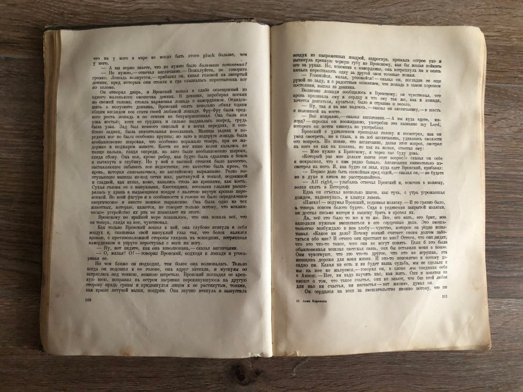
Typeface. For this book was chosen classic typeface with serifs, looked like it was printed by a typewriter. The text blocks are justified, with an indent on the left side, obviously with hyphenations on the right. Those text blocks definitely followed the role of the golden ratio.
The weight of the book. The book is very heavy, definitely, it was purposely made for the reading at libraries or home.
Imagery. Practically no images were used here. I can say that approximately 10 drawings, one for each chapter. They all look like quick pencil sketches, but they are valuable images, that reflect the style of the book.
Mamushka. Recipes from Ukraine & beyond. Olga Hercules
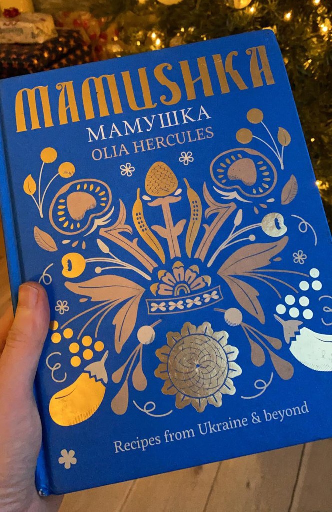
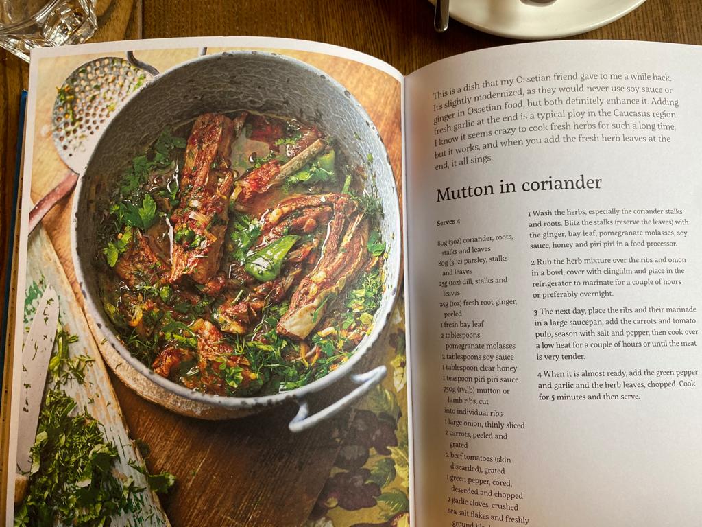
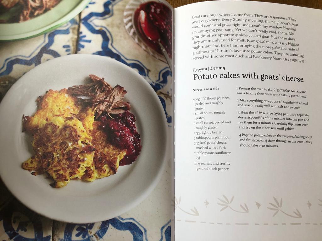
The function of the book. Culinary book of recipes originated from Eastern Europe written by a London-based Ukrainian chef. Mamushka is a celebration of the food and flavours of Ukraine and the “Wild East”. I think this is a visual book for people who love experiments in cooking and high-quality book design. I really loved that book because of the professional images, good book design inside and obviously good food ideas. First time I discovered that book in the local restaurant, it was located on the shelfs, like a book to look through while people drink their coffee. Later we got that book as a gift, so now it takes place in our kitchen shelfs.
The front cover. Hardcover made in beautiful blue colour with some traditional pattern printed in gold. The texture of the cover nice and smooth, with only some textural shapes around printed foil. On the the front cover the name of the book Mamushka was placed on the top centre position. Decorative font probably was designed specially for the cover, with the name of the author below. And some explanations to the book bottom centre.
Page extent. 240 pages.
Front matter. Has a beautiful spread for the front pastedown and front flyleaf with design on it, traditional Eastern Europe ornaments. Next spread has the name of the book with the same type of font as on the cover, but in the slightly painted cream colour paper and little photo image of sunflowers field on it. For the next spread on the left page all information about publisher, copyrights, web address, ISBN number, and on the right page again duplicated the name of the book with some family portraits on it. Additional spread for the contents, and extra family photos from around the countries.
End matter. Has duplicated first beautiful spread with ornaments on it. And standard next spread with all information about copyrights, addresses, ISBN numbers, editors, designers.
Paper quality. Paper has that nice textured feel, it’s not super smooth, more like deep coated paper touch.
Typeface. The font for this book was chosen standard for publications, serif easy read font, aligned to the left, with free side on the right, no hyphenations were used in that text columns.
The weight of the book. Not too heavy, but the hardcover definitely makes it heavier, than normal. I would say standard cooking book weight.
Imagery. As that is a recipes book, it is full of food photographs for each recipe. Also on white pages were used some traditional grey patterns.
The Butterfly of the Stars. Bernard Werber
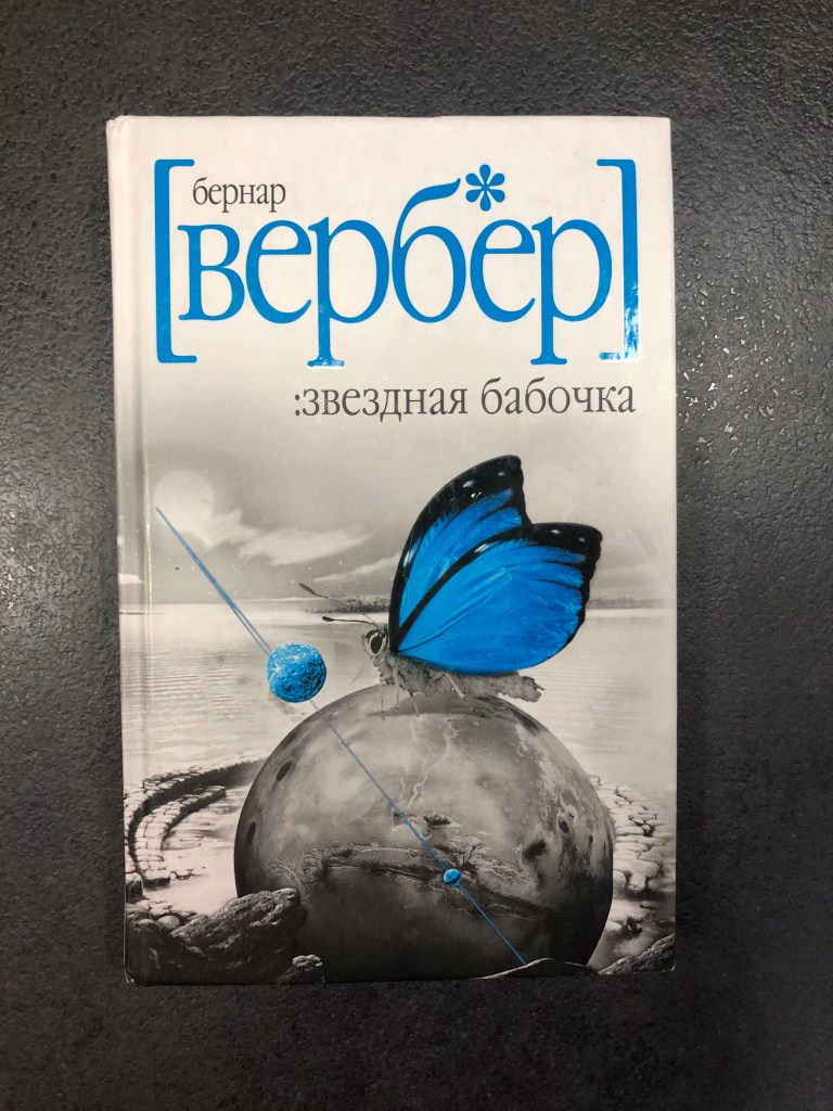
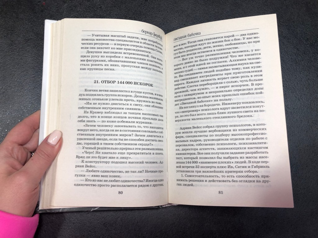
The function of the book. I think that is the kind of book that younger generations could read, or people who like fictions. It describes a generation ship under the form of a long rotating cylinder, with 144,000 people leave Earth to travel to an exoplanet. It has some clever philosophy ideas, but at the same time the story developing in the imaginary world. Ideal for people who loves fantasy stories. It doesn’t have any illustrations inside, just a plane text to read through.
The front cover. White hardcover with grey and blue photo collage design on it. What’s interesting about the author and book name on the front cover, is that all letters are low letters, even the name of the author, which is like a part of font design.
The back cover. Has the picture of the author, with a short story about the book, barcode, signature of Bernard Werber and publication logos. The dominant colour of cover is white.
Page extent. 343 pages. For the front matter were used 6 leaves, for the end matter extra 5 leaves.
Front matter. Front pastedown and front flyleaf are traditionally thicker paper than the rest pages, which are of the same quality. The second page has the logo of the publisher and city name. The next spread has the name of the book, in Russian and French languages, publisher name, and years published (different from French and Russian version). After on the left side page with ISBNs, copyright information, translator name, and for the right page the name of the book same as on the cover page, but with black and white colour was used. The next spread is blank, with some wording fo honour for the book, and the next spread is blank too, with the name of the chapter only.
End matter. Same paper quality as from the front, thicker than the rest, next 4 pages with book adverts, some covers that has been released by the same publisher. The next 2 pages contain such information as the address where the book could be bought. After there is a page with the designer’s name, publisher names, web address and contacts. And next spread contains the list of books by the same author.
Paper quality. Paper has that nice textured feel, it’s not super smooth, more like coated paper touch. Slightly cream-grey colour.
Typeface. Standard serif font, column justified with hyphenations.
The weight of the book. The book is quite light, because of it small size 13 x 21 cm, I could put in your bag that to read somewhere in the public transport on the way to work.
Imagery. No images were being used, just a plain text.
The Orange Gide. Capital Tour
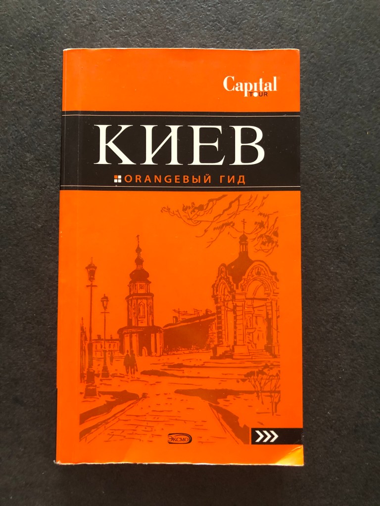
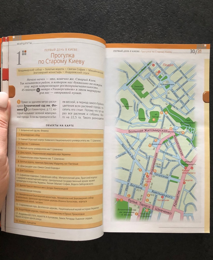
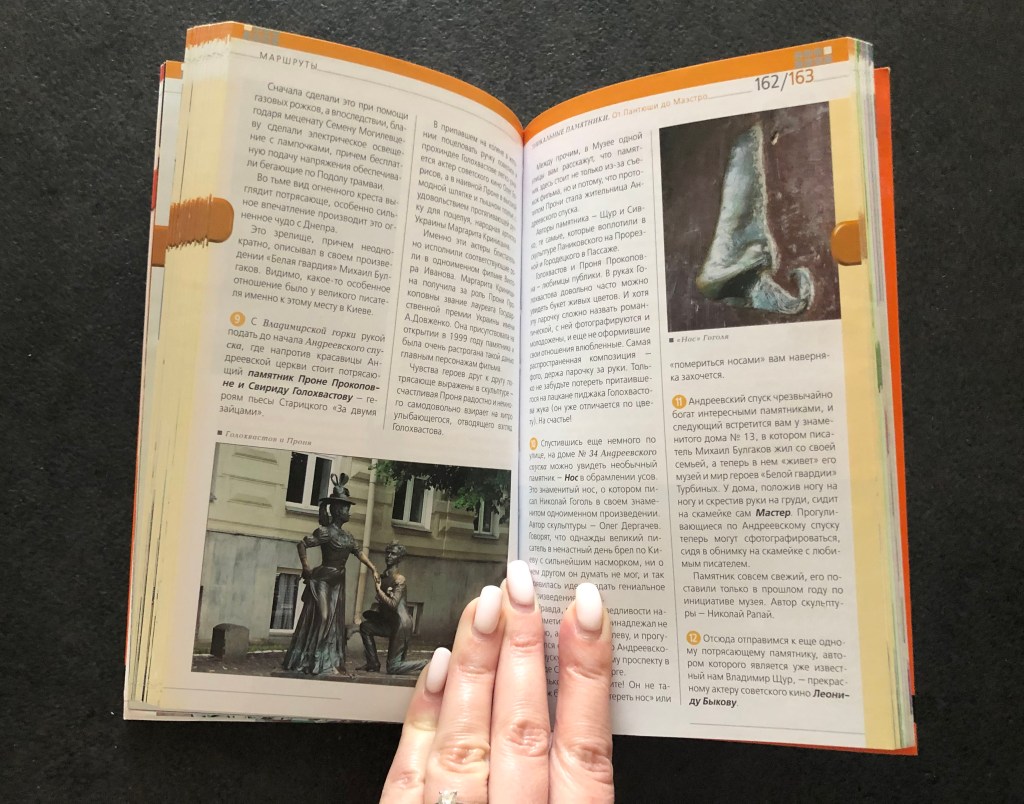
The function of the book. Travel guide book for people who visit Kiev city first time. The book is for Russian speaking travellers, it has all important city sites locations to visit, the list of the restaurants, museums and cultural spots, and underground map. Also it can be valuable for people who are interested in the history of Kievan Rus.
The front cover. Orange softcover with flaps 9×19 cm, as big as the size of the cover 11×19 cm. On the front has lacquer design elements. Th front cover contain the name of the book Kiev, Orange guide, capital tour logo, and publisher Eksmo.
The back cover. Has same flaps as the front cover. The back of the book has general description of the book, address of the project and barcode.
Page extent. 271 pages. For the front matter were used 5 leaves, for the end matter extra 3 leaves.
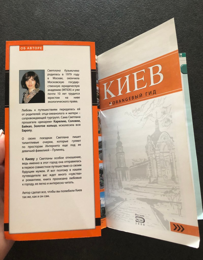
Front matter. First page has a duplicate of the cover page, but on the white background. On the flapper was placed the picture of the author of the book, and short description of her interest in Kiev as a tourist location. Rest pages has timetables for the places to visit and page of content.
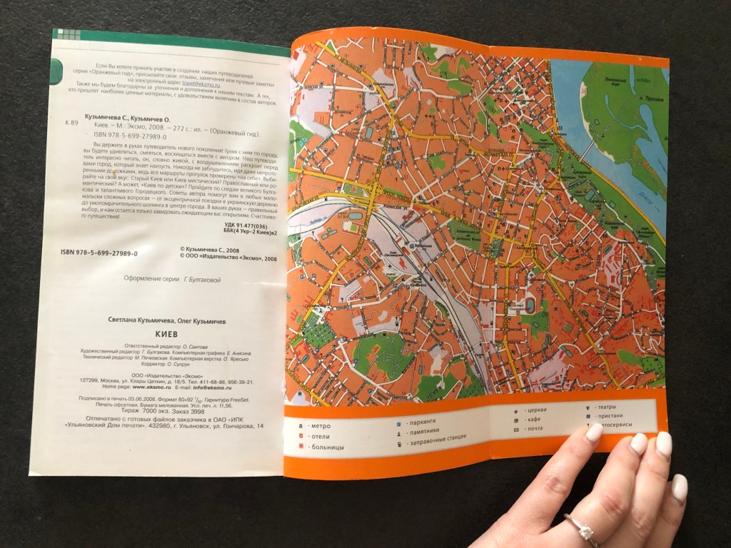
End matter. Inside of the cover was placed the map of Kyiv city, and for the flapper was used the map of the underground. So for the travel guide all space was sufficiently used, so even inside of the cover have important information for the tourist. As this is softcover, no flyleaf or pastedown. Only one page with ISBN number, the number of books that was printed, addresses, designer name, editor names and format of the book.
Paper quality. Offset printing, coated paper.
Typeface. San-serif font, 2 columns each page, justified with hyphenations.
The weight of the book. The book is very light and handy, meant to be carried around the city in the bag, just in case for the tourists.
Imagery. Has photos of the city sites and maps.
OSHO. About Love
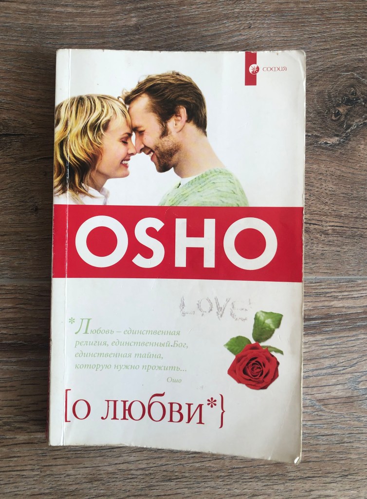
The function of the book. Indian philosophy type of book for people who are looking for some answers about the love, and how to become free from negative thoughts, something crossed with meditation and yoga studying. This book was written based on the Osho’s conversations, so it doesn’t have a plot, the genre of this book reminds more questions and answers structure, similar to the interview. I think it was written mainly for people who are interested in Indian culture, to have some casual read to get distracted.
The front cover. Softcover, with some gloss effect on the top of it. The dominant colour is white, but with it has some collage with it. Looks old-fashioned as to my taste, I had this book for almost 15 years. The main highlighted point is pseudonym of the writer, in addition to that cover has the saying from the book, and placed in brackets name [about love}. On the top right corner little logo of the publisher.
The back cover. Mainly white colour for the back cover, with a small image of philosopher, but the name OSHO still was being used. Also some phrases and quotes around, similar to the front cover really.
Page extent. 281 pages, with 3 leaves for the front matter, and 4 leaves for the back matter. All pages same quality.
Front matter. The first page is the same quality paper as the rest, it has duplicated location for the name of the book About love from the front cover. No such thing as pastedown and fly leaf on this book. What’s interesting, on the next was printed black and white duplicate of the cover page, also it has logo of the publisher. And in addition standard spread with ISBN number, copyrights, explanations to the book and year printer. On the right side the page of contents.
End matter. Only two pages for the end matter, with address, translator name, corrector name, designers names for the cover and book itself.
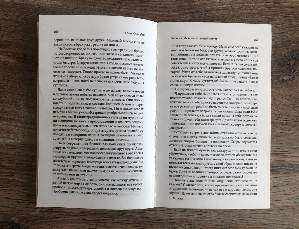
Paper quality. The book is quite casual, so the quality of paper quite low, very simple paper, with see through pages.
Typeface. Standard serif font, column justified with hyphenations.
The weight of the book. Very light book, it is very small as well, only 12.5 x 20 cm, similar to the copybook, or notebook, that someone can carry around.
Imagery. No images were used.
Conclusion
I would like to say that exercise was quite engaging for me, I have never examined books in such details before, there were some facts that I’ve learnt from it. For example, I’ve noticed that for the classical books, or novels designs there are lots of spare pages for the front and end matter, with copyrights, and regular commercial information. The quality of the paper isn’t the greatest, I can see that publisher tried to save up on the printing, as books on sale don’t go as expensive. But for designer books, which far more expensive than a classical novel, the best quality of paper was used, complicated designs, and unique fonts. Front matter and end matter organised into different ways I can see creative approach, some artworks printed from the very first pages, and mainly there is information such as a content page in chronological and alphabetical order. I’m sure some knowledge that I’ve got from these exercises, such as attention to each part of the book, will be useful for my next assignment.
