Based on your work from the previous exercises, think about how your designs within the context of the book. For example, visually explore how your artwork sits within the format of your A5 pamphlet – how the page might frame the artwork, how different pages sit together or how you might begin to develop a narrative across multiple pages.
This process might suggest new ways of presenting or developing your work. Think about how you want to finish your artwork, whether this is through typography, illustration, photography, drawing or another format.
Critique your work – what has the format of the pamphlet offered you, how might your ideas develop further, and how has your understanding of creative book design changed through this exercise?
Production
As a designer, you need to have an understanding of the processes involved in creating a book. Some of these processes remain essentially the same as in early books, for example, folding paper to form pages and binding these together to form a spine. The spine, like our own backbone, is structurally significant in that it holds the pages of the book together and allows us to open and read the pages.
For the purposes of your first assignment, your book will be based on a simple, fanzine-like publication. For the production, you will need to consider how you print or reproduce your content, what sort of paper you can use, how you will bind it, and importantly, how many copies you will produce. Even with a very simple black and white photocopied publication, you will need to consider how your artwork, and the structure of your content fits, with this mode of production. In other words, what are the possibilities and limitations of photocopying, and how can your design approach and artwork accommodate these?
Critiquing my work
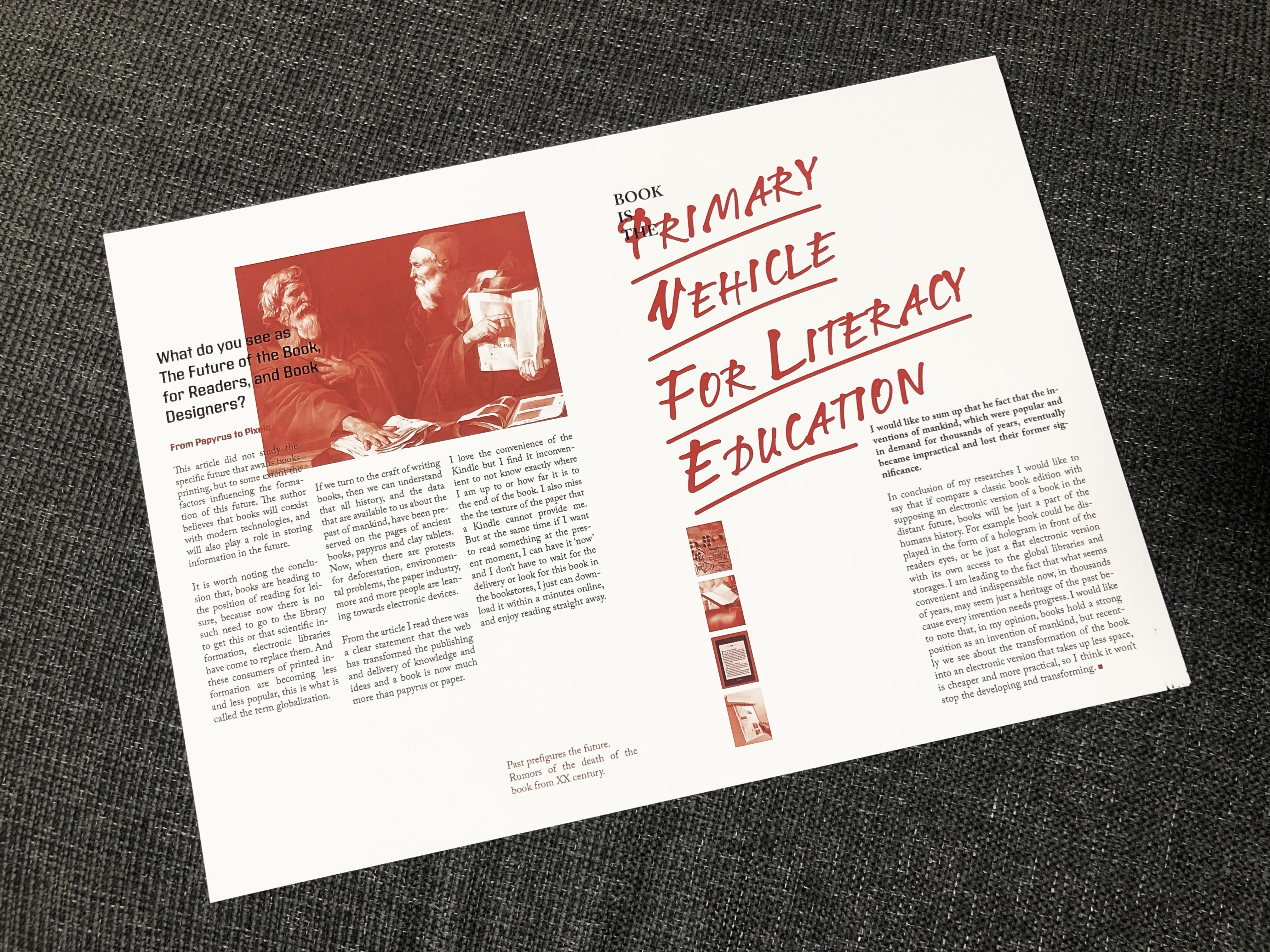
That was a quite interesting turn for this part. When I designed this spread I didn’t think I would have to go back to it again. I thought that from the design point of view it was a good layout, and partly I could have inspiration for the future My Zine booklet. I loved that font I’ve discovered for the headers, the combination of red images with it, and usage of different size columns in one spread. I’ve noticed some disadvantages on that booklet, that I was going to correct. For example, little images on the right side needed to be bigger, as they practically disappeared on that page, they were too small. And I didn’t like the white space on the left side of the page under the text columns as much, the text definitely needed to go more down. As I was going to use this pamphlet for the A5 magazine page, I thought I could make the font bigger, and naturally, it will go slightly down. Overall, it was a good template to work with.
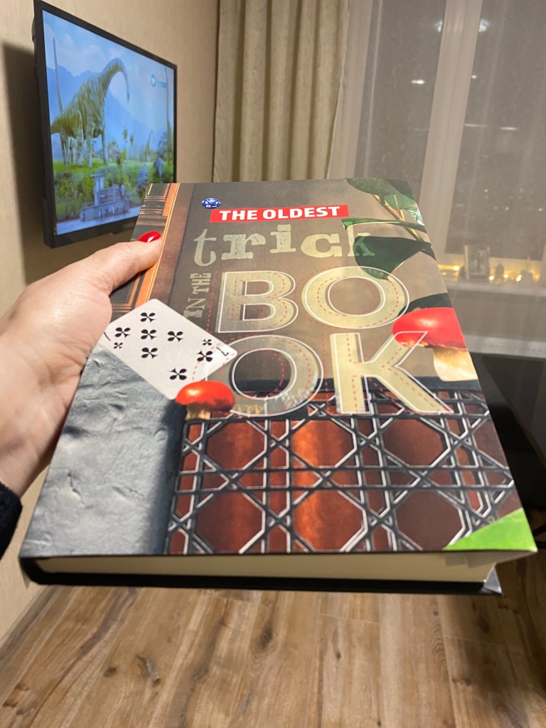
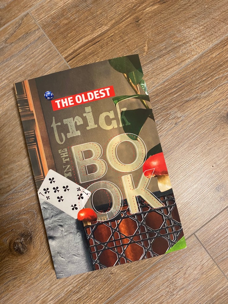
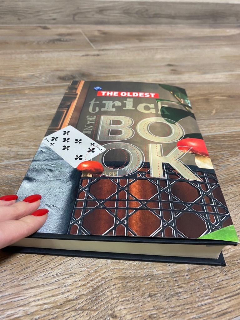
I found a book in my home library, measured the size of it and printed like a super-cover for it. That cover design turns out to be so bright and colourful, didn’t expect that at all. The collage approach I used for this cover could be useful for My Zine design. I was going to borrow that style again, but with different objects. This book cover had a vintage feel, probably that was because of the dominant sort of dark green and brown colour. I was thinking about how to combine these two opposite styles in one piece, and I was looking forward to some interesting solutions for my future design.