
Using your research into artists’ books and fanzines as a starting point, think about their physical or design qualities, and creatively apply some of these approaches to your own designs.
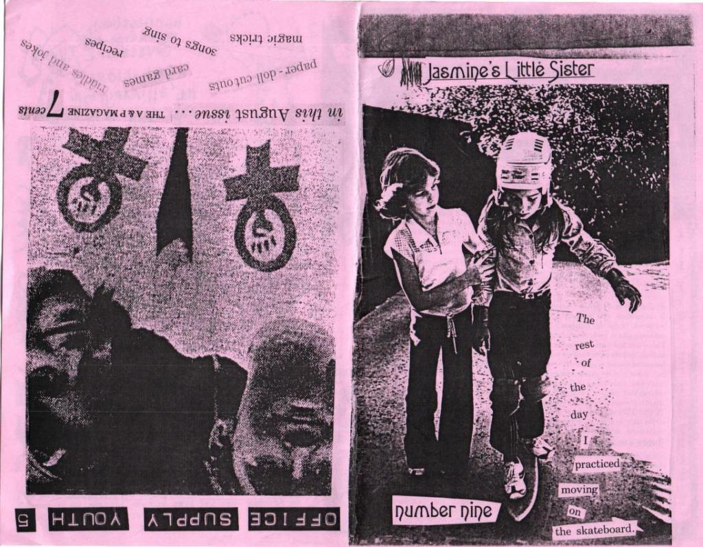
For example, there’s a distinctive visual quality to many fanzines which comes from a ‘cut and paste’ approach to designing and through the use of cheap photocopying and printing. Punk fanzines in particular make a virtue out of having limited resources, no computers and little, or no, formal training as graphic designers. Use your sketchbooks to experiment with a similar ‘cut and paste’ approach by cutting and collaging magazines and other material. What does this approach offer you as a book designer?
Alternatively, you can find other ideas you would like to test out in your sketchbook. You don’t need to make any finished designs, just give yourself room to experiment and try things out.
Research
This exercise is a kind of continuation of my previous research in the field of the fanzine concept, and its role in modern culture and creativity. Here I have to analyse what are the main qualities and properties of a fanzine in terms of design. First of all, what catches my eye is the amateur design, the untidy look and the scattered, chaotic composition, the unthinkable selection of fonts, the feeling of bouncing text, and the complete impression that the design was created on the run, sort of in a hurry. What’s also noteworthy is that fanzines use inexpensive, lo-fi printing tools. Here I am reminded of my exercises from the Core Concepts unit where we created a poster for local vocal lessons, a budget version, printed on a black and white printer, as a variation on coloured paper. https://eleonoras.art.blog/2020/05/13/exercise-poster-and-flyer/
One of the reasons for creating those odd posters was the low budget, but another reason was the passion and creative thinking, to demonstrate that admiration of the artists is coming first, and only after that the budget could be invested in it. I think it’s a free spirit as well, not to be limited by higher expectations, something that goes against the norms. The world of marketing materials is replete with magazine models and perfect design solutions, so the opposite trend has come into fashion, the improvised material of an ardent fan. I think, in this case, enthusiasm won out over professionalism.
In my past experience, I only used professional software for designing images, but now it’s time to learn something new and replace it with improvised materials, clippings from newspapers, magazines, and so on.
Mood Board Punk Fanzines

Using punk music fanzines examples, I would like to create a map for inspiration. When I see the location of the text in these designs, I recall another exercise from the past unit, where we needed to place words in such a position, depending on what association a particular word evoked. For example, speed is a slanted word, as if rushing forward, or silly, in a playful manner https://eleonoras.art.blog/2019/08/12/exercise-playing-with-words/ Also fanzines have a collage element that is noteworthy is the component that we went through in the 3rd part of Core Concepts too. So this specific exercises is replicated our previous experiences, and gather them together https://eleonoras.art.blog/2019/06/20/exercise-photomontage/
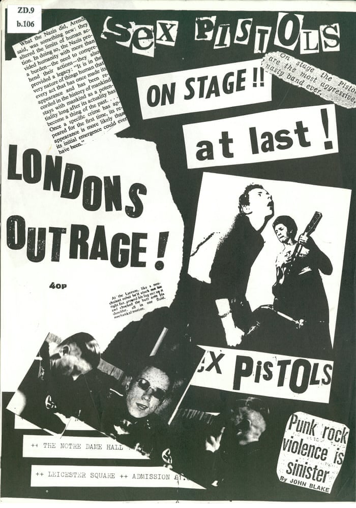
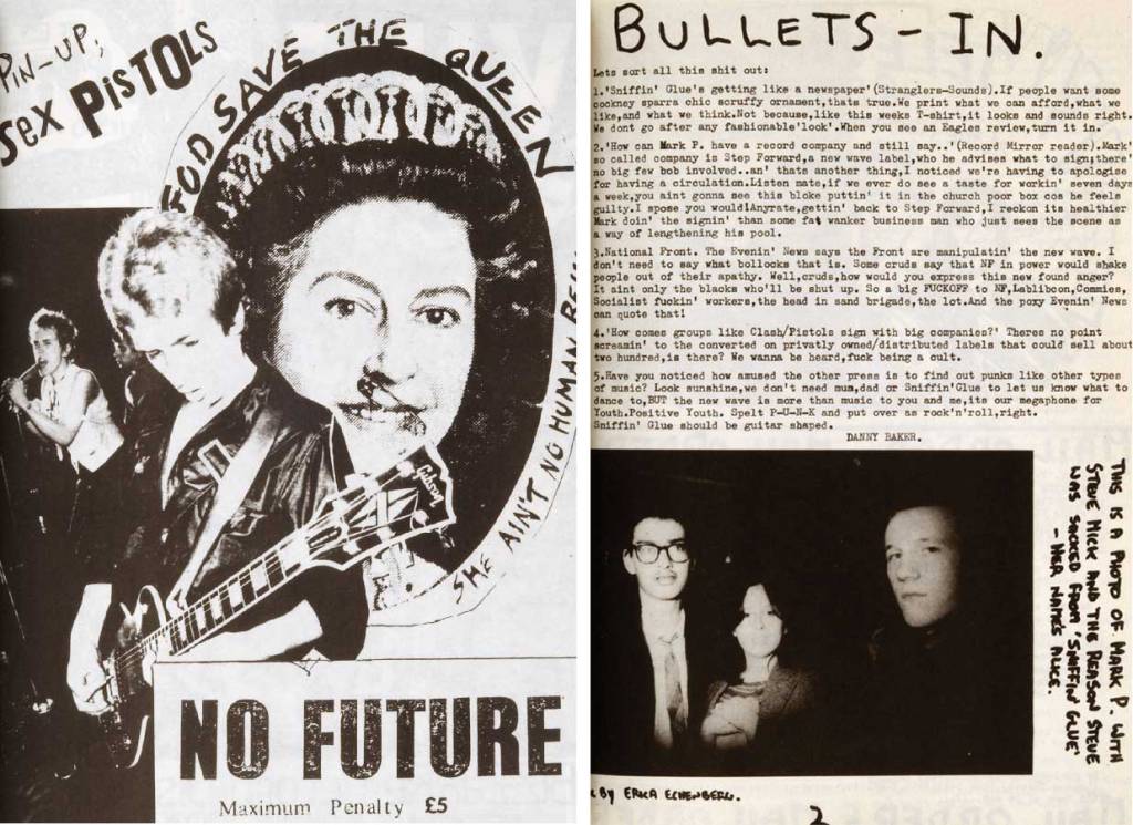
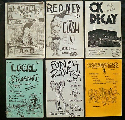
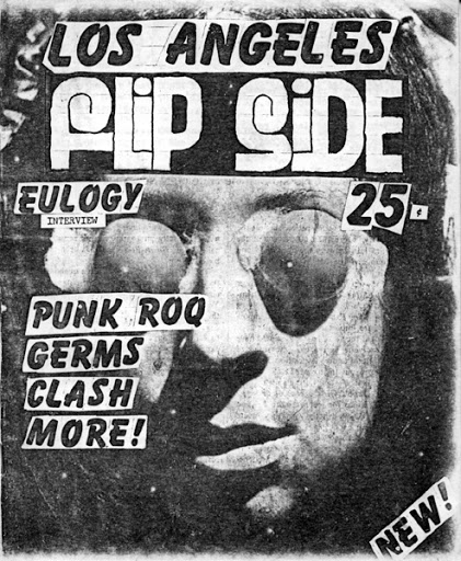
Here I have collected examples of punk fanzines that I liked. I noted a fascinating combination of fonts, amateur design, caricatures, and photographs taken in low quality, but all this together creates a unique style that is exclusive to this trend.
Mood Boards
Also, I would like to mention famous artists who work in a similar copy-paste manner. To do this, I again had to go back to my past notes on the Pinterest board. I noticed that I had several authors saved in my mood boards. There are Robert Rauschenberg and David Carson. Robert Rauschenberg uses more muted colours for his collages, with a vintage style, paints and brush strokes, while David Carson’s works are produced in a more modern way, and mainly with cut and paste objects. Nevertheless, both authors share a copy-paste style, and such a theme would be suitable for fanzines design.
Quite an interesting question, how could this fanzines-style collage skill be useful to me in Creative Book Design? I suppose I could apply this technique to a modern book edition. Even if the story was published a hundred years ago, and the publication wanted to reissue a new edition, perhaps collage techniques could work for the modern book cover design. Or, let’s say some art movement wants to publish a magazine book with some contemporary collages. Even if the designer works with different textures, in the end, everything can be photographed and printed in a brochure.
Another mood board I created specifically for this exercise. I created these mood board textures because they contained a lot of different materials that designers could work with. My aim was to see as many options as possible to create my own fanzine collage.
When I performed similar tasks in the previous unit, I always wanted to try working with different textures in design, use non-standard text, consisting of scraps from newspaper and magazine clippings, and try to combine the artistic part, and texture and design in one layout. While this exercise is mainly experimental, I would like to use as many different approaches and principles as possible in order to discover different variations of the creative layout.
Materials at hand
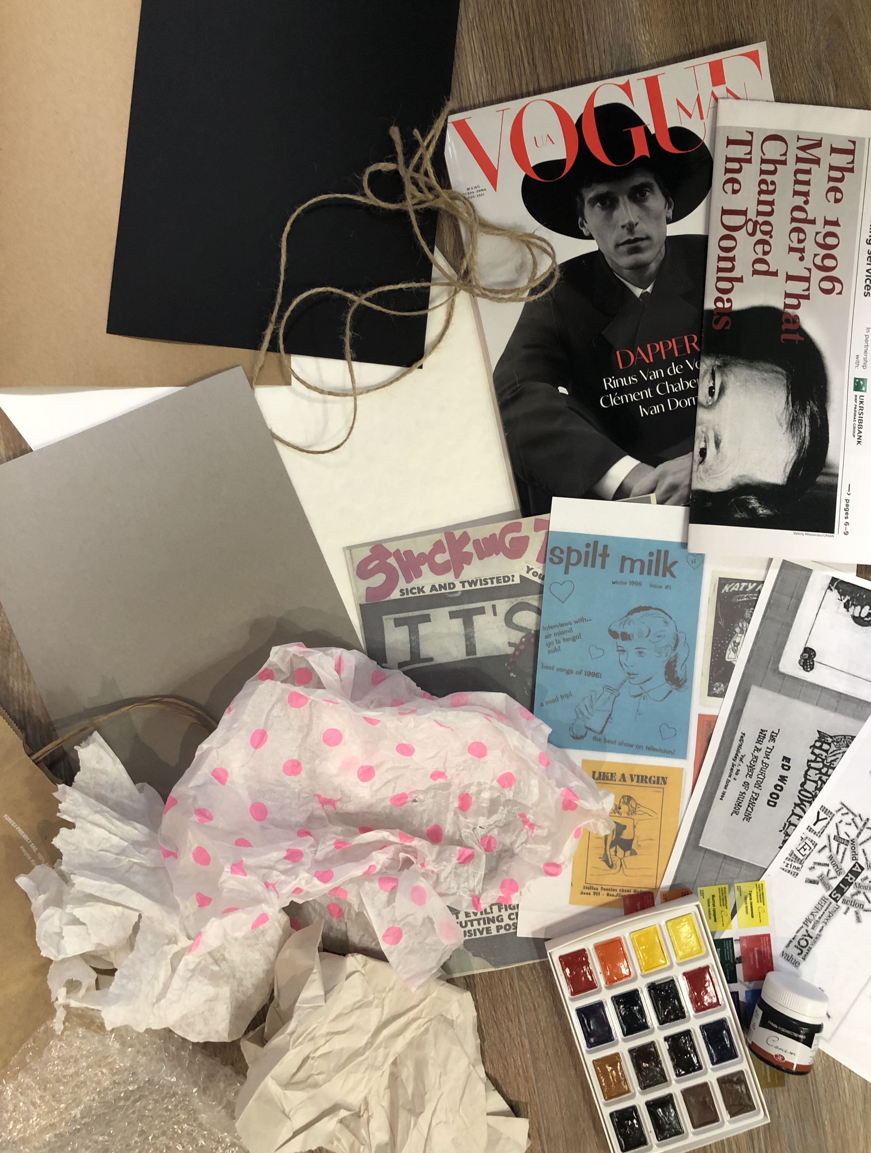
To get ready for this exercise I collected as many different materials as possible. I did not know if I would need everything but I thought better to have more, and if I don’t need something, I throw it back. So, I had at my disposal a few sheets of design paper, a packing wrap, a bubble wrap, gouache black paint, a paper bag, watercolours, rope, Kyiv Post newspaper, and Vogue Man magazine. I wanted to experiment with all the textures to see the result and compare which one works best.
‘Cut and Paste’ Approach
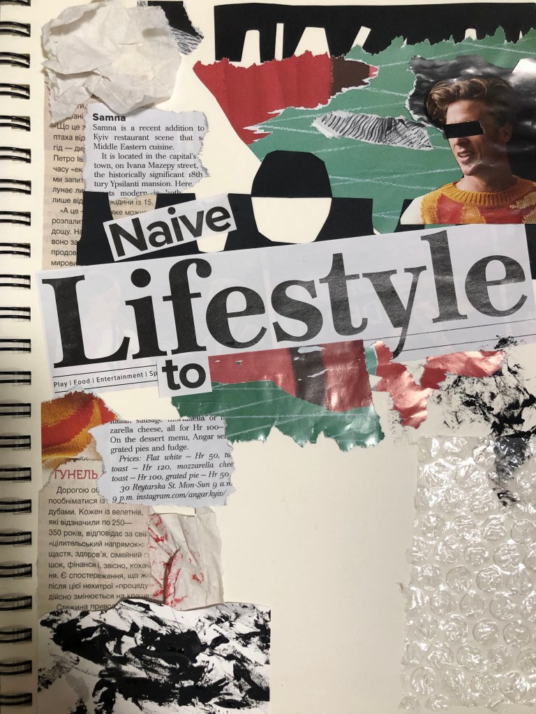
I created the first layout based on the principle of dividing the A4 size area into four even parts. The word Lifestyle was placed in the middle at a slight slope, and further around I filled the sheet with different objects. I wanted to create a layout inspired by the work of David Carson, who uses a huge number of different techniques in his work, which are later used in print. In this work, I used multi-coloured magazine clippings, so the design turned out to be full colour, mainly consisting of red, green, orange and black. Around I wanted to give some rigour to the layout, limiting it to black clippings. At the same time, I filled this collage with some smooth lines. I tried using small strokes of paint on paper, pasted one paper on top of another and tried to place the rope in the layout, all of this created a pretty interesting composition. I agree that it turned out to be a little overloaded, but since it was a test layout, I realised where I needed to improve. The process itself was entertaining. The conclusion was that even for such a chaotic composition, a strategy is needed, it was necessary to understand how to properly divide the sheet, and that here I got a square composition. There was little free air in it, but the layout itself looked confident and firmly in its foundation. I thought this was a good start for an experiment.
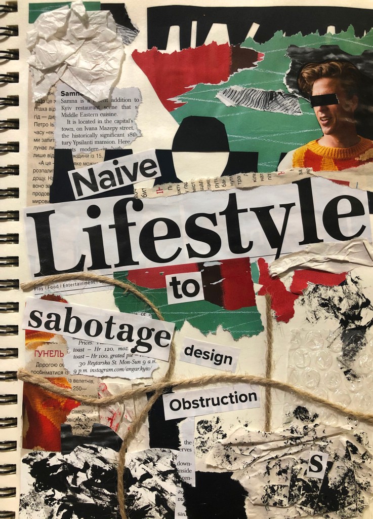
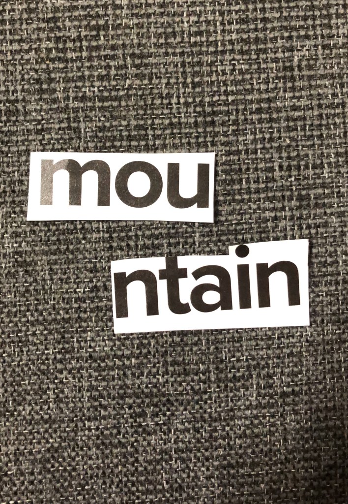
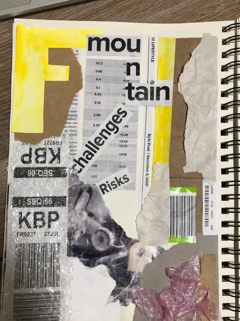
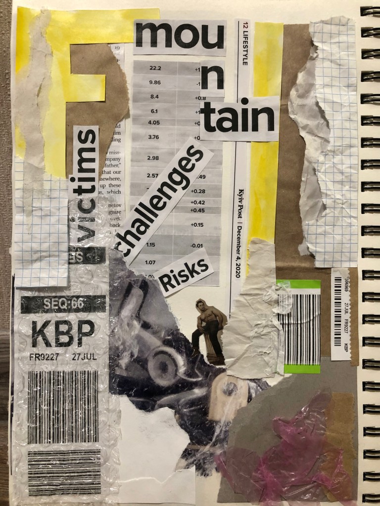
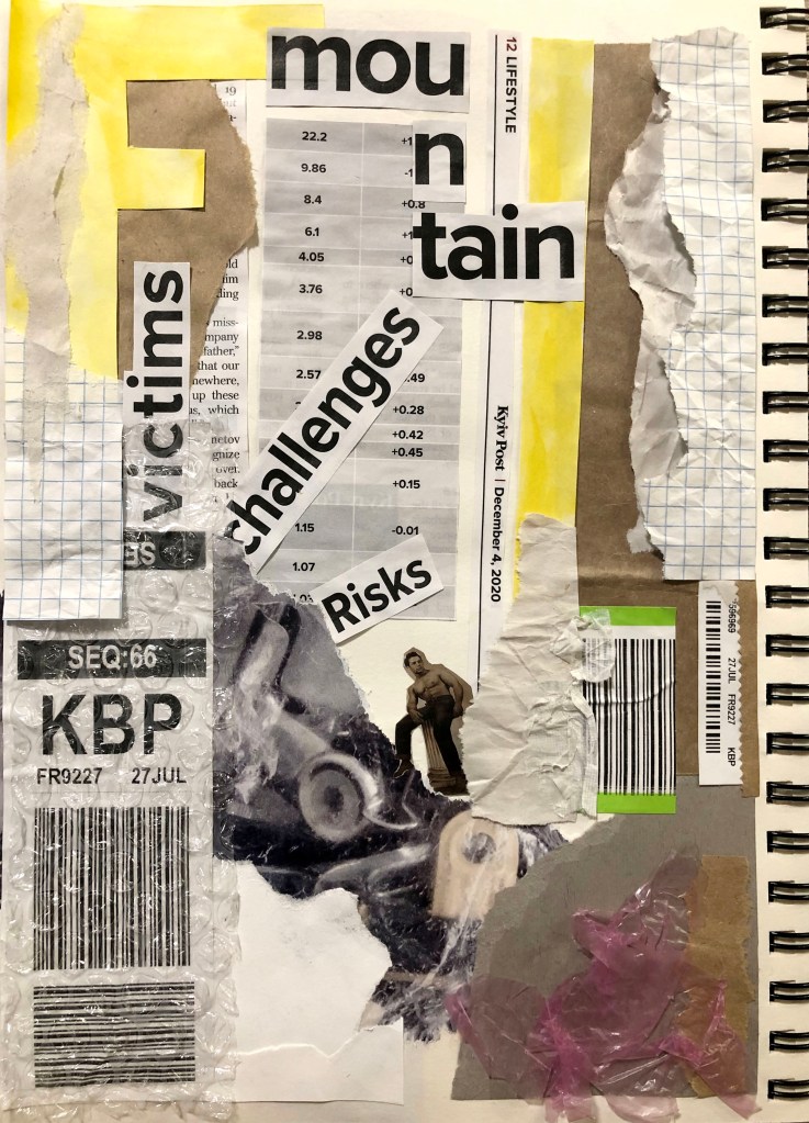
The next layout I wanted to do in the economic field, is to make an analogue with numbers and financial risks. Here I have used fewer colours, mostly black and white with a bit of yellow added. This layout was characterised by straighter lines, with angles and slopes. I wanted to add some rigour to this layout in order to compare it with the previous one. Nevertheless, the style itself and perhaps my style of work brought a casual look. I have signed the names of the layouts, they consist of various cutout excerpts from newspapers.
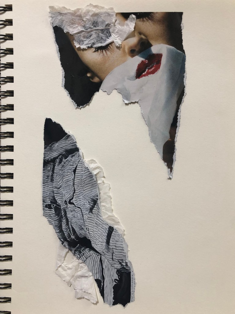
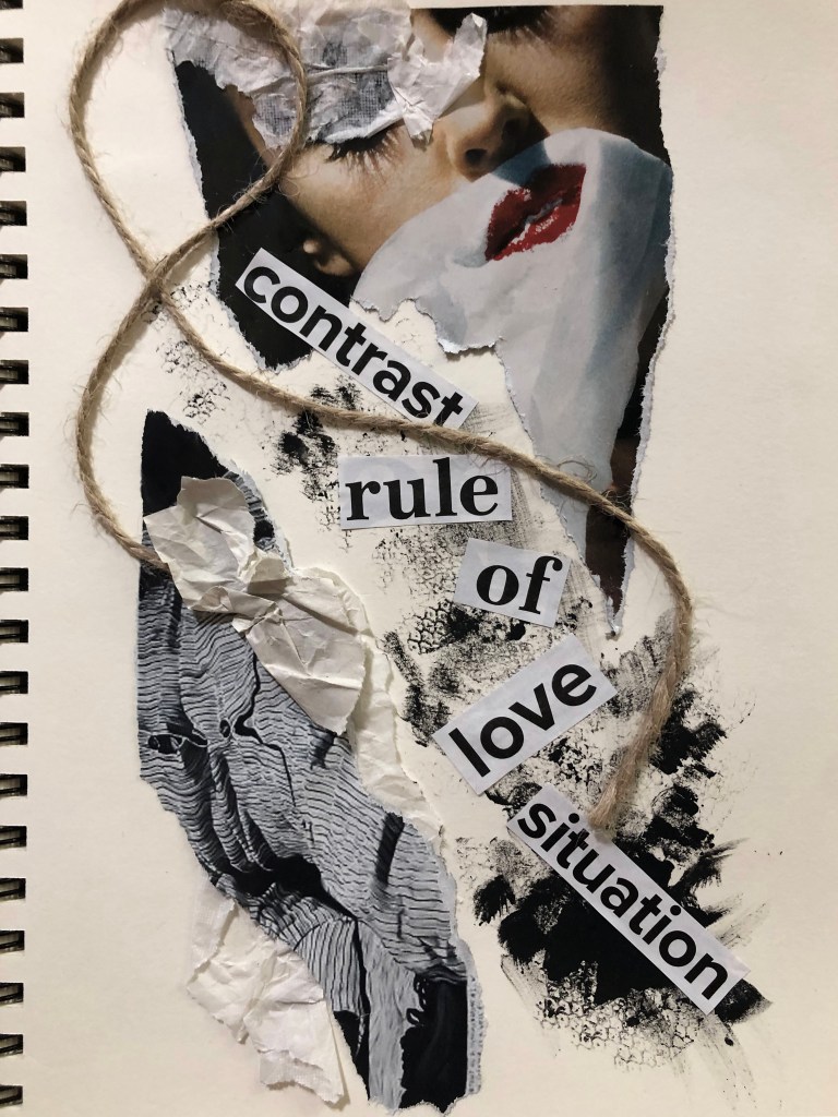
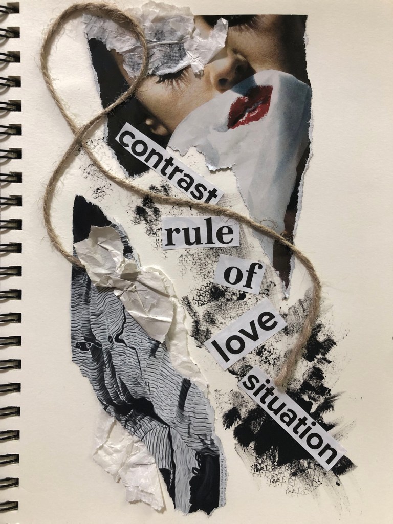
One more layout, in addition, I wanted to create lightness and freedom. Get rid of so many elements, bring in weightlessness, and a love line. I would like to say that perhaps this is my favourite experiment with collage and texture, the layout turned out to be so airy and delicate, there was something especially attractive about it. I used just a few scraps from a magazine, a bit of wrapping paper, a small piece of rope and strokes of gouache paints, with words scattered at an angle, and the layout is ready.
This exercise was an entry into the new world of hand-made designs, and the one I quite enjoyed. I could see first outcomes looked a bit mature, but I thought there is a potential in them for use in the future. Also, the software and special filters can elevate them to a new level. As a person accustomed to working exclusively with graphic software, I enjoyed the tactile process with texture, and collages as part of a fanzine, this is what I have long wanted to try, and now there is a reason for experimenting. Indeed, based on this principle, I could create postcards, magazines, brochures, illustrations for books and other materials, anyway it can be a great variety. Here, of course, was no reference to a specific topic, and we were free experimental artists, but I am sure that even if I had a given topic, I could still present it creatively.
