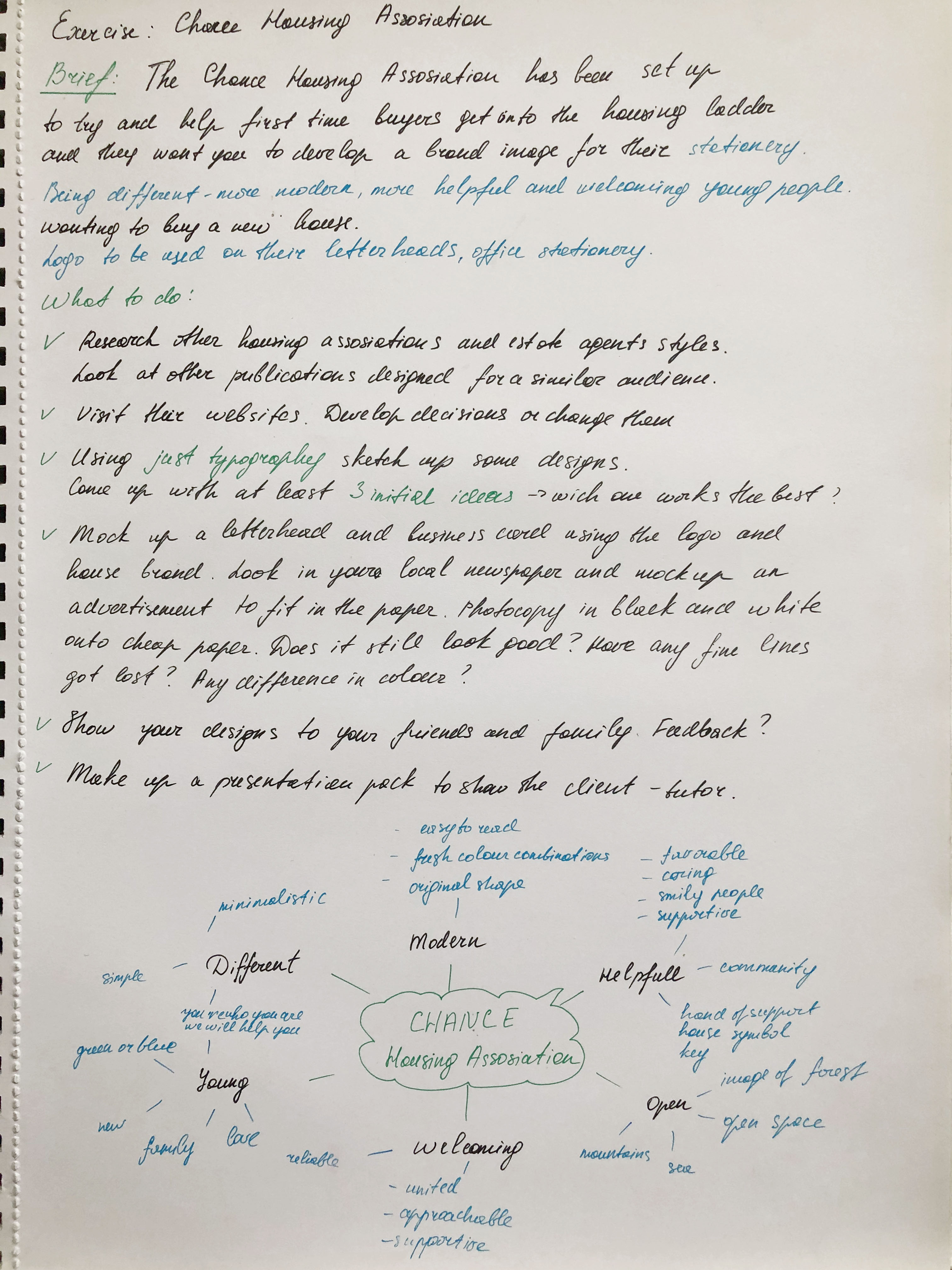
The Chance Housing Association has been set up to try and help first time buyers get onto the housing ladder and they want you to develop a brand image for their stationery. It is important to them that the Association is seen as being different from the other local housing associations – more modern, more helpful and definitely welcoming to young people wanting to buy a house.
OCA. Core Concepts
They want to use their logo on their letterheads and office stationery and it will also be used somewhere on the sheets that hold the property details. It also needs to be reproducible in the local newspaper and professional trade magazines.
What to do
• Research other housing associations’ and estate agents’ styles. Look at other publications designed for a similar audience. This information should help you identify as much what you don’t want to do as what you do.
• If this was a real job you would need to visit the housing association’s offices and website, if it has one, to see how many decisions they have already made – for example they may have painted their sign silver and dark blue and used a particular font. As the designer you may want to continue with and develop those decisions or change them.
• Using just typography sketch up some designs. You want to come up with at least three initial ideas to show the client. In this instance you can decide which one you think works best to further develop.
• Mock up a letterhead and business card using the logo and house brand. Look in you local newspaper and mock up an advertisement to fit in the paper. Measure the space carefully remembering to leave sufficient margins so your text isn’t cramped. Photocopy in black and white onto cheap paper – does your logo still work? Have any fine lines got lost? Are the differences between colours still discernable?
• Show your designs to your friends and family. What is their feedback?
• If you need to, go back and adjust your artwork. If all is well make up a presentation pack to show the client – in this instance your tutor. Keep all your work and record the process in your learning log.
Researches
This time I had a new project with more in-depth market analysis and compiling a portfolio and brand book for Housing Chance Association. Here I have an opportunity to feel like a real contractor not only in design but also in marketing. The task is challenging to subordinate and includes several stages. I wrote for myself the critical points of the brief because here a challenge not only to develop a logo but also to understand how important the uniqueness of the brand is, to build up a recognisable corporate identity which will carry the main message to customers.
I made a mind map in my notes because here, it was essential to observe the structure and sequence of actions. The mind map helped me concentrate on the main factors, and decide on the keywords for the brief.
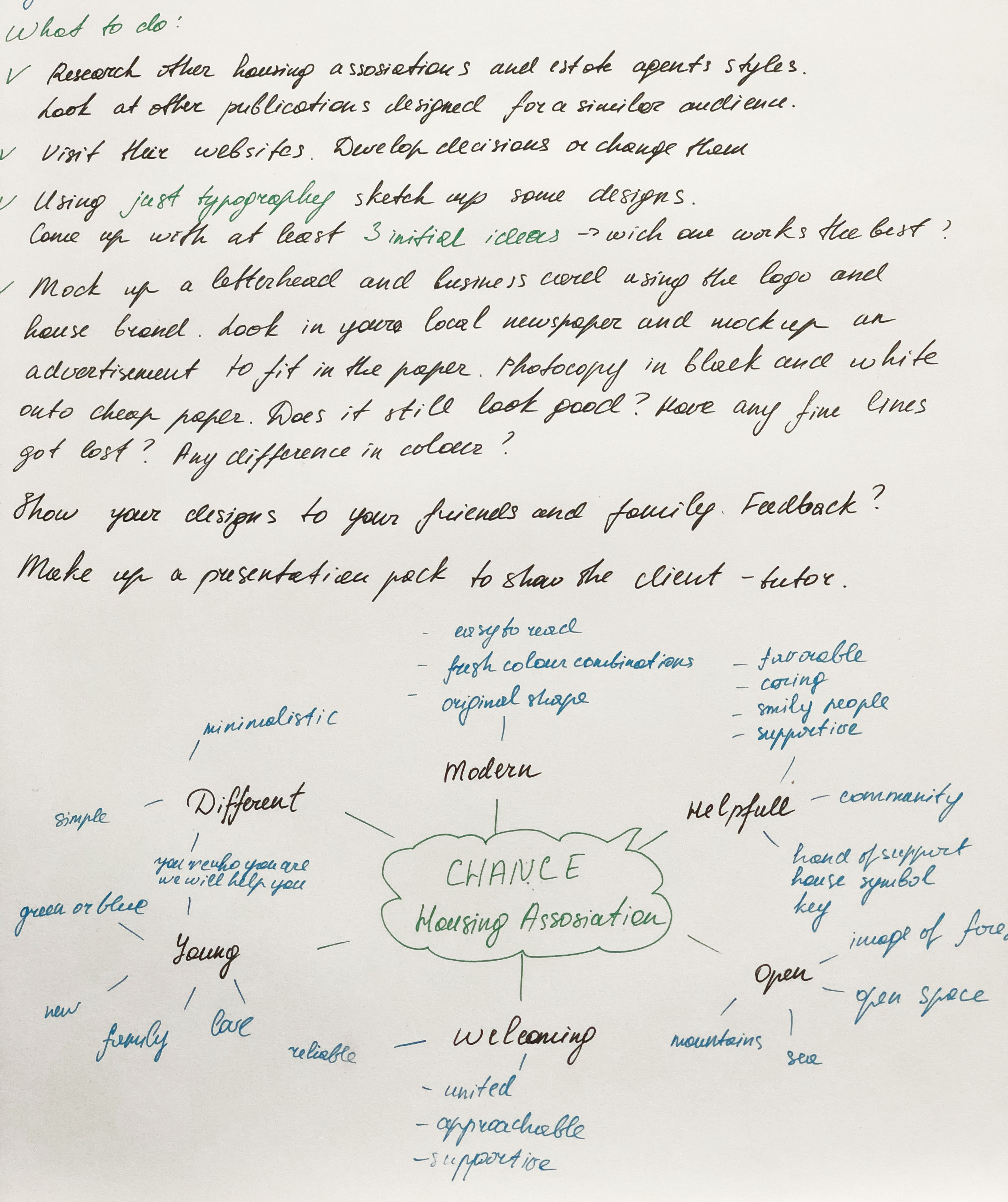
So, in the first stage, it is necessary to analyse existing companies, understand what unites them, and find the missing link in the market that would help distinguish the brand from other companies. To begin with, I found a collection of Housing Association logos in Google, because here it was vital for me to find existing companies, by far the first in the list were those that are in most significant demand through Internet searches. I had never before paid attention to the offices of a housing association, apart from charities; however, their mission is still quite significant, this is a real help and support for a young people who are just getting on their feet. I noticed that in most of the logos you could see the house symbol, a shelter, a symbol of a roof over the head, which gave me the feeling that the house symbol is the most used option. Some companies went to more non-standard ideas, let’s say the silhouette of people, or unifying brackets. Also, some logos resemble the collection of the missing puzzle, as the personification that we will help you feel complete. These are understandable, easily recognisable symbols for such field of activity. I also noticed that light, pleasant combinations of colours are being used, such as blue, green, or combinations of multi-coloured elements, thereby hinting that the brand is light and unlimited in some strict framework.
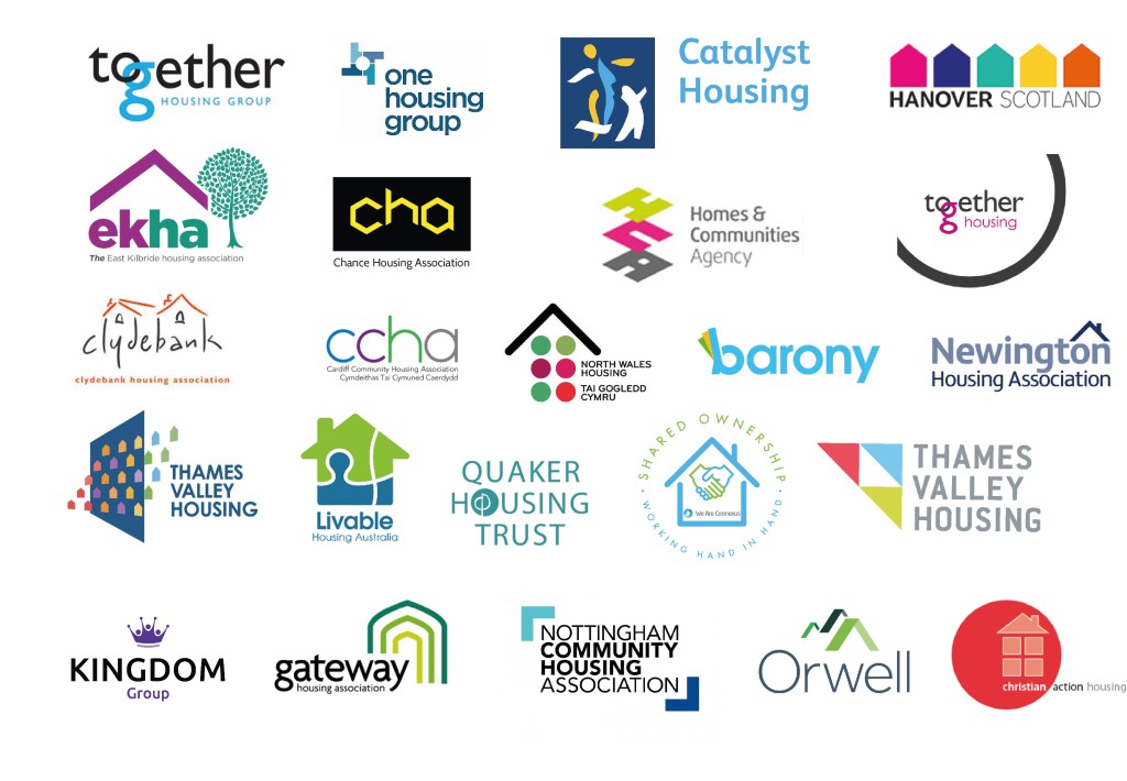
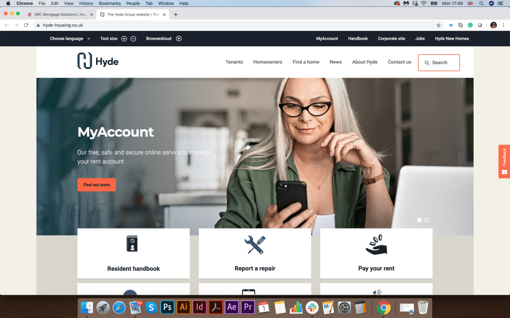
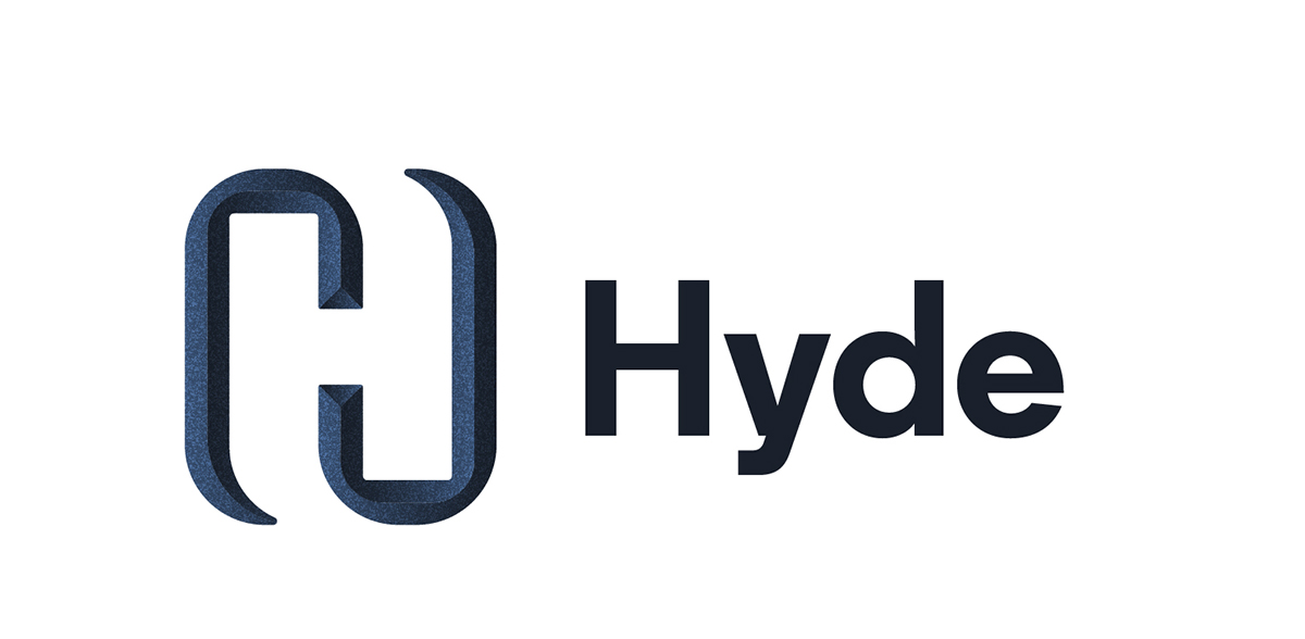
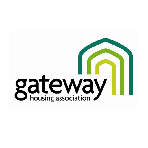
After that, I proceeded to the next stage of research. I have collected screenshots of real companies in the field of Housing Association. The first thing I turned my attention was the vibrant colours on the site, combined with smiling and friendly assistants. At first glance at the company’s website, it’s essential to show a potential client that we are glad to see you and want to work with you. The service menu is located in the top part of the screen. The company logo is in the upper left corner and then comes the banner. I also noticed that the list of services was highlighted in bright multi-coloured blocks with icons, which indicates that usability was designed for clarity and maximum availability of information, which talks about openness and a desire for cooperation. Let’s say companies like CHP, gateway, together housing are made in a similar style as if they are links in a single chain. But Hyde is an association of a more mature business, grey shades with a deep blue logo dominate here. I paid my attention to the company Jigsaw, which, compared to the others, was distinguished by a restrained style, an unusual shape of the logo and the unique structure of the website. It also focuses on family values.


Favourite Logos
For myself, I highlighted several logos of Housing Association companies, which, in my opinion, are distinguished by their originality. The Jigsaw logo had a non-standard symbol, with not just for the silhouette of the house, but according to the origami principle. Also, the website was designed on a modern structure. I also liked the Hyde corporate identity and logo, which hides a 3D image of the H. Platform logo stands out because of its bright and bold font, and precise reading.


Researches Conclusion
The main difference between Housing Association and estate agents is the difference in values. From my experience I can say that walking around the city centre I could meet property selling or renting companies, where the main entrance is covered with photographs of houses or apartments, with different price variations. At the same time, the Housing Association is located in more remote places. The working principle is more similar to charitable organisations, where it is essential to hear and understand each person’s story. While estate agents are exclusively commercial organisations, and the main target for them to lease or sell the real estate of their clients as much as possible.
Housing associations are a not-for-profit organisation that can be registered charities or focused on helping particular social groups such as over 60’s, disabled customers or young people as in our example. In comparison, estate agencies mainly run for-profit and therefore tend to use higher rates with no particular social group focus, offering very exclusive properties as well as basic living accommodation.
Sketches
After I researched housing associations and their corporate identity, determining the fundamental differences from commercial estate agencies, critical principles in the design for such organisations on the market, I started sketching the future logo. Based on the mind map, I also summed up what keywords can be used in sketches. For the future logo in my designs, I wanted to use such objects as building, the key, lock, ladder, window, door, roof, in general, the main components of the house. My goal is to reproduce bold, readable, transparent, bright, modern logo that would attract the right audience. Since this organisation is designed for the younger generation, I also wanted to create a colour palette, with fresh, bright shades, but at the same time observe the style and fashion trends. From my sketches can be seen that some logos were based on the image of the house, roof, key, all of them were interpreted in the very spelling of the logo. I understood that initially, the task was to use the company name “Chance” as a logo, and this is a more difficult task than drawing a different logo, as a house or any other graphic element. It was essential to show that the name of the company itself is already a logo and carries its message to customers, the principle of “Type Tells Tales”.
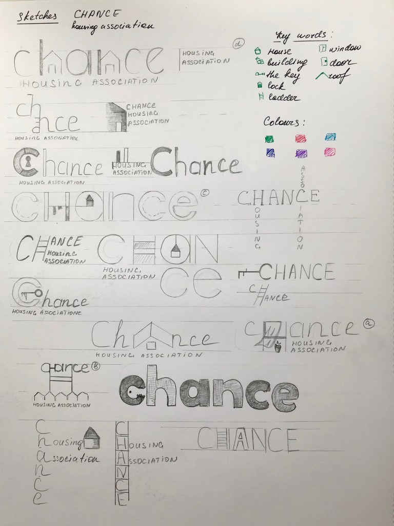
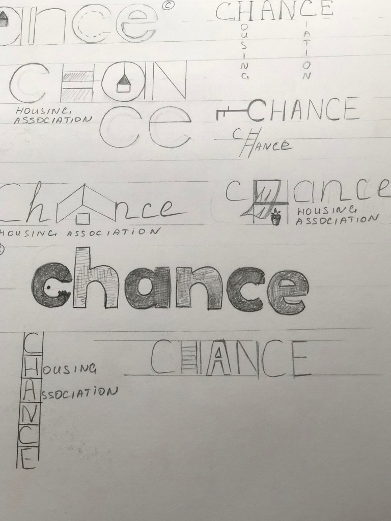
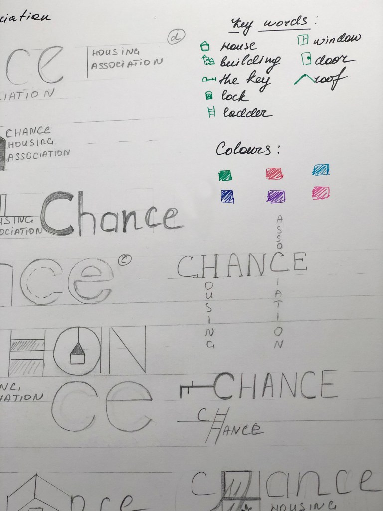
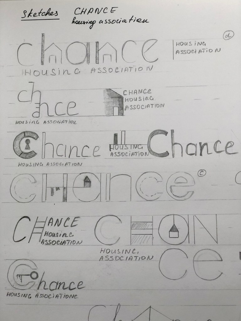
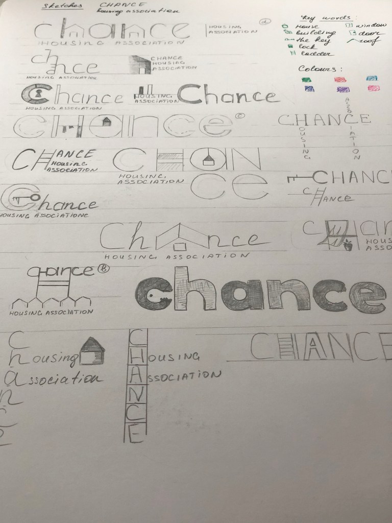
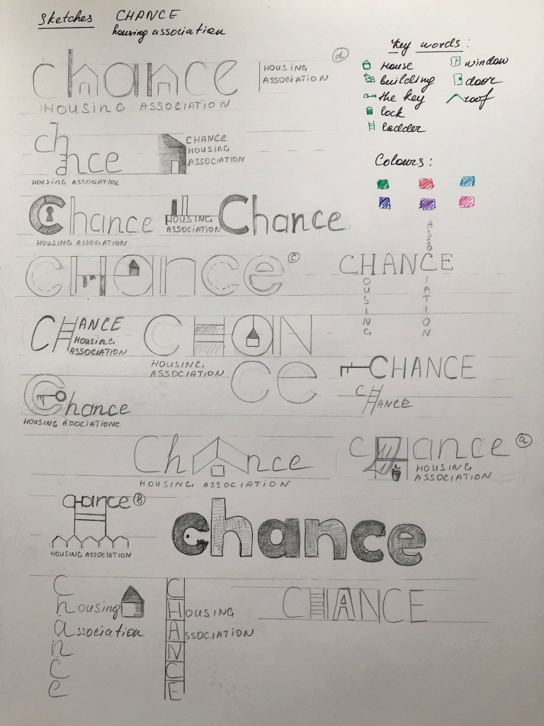
So from my sketches, I could see the design leaders, but I wanted to draw several options so that I could choose the most successful option from the drawn designs in colour.
Logo Design
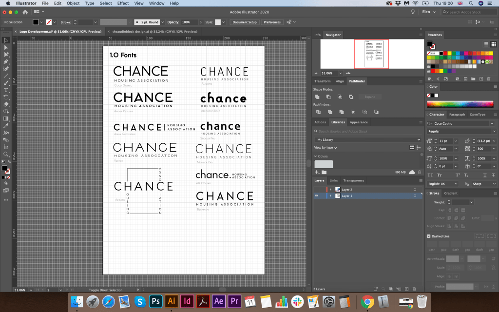
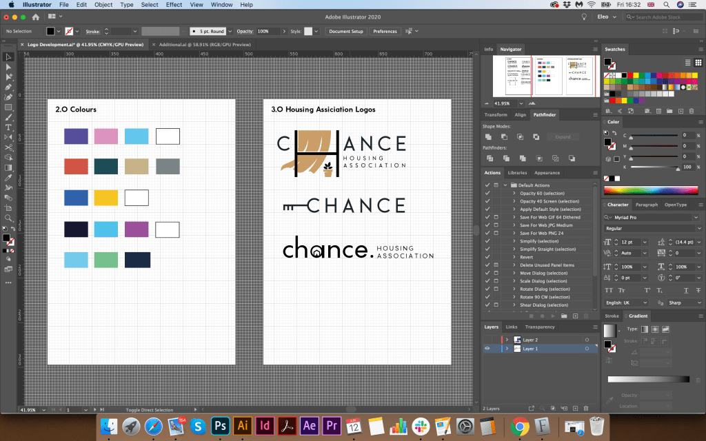
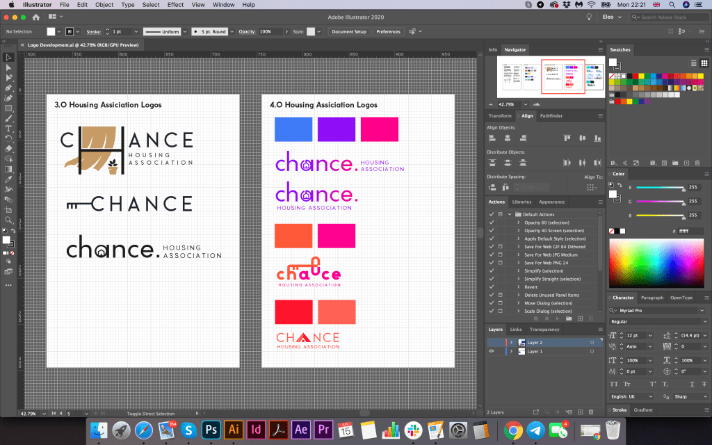
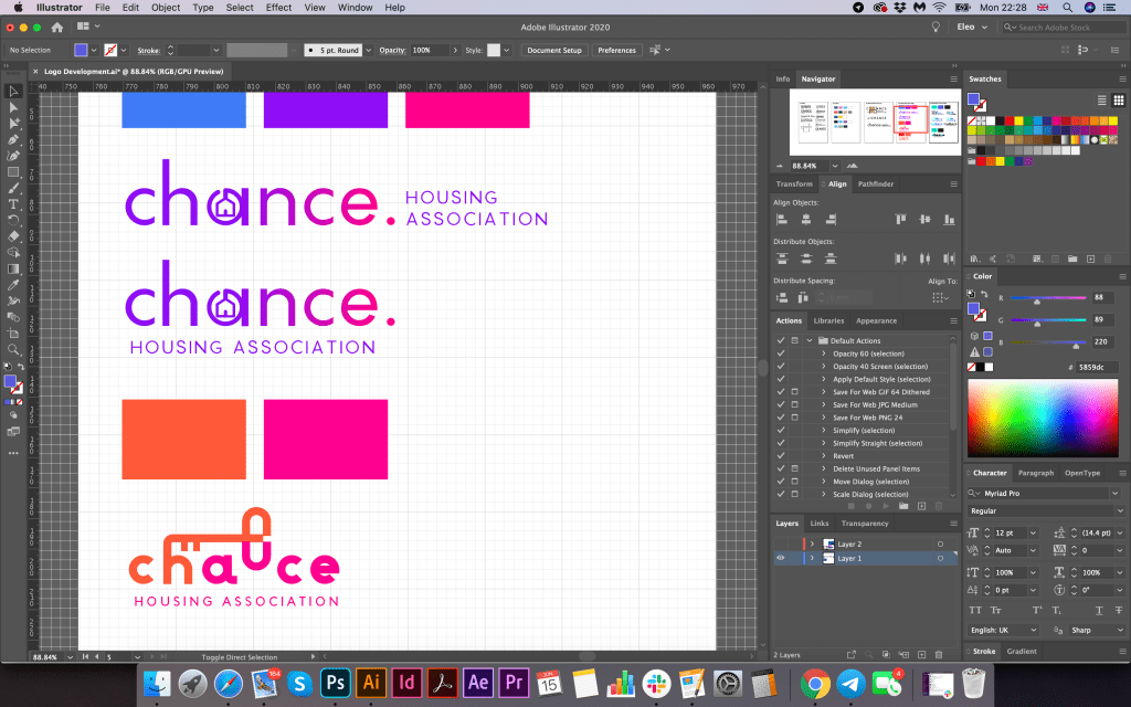
Further, according to my sketches, I started designing the logo. For the beginning, I used the principle of choosing a font, then selecting a colour pallet, and after drawing the symbol. From my screenshots, it can be seen that I created a list of modern fonts, sans-serif mainly. I liked the thinner font options, but I was not sure that they would help me display the logo I wanted. I also created a list of colours for the corporate identity, as I wanted to show the freshness, freedom and lightness of the brand, a combination of green and blue shades became my favourite.
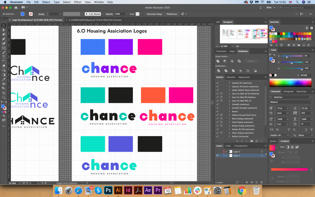
I still did not understand whether I would like to make a gradient or freestanding colours for the logo, but I thought that I should make that decision later. I portrayed the first options in black, but after I used full colours, as for me it would be easier to determine the mood of the brand. So there were bright orange-pink shades, as some shades of purple and blue.
In the first version, I portrayed a window with a curtain, an exciting combination, but I did not quite imagine such a trendy design in a charity type organisation. Next, I had an option with a suspended house in the letter “a”, which looked more like a keychain. I liked this version of the logo, but I thought that the font was too thin, I wanted to portray bolder font, have more prominent understanding. I also had an option with a key above the logo that came from the letter “h”, but again I was not quite sure of the clarity of this spelling. The roof variant is a bit outdated; such kind of logos was often used around ten years ago, mainly for construction companies. I tried to depict a curly roof for writing the letter “A” in the word “Chance”, and also dilute it with small four windows, a more modern version. However, still, I did not want any association with a building company. I wanted to show a symbol of housing, home. Therefore, I used the last option with the key in the letters “c”.


I showed the logo options to my family, and everyone agreed that the last logo with bold spelling and the key symbol is the most successful. I thought it would be nice to show the key as a symbol of getting into the property. For the logo, I used Coco Gothic Heavy font, in lower cases, but for the tag line, I used Beckman font all capital letters with some spacing between the notes. I wanted to add some kind of zest to this logo, so the idea came to move the letter “a” and “h” closer to each other, and mark letters “c” “a” “n” in one dark purple-blue colour, so the word “Can” clear could be read from it. For the letter “a” I added extra white outline, so it does not interfere with the letter “h.” I could probably use the slogan, “Yes, you can!”, with a special meaning that everyone can get your own home.

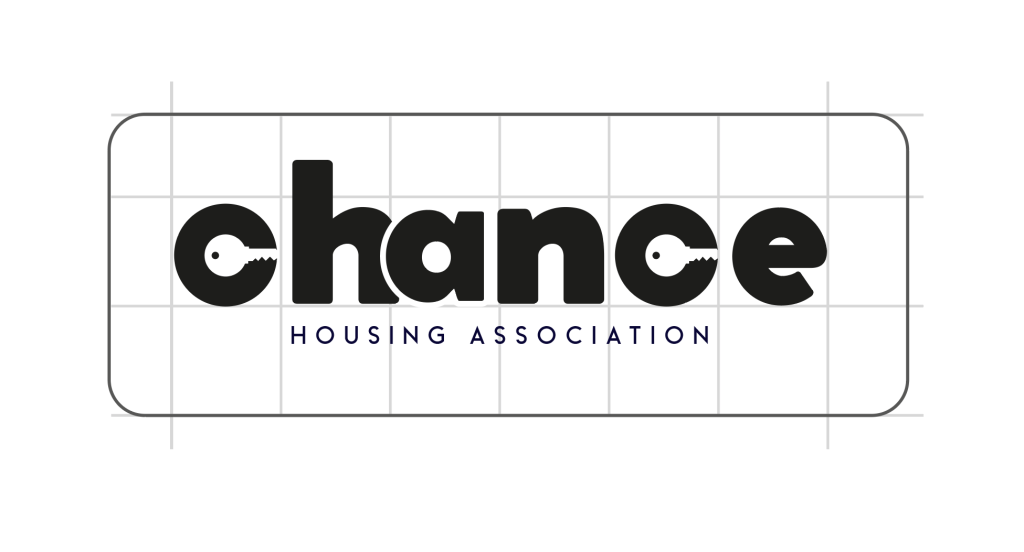
In the next step, I made a small presentation of the logo, which would look like a page from a brand book. I would very much like to create a more detailed brand book, but due to lack of time, I could only recreate only one page. So I determined the constituent elements of the logo, how the letter “c” was transformed into a key symbol. I also depicted in the cells the location and proportions of the logo, indicating the free field around. In addition, the colour gamut and gradient in percentages for CMYK, RGB, and HEX colour schemes.
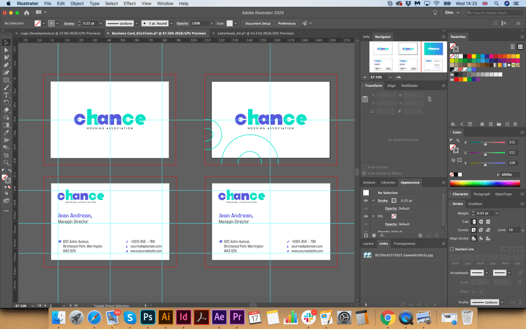
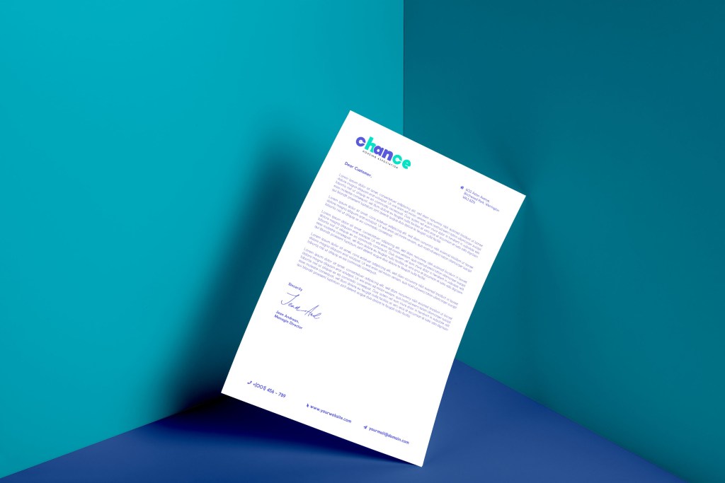
Stationary Design
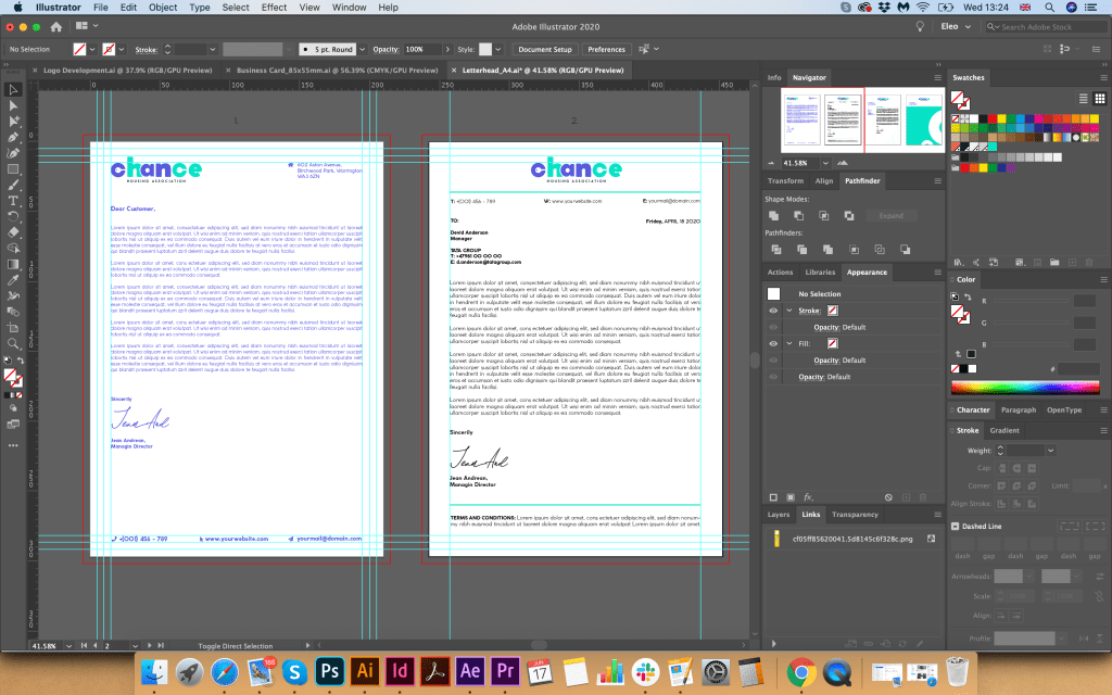
After I had chosen the logo and colour combination, I moved on to the next stage, creating a letterhead and business cards. From my own experience, I know that the logo, font, and corporate colour essentially set the style for the stationery design. If I go back to the mind map, clearly the client wanted to see the different, welcoming, helpful, open brand, which would attract young people, who have a hope of getting their own first home. Here was essential to keep that freedom and youth of the brand, I wanted to experiment with some turquoise, blue, and spacious designs, with some feel of modern association, but keep it less funky at the same time, as that is a charity organisation.
I played around with some colour font ideas and different variations of text locations. I wanted to use some modern tall font for the Blank A4, but in the result, I ended up with Coco Gothic variation font in the purple colour font, as it worked quite well the logo and the central concept. At the same time, I realised that option with a full coloured logo and text colour is only available if the coloured printer available, or that is an electronic version of the letter, mainly I think all would be printed in black.
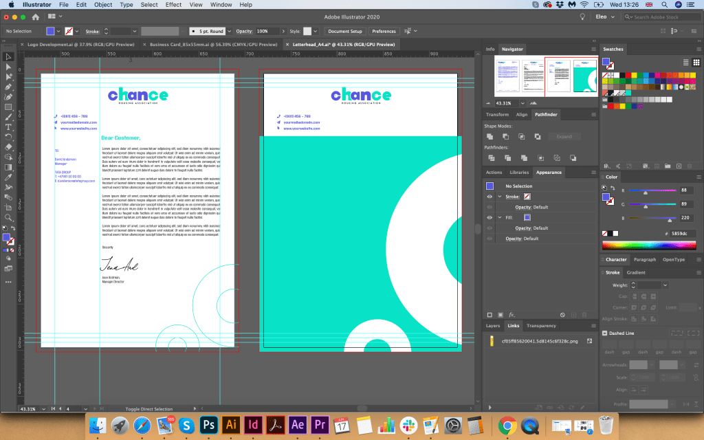
I thought it would be nice to see how the folder for documents would look like, so I created some idea with background gradient with some white circles around it, which seemed relatively fresh and eye-appealing. I thought that based on the principle with a colourful background, I could create a design for business cards. I had an option with a white logo, which looked quite lovely on the bright background as well. For business cards, I created a generic business card, without a name, it’s useful to have them for the company. Still, in terms of design, I decided to lose those circles around, as I thought they were the only disruption. In the result, I had a fresh, bright modern design, which was needed to mockup for the final touch.

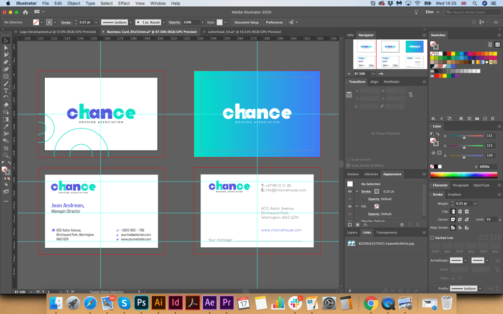
Stationary Mockup
Also, I chose a bright background for modelling printed materials to highlight the freshness and youth of this design. I also depicted several examples of the A5 format and the Euro format, which can be used as envelopes, compliment cards, or payslip. Such a striking design only emphasised my idea of logo design.


Advertisement for newspaper
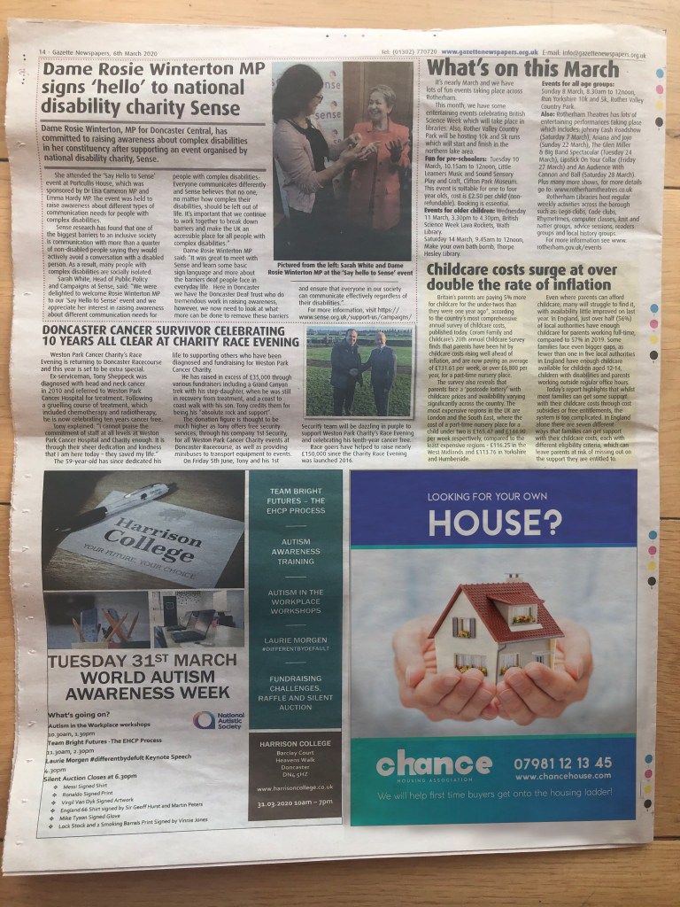
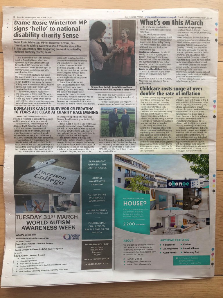
The last touch for these series of design is an advertisement for the local newspaper added some different variations I could bring for the brand. I’ve measured design of the Doncaster Gazette I had in my disposal, most of the advertisement places were just about 13×16 cm, vertical position. I’ve created a few articles, some of them looked like text with regular explanation what is all about, another option I made look like more property kind of adverts. But I thought would be nice to find some take care images and place it for the advert with a large and prominent text, so these designs creating the idea of a call to action, with a question mark, “Looking for your own house?” It could be another slogan like, “Looking for the possibility to buy your own house?”.
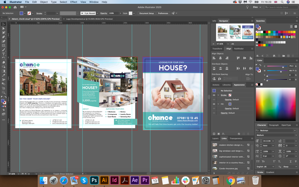
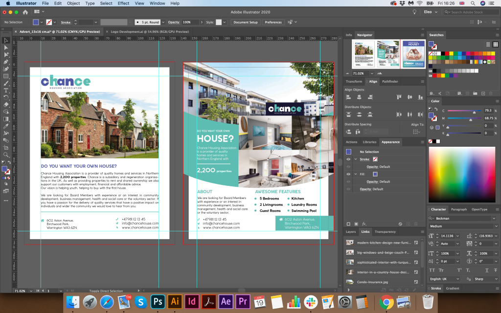
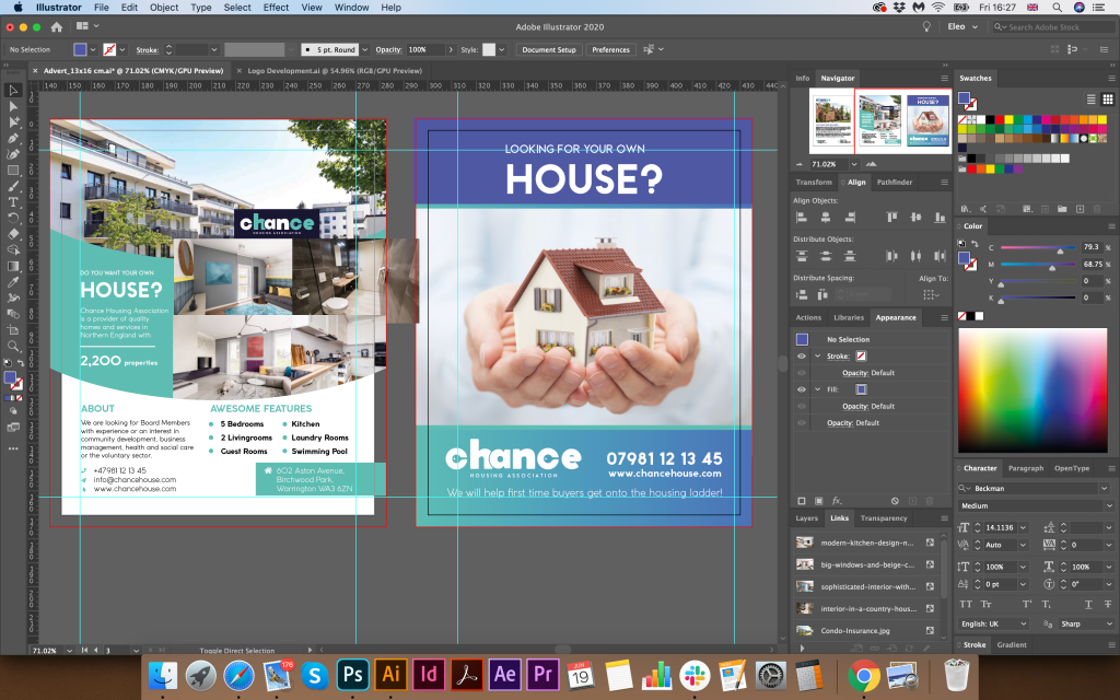
I’ve mocked up a few options of the advertisement, and I thought that my preferable option with a little house on it with big readable text, so it would be an excellent option to make this advert to stand out.
Reflection
In conclusion, I would like to say that I thoroughly enjoyed this exercise. During all process, starting from sketches leading to the advertisement design, I was asking my family to have a look at the progress, to ask what kind of ideas this branding brings initially. The challenge of this task was to create the logo inside of the Type letters “Chance” which was initially more complicated. Probably would be easier to concentrate just on the logo, however on this task I had to think about the logotype first. Another quite interesting fact is that housing association could be similar in the logotype to the construction companies, or locksmith, as they have identical direction, which is a house, or getting into the house. However, with the help of colour variation and font, I think I could create more charitable direction for this brand. Here I had to remember some of my previous Assignments and exercises, where I had to apply the principle of communicating type, at the same time closing a colour pallet which would bring the right mood as well. I think that the result of my work is quite good, the only my concern is that is it visible these key symbol inside of the letter “c”. I think I produced this logo big and bold enough to be able to see the details on the big scale as in the smaller proportions. Creating the brand identity of the company is one of the significant parts for the graphic designer. Even if the existing company has its logo, it’s useful to have some reviews in terms of design that to be able to keep up with the modern tendencies, and I’m looking forward to some more branding tasks in the future.
