
This exercise is about how you deal with two different spaces to work in. You have been asked to design an A3 poster and an accompanying double sided A6 flyer to promote a singing course run by an organisation called SingOut (all one word). They have very little money so want to print these posters on their black and white photocopier. You can use a colour paper if you want.
You may want to include an image such as a drawing or photograph, but be very careful with photos as they tend not to reproduce well on a photocopier particularly if they are colour photos. You will need to check by printing off your design and/or photocopying it.
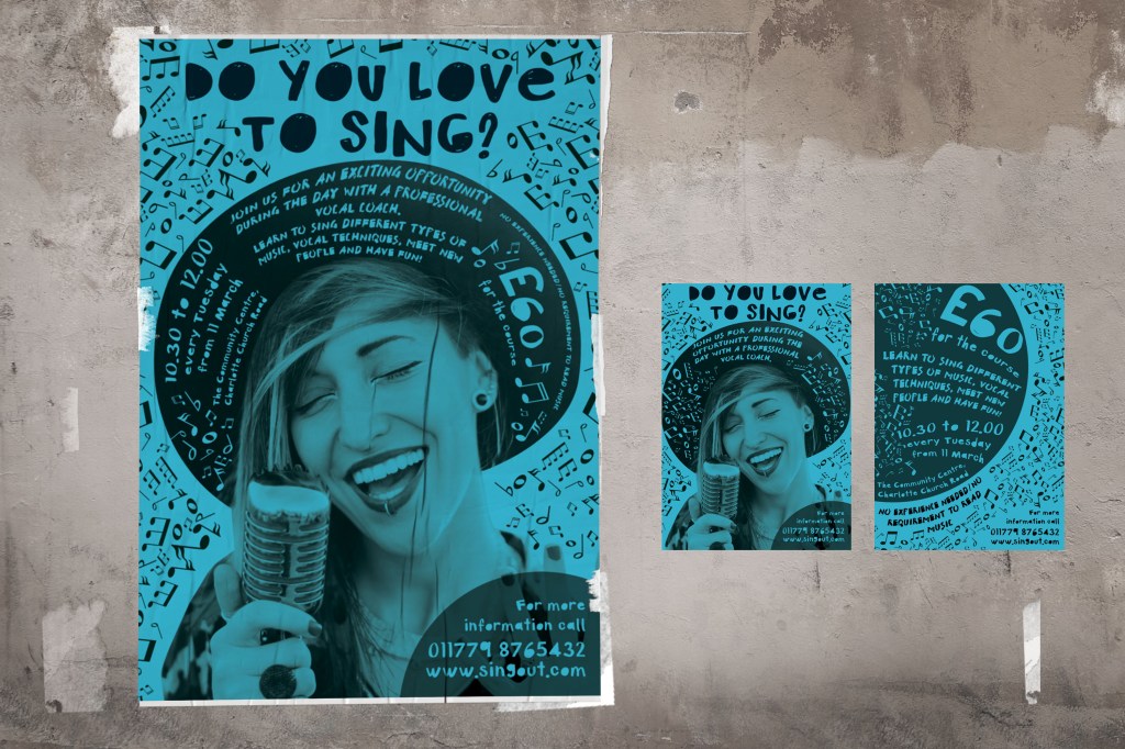
The information they want to give is:• Do you love to sing?
• Join us for an exciting opportunity during the day with a professional vocal coach.
Learn to sing different types of music, vocal techniques, meet new people and have
fun!
• 10.30 to 12.00 every Tuesday from 11 March
• The Community Centre, Charlotte Church Road
• £60 for the course
• No experience needed/no requirement to read music
• For more information call 011779 8765432 http://www.singout.comThe first thing you need to do is work out if you have all the information you need to fulfil the brief. If not what is missing? Work out the hierarchy of the information. How will you divide your information up to fit on both sides of your flyer? How will you link the design for the poster with that of the flyer? How can you make the poster eye-catching and effective with such a limited palette? Which typeface or faces will you use and why have you made that decision?
When you have finished pin your poster up and critique your work. What do you think? Keep notes and sketches in your learning log.
OCA. Core Concepts
Researches
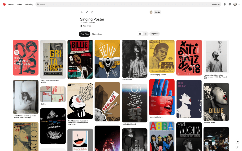
To start with, I decided to find ideas for inspiration on vocal posters. In my opinion, the main argument for these vocal classes sign is to identify the singing person or singer/singer in action. I found some of the options that I saved in the mood board on the Pinterest page. My collection of posters are mostly concert posters, but they helped me to form an idea of how I would like to portray my version. The fact that the colour scheme had initially restrictive requirements, where I could use only one colour, was a kind of advantage. The main reason why I thought this was an advantage, because colour paper and printing in the same colour, in our version, black and white printing, could create the necessary style and creative layout. From my earlier researches about techno music, I noticed that artists rarely used full-colour image, mainly the idea is a restrained selection of colours. I thought in this design due to colour restrictions, I could achieve a somewhat non-standard solution.
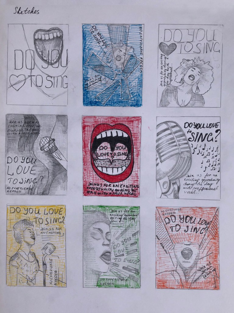
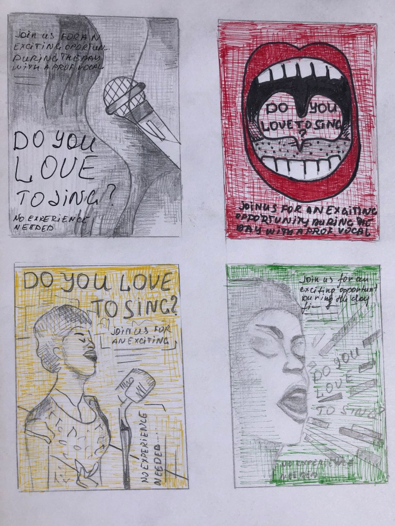
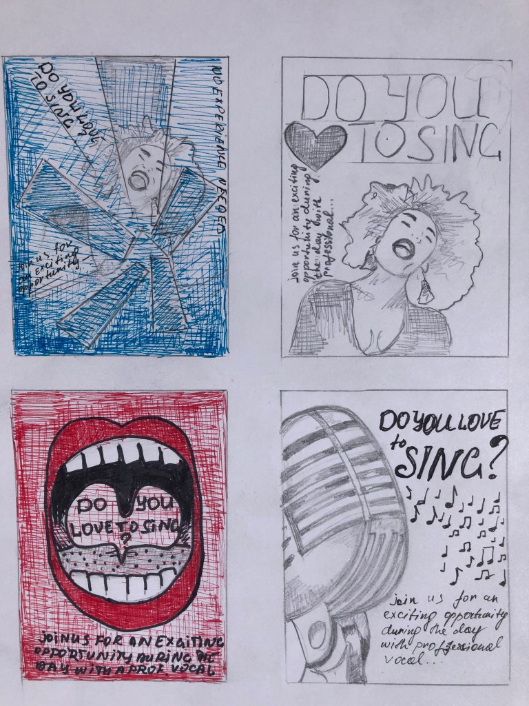
Sketches
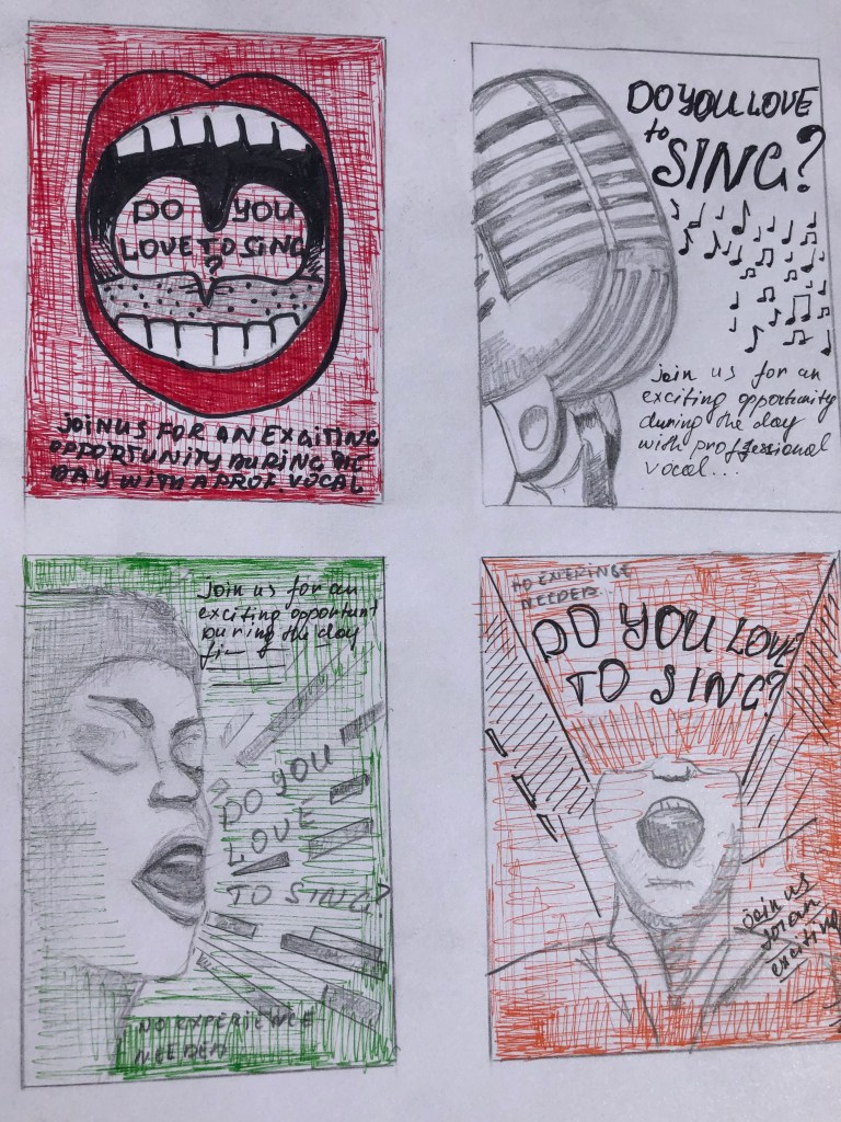
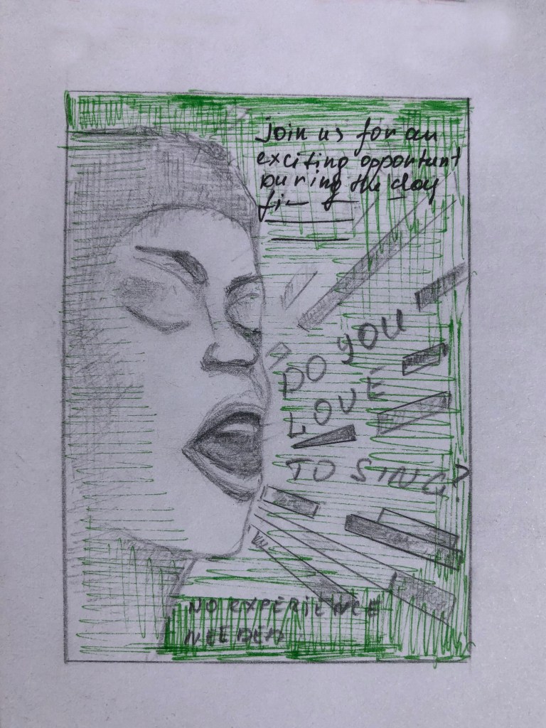
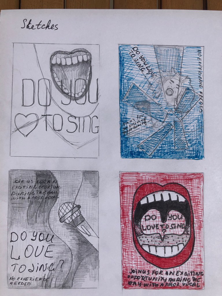
Next stage, I started sketching future designs. At the heart of my ideas for posters were such as a person singing full face and profile, I also wanted to depict the flying words from singer’s mouth, since it was vital for me to show the person in action. As an alternative, I thought would be good to depict a microphone, in several variations, a direct association with singing, as well as variations just with the mouth, a more radical design, which in my opinion was more bold and flashy, but as an option is entirely original. The text for the posters is very casual, open and welcoming, with a message: “Come to us, your experience is not important to us, your main desire and love for singing are important to us”, — so the design for it should also be light and playful.
Since the musical direction is also quite creative, I wanted to introduce some original solution into this poster, which would help me to highlight this poster against the background of other options.
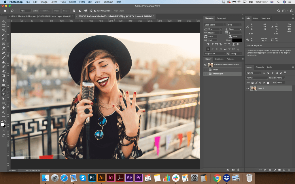
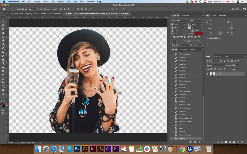
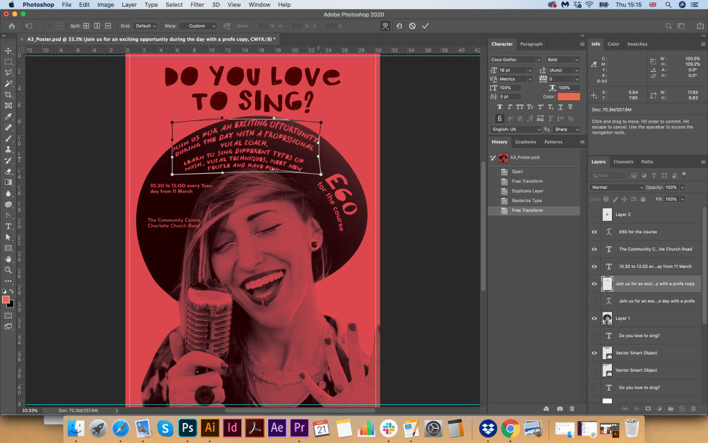
Also, for the image of a vocalist, I wanted to pick up a girl with a bright and attractive appearance, and from the first sight, it would be clear that the poster carries a creative message. I was looking for some options, and the image the most suited my requirements, such as action (singing), a microphone, a vivid picture of a girl who looks casual, and I could later beat her wide-brimmed hat in the poster.
Designs
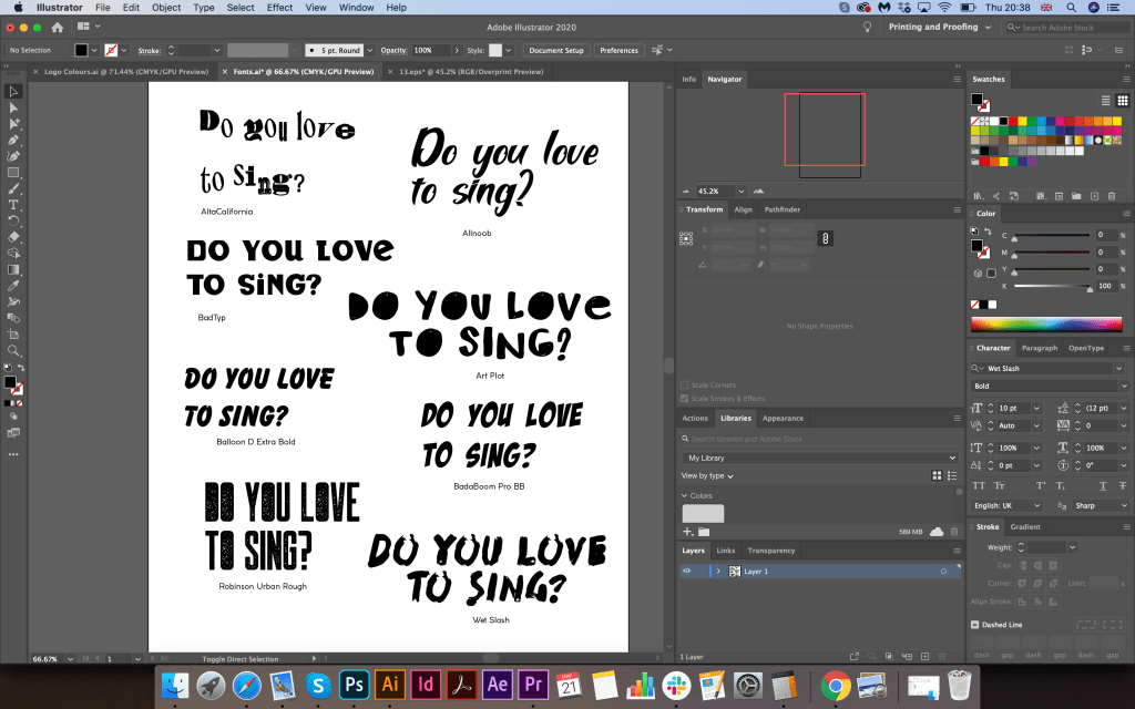
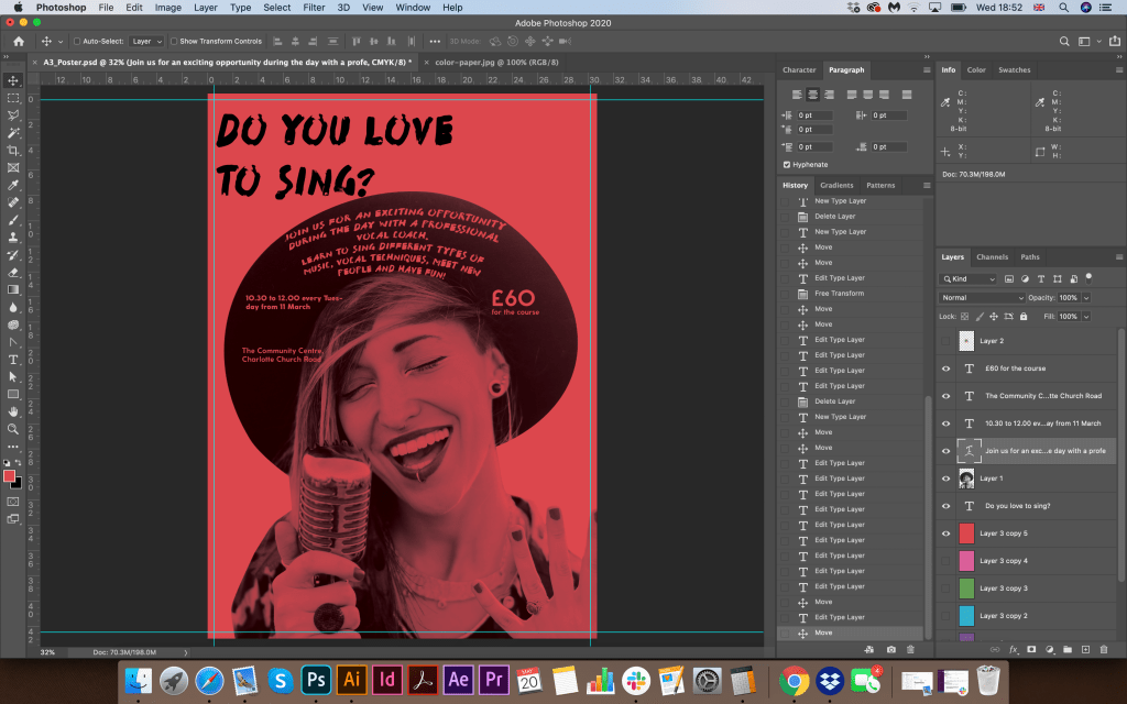
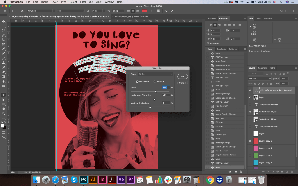
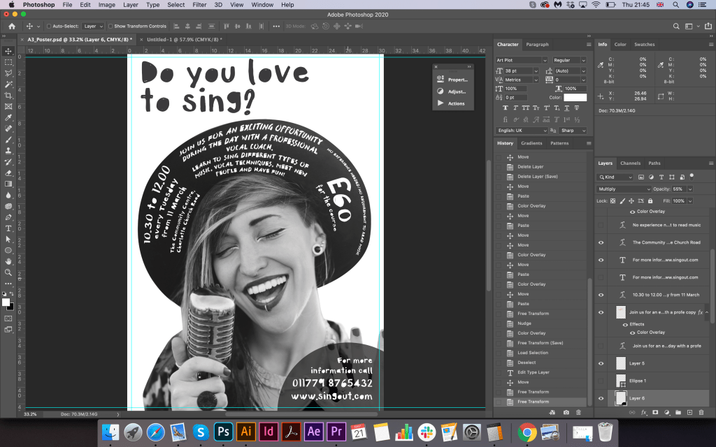
The next step I cut out the image because I did not need a background, I planned to put the vocalist herself on the experience of coloured paper. I collected some options of coloured paper from bright yellow, pink to green and blue, they all were successfully suited to my design format, I couldn’t decide which colour I preferred, so I thought I will try all of them for now. Next, I proceeded to the selection of the font. I felt that it would be worthy of experimenting with the font and choosing a decorative character, I looked for some new fonts on the site for posters, and I also went through the Adobe Fonts font library. My favourite fonts were the Font Art Plot Regular fonts I chose for the main headline. Do you love to sing? WetSlash as an optional font. I tried to place the font at an angle, but because of the rounded hat, which occupied most of the space, I realised that I needed to apply a curved arch shape that would repeat the form of a circle.
So as I copied the text into a poster template, I gave it the shape of a hat with curved parts. I took out the address and contacts in the lower right corner, I did not have enough space on the hat, but I got the idea to place it separately.
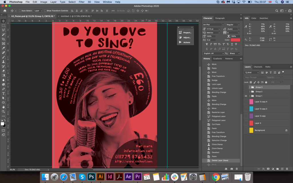
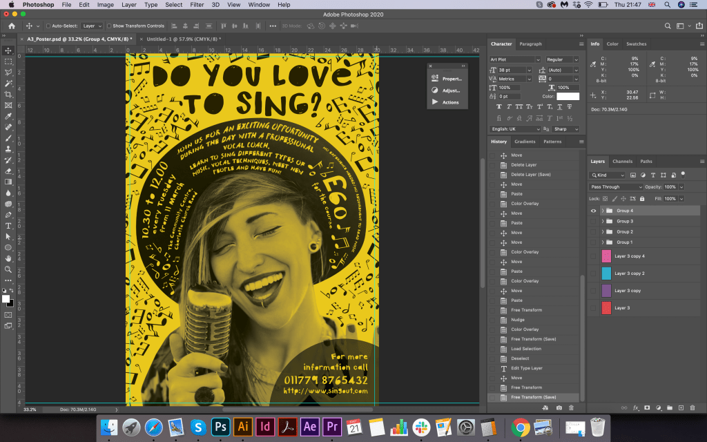
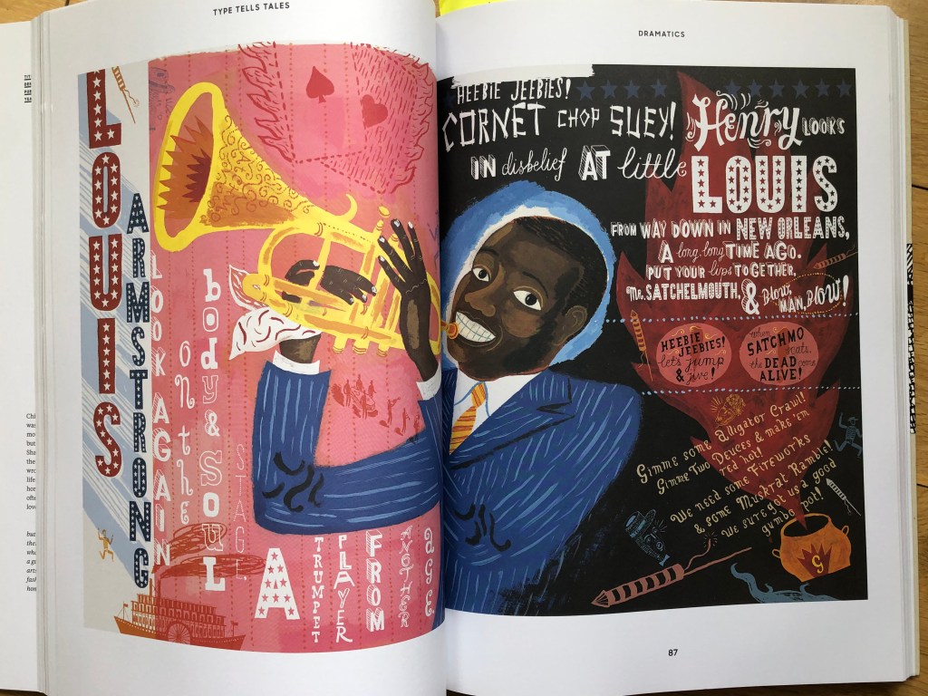
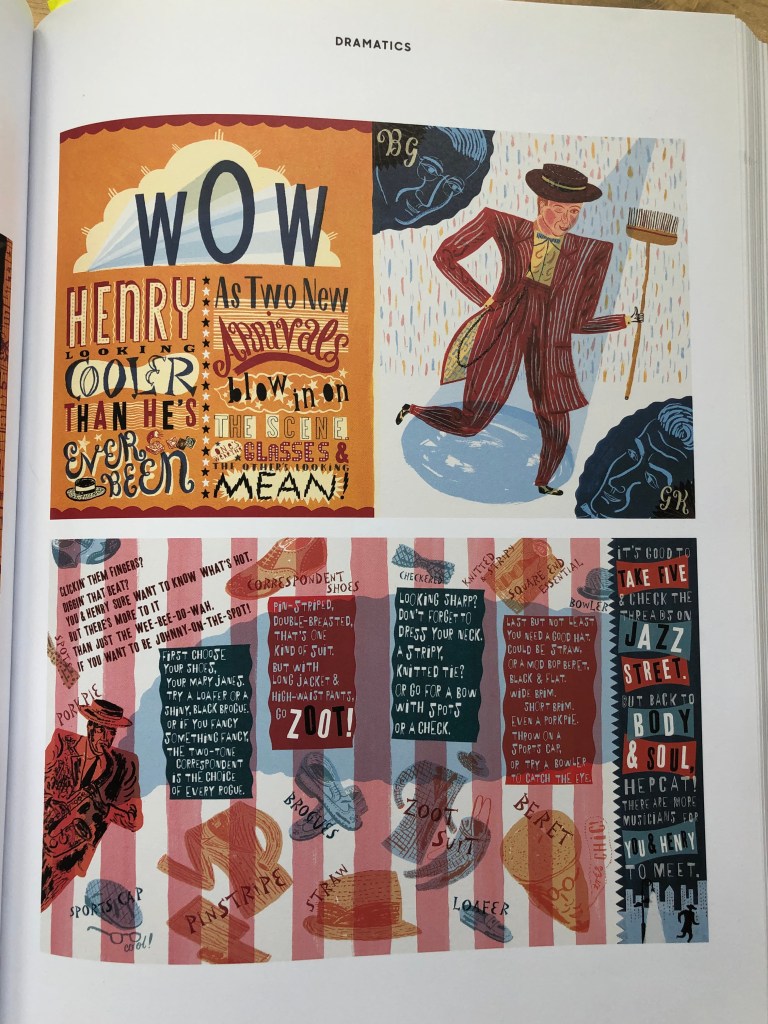
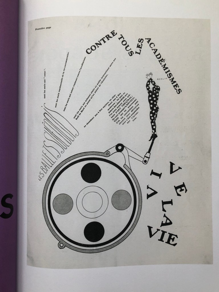
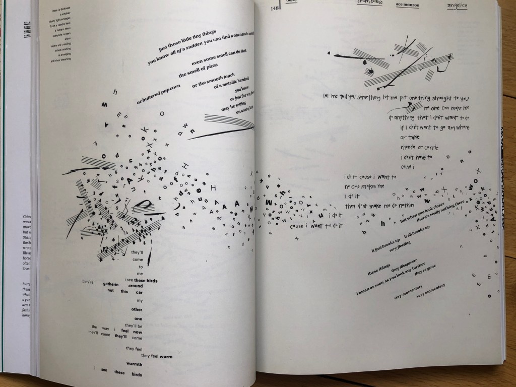
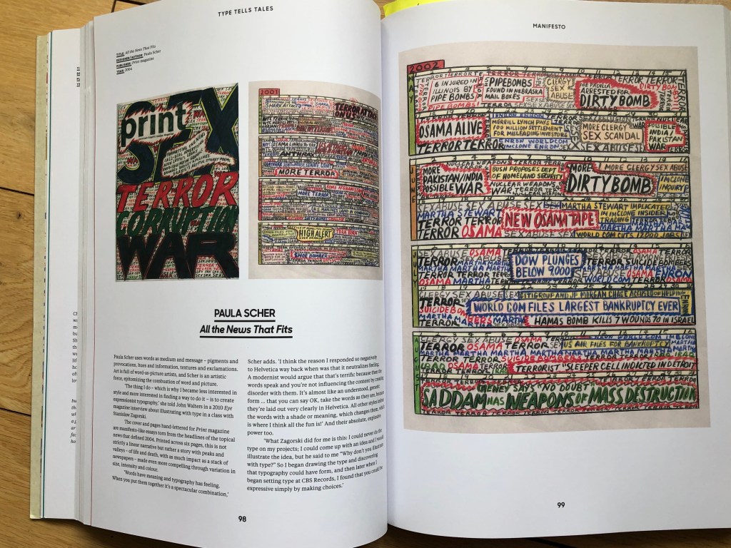
After I placed the whole font on the poster, I realised that there was still a lot of space around. It would be interesting to apply the style from the Font Tells Tales book, and fill the rest of the room with musical notes (as an option, I could also place phrases about vocals or creativity around the vocalist). As an inspiration, I turned to artists like Warren Lehrer “I mean you know” with his play of voices, which his creative approach in lettering and characters. Also, I could relate my future design to such artist as Jonny Hannah “Hot Jazz Special” with her use of all kind of fonts and angles for them. Also Paula Scher works with her saying “Words have meaning and typography has feeling”. All these examples served as a kind of inspiration for the style chosen for this poster.

Flyer Design
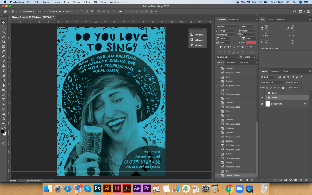

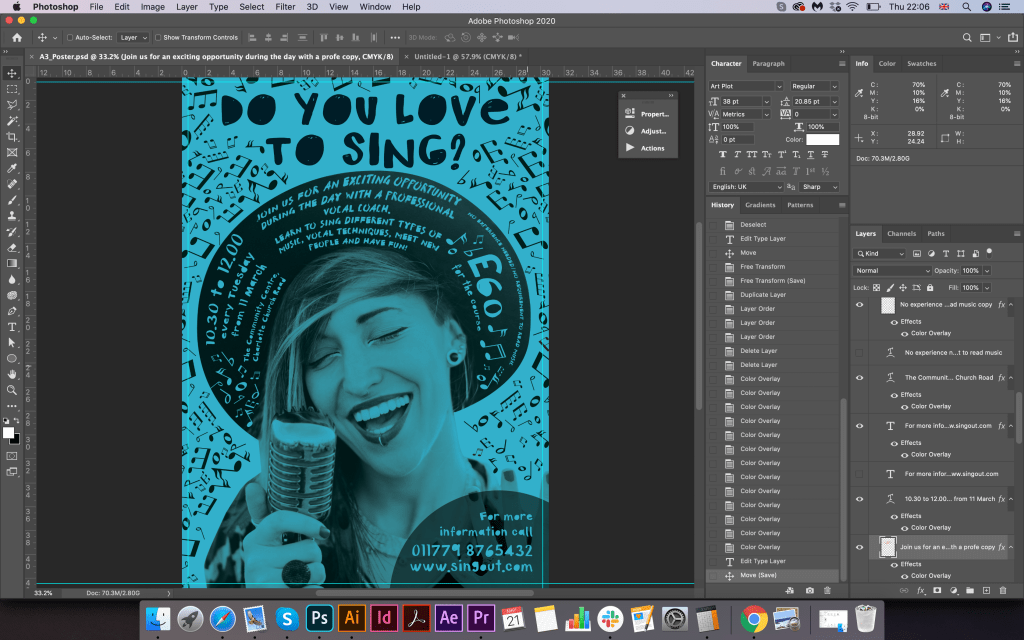
After the design of the poster was outlined, I started designing the flyer. I placed all the information on the poster, including details such as an address, course description, and cost of the event. The main thing is that the main message is “Do you love to sing?” in large print, so he called the audience to his attention. On the flyer, I divided all the information into several parties, I thought that in general descriptive texts are not even needed on the flyer, it was also important to keep the whole message on it, join us, the cost of the course, contact details. The only thing that I divided the narrative into the front and back. Also on the reverse side, I decided to beat the font in a circular composition to support the tandem with the front side, and I also scattered throughout the area notes that attract attention with their style, at first glance, it becomes clear that this is a musical direction.
Final designs
This design was loaded with different elements. Still, I tried to compare it with a more spacious layout, it didn’t appeal to me like that, and judging by the reviews of my family, they would also prefer my final version with a bunch of texts and notes around, it has creativity and originality.

Conclusion
This exercise was an exciting task to follow the hierarchy of textual information. The main message “Do you love to sing?” was highlighted in the largest font. In this design, the question to the potential customer occupies the leading position, so it was necessary here to highlight the font in large letters. Further on the attractiveness of attention are the price, address and contact information. The descriptive part of the event in my design is much smaller, as I did not want to overload the layout with too large text. Probably I could make the price smaller, or delete it to make sure the price wouldn’t be a daunting symbol for the potential customer. But here what is essential is the SingOut company wish, whether they want to indicate the price on the main poster, or is this hidden information only for the flyer, and for a more detailed acquaintance?
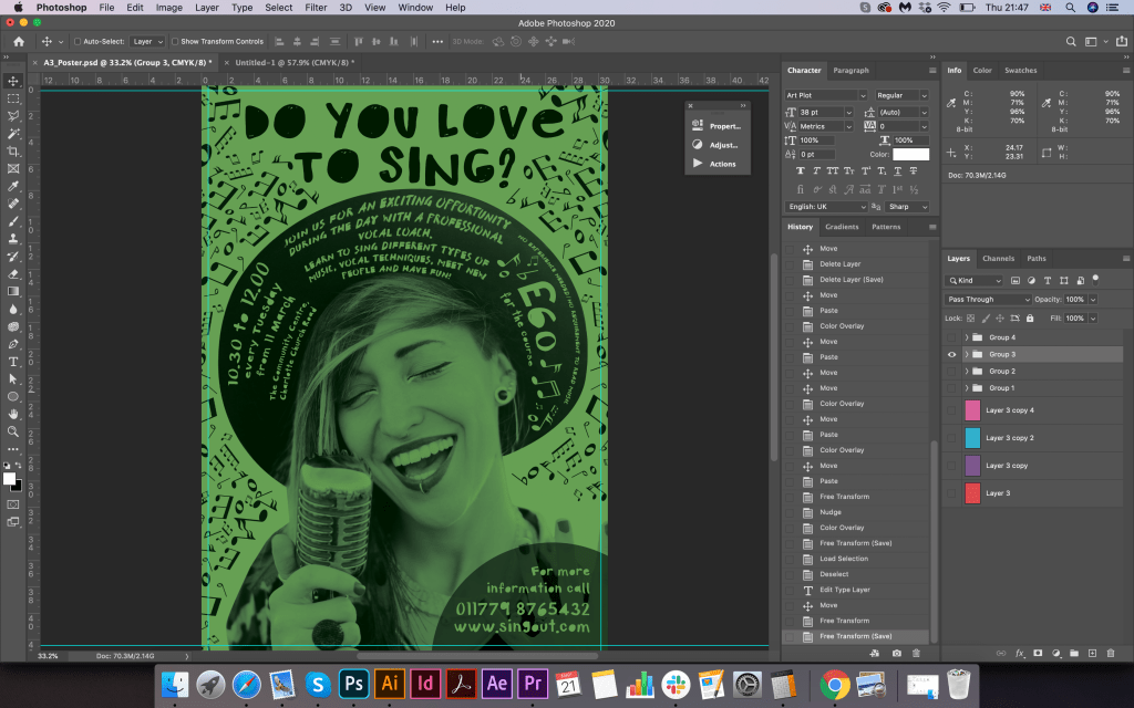
Also, I mocked up a poster on different colours of paper. I liked the possible variation with colours. The yellow paper would always be brighter and more flashy, cyan or green for calmer shades for printing; it also depends on the customer’s desire. I printed the poster on white paper, and the potential of the sign was already visible. Overall, I enjoyed this task; it was fascinating to work in a new style, to follow the hierarchy of information and make the font a part of the design. As a result, the poster was quite playful and attractive. I think it would meet the wishes of a potential client.
References
- Source of vector image for musical notes: https://bit.ly/2LYvEMD
- Image of the singer: https://bit.ly/3bZYkiV
- Font download: https://elements.envato.com/ru/fonts/decorative
- Book Type Tell Tales. Steven Heller & Gail Anderson.

One thought on “Exercise: Poster and flyer”