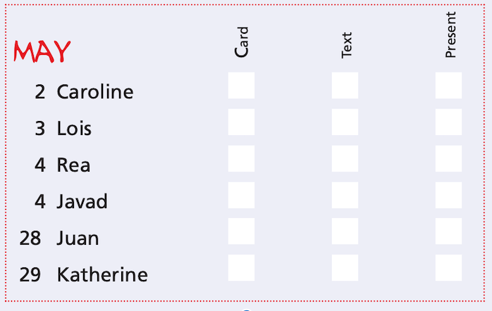
For this exercise you are going to make up a poster list for yourself. It is intended that you keep it pinned to a noticeboard or wall to remind you of the dates and, as it will be there a long time, it needs to look good.
Start by collecting all the birthdays of your friends and family. You’ll need their name and birth date, to decide whether or not you buy them presents or just send a card, text message or email.
When you have all this design a page to include all this information for example:
Introduction
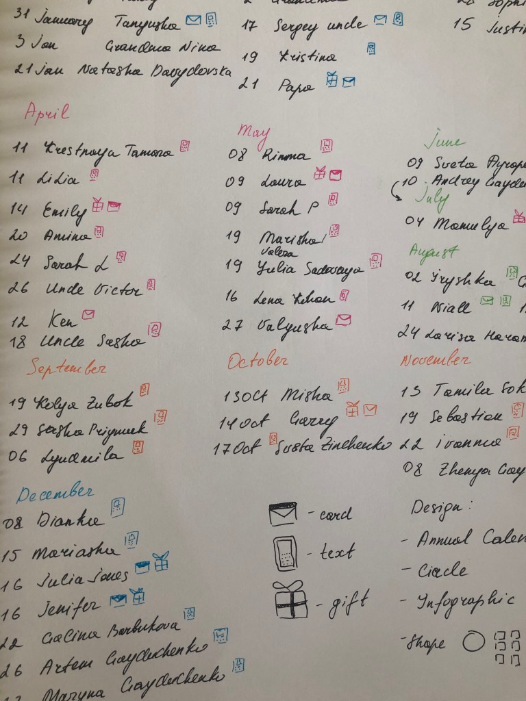
Nowadays most of the people using social media platforms and reminders in the phone calendars to remember the birthday list of their families and friends. But I thought it would be ideal for myself to create a calendar with the birthday list of my friends and family, as being on a distance from some of my close relatives and friends, sometimes I keep forgetting important days. Though, I thought that is quite useful task, so I was all ready to complete this mission. For this particular exercise, first of all, I’ve decided to go through the content list for my close family and relatives whose I wanted to include in my annual birthday list.
Ideas
It turned out quite detailed list of 50 people, which I was planning to use in the design. Frankly, I got a little stuck at this point. I had experience in creating calendars, both desktop and wall samples, where all dates and holidays were mandatory, but I never wondered how footnotes for the holidays would look like, their description, or what if I create a universal calendar only on the one single sheet with fitting all the important information.
I looked for some examples of birthday reminders on Pinterest, most of them looked like girl diaries. I replenished the collection of inspiration boards with some examples of original calendars with an interesting layout and composition.
Despite the simplicity of the task, I was a bit stumped with ideas, maybe I wanted to create something more than a standard sheet with reminders of birthdays, and at the same time, I did not want to create a pun or rebus with all the memorable dates. In order to clarify the situation, I created some sketches of the future calendar. Most of my options were based on infographics and typography. The first option is quite an understandable infographic, with branches from each month. Here I risked overloading the space with names and arrows from each month, which in the end could lead to confusion. Other options were based on standard plates, which in essence I could add creative with unusual fonts. An option with a circular calendar and multi-coloured months from a design point of view could be an interesting idea, but there was a difficulty how to organise it correctly, so in practice, it turned out to be an impractical option.
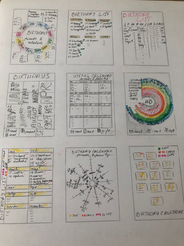
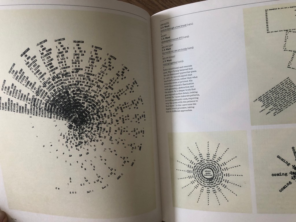
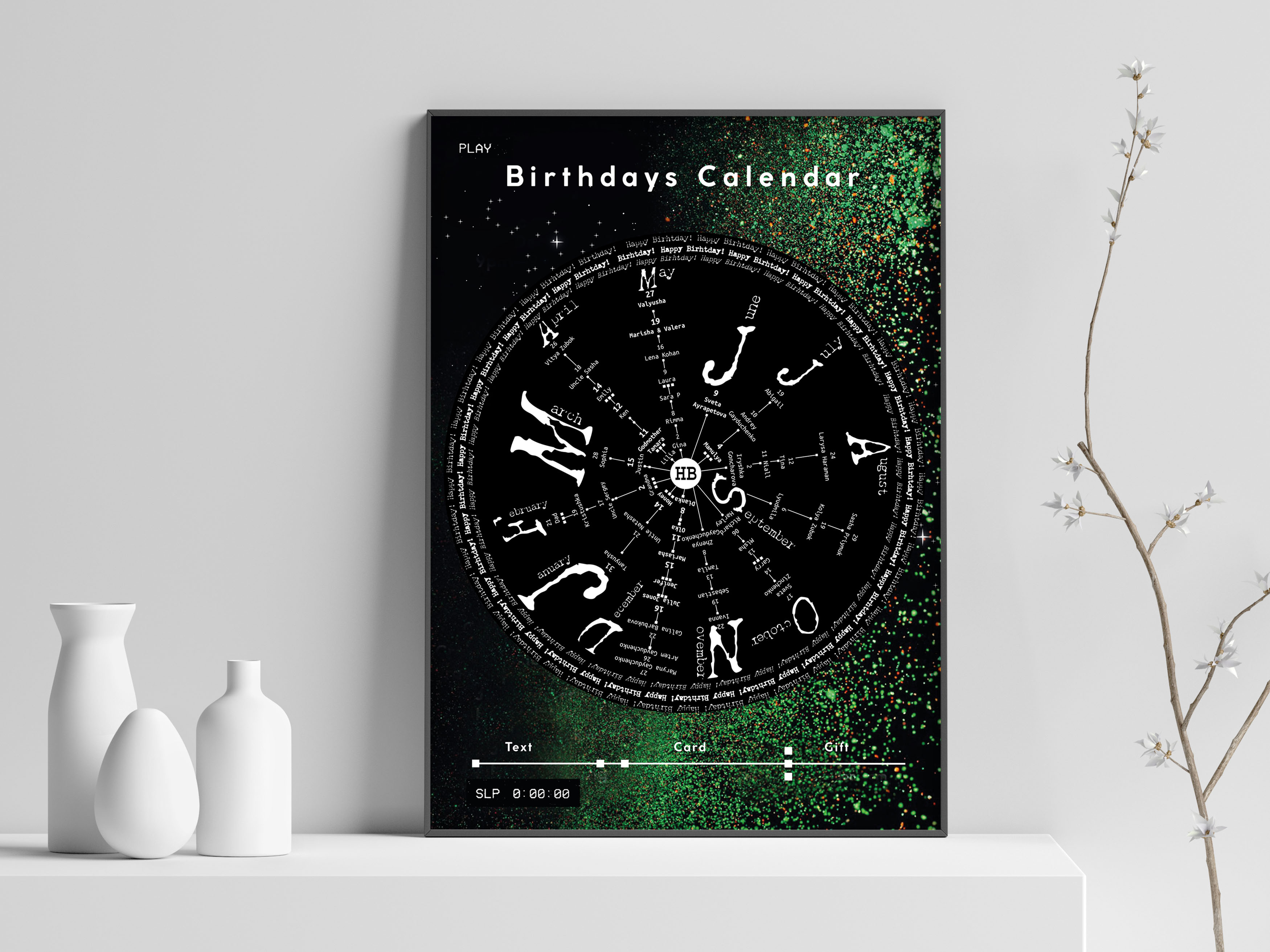
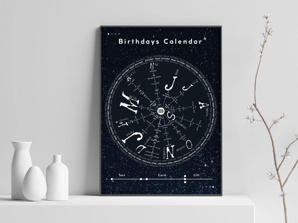
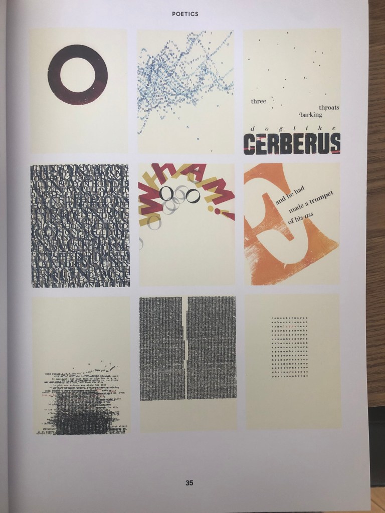
I got the idea to create a circular calendar with dates, I found a source of inspiration from the new book I bought Typewriter Art, a Modern Anthology, by Barrie Tullett. I kind of liked that image presented in this book, organised into the circle, that gave me some thoughts wether it will be a good idea to create my calendar in the similar way. As I had a different number of people for each month, I could create sort of different sizes sunrises from the center. Therefore, I created a small sketch for this calendar, it could be still quite tricky to read all the names and dates, but I thought I’m going to try it. For reliability, I still had additional version of the calendar, which in its structure was more like a poster, I planned to scatter the months of the year over the entire area in different sizes, and after that, make descriptions for each birthday.
Design
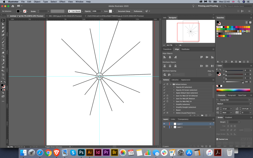
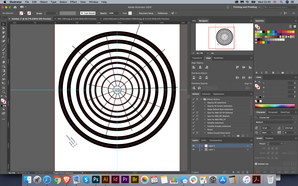
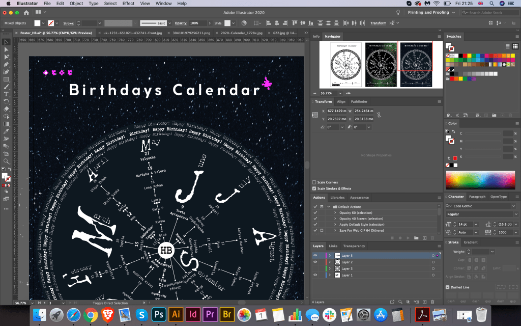
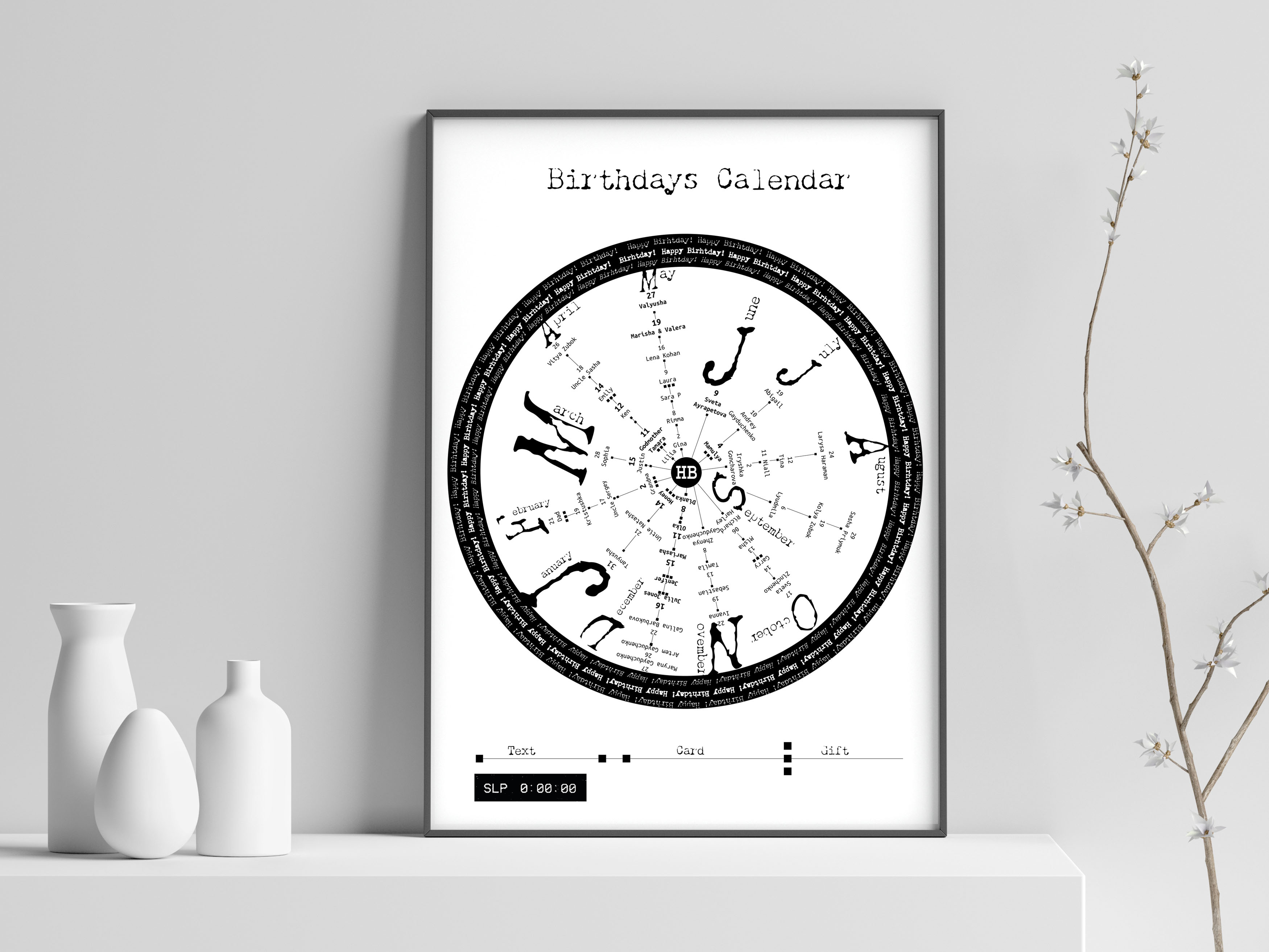
Soon after I proceeded to design the poster. First of all, I drew a small form where planned to build the entire design. In the centre of the composition, I placed the characters HB (Happy Birthday) and 12 branches from them for 12 months. Next, I started drawing up a list of names in a circular motion, the first numbers were located closer to the centre, then in order to the dates further down of the month. To indicate the months of the year, I chose the first capital letter in the Chandler 42 font, similar to the font in the first typewriters which original had sort of defect in the paint. For names and dates, I chose the Ubuno Mono serif font, which also looked like a font from vintage typewriters. I scattered the months of the year in a more chaotic manner, as more dynamics were visible in the circle.

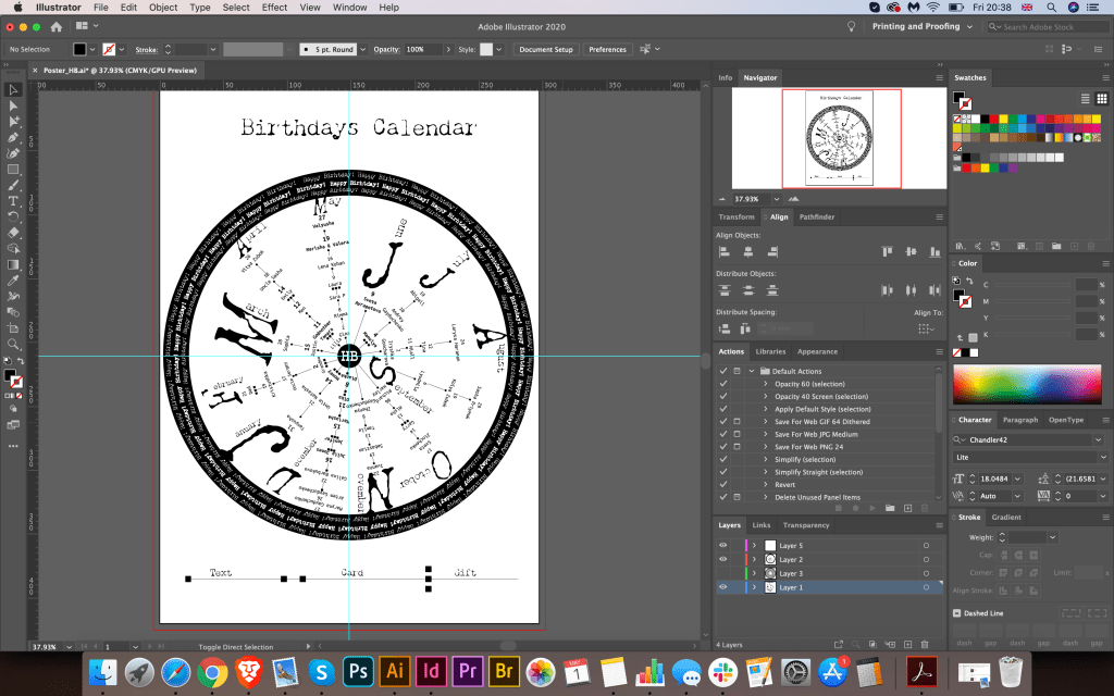
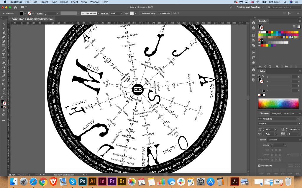

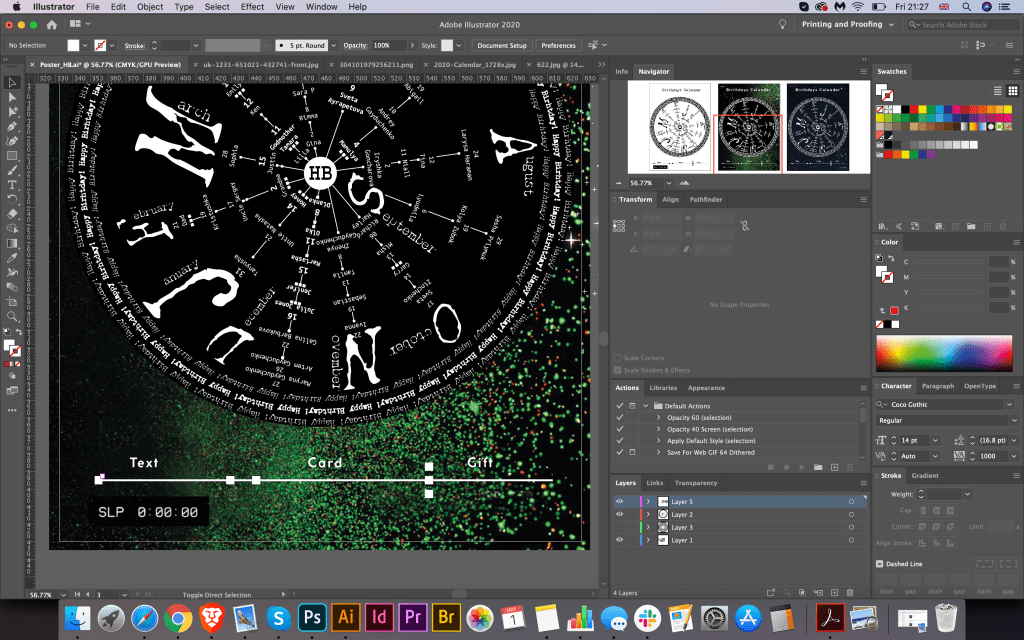
In the first version, I wanted to keep 2 colours in black and white, it looked like the trend of the first creative projects created on a typewriter. In order not to overload the composition with complex elements that act as a kind of cypher, I created a grid with notation, where 1 square is to send a message, 2 squares are to send the card, and 3 squares are a gift.
To finish the composition, I gathered in the circle the phrase Happy Birthday made in several types of Chandler 42 font.
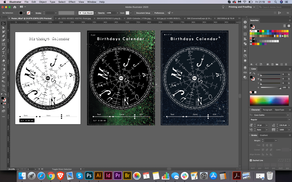
My goal in this design was not only to create traditional Birthday Calendar but also to look at the option of circular composition for the calendar, to trace its practicality and the dynamics of perception of information. The result was quite interesting, maybe it is not the most convenient for reading, and I will have to consider to read it close, but the option itself turned out to be quite unusual. It prompted me to some variations, I decided to experiment with colour and add a contrasting dark background with stars. So, as additional versions I got a horoscope on the birthdays of friends and relatives. I took an experiment with fonts and tone, and in this way created a design similar to the night sky and stars lit on it. I tried using several shades, like scattered glitter and black background, as well as a much darker blue sky and a deep blue tint for my date range. I stated Birthday Calendar in a modern CocoGothic font with a set tracking between letters.
Conclusion
In conclusion I would like to say that I quite enjoyed that experiment with Circle Birthday Calendar. I started with idea of the round design for the calendar, then it lead me to the option with Typewrite Art, where fixed width fonts were used in terms of creating round image, which has an impression of turning around of the centre circle. From all of this colour options, I still thought that I preferred first black and white design, which was easier to read compare to other designs, as the main idea was to create something readable to be able to follow the notes. I’m looking forward to print this poster, I’m sure i will make a good use of it.
Option with Squared Composition
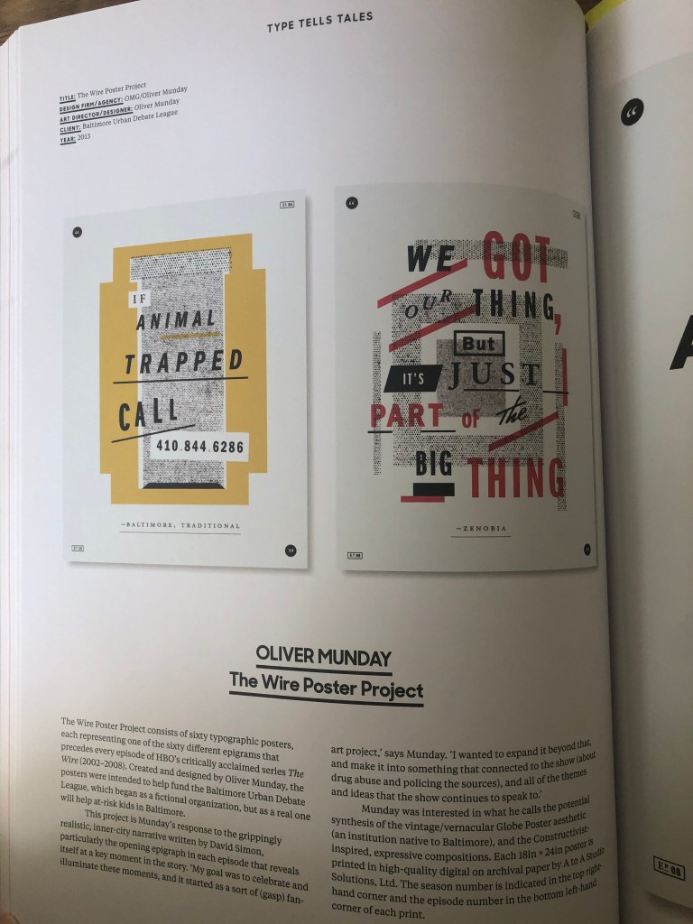
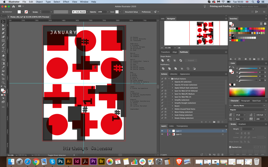
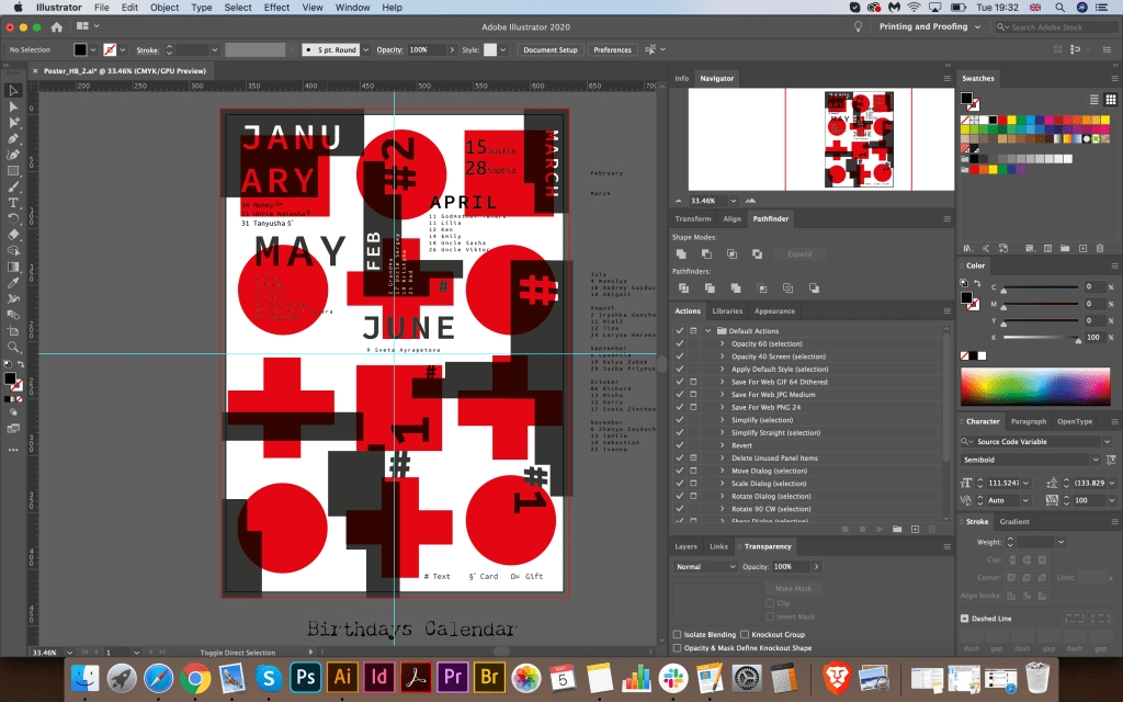
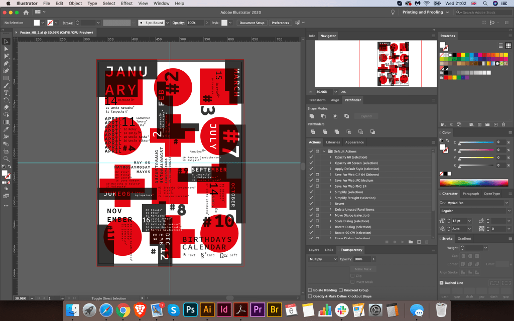
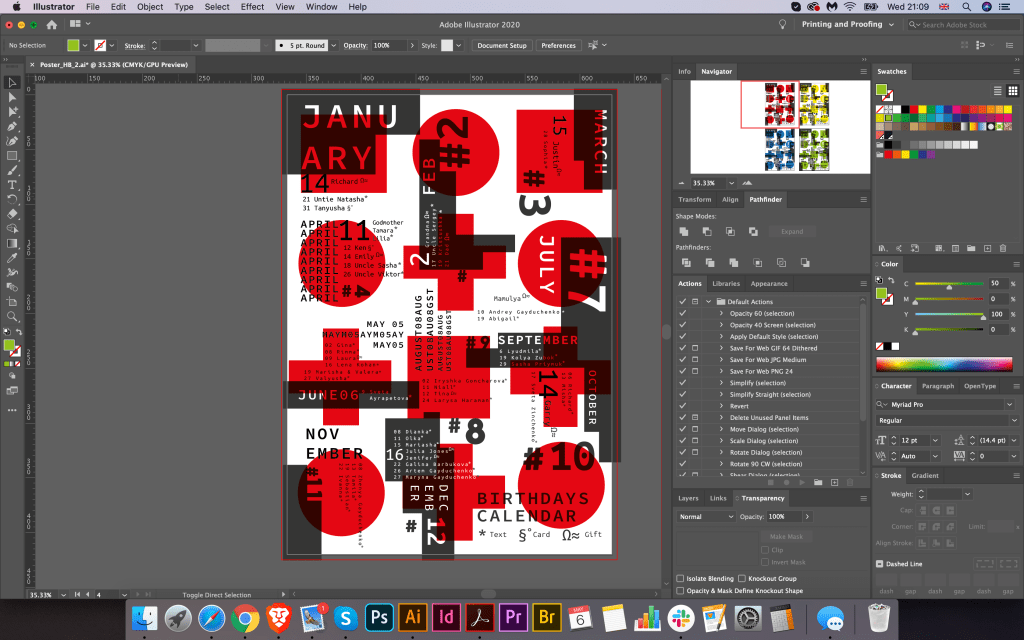
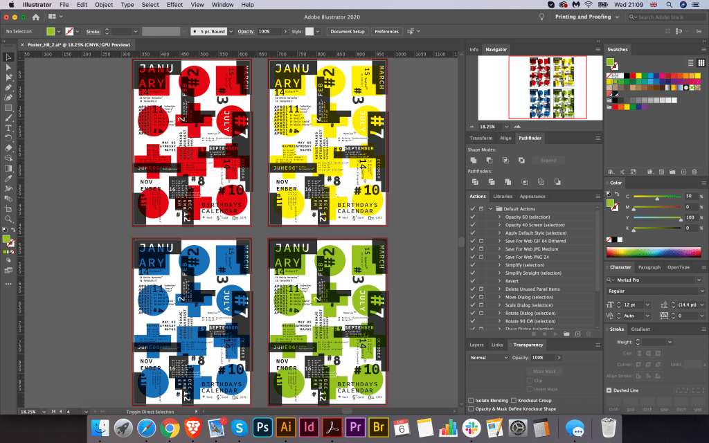
Another idea for this calendar was to create squared composition poster, with organised space in the own segments around the sheet. The reason why I went for another experiment because I wanted to compare the readability and impression from the design in the more traditional squared design. I thought that for this Birthday List calendar I can make it all the stronger by using different fonts and fonts around it. I imagined the space with all names and birthday around in dynamic composition, where each name of month placed closer to the birthday list. For this poster, I was inspired by book Type Tale Tales, which had lots of experiments with font placement and colour variations.

I wanted to try to make my font to be loud but still be supported by simple geometrical parts. I chose simple geometric figures, such as square and circle, with only to colours around it, red and grey. In case that to bring some deepness to this composition I applied multiply effects for these figures, so they were seen through each other.
After that, I proceeded to the placement of each month from the left to the right but keeping at the same time chaotic feel. I didn’t want to overuse it too much, as I still needed to follow which month for which list was there, so I placed next to each month additional symbols # with the number of the month. To be fair, once I created that skeleton with different shapes on it, I thought it will be a quite successful design, it doesn’t have a traditional structure, it had font experiment, so by adding names and month around, with different angle only gave extraordinary feel to it. For the name of the months, I used fixed-width font Source Code Variable Semibold. From the design, it can be seen that I used different sizes for this font, and different colour, for some month’s names I tried to cut this letters inside of the boxes, so it had cut through effect. For the list of people’s name, I used similar font Ubuntu Mono, as I liked that font style for that kind of the design. For the Numbers around I used big bold font of Coco Gothic, as those font selections create good combination together. That to determine what kind of birthday attention each person will have, I placed code in the right bottom corner, where * means text, §˚ card, and Ω≈ a gift, my little cypher for each day.
Conclusion
In conclusion I would like to say that I was quite please with design. It didn’t take me a few moments of creating it, and I had lots of hard work by completing it, but it helped me to widen my researches, and see some more potential, that quite simple task from the first side, as Birthday Calendar can bring some extra creativity on it.

