Choose a magazine, newspaper or journal and work out the grid or grids they have used.
You will probably need to look at least four pages to get a feel of the layout.
Measure the size of the pages, the margins, the text columns and the gaps in between
them. How many columns do they use? Is it the same on every page?
Can you identify the fonts they use? Do you have it or one with similar properties?
How do they use photographs and illustrations? How much ‘white space’ on the pages is
there?
Draw up a two page spread using the same grid as the magazine. Indicate text using
Lorum Ipsum and indicate images by either filling a picture box with a 10% tint or using
a picture from your collection.
When you have done this see if you can develop the grid further.
Select a title and images and see how many variations you can come up with. What
happens when you alter the body font or headline font? Do different kinds of images
change the ‘feel’ of the publication? Do you think the readership for each of your
variations would be the same? Does the image you choose suggest a different design?
Which ones work best and why? Make notes in your learning log.
Design Principle: Guides, Gutters, and Grids
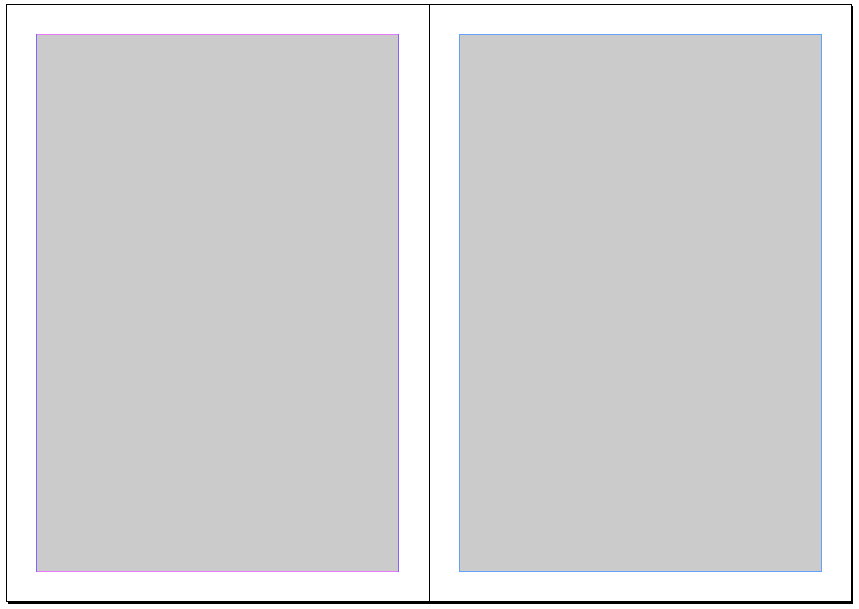
Margins are very important part of any publication design. To set up a type and leading sizes you have to set up columns, and to set up the columns you have to start with proper margins. Margins contribute to the effect of the overall design and the white space surrounding them creates a sense of comfort and belonging.
Setting up the margins
In this case we have to set up margins in a mathematical relationship to the page. Most famous relationship is the “golden section” in which the page proportions are 34:21 and the print area is as deep as the full-page is wide, with the margins in the proportions 2:3:4:6. This results in margin proportions 2:3:4:6. Inner margin should be 2 units, top one 3, outer margin should be 4 units and bottom one 6.
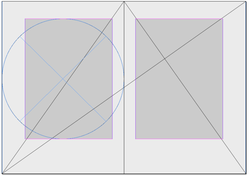
This kind of margins setup is very elegant and very few magazines can afford it. Today’s modern magazine design is swapping the size of top and bottom margins. Quite differently than the “golden section” which is more common in book layouts.
Setting up columns
The type area can be subdivided into columns. In setting up your columns, be sure that the text frames that will contain your body text are wide enough, either as a single column or in multiples, for the text to be readable. The relationship between type size and text frame width is the column measure.There’s no cast-iron rule for the size of column measure. Some jobs lend themselves to generous columns; often economy dictates narrower columns than are optimal.
Magazine Designing http://www.magazinedesigning.com/setting-up-types-and-description-of-page-margins/
Designs
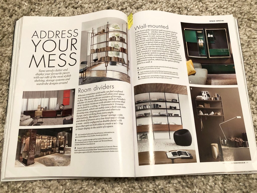
For this exercise, I decided to take a new approach to the design of the magazine, here I came to the fresh Elle Decoration March 2020 issue, filled with all kinds of variations of modern trends in interior design. I flipped through some pages of the magazine, and the first thing that caught my eye was that in such magazines 50% -70% of the print space is occupied by images, a photo report. The magazine was literally filled with stylish and organically fitting images.
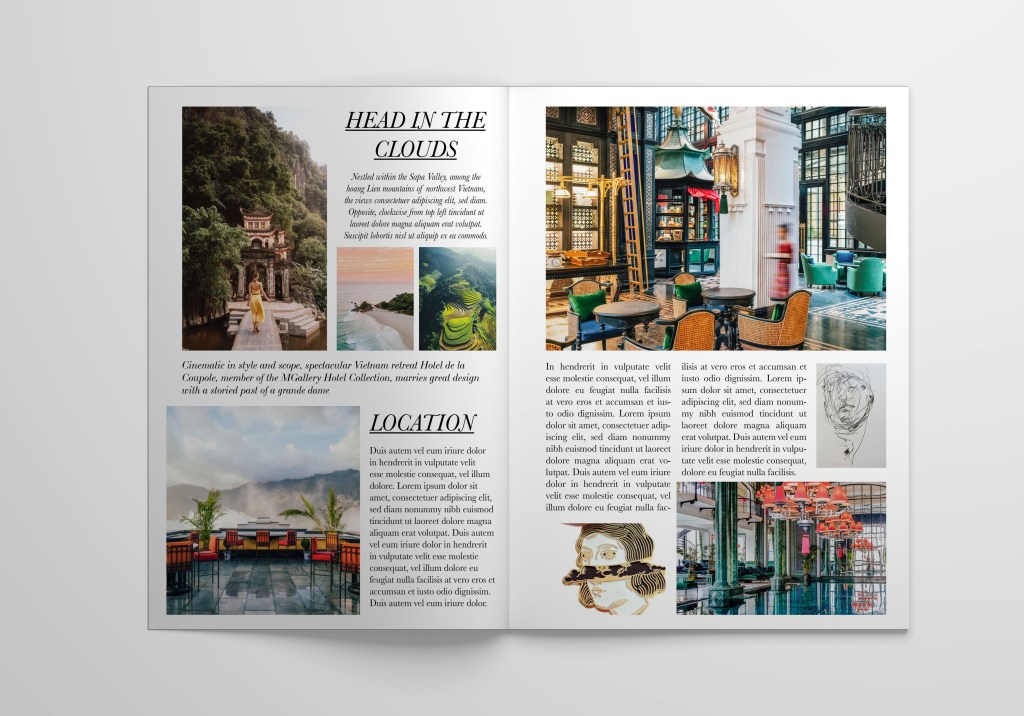
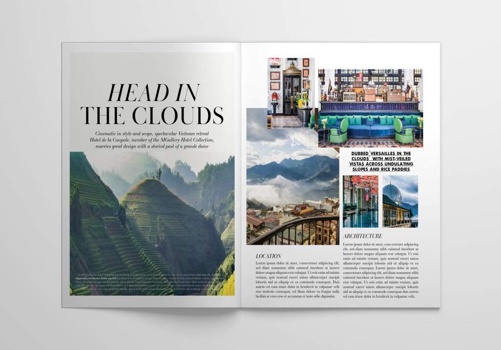
I selected several layout options for myself, but I decided to work with the article Head in the clouds, which outlines the design of one of the respectable hotels in Vietnam. I liked the title of this article, I realised that here I have a whole area for creativity.
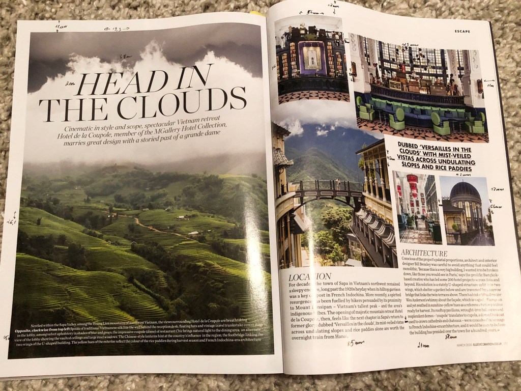
I measured the magazine size, which was slightly bigger than A4 format, 220×280.5 mm, after that created a document in Adobe Indesign, double spread. I measured all margins, indents, glyphs, the width of the text, placing all notes on my magazine page. That to recreate the fill of the magazine I found fonts through the Adobe Fonts application. The font was used for the title with serifs Baskerville Poster PT 77pt, for the text bellow the header was used elegant handwritten font LTC Bodoni 175 16pt, for quotes I found similar font Futura Bold 15pt, for the main text was used same font as for header, but 12pt font size. Also I wanted to recreate the fill of the magazine by using similar images, that I found through the MGallery Hotel Collection website.
https://sofitel.accor.com/hotel/A5V2/index.en.shtml#origin=sofitel
Original Design
It was not particularly difficult to portray an identical design, it was interesting for me to follow the layout process, a combination of fonts, how one image is superimposed on top of another. I tracked an unusual font along the lines A, D, and also a combination of a font with a slope in the first line, and a direct font to the top. I’ve noticed that for intro and quotes text was lined up to center, and for the main columns text was justified without hyphenates.
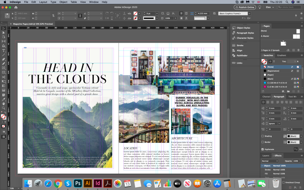
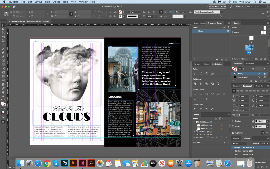
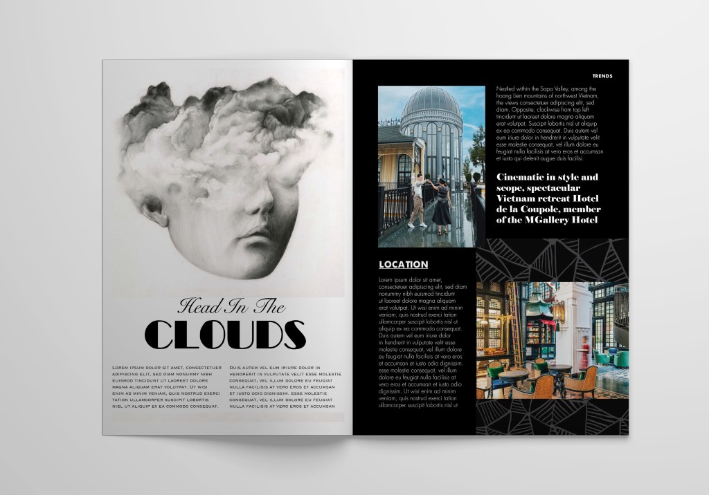
Head in the Clouds Design 1
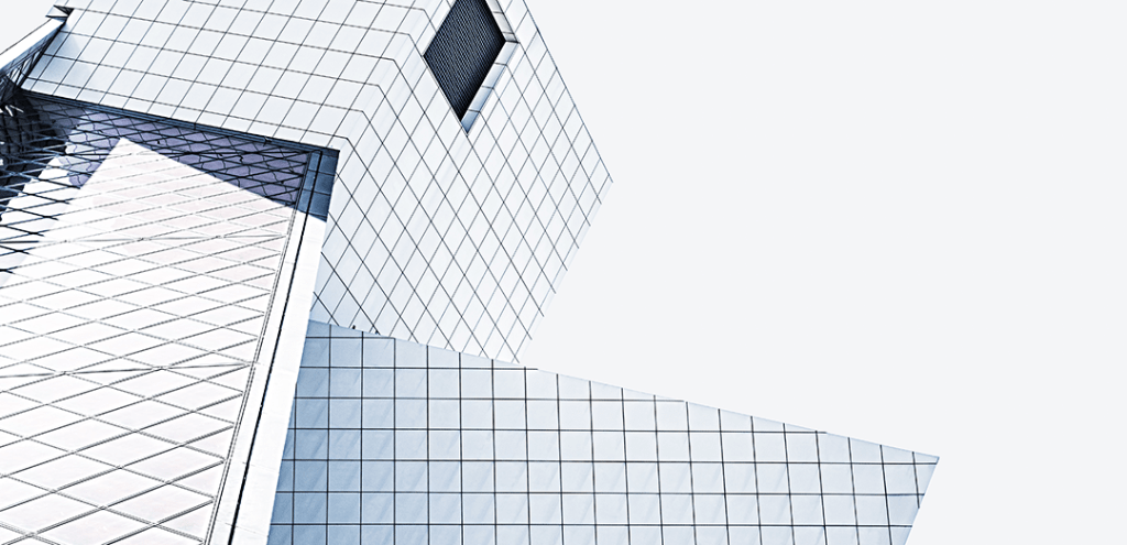
Now a more interesting task was coming up: to bring my mood and my idea into the design. I wanted to create more original option, experiment with contrasts, but here I also needed the images that I found through the Pinterest:
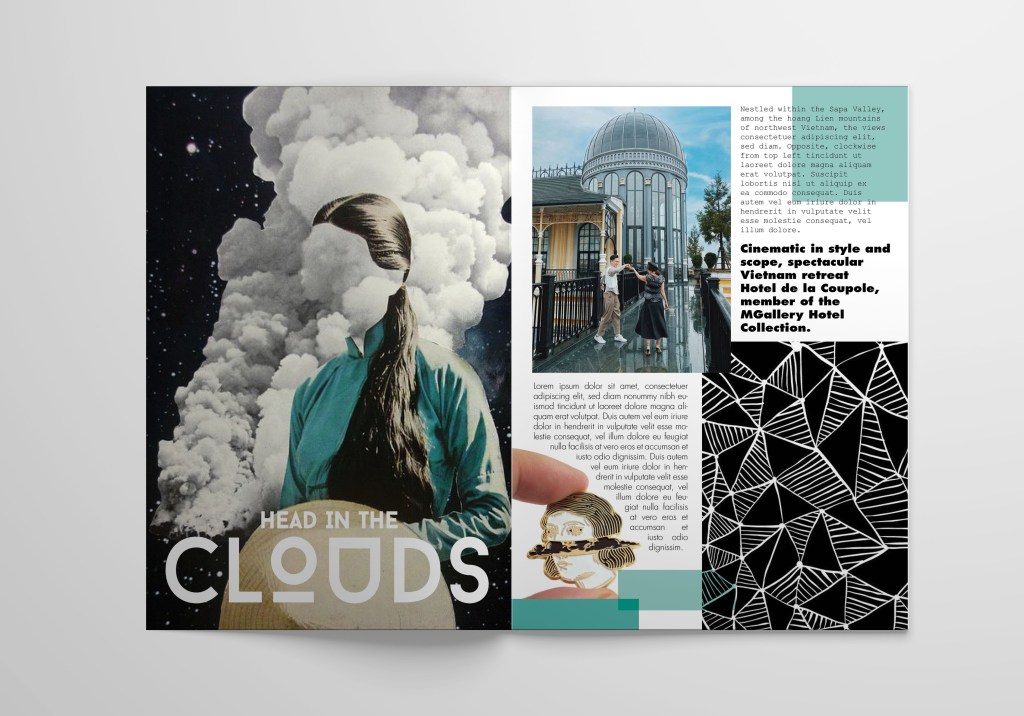
I started with a similar option, where the photo on the left side occupies the entire area of the sheet, only I used without spaces on sides, the photo took up the entire sheet, on the right side created scheme with combination of photos and spaces for text. Here I made the design more loaded, added a black image with a pattern, as well as several font variations. A photo of a girl with clouds introduced a peculiar mysticism into this layout, I could present it in one of the art magazines. Here I liked the combination of sans-serif fonts, bold and fixed-width fonts. I also aligned the first block to the left, and the block below to the right, adding torn edges around the expression of the girl’s head in the form of a brooch.
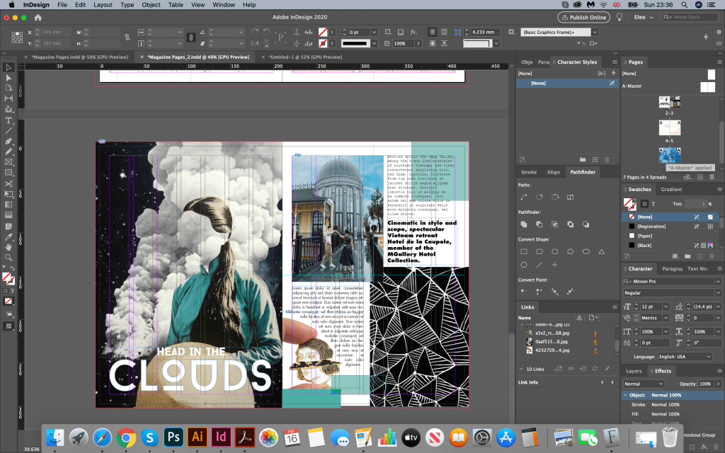
Head in the Clouds Design 2
The following images of the head in the clouds, I chose a decorative font for the title. I repainted the right side in black. Here I also experimented with fonts. In the first paragraph, the font is Futura light; in the second, the font is in capital letters. I also added quotes in cursive. But I was not quite sure if I like that font combinations, they looked too random to me, and I had a lost of page balance on it, for example I could see too much white spacing below the header.
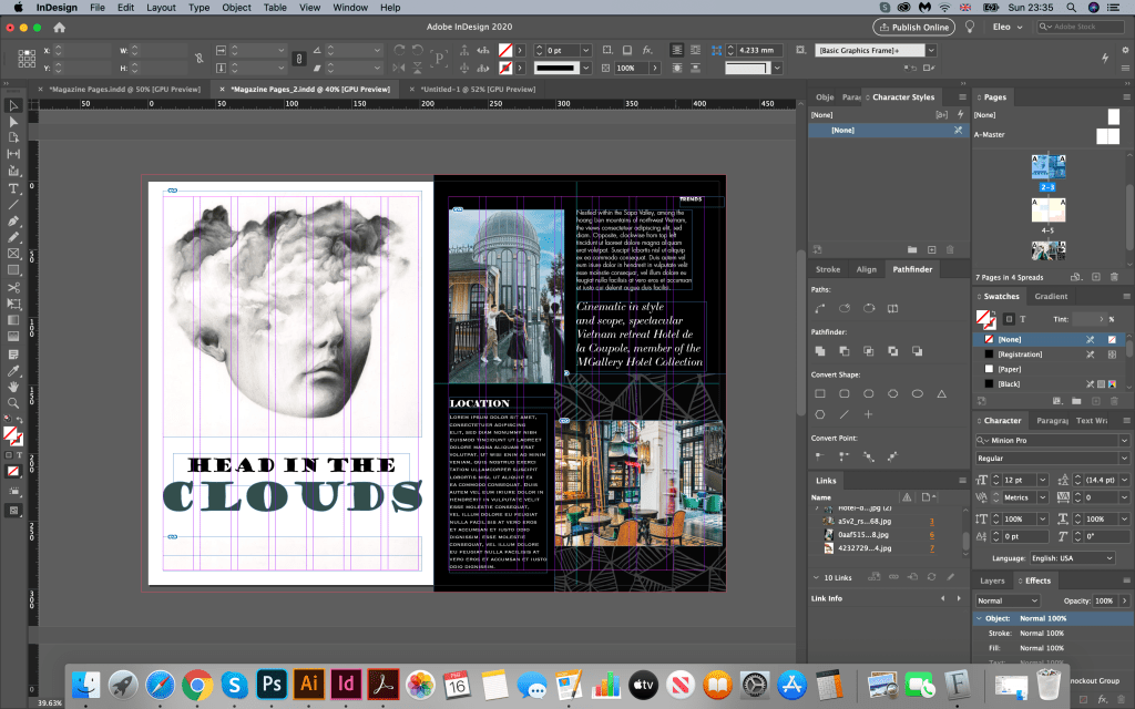
Therefore the solution was to move some text below the header, and change some fonts for titles, and columns. In my next design could be seen improvement in the page structure. I changed fonts for headers to the combination of handwritten Snell Roundhand font on the top, and decorative Broadway Regular bellow it. I think that title created a good combination with photo I used. Below the title I placed some text, as I thought that space was quite negative. I filled it with some wording. Font that I chose was all in upper cases Copperplate light 12pt, but for the columns I used Futura light font aligned to left. Also, for the contrast I placed quote in bold serif Elephant font. Here I decided to give for the columns more free space, also it looked less strict than justified columns.
I think the second attempt of this design was much more successful, I like the combinations for fonts, and their interaction with photos. I was not quite sure about yin and yang (black and white) page format, maybe it was a bit too much contrast, and was missing some smoothness. However as idea itself it could go life as well.
Head in the Clouds Design 3
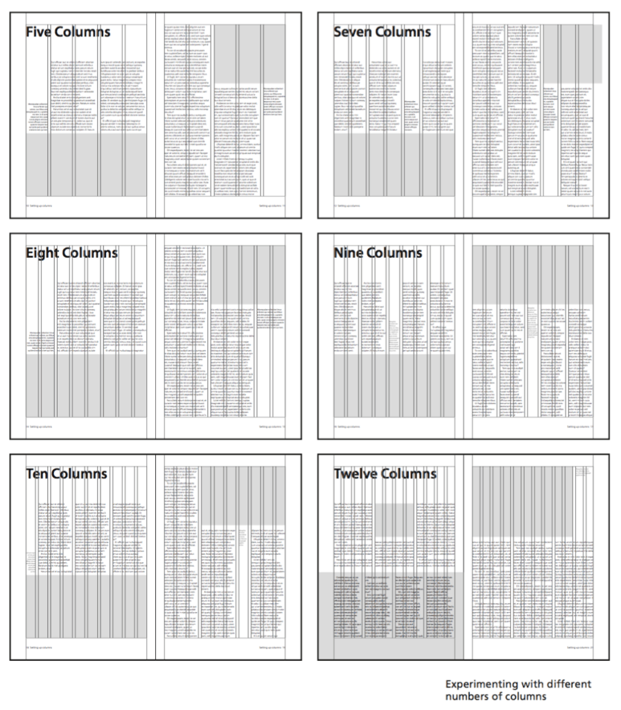
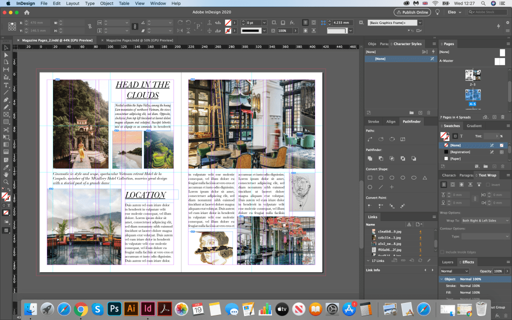
My final version with designs where photos where placed around the page. I divided pages into few parts, specified where the center is. My idea was to create mix of photos and text around it. To make it easier I created a grid, with colourful boxes for photographs, and free spacing for text information. Over here, I found quite useful tool where I could change the number of columns and size of margins. I have never used it before, usually I would create designs based on the simples forms, but over here I could see more possibilities of creating harmonic grid.
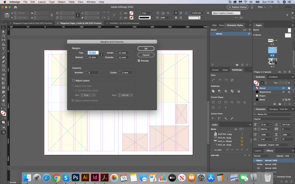
When the skeleton was ready, I started to fill it with photographs and texts. In this design I wanted to create the fill of glamorous travel / design magazine, with just a few options of fonts, and lots of stylish photographs. Here I sued as photographs from Pinterest travel search, same as some images of hotel. I loved how they worked together, and their interesting harmony. I was surprised how useful this column tool could be. It would let me to see all possible grids I could apply over it. For some text boxes I chose central paragraph, for intro text I lined it up to the left side, but for the text boxes I chose combination of left aligned and justified. Jere I had practically 3 options for paragraphs, which I quite liked. I could see that on the right side I had some gaps between words, therefore for my final design I used hyphenates to avoid negative spaces between words.
Ready Designs
Conclusion
In conclusion I would like to say that each magazine has its own set of layout styles and fonts. And depending on which images are used, and which fonts, even small details such as aligning blocks to the left or right, carries a new character in the design. My ideas are more non-standard, creative, maybe they would fit better into magazines about exhibitions or art directions, even the very selection of photos affects the mood in the magazine. I think that as such there is no good or bad option, depending on the style of publication or it’s auditory you can create any design according to requirements. If the task is to make a design in such a style as to fit into the Elle Decoration magazine as much as possible, then this is certainly a more restrained version 3, with collage of images, san-serif font for header and main text. I think that the readability of my layout options is also quite good, however I would avoid printing on a black background, all the same information is more easily perceived on a white background. I would also stick with more readable fonts, this is a serif font, tearing to the left. At the same time if I had to go beyond the scope, create something unique, then you can show courage, and pick up decorative fonts, and mix them all together in one article.
