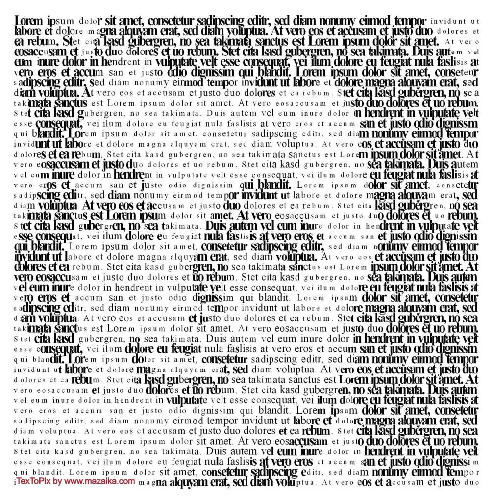
Lorem Ipsum is dummy text with more-or-less normal distribution of letters that makes it look like readable English. It has been used for many years and some desktop publishing packages now use it as their default model text. If you don’t have it already, go to http://www.lipsum.com and generate as much as you need. Now select one of the designs from your research that you like and think works. Using the dummy text, try and copy the layout and design as closely as possible. You will need to measure the margins and column widths. If you don’t have the exact typeface get as near as you can. If you are copying a page that includes photographs just leave 10% tinted boxes to indicate their position. Is the type serif or sans serif? Is the text set ragged or justified? Are there spaces after paragraphs or are new paragraphs indented? How many columns are there to a page? What happens when you alter the fonts, change the alignment, adjust the leading or tracking? Now try another, a different publication from your collection.
OCA. Core Concepts
Start
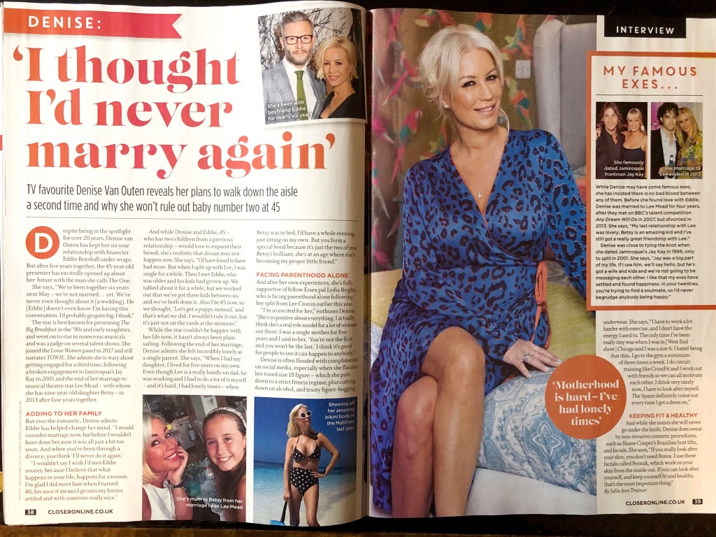
After analysing this exercise, I understood that it was a continuation of the previous task, where I tried to collect different examples and samples of layouts from newspapers and magazines. Once again I went through all the samples that would have brought my attention to a more detailed analysis. So, in my archive, there were two designs that I would like to display in this part. The first one from the magazine Closer, and the second, oddly enough, the magazine about fishing Carpology, which in my opinion turned out to be quite creative and interesting in the combination of fonts and composition.
Sketches
I liked the large unusual headline and the presence of photos and inserts of different colours in a women’s magazine. This design, in my understanding, was quite attractive and interesting. So, I transferred all measurements of text blocks, font sizes and options in a small sketch. Since I didn’t have a special ruler that would help me determine the font points, I found a simple way to measure the font size manually. The most interesting part was to determine the font itself. In my sketches, could be seen that I have identified the dominant features of each font, such as “g” “t” in the title, and the letters “R” and “G” in the subtitle. Explanations of font choices and measurements from my sketchbook are bellow.
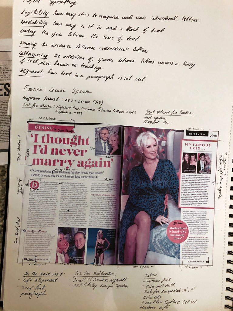
In the case of defining fonts, the font selection function in Adobe Indesign turned out to be very useful, in which you can select fonts depending on their type, such as serifs, sans serifs, fixed-width, script, and so on. After several attempts I was able to find the desired font, uploaded it to my computer, and accordingly expanded my collection of fonts.


Design 1
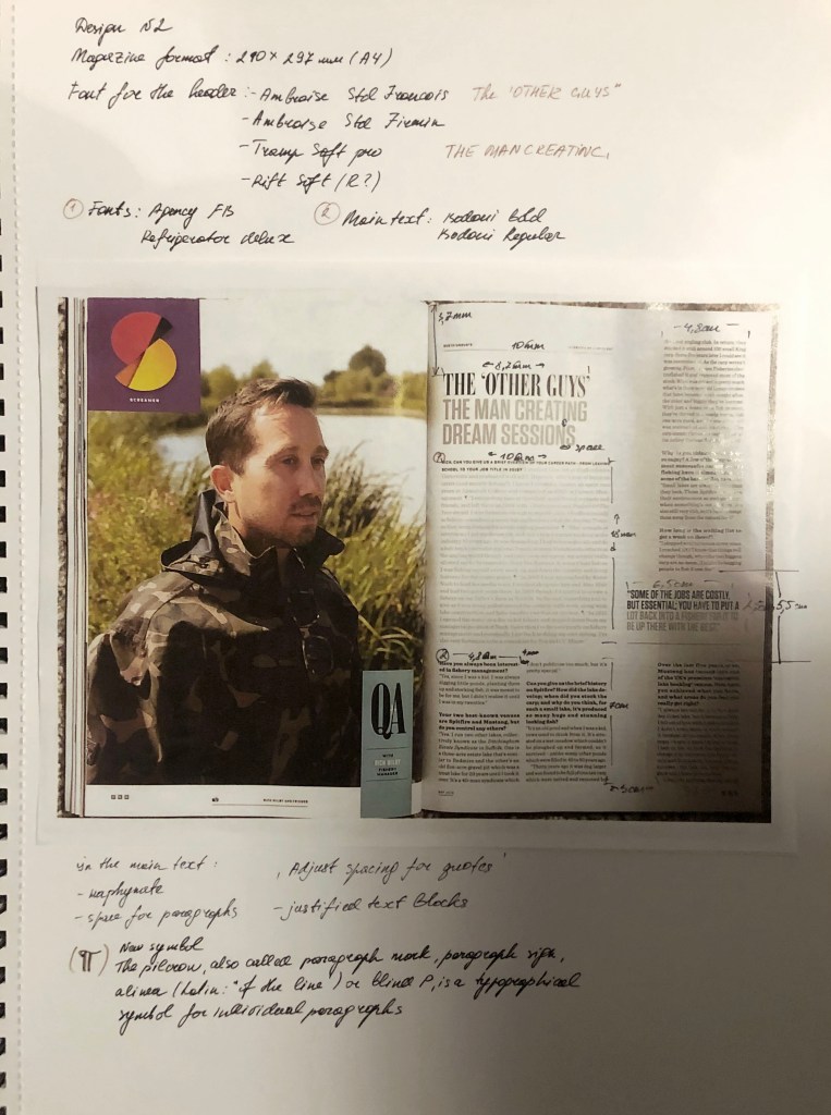
After measurements of all text blocks, paragraph spacing, and possible font options, I started designing in Adobe Indesign. So, in the main heading, the serif font is used, which I defined as the Lust Didone font, 75 pt. The introductory word uses the sans-serif font Dita Cd Light, which I had to transform, namely, squeeze up to 87%, and the letter space by -25%. The subtitle, photo caption, Initial letter uses the Europe-Bold sans-serif font. The sidebar also uses the font from the main header of Lust Didone. In the main text, I’ve noticed the peculiar letter “w” which helped me to define the font as Adobe Caslon Pro (10pt). The paragraphs were aligned to the left, in the left spread only three columns, but in the right because of the dominant photo, only one column was selected for the text. There are no indents between paragraphs, but there are spaces in front of a paragraph, which makes text readability easier. This layout is saturated with photos, 4 types of fonts, which makes it dynamic and easy to read.
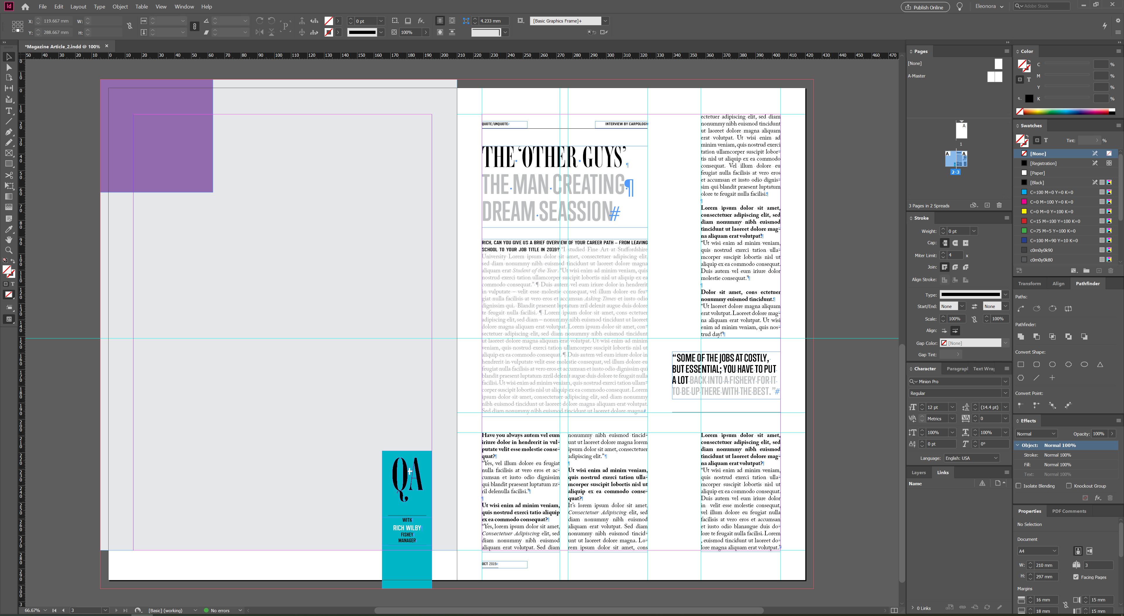
Design 2
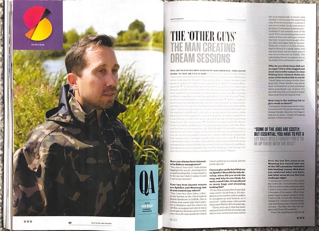
And finally, an analysis of the fishing magazine, which attracted me with its simplicity and originality. The use of a serif font combined with a modern sans serif font for the title is also noticeable in this magazine. In order to determine the font, I used the same method in Adobe InDesign, as in the previous layout. There are two interesting combinations in the title, font Ambroise Std Francois (50pt) and Trump Soft Pro Bold (44pt). Columns of paragraphs are divided into one wide, as the main, and three columns for the main text. Here the text is aligned on both edges, hyphenation is present. The design is neat and discreet, pleasant to read.
In the main text there is also a combination of sans-serif and serif fonts Refrigerator Deluxe (10pt), Adobe Caslon Pro Regular/Bold (10pt). There is some extra spacing between each paragraph, and lots of air around the text blocks, which makes wording easy to read and follow.
Conclusion
In conclusion, I would like to say that I truly enjoyed this exercise. I was able to find the necessary font among thousands of fonts. Once again, I realised for myself how important attention to detail is, and that small differences in layout, such as hyphenation, text alignment to the left or adjusted, visually change the perception of information. I have discovered the importance of kerning and leading. I am sure that I will be able to supplement my knowledge with new skills which will be useful for future designs.
