In this research point I need to anilise different layouts of magazines, publications and newspapers, to see which one is easy to follow, and which don’t. Bellow is collection of newspaper layouts and magazines that were appealing to my eye.
The example below is my favourite. For the header was chosen bold san-serif font all capital letter, and narrow font for the bottom word. Looks quite good together, combining opposite fonts. For the intro my favourite Playfair Display Italic font. The text was shaped nicely, the font is serif. All justified. For the initials Bold Narrow serif letter, good contrast.
Others examples that appealing for my eye. Materials that were being used. https://www.pinterest.co.uk/edavydovska/magazines-newspapers/
During the article’s analysis, I noticed for myself that there are basic keys and methods that professional designers use in layout, but at the same time, perhaps free or cheaper publications are neglected.
Properly organised space, photo layout and font selection play an important role in the readability and perception of the text. All of the examples below are neatly formed into blocks, serif text, a visible caption, large photographs and adjusted text for the long read paragraphs.

Pinterest Image
https://www.pinterest.co.uk/edavydovska/magazines-newspapers/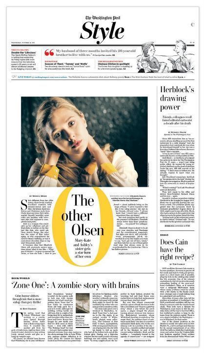
Pinterest Image
https://www.pinterest.co.uk/edavydovska/magazines-newspapers/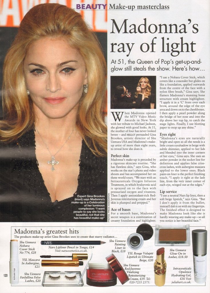
Pinterest Image
https://www.pinterest.co.uk/edavydovska/magazines-newspapers/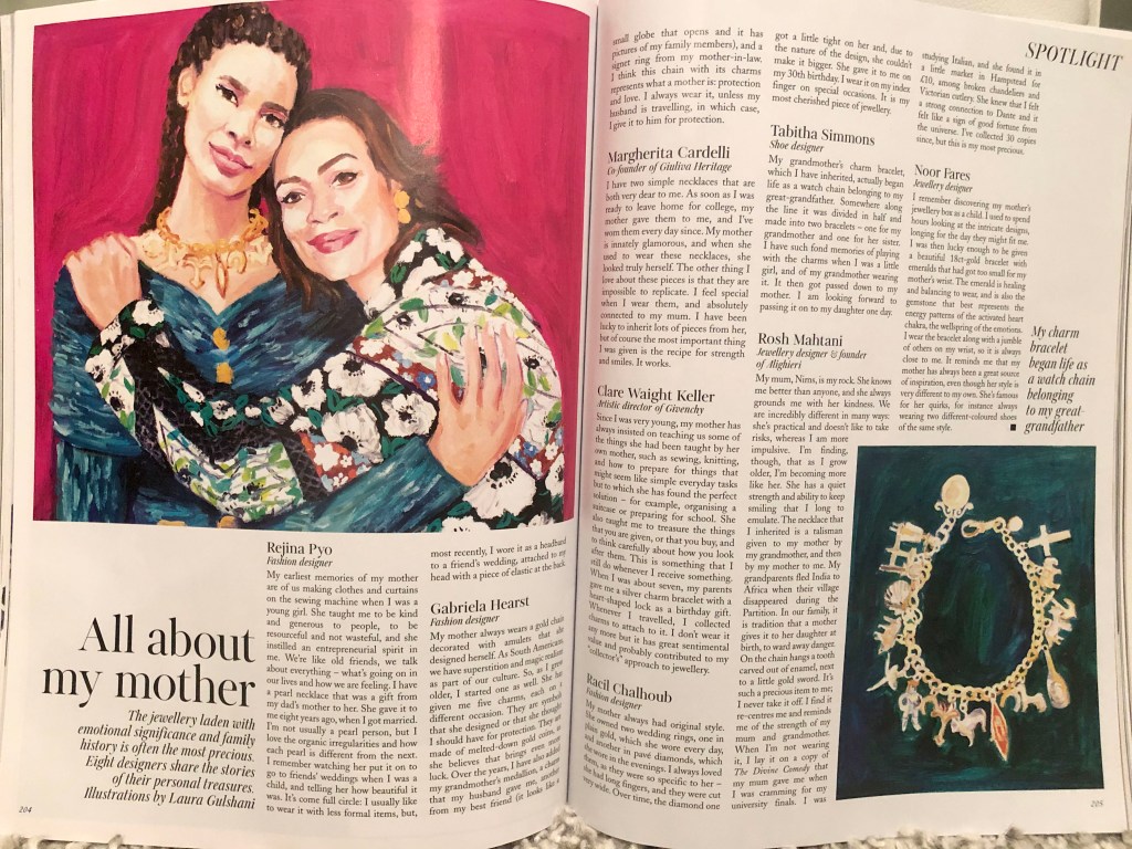
Vogue Issue September 2019 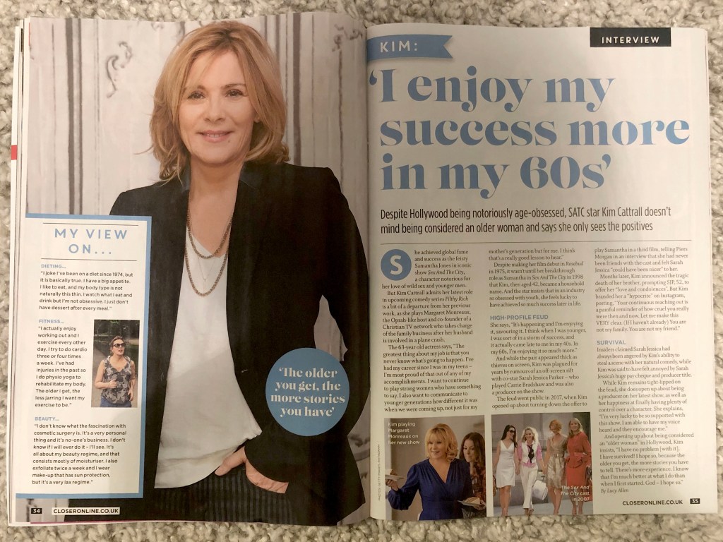

Vogue Issue September 2019
Examples that I didn’t like really. Looks quite messy, lot’s of imperfections in font chose, and layout itself. Explanations are blow. All images below from Pinterest Image
https://www.pinterest.co.uk/edavydovska/magazines-newspapers/
The examples below look chaotic and overloaded. Suppose the torn edges of the text look unsuccessful around large objects, such techniques should be avoided. Also striking is the long space at the end of the paragraph. For example, for small paragraphs, the text looks good when it is aligned to the left, but if it is a long text, then it is necessary to justify it on both sides of the column.
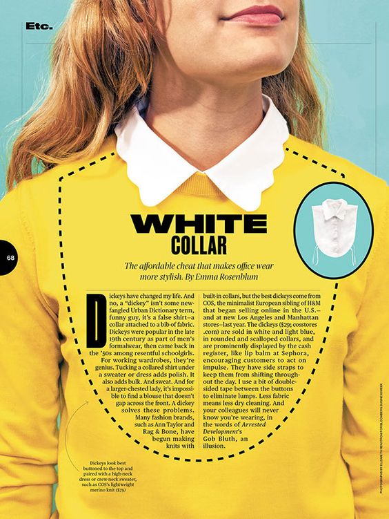
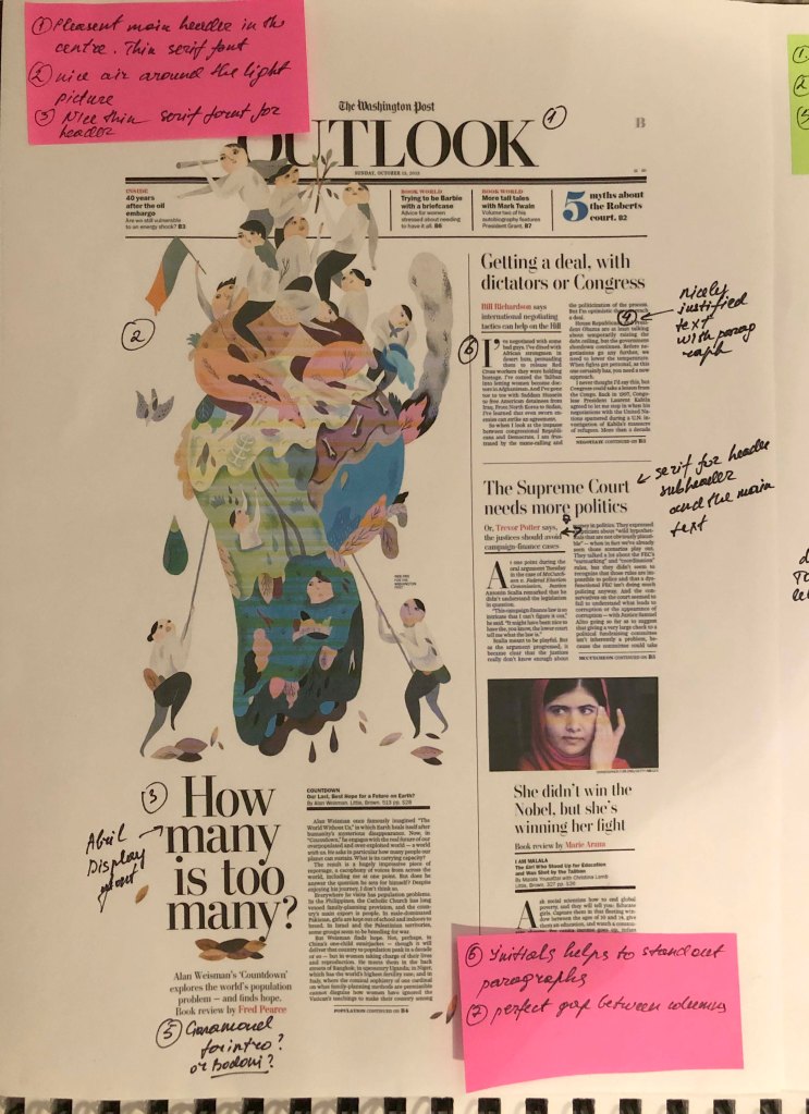
Example №1, in my understanding, is an example of a successful and professional layout, especially for a newspaper, where the quality of the paper is different, and coloгr images are duller. However, paragraphs and paragraphs are organiыed correctly. Headings go to the main background, the text is readable.
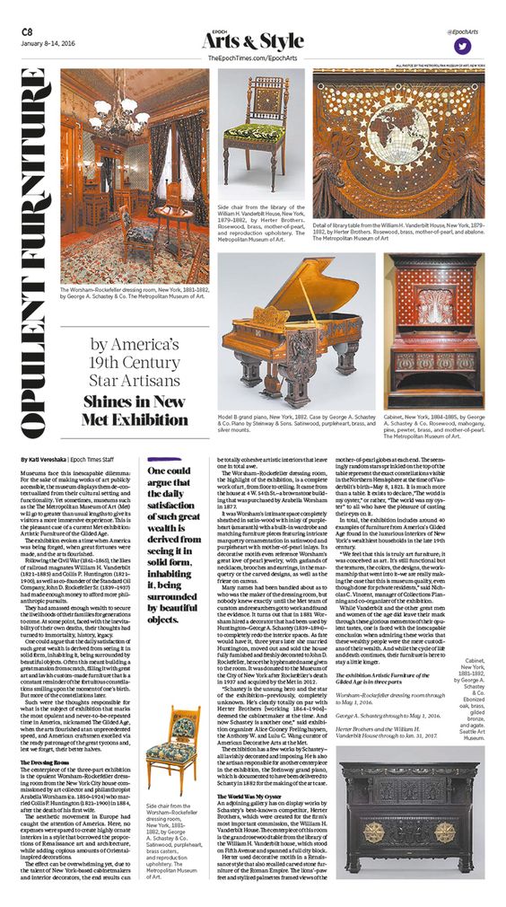
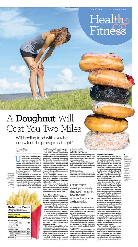
Example №2, also of interest to the original layout, I was particularly impressed by the form in which the text was framed. Layout №3 with the culinary text, divided into small paragraphs aligned on the left side. Here sans-serif text looks good. And the main heading is large compared to the rest of the text.
Layout №4 is an example of a poorly organised space. Also, the title is lost on the background of randomly scattered images. Despite the fact that the columns are aligned on the left and right edges, spaces are too wide between paragraphs.
Similarly layout №5. The columns of the text are aligned to the left, which complicates the ease and readability of long text. Of the advantages, I would note a good title and location of the photo.
Design No. 6, the text is aligned and revised relatively correctly, but because of the wide columns and the lack of photo images, the layout itself looks boring.
Example №1 Newspaper 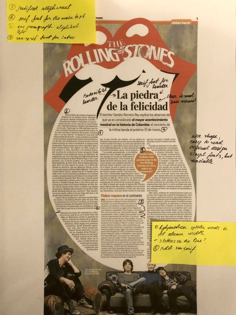
Example №2 Newspaper 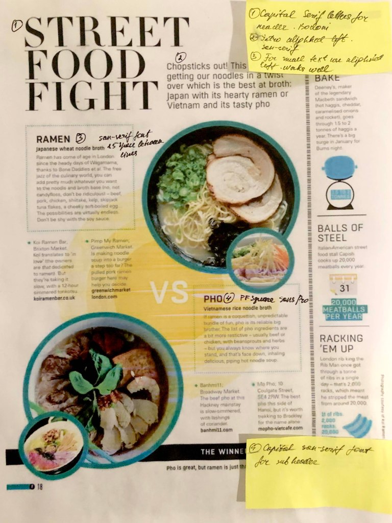
Example №3 Magazine 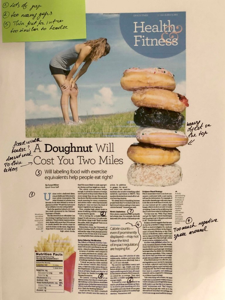
Example №4 Diet Article 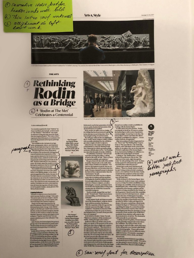
Example №5 Newspaper 
Example №6 Music Magazine
Example №7, it turned out to be noteworthy to me because it has a gigantic headline and plenty of space around. At the same time, on the opposite side is a photograph, which makes this design also catchy for reading.
One last example of a hasty design, where there are extra spaces in each line, breakaway contacts (telephones, web address), has written off the last two designs, № 10 and № 11, as a layout that they didn’t have time to fix and subtract.

Example №7 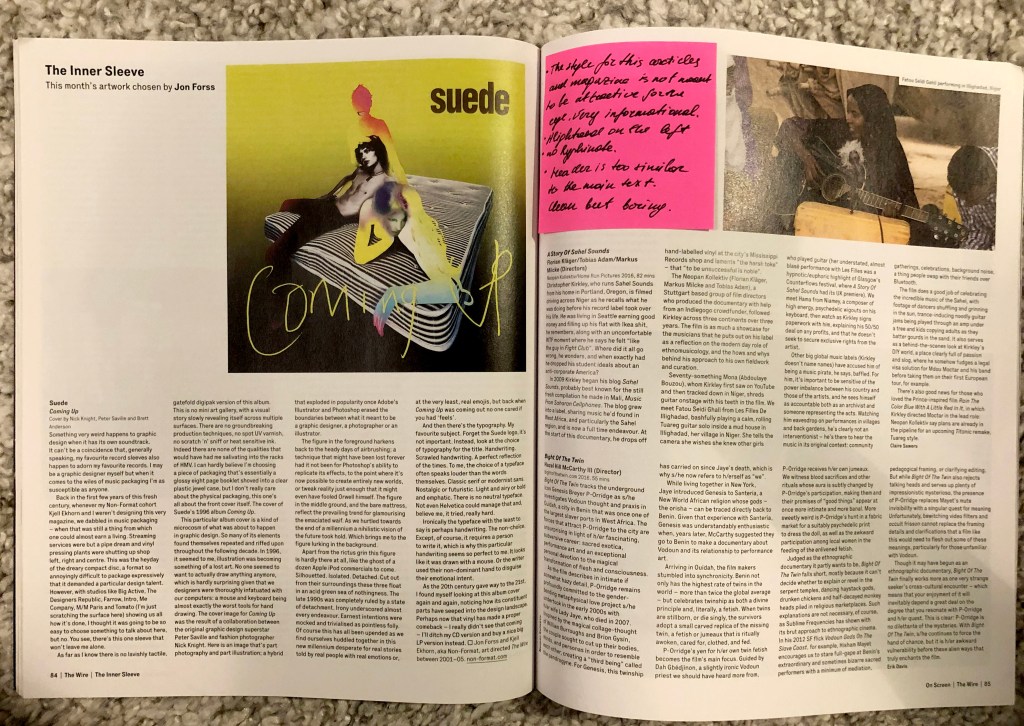
Example №8 
Example №8 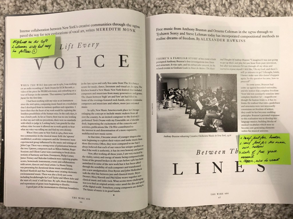
Example №9 
Example №10 
Example №11
Conclusion
In conclusion, I would like to say that this task turned out to be more exciting and important than it seemed to me from the first. I noted for myself that for long readers it is better to use a serif font. I also noted that magazines mainly use two types of alignment, this is left-aligned and justified, should be careful with both choices, as they do not work for some cases. I also noted that if space permits, the layout looks interesting with large headlines, a more defiant and flashy sans-serif font, while a small serif font looks modest but neat. In the future I plan to collect magazines and newspapers, perhaps glancing briefly at the accuracy and correctness of the layout, I think this will affect the formation of my level of text design as well.
