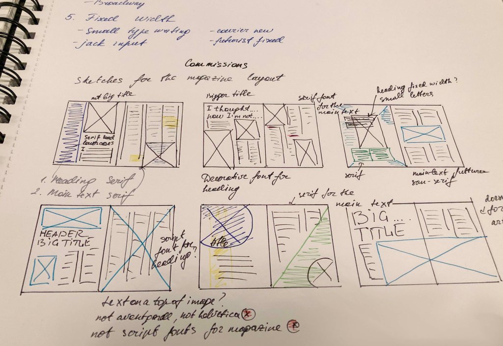
Create your own sample book of typefaces on your computer that you can refer to. Organise them into:
• Serif for continuous text; readable at small sizes and those suitable for headings.
• San-serif for continuous text; readable at small sizes and for headings.
• Script fonts that look handwritten with a pen or brush.
• Decorative fonts only suitable for headings or ‘fun’ uses.
• Fixed width, techno and pixel fonts for use on the web or to give a computer appearance.
Identify which typefaces have bold, italic, black or light fonts.
Now identify which fonts you might use in each of the following commissions:
• A short story in a woman’s magazine entitled “I thought I loved him; now I’m not so sure”. The story is 1300 words long so you will need to identify a text font and a headline font.
• An advertisement in a parish magazine asking for more helpers on the flower rota. The finished size is A6 landscape and the text reads: “Can you add that important artistic flourish to our church? We desperately need more volunteers to join the flower rota. If you can help or would like more information please contact Jennie jennie@vicarage.co.uk.”
• A poster to advertise an after-school club for boys aged 13 – 14. The poster will be A3 size and the copy reads: “Bored? Feeling got at? Nowhere to go? Then why not come and join us on Tuesdays and Wednesdays after school in the Old Gym. We’ve got football, ping pong, table soccer, computers, Karate, cooking and lots more. All free just come along.”
• Your friends’ engagement party. They want a flyer A5 size to send to their friends as if advertising a club night. The copy reads: “Mandy and Josh are finally going todo it…well almost!!!!! Come and join them on Friday 24 March from 8 pm at theGolden Calf to celebrate their long-awaited engagement… and yes lots of presents would be gratefully received particularly if we can drink them!!!!! Then have a go at mocking up each of these. Try different fonts to see how each changes the feel of the text and make notes in your learning log about which works best and why.
Start
This exercise turned out to be a task with two unknowns. When I just got acquainted with this task, I realised that I needed to break it into several sections to create for myself a general picture of font types, and only after using them in advertising and magazines. That was my first collection of fonts that I have ever created in my entire experience in graphic design. To get started, I turned to Wikipedia, which is more for the concept of a specimen book.
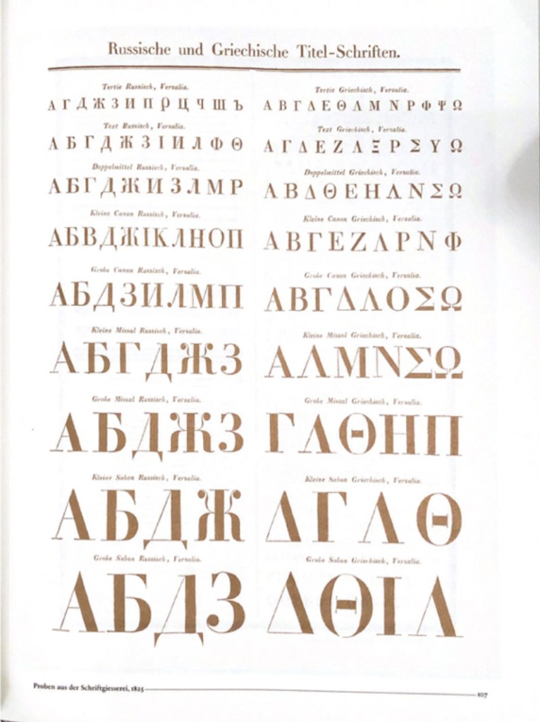
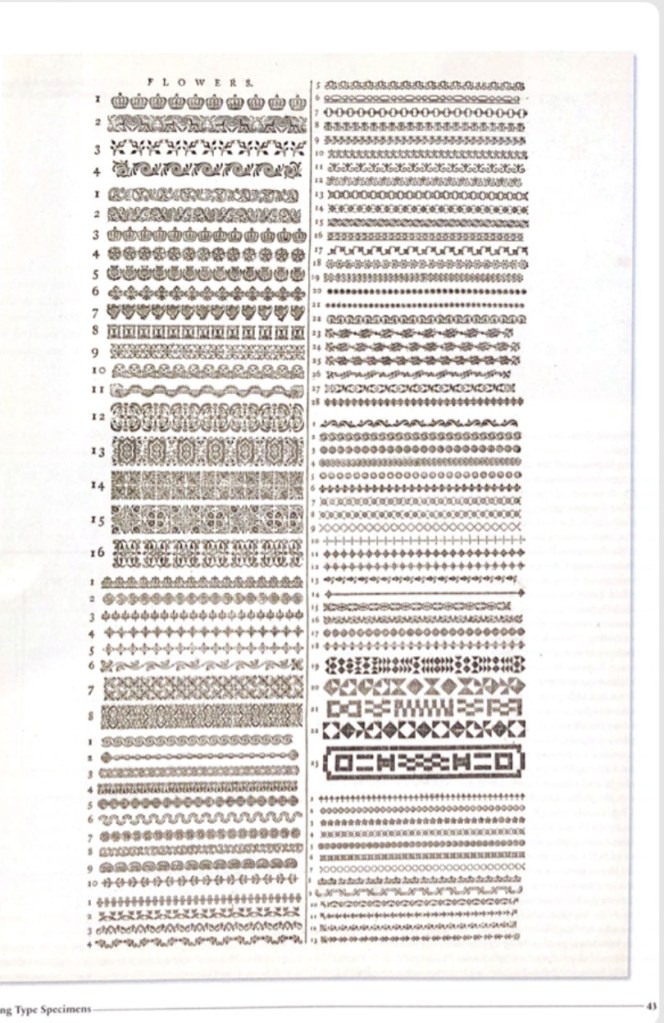
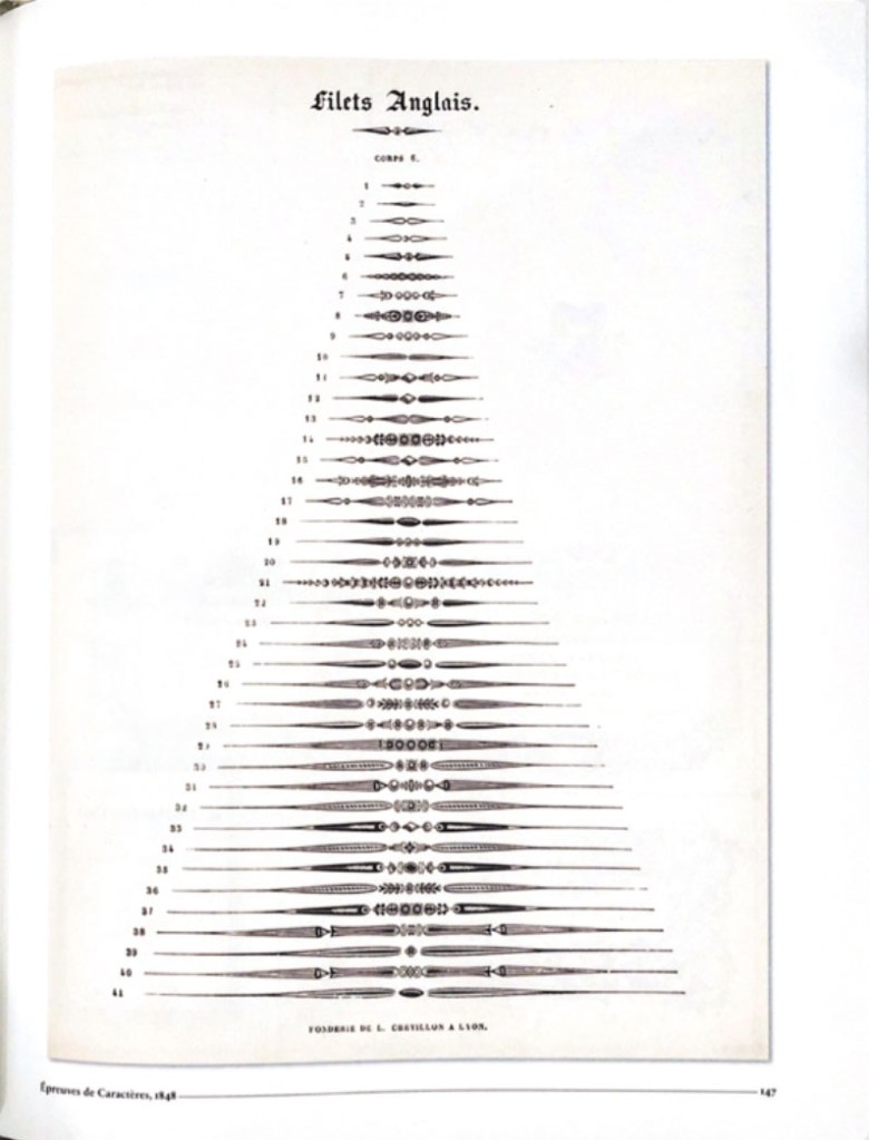
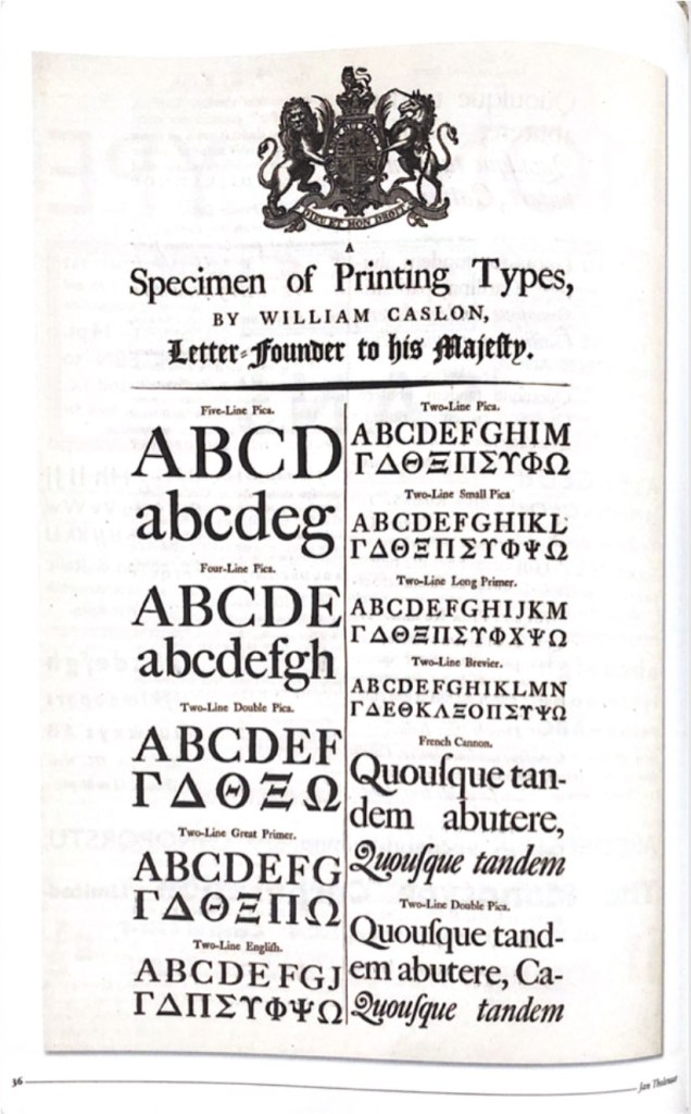
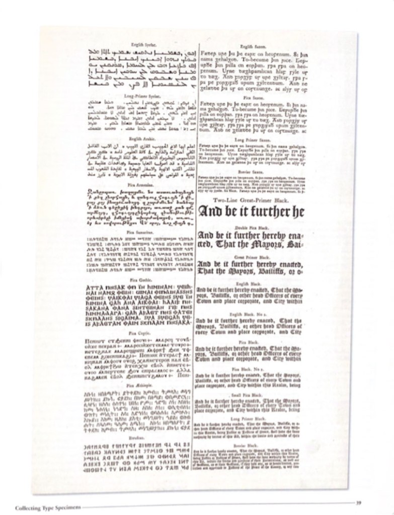
Specimen books (in full: type specimen books) are the printed brochures or catalogues of type foundries and printers, offered to advertise the range and quality of type available. They have been an essential part of the printing trade since soon after the invention of printing with movable metal type in the 15th century.
The ideal specimen book shows the typefaces in a range of sizes, using short sentences rather than A-Z strings (which are of little use for getting a feel for the type in use). Colour is sometimes used, but usually very discreetly, such as a red title. Samples in text sizes (6 to 14 point) typically show a longish block of text to help one judge readability, but would not be offered for decorative and display typefaces. It is quite common not to deliver a complete character set: foundries have always been concerned about piracy. Instead, a chart might be shown in an appendix where characters included in all the foundry’s fonts.
Collecting Type Specimens
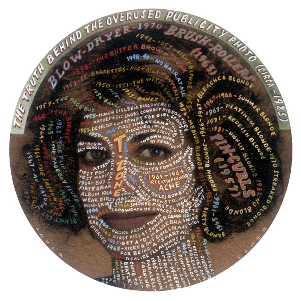
The other day I bought a book with collections of fonts compiled by one famous collector, Jan Tholenaar. Specimen collections have become an inspiration in a passion for the history of fonts, and their unique journey through generations and centuries. But some fonts were invented hundreds of years ago, but they continue to be in demand among it for print advertising and printing.
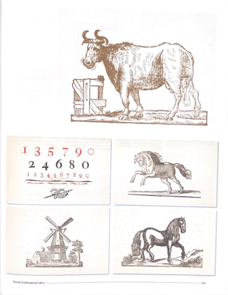
Between the dates 1830 and 1930, a collector that goes by the name of Jan Tholenaar assembled one of the most significant collections of type specimens in the world. It was incredibly diverse of ornaments, fantasy letters, also with examples of artistic printings—all the letters in all variety of colours. What he was doing, he was buying loads of old catalogues from antique shops around the world, from magazines, and then will organise them into the specimen.
In fact, not long time ago, the American poet Dan Carr designed his typeface for his poems and cut dies it himself. This specimen was included in Jan’s collection as well. Another fact that immensely impressed me was about the first smallest engraved font 2.5 points by letter engraver Henry Didot in the early 19th century.
Nowadays, it’s not easy to become specimen collectors; you have to visit antiquarian booksellers or auctions. Jan Tholenaar had one of his first collections from visiting the library of the Amsterdam Foundry, or from visits to the St.Bridge Printing Library in London. Type specimens are naturally were found in notable publications, such as in house magazines through ought the world. I was fond of his obsession with sample collecting; he would admire some of the rarest fonts collections. He would do everything that to get desirable one into his group, like type foundry Debney & Peignot with more than 400 rare specimens.
Type A visual History of Typefaces and Graphic Styles 1628-1938. Edited by Cees W. de Jong, Alston W. Pervis, Jan Tholenaar
After familiarising myself with the historical font sets and their lectures, I created a mood board on Pinterest. It helped me to visualise my interpretation of the type specimen, which I would like to implement in my style. These examples are quite eyed appealing, as for me, they look like a celebration of each font and its characteristics.
Typography Specimen Book
I was very excited to create my type specimen, where I could join them into the little font guide. I had thoughts about several styles for the typography layouts, so I needed to transfer them into pieces of paper in my learning log. I organised designs and put everything together in a single style. I intended to associate an exact, bright colour for each font. For the brochure, I chose format A4 in terms each font would have their spread with lots of air around and some examples of font usage, size, alphabet, and font history.
In my specimen guide, I have chosen particular fonts, as from my point of view are the best for reading, advertising, and experimenting at the same time. There 3-4 different fonts for each type, I thought it would help me with the font variety for the production of future design. Below is the list of my fonts selection:
Serif fonts:
- Adobe Caslon Pro
- Playfair Display
- Garamond
- Elephant Italic
San-serif fonts:
- Futura
- Helvetica
- Avantgarde
Script fonts:
- Vegan Style
- Jane Austen
- Acroterion
Decorative fonts:
- Glamor
- Broadway
- Bernard
Fixed width:
- Courier New
- NovaMono
- Fixedsys
Some of the fonts I had already installed on my computer, but for some of them, I had to browse various types of sources, where I could find some original fonts I could use.
Sketches for Specimen Type Book.

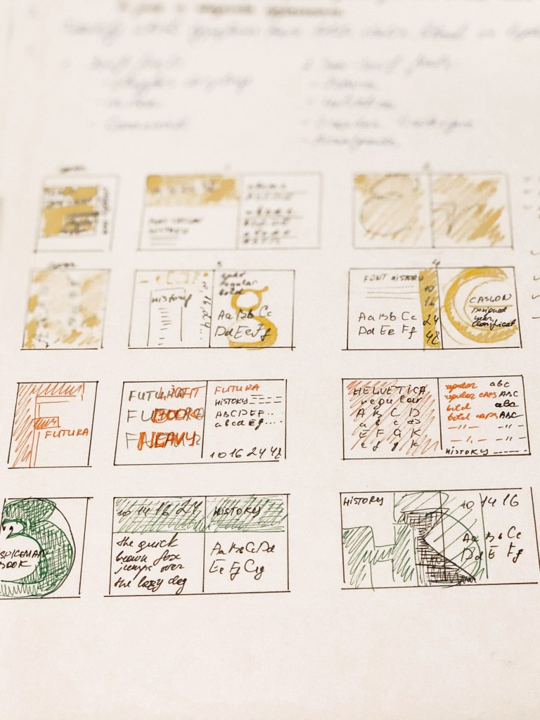
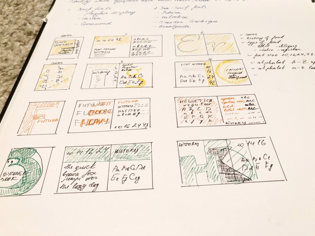
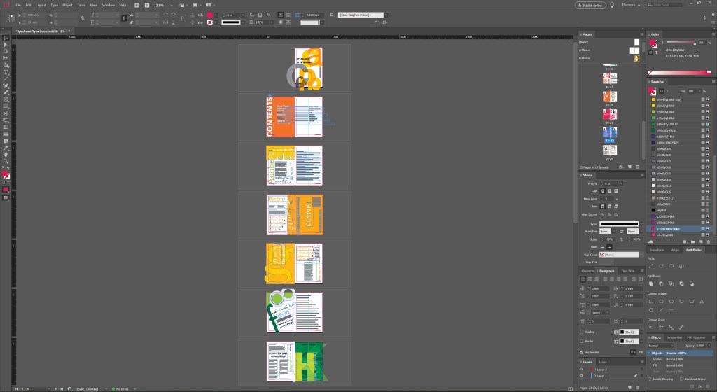
I must admit it took me a while to create as many as possible layouts for fonts but keeping them into a similar structure at the same time—the best program for the multi-page document in Adobe Indesign. I’ve created a quick style for pages, and some basics as Futura font for the main font in the catalogue. I played around with the cover for this brochure, and some interesting styles for fonts. I really enjoyed this part of exercises, as I had freedom in my style, and I could reflect my personal preferences in the designing brochures. I loved combining all these fonts into the singular material; also, I quite enjoyed the different font used for each page.
For some pages, I chose a rectangular layout, for fonts such as Playfair Display, Adobe Caslon, while I designed some fonts as a porter when applying layout at an angle, with a radical combination of fonts of different sizes. Font examples: Broadway, Futura, Helvetica.
Since all fonts are different, and in some, we see the presence of only one type of font, examples of Fixedsys, Jane Austen, in this case, I displayed only the one alphabet with capital letters and lowercase. But some fonts are full of various styles, such as Avantgarde, Helvetica, Glamor, with Italic, Bold, Condensed type of writing, then, in this case, we see all types of spelling of the font in the alphabet, that is, duplication of the alphabet on one sheet. I enjoyed this experiment with the layout of the brochure, in my opinion, it reflects the individuality of each font, but at the same time, it has a single style.
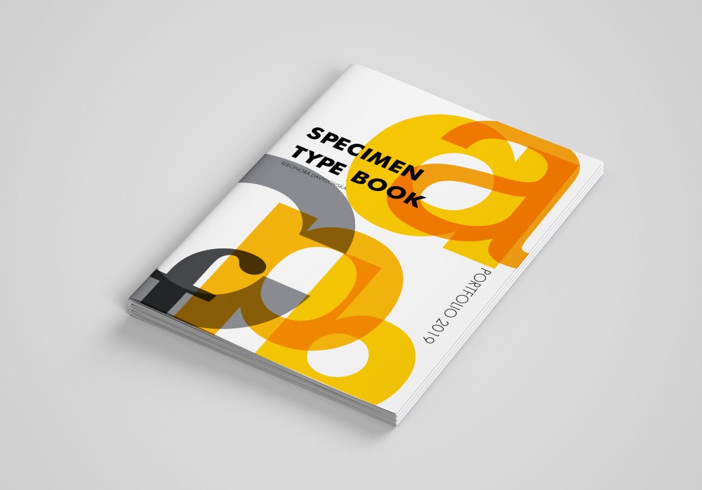
Specimen Type Book Cover 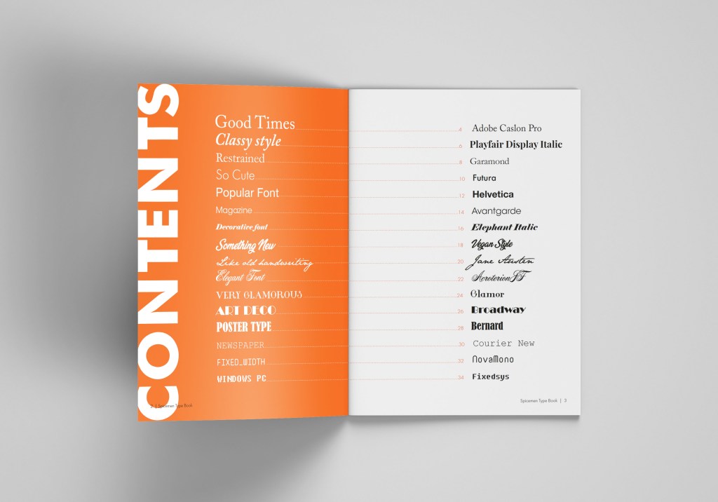
Page of Contents
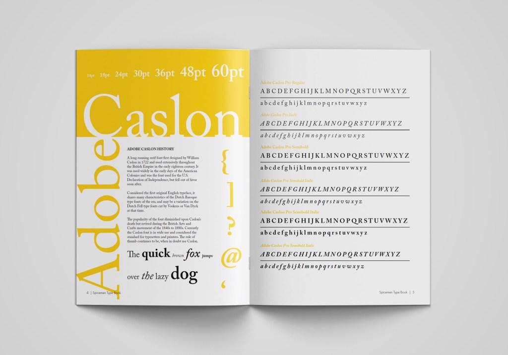
Design for Adobe Caslon Font 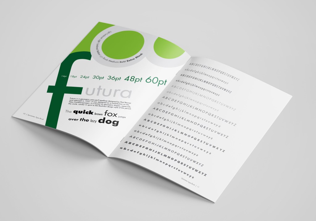
Design for Futura Font
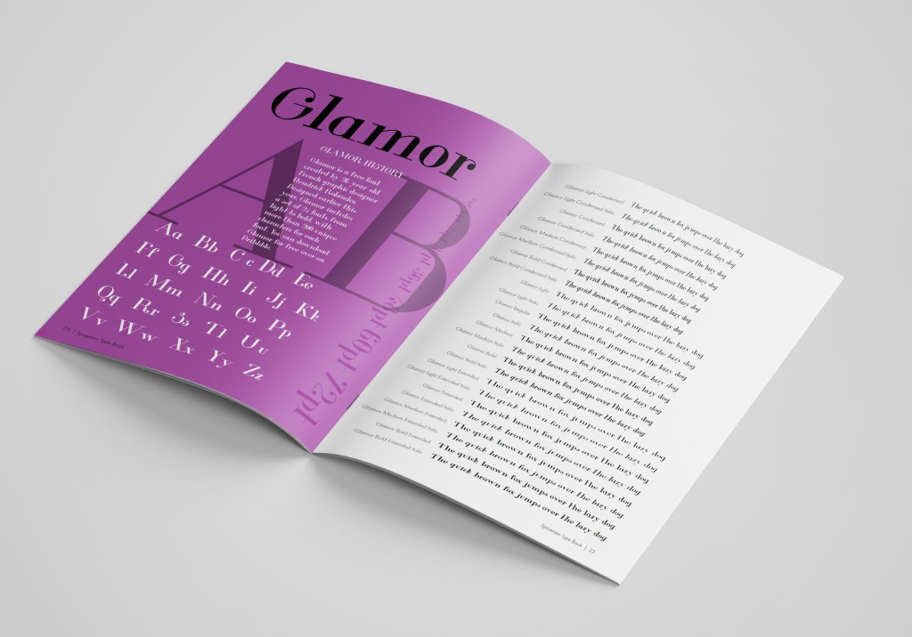
Example of Decorative font 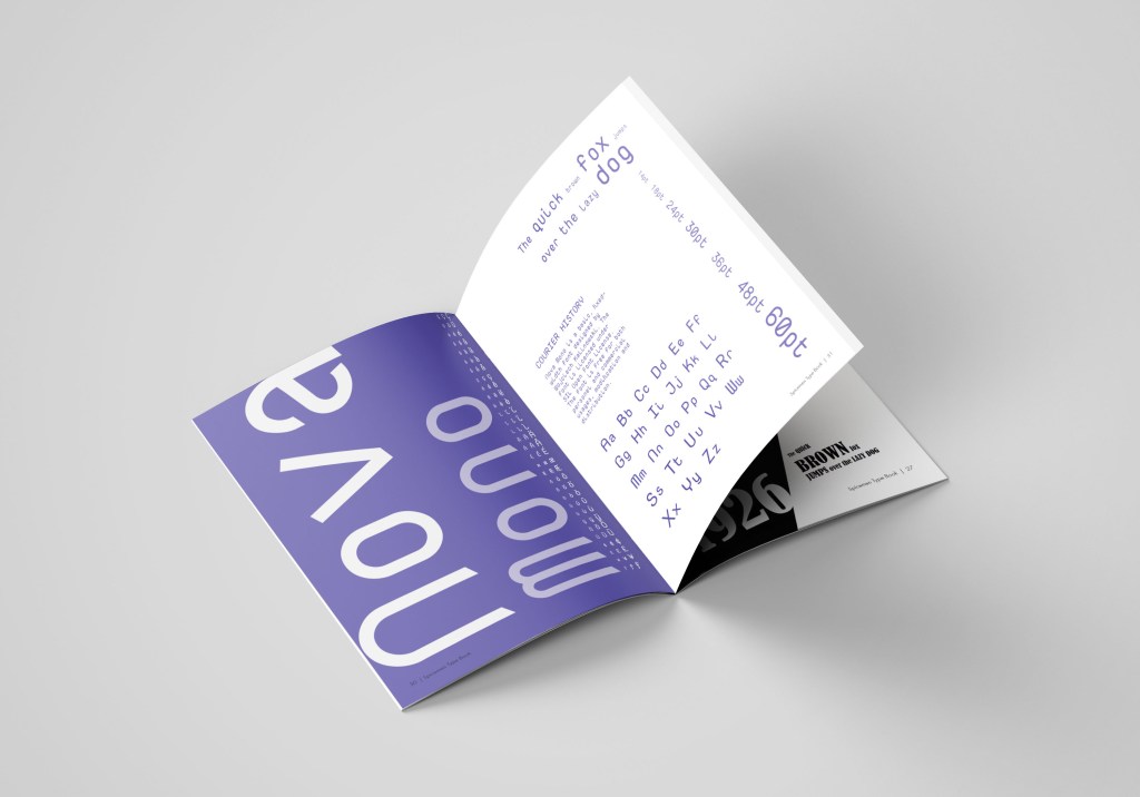
Example of Fixed Width Font
For the full Specimen Type Book preview, please copy this link and paste it in the new tab https://fliphtml5.com/temu/vfms
Commissions
Now the crucial moment has come, the application of my font catalogue in design. The first design is a layout for an article of women’s magazine. The headline itself made me nostalgic when in my youth, I read magazines about the complexities of relationships, beat procedures and tips for caring for home flowers in one issue. I remembered magazines from the 90s, 2000s, when the more images, backgrounds and brighter the headlines, the better. I drew several layout grids in Adobe Indesign, which I planned to add images to the photo later. I found some stock photos of girls with sad emotions on Pinterest to use them for the design layout. Link to my Pinterest account is below.
Some of the screenshots for the magazine article design are below. I actually quite like to see designs in the small proportions. Usually, seeing smaller scales of the pages that gives you the feel composition and colours.
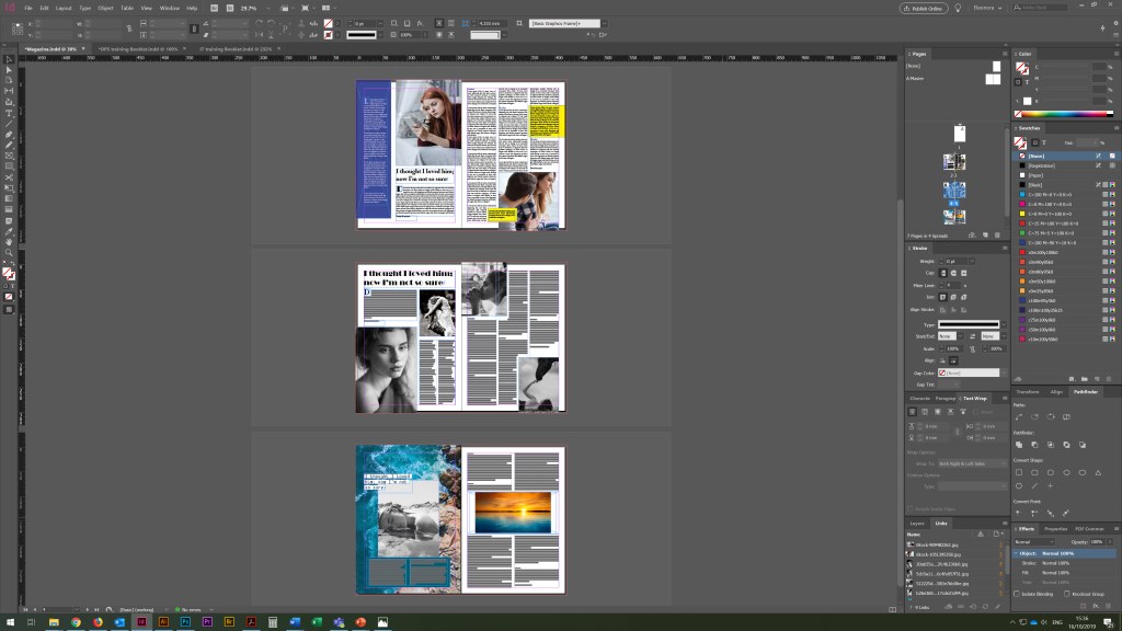
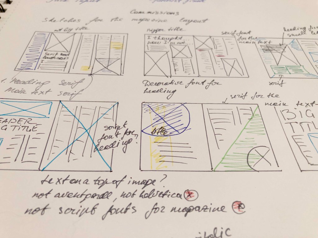
In design No. 1, I used the font that was my first on the list from the catalogue Adobe Caslon Pro; I experimented with it for the readable text, the main heading, and the subheadings between paragraphs. I finished the Glamor font for subtitles and initials before paragraphs.

In design No. 2, I replayed the layout, added more model photos, with dramatic overtones. But since the task was to use fonts in the design, I decided to use the Broadway decorative font for the main title. For the main text, I chose the neat font Futura, which has more spaces between sentences lines then Adobe Caslon Pro, but this font is a serif, which tends to be more readable for the articles. Here I could see a brighter contrast between the text and the title. In my opinion, in such a font combination, a more confident direction appeared in the magazine.
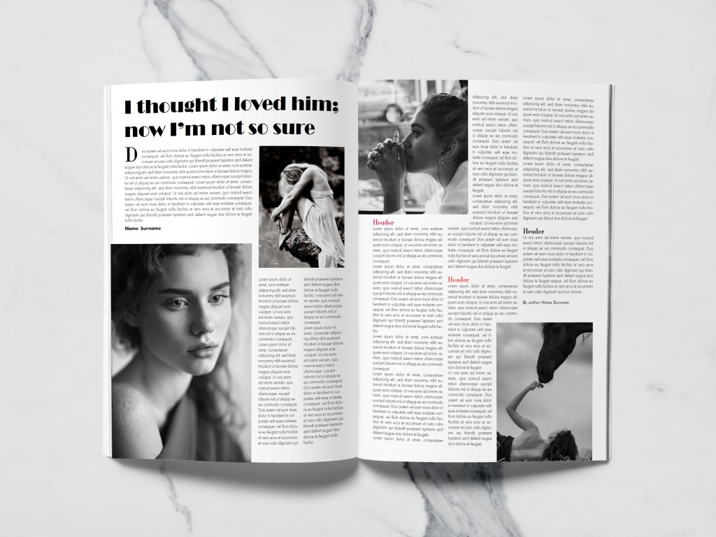
In design No. 3, I wanted to experiment even more with fonts, and in the third version of the magazine layout I used a new font, I was curious to see how the decorative NovaMono font fits into the title for the article, and also the font itself is small in size for the title; however, it is still well-read. Again, the design and overall impression turned out to be more modern style, in such a font the header seems to have been printed on the computer as a subject line. In the main text, I combined several fonts Futura and Adobe Caslon Pro, which, in my opinion, adds accents to the text.

I think that of the three options, I would prefer design No. 1, in my opinion, the font for the general text is well matched in it, as well as the standard title in the Adobe Caslon Pro font. This option is more classic, easy to read, although I would like to note that the font for the title could be selected more original than a standard serif font. In the second version, I liked the experiment with the font for the title, but I think that due to the large dominance of the photo, the layout itself turned out to be overloaded with images. In general, I was satisfied with the result. I realised that the main thing for the magazine layout is font readability.
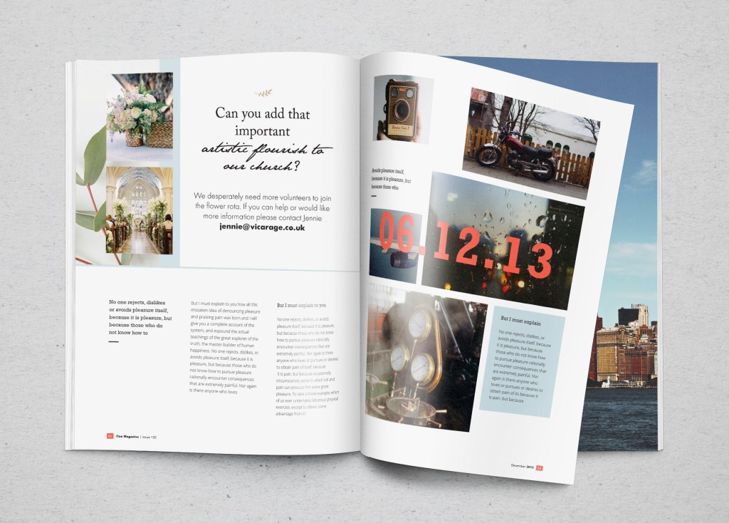
Parish Magazine Advertising
Layout for advertising a florist in a church was given to me more easily than the previous task. In my understanding, it was important to convey the tenderness and lightness of the ad, which could be diluted with floral arrangements. In option No. 1, I used three different fonts. I decided to split the title into two different fonts, so the ad becomes more attractive. For the first part, I used the serif font Adobe Caslon Pro, then the title goes into the handwritten font Jane Austen, for the main text I used the font Futura. The result, in my opinion, was decent, pleasant to perceive, and easily recognisable.
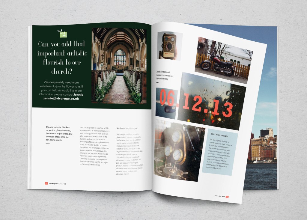
In design №2, I used a new font for the title, Glamor, and a similar font for the body text. I can not say that I am delighted with this option. Probably, a combination of fonts was not quite well-chosen in it, and yet I still lack a handwritten font that would add tenderness to this work.
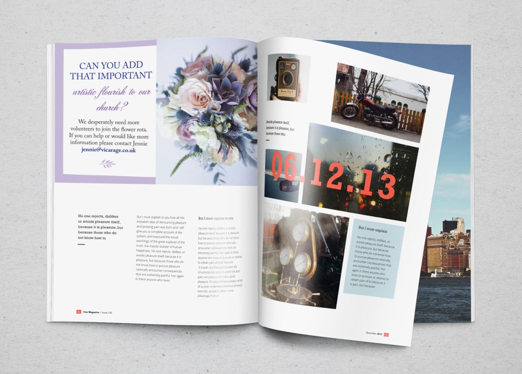
In design №3, I added the Acroterion classic script font, and for the title, I selected all the uppercase letters of the Playfair Display serif font. The main font is also the Playfair Display. I tried to use more fonts in this ad, such as Helvetica and Avantgarde, but somehow they were not successful in the two cases (magazine and parish florist). However, I realised that I needed to apply them as well because I included them in the list of fonts catalogue. Of all the three options, I prefer the option №1 the most, readable, straightforward text, and a right combination of fonts.
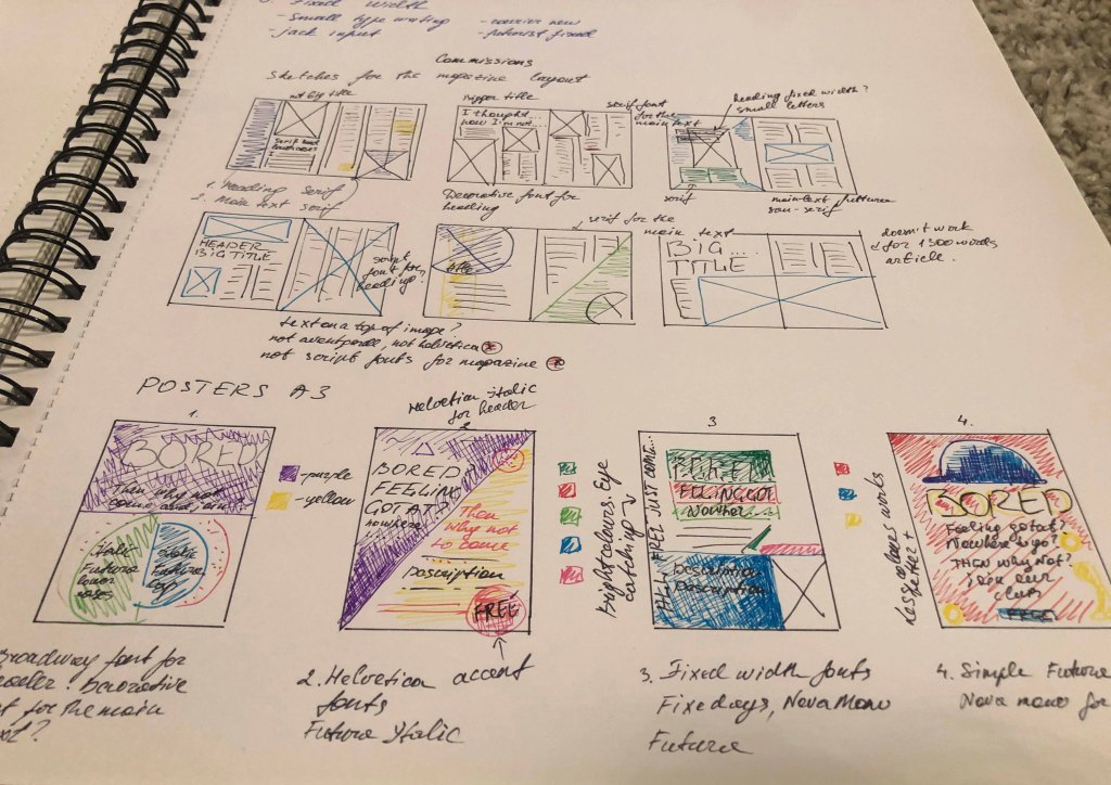
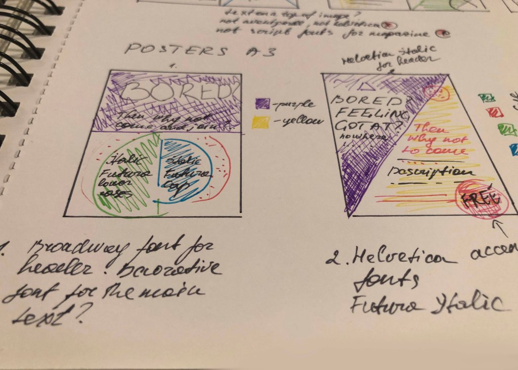
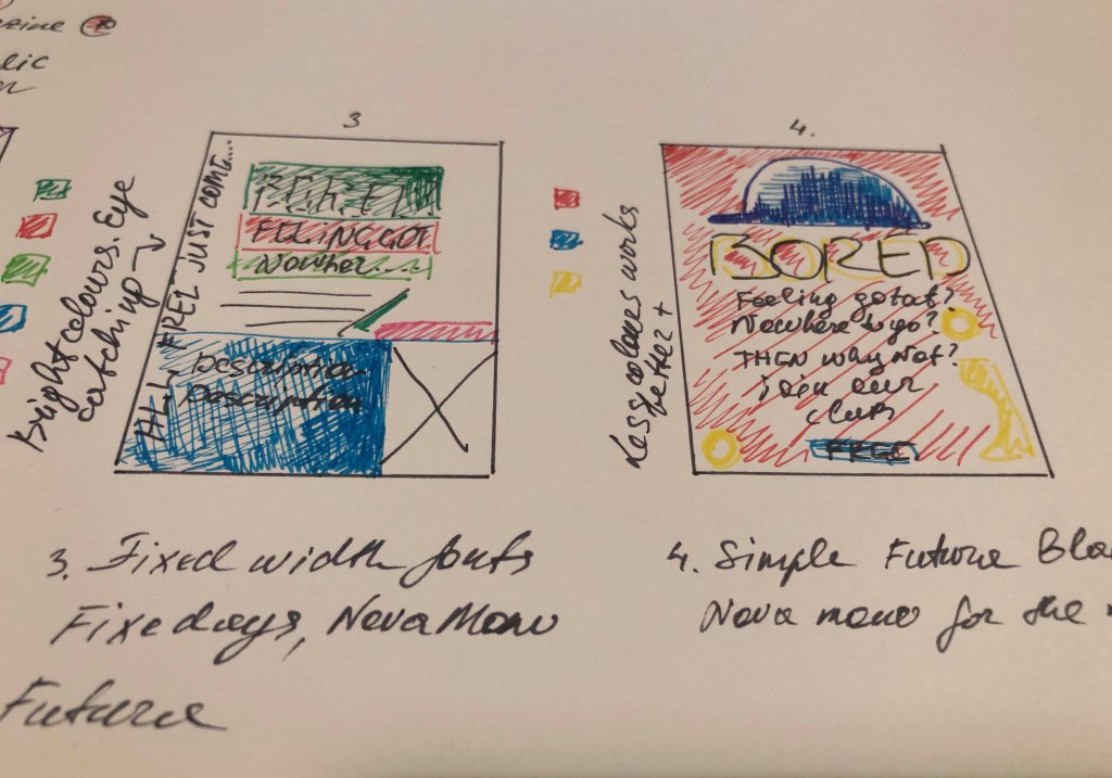
After-School Poster Design
To produce a school poster was another challenging design, where I had to use more fonts for the schoolboys club poster. Even though in this task, it was essential to concentrate on font variations, in my understanding, there are 3 critical components of the poster design, such as composition, colour scheme and the font itself. The print screen below shows all the porter options that I worked on in the process.

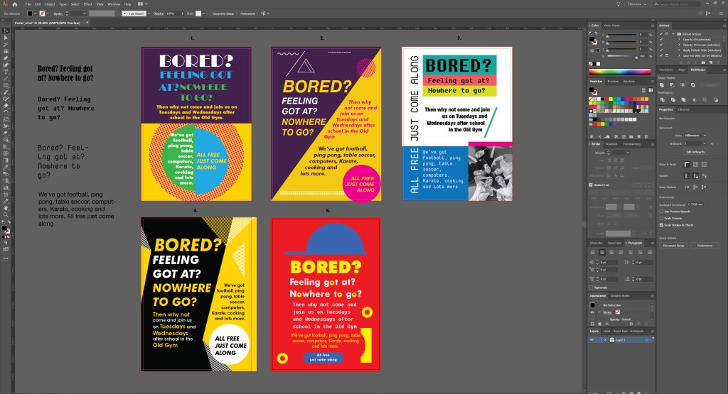
Screenshot Poster Design
In design number 1, I used the font Broadway and Futura Bold. I tried to experiment with colour and curly elements, dividing the crawl into several parts, but something in this version the poster didn’t want to go to bed at all, so I had to reject such a design.
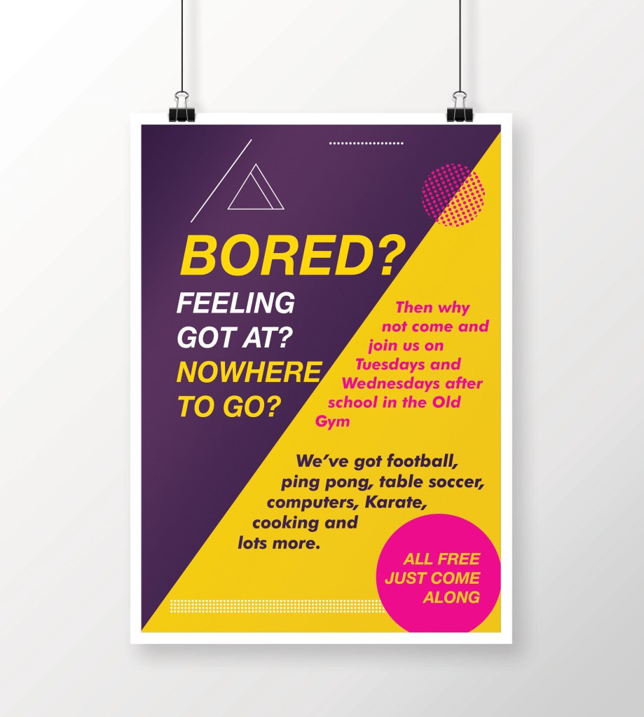
Design number 2, in my opinion, is more successful. I divided the area diagonally and used slanted fonts. The fonts were relatively simple, such as Helvetica Bold Italic for headings, Futura Bold Italic for the main text. In my opinion, this is a better option for accepting information and reading; however, because of the diagonal, I did not have enough space for a larger font for the title. So I started the next design.
Design №2
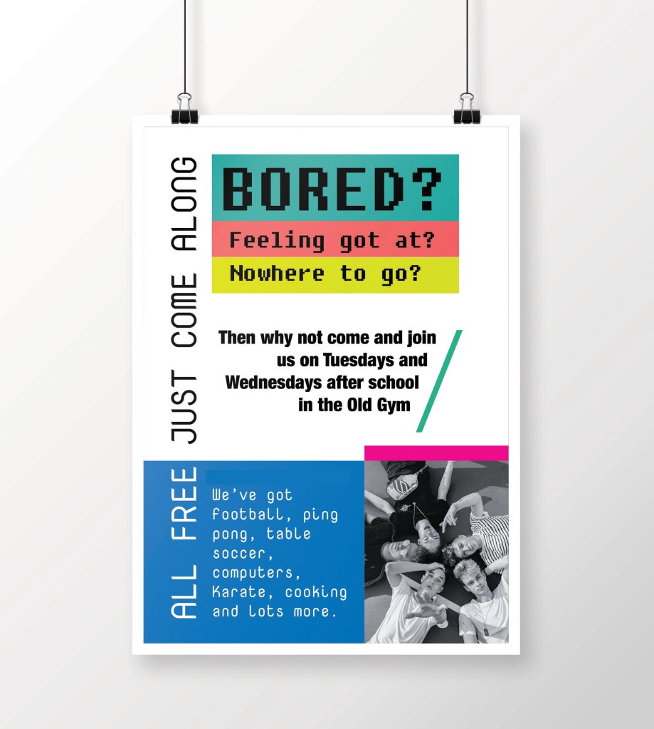
Design No. 3 turned out to be a new trend compared to previous versions. Here I used new fonts; they are unusual, modern and ideal for this kind of porter. Here I used fonts from the Fixed width: NovaMono, Fixedsys (for the title), I also diluted the main text with the Helvetica Condensed Bold font, in my understanding, this is an excellent solution to combine several fonts in one loss. Also, these fonts are unique in their way, and they still have a standard feature, they are tall fonts, sans-serif, they look fresh and pleasant to read. In the lower right corner, I filled the place with a photograph of a group of young guys, as a sample, although there may be options (the image of sports, competitions, etc.).
Design No. 4 (see on the screenshot) is an intermediate version with design №2. I first drew it for the sample, and I liked the solution with the fonts in the slope, but the background seemed boring to me, so I redid it in option №2. Although at the same time, the font for the title in design No. 4 of Helvetica Bold Italic is more successful than in version No. 2.
Design №3
And finally, my last version number 5, in my opinion, the most interesting. The idea to portray a cap came spontaneously. In this design, I like everything from colour to the selection of fonts. Who would have thought that a reasonable standard Futura Bold font could harmonise so well for both the title and the main text? In this design, for the additional wording, I used Fixedsys font, which works perfectly with other fonts around.

Design №5
In conclusion, I would like to say that I was quite satisfied with my designs. I used the spectre of fonts widely, however at the same time I’ve noticed that some fonts wouldn’t work for this kind of advert, such as Script fonts, and Decorative fonts, they would look too old-fashioned and out of place for this kind of designs. However, the preferred options of fixed-width fonts and san-serifs font, such as Helvetica, Futura Bold, worked quite right for these posters.
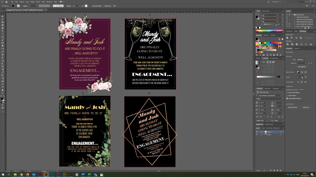
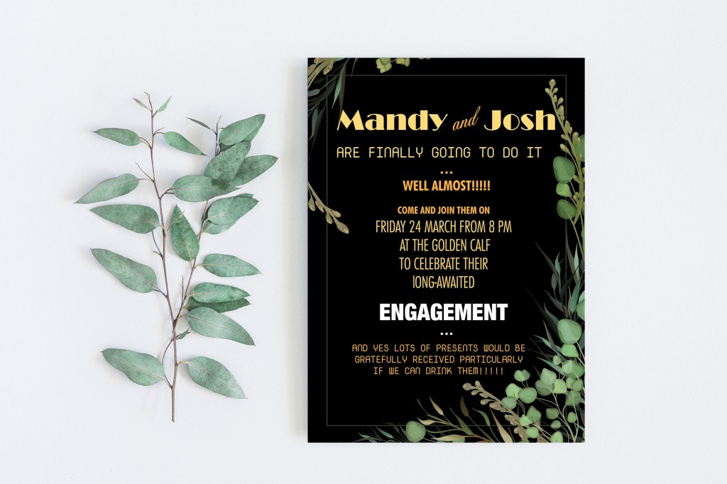
Friend’s Engagement Party
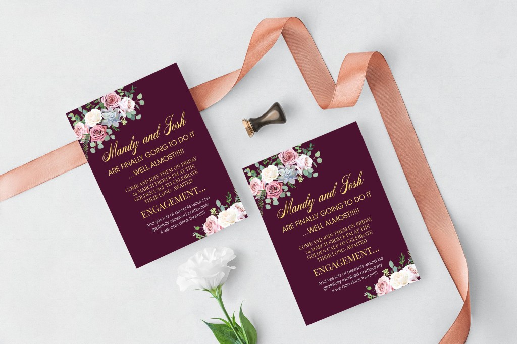
And finally, my last collection of designs in this exercise is an engagement party invitation. Below are screenshots of my final designs. I noticed that I still had fonts that I didn’t use earlier, but I could fit them well into the invitation design, fonts such as Vegan Style and Elephant Italic added a unique concept to the layout. Since this is an evening party, I wanted to portray all the invitations on the dark saturated background to make more association with the evening celebration.
In design No. 1 against the backdrop of burgundy, I used such a light and pleasant handwritten font Acroterion in combination with two different fonts, with serifs PlayFair Display and sans serif Avantgarde. In my opinion, a good option, easy to read and perceive information.
Invitation Design №1
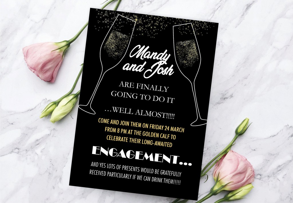
Design No. 2 is also quite exciting and understandable, in it I used font variations to the maximum, it also has a serif font with all uppercase letters Garamond, a narrow font Helvetica Condensed, as well as Broadway font in the style of the 20th.
Also, this is the only design in which I finally managed to use the font Vegan Style, in my opinion, quite successfully.
Invitation Design №2
Design No. 3 is a kind of experiment, in it, I combined different fonts from the modern computer era of NovaMono and 20s style font Broadway, as well as the narrow font Helvetica Condensed, Helvetica Condensed Bold. There is a certain kind of originality in such a variation because at first glance opposite, and incompatible fonts are combined here. Nevertheless, the design turned out to be catchy.
Design No. 4 is unusual; the text goes at an angle. Still, the frame around me was a little embarrassed; it seemed to me that it squeezed the space, so I left this option only as an intermediate one since it contains an exciting variation of fonts, such as Elephant Italic, Glamor Italic, Adobe Caslon Pro. (see screenshots above)
Invitation Design №3
Conclusion
In conclusion, I would like to say that I am pleased with my final designs. I created a good variety of layouts and compositions to be able to compare different aspects of design. At the moment, I would say this exercise was the most comprehensive, but they still were made around printing designs and font solutions. I once again emphasised for myself how important the font choice for designs. That typography plays a vital role in the correct understanding of layout, especially the part of the clarity of the message. Also, for the first time, I created a specimen type book, which I can refer to in my future designs.
