
This exercise is designed to help you to look at typefaces more closely. You will need a sharp pencil, some tracing or thin paper and a ruler. On the facing page the typeface Baskerville has been deconstructed so it only contains the strokes, serifs and bowls that are common to all the letterforms. Your task is to try and put it all back together again to read
the quick brown fox jumps over the lazy dog
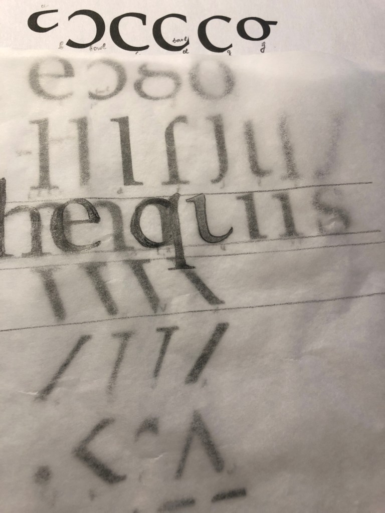
This is a pangram containing all the letters of the alphabet. It is all in lowercase. Start by drawing your baseline, determine the x height by identifying a whole letter such as x, e or n and draw your median line. This should provide a good starting point to try and piece together all the other elements. Remember that some parts will be used more than once, for example the same stem will be used in several letters. Try and account for all the parts without leaving any stray serifs behind.
Researches
So, continuing to research the theory of type, the new task brought a new experience. For me, a font has always been an all-encompassing component in the design, when you have a task to create a layout, in my understanding, a font has always been an addition to the message. But in the new chapter, the theory of typography opens as a separate part, which is also important for graphic designer attention, because it has the origins of the development of design theory, and writing takes its origins from ancient times, as well as paintings and drawings. Before starting the practical task, I decided to create for myself a small auxiliary layout of the anatomy of the text, in which I painted all the components of the font.

I’ve noted some of the names of letterform parts: aperture, ascender, baseline, cap height, descender, leading, letter-spacing, sans serif, serif, stem, stroke, x-height. Ascenders are an upward vertical stroke found in certain lowercase letters that extend beyond either the cap height or baseline. Descenders are the downward vertical stroke in these letters. In some cases, a collision between these strokes can occur when the line height (the vertical distance between baselines) is too tight. A serif is a small shape or projection that appears at the beginning or end of a stroke on a letter. Typeface with that have serifs are called a serif typeface.
In a detailed analysis of the font, I noticed that all composing letters have a logical explanation. If you look at the font as a live object, then each element can be compared with the nature that surrounds us.
For example, the tail at the letter Q, the shoulder at the letters n, m, h, the small ear at the letter g, the straight stem as the basis for the characters h, k, l, bowl resembles a cup handle with tea for symbols such as p, d, b, p.
When it came to analysing the individual elements of the font in the task, I realised that it is not so easy to recognise all the letters when they are fragmented into small particles. I had to spend some time analysing all the elements of the font. To make my task a little easier, I decided to start by designating for myself on a piece of paper to which symbol this or that element can be attributed.

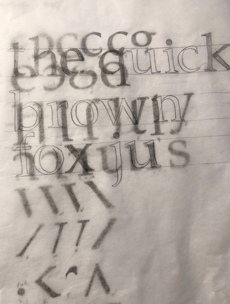
I decided on the size of the letters 2 cm and the distance between the lines of 1.5 cm.
Letters such as l, s, g, o, e were obvious. When I determined the letters h, n, I gradually began to see the boundary between the characters, literally a slight difference mattered. Suppose a serif on one side that would be suitable for the characters m, n, h, did not find its application, in my opinion, the serif should be on both sides. But over symbols b, p, d, m, v, w, p, q I had to sweat. Also, I never paid attention to the connection between the letters u & a, for me it could be said a discovery, until the last day I thought that I would have to finish the letter a by myself!
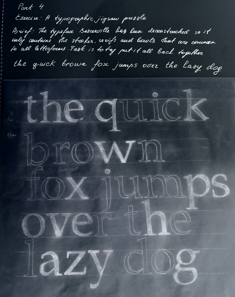
In conclusion, I would like to say that I had to spend a little more time on the task than I expected. In fact, it was important for me not only to draw letters and forget about this exercise, for me it was important to delve deeper into the analysis of the font and its components. Suppose now I can now determine for myself some differences in the font, and that one small serif, gives the font stability or dynamics. Earlier for me the theoretical font was an unknown Planet. Now I understand that after doing a little research, I understood the basic components of the font, and I began to think about creating my own font in the future.
