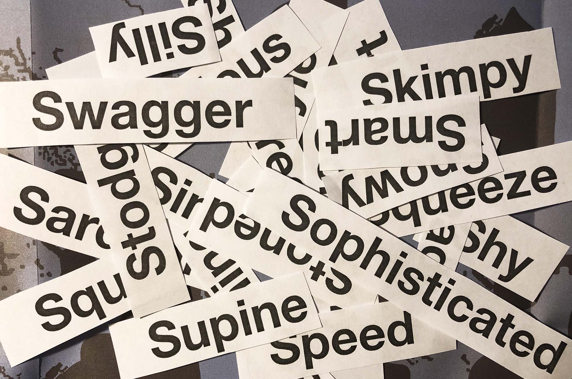
Using the following words create typographical representations that present both the word and a suggestion of its meaning.
Sad Safe Sardonic Saucy Scholarly Serious Shadow Shattered Shy Short Silly Sinking Skimpy Sleek Smart Snowy Sodden Soothing Sordid Sophisticated Speed Squat Squeeze Stiff Stodgy Stoned Style Supine Swagger Sweet
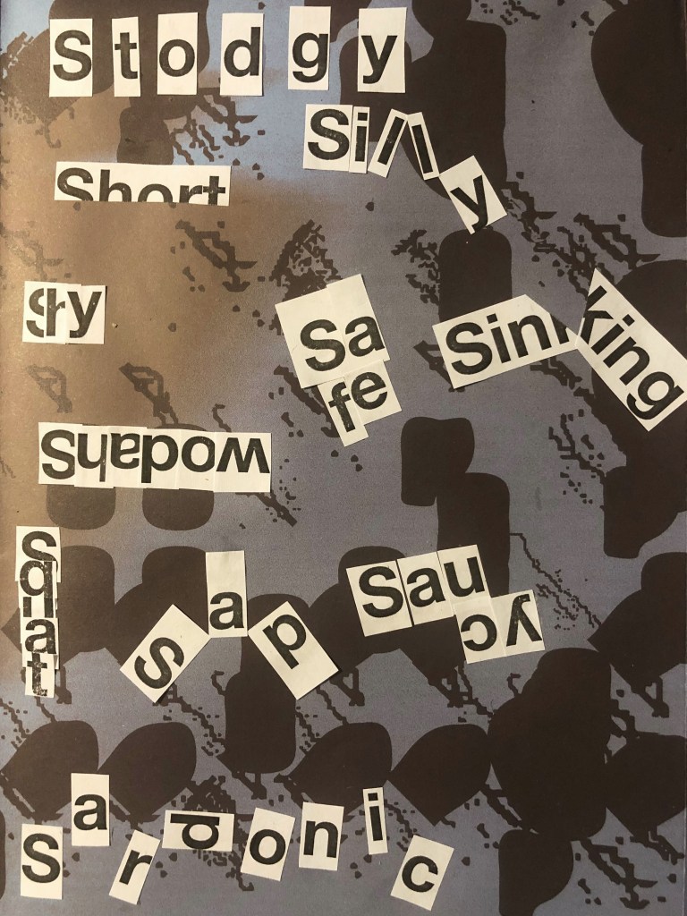
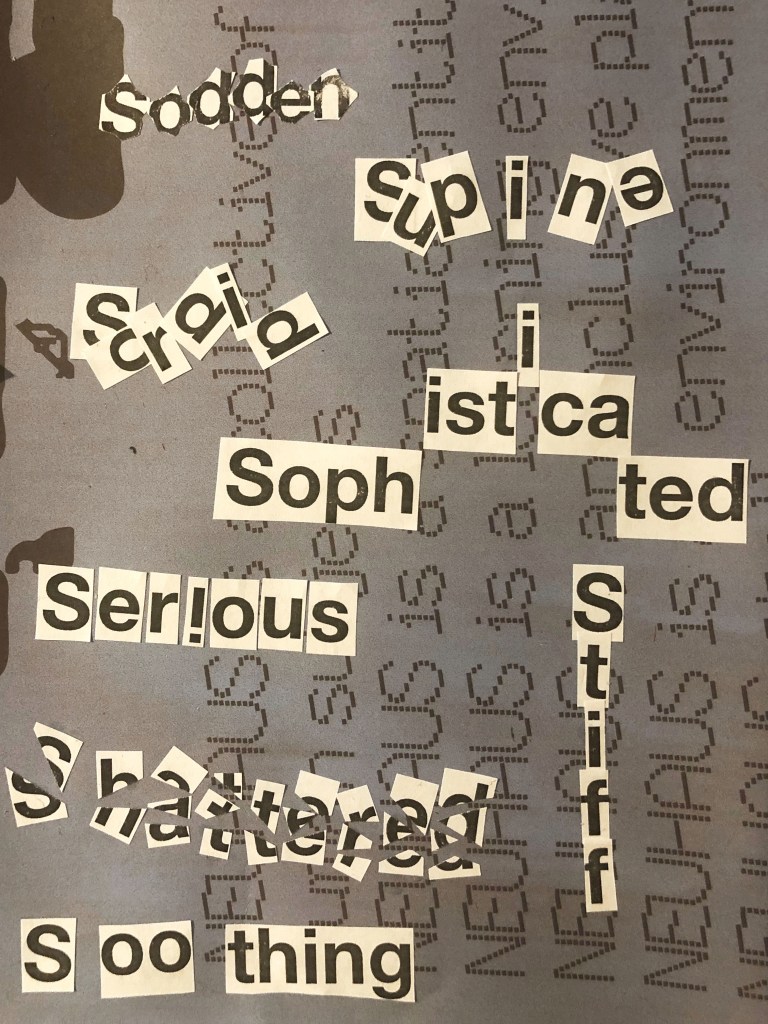
Start this exercise by working on A4 sheets of paper. Set the words in 48pt HelveticaBold, print and cut out the words and then arrange them and stick them to a sheet of paper trying to capture the meaning of the word visually. Think about the composition, using the white space of the page to help you construct your meanings.
Then work digitally using any of the software you have available. Explore how you can set text at a slant, at different sizes, in different colours and fonts. Try using filters in your software for other effects. Make notes as you work explaining your choice of representations and which ones youfeel that you were most successful with.
Practical Part
So, it’s time to start the first task of the printing section. Before I dive into the practical task, I made a small investigation into the history of type, I traced the evolution of writing for myself, it was interesting to follow the very origins of the development of type and writing, and how centuries-old inventions influenced modern typography. I left small notes in my Research Point.
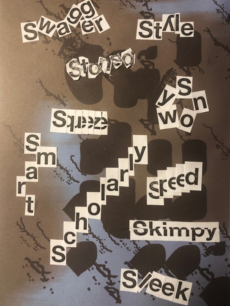
At first glance, the standard pun-word exercise was very exciting. What struck me most was that how different the permutations of the letters in one word can be, and how this affects the visual perception of the word. I made sure for myself that the standard font, but the unique arrangement of letters can affect the character and mood of a person.
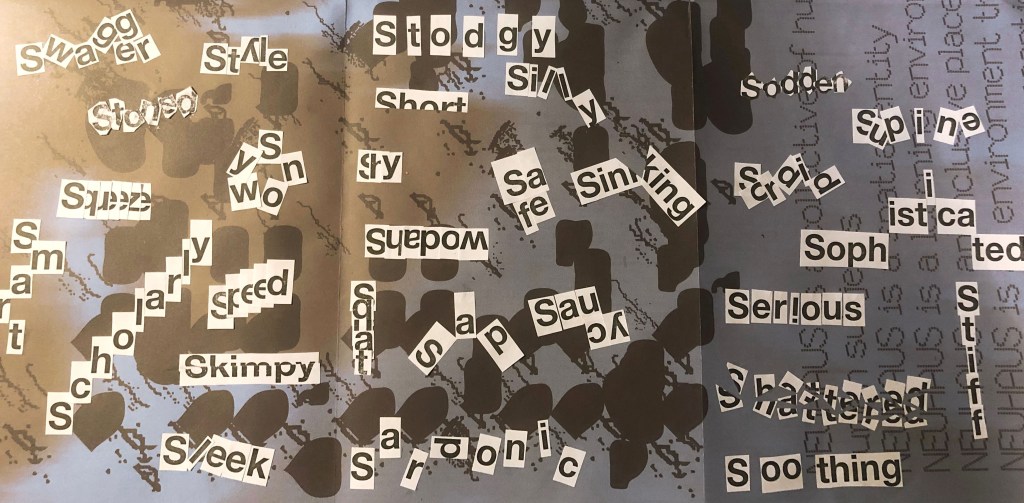
When I imagined the word Sad I could see a sad smiley, and I want to place the word flowing down. When associating the word Safe, I presented a safe for keeping all valuables, and all the words are grouped into a cube shape. When associating the word Sardonic, I imagined something daunting when the letters want to scare so they scatter on different sides. For word Saucy, I imagined something playful and tasty. For word Scholary, this word which all strives to learn more is therefore directed upward. For word Serious, I imagined an exclamation point, so this is the emphasis, I am serious, and it is important! Word Shadow is a reflection, and it is read backwards. Word 8 is like broken glass, so it came to me to sweat by arranging small pieces of letters in a chaotic manner. Word Shy is hiding inside itself because it is shy to show itself in all its beauty. For word Short, the entire length of the letters is not enough, because it is small. Words Silly and Sweet are also playful and funny, so some letters do not want to stand in a row, but they want to somehow escape. Word Sinking, like the drowning ship Titanic, is broken in half, pulling to the bottom. And so all other words. I like the fact that they have no limits to play around!
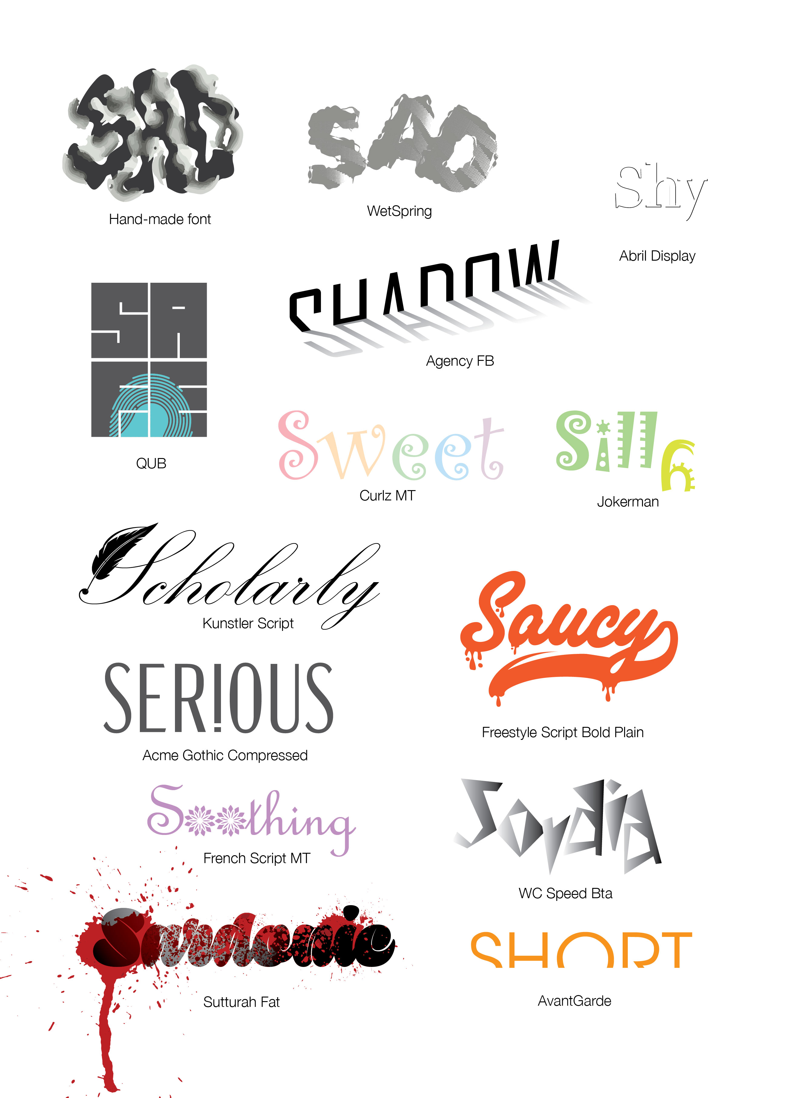
When I started the graphic part of the assignment, it was important for me to show the meaning of the word in addition to the unique arrangement of letters, but also through the form of the font and its color as an addition. In my opinion, the font itself can convey the meaning of the word and its orientation. For example, I discovered the new Sutturah Fat font, it is easy to read, and it really has something intimidating, but a couple of bloody spots added even more meaning to the word. Or let’s say the Kunstler Script font, in my understanding, a scientist often writes in a beautiful, wide-spread font, let’s say this is a real idea. The same applies to the words Sweet / Silly, in which I used light, playful fonts with cute, subtle hues. I was also inspired by the font Riesling, for the word Sofisticated, such gracious and elegant font, as I understand it, there is really something attractive in this word. But to make this ford even more visible I arranged it into the goes high style. Thus, I replenished the font database, and I tried to beat every word in the role of a logo, like a word that represents itself in shape, color, and the arrangement of letters. In this practical lesson, I indicated all the fonts that were used in the design.

Conclusion
Based on my preliminary sketches of the font layout, I created words like Sad, Stoned, which kind of goes into the haze, relaxed and blurry image. With the word Speed, I had a desire to experiment, in which the letters e are depicted in the form of a speedometer.
In some words, I noticed difficulties, for example, such as Supine, Sleek, Soothing, I tried to add more tilt to them, convey the mood through color, and arrange the letters in a more chaotic version, but in my opinion they do not look as convincing as the rest fonts.
In conclusion, I would like to add that I enjoyed this assignment, it is painstaking work with fonts, and to some extent a separate chapter in the history of design, but it deserves a lot of attention, because the typography depends on the ease and correctness of the message, which the designer wants to convey to the viewer.
2 thoughts on “Exercise: Playing with words”