The history of type development has seen many exciting eras. The invention of moveable type, for instance, revolutionized our world, allowing the transmittal and sharing of knowledge, raising the level of the world’s literacy, and enabling civilization to progress and prosper.
Type History and Timeline of Typogrphy.
Ancient cave paintings that date back to 20,000 B.C. are perhaps the very first recorded written communication. However, formal writing is said to have been developed by the Sumerians at around 3,500 B.C.
Greek lapidary letters 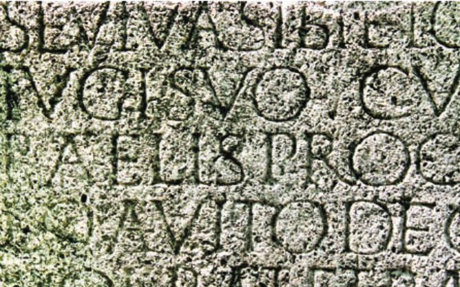
Roman monumental capitals
As civilisations advanced, the need to communicate complex concepts grew—hence the development of Egyptian hieroglyphics. By 3100 B.C., the Egyptians began incorporating symbols or ideograms into their art, architecture and writings.
Fifth Century BCE.
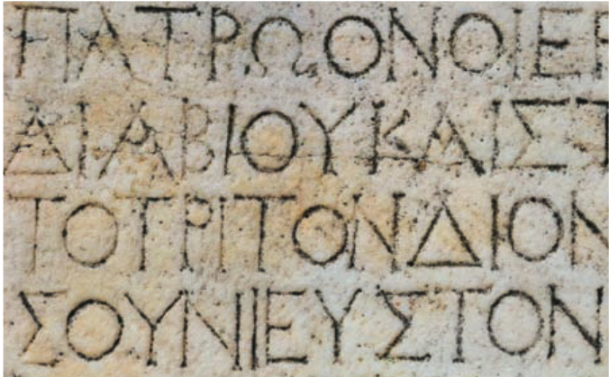
Greek lapidary letters, letters carved into hard surfaces, were one of the first formal uses of Western letterforms. The Greeks adopted the Phoenician alphabet for their own needs, and as a result, changed several letters and created the foundation for Western writing. Roman monumental capitals are the foundation for Western type design, as well as the ancestor of all serif typefaces Fourth and Fifth Centuries CE This time period saw square capitals, formal hand-written letters that evolved from Roman monumental capitals.
Fourteenth and Fifteenth Centuries
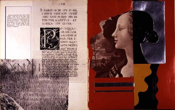
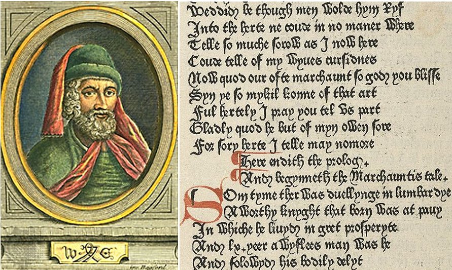
The Middle Ages were all about hand-written and well-illustrated manuscripts. It led to the evolution of a wide range of writing styles. Unicals and half unicals were prominent features, with rounded, elaborate lettering. The art of Calligraphy along with page layout and lettering forged new ground. Calligraphy masters travelled across the known world to share their knowledge with the educated elite.
Nicolas Jenson (77) (1420– 1480) was one of the first printers to cut and use fonts based on Roman rather than northern European Fraktur letterform.

Another fifteenth-century notable, William Caxton (1421– 1491), a man credited with introducing to England the craft of printing with movable type, was first a successful businessman and government official before beginning his typographic career.
Sixteenth Century
Garamond (74) (1500– 1567) was the most distinguished type designer of his time, perhaps of the entire Renaissance period. A true typographic innovator, he was instrumental in the adoption of Roman typeface designs in France as a replacement for the commonly used Gothic.
Seventeenth and Eighteenth Centuries
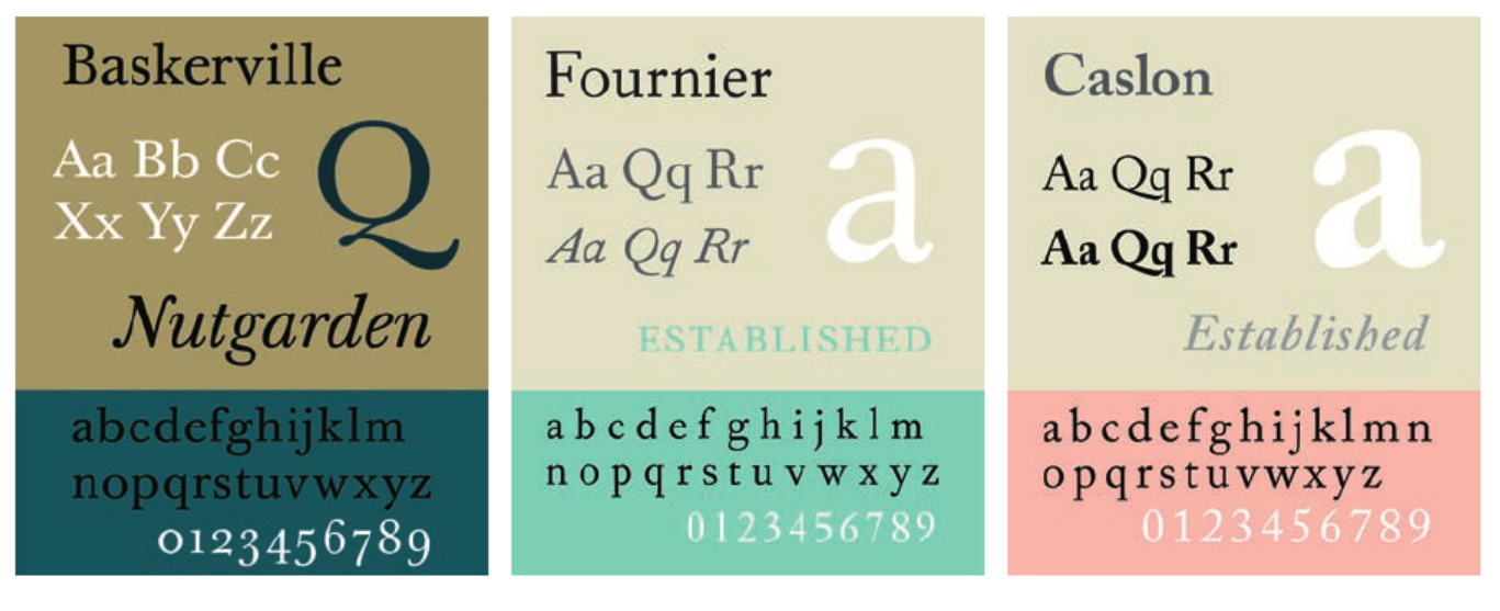
During this period, English gunsmith-turned-type-designer William Caslon I (72) (1692– 1766) founded the Caslon Type Foundry. He was one of the few wealthy type designers. His work, based on earlier Dutch designs, does not possess irreproachable perfection like that of Bodoni (156) or Baskerville (154) . Caslon’s strength as a type designer was not in his ability to create flawless letters, but to create a font that when set in a block of text copy appeared perfect in spite of the vagaries and individuality of each letterform.
Early Nineteenth Century
Early in this century, Lord Stanhope invented the first printing press. A few years later, in 1816, William Caslon IV designed the first sans serif font, creating the English serifed design. Many claim that the design for this sans is based on the Greek lapidary letters of the fifth century. Note how close they also look to the caps found in faces such as Futura (174) and ITC Avant Garde Gothic. In 1818, Bodoni’s (71) Manuale (completed by his wife after his death) showed the quintessential modern type.
Mid Nineteeth Century
For many years, ATF had the greatest offering of typefaces in the world— an offering that Benton essentially built. Outside the United States during this period, Emil Rudolf Weiss, Rudolf Koch , Lucian Bernhard , and Paul Renner began designing type.
Koch was primarily a calligrapher and teacher, but his association with the Klingspor type foundry in Germany provided the opportunity for a number of his designs to become type fonts.
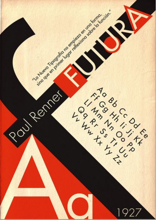
Renner created the first modern, geometric sans serif face: Futura . Although not a member of the Bauhaus, Renner shared its ideals and believed that a modern typeface should express modern models, rather than revivals of previous designs.
Late Ninetheeth
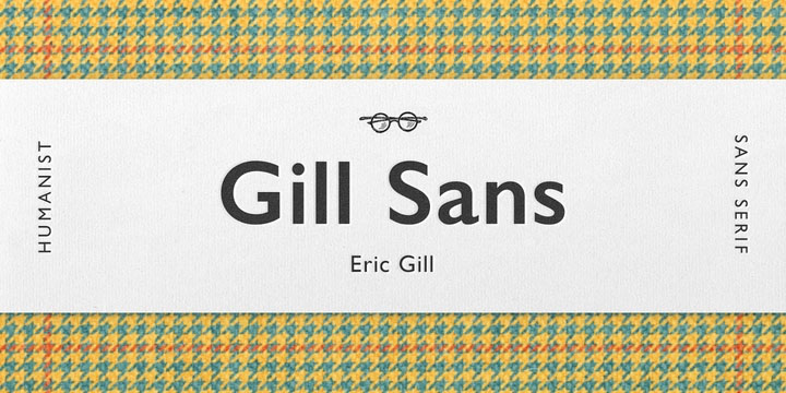
Eric Gill (1882– 1940) was an English sculptor, stonecutter, artist, and type designer. His most important work— and his only sans— is Gill Sans. His other designs include Joanna, Perpetua, and Pilgrim.
By the Industrial Revolution typography was all about communicating with the masses. Through signs, posters, newspapers, periodicals and advertisements, typefaces became larger and catchier, with bolder lettering and shading—as well as experimental serif and sans serif typefaces. Ornamental typography was another major highlight in this era. In the 1800’s, medieval art and hand crafted individual art has become commonplace, and international artistic styles developed considerably.
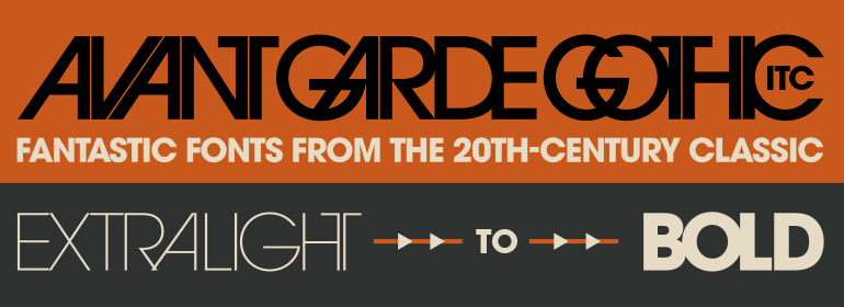
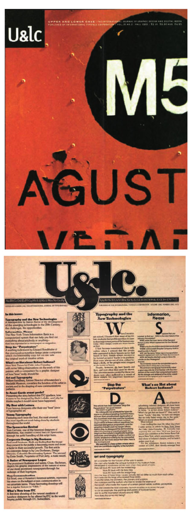
The year 1970 experienced the release of ITC Avant Garde Gothic and ITC Souvenir. ITC Avant Garde Gothic was ITC’s first typeface, initially drawn by Herb Lubalin (95) as the logo and headline face for Avant Garde magazine.
In 1982, John Warnock and Chuck Gerschke founded Adobe Systems. In 1983, Adobe PostScript was announced, one of the three most important technological advancements in typographic history.
1990s
ITC released Tekton in 1990, possibly the ITC Souvenir of this decade. It was designed by David Siegel for Adobe Systems (124) and based on the hand lettering of D. K. Ching, a Seattle architect. The following year, Adobe introduced the Portable Document Format— what’s today commonly called PDF— to aid in the transfer of documents across platforms. Apple introduced its TrueType to compete with Adobe’s PostScript. Stag Family by Christian Schwartz.
2000s
In 2000 and 2001, Agfa purchased the ITC type library and created Agfa Monotype, a merger of Agfa Typographic Systems and Monotype Typography. The Gotham typeface family, by Tobias Frere-Jones (87) , was released. Apple introduced Mac OS X 10.0 code named Cheetah. Harvey R. Ball, who created the cultural and typographic iconic drawing of a smiling face on a yellow background, passed away.
Source: Tselentis, Jason, et al. Typography, Referenced : A Comprehensive Visual Guide to the Language, History, and Practice of Typography, Quarto Publishing Group USA, 201
