In this exercise you will read existing signs, symbols and images, and then drawing on their visual language create your own symbols.
OCA. Core Concepts
Choose one of the following concepts:
• Danger
• Movement
• Love
• Here
How does existing visual language represent these concepts, for example both ‘danger’ and ‘love’ use red, while ‘movement’ and ‘here’ use arrows. Research the different similes and metaphors that are in common use. Document them through drawings, collecting examples and mind maps.
Now create an alternative symbol to represent at least one of the concepts.
Pencil and paper is the fastest and most practical way of working out your initial designs. You may then want to develop your idea further using computer software.
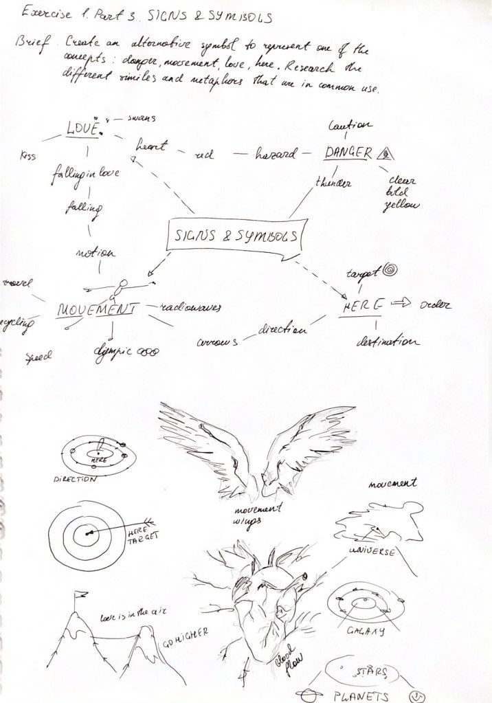
Generic researches
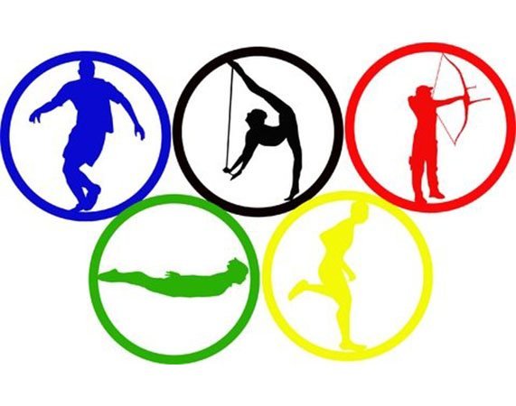
In our modern world, we are surrounded by signs that are figuratively associated in our understanding with a certain action. For additional acquaintance with the theme of signs and symbols, I purchased a book of Pictograms Icons & Symbols. Pictograms and icons are a keystone of nonverbal and multicultural communication. From this book I could discover over 2,000 examples of pictograms, including icons from Olympic Games from 1964. The invention of semiotics is basically the analysis of signs and symbols and their use, which was invented by Charles Sanders Peirce, who saw the entire universe as an extended network of signs. He was the fist one who adopted a method of classification, which divided all signs into three categories of icon, symbol and index. Visual Signs can be seen for example at body language, illustrations, circumstances. But Auditory Signs can be heard, as alarm clock, siren etc.
Through this book, you can trace the origins of the signs and symbols, which originate from the Middle Eastern of Mesopotamia and Egypt. Also visible is the basic principle of constructing signs, where the thickness of the lines, conciseness and universality are important regardless of culture and language. I was especially interested in the pictograms on the last pages of the book, in a completely unusual for the human eye sign language in comic form. (New users for pictograms). The requirement was a concept that could be added on effectively and flexibly to something that already existed. The signs themselves comprised pictures and texts, which together conveyed all the necessary information. In addition to providing directions, the system was divided into three categories: cultures, sponsors and exhibitions.
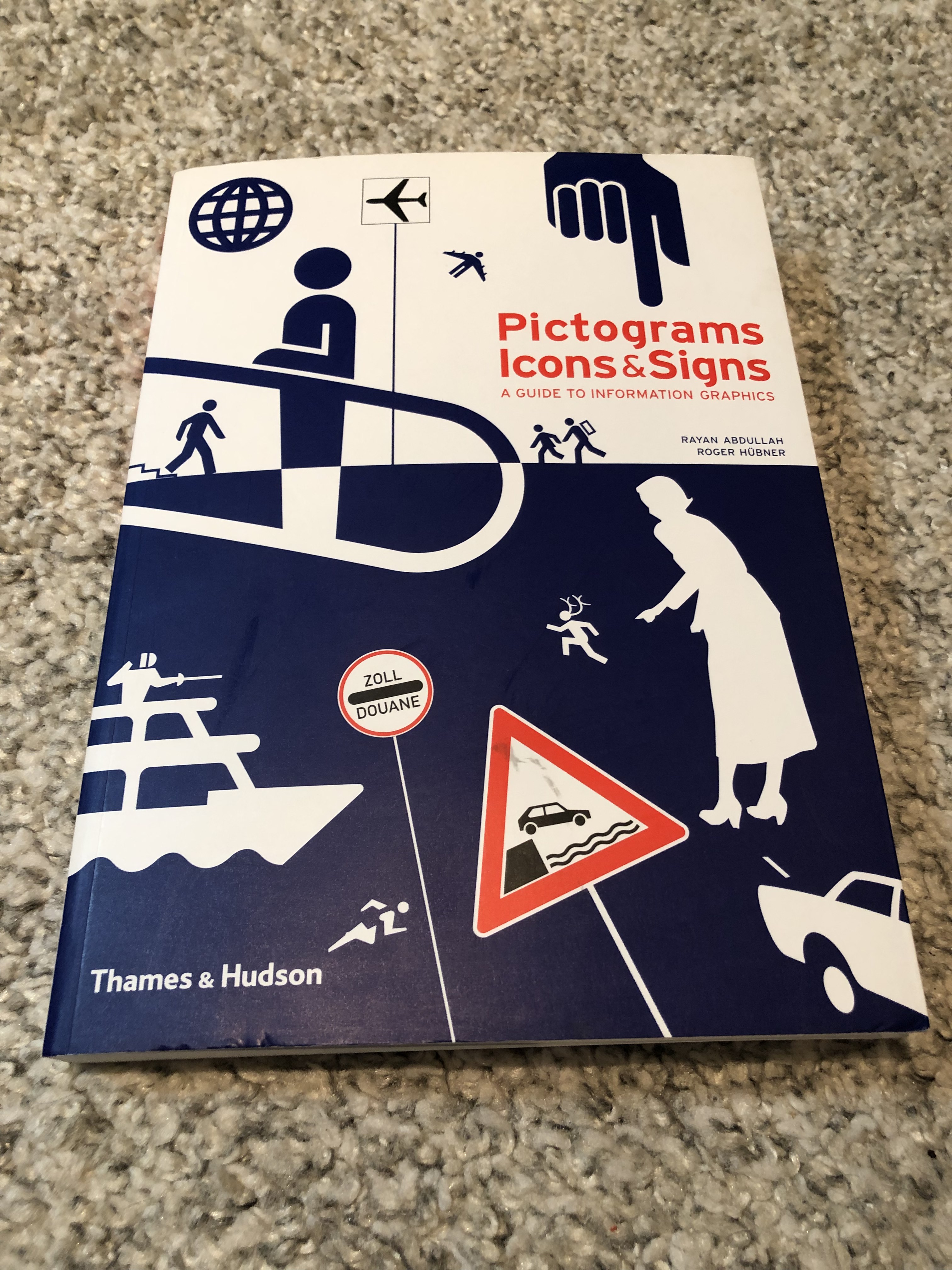
Pictograms, Icons & Symbols. A guide to information graphics. 
The history of pictograms 
Commercial pictograms. Movement. 
Commercial pictograms. Directions, order. 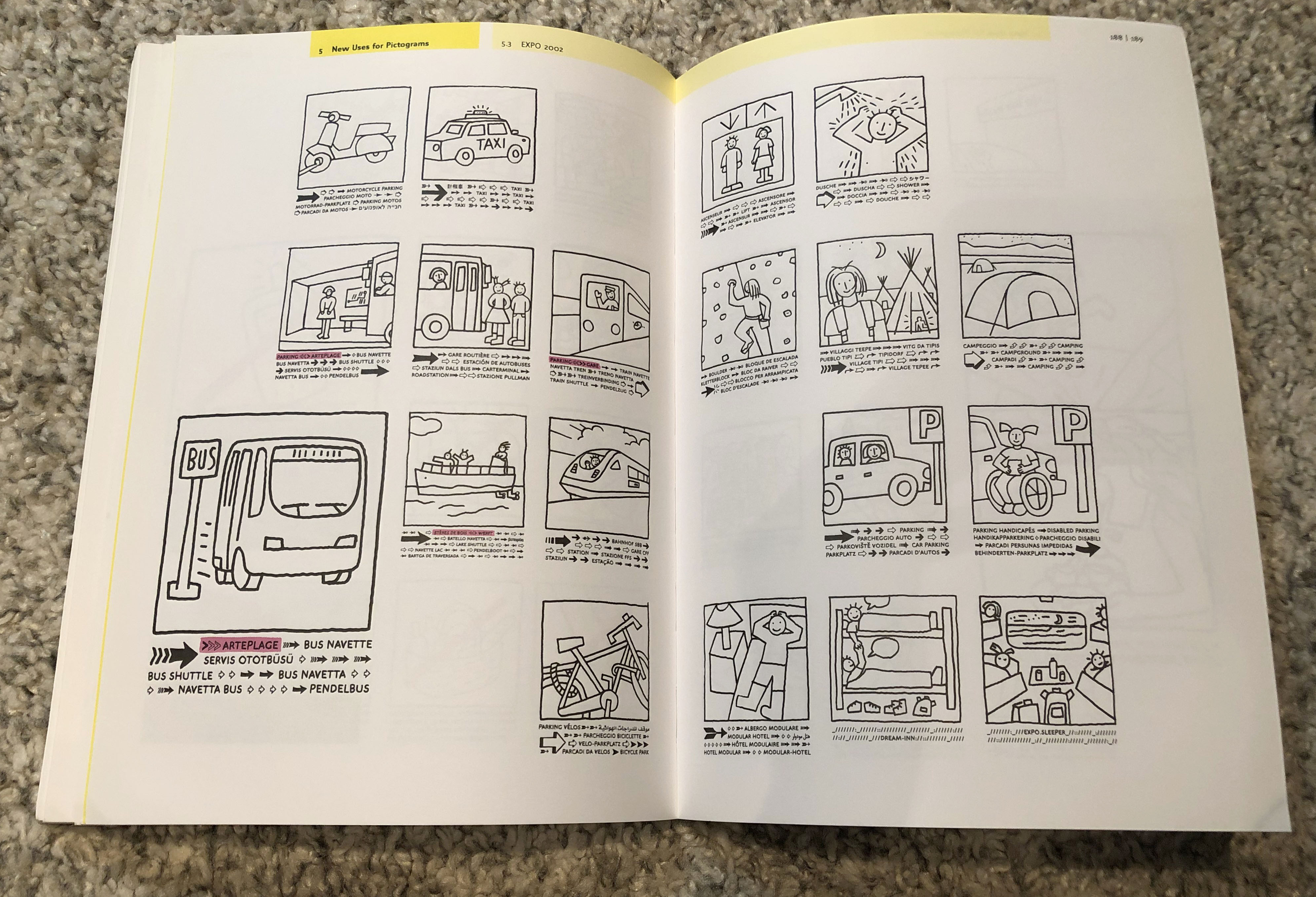
New uses for pictograms
I also wanted to create a unique character that would be readable and unique at the same time. Before starting to develop my own design, I decided to put together a mood board for each topic in order to identify trends and style for each symbol for myself.
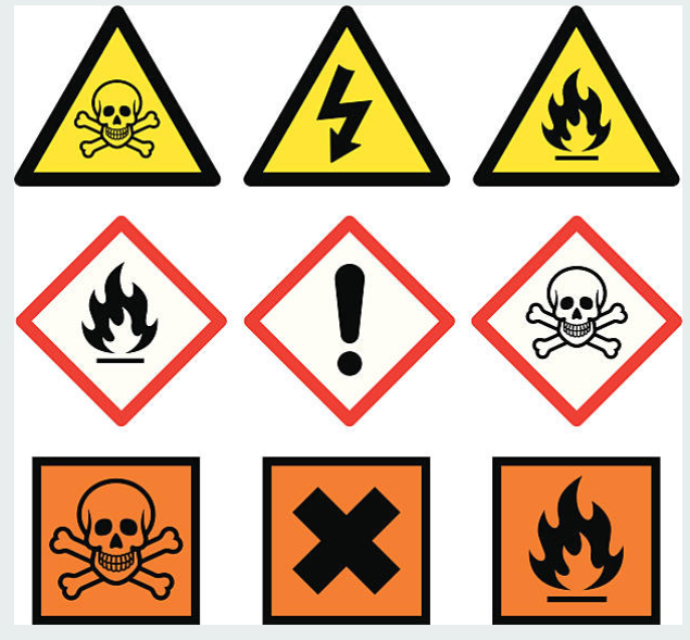
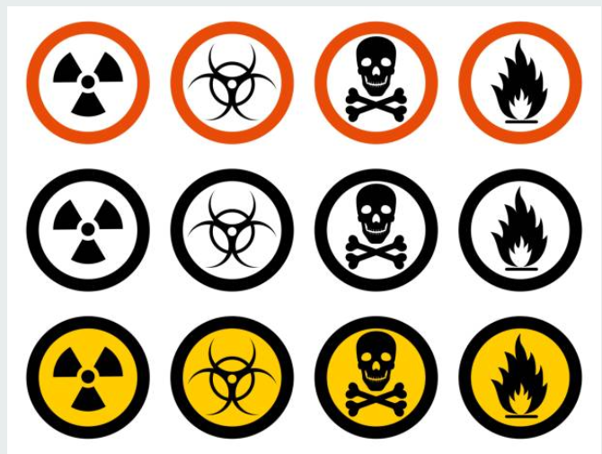
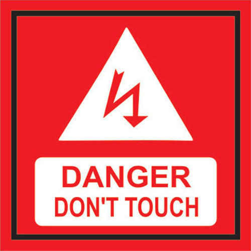
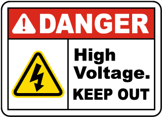
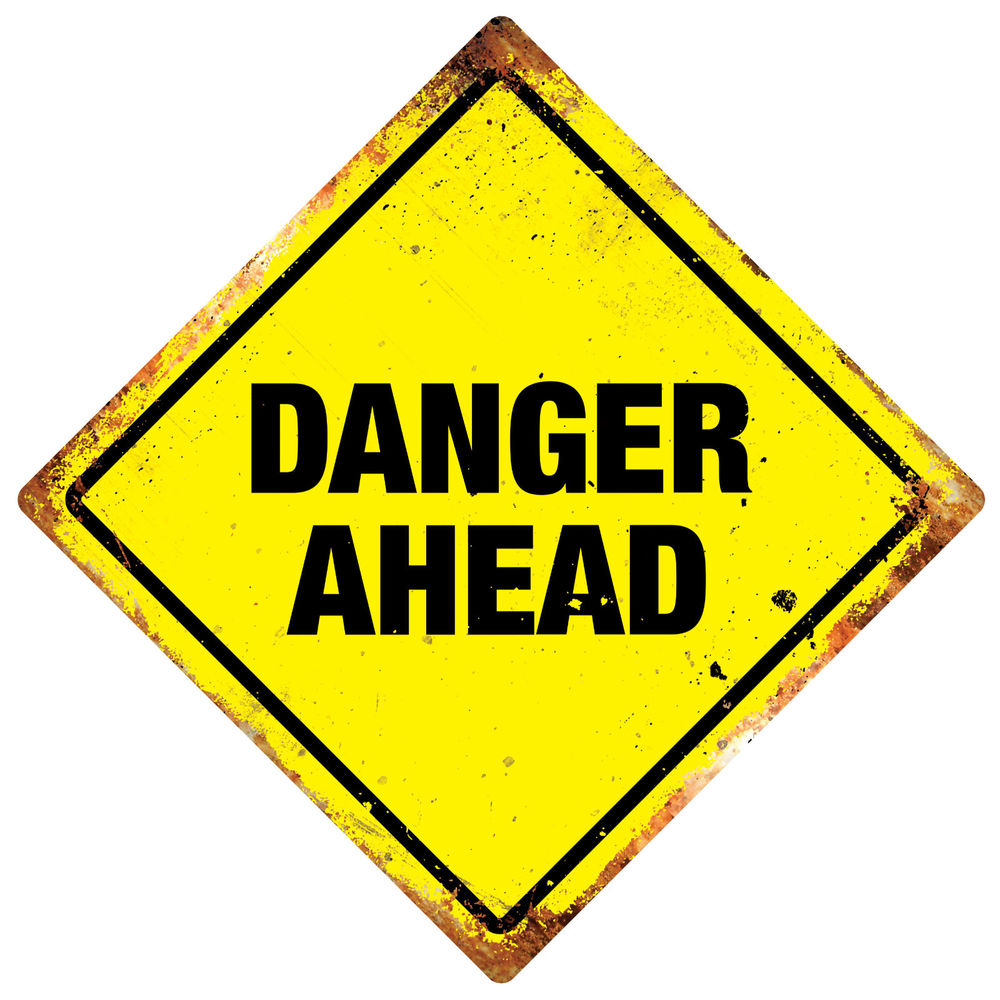
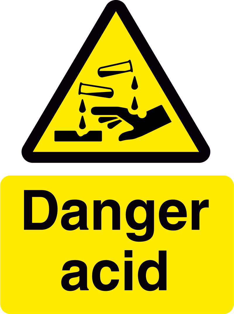
Danger
The first is the danger that it is customary in the community to highlight in yellow and red. Yellow colour often contrasts with the surroundings, so it is easier to spot the danger; red – the colour of increased attention, orange is also from the same colour category. There are two major shapes of the signs, for example as traffic signs, where the triangle is a warning sign, and the circle is obligatory. In the caution signs of danger no place for creativity, here conciseness and speed of perception to the human eye are important.


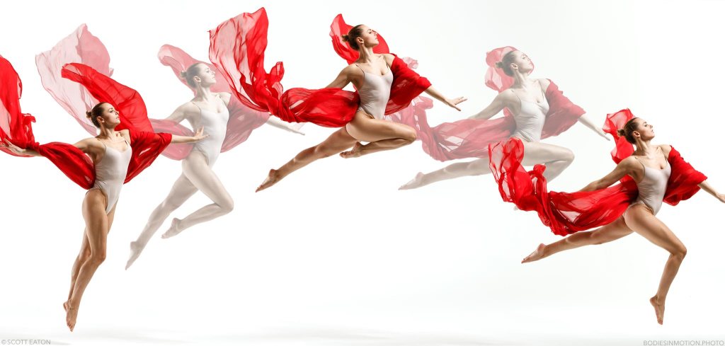
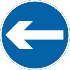
Movement
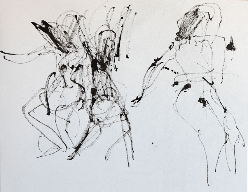
As for the sign of movement, my associative series was connected with the concept of dance, sprinter on the run, direction, the Olympic Games, where everything is joined with movement and purposefulness, then I came to the idea of radio waves, which in turn are a symbol of progress in modern world. I also liked the visualisation of the image taken from the Pinterest, where the human figure was outlined by primitive lines, even in such minimal wards the dynamics are attached.


36769518 – man runner silhouette vector background template concept made of stripes 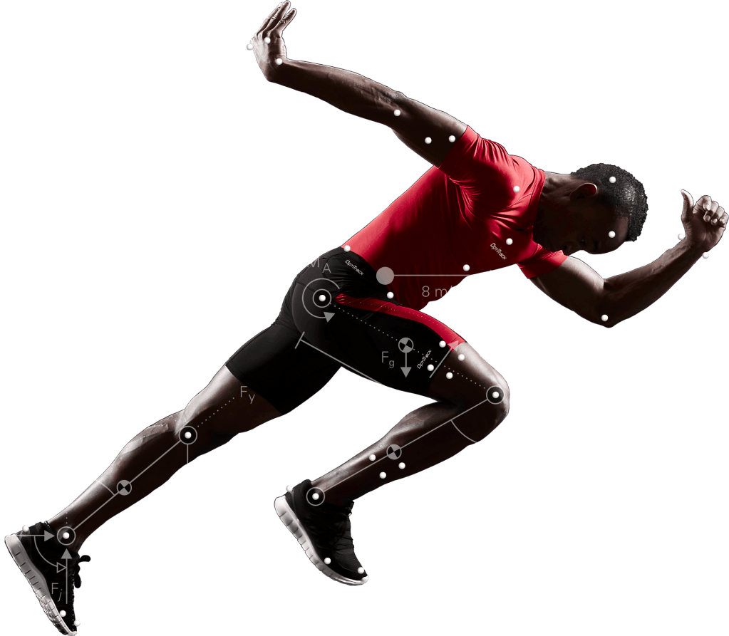
Love
The first thing that comes to mind at the word sign of love is the red heart. In order to clarify for myself how far this symbol originates, I turned to Wikipedia for an answer.
So, the heart symbol is the ♥ symbol used to denote the heart itself or love. The real human heart resembles very distantly. During the period of antiquity, the ancient Greeks and Romans associated feminine beauty, mainly with the forms of the bodies of women from the back. That is, the symbol of the heart is nothing more than a reproduction on the paper of the female buttocks. A pair of swans, swimming towards each other, at the time of contact form a heart shape. Swans are a symbol of love, loyalty and devotion, as a formed couple stays together for life, which is extremely rare in the animal world. https://bit.ly/2HXYi0D
Poster ‘Love’ by Robert Indiana full of erotic, religious, autobiographical, and political underpinnings” that make it “both accessible and complex in meaning. “The word love was connected to [the artist’s] childhood experiences attending a Christian Science church, where the only decoration was the wall inscription “God is Love”. The colours were a homage to his father, who worked at a Phillips 66 gas station during the Depression”. She quotes Robert Indiana as describing the original colours as “the red and green of that sign against the blue Hoosier sky”.
https://en.wikipedia.org/wiki/Love_(sculpture)
As for the image of love in the art world, here, first of all, the picture of lovers kissing is presented, the picture is filled with elements, but the key symbol here is the act of touch itself.
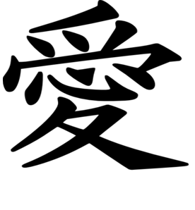
Japanese Love Symbol 
Gustav Klimt , The Kiss
1907–1908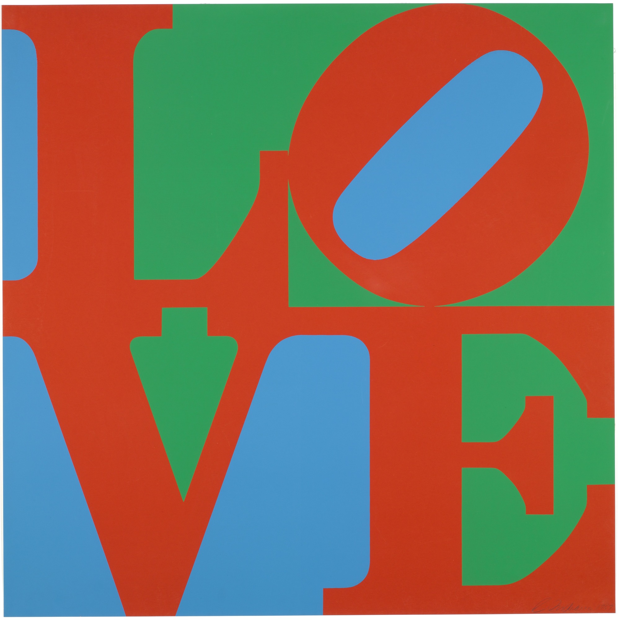
Robert Indiana
Love 1965
Gesture heart symbol 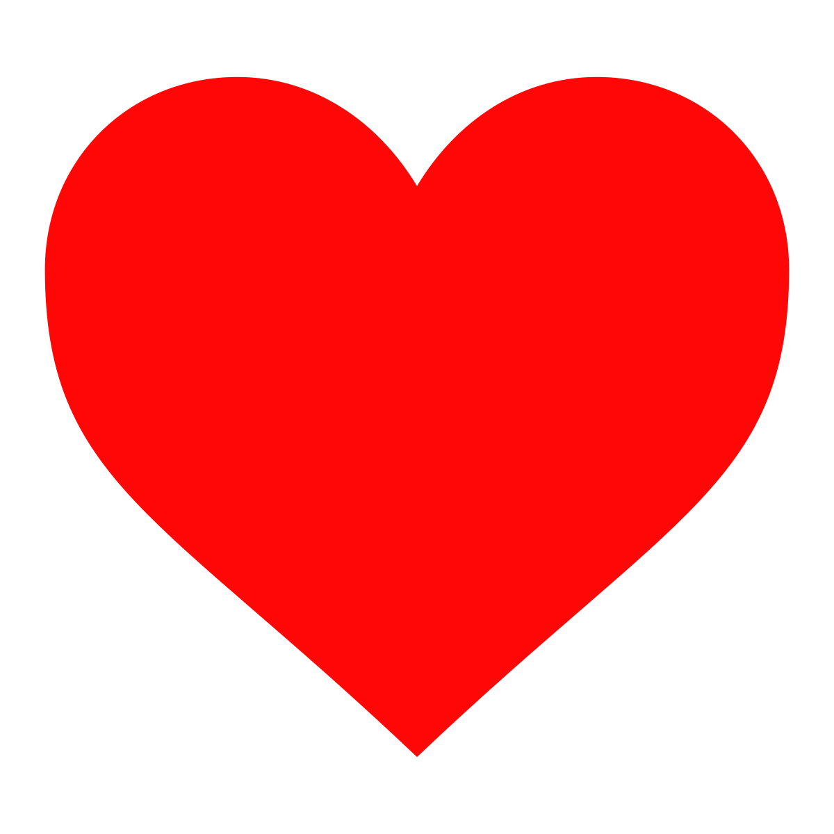
Traditional Love Symbol 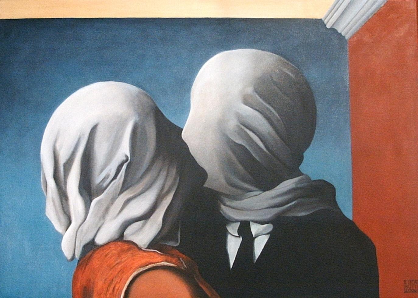
René Magritte, The Lovers,
1928
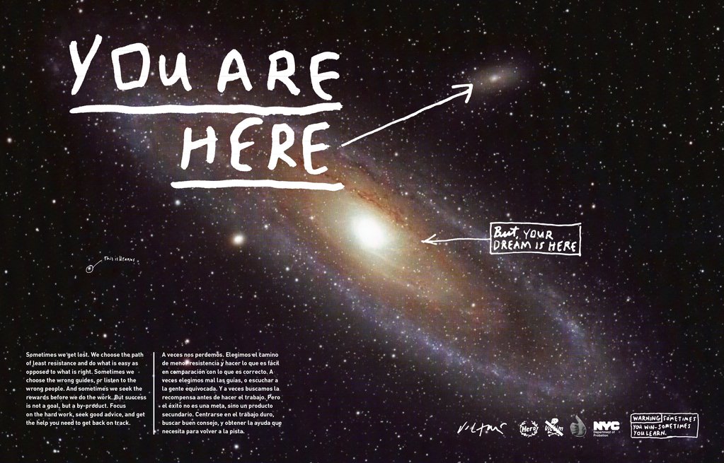
Here
With the association of a sign, an image of direction, arrow, target, index fingers appears as a symbol of the order. In my understanding, the sign here is more common for traffic signs, and indicating the direction of action, accuracy is important. I liked the idea of the pointing arrow in space, the further we move away from the object in understanding here, the more the spectrum is around, while ‘here’ in the target image, this is a more precise concept, where the center is clearly visible.


Ideas Generation
After generating the basic ideas, I proceeded to the sketches. In the process of drawing, I understood which representation of the sign I was most inclined to. My thoughts revolved around such phrases as love is in the air, love moves, the touch of love, the creation of love, everything was connected around a symbol of love as action and development. Associations love from the absorption of water for the soil, love from the soil and roots for the growth of the tree. The flow of blood through the veins. Raise love. My associative series revolved around such key phrases as you receive love, absorb it inside and grow with it. The flow of blood through the heart to the arteries. Cultivate love. I noticed the connection between the concepts of movement and love when life is love, and a sign of love is a movement. When we are moving, we get energy, water, air. I imagined the movement of the existence of all life from the smallest representatives of life as a molecule, to the Universe.
Mind Mapping and Sketches 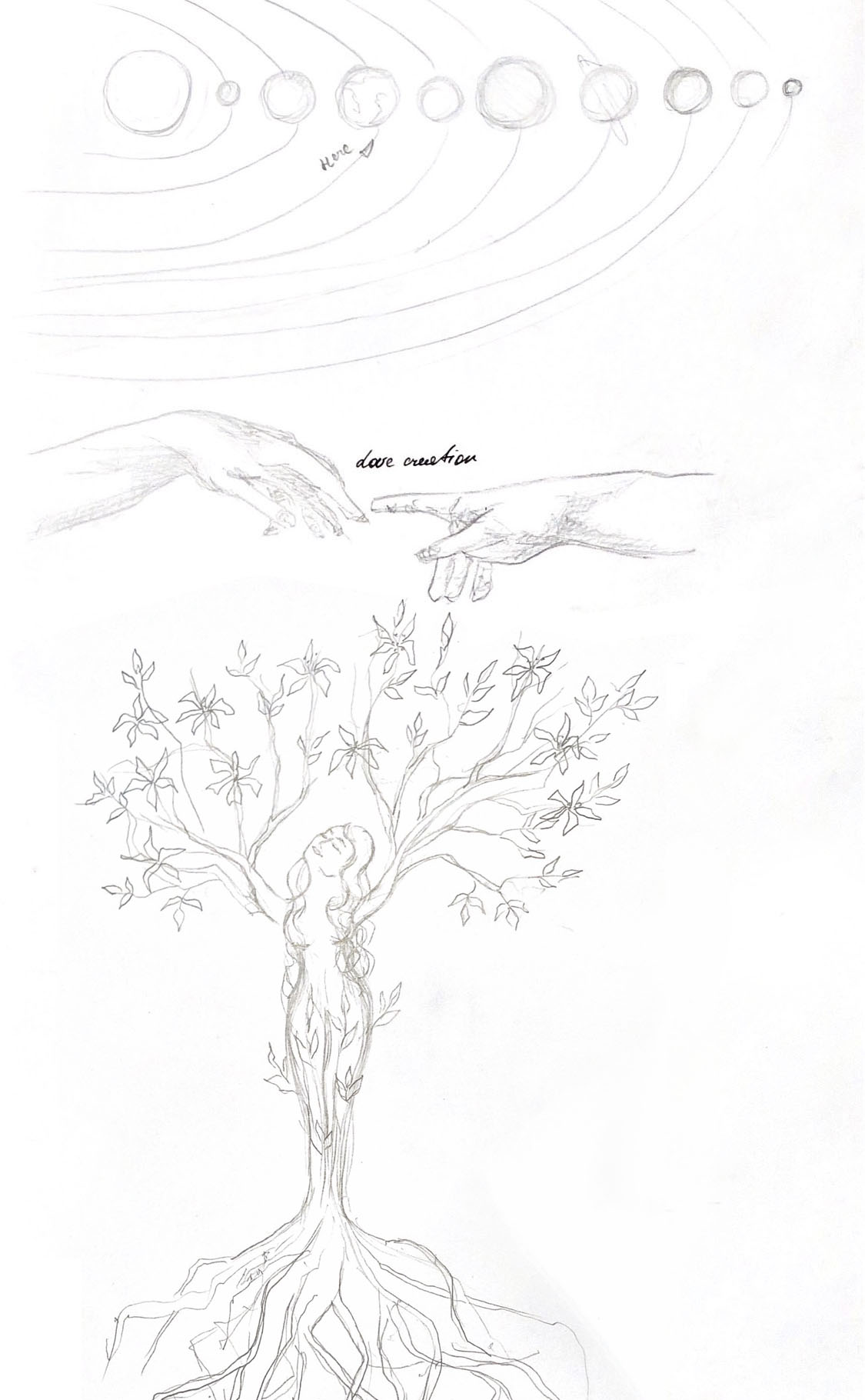
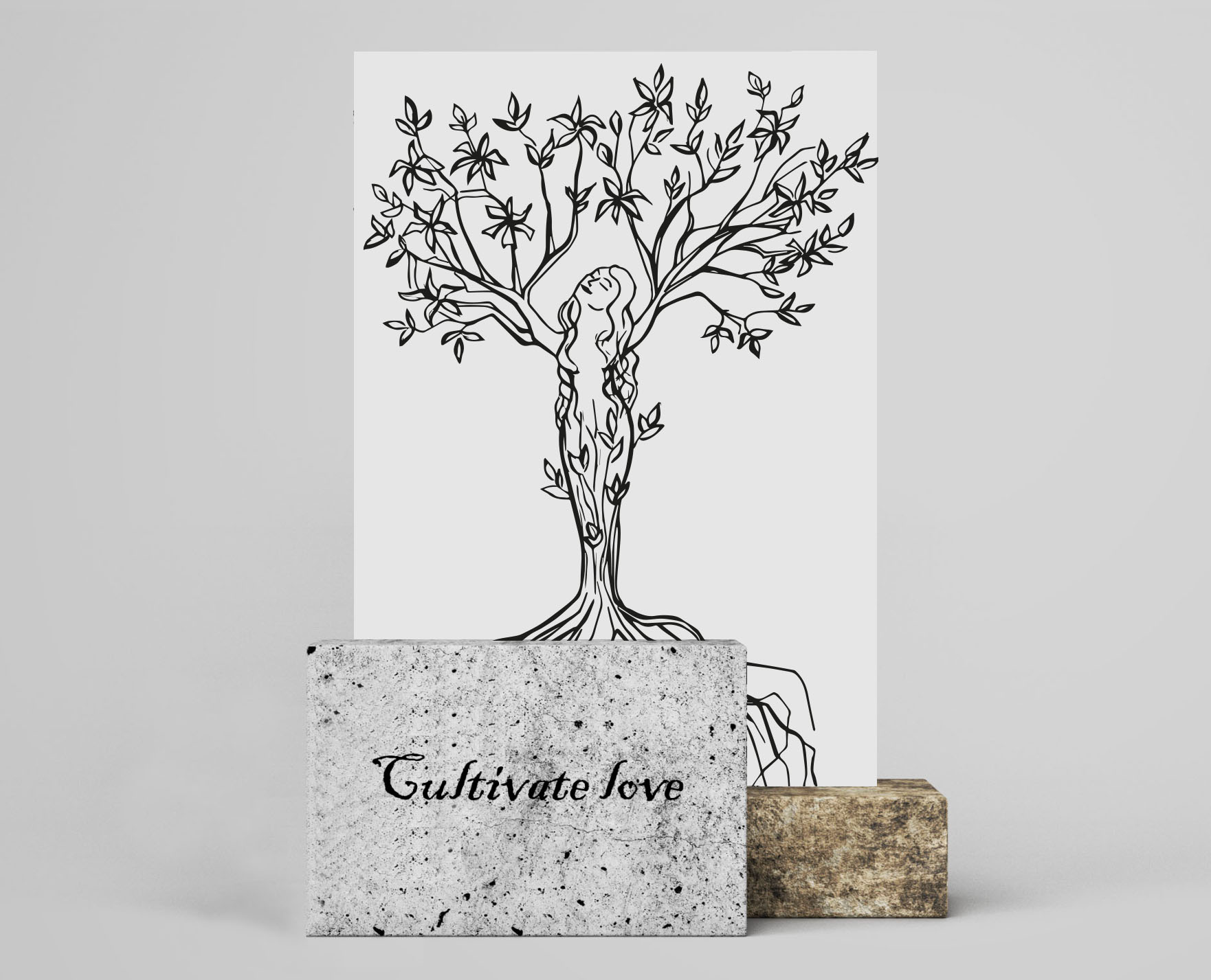
First Sketch for the idea of Cultivate Love
I like the idea that love feeds and gives the strength of growth, I wanted to depict a tree in motion, the roots of which feed on the soil. In my understanding love is one of the components of the growth of the tree itself. The symbol of the tree presenting a smiling woman with open branches, I can say she gets the energy from two sources: sun, warmth from the top and from the soil and water from the root system. I didn’t show on my painting soil, water or sun, as I wanted to leave the place for imagination, that tree could be still small that it will fit into the little house pot.
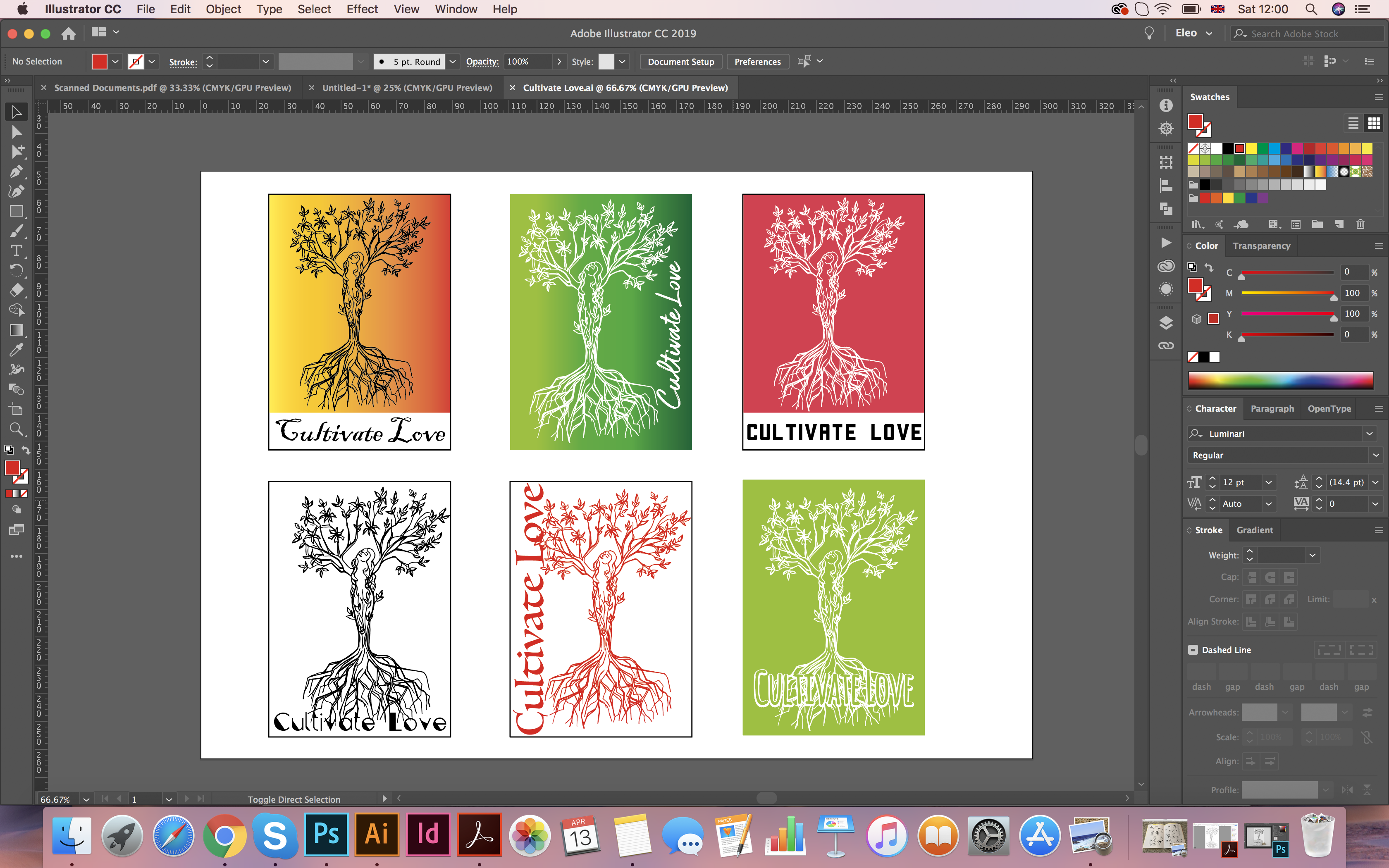
To develop the design of my love symbol, I first sketched a tree, then I circled my sketch with a black pen. I was able to translate the scanned image into a vector in Adobe Illustrator using Image Trace Tool, which would let me to scale that image into the different sizes. On the tree itself, you can see the outlines of flowers along with the leaves, as a symbol of flowering and love, I used the spring magnolia tree.
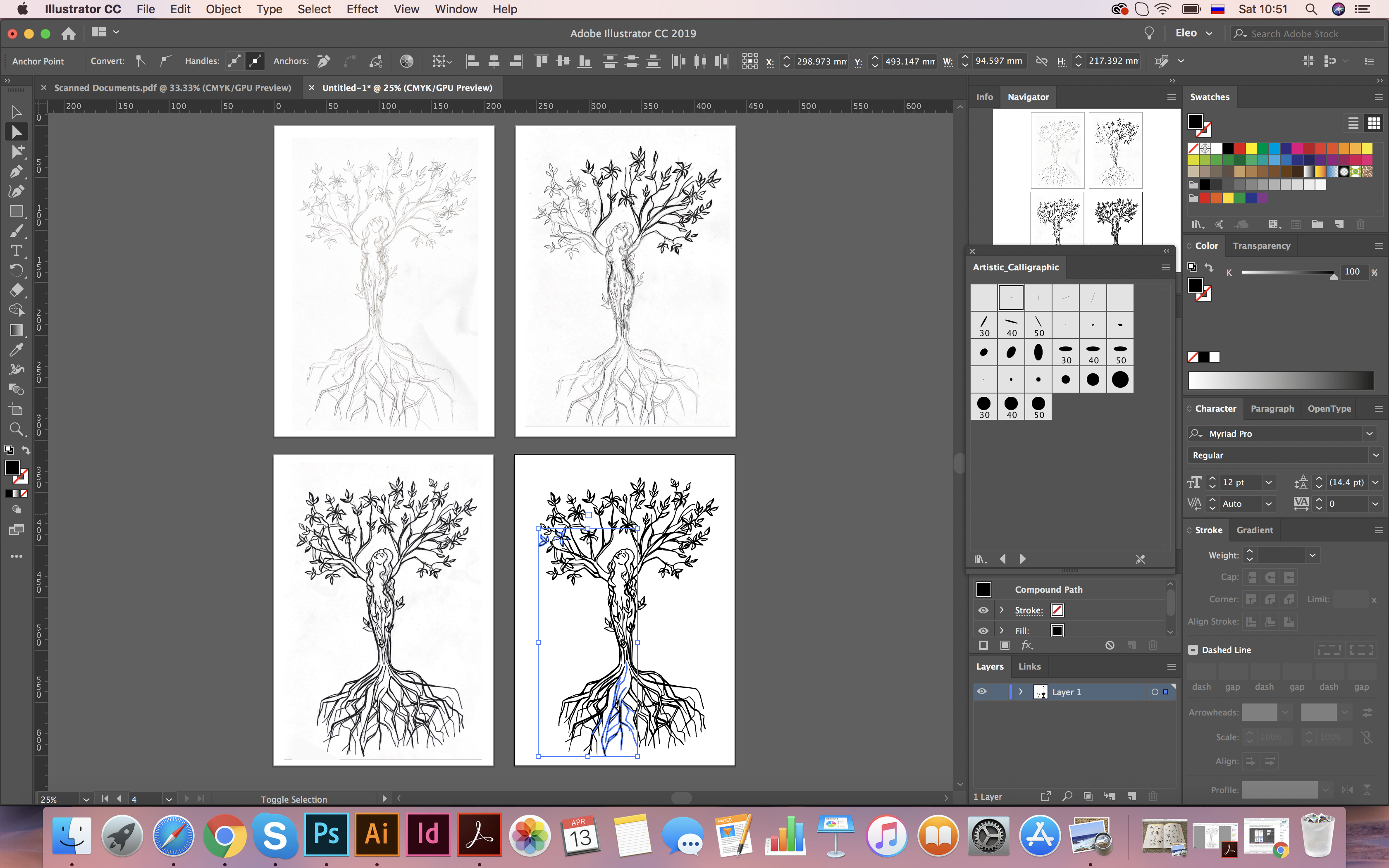
I was also interested to see how my drawing would look in graphic design layouts, on a bright background, or white one with different lines colours, and with different fonts. In the course of the experiment, I saw how much the perception of the sign changes, from green to brightly red coloured, also the fonts played their part. The green background was more like a sign of disposition and openness, in a red combination the tree more resembled a symbol of passion and challenge.
In conclusion, I would like to say that I enjoyed the task. I liked developing ideas of different symbols and signs, and how the union of such concepts as love, movement, direction of action can create a new symbol. The tree symbol in my understanding is a universal sign for the image of love and growth. From the first sight you could think that tree is a static object, it doesn’t move anywhere, and spend all it’s life at the same place, but it has enough of energy and courage that to each year renew their buds, which later turn into beautiful leaves and flowers.