It is very easy for the ephemera of everyday life to disappear; leaflets binned, magazines
recycled and books reprinted. If you get in the habit of collecting examples of design that you encounter everyday, then you start to get a feel of your tastes and interests, and over time both your design horizons and cultural awareness broadens.
Start a scrapbook, sketchbook or use a blog to document the visual world around you.
Find examples of visual language that interest you, these could be taken from anywhere
(art, film, photography, illustration, design, craft, cinema, hobbies, etc).
If you can, visit museums, galleries and consider all the graphic design around you – in
books, magazines, cinemas, shops and poster sites. This is your investigation, so follow
your nose.
Over the last couple of days, I have been saving pins of various designs that interest and attract me. Most of them just for inspiration, something that makes my eye attracted by.
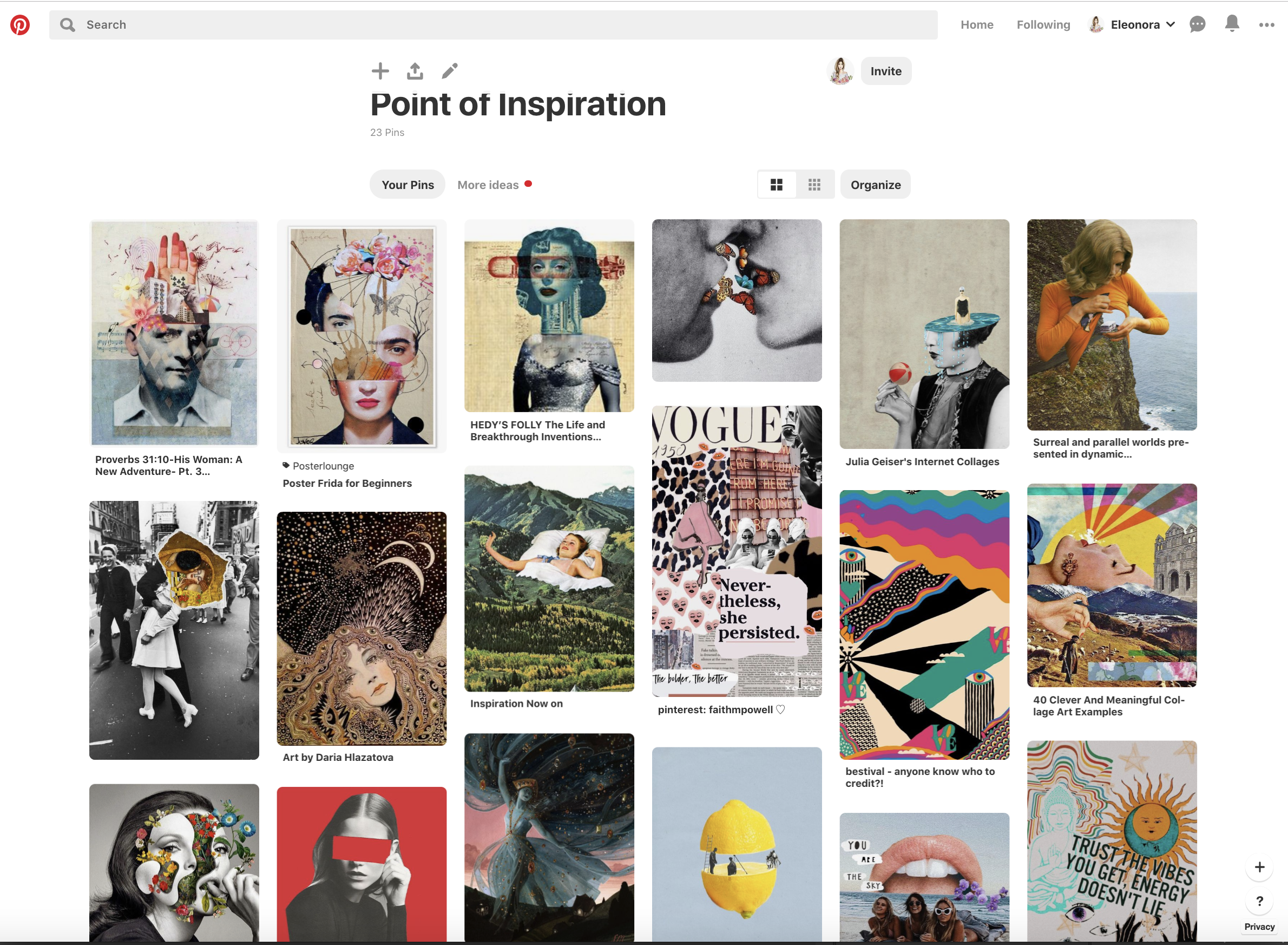
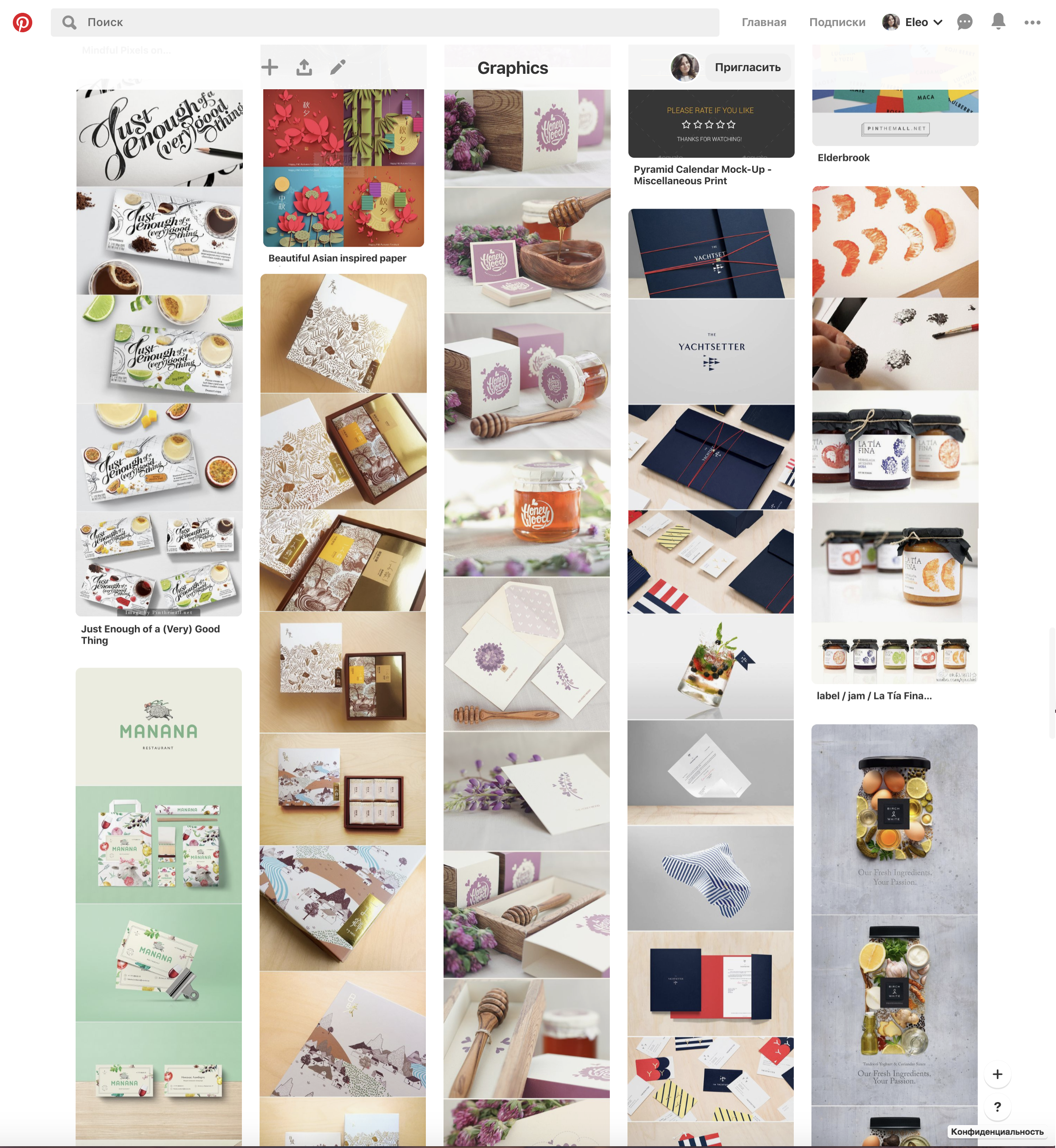
At the same time I have been collecting for a few years some pins for boards for commercial projects, that I could use as ideas for everyday designs. There are printed boxes, leaflets, labels, calendars etc.
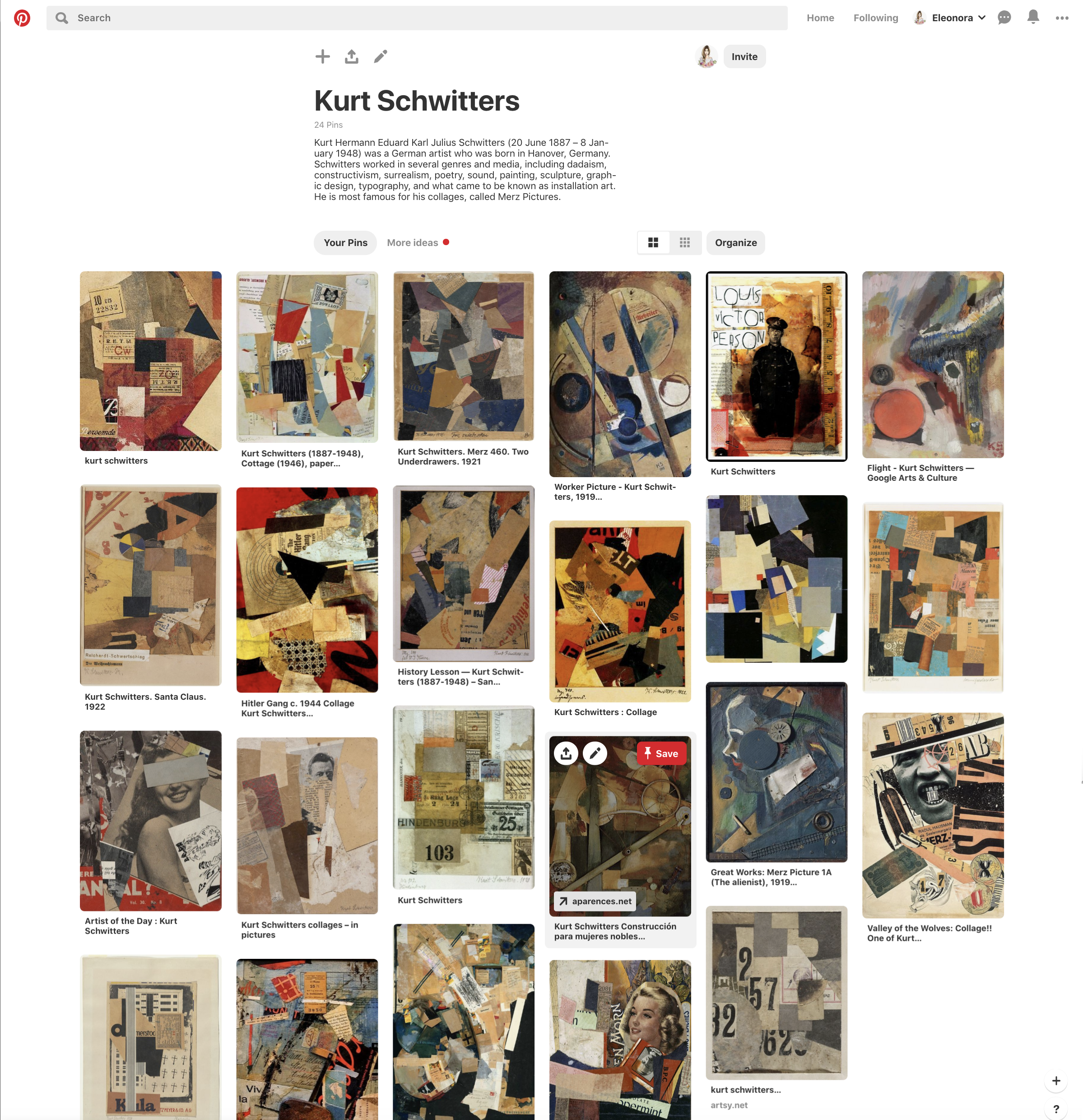
I’ve created some new boards for artists that were recommended by my tutor. I thought that it would be a good idea to keep all designers at the same place, so in case of I would like to rely on some of them, I can see them all collected on my Pinterest profile. I admire works of Kurt Schwitters, as his art looked like a sketchbook, or collection of the craft by itself.
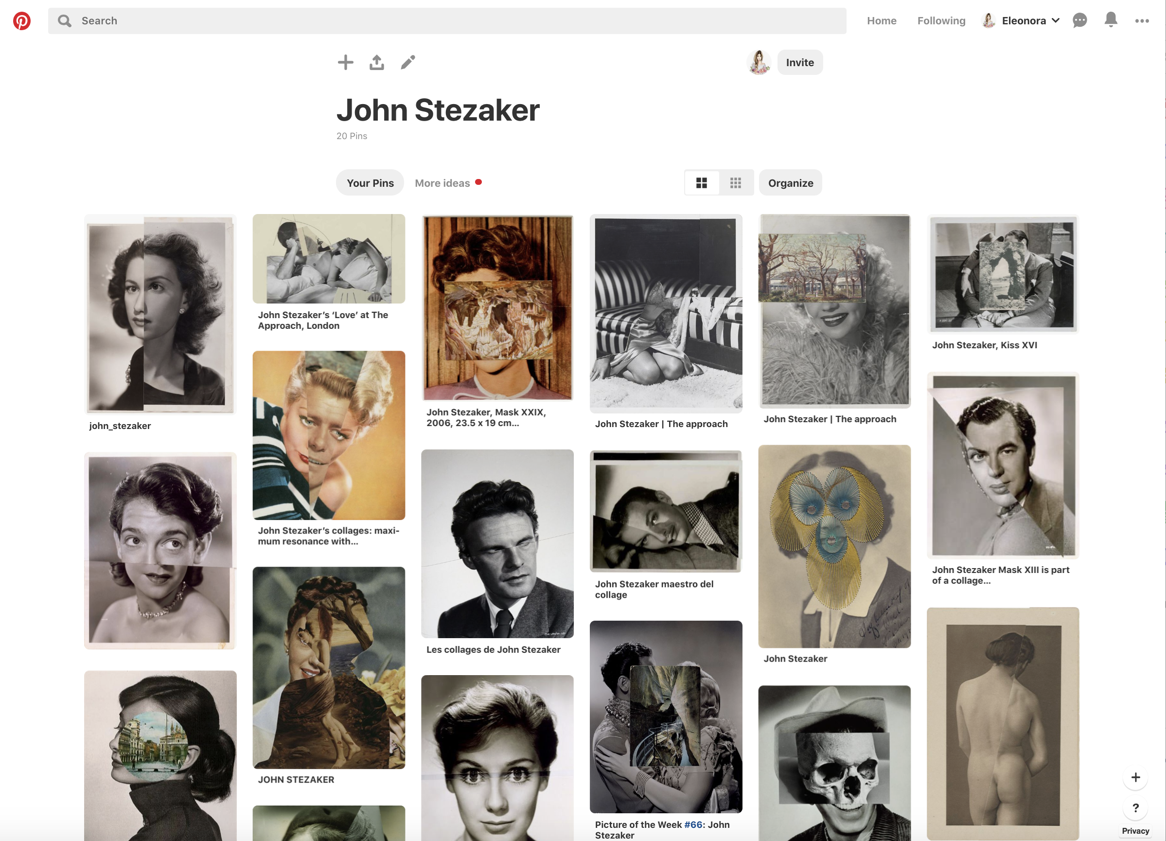
Some more Pinterest desk for John Stezaker masterpieces. John Stezaker’s work re-examines the various relationships to the photographic image: as documentation of truth, purveyor of memory, and symbol of modern culture. In his collages, Stezaker appropriates images found in books, magazines, and postcards and uses them as ‘readymades’. Through his elegant juxtapositions, Stezaker adopts the content and contexts of the original images to convey his own witty and poignant meanings.
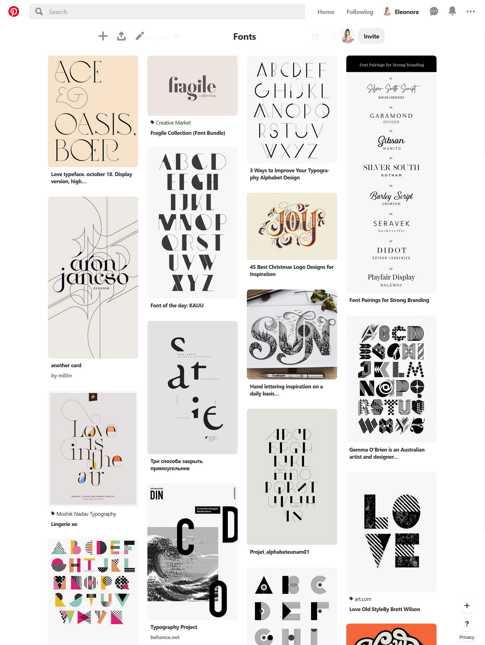
Also, I’ve created a new board for Fonts, as I felt I had a missing gap within typography knowledge, so I thought that it could be a good start for a fonts experiments for my graphic design aspirations.
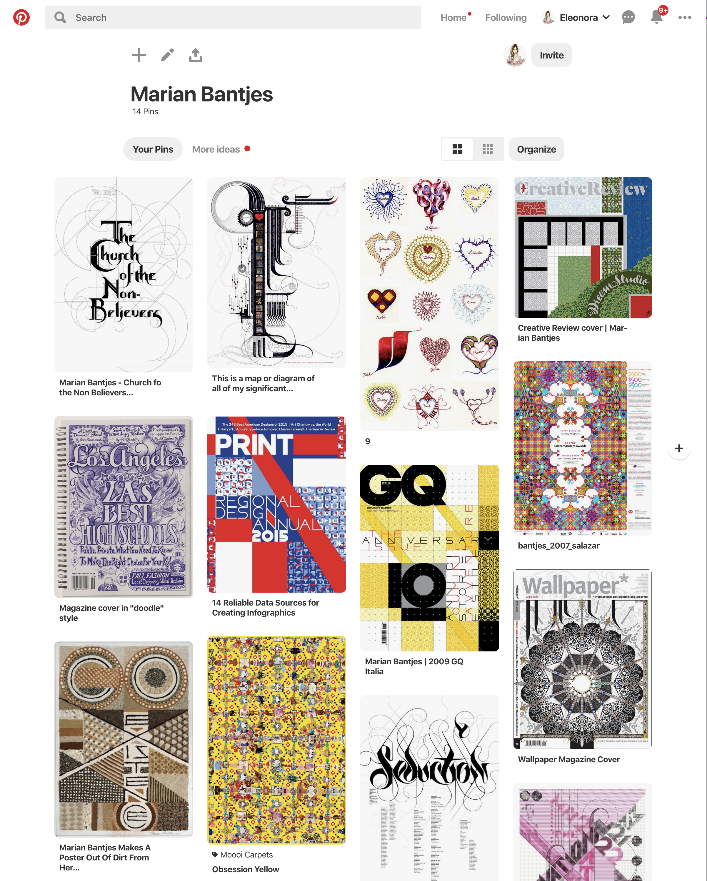
Up recently I’ve discovered for myself a new artist Marian Bantjes. She has created a unique visual language that combines typographical craftsmanship, illustrative flair and personal observation. Her generous approach, meticulous attention to detail and wit have made her one of today’s sought-after graphic artist.
The works of Marian Bantjes first of all attracted me by experimenting with structure, color, and form, as well as with such objects as fur, wax, sand. I liked her bold approach to the surrounding things, where in every small trifle she sees for herself a potential creative object. This is what I would like to develop in myself, be inspired and absorb.
Are there dominant themes emerging?
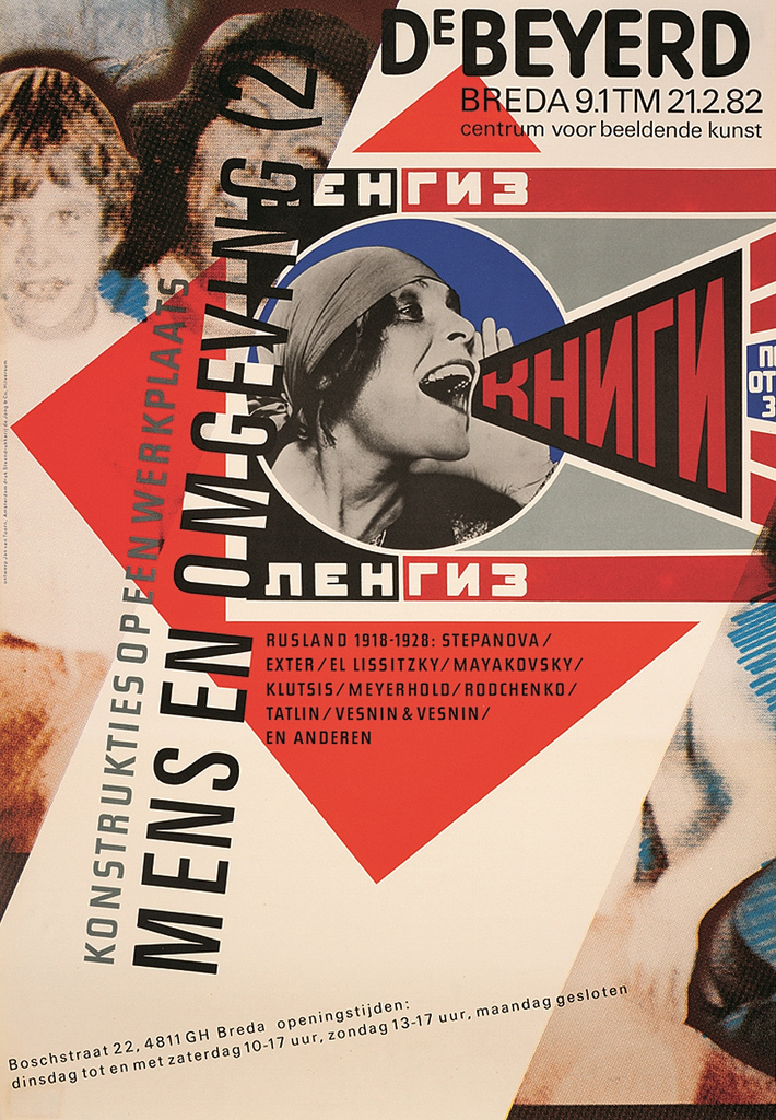
I feel that I am more attracted to the complex compositions in which the collage style dominates. I am attracted to the mystical effect, when at first glance unrelated objects create a unique composition. At the same time, I noticed that vivid patterns, the multiplicity of objects in combination with geometrically regular forms in my understanding create a unique harmony.
Also earlier in my article, I gave examples of works by Matthew Richardson, which also showcased the collage style and the layering of objects one on another.
You may find yourself interested in a particular area of design, era or design product. What does this tell you about your own visual language and cultural awareness?
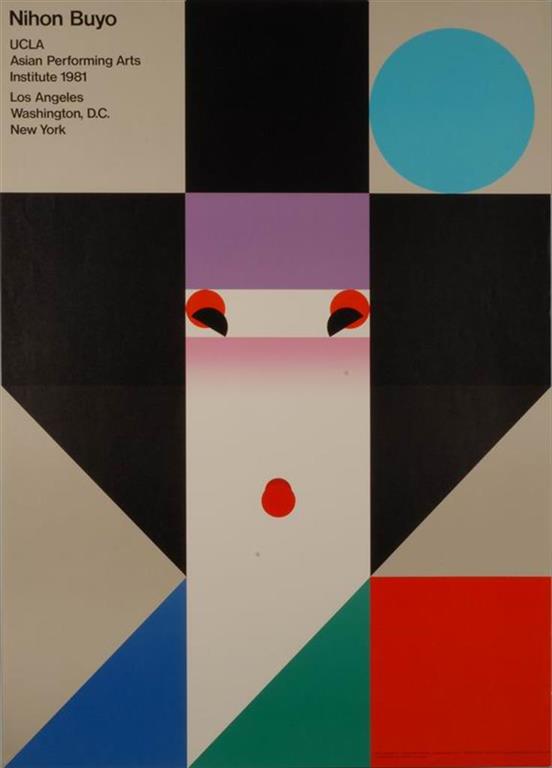
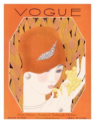
That to answer that question I referred to the book Pioneers of Modern Graphic Design, as it has collections of artists starting from Art-Deco style of 20th to the Urban Design in Digital Area. In graphic design, the Art Deco style was an electric mix. I like geometric and zigzag lines that were taken from both the visual style associated with the popular dance the Charleston and from ziggurats of Egypt. Also, I felt an influence on my graphic design vision from the late modern and postmodernism. The postmodern graphic designer no longer searched for a single dominant message or visual form but instead used hybrid imagery, mixed typographic styles and delighted in complex composition.