This assignment will allow me to put into practice everything that I’ve learnt through the exercises, also my abilities to work through the design process of problem-solving.
Brief
What am I being asked to do?
Create a range of cards of sentiments or events that are worthy of a greetings card, but are currently not catered for by card manufactures. I need to design the cover and the message inside.
Requirements: At least three finished cards will be produced, which can either be unrelated or work as a series linked to the same sentiment. Size and dimensions that I have available.
Target Audience: Identify through the researches.
Where: Online stores, supermarkets, hand-made gif-shops, markets.
How: Analyse the brief, identifying keywords, communication issues and design problems. Develop ideas that are unexpected and fun. Explore some of life’s other landmarks that currently don’t feature in greeting cards, find the audience for them, visualise ideas and complete designs by using Adobe Software.
When: Deadline 22 January 2019
Steps of design
- Analyse the brief
- Identify keywords
- Identify primary and secondary research
- Create mood boards to explore the feel of sentiments
- Visualise my ideas through thumbnails
- Create mock-ups for cards
- Critique your work. Write a short rationale for each of my designs
- Finish artwork. Use appropriate DTP, image manipulation and/or illustration software to complete them.
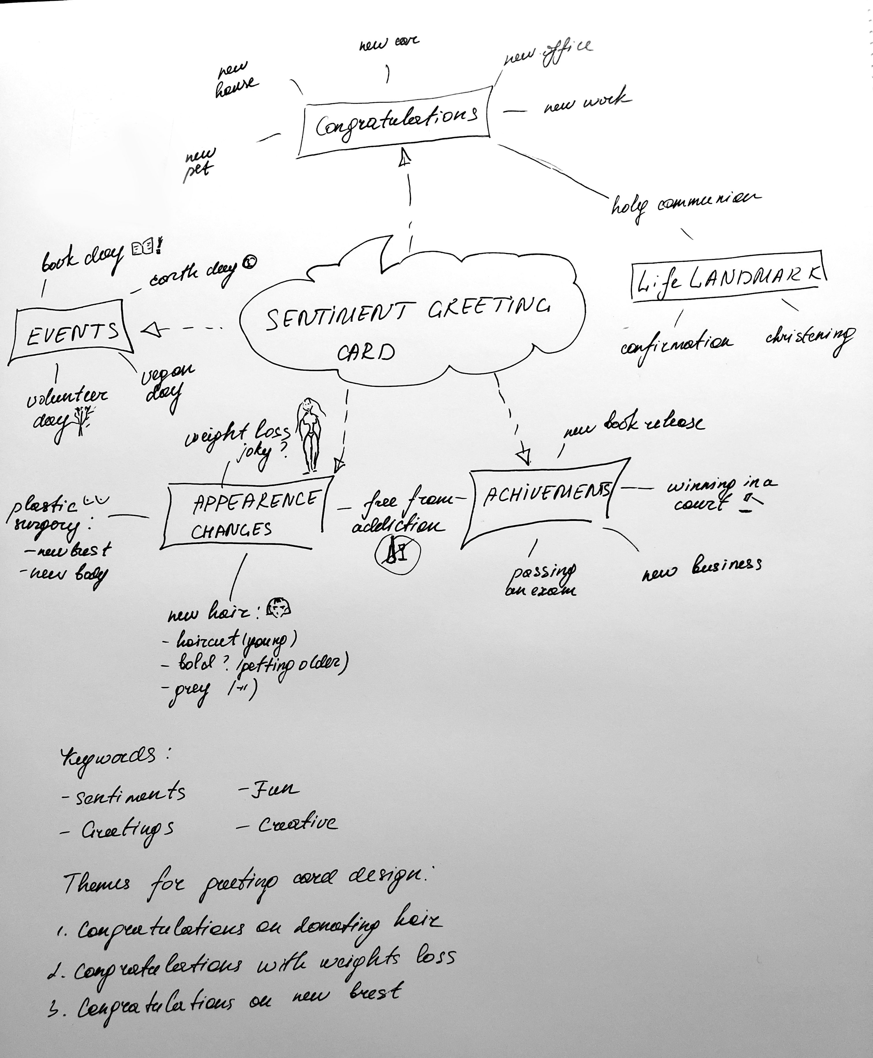
Keywords:

- Landmarks
- Sentiments
- Celebrations
- Greeting
- Fun
- Creative
Primary Researches
Definition of greeting card
A greeting card is an illustrated piece of card stock or high-quality paper featuring an expression of friendship or other sentiments. Although greeting cards are usually given on special occasions such as birthdays, Christmas or other holidays, such as Halloween, they are also sent to convey thanks or express other feelings (such as to get well from illness). Greeting cards, usually packaged with an envelope, come in a variety of styles.
A standard greeting card is printed on high-quality paper (such as card stock), and is rectangular and folded, with a picture or decorative motif on the front. Inside is a pre-printed message appropriate for the occasion, along with a blank space for the sender to add a signature or handwritten message. A matching envelope is sold with the card. Some cards and envelopes feature fancy materials, such as gold leaf, ribbons, or glitter.
Photo greeting cards are most popular for sending holiday greetings such as Christmas, Hanukkah, and for baby showers.
Personalised. Websites using special personalisation technology, such as Moonpig, allow consumers to personalise a card which is then printed and sent directly to the recipient.
Reusable are greeting cards for the budget conscious. The pages that have been used for reusable cards can be removed after being received and fresh pages can be used to reuse the cards.
Musical. Some greeting cards play music or sound when they are opened.
Electronic (also called e-cards). Flash-based cards can be sent by email, and many sites such as Facebook enable users to send greetings. Many of these electronic services offer open or anonymous chat, to enable further discussion.
Pop-up cards are normally cards that, once opened, have a picture coming outward, giving the reader a surprise. Pictures and printed messages in greeting cards come in various styles, from fine art to humorous to profane.
Printable also known as digital greeting cards, they can be found online through shopping platforms such as Etsy and some blogs. Usually available in the form of a pdf document, the design for a card can be printed out at home or a local print shop. Printable cards have allowed designers to make cards readily available to customers all over the world.
Interesting facts about the greeting card industry
- No other country has such a tradition of card sending or card display in the home – the sending and receiving of cards is an important part of our culture.
- We buy more cards per person than any other nation – 33 each year.
The UK card industry is acknowledged to be ten years ahead of the rest of the world in terms of design. - It’s a creative industry with strong bases in London, Nottinghamshire and the North, especially
- Charities estimate that £50m is raised for good causes through the sales of charity Christmas cards each year.
- One of Sir Henry’s first Christmas cards, sent to his Grandmother was recently sold at auction for £22,500.
According to the Greeting Card Association, 85% most greeting card purchases in the UK are made by women. This means that four out of five purchases are going to be made by a woman. Therefore, regardless of who the end recipient of the card is, my key customer target is female. That fact is leading to the conclusion that even male themed cards are likely to be purchased by a woman.
I’ve noticed, when a man buys a card most of the time they are for special occasions, such as Christmas, Birthday or Saint Valentine Day. Nevertheless, when it comes to the buying Christmas card for friends or family, most of the designs are full of sparkles and tender paintings that most likely will be attracted by a woman.
Secondary Research
After Primary research I could identify the target audience, they are women, aged 25-55 years which have made a decision under the different circumstance to make some changes in their appearance, I’ve specified for myself basic themes I could use for cards design, which was:
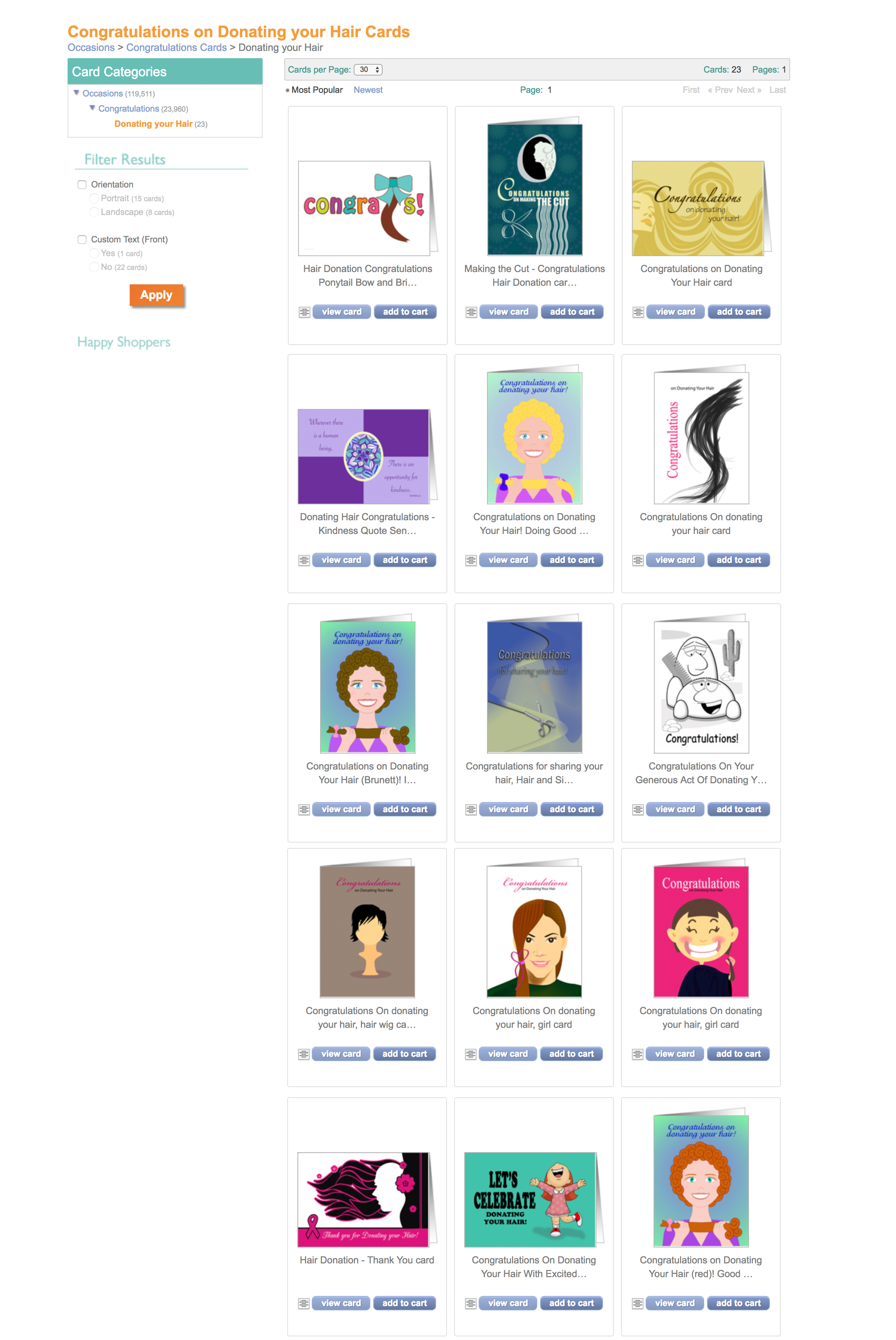
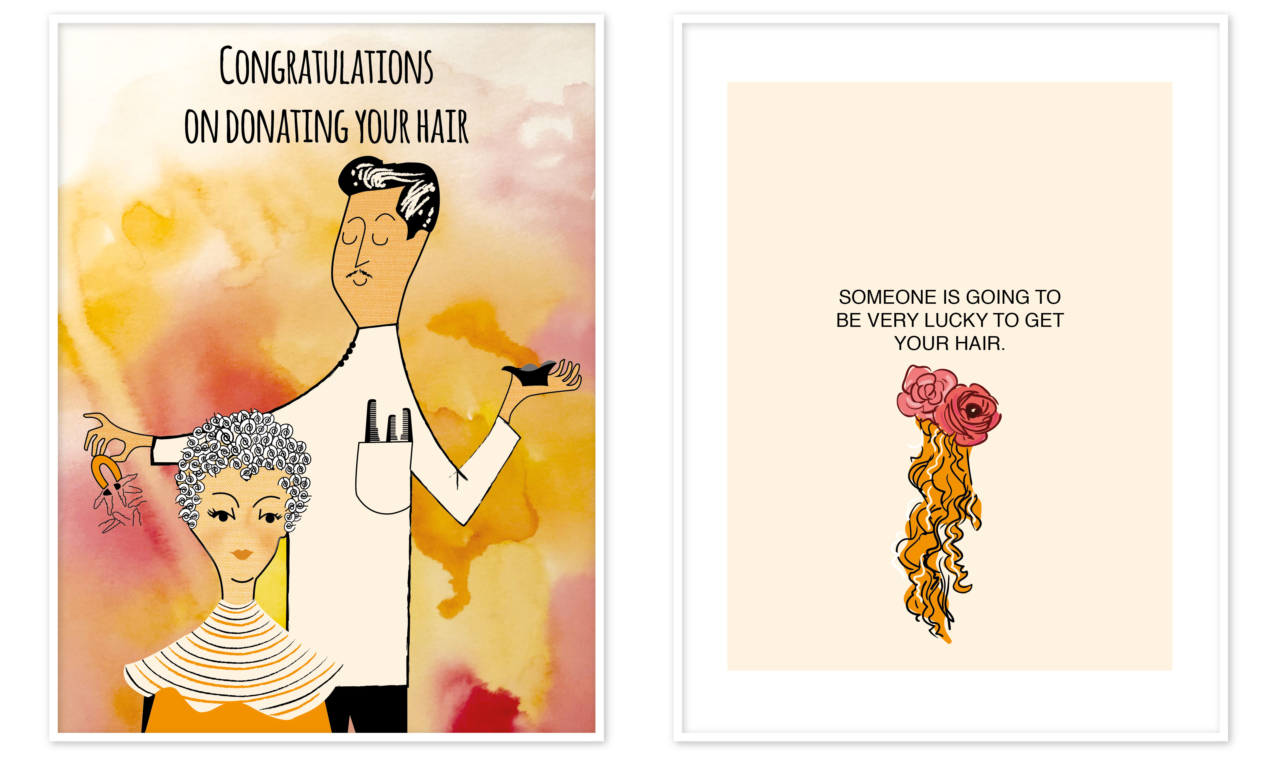
- Congratulations on donating your hair
- Congratulations with weight loss
- Congratulations on new breast
I thought to create a theme of cards untied by such an important subject for the modern society as volunteering, keeping fit, and quite popular phenomenon as plastic surgery, in my case – breast enlargements.
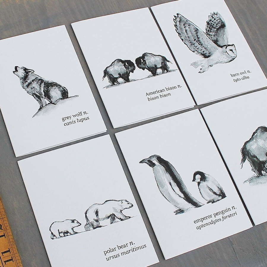
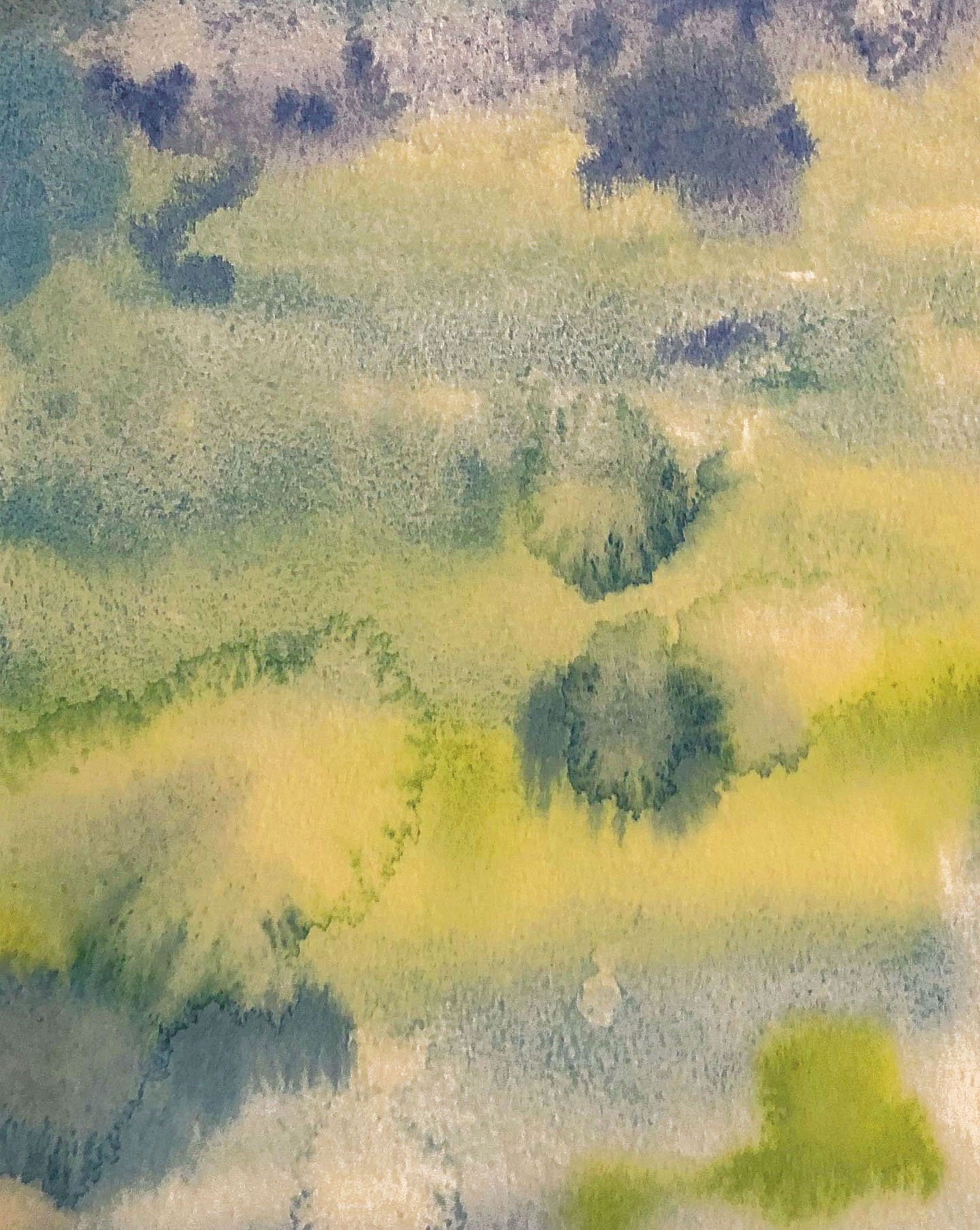
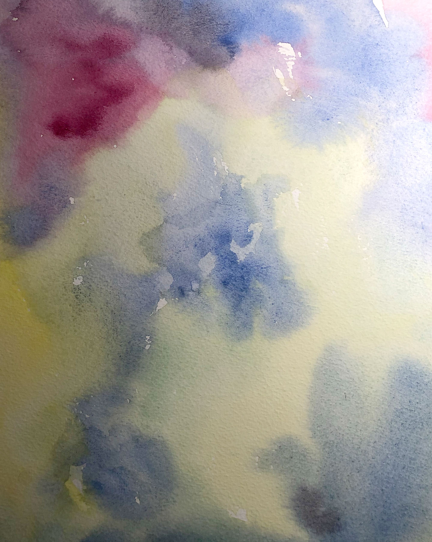
I’ve created a mood board from the different cases cards, but at the same time, they were similar in style that I could see for my future designs. They are soft, tender, minimalistic, with pretty much usage of watercolour and painting technic.
Greeting cards examples from hallmark.com


Card design
I’ve made secondary researches for the first card Donating a hair, what I’ve noticed that theme is available on the market, but not that popular as it could be, and the variety of cards was not great. I believe that volunteering is an important part of modern society, and donating hair could actually play a significant role for many children in need. Also, what I thought, that for women who decided to make that big step would be a little pleasant gift to get that card, as a reminder that they actually did something important.
For that card design I imagined a lady with a short hair, she is happy and smiling, as she cut them for a good case. Another idea I had was related to the Little Princess trust charity, which is providing real hair wigs to children and young people with hair loss. I made some sketches with happy inspiring woman, also, another image was coming from princess next to the unicorn, as a symbol of faith to magic.
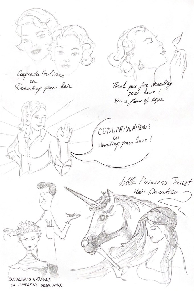
After some sketches I decided to go for a sketch of woman with a hairdresser on the watercolour background. I painted some watercolour samples that I could use for the first card. Firstly, I did some drawing of watercolour, as I planned to use them for the background for my card. After some trials, I decided to use the soft and warm colours of pink and yellow stains.
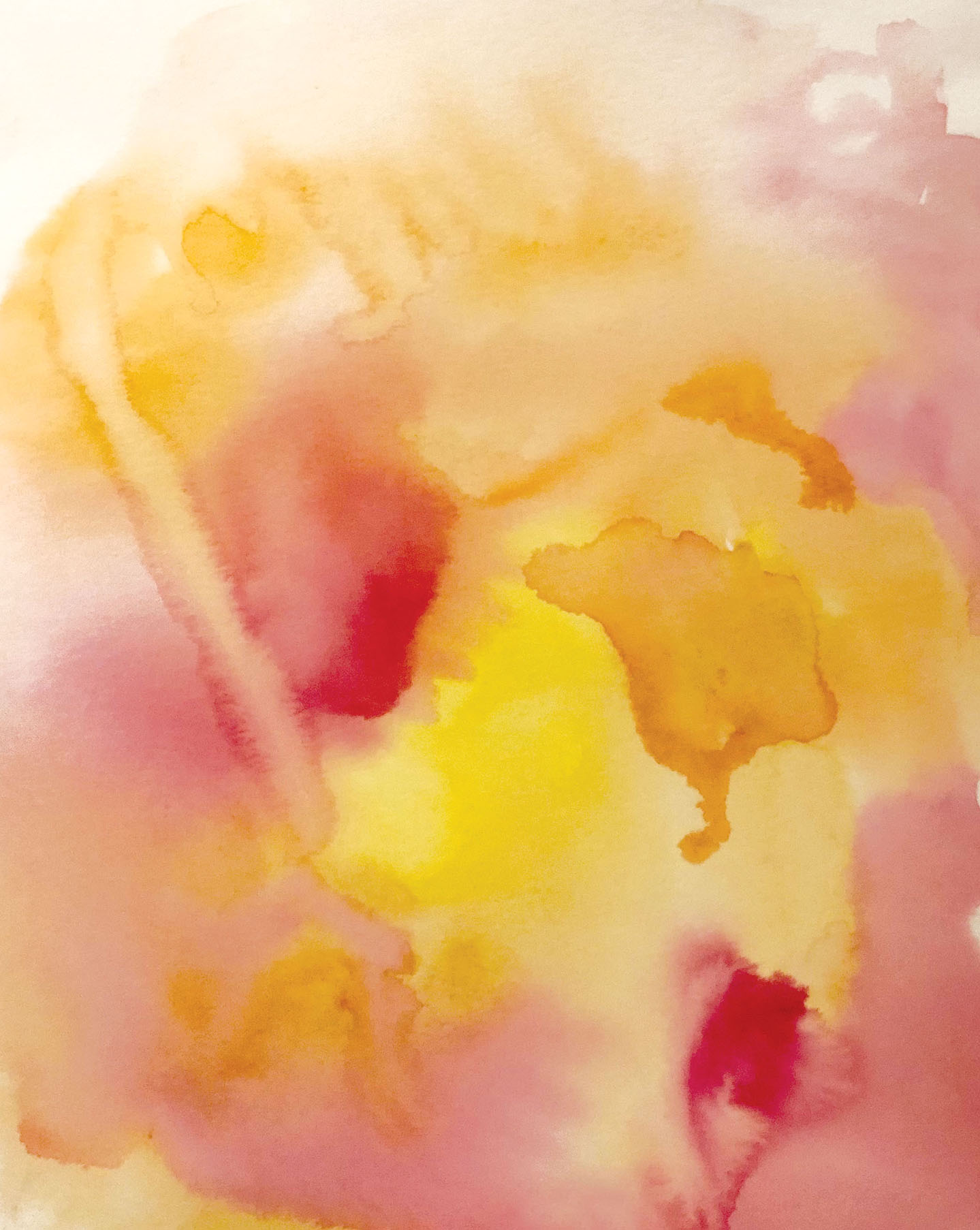
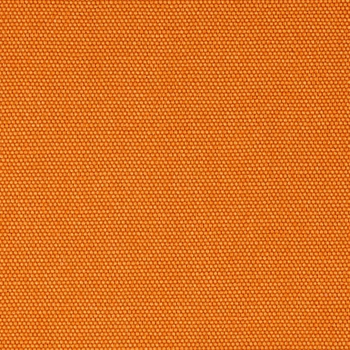
I painted an illustration of a woman with the hairdresser, the drawing was created in the old style cards. For human faces and hands, I used a piece of pale orange fabric, as it would give the texture to the image. For the slogan, I’ve decided to keep it simple ‘Congratulation on Donating Your Hair’, with the font Amatic Bold, which matched to the drawing style.
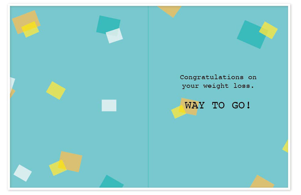
Card Design ‘Weight Loss’
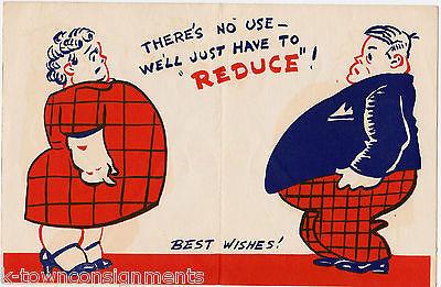
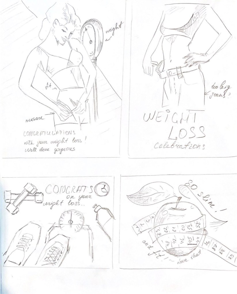
For the second card I same researches to explore a current market. The greeting card for the weight loss was not varied either, most of the cards were joky and made in cartoon style.
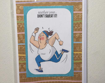
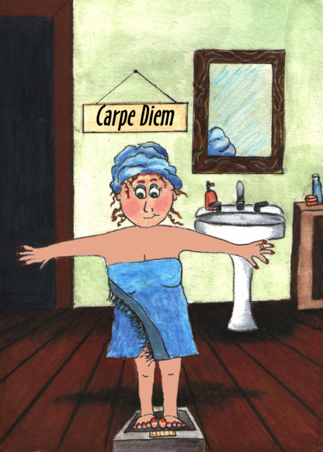

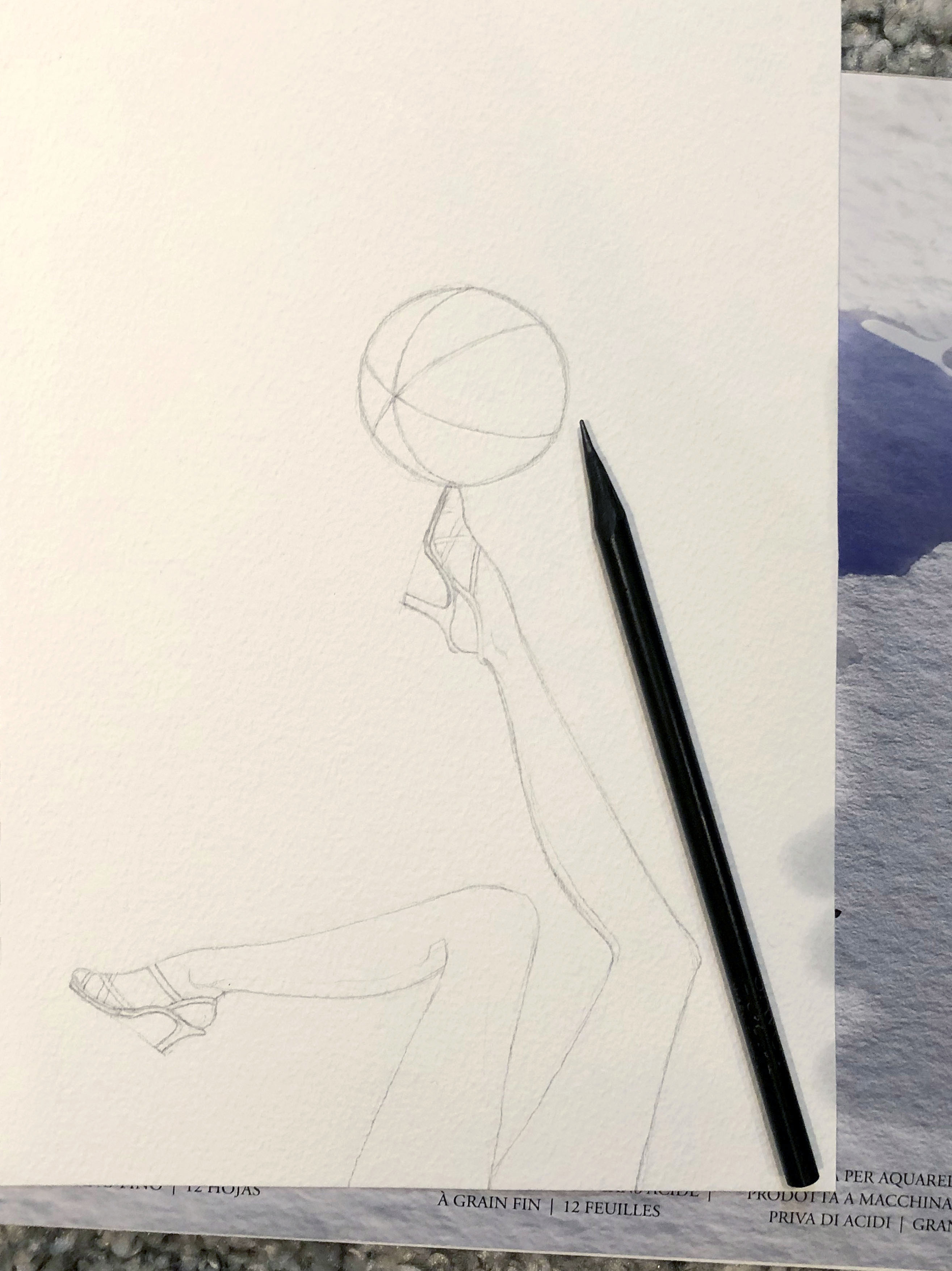
I was quite sure that for my cards design I would like to keep the retro style. I found that image with upside down girls with scales on the top of their tiptoes, I like it as it was joky and quirky.
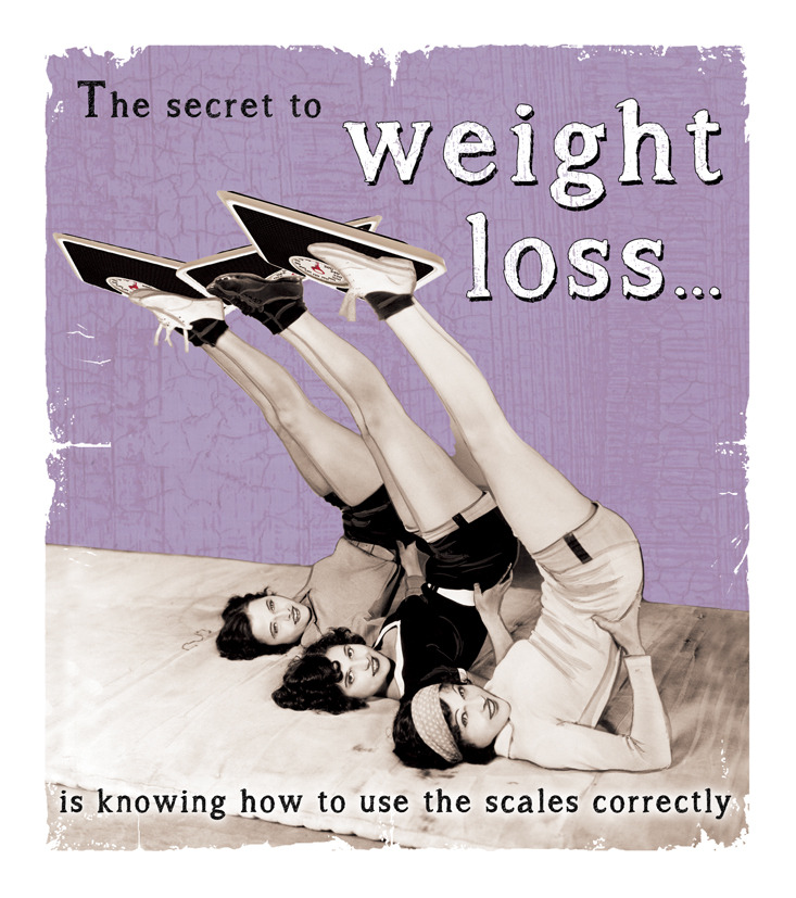
The secret to a weight loss greeting card.
https://www.jellynbean.com/trade-products/greeting-cards/039secret-to-weight-loss039-6×7-inch-card.html [Assesed January 2019}
I made some sketches of a woman measuring her shapes, she is wearing old style lingerie and stands on the old-style weights. I tried to develop my ideas around healthy eating, weight measure, and some sports equipment, but as I like that upsidedown image of girls, I thought that it would be interesting to produce something similar.
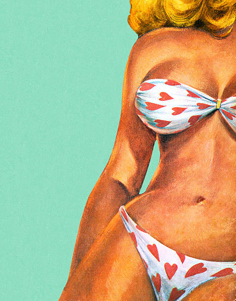
For inspiration, I went through the book Pioneers of Modern Graphic Design. As I imagined a classic card in retro style, I found the design that I could use as an example for my watercolour drawing. Advertisement by Paul Rand for Jacqueline Cochran, 1946.
Painting Progression
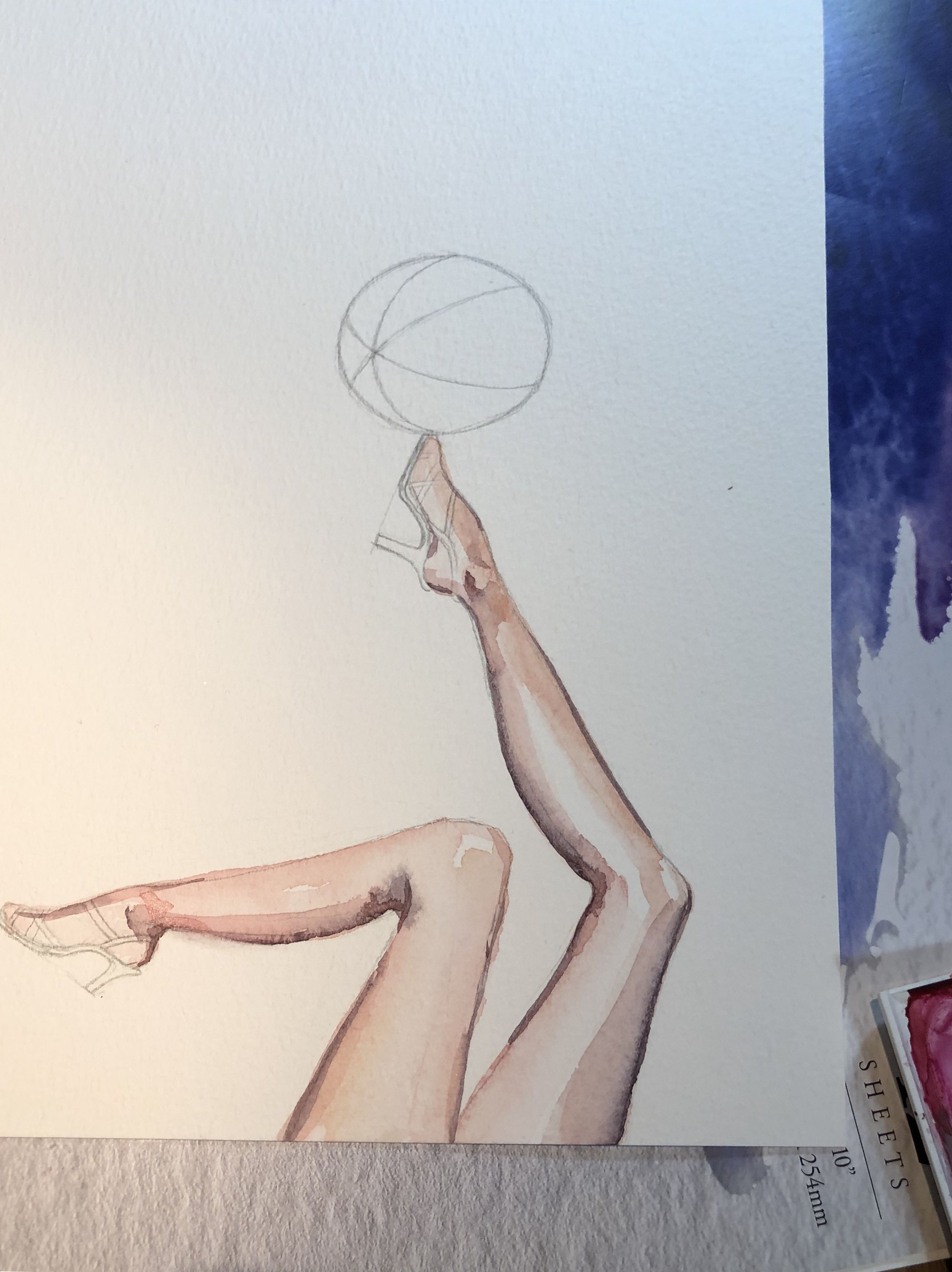


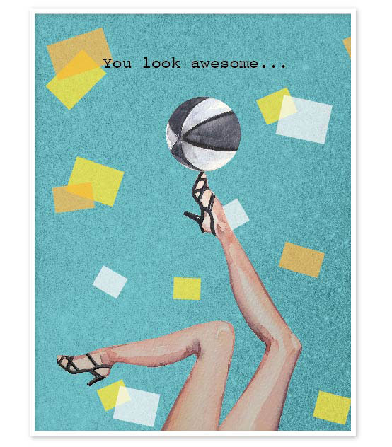
The drawing that I got in the result was worthy by itself to be used for the greeting card, but I thought that I should try to apply colourful background on it, as I wanted to pop out an image of the legs on the first plan. I tried to combine sparkle background with tiffany blue colour in Photoshop, I was quite happy with the result, as I got needed 3D-effect. I’ve put around colourful confetti squares, which played a contrast around the key image. For the font, I used Courier regular, as it completed my design with a retro sense.
Samples for background colour and confetti images for the greeting card


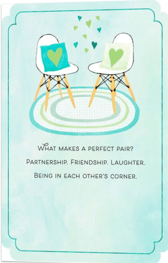
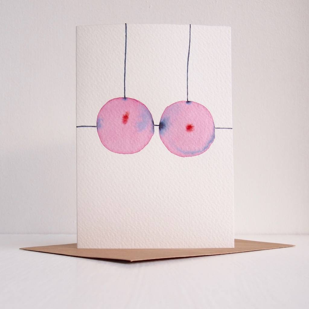
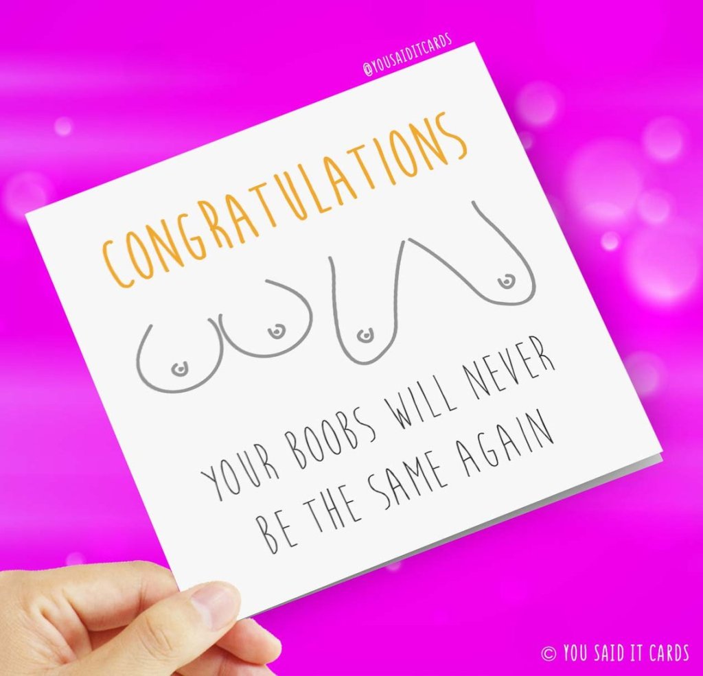
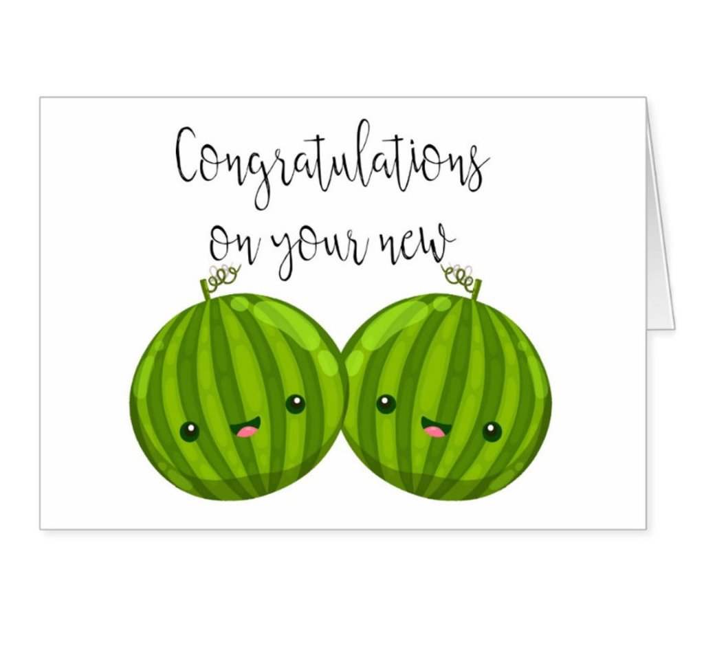
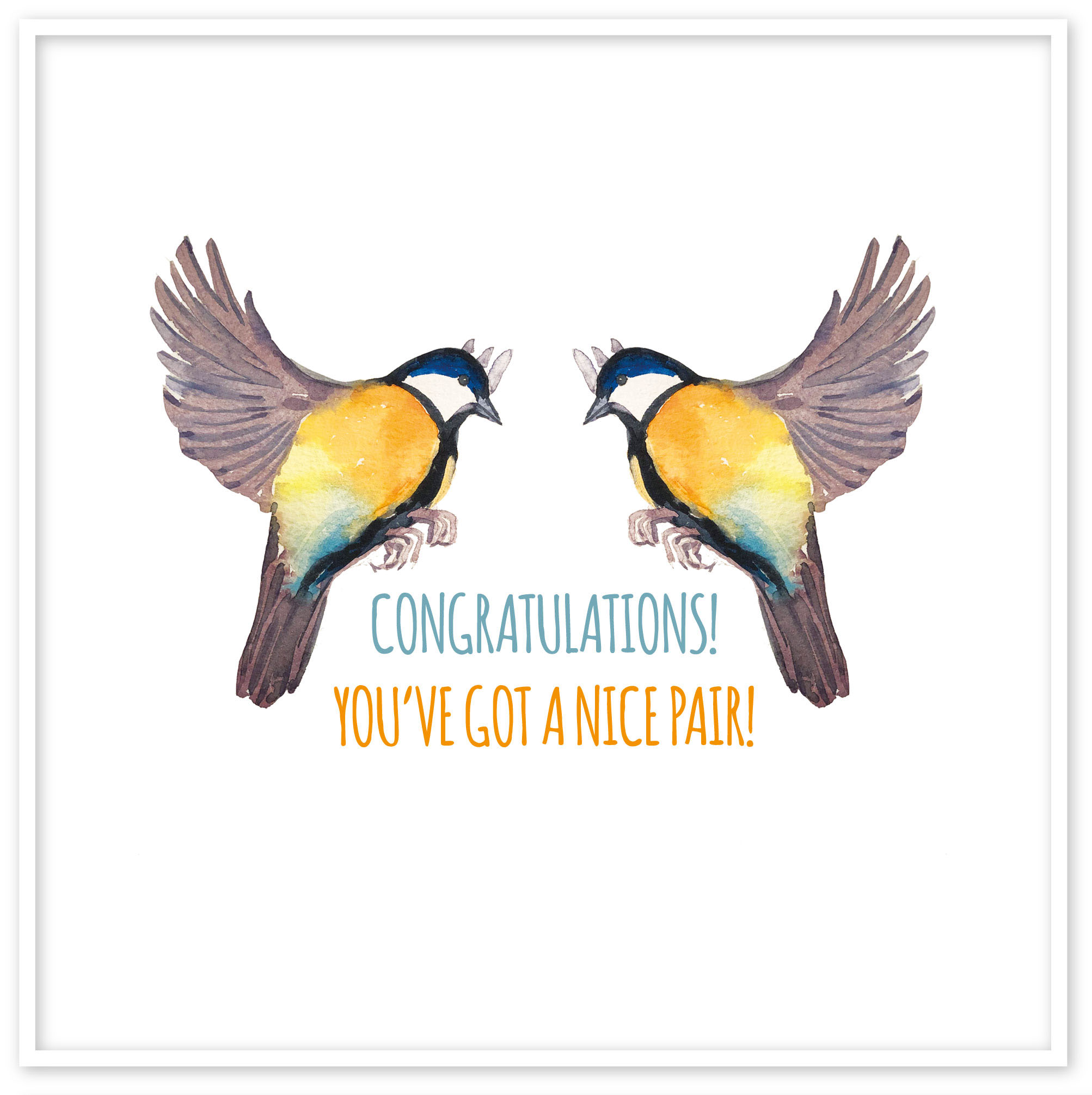
Card Design ‘Nice Pair’
For the third greeting card, I was a bit hesitating what theme to choose, as I wanted to keep it decent but funny at the same time. I went for some researches for the breast surgery cards. There was more variety on those cards, but of them were online cards, as they were not popular for printing.

Breast Enlargement Card Sketches
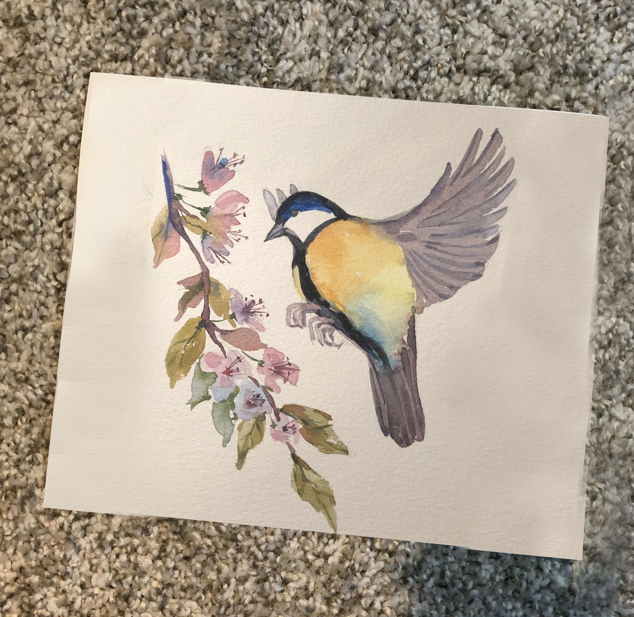
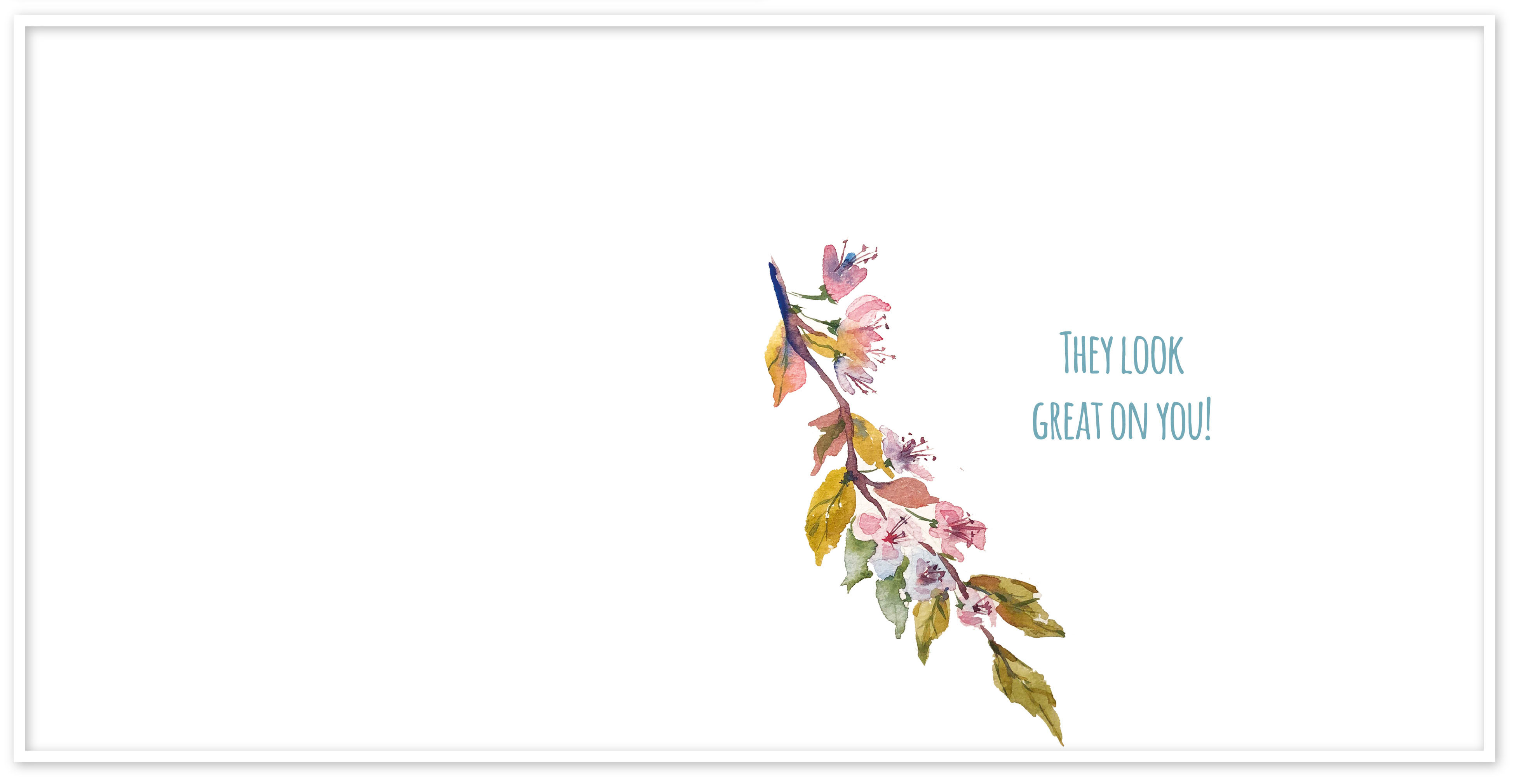
I liked the idea of playing with words, so for this card, I have painted watercolour birds. For the font, I’ve chosen Amatic bold, same as for the first card, as to me that is the kind of handwritten font plays well with my drawing. I painted only one bird and flipped it around that to have the same proportional bird. I was going to put the cherry tree branch in the face of the card, but I felt like there were too many objects, therefore I placed it inside of the card. I think that card looked minimalistic and clear, but that what made is special in the result.
Painting progression.


In conclusion, I would like to say that have enjoyed this assignment as it helped me to dig dipper into my creative abilities. The most difficult part for me was to make researches and to find out what greeting card would be worthy to produce, as I wanted to design something original and funny at the same time. I have never thought about the target audience for greeting card until I found out that the card manufacturing market is more related to a female audience. I think my cards would definitely be attracted by female aged between 25-45 they are thoughtful and have a good sense of humour.
‘Hair Donating’ card stands out in front of other cards as it can play a major role in modern society such as volunteering and donations. This greeting card would have a big potential, as it can take a part in the charity project, for example, like from the purchasing each greeting card, some of the money will go to the special organisations.
I feel like ‘Weight Loss’ greeting card is my favourite, as it would have a good chance to stand out in the market. I’m pretty satisfied with the result I’ve got, but I’ve noticed that I could develop my ideas only when I created a style for them, in my case it was related to the watercolour paintings.
‘Breast Enlargement’ greeting card differs to other cards as I would call it less serious, however, I would think if a woman has made a decision for such changes it’s always nice to get some attention and cheering words.
In addition, that course for the second assignment helped me to go through all the stages, I’ve learnt the importance of researches, mood boards, and sketches for the problem solving, and critiquing my work.
