This time I have a task to design 2 posters. The first poster should be full of details and descriptions about the event, when and where it’s taking place, what’s going on, how long it lasts, how much it costs and what to expect, basically including all the details that audience might need. For the second poster, I have to apply Occam’s Razor principle to pare back the information to a bare minimum.
Occam’s razor (or Ockham’s razor) is a principle from philosophy. Suppose there exist two explanations for an occurrence. In this case the one that requires the least speculation is usually better. Another way of saying it is that the more assumptions you have to make, the more unlikely an explanation.
I’ve decided to create two posters for the Bryan Adams Concert, rock band, which is touring around Europe at the moment. As my husband and myself are big fans of his music, I keep following his page of concert photographs. Also, I’ve seen interesting posters for his concerts and song albums loads of times, I thought that is the kind of direction I would like to work with, to give them my vision of design.
Mood Boards
Firstly, I found some designs for inspirations. I had some researches for creative ideas, I had a look through designs that could meet two requirements: minimalistic posters according to the Occam’s Razor principle, and busy designs with lots of information. There are some designs that I could start from.
Explanations of my choice
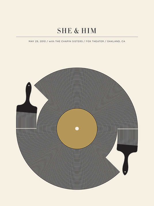
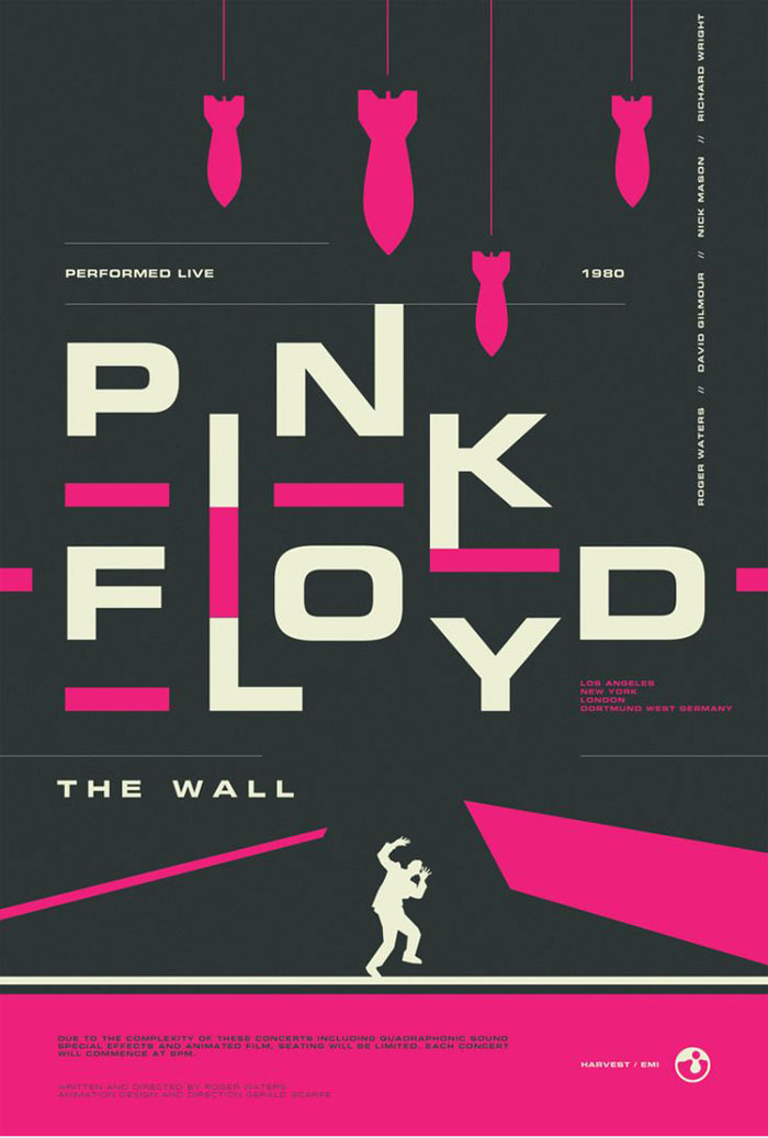
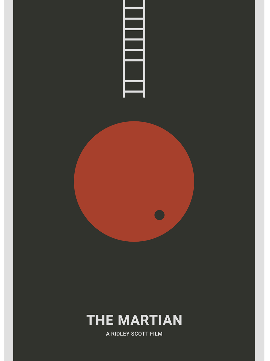
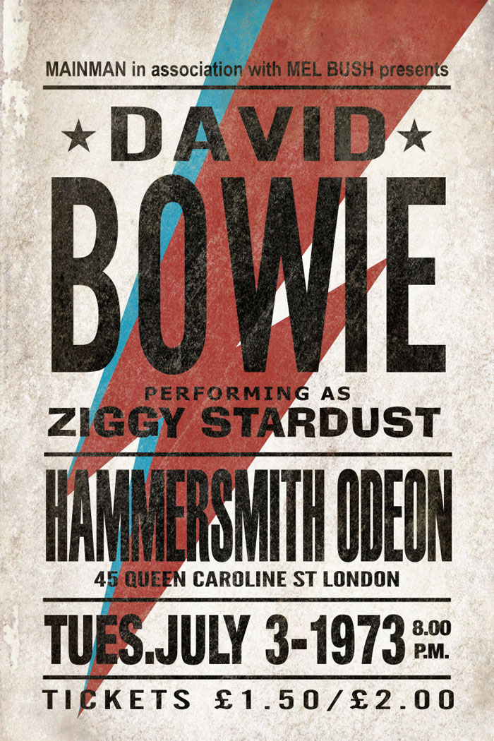
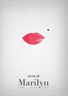
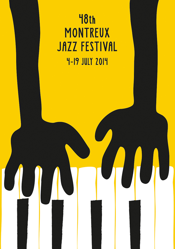
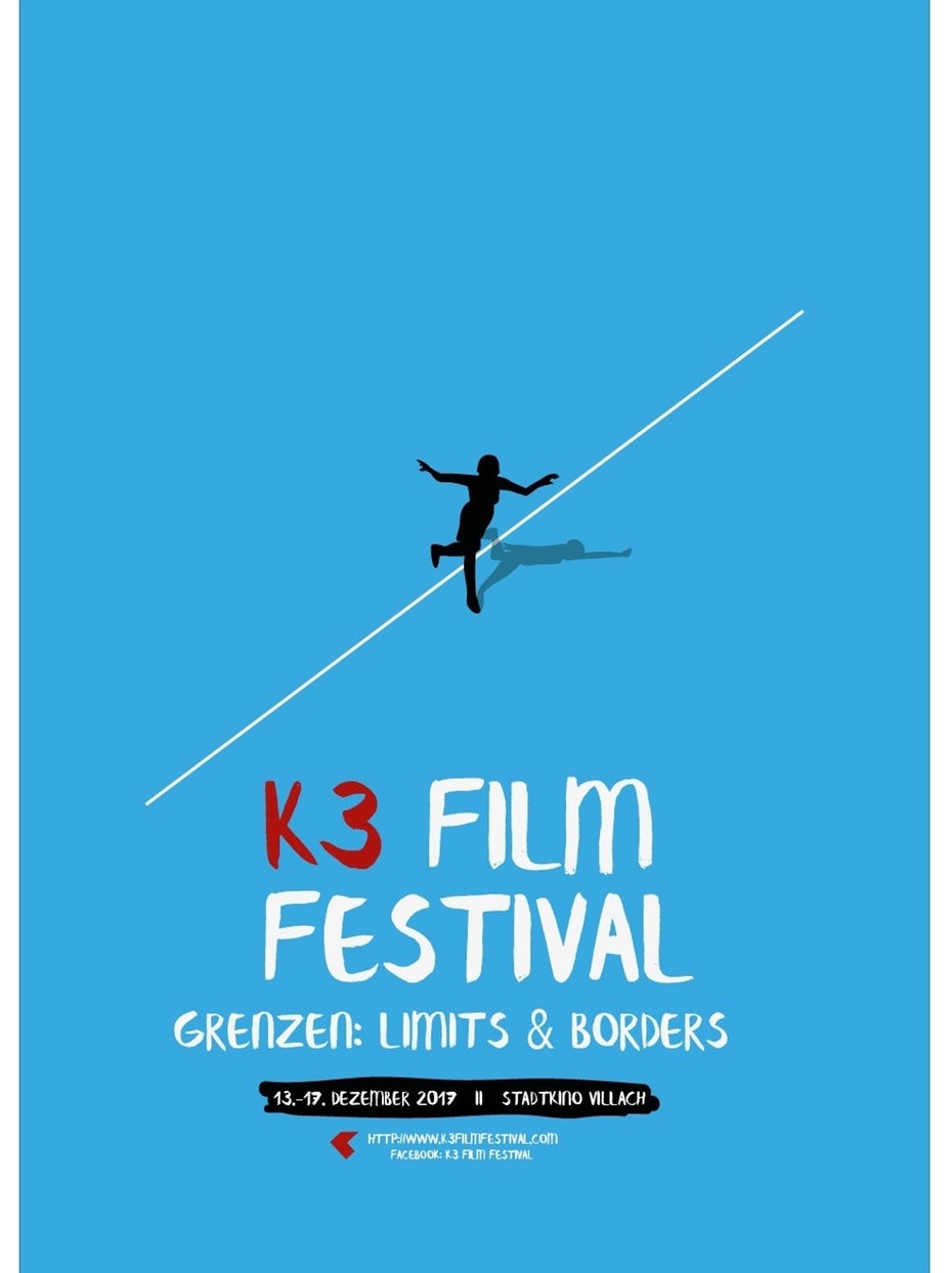
Pink Floyd is the kind of design I would call simple, but heavy, as it has the kind of hard contrast between the colours: dark grey, pink and white. Johnny Cash poster is an ideal example of overloaded design, where all information as possible was fitted in, but, at the same time, the name of the artist is still coming in front, also I like an idea of A letter missing, instead of that was used an image of the artist itself. Same as David Bowie poster, I don’t prefer too many typefaces on the poster, but that is the case where it works very well, as each line is the kind of independent message to the reader, but the name of the artist is still on the first place. Some minimalistic posters as The Martian, Marilyn, K3 Film Festival are examples how positively space could work, as I’m as a reader could have my impression from the message in a couple of seconds, I would call them simple and clever.

Source: https://www.designyourway.net/blog/inspiration/concert-posters-design-ideas/
Bryan Adams Posters
Then I went for some researches that to get a general idea what style of Posters Bryan Adams marketing team using for concert announcement. I’ve noticed that on his posters there is a domination of black and white photographs, orange, and red colour. I think that is the kind of style that singer using that to promote his brand. After that, I have found out that Dirk Rudolph is an artist from Germany who has been creating Bryan Adams promotional materials for the past few years https://www.dirkrudolph.de/
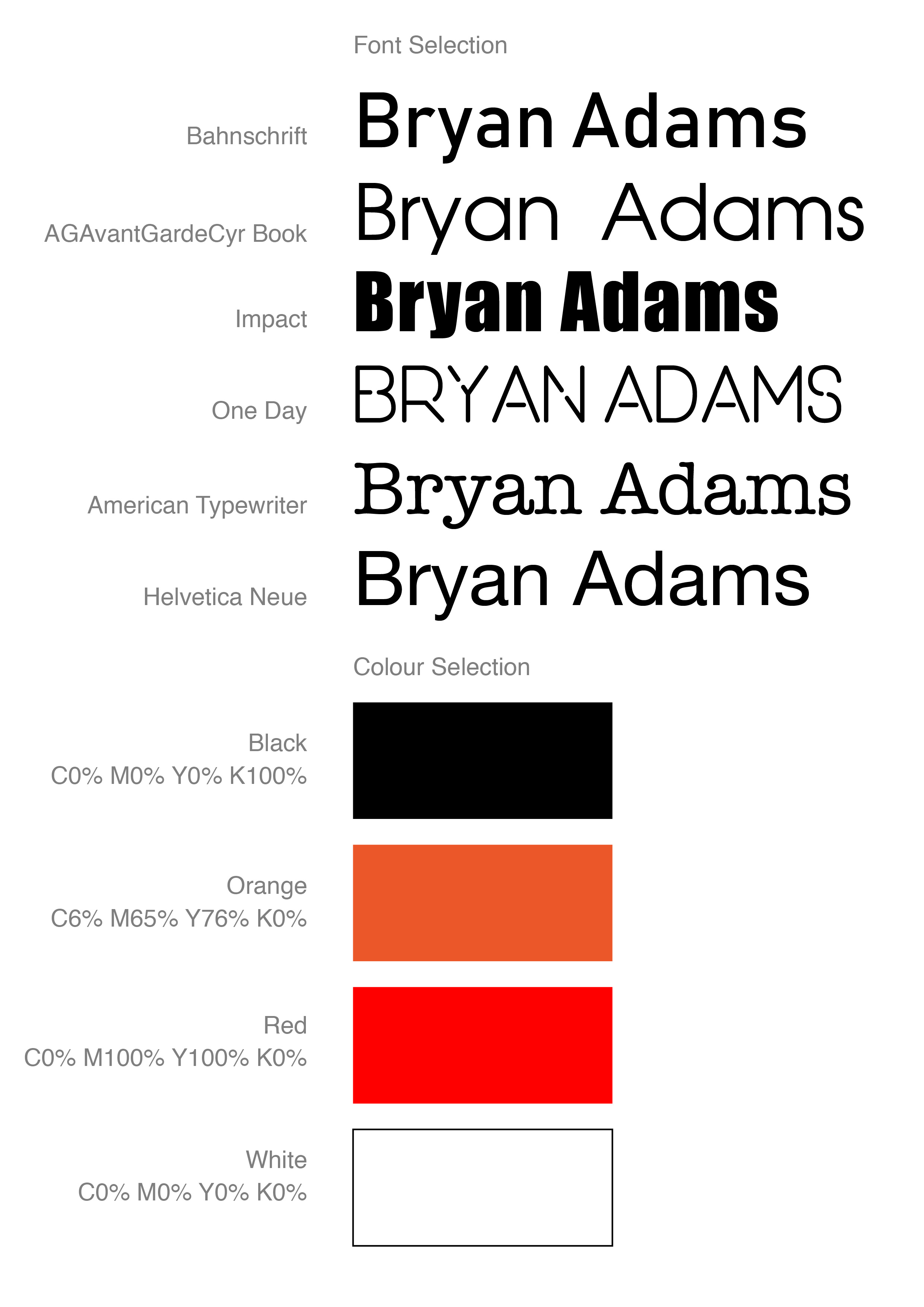
I started with some sketches of the poster. I liked the idea of missing ‘A’ title at the Johnny Cash poster, and different fonts combinations, so I thought I could work out with Bryans Poster in a similar way. I made some table with fonts and colours.
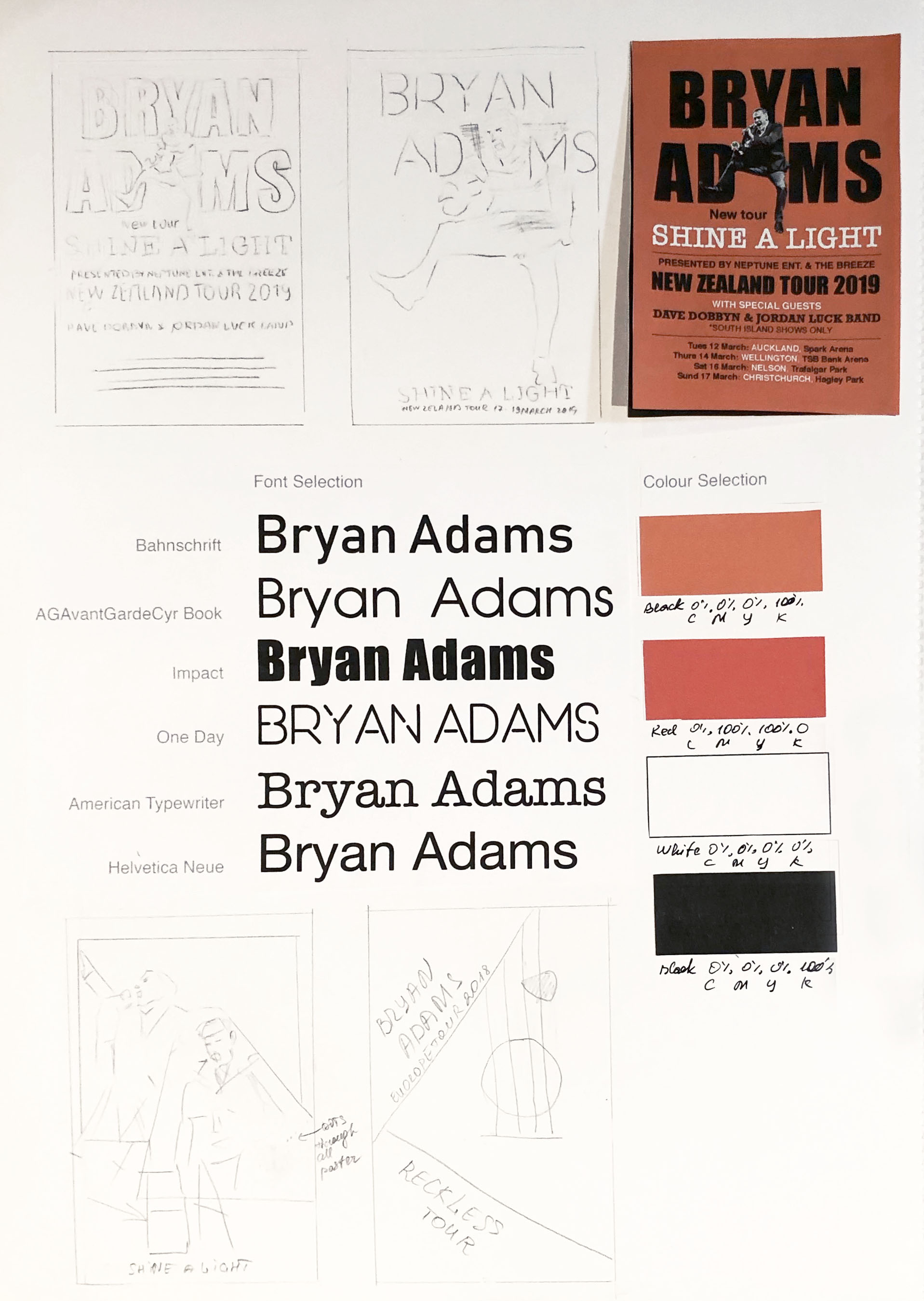
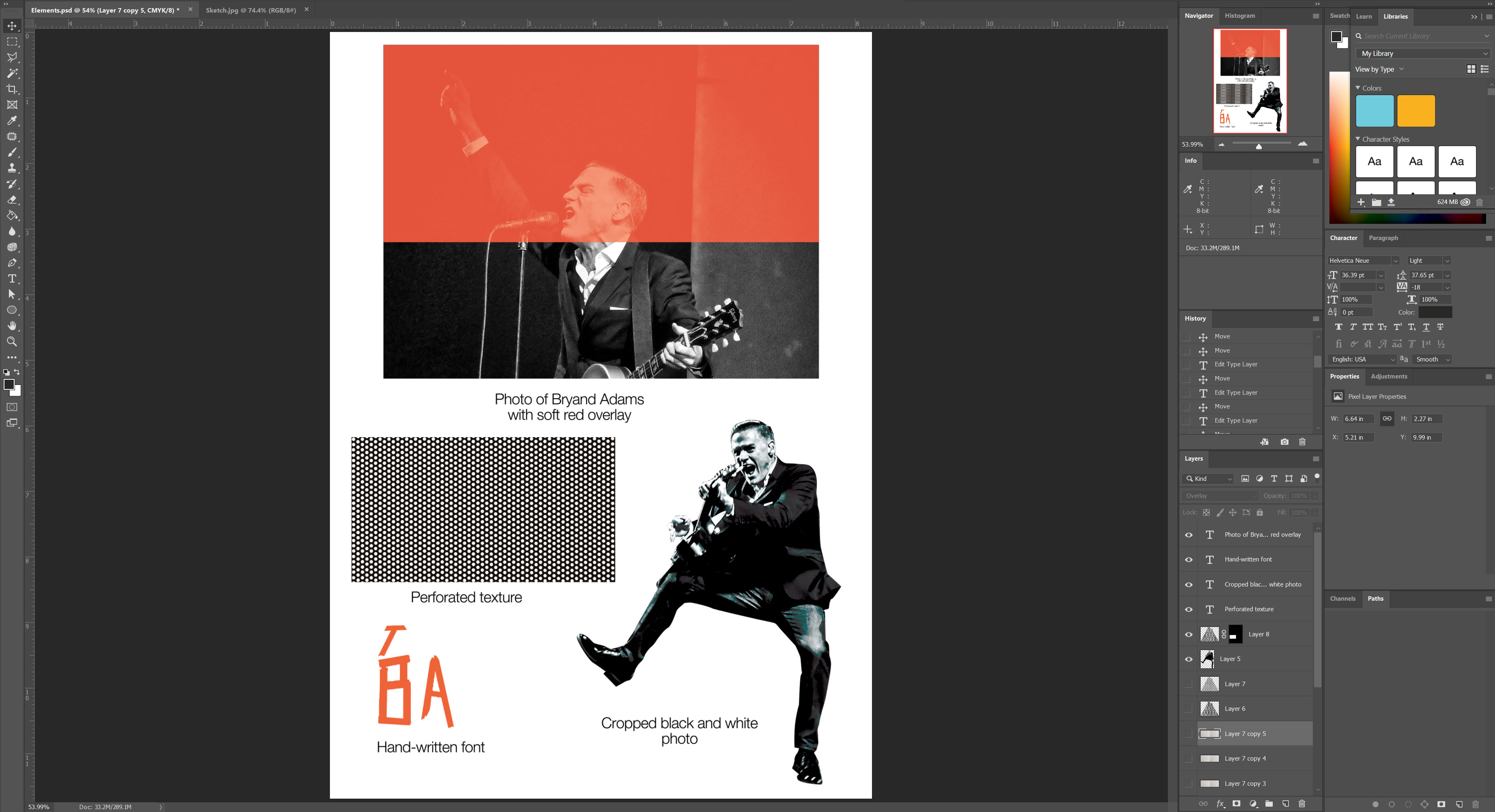
I had on my archive photograph taken by my husband of Bryan Adams from his tour in Vancouver, I liked the energy and spirit from that photograph, it could work well as an independent image at the full poster size, and at the same time as an additional image at the ‘busy’ poster. I went on the Dark Rudolph website for some inspiration, I’ve noticed that for Bryan Adams he using black and white photographs in combination with bright orange and red colours.
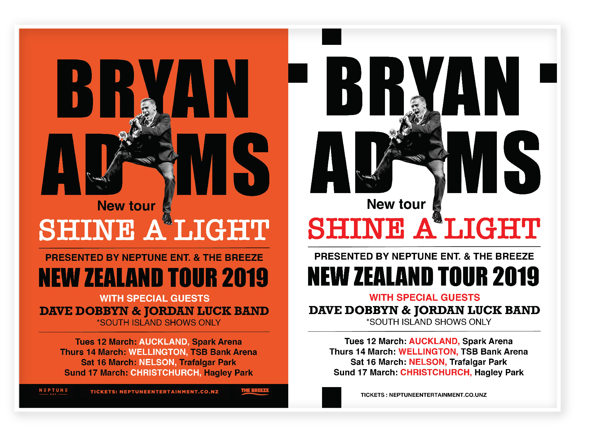
For my first poster, I used a couple of fonts. For Bryan Adams name I used Impact font, to stand out the name, also were used such fonts as American Typewriter and Helvetica New. For the same design I did reverse version with an orange background, I think it could be an additional option for printing as well.
Another design I tried to figure out how the principle of Occam’s razor could be used. I minimised the number of text lines and used just only a picture of Bryan Adams with the name of a Concert Tour. I thought I would like to use the kind of square that Bryan is jumping out. On the black background for the concert name tour, I used red outer glow, same as on the orange background.
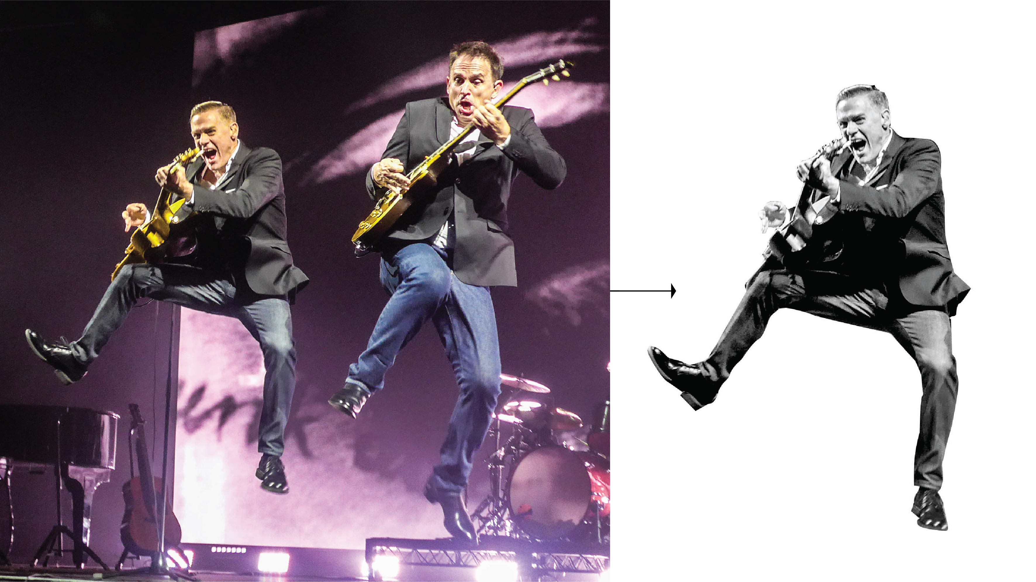

After a couple of trails with poster design, I went further down in my researches. Inspired by Dirk Rudolph designs I had an idea of combined images of Bryan’s photos for the poster.
I’ve created dots texture in Adobe Illustrator, which I could use on the top of Bryans photos. I used different shapes on it, applying overly mask. I tried a couple of different options, where the picture was on the top of the mask, and behind of mask as well. In the result, I went for the option where my picture goes on the top of the texture, but Bryan’s photo with the dots texture as well.
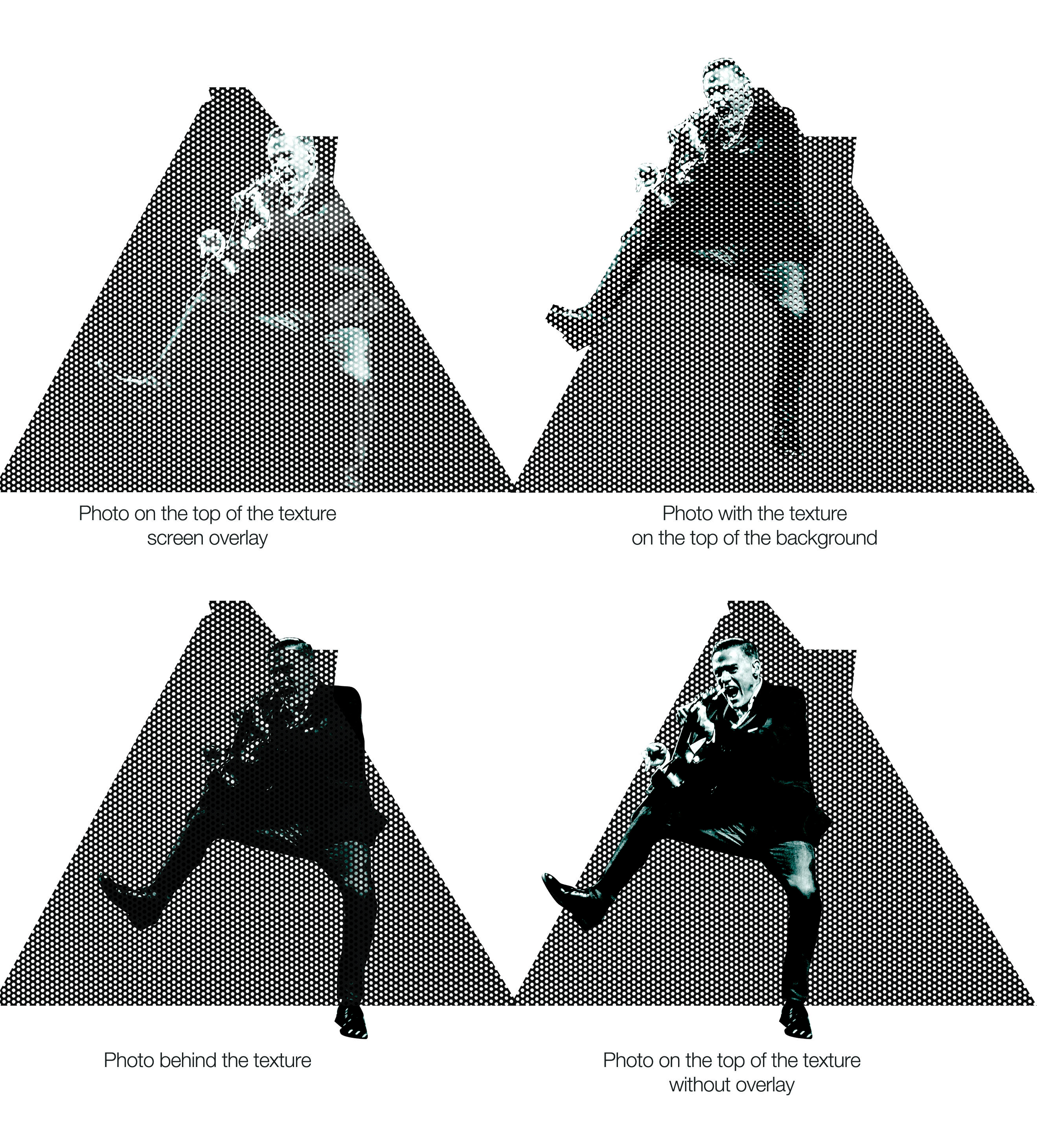
I’ve created circles grid, applied layers mask on the photographs. For the font, I’ve created my own one, painted from pieces of the film two letter BA. I tried to apply the multiply layer on one of the photographs, borrowed the orange colour from the letters. In the result, I had a poster with three plans, which looked like a 3-D effect. I liked the idea of black and white photographs combined with a red background on the top.
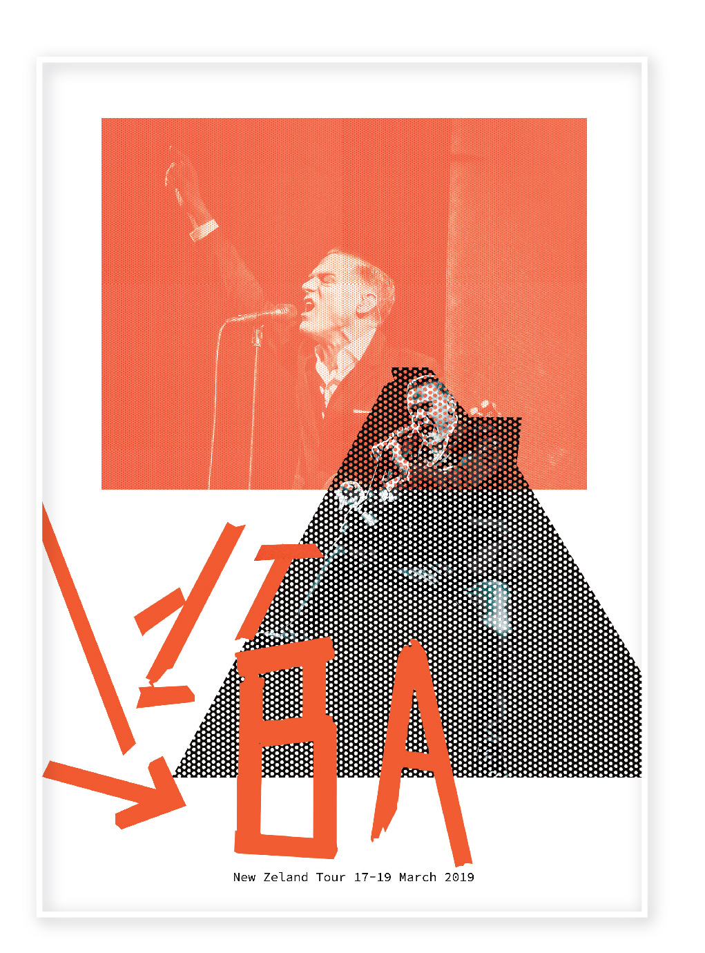
In a conclusion, I would like to say, that I could get the best result for a poster design in my last option. I think despite that fact that the image of the singer is hidden behind the dots grid, the visual is still recognizable. It has lots of white space around, and composition by itself is quite eye-catching, I believe, that potential audience will find time to stop near that poster that to read some details, there is not much following information, but I strongly believe that popular brand, doesn’t have to be followed by a load of details and explanations, such as duration, programme and by other andadditional information. If I was a potential client for that band concert, I would see that poster as a reminder that concert is coming, start and end date, and after that, I will definitely go online to google for some tickets and all the details of the tour. Considering the design by itself, looking through the Bryan Adams marketing projects I could see that he prefers non-standard kind of thinking. At the same time, my last design reflecting in the best way his outstanding personality.
