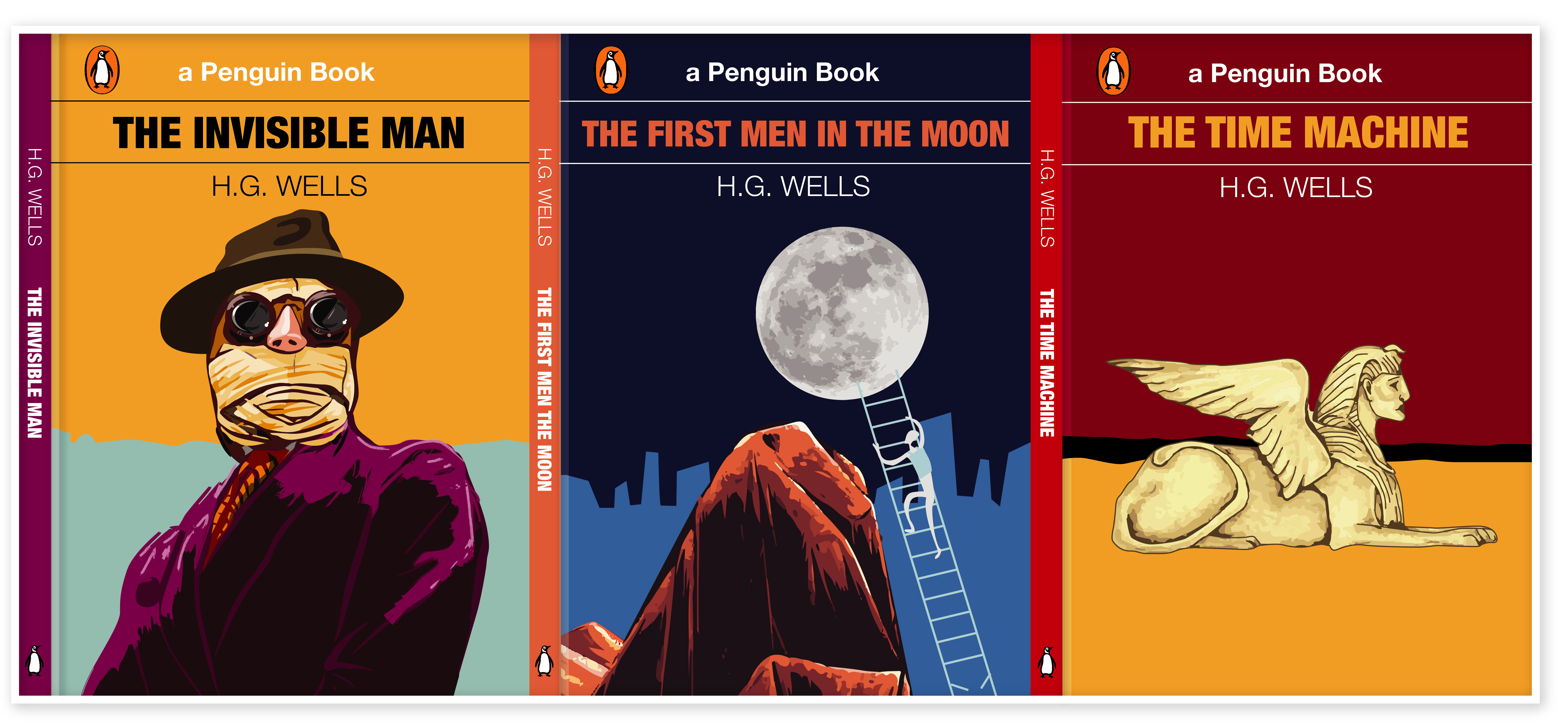
The brief is to design a stunning and contemporary cover for one of the 20th century’s most acclaimed authors, HG Wells. The books will be published in paper format and need to include the titles, author’s name, publishers name and trademark.

Keywords for the generic topics of HG Wells books:
- mid-life crisis
- class
- feminism
- materialism
- consumerism
- love
Researches
The first step in my researches was to fill the gaps in my knowledge. I had some worries about starting this task, as I have never read his books before, therefore I looked for the books review that to have some basic ideas regarding the books that would inspire me. I went on Google to read about author more, and at the same time to find some cover designs that were printed for HG Wells, at the same time I that could use them for generating ideas.

I used mind mapping technique to fill the gaps and identify keywords that could help me to produce my own ideas for sketches and visuals.
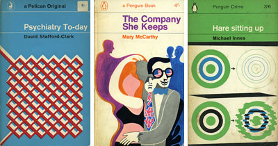
I’ve made some researches of the cover designs that were previously published starting from the first publications and leading to the modern covers for HG Wells books. They gave me some tips I could use in my design. From my vision, I would say that cover design I could use for my own ideas is with the fewer elements, the kind of minimalistic designs, like the cover of Invisible Man on the blue background, where I could see mainly only a few elements like hat, suit and the name of the book and author. Another design that I think stands out compare to the other design is a first cover for the Time Machine book, where instead of busy element around I could see the main one object, which is sphynx.
I tried to identify three books that I would work with. Below is mind mapping of some well-known HG Wells timeless fiction and novels. After that, I could have a clear understanding of what books I would like to work with.
- The Invisible Man
- The Time Machine
- The First Men in the Moon

https://dribbble.com/shots/5471891-Book-Covers-with-Story-Tales-Font
[Accessed November 2018]
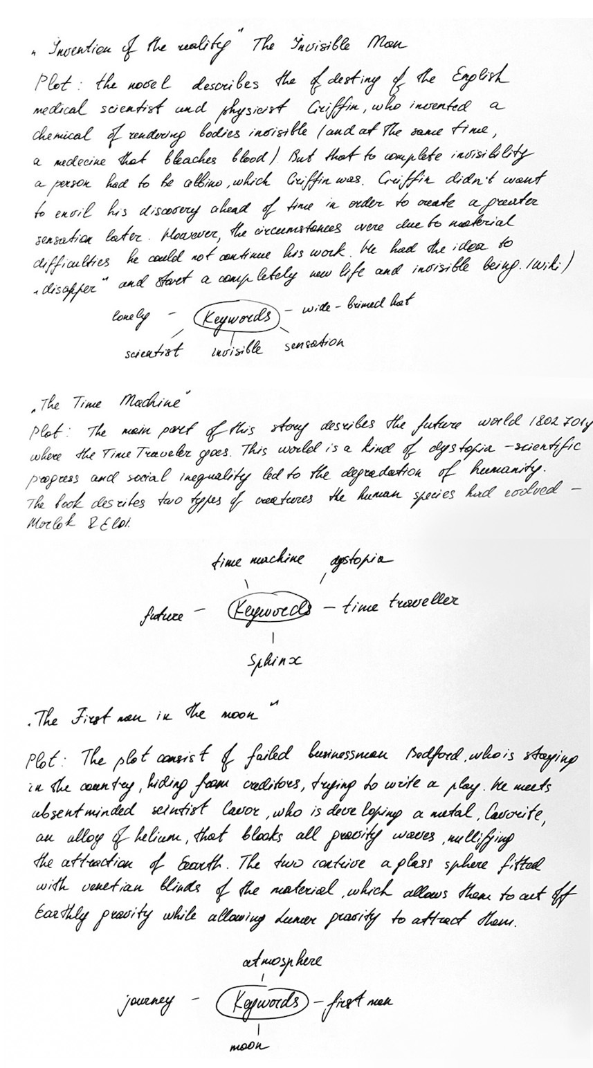
As I had a gap in a plot understanding, I read the review for all books, and after that, I decided to create a mind mapping with keywords, and general ideas for each cover.
I found some examples of contemporary book covers that were redesigned from classic novels. I tried to identify for myself how would I imagine modern book cover, I decided that it should be vector illustration, with a bright background and contrast colours. Some examples that I liked below.
After I did my final researches I made the decision that I would like to use vector illustration in my work with some abstract addition.
For typeface, I’ve decided to keep it simple. For all book names, I used Helvetica Condensed Bold, for the Author Name I used Helvetica Light, for the Publisher Name I used original typeface Helvetica Regular.
The Invisible Man – Book Cover Idea Generation.
- Loneliness
- Scientist
- Evil Genius
- Strange appearance
- Invisible
- Pink Nose
- Wide-brimmed hat
Notes from Learning Log.
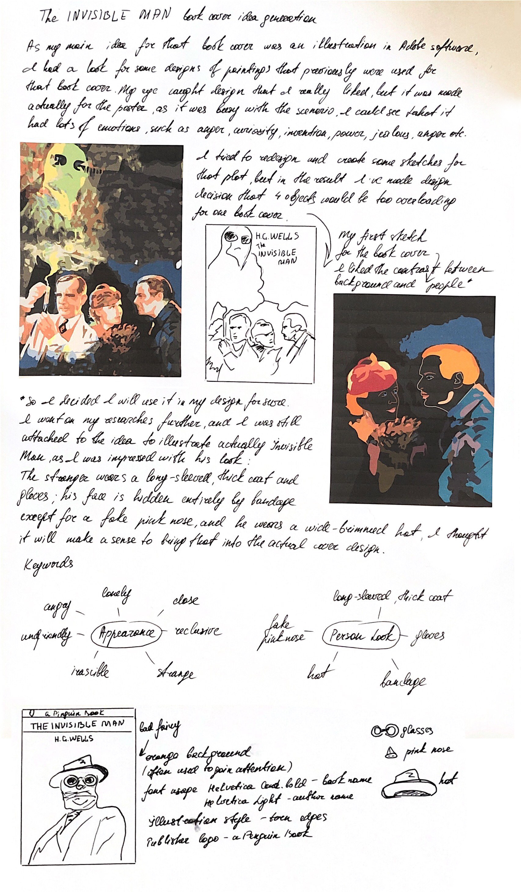
For the source of inspiration, I found that old poster, which perfectly displays my vision of the Invisible Man. I could see there arrogance, power, and the kind of grotty at the same time. I’ve painted my own image of the invisible man relying on the poster, using the Pen Tool and Pain Brush Tool.
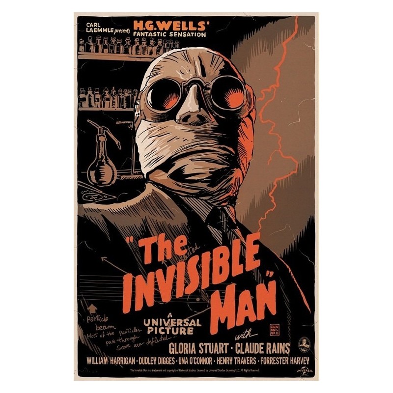
https://www.amazon.com/Invisible-Classic-Vintage-Movie-Poster/dp/B01F6MMDBU [Accessed November 2018]
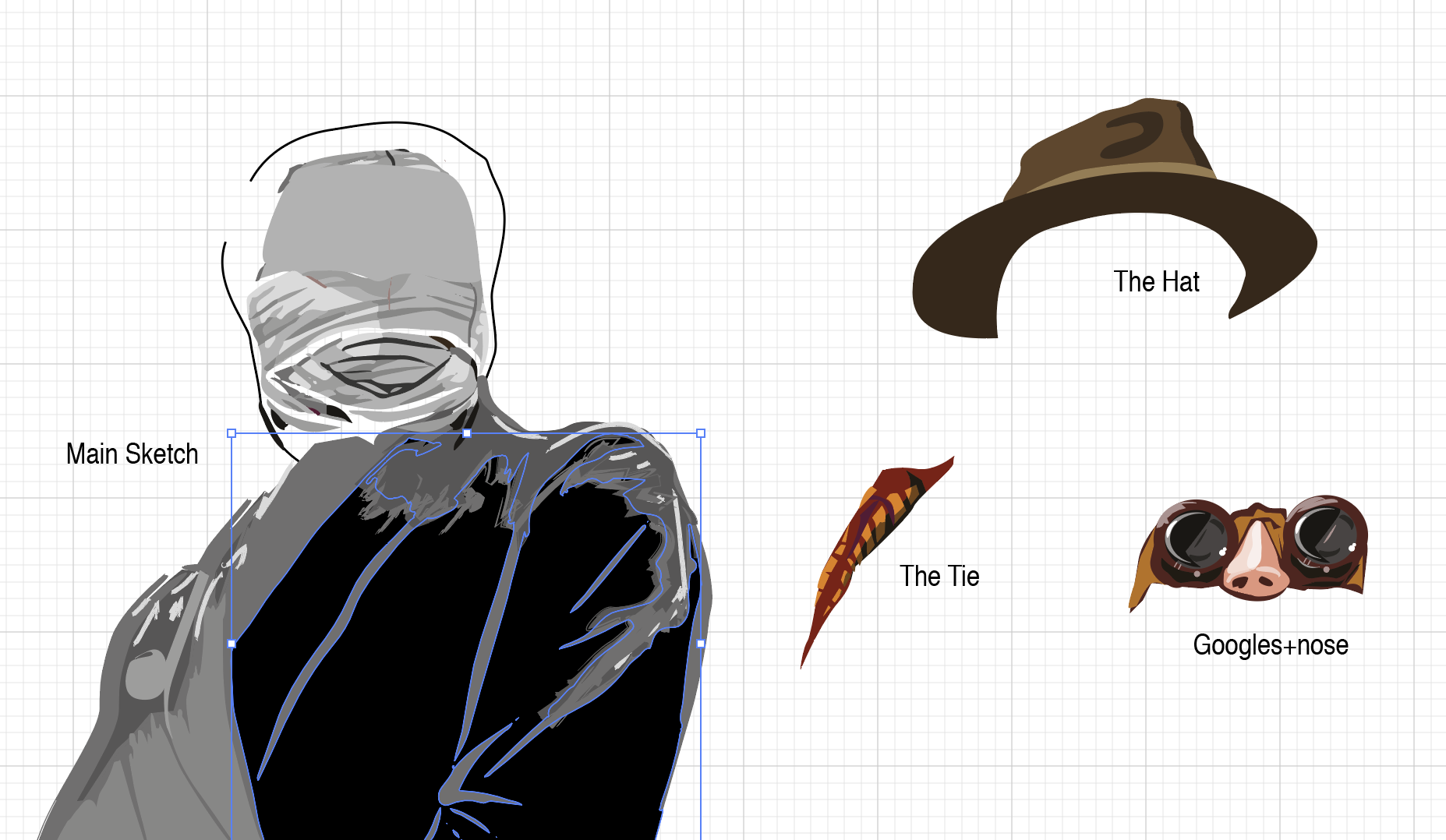
Sketch in Illustrator for Invisible Man book cover
I played around with the colours for his jacket, evenly that his personality was quite miserable, I liked the idea of bright colours for his jacket, I found it eye-catching for the potential buyer.
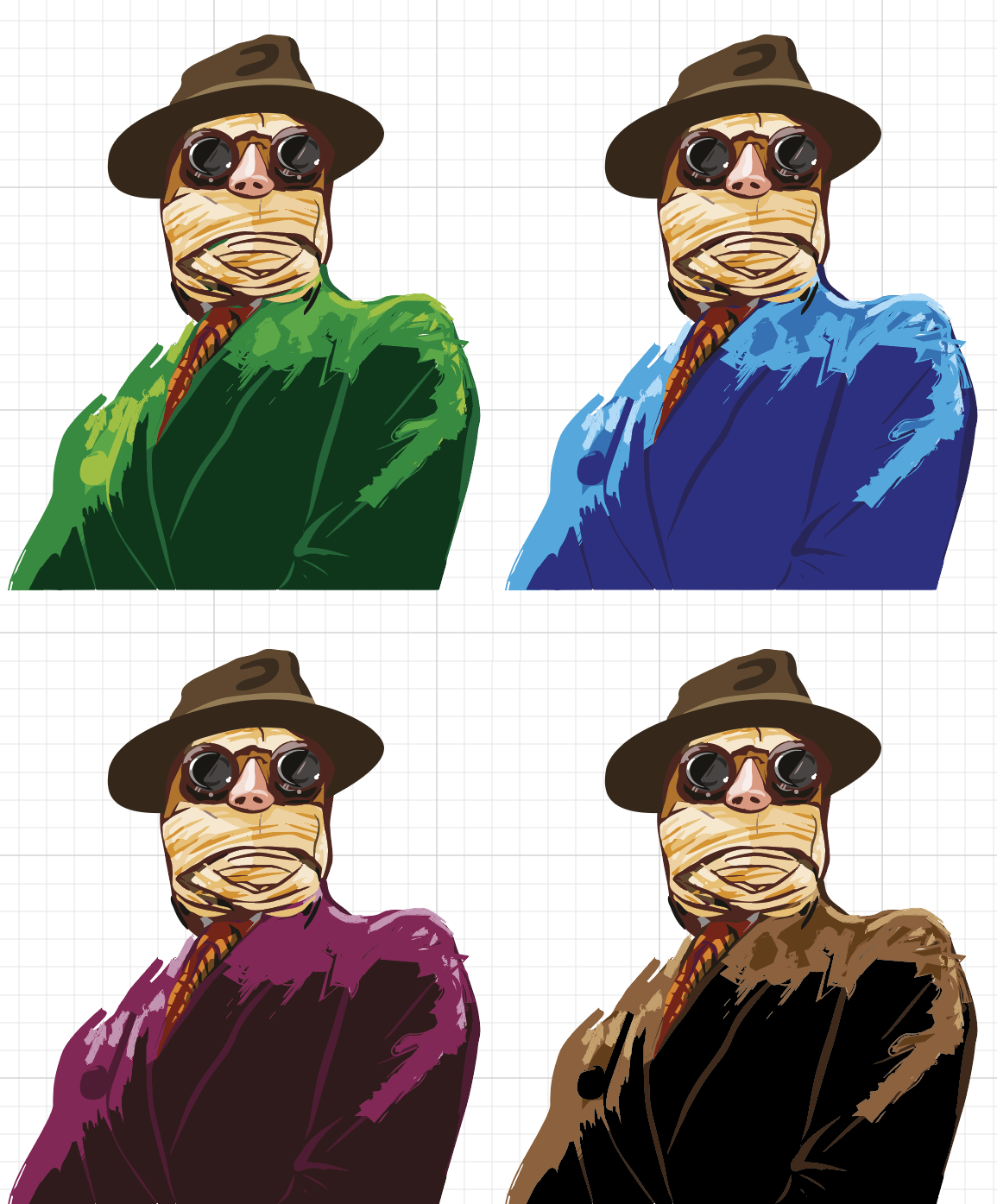
Colours comparison. Painted by Eleonora Davydovska on November 2018
Book design I’ve got in the result is presented below. On my sketches, I had the plain orange background, but after some additional works, I could see that design missed some sort of deepness, therefore I put in some additional tender blue colour that the image of Protagonist came into the front of the composition.
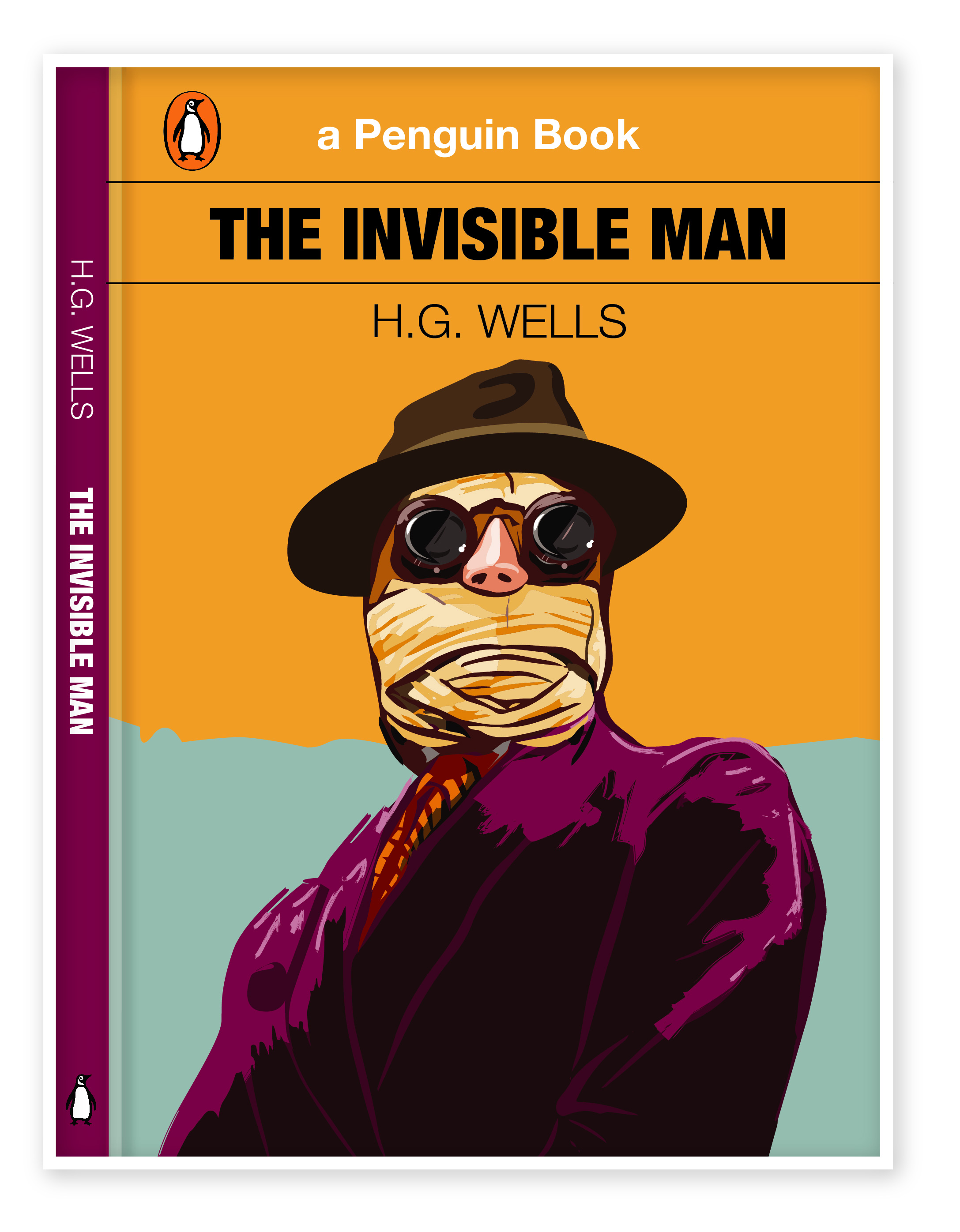
I think I’m quite satisfied with the result that I’ve got. As my illustration presents a spirit of the protagonist personality, as Griffin has become one of the most famous images of “evil genius” in world literature.
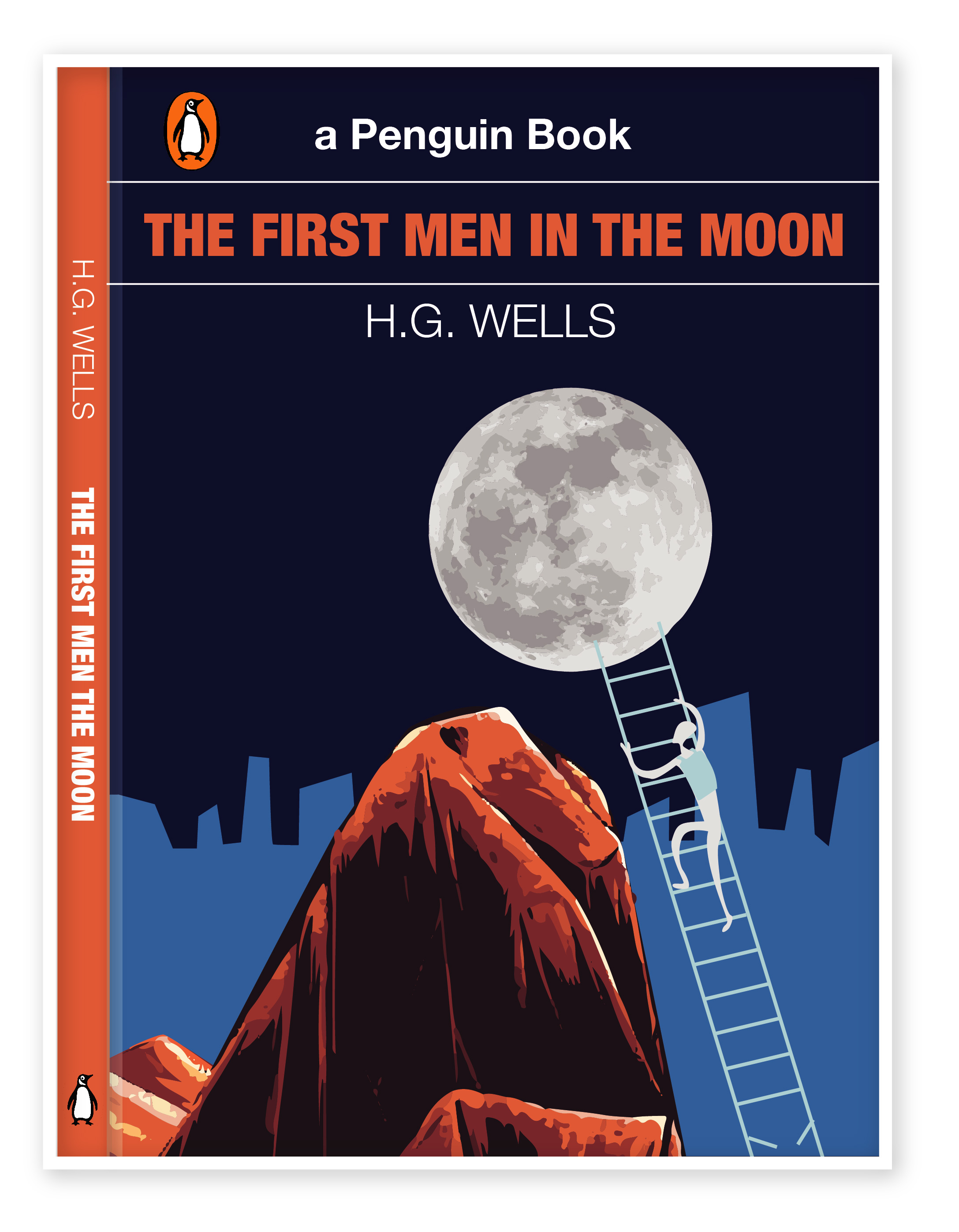
The First Men In The Moon – Book Cover Idea Generation.
- Gravity
- Space
- Satellite
- Revolution
- Lunar
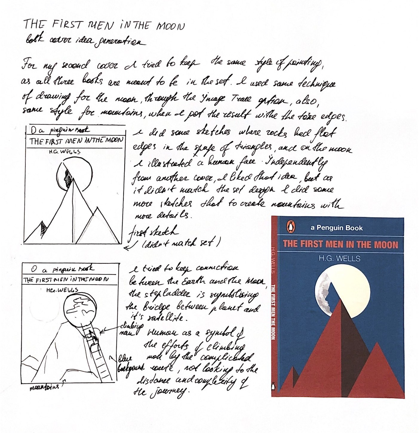
As I had an initial idea to play around with the mountains and the moon, to keep the connection between the planet and its satellite. I tried the first option with the sharp angles, however, for that book cover I still wanted to avoid the straight lines, so I lose this first option. Some of my researches and sketches are presented below.

Sketches in Adoby Illustrator for the First Man in the Moon book cover

Cover Option 1
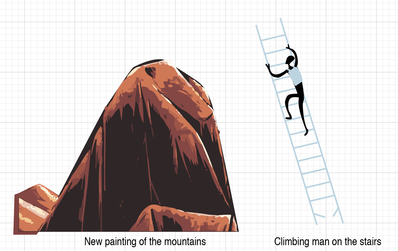
After the first trial I went further in my researches, so this time I was going to paint mountains with soft torn edges. My thoughts were coming from that I was going to keep all book covers in the similar style, in the kind of dynamic painting, avoiding stright smooth forms as much as possible. Below is presented some of my drwaings in Adobe Illustrator.
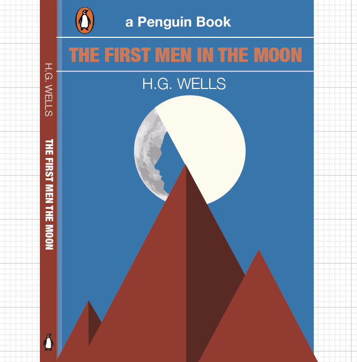
The final design for the book cover.
For the background, I’ve chosen two shades of blue colour, which represents the sky, and is associated with open spaces, freedom, intuition, imagination, inspiration, and sensitivity. Darker blue as a symbol of space and lighter blue is a symbol of human civilisation. I quite liked that drawing, both images Moon and mountains were painted with shades and lights. The last step is broken, as I wanted to show an interrupted connection with Earth, when Cavor’s programs break off in half a word, while he was about to reveal the secret of Cavorite’s production to earthmen.
The Time Machine – Book Cover Idea Generation.
- Time Traveller
- Futuristic
- White Sphinx
- Machine
Ideas from my sketchbook:
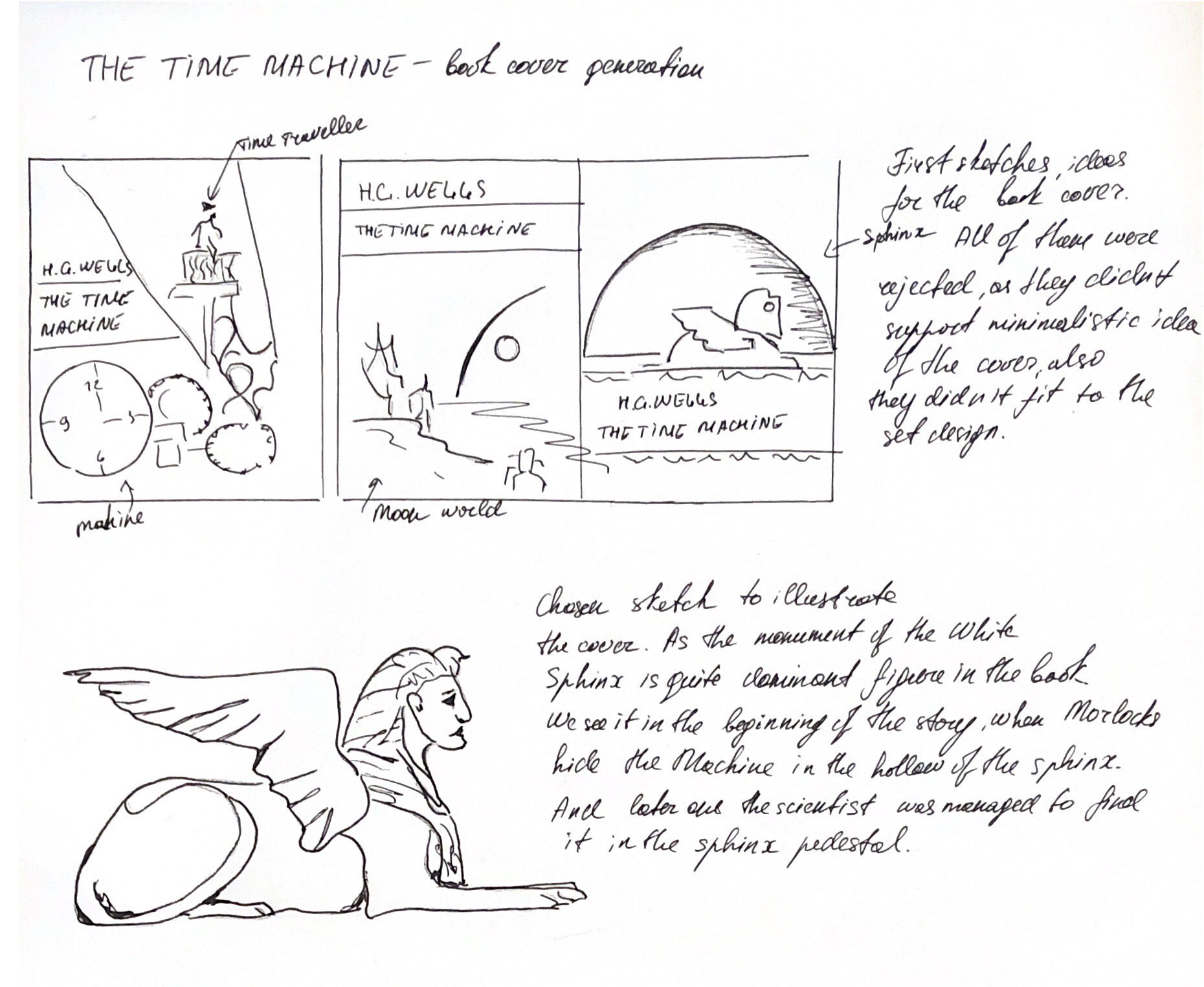
For my third book cover, I went through some researches, as I preferred to keep it simple, so I’ve decided to execute an illustration image of White Sphinx. The idea was taken from that bit:
Meanwhile, the Morlocks, who, despite the loss of intelligence, retained a purely mechanical interest in technology and the ability to serve it, they found the Time Machine and hide it in the hollow pedestal of the White Sphinx. Having discovered the loss, the Traveler almost went mad, but eventually calms down and realised that the Machine could not be disappeared by itself, which means that it can be found. He manages to find traces of carrying the Time Machine leading to the doors in the Sphinx pedestal, but all attempts to learn something from the Eloi run into a wall of complete misunderstanding and rejection.
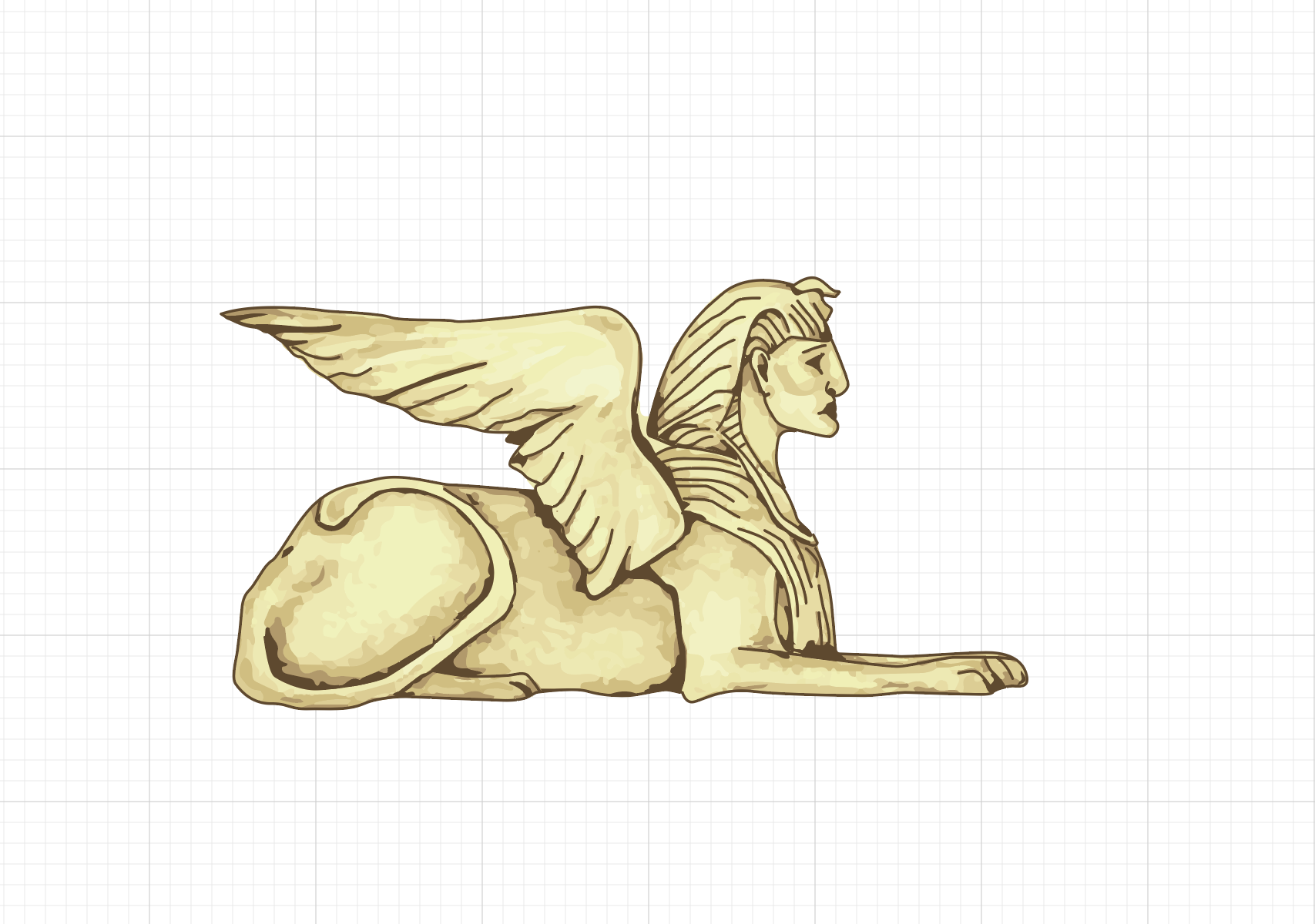

I’ve painted in Illustrator picture of Sphinx, adhering to the general style of drawing which I used in the book covers from above. I had trials with the colour for the main background, from light red to the darker shades, after that I went with burgundy background mixing with orange half in the bottom of the cover, and between them, I’ve put a black line, that to keep the horizon in the contrast.
Overall, I think I’m quite satisfied with book cover design that I got in the result, as they all look in the same style, they are contemporary, eye-catching, and following the plot of each book. Also, all of them made in the same style, and they have some colours in common, like orange, blue, and red. Mind mapping and researches, with describing of each step was some sort of new experience, in the result I could see all job that I went through, with keeping an eye on the progress of the design. I would probably do some more sketches, because sometimes I keep most of the ideas in my head, selecting the best ones and improving them. However, I think I went through quite detailed researchers and in the result my paintings have proved the original ideas of itself.
Final H.G.Wells book covers